Archive for Research

The Royals: The AL’s Weirdest Hitters

The MLB season is quickly approaching, and I am running out of ways to entertain myself until real baseball starts again.  One way that I attempted to do so today was to prepare a guide about strengths and weaknesses of offenses by team.  I just worked with the AL because I didn’t feel like adjusting the data for DH and non-DH teams to be in the same pool.  Using FanGraphs’ infallible Depth Charts feature, I gathered every American League team’s projected totals for AVG, OBP, SLG, and FLD, in order to see some basic tendencies for each team coming into the 2014 season.  I plugged some numbers into 4 variables which I thought would give a better-than-nothing estimate of how a team’s offensive roster was set up. Here are the stats I used to define each attribute:

Contact: AVG

Discipline: OBP – AVG

Power: SLG – AVG

Fielding: FLD

These variables are about as perfect as they are creative (which is to say, not very).  However, this was intended to be a fairly simple exercise.  For each variable, I ranked all the teams and assigned a value between -7 and 7.  The best team in the AL received a 7, second best a 6, and so on.  A score of 0 is average and -7 is the worst.  Here are the results:

Dashboard 1

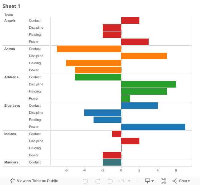
As an inexperienced embedding artist, I feel obligated to include this link, which should work if the above chart is not working in this window.

Immediately, one thing popped out at me. The Royals are 1st in Contact. They also are 1st in Fielding. This is good, since they project to be dead last in Discipline and Power. These facts going together really is odd. For the most part, teams fit into more general molds. The White Sox and Twins are below average in everything. The Yankees, Red Sox, and Rangers, are below average at nothing. The Rays and A’s are, to no one’s surprise, copying each other with good Discipline and Defense.

In fact, outside of the Royals, there isn’t another team who is 1st or 15th in any 2 categories, and Kansas City did it in all 4. To figure out how they got here, let’s look at some of the ways they stick out from the rest of the league.

In 2013, the American League had a 19.8% strikeout rate. Of all the Royals’ projected starters in 2014, Lorenzo Cain had the highest 2013 K% at 20.4%. Alex Gordon sat at 20.1%, and you won’t find anyone else above 16.1%. Not satisfied with an overall team strikeout rate about 3 points lower than the league average in 2013, the Royals went out and acquired Omar Infante and Nori Aoki this offseason, whose respective rates of 9.1% and 5.9% ranked 8th and 1st among all hitters with 400+ PA last year. It’s obvious why the Royals batting average is supposed to be 8 points higher than the 3rd best in the league. They put the ball in play.

Unfortunately for them, putting it in play is about as much as they can do. They’re the least likely team in the AL to be clogging up bases with walks, and they’re the least capable team to drive in runs with power.

In 2013, the American League had an average Isolated Power of .149. Alex Gordon led the Royals with his .156 mark. And that was it for the above average power hitters. Even Designated Hitter Billy Butler couldn’t muster up anything better than a .124. The team’s ISO was .119, which won’t be affected dramatically by the arrival of Aoki and Infante, whose ISO’s averaged out to .108, but who replace weak-hitting positions for the Royals.

Oh, and for discipline: they don’t walk. They don’t like it. GM Dayton Moore got in trouble for saying something dumb about it, and the data suggest Manager Ned Yost may not have been aware they existed when he played. To the Royals’ credit, they did acquire Aoki, whose 8.2% rate last year was ever so slightly higher than the AL average of 8.1%. Omar Infante’s rate was just above 4, though, and their 6.9% team rate probably won’t be much better this year.

Lastly, fielding. Kansas City could flat out field, winning 3 Gold Gloves, and saving a mind-blowing 80 runs according to UZR. That number, more than double (!!!) anyone else in the AL in 2013, was the 2nd highest UZR ever in the AL, trailing only the 2009 Mariners. Those 80 runs are almost sure to decrease in 2014, but there’s little reason to argue that any other team in the AL will be expected to save more runs with the glove this year.

Overall, the Royals offense could be nuts in 2014. They won’t strike out, and will put the ball in play. There won’t be many other ways they get on, and they won’t be hitting the ball out of the park much. If last year is any indication, they should save some runs for their pitchers when they’re out in the field. No matter how they turn out this year, there’s one thing to remember. If you’re watching a team effort from Kansas City, there’s a decent chance that no one in the rest of the league is doing it better. There’s also just as good a possibility that everyone is.


What’s the Value of a Home Run These Days?

Let’s face it, people love the home run. It’s why players like Mark Reynolds can find jobs. These days, we aren’t surprised when we see a couple of home runs in one game. It wasn’t always like this, however. Home runs used to be a rarity among baseball events. In the early 20th century, it wasn’t uncommon for a player to lead his league in baseball by hitting 10-15 home runs. This brings me to the question: how has the home run actually changed? Not in terms of its frequency, but in terms of its value. More specifically, its value in runs. To approach a solution to this question without arduously parsing through hundreds of event files, we must find a way to mathematically frame the game of baseball in a way that encourages simplicity but doesn’t lose the most familiar parts of the game.

Markov Chains

The first batter of the game steps to the plate and sees no runners on base with none out. He pops up. The second batter steps to the plate and sees the immediate result of the last at bat: an out. The second batter walks. The third batter then sees the immediate result of the second batter’s at bat: a runner on first base. The stream of batters stepping to the plate and being placed into a state resulting from the previous batter’s at bat exemplifies the nature of a Markov Chain. When a batter steps into the batter’s box, his current state (whether it be an out situation, a base situation, or a base-out situation) is only dependent on the previous batter’s state. This is known as the Markov Property. Using this structure, we can simulate any baseball game we’d like. However, to keep our calculations simple, we should introduce some new rules.

The Rules of the Game

  1. A batter can only attain a BB, HBP, 1B, 2B, 3B, or HR.
  2. Outs only occur via a batter getting himself out.
  3. Anything other than the events from 1) is assumed to be an out.
  4. When a batter gets a hit, the runners on base advance by as many bases attained by the batter (e.g. a double with a runner on second will score the runner on second).

These are the rules of the game. There are no stolen bases, no scoring from second on a single, and no double plays. We have stripped the game down to only its essentials, while implementing certain changes for our own convenience. For our purposes, we don’t care about Mike Trout’s 33 stolen bases, only the fact that he mainly attains his bases through the events we allow.

The Out Chain

We assume that the probability of a batter getting a single at any point during a season is the number of singles he gets for the season divided by his plate appearances. We do this for the probabilities of all our desired events. By doing this, we can construct a simple Markov Chain where players step to the plate and find themselves batting with 0, 1, or 2 outs. We find that this chain is irreducible, meaning that each state (0, 1, or 2 outs) eventually leads to every other state. This, and the fact that we are dealing with a finite number of states, leads us to the existence of a probability distribution on our state space of outs. It so happens to be that when a batter starts his at bat, he does so with an equal probability of seeing 0, 1, or 2 outs, i.e. the probabilities of a batter seeing 0, 1, or 2 outs when he comes to the plate are all 1/3. The knowledge that outs are uniformly distributed over our game allows us to construct probabilities for a more complicated chain that should shed light on our original question.

The Base Chain

We now place our focus on the stream of batters who see a certain base situation when they step to the plate. The transitions of base situations are dependent on the out situation, as can be seen when a batter bats hits with 1 out versus 2 outs. Batting with 1 out, if the player makes another out, then the base situation stays the same for the subsequent batter. If he does this with 2 outs, however, then the inning is over and the base situation reverts to the state where no one is on base in the next inning. Fortunately, we know that the probability of a batter seeing any number of outs when he steps to the plate is 1/3. In a similar manner to the Out Chain, we find that every state in the Base Chain leads to every other state. The “runners on the corners” state eventually leads to the “bases loaded” state, which eventually leads to the “bases empty” state, and so on. Since there are finitely many base situations, we are led to a stationary probability distribution on the state space of base situations. That is to say, there is a probability associated with a runner stepping to the plate and seeing the bases empty, and another for seeing a runner on first, etc.

Results

Using this method, a player in our universe who stepped to the plate in 2013 saw the bases empty with an approximate probability of .467. That same batter saw the bases full with a probability of .103 and one runner on first with probability .210. If a team managed to load the bases, they’d find that they generally had to wait about 10 more plate appearances before they next loaded the bases. If they put runners on the corners, they generally had to wait 42 more plate appearances before they did so again. All of this leads us to some of our final conclusions. In the context of our rules, the expected number of runners on base in 2013 was .908, meaning that the expected value of a home run was 1.908 runs. This method generates home run values that are always between 1.8 and 2.2 runs. The following is a table of all of the expected home run values this method generates from the seasons of the last 25 years:

In the last 25 years, we predict that a home run had the greatest value in 1999, at 1.972 runs. This is a reflection of the heavily offensive environment of the season, when big bats such as Sammy Sosa, Mark McGwire, and Barry Bonds were getting on base at staggering rates. The following is a graph of all of the home run values the system predicts from 1884 through 2013:

We see that this system predicts home runs to have been of more value from around 1889 to 1902, when the home run hovers at around 2.00-2.15 runs. While most players of this generation weren’t hitting home runs, they were certainly getting on base often. In 1894, 38 players had on base percentages greater than or equal to .400, compared to 7 players in 2013. When on base percentages are higher, more people are on base, and this increases the expected value of the home run. Under our restrictions, however, the home run hasn’t been worth 2.00 runs since 1950 and these days it fluctuates between 1.90 and 1.93 runs. While these estimates are all under the umbrella of rules and assumptions, this framework allows us to more easily generalize the game of baseball while preserving its most important aspects. It’s this framework that gives us the power of estimating that, while Chris Davis‘ 53 home runs were probably worth 101 runs in 2013, they may have been worth 114 in 1894.


Talkin’ About Playoffs

While watching the playoffs last October, I realized that I had never seen rookies play such a prominent role in the postseason before.  Pitchers like Michael Wacha, Gerrit Cole, Hyun-Jin Ryu, and Sonny Gray propelled their teams into contention during the regular season, and took the hill in multiple elimination games.  The inimitable Yasiel Puig had a similar impact on the Dodgers’ fortunes in 2013.

This observation led me to investigate rookie performance during the 2013 regular season.  Were rookies contributing to the success of their teams more so than in the past?  Were rookie pitchers outperforming rookie hitters?  How about rookies on playoff teams versus non-playoff teams?

Using WAR data from Baseball Reference (sorry, guys) I measured rookies’ contribution to overall team success in 2000-2013, defined as rookie WAR divided by their team’s WAR.  A few definitions before jumping in to the findings:

  • Rookies are players who have accumulated less than 130 AB (or 50 IP) and less than 45 days on an active roster prior to their rookie season
  • For consistency across time, teams that won the second wild-card slot in 2012 and 2013 are not considered playoff teams (u mad, Reds and Indians fans?)
  • Rookie pitcher WAR = amount of WAR created by a team’s rookie pitchers
  • Rookie pitcher share of WAR = % of a team’s WAR created by rookie pitchers
  • Rookie batter WAR = amount of WAR created by a team’s rookie batters
  • Rookie batter share of WAR = % of a team’s WAR created by rookie batters
  • Rookie total WAR = Rookie batter WAR + Rookie pitcher WAR
  • Rookie share of total WAR = Rookie pitcher share of WAR + Rookie batter share of WAR

In chart 1, rookie share of total WAR for the average team in 2013 (11.3%) is above the long-run average of 8%, and was only exceeded in 2006 (12.7%).  But there was no discernible difference in rookie share of total WAR between the average playoff team (10.9%) and non-playoff team (11.4%) last season.  So far, it would appear as though I need to adjust my TV.

The data becomes more interesting when the average team’s rookie share of total WAR is decomposed into pitcher and batters’ contributions (chart 2).  There is a rapid rise in rookie pitcher share of WAR between 2010 and 2013, peaking last season at 6.7% of the average team’s WAR.  This increase was so strong, it more than made up for a decrease in rookie batter share of WAR during the same timeframe, from 6.5% in 2010 to 4.6% last season.

These trends become starker when the analysis is limited to playoff teams (chart 3).  On the average playoff team in 2013, rookies provided 10.9% of WAR, a step down from the high reached in 2012.  But there is still a huge rise in rookie pitcher share of WAR between 2010 and 2013, to 8.7% last season, and a concurrent decrease in rookie batter share of WAR, to 2.2%.  In other words, 80% of the average 2013 playoff team’s rookie total WAR was generated by pitchers.  If not for a certain Cuban-American hero with a penchant for bat-flipping, that share would have been even higher.

But some evidence, as well as anecdotal observation, suggests that pitchers in general have become more dominant over the past few seasons.  Is this trend, observed so far among rookies, true of all pitchers?  Over the past fourteen seasons, the average team has generated between 36-44% of WAR from pitchers (chart 4).  This share has been consistent over time, and has edged up only slightly during the past few seasons.  This suggests that rookie pitchers, especially those on playoff teams, really did excel in 2013.

Now, let’s look at just how good the rookie pitchers on playoff teams were last season (chart 5).  Together, the 54 rookie pitchers on 2013 playoff teams generated 29.6 WAR, which is slightly higher than last year’s total (29.1 WAR) and much higher than the long-run average (16.0 WAR).  What’s even more impressive is that last season, 57% of all 30 teams’ rookie pitcher WAR was generated by the rookie pitchers on playoff teams, a higher share than in any other season since 2000.  Cumulatively, 54 rookie pitchers on 8 teams outperformed 151 rookies on 22 teams.  Not bad.

But wait…there’s more.  By focusing on the best rookies on playoff teams (arbitrarily defined here as those who generated 1+ WAR), we see that there were 20 such players last season (chart 6).  Of that number, 16 were pitchers, like Shelby Miller, Hyun-Jin Ryu, and Julio Teheran.  Five of those pitchers were on the Cardinals (Miller, Siegrist, Wacha, Rosenthal, and Maness.)  The concentration of top rookie pitchers on playoff teams last year is the highest in at least fourteen seasons.

My initial observation, “Wow, there are lots of rookie pitchers killing it in the 2013 playoffs!” looks to be borne out in the data.  This raises two other interesting questions:

1.  For any of last year’s playoff teams, did rookie pitchers provide enough value to get their team into the playoffs?

2.  Is the rookie pitcher observation a one-time anomaly, or indicative of a larger trend?

The first question is relatively easy to answer.  We can compare each playoff team’s rookie pitcher WAR (essentially, how many more games the team won because of rookie pitchers) to the number of additional games each playoff team could have lost and still made the playoffs without tying a second-place team (let’s call this the buffer). 

For four out of eight playoff teams (again, I exclude the second wild-cards), rookie pitcher WAR is higher than the buffer (chart 7).  But since Detroit and Tampa made the playoffs by one game, and since Pittsburgh’s rookie pitcher WAR is less than one game higher than the buffer, it’s hard to argue that rookie pitchers definitively moved the needle for them. Andy Dirks or Yunel Escobar could have just as easily gotten their teams over the hump, since they also created more than 1 WAR.

The Cardinals are the one team whose rookie pitchers probably got them into the playoffs.  They got 9.7 extra wins from their rookie pitchers (almost 23% of the entire team’s WAR), and made the playoffs by 6 games.

The second question is harder to answer, since the 2014 season hasn’t started yet.  There’s no clear reason why rookie pitchers on playoff teams would suddenly start playing extremely well, especially since it doesn’t look like they’re causing their teams to make the playoffs.  The likeliest explanation is that the top teams in the league happened to have outstanding rookie pitchers last year.  Sometimes, “stuff” happens.

But if you want to prove me wrong, and show that last year’s playoff teams have developed great farm systems capable of producing more top rookie pitchers, pay close attention to what Jameson Taillon (Pirates), Carlos Martinez (Cardinals), Jake Odorizzi (Rays), and Allen Webster (Red Sox) bring to the table in 2014.  All four pitchers are on Baseball America’s list of top 100 prospects, are on last year’s playoff teams, and are projected to crack the majors this season.  If they get off to a hot start, and if they help their teams return to the playoffs, I might have to revisit my conclusion next winter.


Options for Closer in Arizona

As I usually do, I was checking through the headlines on mlb.com and I happened to notice that Kirk Gibson has not made a decision for who will be closing for his team. This should be one of the bigger questions leading up to the regular season as the Diamondbacks have several options when it comes to closers.

Honorable Mention: Josh Collmenter
He is a pitcher who has quietly been one of the best relief pitchers for the Arizona Diamondbacks of late. He is a three pitch pitcher with an 88 mph fastball, a 70 mph curveball, and a 78 mph changeup. With that slow speed, one would expect him to be a more pitch to contact kind of pitcher and let the defense take care of him. But he posted a career low 32.7% groundball rate which is low for many pitchers. However, he also does not give up that many homers, giving up an average of .78 HR/9 last season. He struck out 8.32 batters per nine innings last season while walking 3.23 batters per nine last year.

Where Collmenter’s value is on the Diamondbacks is as a long relief, spot starter pitcher for them. He pitched in 49 games last season and threw a total of 92 innings meaning that he threw nearly 2 innings per appearance. In his career in the minors, he pitched all of his outings as a starter with the exception of 2 games in his first year in low A ball in 2007. Closer could be a good spot for him with the strikeout rate but I would like to keep him in the bullpen for if the starter can only throw 2 innings or less.

3. Brad Ziegler
It is no secret that Brad Ziegler is very good at getting groundball outs, that is what makes him successful. He doesn’t really throw an actual sinker per se, but his fastball essentially plays the role as sinker. The submarine arm action that Ziegler throws with has the pitch rising up briefly before dipping down just before it gets to the plate (as shown in the gif below).

By using this heavy sinking action on the fastball, he has produced a career 66.1% ground ball rate (which has been raised to a 72.9% rate since the start of the 2012 season) and in front of a great fielding team like the Diamondbacks (team UZR/150 of 8.1, good for second highest in the Majors), that leads to success. But this is why he should be used more of as a relief ace as opposed to closer. If the starter leaves the game in the seventh inning with people on base, I want a pitcher to come in who can get the ground ball double play. Neither Putz nor Reed are as good at getting groundball outs and only Putz has a higher LOB% (90.9% for Putz as opposed to Ziegler’s 80.7). If Ziegler is put into the role of closer, then he would be less likely to be put into a situation where a groundball is needed as the manager would want to hold on to him until the ninth inning.

2. J.J. Putz
J.J. Putz has a very realistic chance of claiming the role of closer at the start of the season. If not for injuries, Putz would have maintained the role of closer last year but an elbow and finger injury during the season limited his playing time to only 34.1 innings and when he returned from them he was more of a situational right handed pitcher. But since the start of the 2012 season, no pitcher on the Diamondbacks has more saves than Putz’s 38 saves leading many to believe that he could be a front runner for the closer spot based on experience alone. He’s been solid for them in the past, but a steady decrease in pitch velocity and an increase in home run rate over the past 3 years should be somewhat concerning for the Diamondbacks. His fastball velocity is still above 90 mph (91.7 mph in 2013 and 92.8 mph in 2012) and the home run to fly ball rate is still not too high (having been only about 14.8% in 2013 and 8.7% in 2012 but that is a concerning increase from the 6.0% HR/FB rate in 2011).

One thing interesting to think about with regards to J.J. Putz is what effect his injuries had on his performance last year. In most areas, Putz experienced a dramatic increase in essentially all statistics but one of the more significant increases occurring in SIERA where he went from 2.29 in 2012 to 3.24 in 2013 and his walk rate increased from 1.82 BB/9 to 4.46 BB/9. It is tough to tell whether or not these inflated statistics are just as a result of injuries or if they are as a result of just wearing down from age. After all, we can’t forget that Putz is now 37 so he does not have age on his side any more. I don’t see him being as bad as his stats from 2013 indicate but it is certainly something to think about.

1. Addison Reed
One pitcher who definitely has age on his side is Addison Reed; the pitcher who I believe should be given the role of closer without question. He proved that he is one of the best young pitchers in the game and he showed this while playing for a terrible defensive team like the White Sox. I believe that his ERA is definitely misleading as a 3.79 ERA makes him seem worse than he is. Reed strikes out 9.08 batters per nine innings, limits the walks with only a 2.90 BB/9, and a HR/9 of .76 which is comfortable in the closer’s role. Those are the kind of numbers that someone in the position of closer should have and with his young age of 25, there is definitely room for improvement. His other numbers like his xFIP of 3.77 in 2013 and his SIERA of 3.19 in 2013 would indicate that he is definitely going to get better.

There are other things to like about Reed aside from his statistics and potential. Last year, he threw the four seam fastball for 92.7 mph, the two seam fastball 93.5 mph, the slider at 83.8 mph, and the changeup at 83.7 mph. The 8.9 mph difference between his fastball and slider are very deceiving to a right handed batter because of the movement away from the batter and the 8.8 mph difference between his fastball and changeup creates a devastating effect on left handed batters as is evidenced by the .266 wOBA vs. L last season with the 37 strikeouts.

The Diamondbacks are in an enviable position with having multiple options that they could plug into closer. With the young and fragile rotation (Corbin has already shown that young starters are good but not invincible) that the Diamondbacks have, I think that Collmenter will have to avoid getting locked into the closer spot as he may be needed to make a few starts. Ziegler was good for the Diamondbacks last season but don’t expect to see him in the closer’s role as a pitcher of his caliber needs to be free to pitch at any time during the course of a game. But honestly when it comes down to the choice, the gap between Reed and the other options is substantial enough that there really should not be much debate.


Examining the Prince’s Reign in Texas: Prince Fielder and the 2014 Rangers

One of the offseason’s most talked-about moves was the trade that sent Prince Fielder to the Texas Rangers in exchange for Ian Kinsler and gobs of cash. While universally (and rightfully so) viewed as primarily a salary dump for GM Dave Dombrowski and the Tigers camp, the Rangers have gained a strong bat to place in the middle of their batting order alongside Adrian Beltre and Alex Rios.

Yet unlike the much-theorized David Price trade, the Fielder deal was not a pure salary dump. Fielder stumbled mightily in his production in 2013. In 2012, he posted a robust .313/.412/.528 traditional slash line, with an impressive .940 OPS and 153 wRC+. According to Baseball-Reference’s oWAR calculations, 2012 was Fielder’s third-most valuable year at the plate with a 5.4 mark. All of this stands in stark contrast to Fielder’s 2013.

Last year Fielder posted a much more pedestrian .279/.362/.457, .819 OPS, 125 wRC+ and 2.9 oWAR. While of course those are still above-average numbers, when attached to the name Prince Fielder and his ubercontract, Dave Dombrowski clearly had reason for concern. However, off-the-field issues are widely believed to have contributed to the dip in Fielder’s production, and natural regression may have also contributed to the fall from Fielder’s career-high traditional slash line. Fielder also enjoyed a career-high .321 BABIP in 2012, with his 2013 mark of .307 more in line with his normal marks.

So, the question presents itself; what exactly does Texas GM Jon Daniels have on his hands in the 2014 model year Fielder? There are a number of factors contributing to this answer. Firstly, while the batters ahead of him do not contribute to his slash line, they certainly do help counting stats such as RBIs. While RBIs are naturally an utterly useless stat when evaluating individual performance, men getting on base allow a hitter to create runs, and as runs are ultimately what win games, putting men on ahead of big bats such as Fielder is part of what goes into good team creation. Therefore, I will examine the clip at which we can expect there to be runners on base when Fielder bats for Texas as opposed to his stint in Detroit.

Secondly, I will also examine the impact Arlington itself will have on Fielder’s bat. Arlington has traditionally been a much more hitter-friendly location than Detroit. But how much exactly will Texas raise Fielder’s numbers?

The top of the 2013 Tigers lineup consisted of Austin Jackson, Torii Hunter, Miguel Cabrera in front of Fielder. Those first three hitters posted OBP’s of .337, .334, and .442, respectively. That averages out to a .371 mark, albeit an imperfect one due to Cabrera’s significantly higher individual mark (also, Cabrera hit a lot of home runs last year, and while that counts towards his OBP, that means the bases were empty when Fielder came to bat). We’ll refer to this average of the top of the order as tOBP, or “Top OBP” for the rest of the article for the sake of saving space.

The top of the 2014 Rangers lineup will be made up of Shin-Soo Choo, and either Elvis Andrus or Jurickson Profar before Fielder, who will bat third. There are a number of different projection systems we can use to forecast the upcoming season, for this article we’ll be using Steamer. Choo is given a .391 OBP, Andrus a .340, and Profar a .321. With Andrus in the lineup the projected tOBP is .365, with Profar it’s .356. So despite throwing his wallet at Choo and his obscene .423 2013 OBP, Jon Daniels in fact is giving Fielder less to work with in front of him.

Or is he? Part of the smaller (projected) tOBP in Texas is that Fielder simply won’t have the best hitter in the game hitting in front of him anymore. Also, one has to expect Fielder to be better at the plate this year. Steamer awards Fielder a substantial .290/.390/.516 line with a 142 wRC+ and 3.4 WAR, a major uptick over last year’s production. If we factor him into the projected Texas tOBP, with Andrus it’s a .374, and with Profar it’s .367. That’s something you like to see if you’re Adrian Beltre, who lead the league in hits last year and launched 30 homers.

And speaking of homers, Fielder’s move to Arlington will help him in that department. The newly named Globe Life Park ranked seventh last year in home runs with a total of 107 being hit there. Comerica Park, where the Tigers play, ranked fourteenth with 99. This helps Steamer award Fielder 29 home runs, up from 25 last year.

However, can we possibly expect Fielder to exceed these projections? As mentioned earlier, Fielder’s down year was contributed to by a number of off-the-field issues according to Hunter. A change of scenery will definitely do Fielder well, and he also seems to have lost some weight if the pictures and video coming out of Spring Training are to be believed. For that reason I’m willing to bump up Fielder’s numbers by a few slots, and I expect him to be even better than what Steamer predicts. Because baseball is a fickle mistress I could easily be wrong, but call it a gut feeling. All in all, Jon Daniels may have caught lightning in a bottle here with his rather expensive gamble, and if Texas manages to overcome their pitching woes they should be a very dangerous team with Fielder anchoring their lineup.


Pitcher WAR and the Concept of Value

Whenever one makes any conclusion based off of anything, a bunch of underlying assumptions get shepherded in to the high-level conclusion that they output. Now that’s a didactic opening sentence, but it has a point–because statistics are full of underlying assumptions. Statistics are also, perhaps not coincidentally, full of high-level conclusions. These conclusions can be pretty wrong, though. By about five-hundred runs each and every season, in this case.

Relative player value is likely the most important area of sports analysis, but it’s not always easy. For example, it’s pretty easy to get a decent idea of value in baseball while it’s pretty hard to do the same for football. No one really knows the value of a pro-bowl linebacker compared to a pro-bowl left guard, for one. People have rough ideas, but these ideas are based more on tradition and ego than advanced analysis. Which is why football is still kind of in the dark ages, and baseball isn’t. But just because baseball is out of the dark ages, it doesn’t mean that it’s figured out. It doesn’t even mean that it’s even close to figured out.

Because this question right here still exists: What’s the value of a starting pitcher compared to a relief pitcher? At first glance this a question we have a pretty good grasp on. We have WAR, which isn’t perfect, yeah, but a lot of the imperfections get filtered out when talking about a position as whole. You can just compare your average WAR for starters with your average WAR for relievers and get a decent answer. If you want to compare the top guys then just take the top quartile and compare them, etc. Except, well, no, because underlying assumptions are nasty.

FanGraphs uses FIP-WAR as its primary value measure for pitchers, and it’s based on the basic theory that pitchers only really control walks, strikeouts, and home runs–and that everything else is largely randomness and isn’t easily measurable skill. RA9 WAR isn’t a good measure of individual player skill because a lot of it depends upon factors like defense and the randomness of where the ball ends up, etc. This is correct, of course. But when comparing the relative value of entire positions against each other, RA9 WAR is the way to go. Because when you add up all the players on all of the teams and average them, factors like defense and batted balls get averaged together too. We get inherently perfect league average defense and luck, and so RA9 WAR loses its bias. It becomes (almost) as exact as possible.

Is this really a big deal, though? If all of the confounding factors of RA9 WAR get factored together, wouldn’t the confounding factors of FIP-WAR get factored together too? What’s so bad about using FIP-WAR to judge value? Well there’s this: From 1995 onward, starting pitchers have never outperformed their peripherals. Relievers? They’ve outperformed each and every time. And it’s not like the opposite happened in 1994–I just had to pick some date to start my analysis. Here’s a table of FIP-WAR compared to RA9-WAR compared to starters for the last 18 years, followed by the same table for relievers.

Starter RA9-WAR/FIP-WAR Comparisons

Year RA9 WAR FIP WAR Difference
1995 277.7 305.0 -27.3
1996 323.2 337.1 -13.9
1997 302.5 336.6 -34.1
1998 326.8 357.8 -31.0
1999 328.7 359.7 -31.0
2000 323.0 348.6 -25.6
2001 324.9 353.9 -29.0
2002 331.4 348.6 -17.2
2003 315.0 346.7 -31.7
2004 311.9 343.0 -31.1
2005 314.8 333.0 -18.2
2006 317.0 345.7 -28.7
2007 343.3 361.6 -18.3
2008 325.7 351.9 -26.2
2009 325.1 351.8 -26.7
2010 317.8 353.6 -35.8
2011 337.3 355.6 -18.3
2012 311.1 337.6 -26.5
2013 304.0 332.4 -28.4

Reliever RA9-WAR/FIP-WAR Comparisons

Year RA9 WAR FIP WAR Difference
1995 78.4 50.3 28.1
1996 73.9 61.8 12.1
1997 98.0 65.4 32.6
1998 101.6 70.4 31.2
1999 99.8 68.9 30.9
2000 106.9 80.2 26.7
2001 103.3 77.6 25.7
2002 91.1 76.6 14.5
2003 112.5 83.4 29.1
2004 117.7 85.1 32.6
2005 115.7 96.7 19.0
2006 112.7 84.0 28.7
2007 86.8 68.2 18.6
2008 104.1 79.7 24.4
2009 103.7 77.7 26.0
2010 109.0 74.9 34.1
2011 91.0 73.6 17.4
2012 116.3 91.3 25.0
2013 126.6 98.5 28.1

Ok, so that’s a lot of numbers. The basis, though, is that FIP thinks that starters are better than they actually are, while it thinks relievers are the converse. And this is true year after year, by margins that rise well above negligible. Starters allow roughly 250 more runs than they should according to FIP every season, while relievers allow about 250 less than they should by FIP’s methodologies–in much fewer innings. In more reduced terms this means that starters are over-valued by about 10% as whole, while relievers are consistently under-valued by about 25% according to FIP-WAR. Now, this isn’t a completely new idea. We’ve known that relievers tend to outperform peripherals for a while, but the truth is this: relievers really outperform peripherals, pretty much all the time always.

Relievers almost get to play a different game than starters. They don’t have to face lineups twice, they don’t have to throw their third or fourth-best pitches, they don’t have to conserve any energy, etc. There’s probably a lot more reasons that relievers are better than starters, too, and these reasons can’t be thrown out as randomness, because they pretty much always happen. Not necessarily on an individual-by-individual basis, but when trying to find the relative value between positions, the advantages of being a reliever are too big to be ignored.

How much better are relievers than starters at getting “lucky”? Well, a few stats that have been widely considered luck stats (especially for pitchers) for a while are BABIP and LOB. FIP assumes that starters and relievers are on even ground, as far as these two numbers are concerned. But are they? Here’s a few tables for comparison, using the same range of years as before.

BABIP Comparisons

Year Starter BABIP Reliever BABIP Difference
1995 0.293 0.290 0.003
1996 0.294 0.299 -0.005
1997 0.298 0.293 0.005
1998 0.298 0.292 0.006
1999 0.297 0.288 0.009
2000 0.289 0.284 0.005
2001 0.290 0.286 0.004
2002 0.295 0.293 0.002
2003 0.294 0.285 0.009
2004 0.298 0.292 0.005
2005 0.300 0.292 0.009
2006 0.293 0.289 0.003
2007 0.291 0.288 0.003
2008 0.297 0.290 0.007
2009 0.296 0.288 0.008
2010 0.292 0.283 0.008
2011 0.292 0.290 0.002
2012 0.294 0.288 0.006
2013 0.293 0.287 0.006

LOB Comparisons

Year Starter LOB% Reliever LOB% Difference
1995 69.9% 73.4% -3.5%
1996 70.9% 73.2% -2.4%
1997 69.5% 72.7% -3.2%
1998 69.9% 73.1% -3.2%
1999 70.6% 73.2% -2.7%
2000 71.4% 74.3% -2.8%
2001 70.9% 74.0% -3.1%
2002 70.2% 72.3% -2.0%
2003 70.7% 73.8% -3.1%
2004 70.4% 74.0% -3.6%
2005 70.6% 72.9% -2.3%
2006 70.9% 74.2% -3.3%
2007 71.5% 74.0% -2.4%
2008 71.3% 73.9% -2.6%
2009 71.7% 74.3% -2.6%
2010 72.0% 75.3% -3.3%
2011 72.0% 74.6% -2.6%
2012 73.1% 76.2% -3.1%
2013 71.9% 75.5% -3.6%

With the exception of BABIP in ’96, relievers always had better luck than starters. Batters simply don’t get on base as often–upon contacting the ball fairly between two white lines–when they’re facing guys that didn’t throw out the first pitch of the game. And when batters do get on, they don’t get home as often. Relievers mean bad news, if good news means scoring more runs.

Which is why we have to be careful when we issue exemptions to the assumptions of our favorite tools. There are a lot of solid methodologies that go into the formulation of FIP, but FIP is handicapped by the forced assumption that everyone is the same at the things that they supposedly can’t control. Value is the big idea–the biggest idea, probably–and it’s entirely influenced by how one chooses to look at something. In this case it’s pitching, and what it means to be a guy that only pitches roughly one inning at a time. Or perhaps it’s about this: What it means to be a guy who looks at a guy that pitches roughly one inning at a time, and then decides the worth of the guy who pitches said innings, assuming that one wishes to win baseball games.

The A’s and Rays just spent a bunch of money on relievers, after all. And we’re pretty sure they’re not dumb, probably.


Projecting Strength of Schedule for Pitchers and Hitters

Friday morning, as I began the tedious process of combining all MLB schedules in one spreadsheet, I noticed that FanGraphs’ resident volcano expert and prolific content generator Jeff Sullivan posted one very similar article, and then another shortly thereafter. He focused on projected WAR, while I planned to look specifically at projected average ERA and wOBA a team must contend with over the 2014 season. So at the risk of writing a similar post, one with drier writing and less cool graphics, I submit to you the following simple table and graphs.

We often look at the strength of a division and make generalizations about the hardest place to pitch (AL East) and hit (NL East). Like park effects, we sometimes jump to conclusions about the effects of dream lineups and weak interdivision rivals. Chad Young’s analysis of Prince Fielder’s move to Arlington is a perfect example of how enthusiasm can be misplaced when we forget that 90 of a club’s 162 games take place outside of their division, with 20 games occurring in a different league.  The table below shows projected mean wOBA and ERA by team, which are weighted by expected plate appearances and innings pitched, respectively. As expected, AL teams generally have a DH-fueled high wOBA and inflated ERA when compared to their NL counterparts. All projections are courtesy of Steamer’s 2014 pre-season projections. Keep in mind that Steamer regresses stats like wOBA and ERA, so there is not as huge a gap between the Red and White Sox (0.332 vs. 0.317) compared to what you might see during the season. However, Steamer has been shown to be one of the best projection systems available when it comes to capturing player-to-player variation in performance (i.e. ranking players by production), which is sufficient for looking at the differences between teams.

2014 Steamer Projections*

Team

wOBA

ERA

BOS

0.333

3.85

TOR

0.331

4.16

BAL

0.326

4.13

NYY

0.322

3.92

TB

0.318

3.63

DET

0.330

3.64

KAN

0.324

3.95

CLE

0.321

3.91

CHW

0.317

4.35

MIN

0.312

4.33

TEX

0.332

4.09

LAA

0.327

4.00

SEA

0.325

3.84

OAK

0.320

3.81

HOU

0.310

4.41

WAS

0.328

3.58

ATL

0.322

3.66

PHI

0.310

3.72

NYM

0.309

3.85

MIA

0.309

4.04

STL

0.326

3.49

PIT

0.323

3.73

MIL

0.321

4.02

CHC

0.319

3.98

CIN

0.318

3.66

COL

0.347

4.22

LAD

0.329

3.44

ARI

0.329

3.78

SF

0.323

3.72

SD

0.319

3.80

*adjusted for PA and IP

I was surprised by the high ERA attributed to the San Diego Padres, poor enough for 6th worst in the NL. The Reds’ Choo-less offense is also, somewhat surprisingly, projected as the 7th worst in the majors. Let’s take a moment to silently reflect that the Minnesota Twins, despite having a spacious ballpark and a non piss-poor payroll, are still projected to give up more earned runs than the Colorado Rockies.

While the table displays projected wOBA and ERA by team, the charts below illustrate the mean wOBA and ERA faced by each team over 162 games.


Projected wOBA

Last September Dave Cameron presented a convincing argument that Chris Sale’s 2013 season was as good if not better than Max Scherzer’s, but was obscured in part because Sale routinely pitched against the Tigers and Scherzer routinely pitched against the White Sox. These projections reinforce the argument in favor of opponent-adjusted measurements—Detroit pitchers are projected to face a wOBA of 0.321 while Chicago pitchers play against teams with a projected wOBA of 0.324.

San Diego and San Francisco are home to some of the most pitching-friendly stadiums in the country. However, in part because they play 28 away games against the Rockies, Diamondbacks, and Dodgers, their opponent’s wOBA is higher than people might expect. However great it is that a flyball pitcher like Ian Kennedy has a home in spacious San Diego, it’s important to note that the Padres are slated to face some tougher-than-average lineups. Projected ERA

ERA drops off pretty sharply when we get to the NL. Surprisingly, hitters for the Nationals and Dodgers appear to have the easiest schedules in their league, despite being in divisions which are better known for their sharp pitching than strong offense. Not having to face the likes Clayton Kershaw or Stephen Strasburg can do wonders for a lineup.

The heavy-hitting Tigers are slated to face the worst pitching staff in the majors. While this is somewhat unfair considering they have the league’s best hitter, it is very unfair that the lowly Marlins will face the best pitchers in the league.

Projections are only predictions, and assuredly some teams will drastically outperform and others will underwhelm by season’s end. However, these data remind us that our preconceptions about who plays in an extreme park or which teams are in difficult divisions should not be overemphasized, nor should we discount the idea that some lineups or pitching staffs will have a significantly more difficult time than others. Over the course of the season, a single team will square off against almost 20 other teams in over a dozen different parks. Whatever the strength of their schedule, position players and pitchers face a wide variety of competition, and no doubt a good many will surprise us all.


Does Pitching Deep into Games Lead to More Wins?

Predicting pitcher wins is a capricious exercise, and few factors have been shown to have any correlation whatsoever with win percentage (W%). To predict wins, one should consider a pitcher’s ERA, offensive support, strength of bullpen, quality of defense behind the mound, and, innings pitched (IP) in a season.

In fact, research has shown that IP and ERA are the only two factors that have a correlation above .30, and the two are very close. In a sample of pitchers from 2003-2013, the correlation for both eclipsed .40.

Obviously, pitching more games leads to more wins in a season, but many fantasy experts insist that pitching deep into games is an important part of earning a win as well. The theory, which I’ve seen taken for granted by experts at ESPN, CBS, Baseball Prospectus, and Rotographs, is that a starting pitcher who pitches into the 8th or 9th inning and leaves with a lead intact is more likely be credited with the W.

However, to earn a win a starter must pitch only 5 innings. Since we know that starters are often less effective after 75 pitches or so, pulling a pitcher early and relying a fresh bullpen that is at least league average should, in theory, be more effective than keeping a starter in the game. Dave Cameron articulated this point when creating a gameplan for the Pirates’ all-important play-in game in October 2013 when he suggested Liriano be pulled after only 3 innings. The chart below reinforces the obvious point that, except for walk rate, relievers generally eclipse starters in most skill metrics.

Figure 1

In 2013 Shelby Miller started 31 games and came away with the W a total of 15 times, earning a W% that ranked 22nd in the majors right behind Clayton Kershaw and Anibal Sanchez. That’s impressive, but also consider that the innings-limited rookie pitched an average of 5.5 innings per start—he only racked up 13 quality starts (QS), ranked 86th in the league. QS, after all, require putting in 6 innings of work with at least a 4.50 ERA.

Why, then, are innings pitched per start (IP/GS) so important, relatively, when considering W%? I hypothesized that pitchers who are given the leeway to pitch deep into games, and hence give their bullpen a rest, were generally better at run prevention than their peers, i.e. sported a lower ERA.

In healthcare research, where we don’t write particularly well, we love simple diagrams to explain hypothesized effects. Below is a diagram showing how one might view the relationship between various factors like ERA, IP, defense, offensive support and bullpen ERA. The perceived link between IP/GS and Pitcher Wins is confounded by ERA, which has an effect on both factors.

DAG
Pitch Efficiency

Before examining the theory that ERA accounts for the correlation between IP and W%, lets look at another possible explanation. Perhaps pitch efficiency is the key. Jordan Zimmermann was the 3rd most efficient starter (14.5 P/IP) in the majors last year, and was tied for the 8th highest W% (.68). However, the table below shows the correlation between W per game started (GS) and P/IP, ERA, and IP/GS among starters between 2009-2013:


W% and…

R2

     ERA

0.39

     IP/GS

0.36

     P/IP

0.08

While ERA and IP/GS appear to be almost equally correlated, the squared correlation coefficient for P/IP was negligible at .08. Variance in pitch efficiency has little to do with variance in W%.

IP/GS: How to Measure a Confounder

There are 2 straightforward ways to determine if the relationship between 2 variables is actually being skewed by a third factor, in this case ERA. The first is to stratify the sample by ERA and see if the relationship between IP/GS and W% still stands. If ERA is not a confounder, we would expect the correlation between each tier to remain relatively stable. As we can see in the chart below, it follows no clear trend.

Figure 3

Interestingly, only the best tier of pitchers, those with an ERA less than 3.65, show any discernible relationship between W% and IP/GS, supporting the theory that those starters who have demonstrated a strong ability to prevent runs are given the chance to pitch more innings.  Among more middling pitchers, the relationship between pitching deep into games and W% is negligible.

The second way to measure confounding is using a regression model. If you create a model examining how factor X predicts factor Y, introducing factor Z should not change the coefficient for X by more than 10% if Z does not have a strong pull on the relationship. For example, if we run a model that shows that smoking doubles your chance of getting lung cancer, then introducing tea drinking into the equation should not really change that smoking-lung cancer connection by more than 10%, unless we believe that drinking tea can also affect lung cancer and/or smoking.

I’m with MGL that regression is often unnecessary in baseball research, as its results can be difficult to interpret and unnecessarily complicated. I might add that even simple linear regression rests on a series of assumptions that are not always met. With that caveat, the data in this sample are normally distributed and I kept the model as simple as possible. Model 1 examines the relationship between W% and IP/GS. Model 2 adds a third variable, ERA.

Parameter

Coefficient (%)

P-Value

Model 1

IP/S

11.13

<.01

Model 2

IP/S

5.71

<.01

Model 2

ERA

-4.77

<.01

All results are statistically significant. Model 1 indicates that for each 1-inning increase in IP/GS, we would expect an 11% increase in W%. Once we control for ERA, we see that each 1-inning increase would result in an even weaker relationship— we would expect a 6% increase in W%. The new coefficient, .057, is more than 10% different from .111 and we can safely conclude that ERA is confounding this relationship, just as we found in the stratified analysis above.

Predicting Wins?

Here at FanGraphs we might mock the idea of pitcher wins, since they are mostly a byproduct of an era when pitchers did pitch deep into games and bullpens were not utilized as often or as effectively. However, when it comes to predicting wins, Will Larson has shown that projection systems like Steamer and CAIRO do a pretty good job, and are on average within 3.5-4 wins of the actual end-of-season results.

In fact, projection systems across the board are better at capturing player-to-player variation (ranking players) in counting statistics like W and strikeouts than rate stats ERA and WHIP.

Figure 4

While I have previously shown that QS correlate much better than W with pretty much every measure of pitcher skill we have, W% is still somewhat predictable. As long as we have yet to #killthewin, we might as well keep trying to forecast the future. 


The Last Remaining Top Starting Pitcher

Ubaldo Jimenez: Check.

Suk-min Yoon: Check.

A.J. Burnett: Check.

Ervin Santana: Nope.

The first three names have all signed contracts within a week and a half, the last one has not. Ervin Santana, a top 50 free agent according to many, is still unsigned and, according to MLB Trade Rumors top 50 free agents list, the only starting pitcher unsigned. So what does that mean for Santana? Well, it means that he may garner a large contract with a large sum of money from a desperate team, or he’ll be robbed of what he’s actually worth. Steve Adams of MLB Trade Rumors predicted that Santana would receive a 75 million dollar contract over five years. Pretty good by any standards, but most likely not what he will get. Jimenez received 50 million while Matt Garza received 50 million as well only weeks ago, while Ricky Nolasco early on in the winter received a 49 million dollar contract. Of course, the annual average salary varies for each player, the highest guarantee salary is 25 million less than that predicted for Santana. So although he may still receive his projected 75 million, the likelihood of that happening looks slim. At this point in the stage, a four year deal seems logical, but I think with an annual salary of ~12 million, perhaps less. Although his career numbers and career in general don’t garner a salary like this, teams will match this price, or exceed it, in order to fill a hole.

The fact that Santana, and many other free agents, took so long to sign does not bode well with the player’s association and reflects negatively on the qualifying offer. The fact that a team is passing over a player with ties to a draft pick means A) that teams value their picks more so than ever and B) that the ability to win now is not as important as the future. Let me explain.

Option A makes sense. Many teams have depleted farm systems a la the New York Yankees and the Los Angeles Angels, so restocking their farm system and building towards the future (whether that be future trades, future post season aspirations, etc) is a viable, and necessary, option for all teams whereas option B is only for a few teams. Not every team is in a position to win now, so signing a player tied to their draft picks would be a lose-lose, but then you have the other teams who can win, and can win now. The Yankees clearly have attested to this. They have signed players tied to draft picks and thus lost those picks, but they are in an excellent position to win now, and for the future. You see, since a team loses a draft pick, they are obligated, but not obliged, to sign players to long term deals in order to make the signing worth wile. The Seattle Mariners believe this as do the aforementioned Yankees.

Thus the qualifying offer, although in place to help players which it does, can hurt teams and players alike. Teams can’t make respectable offers to players without losing their draft picks, and if they do, they tend to offer the player more money than he is worth. While the players, on the other hand, receive large paydays and security for their families, they do have to wait for a team to take a chance on him, if they even want to and lose their draft pick. And Santana perfectly reflects this. The notion that a team in need of a player (the Toronto Blue Jays for example) is not willing to offer a worthwhile deal to a player because they need the picks, while the player has to hope that what he receives is a viable, and legitimate, contract.

In conclusion: I do not like the qualifying offer. It ruins a team’s ability to sign a free agent while at the same time makes a player less valuable since his is tied to a draft pick.


Justin Verlander: Ready to Regain Righteousness

So last year in my 10-Team, 35 man roster, dynasty fantasy baseball league, I found myself in need of some starting pitching after the first two months of the season. I was last in my league in quality starts, and near the bottom in ERA and WHIP. Manny Machado was my cornerstone 3rd baseman, and he was hitting a fiery .355 for the month of May. For how good he is, I did not believe he was a batting title contender, so was interested in seeing what I could get for him.

Enter Justin Verlander. The Tigers’ ace, (at the time) had a 1.83 ERA and was 3-2 in April, and had hit a rough spot in May where he surrendered 16 ER in 12.2 innings. After going 17-8 with 239 K’s in 2012, I felt like this was a great time to buy low on the guy, while selling high on Machado. So I traded the Orioles’ phenom for the Mr. Kate Upton. Well, safe to say, that WAS NOT the trade that ended up winning me the league. From the end of May forward, Verlander posted a 3.36 ERA for the remainder of the season and was walking batters like it was the cool thing to do, posting a 3.07 BB/9 (which is AWFUL for him). He ended the season with a 3.46 ERA and only 13 wins, which were his worst totals in those categories since 2008. This isn’t an argument against Machado’s lack of offensive ability, which I will discuss at a later date. Instead, I will be telling you why Verlander’s performance last season was a fluke, and he will regain his Cy Young form in 2014.

As pitchers age, they usually lose a little oomph on their fastball. People will probably look at Verlander and assume this is the reason why he was less effective in 2013.


Year

Age

Fastball Velocity (average)

2010

27

95.5

2011

28

95.0

2012

29

94.7

2013

30

94.0


Based on the table above, you can see how he has lost some velocity on his fastball. For more detail, follow this link to view his velocity charts for 2013 and compare it to his prior years. If you notice, in his first five starts of 2013, his fastball average was hovering around the 93 mph mark, well below his average of the last four years, 95.2 mph. In those first five starts, Verlander posted an ERA of 1.83, had a K/9 of 9.38, WHIP of 1.19, and held batters to a .242 average. Even with a fastball that seems to be slowing down, Verlander has still found a way to retire batters, and more importantly, still strike them out. So the argument that his fastball is becoming “too hittable” isn’t necessarily correct.

BABIP, for those of you who don’t know, is the percentage of time that if a batter makes contact with a ball and puts it in the field of play, it will go for a hit. Generally, the league average for hitters falls somewhere between .290-.310. But there are plenty of factors that can influence BABIP, such as a player’s skill, defense behind a pitcher, and our good friend LUCK. More on that in a moment, but first, let’s establish what factors influenced Verlander’s BABIP. From 2008-2012, Verlander had an average BABIP of .282, which is below the league’s average range of .290-.310. Based on this sample size, we can assume Verlander’s skill set is above the mean for pitcher. Secondly, Defense. According to baseballreference.com, the Detroit Tigers ranked 12th out of 15 AL teams last year in errors and double plays. On a more optimistic note, they were 4th in fielding %. Those numbers indicate that they were a mediocre, at best, defensive team, which would cause Verlander’s BABIP to slightly increase toward the league mean. Lastly, we don’t have a way to measure luck, but Verlander’s 2013 BABIP was way above his recent average of .282, sitting at .316.

Point being, there were too many balls that were put in play that fell for hits considering all the conditions I stated above for Verlander.

It was not just his inflated BABIP that led to a down year in 2013 for Verlander. He posted a five-year high in BB/9, at 3.09. When you walk people and then give up hits, runners are bound to score. In 77.2 innings in June and July of last year he walked 33 batters. In the final 97.2 innings of last season and the playoffs, he only walked a combined 22 batters. He was able to regain his control in the second half that he had lost mid-way through 2013. I think the control he demonstrated toward the end of 2013 will carry over into 2014.

One more random stat to consider: Verlander’s IFH% (infield hit percentage) for his career sits at 5.9%. Last season, that stat jumped up to a recent high at 8.3%. Reasons for that stat being high could result from the inefficiencies of Miguel Cabrera at 3rd base, or inconsistent defense of Jhonny Peralta. The Tigers now have the more athletic Nick Castellanos at 3rd, and made a mid-season trade last year for Jose Iglesias. Both of those additions provide upgrades defensively for the Tigers compared to last year.

With everything that I’ve discussed, this guy is being way undervalued in fantasy drafts this year, going in the 5th or 6th rounds depending on the format. If you can grab him in the 4th over guys like Zach Greinke or Madison Bumgarner, I would do so. He still strikes people out at a high rate, posting 217 K’s last year. Also, don’t forget that he pitches for a team with one of the most potent offenses in the game. When Verlander’s BABIP regresses, his improved defense and control kicks in, he will regain his righteousness.