Archive for Research

Foundations of Batting Analysis – Part 2: Real and Indisputable Facts

In Part 1 (http://www.fangraphs.com/community/foundations-of-batting-analysis-part-1-genesis/), we examined how the hit became the first estimate of batting effectiveness in 1867 leading to the creation of the modern batting average in 1871. In Part 2, we’ll look more closely at what the hit actually measures and the inherent flaws in its estimation.

Over the century-and-a-half since Henry Chadwick wrote “The True Test of Batting,” it has been a given that if the batter makes contact with the ball, he has only shown “effectiveness” when that contact results in a clean hit – anything else is a failure. At first glance, this may seem somewhat reasonable. The batter is being credited for making contact with the ball in such a way that it is impossible for the defense to make an out, an action that must be indicative of his skill. If the batter makes an out, or reaches base due to a defensive error that should have resulted in an out, it was due to his ineffectiveness – he failed the “test of skill.”

This is an oversimplified view of batting.

By claiming that a hit is entirely due to the success of the batter and that an out, or reach on error, is due to his failure, we make fallacious assumptions about the nature of the game. Consider all of the factors involved in a play when a batter swings away. The catcher calls for a specific pitch with varying goals in mind depending on the batter, the state of the plate appearance, and the game state. The pitcher tries to pitch the ball in a way that will accomplish the goals of the catcher.[i] The batter attempts to make contact with the ball, potentially with the intent to hit the ball into the air or on the ground, or in a specific direction. The fielders aim to use the ball to reduce the ability of the batting team to score runs, either by putting out baserunners or limiting their ability to advance bases. The baserunners react to the contact and try to safely advance on the bases without being put out. All the while, the dirt, the grass, the air, the crowd, and everything else that can have some unmeasurable effect on the outcome of the play, are acting in the background. It is misleading to suggest that when contact between the bat and ball results in a hit, it must be due to “effective batting.”

Let’s look at some examples. Here is a Stephen Drew pop up from the World Series last year:

Here is a Michael Taylor line drive from 2011:

The contact made by Taylor was certainly superior to that made by Drew, reflecting more batting effectiveness in general, but due to fielding effectiveness—and luck—Taylor’s ball resulted in an out while Drew’s resulted in a hit.

Here are three balls launched into the outfield:

In each case, the batter struck the ball in a way that could potentially benefit his team, but varying levels of performance by the fielders resulted in three different scoring outcomes: a reach on error, a hit, and an out, respectively.

Here are a pair of a groundballs:

Results so dramatically affected by luck and randomness reflect little on the part of the batter, and yet we act as if Endy Chavez was effective and Kyle Seager was ineffective.

Home runs may be considered the ultimate success of a batter, but even they may not occur simply due to batting effectiveness. Consider these three:

Does a home run reflect more batting effectiveness when it lands in front of the centerfielder, when it’s hit farther than humanly possible,[ii] or when it doesn’t technically get over the wall?

The hit, at its core, is an estimate of value. Every time the ball is put into play in fair territory, some amount of value is generated for the batter’s team. When an out is made, the team has less of an opportunity to score runs: negative value. When an out is not made, the team has a greater opportunity to score runs: positive value. Hits estimate this value by being counted when an out is not made and when certain other aspects of the play conform to accepted standards of batting effectiveness, i.e. the 11 subsections of Rule 10.05 of the Official Baseball Rules that define what are and are not base hits, as well as the eight subsections of Rule 10.12.(a) that define when to charge an error against a fielder.

Rule 10.05 includes the phrase “scorer’s judgment” four times, and seven of the 11 parts of the rule involve some form of opinion on the part of the scorer to determine whether or not to award a hit. All eight subsections of Rule 10.12.(a) that define when to charge an error against a fielder are entirely subjective. Not only is the hit as an estimate of batting effectiveness muddled by the forces in the game that are outside of the batter’s control, but the decision whether to award a hit or an error can be based on subjective opinion. Imagine you’re the official scorer; are these hits or errors?

If you agreed with the official scorer on the last play, that Ortiz reached on a defensive error, you were “wrong” according to MLB, which overturned the call and awarded Ortiz a hit retroactively (something I doubt would have occurred if Darvish had completed the no-hitter). Despite Chadwick’s claim in 1867 that “there can be no mistake about the question of a batsman’s making his first base…whether by effective batting, or by errors in the field,” uncertainty in how to designate the outcome of a play is all too common, and not a modern phenomenon.

In an article in the 6 April 1916 issue of the Sporting News, John H. Gruber explains that before scoring methods became standardized in 1880, the definition of a hit could vary wildly from scorer to scorer.

“It was evidently taken for granted that everybody knew a base hit when he saw one made…a group of ‘tight’ and another of ‘open’ scorers came into existence.

‘Tight’ were those who recognized only ‘clean’ hits, when the ball was not touched by a fielder either on the ground or in the air. Should the fielder get even the tip of his fingers on the ball, though compelled to jump into the air, no hit was registered; instead an error was charged.

The ‘open’ contingent was more liberal. To it belonged the more experienced scorers who used their judgment in deciding between a hit and an error, and always in favor of the batter. They gave the batter a hit and insisted that he was entitled to a hit if he sent a ‘hot’ ball to the short-stop or the third baseman and the ball be only partly stopped and not in time to throw it to a bag.

Some of them even advocated the ‘right field base hit,’ which at present is scored a sacrifice fly. ‘For instance,’ they said, ‘a man is on third base and the batsman, in order to insure the scoring of the run by the player on third base, hits a ball to right field in such a way that, while it insures his being put out himself, sends the base runner on third home, and scores a run. This is a play which illustrates ”playing for the side” pretty strikingly, and it seems to us that such a hit should properly come under the category of base hits.’”

While official scorers have since become more consistent in how they score a game, there will never be a time when hits will not involve a “scorer’s judgment” on some level. As Isaac Ray wrote in the North American Review in 1856, building statistics based on opinion or “shrewd conjecture” leads to “no real advance in knowledge”:

“The common fallacy that, imperfect as they are, they still constitute an approximation of the truth, and therefore are not to be despised, is founded upon a total misconception of the proper objects of statistical inquiry, as well as of the first rules of philosophical induction. Facts—real and indisputable facts—may serve as a basis for general conclusions, and the more we have of them the better; but an accumulation of errors can never lead to the development of truth. Of course we do not deny that, in a mere matter of quantity, the errors on one side generally balance the errors on the other, and thus the value of the result is not materially affected. What we object to is the attempt to give a statistical form to things more or less doubtful and subjective.”

Hits, these “approximations of the truth,” have been used as the basic measurement of success for batters for the entire history of the professional game. However, in the 1950s, Branch Rickey, the general manager of the Los Angeles Dodgers, and Allan Roth, his statistical man-behind-the-curtain, acknowledged that a batter could provide value to his team outside of just swinging the bat. On August 2, 1954, Life magazine printed an article titled “Goodby to Some Old Baseball Ideas” in which Rickey wrote on methods used to estimate batting effectiveness:

“…batting average is only a partial means of determining a man’s effectiveness on offense. It neglects a major factor, the base on balls, which is reflected only negatively in the batting average (by not counting it as a time at bat). Actually walks are extremely important…the ability to get on base, or On Base Average, is both vital and measurable.”

While the concept didn’t propagate widely at first, by 1984 on base average (OBA) had become one of three averages, along with batting average (BA) and slugging average (SLG), calculated by the official statisticians for the National and American Leagues. These averages are currently calculated as follows:

BA = Hits/At-Bats = H/AB

OBA = (Hits + Walks + Times Hit by Pitcher) / (At-Bats + Walks + Times Hit by Pitcher + Sacrifice Flies) = (H + BB + HBP) / (AB + BB + HBP + SF)

SLG = Total Bases on Hits / At-Bats = TB/AB

The addition of on base average as an official statistic was due in large part to Pete Palmer who began recording the average for the American League in 1979. Before he began tracking these figures, Palmer wrote an article published in the Baseball Research Journal in 1973 titled, “On Base Average for Players,” in which he examined the OBA of players throughout the history of the game. To open the article, he wrote:

“There are two main objectives for the hitter. The first is to not make an out and the second is to hit for distance. Long-ball hitting is normally measured by slugging average. Not making an out can be expressed in terms of on base average…”

While on base average has proven popular with modern sabermetricians, it does not actually express the rate at which a batter does not make an out, as claimed by Palmer. Rather, it reflects the rate at which a batter does not make an out when showing accepted forms of batting effectiveness; it is a modern take on batting average. The suggestion is that when a batter reaches base due to a walk or being hit by a pitch he has shown effectiveness, but when he reaches on interference, obstruction, or an error he has not.

Here are a few instances of batters reaching base without swinging.

What effectiveness did the batter show in the first three plays that he failed to show in the final play?

In the same way that there are a litany of forces in play when a batter tries to make contact with the ball, reaching base due to non-swinging events requires more than just batting effectiveness. Reaching on catcher’s interference may not require any skill on the part of the batter, but there are countless examples of batters being walked or hit by a pitch that similarly reflect no batting skill. A batter may be intentionally walked because they are greatly skilled and the pitcher, catcher, or manager fears what the batter may be able to do if he makes contact, but in the actual plate appearance itself, that rationalization is inconsequential. If we’re going to estimate the effectiveness of a batter in a plate appearance, only what occurs during the plate appearance is relevant.

Inconsistency in when we decide to reward batters for reaching base has limited our ability to accurately reflect the value produced by batters. We intentionally exclude certain results and condemn others as failures despite the batter’s team benefiting from the outcomes of these plays. Instead of restricting ourselves to counting only the value produced when the batter has shown accepted forms of effectiveness, we should aim to accurately reflect the total value that is produced due to a batter’s plate appearance. We can then judge how much of the value we think was due to effective batting and how much due to outside forces, but we need to at least set the baseline for the total value that was produced.

To accomplish this goal, I’d like to repurpose the language Palmer used to begin “On Base Averages for Players”:

There are two main objectives for the batter. The first is to not make an out and the second is to advance as many bases as possible.

“Hitters” aim to “hit for distance” as it will improve their likelihood of advancing on the bases. “Batters” aim to do whatever it takes to advance on the bases. Hitting for distance may be the best way to accomplish this, in general, but batters will happily advance on an error caused by an errant throw from the shortstop, or a muffed popup in shallow right field, or a monster flyball to centerfield.

Unlike past methods that estimate batting effectiveness, there will be no exceptions or exclusions in how we reflect a batter’s rate at accomplishing these objectives. Our only limitation will be that we will restrict ourselves to those events that occur due to the action of the plate appearance. By this I mean that baserunning and fielding actions that occur following the initial result of the plate appearance are not to be considered. For instance, events like a runner advancing due to the ball being thrown to a different base, or a secondary fielding error that allows runners to advance, are to be ignored.

The basic measurement of success in this system is the reach (Re), which is credited to a batter any time he reaches first base without causing an out.[iii] A batter could receive credit for a reach in a myriad of ways: on a clean hit,[iv] a defensive error, a walk, a hit by pitch, interference, obstruction, a strikeout with a wild pitch, passed ball, or error, or even a failed fielder’s choice. The only essential element is that the batter reached first base without causing an out. The inclusion of the failed fielder’s choice may seem counterintuitive, as there is an implication that the fielder could have made an out if he had thrown the ball to first base, but “could” is opinion rearing its ugly head and this statistic is free of such bias.

The basic average resulting from this counting statistic is effective On Base Average (eOBA), which reflects the rate at which a batter reaches first base without causing an out per plate appearance.

eOBA = Reaches / Plate Appearances = Re/PA

Note that unlike the traditional on base average, all plate appearances are counted, not just at-bats, walks, times hit by the pitcher, and sacrifice flies. MLB may be of the opinion that batters shouldn’t be punished when they “play for the side” by making a sacrifice bunt, but that opinion is irrelevant for eOBA; the batter caused an out, nothing else matters.[v]

eOBA measures the rate at which batters accomplish their first main objective: not causing an out. To measure the second objective, advancing as many bases as possible, we’ll define the second basic measurement of success as total bases reached (TBR), which reflects the number of bases to which a batter advances due to a reach.[vi] So, a walk, a single, and catcher’s interference, among other things, are worth one TBR; a two-base error and a double are worth two TBR; etc.

The average resulting from TBR is effective Total Bases Average (eTBA), which reflects the average number of bases to which a batter advances per plate appearance.

eTBA = Total Bases Reached / Plate Appearances = TBR/PA

We now have ways to measure the rate at which a batter does not cause an out and how far they advance on average in a plate appearance. While these are the two main objectives for batters, it can be informative to know similar rates for when a batter attempts to make contact with the ball.

To build such averages, we need to first define a statistic that counts the number of attempts by a batter to make contact, as no such term currently exists. At-bats come close, but they have been altered to exclude certain contact events, namely sacrifices. For our purposes, it is irrelevant why a batter attempted to make contact, whether to sacrifice himself or otherwise, only that he did so. We’ll define an attempt-at-contact (AC) as any plate appearance in which the batter strikes out or puts the ball into play. The basic unit to measure success when attempting to make contact is the reach-on-contact (C), for which a batter receives credit when he reaches first base by making contact without causing an out. A strikeout where the batter reaches first base on a wild pitch, passed ball, or error counts as a reach but it does not count as a reach-on-contact, as the batter did not reach base safely by making contact.

The basic average resulting from this counting statistic is effective Batting Average (eBA), which reflects the rate at which a batter reaches first base by making contact without causing an out per attempt-at-contact.

eBA = Reaches-on-Contact / Attempts-at-Contact = C/AC

Finally, we’ll define total bases reached-on-contact (TBC) as the number of bases to which a batter advances due to a reach-on-contact. The average resulting from this is effective Slugging Average (eSLG), which reflects the average number of bases to which a batter advances per attempt-at-contact.

eSLG = Total Bases Reached-on-Contact / Attempts-at-Contact = TBC/AC

The two binary effective averages—eOBA and eBA—are the most basic tools we can build to describe the value produced by batters. They answer a very simple question: was an out caused due to the action in the plate appearance. There are no assumptions made about whose effectiveness caused an out to be made or not made, we only note that it occurred during a batter’s plate appearance; these are “real and indisputable facts.”

The value of these statistics lies not only in their reflection of whether a batter accomplishes his first main objective, but also in their linguistic simplicity. Miguel Cabrera led qualified batters with a .442 OBA in 2013. This means that he reached base while showing batting effectiveness (i.e. through a hit, walk, or hit by pitch) in 44.2 percent of the opportunities he had to show batting effectiveness (i.e. an at-bat, a walk, a hit by pitch, or a sacrifice fly). That’s a bit of a mouthful, and somewhat convoluted. Conversely, Mike Trout led all qualified batters with a .445 eOBA in 2013, meaning he reached base without causing an out in 44.5 percent of his plate appearances. There are no exceptions that need to be acknowledged for plate appearances or times safely reaching base that aren’t counted; it’s simple and to the point.

The two weighted effective averages—eTBA and eSLG—depend on the scorer to determine which base the batter reached due to the action of the plate appearance, and thus reflect a slight level of estimation. As we want to differentiate between actions caused by a plate appearance and those caused by subsequent baserunning and fielding, it’s necessary for the scorer to make these estimations. This process at least comes with fewer difficulties, in general, than those that can arise when scoring a hit or an error. No matter what we do, official scorers will always be a necessary evil in the game of baseball.

While I won’t get into any real analysis with these statistics yet, accounting for all results can certainly have a noticeable effect on how we may perceive the value of some players. For example, an average batter last season had an OBA of .318 with an eOBA of .325. Norichika Aoki was well above average with a .356 OBA last season, but by accounting for the 16 times he reached base “inefficiently,” he produced an even more impressive .375 eOBA. While he was ranked 37th among qualified batters in OBA, in the company of players like Marco Scutaro and Jacoby Ellsbury, he was 27th among qualified batters in eOBA, between Buster Posey and Jason Kipnis; a significant jump.

In the past, we have only cared about how many total bases a batter reached when he puts the ball into play, which is a disservice to those batters who are able to reach base at a high rate without swinging. Joey Votto had an eSLG of .504 last season – 26th overall among qualified batters. However, his eTBA, which accounts for the 139 total bases he reached when not making contact, was .599 – 7th among qualified batters.

This is certainly not the first time that such a method of tracking value production has been proposed, but it never seems to gain any traction. The earliest such proposal may have come in the Cincinnati Daily Enquirer on 14 August 1876, when O.P. Caylor suggested that there was a strong probability that “a different mode of scoring will be adopted by the [National] League next year”:

“Instead of the base-hit column will be the first base column, in which will be credited the times a player reached first base in each game, whether by an error, called balls, or a safe hit. The intention is to thereby encourage not only safe hitting, but also good first-base running, which has of late sadly declined. Players are too apt, under the present system of averages, to work only for base hits, and if they see they have not made one, they show an indifference about reaching first base in advance of the ball. The new system will make each member of a club play for the club, and not for his individual average.”

Of course, this new mode was not adopted. However, the National League did count walks as hits for a single season in 1887; an experiment that was widely despised and abandoned following the end of the season.

It has been 147 years since Henry Chadwick introduced the hit and began the process of estimating batting effectiveness. Maybe it’s time we accept the limitations of these estimations and start crediting batters for “reaching first base in advance of the ball” and advancing as far as possible, no matter how they do so.


[i] Whether it’s the catcher, pitcher, or manager who ultimately decides on what pitch is to be thrown is somewhat irrelevant. The goal of the pitching battery is to execute pitches that offer the greatest chance to help the pitching team, whether that’s by trying to strike out the batter, trying to induce weak or inferior contact, or trying to avoid the potential for any contact whatsoever.

[ii] Technically, it only had a true distance of 443 feet—not terribly deep in the grand pantheon of home runs—but the illusion works for me on many levels.

[iii] The fundamental principle of this system, that a reach is credited when an out doesn’t occur due to the action of the plate appearance, means that some plays that end in outs are still counted as reaches. In this way, we don’t incorrectly subtract value that was lost due to fielding and baserunning following the initial event. For instance, if a batter hits the ball cleanly into right field and safely reaches first base, but the right fielder throws out a baserunner advancing from first to third, the batter would still receive credit for a reach. Similarly, if a batter safely reaches first base but is thrown out trying to advance to second base, for consistency, this is considered a baserunning mistake and Is still treated as a reach of first base.

[iv] There is one type of hit that is not counted as a reach. When a batted ball hits a baserunner, the batter receives credit for a hit while an out is recorded, presumably because it is considered an event that reflects batting effectiveness. In this system, that event is treated as an out due to the action of the plate appearance—a failure to safely reach base.

[v] Sacrifice hits may be strategically valuable events, as the value of the sacrifice could be worth more than the average expected value that the batter would create if swinging away, but they are still negative events when compared to those that don’t end in an out—a somewhat obvious point, I hope. The average sacrifice hit is significantly more valuable than the average out, which we will show more clearly in Part III, but for consistency in building these basic averages, it’s only logical to count them as what they are: outs.

[vi] There are occasionally plays where a batter hits a groundball that causes a fielder to make a bad throw to first, in which the batter is credited with a single and then an advance to second on the throwing error. As the fielding play is part of the action of the plate appearance—it occurs directly in response to the ball being put into play—the batter would be credited with two TBR for these types of events.


I’ve included links to spreadsheets containing the leaders, among qualified batters, for each effective average, as well the batters with the largest difference between their effective and traditional averages, for comparison. Additionally, the same statistics have been generated for each team along with the league-wide averages.

2013 – Effective Averages for Qualified Players

2013 – Largest Difference Between Effective and Traditional Averages for Qualified Players

2013 – Effective Averages for Teams and Leagues


Feasting on Garbage: Early Strength of Schedule and Team Offense

The Oakland Athletics and the Colorado Rockies are two of the most productive offenses in the league this year, both ranking in the top 5 teams by wRC+. By contrast, the Brewers and Cardinals have been below-average so far, with a 93 wRC+ and 96 wRC+ respectively. Could the strength of these teams’ early schedules be a factor in these varying levels of production?

To evaluate this, I tabulated the actual innings pitched by opponents of the Athletics, Rockies, Brewers, and Cardinals so far in 2014, and then tabulated the anticipated innings for upcoming opponents in June, assuming 9 innings per game. (You could pick any four teams you wanted; these were the ones that interested me). To evaluate the quality of the pitching staffs faced, I used SIERA (published here at FanGraphs) to evaluate the runs the pitching staffs would have been expected to give up, on average, in light of their actual skill sets. Last year, SIERA explained 63% (by r2) of the variance in runs given up by team pitching staffs, making it a good choice for this exercise. Because the pitchers faced in a game are largely outside an opposing team’s control, I used the current, team-average SIERA for each pitching staff, and weighted each inning of a team opponent by that value. I totaled the weighted values to get an aggregate SIERA for the collective opponents of each team.

Let’s start with quality of opposing pitchers for each team in the two months so far:

Opponent SIERA
Lg. Avg. Athletics Rockies Brewers Cardinals
3.73 3.86 3.65 3.58 3.62
AVG RUN EFFECT +7 -4 -8 -6

SIERA can be a difficult statistic to appreciate because it operates on a tighter curve than other pitching statistics (ERA, FIP), and small differences have a surprisingly large effect on runs allowed.  Remember that as with most pitching metrics, however, lower is better.

Let’s work from the league-average SIERA so far this year — 3.73 — to make some overall observations. First, the Rockies’ production is quite impressive, as they were facing above-average pitching skills yet managed to generate a 110 wRC+. The Athletics, on the other hand, generated the same 110 wRC+ as the Rockies, but the quality of competition was entirely different. For the past two months, they’ve had the privilege of teeing off on opponents with an average staff SIERA of 3.84. That is literally like facing a team slightly worse than the Astros (3.83 SIERA) every day for two months.

Contrast that with the task faced by the Brewers and Cardinals so far. To date, the teams faced by those two clubs have posted an aggregate SIERA of 3.58 (Brewers) and 3.62 (Cardinals). On average, that’s like facing a top-10 pitching staff every day for two months. Is it all that surprising, then, that these two teams, widely thought to be above-average offensively when the season began, have struggled to live up to offensive expectations so far?

How does this difference actually affect runs scored? That is a tricky fact to isolate. Drawing a zero-coefficient, least-squares line, each .01 of SIERA has been worth about half of a run so far in 2014. (That rate is comparable to the entire season of 2013, suggesting that this ratio stabilizes fairly quickly). By that measure, as shown in the above table, we would expect their tough schedule to have cost the Brewers almost a win (8 runs) over average in runs scored so far, and almost a win-and-a half as compared to Oakland (15 runs difference). The Cardinals are not far behind.

But that is just the average runs lost, and does not account for the outliers. It probably won’t surprise you to learn that the largest deviations (residuals, technically) from the relatively modest average tend to come from teams at the bottom half of the pitching barrel. When these teams have a bad day, they are really bad, and they are prone to getting blown out. These teams include the White Sox, the Rangers, and the Astros — teams that, as it so happens, have been well-represented on the Athletics’ schedule to date. Certainly, we should expect good teams to blow bad teams out, but when your offensive success consists substantially of beating up bad pitching, it’s hard to say how good your offense really is. The Brewers and Cardinals, on the other hand, have enjoyed healthy servings of the Braves, the Cubs, the Reds, and also each other. All of those teams are in the top half of the league by SIERA, and none of them has a tendency toward outlier scores that allow an opponent to super-size their run differential.

What’s particularly interesting, though, is that this imbalance is about to change in the month of June. Here is how it looks right now:

Opponent SIERA
Lg. Avg. Athletics Rockies Brewers Cardinals
3.73 3.67 3.48 3.87 3.75
AVG RUN EFFECT -3 -13 +7 +1

Things project to be different this month. In June, it is the Brewers’ turn to feast on garbage pitching, as they essentially get to bat against the Astros pitching staff for the entire month (3.87 SIERA). The Cardinals aren’t quite as fortunate, although they still get to face slightly below-average pitching (akin to facing the Rays every day), whereas the Athletics at least have to face a top-half schedule by aggregate SIERA. The poor Rockies, on the other hand, fare worst of all, with a schedule that could not be more grueling: the Braves, Brewers, Cardinals, Dodgers, and Nationals, among others. If the Rockies still come out of June with an above-average wRC+, we can safely say that they are probably a true-talent, above-average ball club, at least when healthy.

The point of all this is not to say that Oakland is some kind of fluke. That team’s out-sized run differential is also a credit to excellent pitching, and it is not Oakland’s fault that it was assigned what turned out to be a favorable early schedule. Yet, this analysis provides yet another reason to be careful when relying upon early-season run differentials.  Before you get too enamored with a team’s production to date, take a close look at the opponents a team has played. You may find that a team’s seemingly-extraordinary results appear to be less so, when you properly weight the skills of the opponents who allowed those results to come about.

Follow Jonathan on Twitter @bachlaw.

Jonathan writes a weekly column about the Brewers at Disciples of Uecker. He has also published at Baseball Prospectus.  


Foundations of Batting Analysis – Part 1: Genesis

This was originally written as a single piece of research, but as it grew in length far beyond what I originally anticipated, I’ve broken it into three parts for ease of digestion. In each part, I have linked to images of the original source material when possible. There has been nothing quite as frustrating in researching the creation of baseball statistics as being misled by faulty citations, so I figured including actual copies of the original material would mitigate this issue for future researchers. Full bibliographic citations will be included for the entirety of the paper at the conclusion of Part III.

“[Statistics’] object is the amelioration of man’s condition by the exhibition of facts whereby the administrative powers are guided and controlled by the lights of reason, and the impulses of humanity impelled to throb in the right direction.”

–Joseph C. G. Kennedy, Superintendent of the United States Census, 1859

In a Thursday afternoon game in Marlins Park last season, Yasiel Puig faced Henderson Alvarez in the top of the fourth inning and demolished a first-pitch slider to straight-away center field. As Puig flipped his bat with characteristic flair and began to trot towards first base, remnants of the ball soared over the head of Justin Ruggiano and hit the highest point on the 16-foot wall, 418-feet away from home plate; Puig coasted into second base with a stand-up double.

Two months earlier, in another afternoon game, this time at Yankee Stadium, Puig hit the ball sharply onto the ground between Reid Brignac and second base causing it to roll into left-center field. Puig sprinted towards first base, rounding the bag hard before Brett Gardner was able to gather the ball. Gardner made a strong, accurate throw into second base, but it was a moment too late; Puig slid into second, safe with a double.

In MLB 13: The Show, virtual Yasiel Puig faced virtual Justin Verlander in Game Seven of the Digital World Series. Verlander had managed to get two outs in the inning, but the bases were loaded as Puig came to the plate. The Tiger ace reared back and threw the 100-mph heat the Dodger phenom was expecting. Puig began his swing but, at the moment of contact, there was a glitch in the game. Suddenly, Puig was standing on second base, all three baserunners had scored, and Verlander had the ball again; “DOUBLE” flashed on the scoreboard.

If the outcome is the same, is there any difference between a monster fly ball, a well-placed groundball, and a glitch in the matrix?

Analysis of batting presented over the past 150 years has suggested that the answer is no – a double is a double. However, with detailed play-by-play information compiled over the last few decades, we can show that the traditional concepts of the “clean hit” and “effective batting” have limited our ability to accurately measure value produced by batters. I’d like to begin by examining how the hit found its way into the baseball lexicon and how it has impacted player valuation for the entire history of the professional game.

The earliest account of a baseball game that included a statistical chart, the first primordial box score, appeared in the 22 October 1845 issue of the New York Morning News edited by J. L. O’Sullivan. This “abstract” recorded two statistics—runs scored and “hands out”—for the eight players on each team (the number of players wasn’t standardized to nine until 1857). Runs scored was the same as it is today, while hands out counted the total number of outs a player made both as a batter and as a baserunner.

For the next two decades, statistical accounting of baseball games was limited to these two statistics and basic variations of them. Through the bulk of this period, the box score was little more than an addendum to the game story – a way to highlight specific contributions made by each player in a game. It wasn’t until 1859 that a music teacher turned sports journalist took the first steps in developing methods to examine the general effectiveness of batters.

Henry Chadwick had immigrated to Brooklyn from Exeter, England with his parents and younger sister a few weeks before his 13th birthday in 1837. He came from a family of reformists guided by the Age of Enlightenment. Henry’s grandfather, Andrew, was a friend and follower of John Wesley, who helped form a movement within the Church of England in the mid-18th century aimed at combining theological reflection with rational analysis that became known as Methodism. Henry’s father, James, spent time in Paris in the late-18th century in support of the French Revolution and stressed the importance of education to learn how to “distinguish truth from error to combat the evil propensities of our nature.” Henry’s half-brother, Edwin, 24 years Henry’s senior, was a disciple of Jeremy Bentham, whose philosophies on reason, efficiency, and utilitarianism inspired Edwin’s work on improving sanitation and conditions for the poor in England, eventually earning him knighthood. This rational approach to reform that was so prevalent in his family will be easily seen in Henry Chadwick’s future promotion of baseball.

Chadwick’s work as a journalist began at least as early as 1843 with the Long Island Star, when he was just 19 years old, but he worked primarily as a music teacher and composer as a young adult. By the 1850s, his focus had shifted primarily to journalism. While his early writing was on cricket, he eventually shifted to covering baseball in assorted New York City and Brooklyn periodicals. Retrospectively, Chadwick described his initial interest in promoting baseball, and outdoor games and sports in general, as a way to improve public health, both physically and psychologically. In The Game of Base Ball, published in 1868, Chadwick recounted a thought he had had over a decade earlier:

“…that from this game of ball a powerful lever might be made by which our people could be lifted into a position of more devotion to physical exercise and healthful out-door recreation than they had hitherto, as a people, been noted for.”

From his writing on baseball during the 1850s, Chadwick became such a significant voice for the sport that, in 1857, he was invited to suggest amendments at the meeting of the “Committee to Draft a Code of Laws on the Game of Base Ball” for a convention of delegates representing 16 baseball clubs (two of which were absent) based in and around New York City and Brooklyn. The Convention of 1857 laid down rules standardizing games played by those clubs, including setting the number of innings in a game to nine, the number of players on a side to nine, and the distance between the bases to 90 feet. The following year, another convention was held, now with delegates from 25 teams, which formed the first permanent organizing body for baseball: the National Association of Base Ball Players (NABBP).[i] The “Constitution,” “By-Laws,” and “Rules and Regulations of the Game of Base Ball” adopted by the NABBP for that year were printed in the 8 May 1858 issue of the New York Clipper.

As the rules were being unified among New York teams, the methods used to recount games were evolving. By 1856, early versions of the line score, an inning-by-inning tally of the number of runs scored by each team, were being tested in periodicals, like this one from the 9 August issue of the Clipper. On 13 June 1857, the Clipper included its first use of a traditional line score for the opening game of the season between the Knickerbockers and the Eagles.[ii] In August 1858, Chadwick—who by this time had become the Clipper’s baseball reporter—began testing out various other statistics, noting the types of outs each player was making and the number of pitches by each pitcher. A game on 7 August 1858, between the Resolutes and the Niagaras, featured 812 total pitches in eight innings before the game was called due to darkness.

In 1859, Chadwick conducted a seasonal analysis of the performance of baseball players—the first of its kind. In the 10 December issue of the Clipper, the Excelsior Club’s performance during the prior season was analyzed through a pair of charts titled, “Analysis of the Batting” and “Analysis of the Fielding.” Most notably, within the “Analysis of the Batting” were two columns, both titled “Average and Over.” These columns reflected the number of runs per game and outs per game by each player during the season – the forebears of batting average. The averages were written in the cricket style of X—Y, where X is the number of runs or outs per game divided evenly (the “average”) and Y is the remainder (the “over”). For instance, Henry Polhemus scored 31 runs in 14 games for the Excelsiors in the 1859 season, an average of 2—3 (14 divides evenly into 31 twice, leaving a remainder of 3). Runs and outs per game became standard inclusions in annual batting analyses over the next decade.

These seasonal averages marked a significant leap forward for baseball analysis, and yet, their foundation, runs and outs, was the same as that used for nearly every statistic in baseball’s brief history. It’s important to note that the baseball players and journalists covering the sport in this period all generally had a cricket background.[iii] In cricket, there are three possible outcomes on any pitch: a run is scored, an out is made, or nothing changes. When the batter successfully moves from base to base in cricket, he is scoring a run; there are no intermediary bases states like those that exist in baseball. Consequently, the number of runs a cricket player scores tends to be a very accurate representation of the value he provided his team as a batter.

In baseball, batters rarely score due solely to their performance at the plate. Excluding outside-the-park home runs, successfully rounding the bases to score a run requires baserunning, fielding, help from teammates, and the general randomness that happens in games. It was 22 years after the appearance of that first box score in the New York Morning News before an attempt was made to isolate a player’s batting performance.

In June 1867, Chadwick began editing a weekly periodical called The Ball Players’ Chronicle – the first newspaper devoted “to the interest of the American game of base ball and kindred sports of the field.” To open the first issue on 6 June, a three-game series between the Harvard College Club and the Lowell Club of Boston was recounted. The deciding game, a 39-28 Harvard victory to win the “Championship of New England,” received a detailed, inning-by-inning recap of the events, followed by a box score. The primary columns of the chart featured runs and outs, as always. What was noteworthy about this box score, though, was the inclusion of a list titled “Bases Made on Hits,” reflecting the number of times each player reached first base on a clean hit. Writers had described batters reaching base on hits in their game accounts since the 1850s, but it was always just a rhetorical device to describe the action of the game. This was the first time anyone counted those occurrences as a measurement of batting performance.

Three months after this game account, in the 19 September issue of the Chronicle, Chadwick explained his rationale for counting hits in an editorial titled “The True Test of Batting”:

“Our plan of adding to the score of outs and runs the number of times…bases are made on clean hits will be found the only fair and correct test of batting; and the reason is, that there can be no mistake about the question of a batsman’s making his first base, that is, whether by effective batting, or by errors in the field…whereas a man may reach his second or third base, or even get home, through…errors which do not come under the same category as those by which a batsman makes his first base…

In the score the number of bases made on hits should be, of course, estimated, but as a general thing, and especially in recording the figures by the side of the outs and runs, the only estimate should be that of the number of times in a game on which bases are made on clean hits, and not the number of bases made.”

Taking his own advice, Chadwick printed “the number of times in a game on which bases are made on clean hits” side-by-side with runs and outs for the first time in the same 19 September issue of the Chronicle.[iv] Over the next few months, most major newspapers covering baseball were including hits in the main body of their box scores as well. The hit had become baseball’s first unique statistic.

By 1868, hits had permeated the realm of averages. On 5 December of that year, the Clipper included a chart on the “Club Averages” for the Cincinnati Club.[v] In addition to listing runs per game and outs per game for each player, the chart included “Average to game of bases on hits,” the progenitor of the modern batting average. All three of these averages were listed in decimal form for the first time in the Clipper. A year later, on 4 December 1869, “Average total bases on hits to a game” appeared as well in the Clipper, the precursor to slugging average.

As hits per game became the standard measurement of “effective batting” over the next few seasons, H. A. Dobson of the Clipper noted an issue with this “batting average” in a letter he wrote to Nick E. Young, the Secretary of the Olympic Club in Washington D.C.—and future president of the National League— who would be attending the Secretaries’ Meeting of the newly formed National Association of Professional Base Ball Players (NAPBBP).[vi] The letter, which was published in the Clipper on 11 March 1871 was “on the subject of a new and accurate method of making out batting averages.”

Dobson was a strong proponent of using hits to form batting averages, noting that “times first base on clean hits…is the correct basis from which to work a batting average, as he who makes his first base by safe hitting does more to win a game than he who makes his score by a scratch. This is evident.” He notes, though, that measuring the average on a per-game basis does not allow for comparison of teammates, as the “members of the same nine do not have the same or equal chance to run up a good score,” and it does not allow the comparison of players across teams, “as the clubs seldom play an equal number of games.” Dobson continues:

“In view of these difficulties, what is the correct way of determining an average so that justice may be done to all players?

This question is quickly answered, and the method easily shown.

According to a man’s chances, so should his record be. Every time he goes to the bat he either has an out, a run, or is left on his base. If he does not go out he makes his base, either by his own merit or by an error of some fielder. Now his merit column is found in ‘times first base on clean hits,’ and his average is found by dividing his total ‘times first base on clean hits’ by his total number of times he went to the bat. Then what is true of one player is true of all…In this way, and in no other, can the average of players be compared…

It is more trouble to make up an average this way than up the other way. One is erroneous, one is right.”

At the end of the letter, Dobson includes a calculation, albeit for theoretical players, of hits per at-bat—the first time it was ever published.

Thus, the modern batting average was born.[vii]


[i] The Chicago Cubs can trace their lineage back to the Chicago White Stockings who formed in 1870 and are the lone surviving member of the NABBP. The Great Chicago Fire in 1871 destroyed all of their equipment and their new stadium, the Union Base-Ball Grounds, only a few months after it opened, holding them out of competition for two years. If not for the fire, the Cubs would be the oldest, continually-operating franchise in American sports. That honor instead goes to the Atlanta Braves which were founding members of the National Association of Professional Base Ball Players (NAPBBP) in 1871 as the Boston Red Stockings.

[ii] Though the game was described as the “first regular match of Base Ball played this season,” it did not abide by the rules set forth in the Convention of 1857 that occurred just a few months prior. Rather, the teams appear to have been playing under the 1854 rules agreed to by the Knickerbockers, Gothams, and Eagles where the winner was the first to score 21 runs.

[iii] The first known issue of cricket rules was formalized in 1744 in London, England and brought to America in 1754 by Benjamin Franklin, 91 years before William R. Wheaton and William H. Tucker drafted the Rules and Regulations of the Knickerbocker Base Ball Club, the first set of baseball rules officially adopted by a club. Years later, Wheaton claimed to have written rules for the Gotham Base Ball Club in 1837, on which the Knickerbocker rules were based, but there is no existing copy of those rules. Early forms of cricket and baseball were played well before each of their rules were officially adopted, but trying to put a start date on each game before the formal inception of its rules is effectively impossible.

[iv] There is an oft-cited article written by H. H. Westlake in the March 1925 issue of Baseball Magazine, titled “First Baseball Box Score Ever Published,” in which Westlake claims that Chadwick invented the modern box score, one that included runs, hits, put outs, assists, and errors, in a “summer issue” of the New York Clipper in 1859. However, the box score provided by Westlake doesn’t actually exist, at least not in the Clipper. For comparison, here is the Westlake box score printed side-by-side with a box score printed in the 10 September 1859 issue of the Clipper. While the players are listed in the same order, and the run totals are identical (and the total put outs are nearly identical), the other statistics are completely imaginary.

[v] This club, featuring the renowned Harry Wright, became the first professional club in the following season, 1869, when the NABBP began to allow professionalism.

[vi] The NAPBBP is more commonly known today as, simply, the National Association (NA). However, before the NAPBBP formed, the common name for the NABBP was also the National Association.  It seems somewhat disingenuous after the fact to call the later league the National Association, but I suppose it’s easier than saying all those letters.

[vii] I immediately take this back, but only on a technicality. “Hits per at-bat” is the modern form of batting average, but at-bats as defined by Dobson are not the same as what we use today. Dobson defined a time at bat as the number of times a batter makes an “out, a run, or is left on his base.” In the subsequent decades after the article was published, “times at bat” began to exclude certain events. Notably, walks were excluded beginning in 1877 (with a quick reappearance in 1887 when they were counted the same as hits), times hit by the pitcher were excluded in 1887, sacrifice bunts in 1894, catcher’s interference in 1907, and sacrifice flies in 1908 (though, sacrifice flies went in and out of the rules multiple times over the next few decades, and weren’t firmly excluded until 1954).


Where is Matt Carpenter and What Have You Done With Him?

A few days ago, I tweeted out some data that I had parsed from Baseball Savant after I decided to see who had seen the most pitches outside of the strike zone get called strikes.  I found the leader of that unfortunate group to be none other than St. Louis Cardinals’ 2B/3B Matt Carpenter. After a sizable amount of interest in that tweet, I decided to look into Carpenter’s numbers a bit further to see if it had anything to do with Carpenter’s decline this year.

As of May 20th, Carpenter has been the victim of 81 pitches out of the zone that have been called strikes — a ratio of about 9.6% of pitches thrown. Next on that list is former Cincinnati Reds outfielder Shin-Soo Choo, hoodwinked 67 times (9.3%). However, two other hitters are seeing a slightly higher ratio of strikes out of the zone — Boston Red Sox outfielder Jackie Bradley, Jr. (9.9%) and Washington Nationals infielder Adam LaRoche (9.8%). Both of the aforementioned hitters have about 150 less plate appearances than Carpenter.

Could this honestly be the explanation as to why Cardinal Nation’s breakout star of 2013 isn’t anywhere near as good as he has been in the previous two seasons? To take it a step further, should we assume that there is a major umpiring conspiracy against Carpenter?

Not exactly.

I looked into this data further and I found that since 2008 (minimum 5000 pitches), there are thirty-eight other hitters within two percentage points of Carpenter’s current rate of 9.6%. The leader of that group is Oakland Athletics catcher John Jaso, who has faced 5731 pitches of which 546 were out of the zone and called strikes (9.5%). The miserable hitter who has fallen prey to the fallible umpire eye 1,324 times — the most in that time span — is Baltimore Orioles outfielder Nick Markakis (8.2%).

So let’s look a little closer at what’s going on with Carpenter in 2014. His BABIP sits at .331, well above the league average but nothing to get excited about because his career average is .348 — which can be considered stabilized after 1,100-plus at-bats. His batting average is currently .265; again, above the league average but well below his career mark of .300. Carpenter still manages to get on base consistently (.371 OBP) and his walk rate is actually three percent higher than his norm of 10.8%. Most importantly, he has yet to hit an infield fly; an indication that he’s making good contact and swinging the bat well.

Are pitchers attacking him differently? The answer again is no because there seems to be no variance in the types of pitches he’s seeing in 2014 compared to previous seasons.

Plate discipline would be the next logical place to go. Here, I’ve spotted something interesting — a Z-Swing rate of just over 50%. Only swinging at half the pitches he sees in the strike zone? Is this indicative of a lack of confidence? That kind of swing rate is bound to get a few extra ‘phantom’ strikes called on you. The league average swings in the zone for 2014 is a much higher 64.9%; Carpenter’s career ratio is 57.3%.

Has he lost his eye? His O-Swing rate is actually lower this year (along with his overall swing rate). He apparently wants to take more pitches and it hasn’t effected his ability to get on base regularly; still sporting a well above-average OBP of .371.

So here’s the biggie — his contact rates. An astounding 95.1% of swings in the zone result in contact and his general contact rate hasn’t varied at all from the past three seasons. You can cancel those requests for an eye doctor visit now. Need more proof? His whiff rate is a minuscule 3.9%.

Obviously when Carpenter sees a pitch he likes, he hits it. The problem seems to be what happens when he does.

I mentioned before that his BABIP is fairly high (currently 39th overall in baseball) and that typically correlates with an elevated batting average. Not the case with Carpenter and here is an example of why. Line drives fall for hits much more than any other type of contact. So far, Carpenter has 23 line-outs this year, highest in the majors. For a guy who is known for his extra-base hits (55 doubles in 2013), he relies on those to fall for hits and they aren’t. His wOBA has taken a major hit for that, down to a pedestrian .319 so far.

I wish I could tell you that this research would involve some sort of diagnosis of Carpenter’s struggle; there is none. His walk rate is up a bit, but he is striking out more (18.8%) than his average ratio of 15.9%. It could simply be that he might not be as good as he’s advertised. It could simply be a down year. But let me leave you with a one last piece of data.

Carpenter is a career .264 hitter in March/April. His average elevates to .321 during the month of May. So far, his average this May has risen slightly but not significantly. Its possible he has a major hot streak simmering on the back burner.

For the sake of Cardinal Nation, I hope that one of the most dynamic players in the game starts to have a shift in hitting abilities sooner rather than later. He’s a fun hitter to watch.


The Fielding Edge: Why Pujols is No Cabrera

When Miguel Cabrera signed his big new contract with Detroit earlier this year, the response of this blogger and many other fans was — No! Specifically, the seeming albatross of Albert Pujols’ contract, and somewhat lesser ones of Prince Fielder and Ryan Howard, were cited as warning signs.

However, Pujols’ injury-hastened offseason, with extra rest, seems to have put a bit of a new spring in his step through taking the fasciitis out. His quick start en route to passing the 500-homer mark would seem to be good evidence of that. Even if a start this hot doesn’t hold, if he finishes the year at somewhere between his 2011 and 2012 levels, it’s a major turnaround and one the Angels will gladly take.

Fielding has been known to set Pujols at least somewhat apart from the other three. But, how much? More than one might expect. Indeed, Pujols overall might come off better than one might expect.

Here’s a check of all four, on total zone runs and ultimate zone rating per 150 defensive games.

Pujols: 96/6.2

Cabrera: -7/-2.0

Fielder: -38/-5.5

Howard: 14/-3.4 (really)

All numbers are for first base only for each player. Howard’s numbers make me raise my eyebrows a bit. They also make me think that we still haven’t “nailed down” defensive sabermetric calculations as tightly as offensive ones. Not just this, but differences between FanGraphs and Baseball-Reference make me say that.

But, before I go down that road, I’ll present one other first baseman’s figures. He’s a bit older, so we don’t have UZR or UZR/150 numbers for him, just total zone runs. You’ve “probably” heard his name among defensive first basemen a few times. I present Keith Hernandez.

Hernandez: 121

And so, Albert Pujols’ fielding neighborhood looks a lot better than one might think.

So, let’s go to Baseball-Reference next. Here, I’ll have all games, not just at 1B, included, for two stats over there: fielding runs and dWAR.

Again, the differences are notable.

Pujols: 134/1.9

Cabrera: -77/-12.0

Fielder: -93/-17.8

Howard: -46/-12.4.

A couple of notes. With B-R, Howard falls a lot closer to Cabrera and Fielder. On both, the idea mentioned by some bloggers and sportswriters, that teams and managers would have to some day worry about Fielder losing his range, is shown to be wrong. He never had it to lose, claims about his prowess at first aside.

Let’s also see what B-R tells us about the Merry Mex.

Hernandez: 117/0.6

Whoa; Pujols actually ranks better than him. Really?

Yes. Another statistic has further proof.

Hernandez was famed for his ability to start 3-6-3 double plays. B-R says he initiated 127 ground ball DPs of all types.

Guess what? Pujols is close behind with 121. After he recently turned his first one this season, I decided, just out of curiosity, to check these numbers.

The others? Not even close. Howard has about 80 fewer and Fielder about 75 fewer. Cabrera, with much less time at 1B, is more than 80 such double plays behind Hernandez.

This is about more than illustrating Pujols’ individual value as a fielder. It’s about team issues.

Cabrera could well be moved to DHing more than 1B already next year, if the Tigers don’t resign Victor Martinez. Fielder, instead of Mitch Moreland, should already be the Rangers’ primary DH. Howard is in the National League, and with a GM who still believes he has a serious shot at the postseason, which is preventing him from being traded into the  AL.

But, Pujols, still playing league average or a touch above at 1B, and likely to do so for a few more years, gives the Angels and Mike Scioscia more flexibility on making out lineup cards. For more details about all this, visit my blog post, please.


Why is Bronson Arroyo Still Throwing a Changeup?

I respect the change-up. As a pitcher myself, I know how difficult it is to throw a good one (thus I don’t). It’s not the most glamorous pitch in baseball, but certainly an effective one if executed correctly. Plus, what constitutes a good off-speed offering reads like a laundry list of mechanical and ball path attributes that have to be repeated over and over again. Proper grip on the baseball. Delivery and arm speed must be identical to the fastball. Velocity needs to be lower than the fastball. The ball should move (ideally both horizontally and vertically) and spotted in a good location. And lastly, there’s the intangible pitching IQ of understanding when to throw it.

The Diamondbacks Bronson Arroyo and his change-up seem to be missing a majority of these qualities… but for some reason he continues to throw the darned thing. 16% of the time in 2013, in fact, and already almost 18% of the time this season. I’m baffled.

Now, of course I can’t know what’s going on in his head (although if someone can point me to an all-encompassing Pitching IQ metric I would be more than happy to apply it). And I also can’t measure his arm velocity at release. So I can’t quantify all of his deficiencies. But there is, fortunately, hard numerical and visual data showing he’s lacking the necessary skills to throw a change-up well.

Let’s look at Arroyo compared to pitchers who threw more than 200 change-ups between 2011 and 2013:

Movement:

Since change-ups (especially the circle change) tend to move down and to the right for right-handed pitchers versus down and to the left for southpaws, absolute value of x-Mov and z-Mov is used to standardize axis movement for both.

2011-2013 Abs(x-Mov) Abs(z-Mov)
League Average 7.17 4.30
Arroyo 6.00 3.60

I’ll give him a C- for movement. F’s are left for the likes of a Samuel Dedunowho posted a whopping 0.3″ of lateral and 1.6″ vertical (ignoring the natural pull of gravity) movement in 2013.

Velocity:

Again, keep in mind this does not include all pitchers, just ones who have thrown 200 or more change-ups between 2011 and 2013.

2011-2013 vFA (pfx) vCH (pfx)
League Average 90.9 82.9
Arroyo 86.6 78.2

When batters are already sitting on a below average fastball, it’s fair to say it won’t take much of an adjustment to catch up to the change. Below average may even be an understatement. There are only 12 guys in this data set of 275 with a lower average vFA. Jamie Moyer is one of them.

D+.

Location:

There are very few pitchers that can have success locating the change-up for called strikes.  Fernando Rodney being the freak off-speed guru who fools batters looking with a career 46.2 Swing%, 48.8 Zone% and 1.51 Val/C on the change. Typically the best change hurlers induce swings. And those swings either result in bad contact or a flat out whiff. But location of the pitch is still overwhelmingly crucial to achieve either.

I’ll use 2013 poor contact master Hyun-Jin Ryu and Braves injured whiff king Kris Medlen for illustration.

Ryu, with his 56.2 Swing% and 70.9 Contact% is looking to get bat on ball with the change. Ending 2013 with a .187 BABIP, the pitch worked beautifully to induce dribbling grounders (54.7 GB%) to an already above average Dodgers defense (3.1 UZR/150). How did he do it? Pin-perfect location (courtesy of Brooks Baseball).

 photo 74025e6d-0ca0-4068-802d-d2575977591e_zps07ccd3d1.png

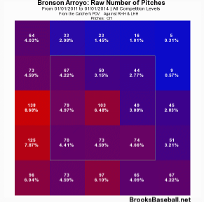
Arroyo also induces hitters to get the bat on the ball with the change… at a whopping 85.5 Contact% rate. But is he getting poor contact with the pitch? I somehow don’t think .600+ SLG and 23 HR  over the past three full seasons would constitute bad contact. Let’s compare his zone chart with that of Ryu.

 photo 53238386-6da5-4f8b-9c21-44707dbd34a3_zpsc37ace95.png


Not quite, Bronson.

“But what about whiffs?” you ask. With a 6.8 career SwStr%, batters aren’t swinging and missing Arroyo’s meatballs either.

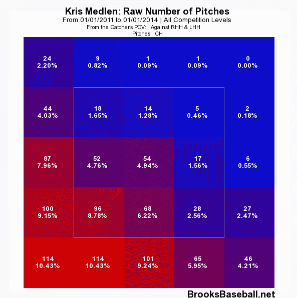
Let’s look at Medlen who owns a 27.5 career SwStr% on the pitch for comparison.
 photo 312d97a3-59b7-474d-8d46-43e4196b2988_zps9c5924cd.png

Pretty, no?

I’ll give Arroyo a D- for location. At least he’s not hanging them up and in on lefties.

So overall grade: barely passing.

I really don’t know what to say at this point. I’m miffed. Confounded. And who is the culprit to blame in the grand mystery of why he continues to throw this sub-par pitch? Batters have already gone deep on it twice in 2014. Is it the catchers? Do we point the finger at Devin MesoracoRyan Hanigan, and now Miguel Montero for keeping blind faith and confidence? Are these guys cursed with chronic short-term memory loss? Or do we blame Arroyo for stubbornly going out there outing after outing and continuing to shove that ball in the back of his palm and firing away? If that’s the case, I get it. I’m a pitcher. I’ve stood there on the mound and though, “This next one will be better, guys. I swear!”

So, please, Bronson. In the end, there is really nothing good that has come from you throwing the thing so often. I like you. I really do. I will forever be indebted to you for giving my beloved 2004 Red Sox their first World Series since “tarnation” was a common curse word. But please. Enough change-ups already.


Modeling Future Contract Extensions

Last month, Dave Cameron published a brilliant yet simple free-agent pricing model.  Using only projected 2014 WAR (ZiPS and Steamer projections are averaged) and the assumption that one incremental win is worth $5 million, it accurately projects the contract length and cost of last offseason’s free agents.  Cameron also made some minor tweaks to his model to project 2015 free agent contracts.  Both articles are absolutely worth checking out in full.

It’d be fun and easy to extend Cameron’s model to predict what David Price (2016), Chris Davis (2016), and Giancarlo Stanton (2017) would make on the free agent market.  (If you’re curious, Price would get 6/$136, Crush would get 6/$112, and Stanton would get 9/$260, assuming that the value of an incremental win increases annually by $500,000.)

But the recent slate of massive contract extensions illustrates the folly of this exercise.  Savvy front offices lock up top talent before it hits free agency, usually at a discount relative to the free agent market.  Young players often prefer an immediate certain payday rather than rolling the dice in free agency, when their future value will be far more unpredictable.  A model that predicts the value of contract extensions would thus be a useful counterpart to the free agent pricing model.  You’re in luck, because I just built one.

I kept the basic contours of Cameron’s model in place; as before, the only inputs are projected 2014 WAR and an estimated value of an incremental win.  This gives us the contract length (projected 2014 WAR times a multiplier that scales up depending on the WAR projection) and average annual value (projected 2014 WAR times $5 million).

To test the accuracy of this approach, I compared the extension model’s output to 32 contract extensions that have been signed since July 1, 2013.  I excluded players projected to produce less than 1 WAR this season.  I estimated the value of an incremental win produced by a closer as $10 million, which lines up with what closers earned in free agency last offseason.  If a player’s extension kicks in after the 2014 season, I counted the remainder of his current contract as part of the extension.

Free Agent Model vs. Actual Contracts

Player Team 2014 WAR Proj Yrs Proj Amount Proj AAV Act Yrs Act Amount Act AAV $/WAR
Mike Trout Angels 8.6 17 $731 $43 7 $146 $21 $2.4
Miguel Cabrera Tigers 6.0 12 $357 $30 10 $292 $29 $4.9
Clayton Kershaw Dodgers 4.7 8 $186 $23 7 $215 $31 $6.6
Dustin Pedroia Red Sox 4.6 9 $207 $23 8 $110 $14 $3.0
Andrelton Simmons Braves 4.5 9 $200 $22 7 $58 $8 $1.9
Jason Heyward Braves 4.1 8 $164 $21 2 $13 $7 $1.6
Matt Carpenter Cardinals 3.6 7 $126 $18 6 $52 $9 $2.4
Freddie Freeman Braves 3.5 7 $121 $17 8 $135 $17 $4.9
Jason Kipnis Indians 3.5 7 $121 $17 6 $53 $9 $2.5
Ian Desmond Nationals 3.2 6 $95 $16 2 $18 $9 $2.9
Jose Quintana White Sox 3.1 5 $78 $16 5 $27 $5 $1.7
Starling Marte Pirates 3.1 6 $92 $15 6 $31 $5 $1.7
Chase Utley Phillies 3.0 4 $59 $15 2 $25 $13 $4.2
Coco Crisp A’s 3.0 4 $59 $15 3 $30 $10 $3.4
Yan Gomes Indians 3.0 4 $59 $15 6 $23 $4 $1.3
Brett Gardner Yankees 2.8 4 $55 $14 5 $58 $12 $4.2
David Ortiz Red Sox 2.7 2 $27 $14 2 $31 $16 $5.7
Jordan Zimmermann Nationals 2.7 4 $54 $14 2 $24 $12 $4.4
Jedd Gyorko Padres 2.7 4 $54 $14 6 $35 $6 $2.2
Homer Bailey Reds 2.6 4 $51 $13 6 $105 $18 $6.9
Hunter Pence Giants 2.4 4 $48 $12 5 $90 $18 $7.5
Julio Teheran Braves 2.3 3 $34 $11 6 $32 $5 $2.4
Tim Lincecum Giants 2.0 2 $20 $10 2 $35 $18 $9.0
Will Venable Padres 1.9 2 $19 $9 2 $9 $4 $2.3
Jose Altuve Astros 1.9 2 $19 $9 4 $13 $3 $1.7
Craig Kimbrel Braves 1.8 7 $123 $18 4 $42 $11 $6.0
Ryan Hanigan Rays 1.6 2 $16 $8 3 $11 $4 $2.3
Michael Brantley Indians 1.6 2 $16 $8 4 $25 $6 $4.0
Chris Archer Rays 1.5 2 $15 $8 6 $26 $4 $2.9
Martin Perez Rangers 1.5 2 $15 $8 4 $13 $3 $2.2
Charlie Morton Pirates 1.4 1 $7 $7 3 $21 $7 $5.2
Glen Perkins Twins 1.0 4 $40 $10 4 $22 $6 $5.5

The initial results are mixed.  The model comes very close to the actual average extension contract length (prediction of 5.1 years vs. actual of 4.8 years), but badly overshoots the actual AAV.  Again, this is because GMs pay more for a win on the free agent market than for a win produced by a player already on their roster.  To account for this, I set the value of an incremental win at $3.7 million, the average WAR / $ of the 30 non-closers’ contract extensions.  (For closers, I used $7.4 million.)

Extension Model vs. Actual Contracts

Player Team 2014 WAR Ext Yrs Ext Amount Ext AAV Act Yrs Act Amount Act AAV $/WAR
Mike Trout Angels 8.6 17 $541 $32 7 $146 $21 $2.4
Miguel Cabrera Tigers 6.0 12 $264 $22 10 $292 $29 $4.9
Clayton Kershaw Dodgers 4.7 8 $138 $17 7 $215 $31 $6.6
Dustin Pedroia Red Sox 4.6 9 $153 $17 8 $110 $14 $3.0
Andrelton Simmons Braves 4.5 9 $148 $16 7 $58 $8 $1.9
Jason Heyward Braves 4.1 8 $121 $15 2 $13 $7 $1.6
Matt Carpenter Cardinals 3.6 7 $93 $13 6 $52 $9 $2.4
Freddie Freeman Braves 3.5 7 $89 $13 8 $135 $17 $4.9
Jason Kipnis Indians 3.5 7 $89 $13 6 $53 $9 $2.5
Ian Desmond Nationals 3.2 6 $70 $12 2 $18 $9 $2.9
Jose Quintana White Sox 3.1 5 $57 $11 5 $27 $5 $1.7
Starling Marte Pirates 3.1 6 $68 $11 6 $31 $5 $1.7
Chase Utley Phillies 3.0 4 $44 $11 2 $25 $13 $4.2
Coco Crisp A’s 3.0 4 $44 $11 3 $30 $10 $3.4
Yan Gomes Indians 3.0 4 $44 $11 6 $23 $4 $1.3
Brett Gardner Yankees 2.8 4 $41 $10 5 $58 $12 $4.2
David Ortiz Red Sox 2.7 2 $20 $10 2 $31 $16 $5.7
Jordan Zimmermann Nationals 2.7 4 $40 $10 2 $24 $12 $4.4
Jedd Gyorko Padres 2.7 4 $40 $10 6 $35 $6 $2.2
Homer Bailey Reds 2.6 4 $38 $9 6 $105 $18 $6.9
Hunter Pence Giants 2.4 4 $36 $9 5 $90 $18 $7.5
Julio Teheran Braves 2.3 3 $25 $8 6 $32 $5 $2.4
Tim Lincecum Giants 2.0 2 $14 $7 2 $35 $18 $9.0
Will Venable Padres 1.9 2 $14 $7 2 $9 $4 $2.3
Jose Altuve Astros 1.9 2 $14 $7 4 $13 $3 $1.7
Craig Kimbrel Braves 1.8 7 $91 $13 4 $42 $11 $6.0
Ryan Hanigan Rays 1.6 2 $12 $6 3 $11 $4 $2.3
Michael Brantley Indians 1.6 2 $11 $6 4 $25 $6 $4.0
Chris Archer Rays 1.5 2 $11 $6 6 $26 $4 $2.9
Martin Perez Rangers 1.5 2 $11 $6 4 $13 $3 $2.2
Charlie Morton Pirates 1.4 1 $5 $5 3 $21 $7 $5.2
Glen Perkins Twins 1.0 4 $30 $7 4 $22 $6 $5.5

With the adjustment to $/WAR, the results look much better.  The predicted average AAV ($11.3 million) is now only 6% higher than the actual average ($10.6 million.)  For the 31 players on the list (excluding Mike Trout, an outlier if there ever was one), the model projects a total of 147 years and $1.87 billion in contracts; the actual sums are 146 years and $1.67 billion.  Not perfect, but decent.

The model misses very badly for unusual situations.  Jason Heyward and Ian Desmond are projected as 8/$121 and 6/$70 respectively, but they both signed 2 year contracts worth less than $20 million last offseason.  Both players were unable to come to terms with their teams on longer deals.  This is probably because they are the odd men out on teams that have either just made it rain on prodigious young talent (Kimbrel, Freeman, Simmons) or will do so in the near future (Strasburg, Harper).  Instead, Heyward and Desmond opted for shorter contracts in order to avoid arbitration and set themselves up for 2016 free agency.

Mike Trout is a unique case.  The fishy outfielder signed a 7 year, $146 million extension last month, which looks like a massive underpay compared to the 17 years, $541 million (!!!) the model says he is worth.  Don’t get me wrong: for the Angels, the Trout signing is still the best deal since the Louisiana Purchase.  But it’s unrealistic to conclude that the Angels saved $395 million, since nobody would wait until Chelsea Clinton’s second term to test free agency, least of all someone who is currently breaking baseball.

Despite these shortcomings, the model can still evaluate the wisdom of recent extensions.  Plotting the 32 players on a 2×2 matrix (the x-axis is the difference between actual and projected AAV, and the y-axis is the difference between actual and projected contract length) shows which front offices overpaid and which got steals.

Scatterplot of Contract Extensions

Slide1

The extensions fall into four groups: locked-in bargains, short-term bargains, “win now” splurges, and albatrosses.

  • Locked-in bargains are the best kind of extension: these contracts are cheap and relatively long.  Yan Gomes is a good example; the model thinks he’s worth $11 million a year for 4 years, but the Indians locked him down for $4 million a year for 6 years.  Initially, I felt bad that Yan missed out on an extra $20 million, but then I remembered that he’s a millionaire in his mid-20s who probably sleeps well at night, whereas I am a non-millionaire in his mid-20s who does not play a sport for a living.
  • Short-term bargains are contracts that are cheap but shorter than projected.  According to the model, Andrelton Simmons is worth $13 million a year for 9 years; the Braves signed him for $16 million a year for 7 years.  So the Braves paid a below-market AAV for Simmons, but deprived themselves of controlling him for two more years (at least in theory).  One caveat here: as explained earlier, Heyward and Desmond fit into this quadrant because their teams were unwilling to pay out for longer contracts, and Trout is simply a freak show.
  • Win now splurges are contracts that are expensive but relatively short.  Clayton Kershaw fits here because he makes $14 million more per year than the model thinks he deserves, but has a 7 year contract rather than the 8 years the model would give him.  One could argue that Kershaw is a potential albatross, but if he leads the Dodgers to a World Series this year, their fans, like the Honey Badger, won’t care.
  • Albatrosses are exactly what they sound like: excessively long, pricey contracts that make fan bases cry.  Hunter Pence and Homer Bailey are the biggest albatrosses on the list; they were paid an extra $42 million (Pence) and $67 million (Bailey) than the model says they’re worth.  Miguel Cabrera really belongs in this quadrant as well.  The model considers Miggy a win now splurge, but only because it thinks he deserves 12 years rather than 10.  No, Tigers fans, Mike Ilitch did not help me build this model.

Finally, the model can estimate how much your team should pay to extend your favorite young star.

Extension Model for 2015-18 FAs under 30 with WAR > 2

Player FA Year Age in 2014 2014 WAR Ext Years Ext Amount Ext AAV
Yu Darvish 2018 27 5.1 9 $168 $19
Giancarlo Stanton 2017 24 4.5 9 $148 $16
Max Scherzer 2015 29 4.6 8 $136 $17
Jason Heyward 2016 24 4.1 8 $121 $15
Carlos Gomez 2017 28 4.0 8 $117 $15
David Price 2016 28 4.2 7 $109 $16
Pablo Sandoval 2015 27 3.7 7 $95 $14
Chase Headley 2015 29 3.6 7 $92 $13
Carlos Gonzalez 2018 28 3.5 7 $91 $13
Chris Davis 2016 28 3.5 7 $89 $13
Brett Lawrie 2018 24 3.4 7 $88 $13
Stephen Strasburg 2017 25 3.5 6 $78 $13
Carlos Santana 2018 27 4.0 5 $73 $15
Jay Bruce 2018 27 3.2 6 $70 $12
Ian Desmond 2016 28 3.2 6 $70 $12
Matt Wieters 2016 27 3.6 5 $67 $13
Justin Masterson 2015 29 3.1 5 $56 $11
George Springer 2019 24 3.0 5 $56 $11
Jason Castro 2017 26 3.2 4 $47 $12
Jonathan Lucroy 2018 27 3.2 4 $47 $12
Brandon Belt 2018 25 2.8 4 $41 $10
Desmond Jennings 2018 27 2.8 4 $41 $10
Jordan Zimmermann 2016 27 2.7 4 $40 $10
Colby Rasmus 2015 27 2.7 4 $40 $10
Yoenis Cespedes 2018 28 2.7 4 $39 $10
Pedro Alvarez 2017 27 2.7 4 $39 $10
Eric Hosmer 2018 24 2.6 4 $38 $10
Johnny Cueto 2016 28 2.2 3 $24 $8
Yovani Gallardo 2016 28 2.1 3 $23 $8
Billy Butler 2016 27 2.1 3 $23 $8
Jed Lowrie 2015 29 2.1 3 $23 $8
Brandon Morrow 2016 29 2.1 3 $23 $8
Asdrubal Cabrera 2015 28 2.1 3 $23 $8

To return to our earlier examples, Chris Davis would get 7 years and $89 million, David Price would get 7 years and $109 million, and Giancarlo Stanton would get 9 years and $148 million if they signed extensions this season.  Of course, it’s tough to predict who will sign an extension and who will try their luck in free agency.  Build me a model that can do that, and I’ll eat my Mets hat.


Battle of the Ks: K/9, K/BB and K%

The great debate has been raging for years: which strikeout-related metric is a better predictor of actual pitching success? Some would say there is no right or wrong answer — that each metric has it’s own unique merit and value. That one must look at certain strikeout-related metrics in combination with others. Unfortunately, as tragic as it may seem, statistical evidence begs to differ. Statistics tell us there is in fact a right answer, and it’s a whopper.

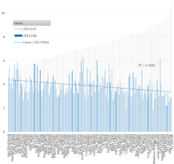
Let’s start with K/9. Looking at all 2013 pitchers with 80+ innings, the correlation (R2) between strikeouts per 9 and ERA is a solid  .1081. This correlation has been consistent, plus or minus a few hundredths, for the past five years. So nothing exciting or anomalous can be found in looking at other seasons. Yu Darvish leads the category with Tony Cingrani, Max Scherzer, Anibal Sanchez, and A.J. Burnett rounding out the top five. Additionally, eight of the top ten K/9 leaders ended up with sub 3.10 ERAs. So a decent indicator all-around.

 photo 53a65e17-24d6-482d-b2de-766753f09051_zps2940fbe7.png

K/BB get’s a bit more interesting. We see a jump in linear correlation to .1671 — more than a 50% increase over K/9. Clayton Kershaw, Cliff Lee, and Adam Wainwright  all leap into the top ten of this metric, with Hisashi Iwakuma climbing into the top fifteen — four elite hurlers in 2013 left out of the K/9 leaderboard.

 photo 98225caf-a307-44c3-850b-d610a9444d32_zps70ee67d9.png

But the real gem is K%. It shows double the correlation versus K/9. Plus, the top fifteen in this category ended the year with sub 3.30 ERA — whereas Scott Kazmir (4.04) and Josh Johnson (6.20) smeared the good name of the K/9 leaderboard; with Kevin Slowey (4.11) and Dan Haren (4.67) unpleasantly loitering on the K/BB board.

The reason K% is so powerful is that it simplifies how effective a pitcher is at simply striking out each batter he faces. When BABIP gets involved — as it does for K/9 (high BABIP pitchers are rewarded on K/9 since the number of outs remains the same even if they’re giving up, say, 10+ hits per game) — the value of each strikeout is severely reduced.

 photo 17feabf1-8665-45c5-af39-48d69923e54a_zpsf45972cf.png


To recap:

2013 R2 (correlation to ERA)
K/9 .1081
K/BB .1671
K% .2089

So should we end the debate completely? No. But if you asked me to put money on Tim Lincecum, a career 25.8 K% pitcher with no decline in the stat over the past 2 years, over Tyler Chatwood, a career 13.0 K% who had a breakout year in 2013 with his freakish 76.3% LOB, I would bet on Lincecum every doggone time.


Top 10 Picks in the ’90s: Irrational Trends

The annual MLB Draft is an exciting time for baseball. Dozens of high school and college players convince fans that they have the potential to be future All-Stars, and teams make selections to stock their farm systems with talent to win in the future. But obviously, not every pick can be savvy, and the majority of these selections turn out to be regrettable. The best a team can do is make rational choices to put themselves in a position to succeed. I decided to take a look at the draft classes in the 1990s to see if teams were making these rational decisions. I chose this decade because it’s the most recent one that is almost exclusively filled with players who have finished their careers.

In the 1990s, there was a fairly even distribution of pitchers and hitters selected with early draft picks. Since roster makeup isn’t skewed much in favor of either group, this seems to make sense. Teams are just as eager to get elite pitching as they are to acquire top-tier hitters. This year, 6 of baseball’s 12 highest paid players are pitchers, 6 are hitters.

It’s not surprising that during the ’90s, 45 of the 100 Top 10 picks were pitchers. In hindsight, this seems like it was probably the result of some pretty big mistakes. There are certainly some successful examples. In 1999, Josh Beckett was selected 2nd overall, Barry Zito was 9th, and Ben Sheets was picked 10th. The hope that a pick can turn into a future ace is enough to tempt any GM to take a pitcher. But that usually didn’t go well.

I gathered the career WAR for every draft pick, and here is the expected output for each Top 10 selection.

Draft Curve

This does not paint a pretty picture for teams who decided to go with pitchers. No matter where on the chart you look, picking a hitter gives a team a better expected outcome than a pitcher, and it’s not particularly close. The average hitter taken in the Top 10 achieved a career WAR of 16.0. The average pitcher reached 7.0. That’s a big gap, and the disparity was made on a large scale.

Here’s a year-by-year average for draft picks at each position:

Draft Bars

1999 was an excellent year for pitchers, as I already mentioned. In fact, it was the best year for pitchers. But if you add it to the list of years for hitters, it would rank 6th out of 11.

Clearly, picking hitters seems like the preferable strategy of the ’90s. But teams opted not to do so roughly half the time.

Similar to what position someone plays, there’s another core attribute about a player outside of his scouting reports: whether or not he went to college. College players will be more developed and will have less room to grow. High school picks are considered riskier with higher upside. The data seem to support that. Unlike the difference between hitters and pitchers, the age of a draft pick had a more nuanced effect.

Draft Source

High school players taken at the top (of the top) of the first round are more promising than college players. This is because elite players like A-Rod, Chipper Jones, and Josh Hamilton don’t often slip under the radar when they’re 17 or 18. But what’s interesting is when you make your way to the bottom of the Top 10, college players have a better expected career WAR. I don’t want to make too many guesses why, because honestly I’m not sure. But it’s a very noticeable trend. No matter the reason, it’s clear that teams should be more eager to draft high schoolers with picks 1-5, and college players with picks 6-10. But look at the frequency of high school draft picks by selection.

Draft Source Pick

Teams do the exact opposite of what they should. The earlier in the draft, the more likely a college player is to be selected. 32.5% of Top-4 picks are drafted out of high school, while 68.3% of picks 5-10 are.

To a strong extent, this analysis is not fair to these teams. I’m looking at these numbers in 2014, and it’s easy to go back in time and point out what mistakes teams made in drafts. But these aren’t scouting report mistakes, isolated misjudgments, or bad luck decisions. Teams in the 1990s made consistent poor strategic decisions on a large scale in the draft that were often indefensible.


Sabathia’s Decline = Lincecum’s Decline? Specific Patterns for Velocity Loss?

CC Sabathia‘s recent decline is looking more and more like Tim Lincecum’s also-much-scrutinized decline.  To make the point, here are some key year-by-year stats for each.

Lincecum
ERA FIP FBv K/9 BB/9 BABIP LD% LOB% HR/FB%
2009 2.48 2.34 92.4 10.42 2.72 0.282 19.2 75.9 5.5
2010 3.43 3.15 91.3 9.79 3.22 0.310 19.5 76.5 9.9
2011 2.74 3.17 92.3 9.12 3.57 0.281 19.1 78.5 8.0
2012 5.18 4.18 90.4 9.19 4.35 0.309 23.8 67.8 14.6
2013 4.37 3.74 90.2 8.79 3.46 0.300 23.1 69.4 12.1
2014* 9.90 6.24 89.9 10.80 0.90 0.393 37.5 48.1 40.0
Sabathia
ERA FIP FBv K/9 BB/9 BABIP LD% LOB% HR/FB%
2009 3.37 3.39 94.2 7.71 2.62 0.277 19.8 71.4 7.4
2010 3.18 3.54 93.5 7.46 2.80 0.281 15.1 75.6 8.6
2011 3.00 2.88 93.8 8.72 2.31 0.318 23.1 77.0 8.4
2012 3.38 3.33 92.3 8.87 1.98 0.288 21.1 71.6 12.5
2013 4.78 4.10 91.1 7.46 2.77 0.308 22.3 67.4 13.0
2014* 6.63 4.82 89.1 9.95 1.42 0.308 21.1 58.8 38.5
* – as of 4/14/14

The velocity loss is perhaps the most publicized common aspect.  Yet, while acknowledging that year 2 of Sabathia’s decline is only about 10% (19 innings) in, it’s shaping up as though there may be many other commonalities:

  • ERA above FIP when it wasn’t the case before
  • Sudden (and permanent?) spikes in HR/FB%
  • An apparent loss in ability to strand runners
  • (BABIP might also be trending up for each, but this is harder to tell, due to the regular noisiness of year-to-year BABIP.  Lincecum also saw his LD% spike, which might not be true for Sabathia.)

Having also been thinking about Nathan Eovaldi lately — who has both elite fastball velocity and an apparent ability to suppress HR/FB (7.0% in 279.2 IP) — I couldn’t help but wonder if these things are systematically related.

I remember there was some attention paid to these things when SIERA was being introduced.  But it turns out most of the attention there was on strikeouts, rather than velocity.  Obviously velocity and strikeouts are positively related.  But (1) Lincecum and Sabathia are actually still pretty good/decent at strikeouts, and this hasn’t prevented their recent struggles; (2) Eovaldi has only elite velocity, and pretty pedestrian strikeouts.  So the real question is: Does velocity itself matter, in addition to strikeouts?

(In the subsequent analysis, I’ll be looking primarily at effects on HR/FB%, LOB%, and ERA-FIP, since those seem to be problems plaguing both of the high-profile cases that prompted this line of thinking.  But there’s otherwise no reason to think those are the only intermediate outcomes where velocity may matter directly.

Also, it turns out that great velocity isn’t required for HR/FB suppression, as a look at the leaderboard in recent years includes some notable non-flamethrowers like Stults, Weaver, and Fister.  Obviously the ballpark matters a lot, too.  But there are also hard throwers near the top, and overall I remained intrigued enough to keep digging.)

Realistically, if there is something there, Sabathia and Lincecum are probably on the more extreme end of the spectrum.  Probably there have been other guys who lost similar velocity but that we didn’t hear as much about because they were better able to adapt or otherwise did not see their overall results decline so dramatically.

What do the results indicate?  By and large, it does appear that velocity matters directly, in addition to strikeouts.  (Regression results below)

HR/FB% LOB% ERA-FIP
OLS FE FD OLS FE FD OLS FE FD
K/9 -.122** .533*** .189 1.118*** .445** .509* .037*** .132*** .151
FBv -.124*** -.841*** -.656*** .140* .953*** 1.155*** -.022** -.155*** -.155***
N 1677 1677 1085 1677 1677 1085 1677 1677 1085
R2 0.015 0.511 0.009 0.125 0.575 0.0265 0.008 0.53 0.029

* = significant at 10%; ** = significant at 5%; *** = significant at 1%

I use 3 different estimation techniques for each outcome:

  • Plain-old OLS
  • Fixed effects (“FE”): estimates results within player, essentially comparing each pitcher’s own years of higher velocity/strikeouts against his years of lower velocity/strikeouts
  • First difference (“FD”): the outcome is now the one-year change in HR/FB% (etc.) for Pitcher A, while the explanatory variables are the one-year change in K/9 and FBv for Pitcher A

Of these, methods 2 and 3 are probably more convincing, since they give results for the same player, where anything else that’s distinct to the player (but invariant over time) gets washed out.  OLS doesn’t do this, and instead mostly compares across players, who may have many differences besides strikeouts and velocity.  In an exaggerated illustration, if our full sample consisted only of Tim Hudson and Felix Doubront, the fact that Hudson is altogether a better pitcher, but sort of a “pitch-to-contact soft tosser,” can make it look like strikeouts/velocity are bad, using OLS, even if having more strikeouts/more velocity is actually good for either player.

Some technical notes:

  • Sample includes player-seasons between 2010 and 2013 with at least 30 innings pitched
  • Standard errors (not displayed) are clustered by player
  • Don’t look too much into the fact that “FE” always gives the highest R2.  Most of this is from all the “specific player indicators” that are now present, rather than the “within-player” aspect, which is the actual point of using FE
  • Starters and relievers are both included.  Part of me prefers to look at just starters, but this allows for much more observations and statistical power.  I’m also not controlling for starter/reliever status, so you’d need to believe that that only matters through its effects on strikeouts and velocity.

You can maybe argue that there are other explanatory variables that should have been included, or perhaps that one needs to be more judicious about the sample to consider.   (I must admit that I threw this together fairly quickly.)  But even if the current analysis is somewhat imperfect, it appears at least plausible that velocity matters directly (for various outcomes), in addition to the rate of strikeouts.

It’s a little too bad, because coming into this season I’d thought there was a decent chance of a Sabathia bounceback, given his partial velocity rebound as 2013 went along.  But that seems to have been only temporary.  While he still may wind up bouncing back when all is said and done, I’m definitely less optimistic than I was a week ago.  Will CC be this year’s version of 2013 Lincecum, who might even tease by FIP/xFIP but continue to underwhelm?