Archive for Research

Pitchers Recovering From Serious Arm Injuries

Pitchers Recovering From Arm Injuries

Introduction

With arm injuries becoming more and more prevalent in Major League Baseball, teams frequently have to figure out what kind of performance to expect from a pitcher coming back from a serious injury. In this study I set out to see how pitchers perform in their first two years after surgery compared to their pre-surgery form.

Overview

I looked at a sample of 39 starting pitchers, encompassing 42 seasons, over the past 10 years that missed a significant amount of time due to an elbow or shoulder injury. I then compared their performance in the last healthy season to their first healthy season back and the season immediately after it. To be considered a “healthy season” for this study a pitcher had to throw at least 80 innings. I did this to get a more accurate indication of the pitchers performance in their last season and first season back, and to not include small samples if a pitcher got hurt in April or came back in September. If a pitcher had no “healthy season” back then I used the season with the most MLB innings out of the two seasons after injury. I excluded all pitchers that never returned to the majors from the study.

To judge pitchers performance I looked at five things: ERA, FIP, strikeout percentage, unintentional walk percentage, and average FB velocity. I chose these measurements because I believe they show the pitchers overall effectiveness (ERA, FIP), stuff (K%), command (UBB%), and arm strength (FB velocity).

I also broke down the data by elbow and shoulder injuries. It is an accepted belief in baseball that shoulder injuries are worse than elbow injuries and harder to come back from. I wanted to see how much harder it was to come back from, and if the statistical decline for pitchers with shoulder injuries was greater than those with elbow injuries.

All Pitchers

ERA

FIP

K%

UBB%

Avg. FB Velocity

Total Last Healthy Season

3.78

4.08

18.75%

7.63%

91.08

Total First Season Back

4.23

4.17

18.58%

7.29%

90.19

Total Second Season Back

3.72

3.78

18.96%

6.80%

90.33

As you can see in the chart above, the ERA and FIP of pitchers in their first year back are higher. Strikeout rates also showed a substantial decline, while walk rates actually improved. The average fastball velocity for these pitchers also decreased as you would expect. The fact that strikeout rates went down by .17% might not seem like a lot, but when you take into account that strikeout rates have been going up steadily over the past ten years, it is actually a larger gap in performance.

MLB Average Strikeout Percentage

2005 2006 2007 2008 2009 2010 2011 2012 2013 2014
16.5% 16.8% 17.1% 17.5% 18.0% 18.5% 18.6% 19.8% 19.90% 20.40%

Naturally, the first full healthy season back is generally 2-3 years after the injury. If they were keeping up with the league average their strikeout percentage should actually go up about about a percentage point, so what looks like a small decrease is in fact quite significant. As for walk rates, there are two competing factors in play. Often times increased wildness is a sign of a larger problem; therefore an elevated walk rate in the season a pitcher blew out could have been an indication of a looming issue. Consequently, walk rates in the last season before surgery may be higher than a pitchers normal level, and by getting their arm fixed, it would gravitate back to their typical performance. The competing philosophy is that control is the last thing to return after elbow or shoulder surgery. Looking pitcher by pitcher it was a 50/50 split with 20 having their walk percentage increase, 20 decrease, and 2 remaining essentially the same in their first year back.

Pitchers in their second year back improved greatly, showing improvements across the board. The sample in year two went down to 26 of the 42 pitcher seasons we started out with. Some dropped out due to age (John Smoltz), re-injury (Johan Santana), or 2014 being their first year back (Michael Pineda). One reason why the numbers in the second post-surgery year improve so much is that to make it to year two you probably had some modicum of success in year one. The pitchers that failed to come back to their pre-surgery form (Mark Mulder, Jason Schmidt, etc.) had their poor stats affect the first year after surgery numbers but are washed out of the second year numbers. Even taking this into account, there are definitely some substantial improvements in year two. Eighteen of the 28 pitchers lowered their ERA in their second season after surgery.

Elbow Injuries

Elbow injuries are generally considered less serious than shoulder injuries. The success rate of coming back from Tommy John surgery is pretty high now, with some people even going as far as to say that pitchers come back stronger after getting it done. The numbers do in some way back that notion as pitchers in their second year post-surgery posted better numbers then they did before getting hurt.

ERA

FIP

K%

UBB%

Avg. FB Velocity

Last Healthy Season Elbow

3.75

3.99 19.42%

7.98%

91.49

First Season Back Elbow

4.06

4.03

19.22%

7.49%

91.04

Second Season Back Elbow

3.60

3.61

19.77%

6.79%

91.38

As you can see in the table above, pitchers do struggle a bit in their first season back, but in year two not only do they improve based on the previous year, they also improved their pre-surgery statistics in all aspects except a small decrease in average FB velocity. Looking specifically at the 18 pitchers that had two seasons after elbow surgery, 11 of the 18 improved their ERA the second season after surgery. Although the data was split regarding average velocity and K%, with about half the pitchers having better numbers the first year after surgery and half the second season, many showed a substantial improvement in their walk rate in season two. This is interesting since it does support the belief that control is the last thing to come back post-surgery.

Shoulder Injuries

Shoulder injuries are believed to be much more damaging to a pitcher’s future than elbow injuries. Part of the reason for this is that Tommy John is so prevalent now, and you see so many people come back from it, it is considered in some ways a routine surgery. Shoulder injuries on the other hand are less frequent and in recent memory we have seen it more or less end the careers of big time pitchers like Mark Prior and Brandon Webb. The numbers in this small study do show that pitchers with shoulder injuries are less likely to get back to a full season of pitching than those with elbow injuries. Eighteen of the 21 (86%) pitchers I looked at with elbow injuries returned to a full season work load (with Brett Anderson still a possibility to get there), while only 11 of 19 (58%) of those with shoulder injuries (Michael Pineda could still do it moving forward) rebounded to even make it over the 80 inning bar one more time in their career.

A couple of pitchers (Johan Santana and Chris Young) who did make it back had another significant shoulder injury during their comeback seasons, although Young made another return to the majors in 2014 after another missed season rehabbing. These numbers also don’t include pitchers like Prior, Webb, Matt Clement, etc. who were established big leaguers at the time of their shoulder injury never to return to Major League Baseball again.

ERA

FIP

K%

UBB%

Avg. FB Velocity

Last Healthy Season Shoulder

3.79

4.13

18.18%

7.30%

90.36

First Season Back Shoulder

4.49

4.35

17.79%

6.95%

89.08

Second Season Back Shoulder

3.94

4.09

17.48%

6.81%

88.93

The numbers do back up the assertion that shoulder injuries are tougher to recover from than elbow injuries. Pitchers who had shoulder injuries had a steeper drop off their first year after surgery, and failed to rebound to the degree that pitchers with elbow injuries did. If you are a team with a young ace who had shoulder surgery, the beacon of hope is Anibal Sanchez. Sanchez went down with a labrum injury during his rookie season in 2006, and although it took him a few years to recover, over the past five seasons he has been pretty durable consistently supporting a mid 3 ERA, including the 2013 season where won the American League ERA title.

Conclusion

Overall this research backed up most of the common thoughts around the game. Pitchers with elbow injuries generally recovered quicker and more effectively than those with shoulder injuries. The biggest improvement from year one to year two after surgery appears to be with walk rates, as a pitcher’s control is often the last thing to come back after being off the mound for so long.

Although Tommy John surgery does have a high success rate, there are pitchers that never really regained their pre-surgery form. Conversely, shoulder surgeries do have a greater negative impact on pitcher performance, but for every Mark Prior and Brandon Webb there is an Anibal Sanchez or Chris Carpenter that returned and went on to have very productive careers. Obviously there are no certainties in medicine, so franchises shouldn’t expect a guaranteed return for pitchers coming off elbow surgery, or automatically disregard pitchers who underwent shoulder surgery.

In fact, there might even be an opportunity for clubs to take a chance on a free agent pitcher a couple of season removed from shoulder surgery with a low-risk high upside deal. The demand for these pitchers is usually low with all of the uncertainly involved with shoulder injuries. If the deal doesn’t work out there isn’t much invested, but if it does, a team might be able to get a guy like Freddy Garcia who won 12 games in 2010 and 2011 while only making $1 million and $1.5 million those two years since he was coming off of labrum surgery. Pitchers coming off shoulder injuries probably aren’t guys you want to pencil in and count on for 200 innings, but for the money involved they could be low cost lottery tickets that could pay off big for a team.


StatCast Playoff Data Breakdown

Now that the baseball season is over I thought I would throw together a little data breakdown of the 2014 playoffs according to the public StatCast records available. I created a rough relational database that will allow me to run a few simple queries to give us an idea of what information the new system will be able to spit out on a daily basis (fingers crossed, next season). I built the database with the anticipation of adding to the records next year as more data is released. I hope, eventually, there will be complete statistics available for each play because in the current format  there are many null values which drives me nuts, but it is what it is.

Seven tables make up the database that is designed to catch each play in it’s entirety. The four main tables are BATTING, FIELDING, PITCHING, and RUNNING. This is where all of the new fancy data is stored. Now as to not get further into the weeds lets take a look at what we got.

BATTING

First, lets look at  the batting statistics for each play in the playoffs monitored by StatCast (and revealed to the public) sorted by batted ball type. Please note each row is an individual play that was tracked and recorded during a given playoff game.

Playoff Batting FB

Playoff Batting FB

Playoff Batting FB

Playoff Batting FB

I purposely left the null values in the tables to demonstrate the inefficiencies that exist due to the lack of data for each play.

FIELDING

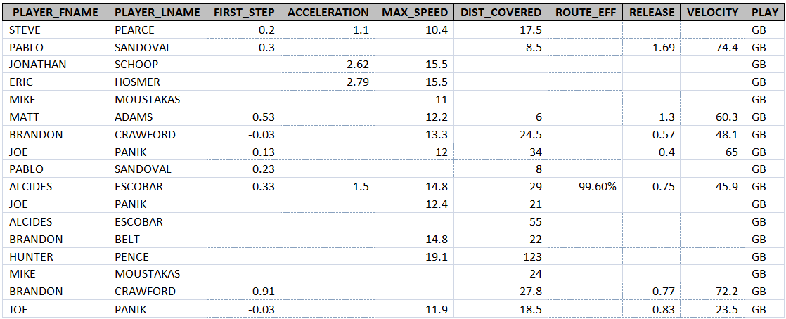
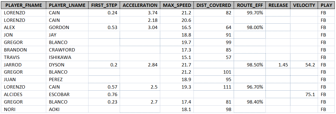
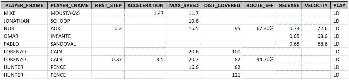
This is were the data starts to get a little more thorough. Once again the tables are sorted by batted ball type and each row represents a particular fielders input on a given play.

Playoff Batting FB

Playoff Batting FB

Playoff Batting FB

Playoff Batting FB

Rather than bore you to death with more tables I will just summarize the other two entities, PITCHING and RUNNING. To date, the RUNNING (base running) entity contains more records than any other aspect of the game. MLBAM has been extremely fond of recording players peak running speeds, which I find to be the least informative of the current metrics recorded. What intrigues me about the RUNNING aspect of StatCast are statistics such as a player’s average lead length on a steal and how that might correlate with SB% or which player has the quickest “first step” when stealing a base. I’m sure all of you have thought of countless other ways to utilize StatCast for base running so I wont go into a brainstorming session. Here are just a few quick facts about the base runners of the 2014 playoffs:

The average lead length by all runners was 10.89 feet.

The average secondary lead was 16 feet.

The player who reached the highest max speed rounding the bases was Jarrod Dyson at 22.3 mph.

Jarrod Dyson also had the fastest first to third speed at 21.1 mph.

The quickest first step came on a sac fly tag up by Hunter Pence. It registered at -.17 sec. I wonder if this means he left early?

For all of the talk about KC’s running game, the Giants actually had an average team lead length higher than KC during the playoffs and there was a decent number of records for each to substantiate it. (50 records for KC, 49 records for SFN)

SFN Average lead length in playoffs 11.1 feet

SFN Average secondary lead length in playoffs 16.4 feet.

KC Average lead length in playoffs 10.9 feet.

SFN Average secondary lead length in playoffs 15.8 feet.

The PITCHING entity is by far the most complete, but contains little data. As of today, MLBAM has used StatCast to track four pitching measurements, Extension, Actual Velocity, Perceived Velocity, and Spin Rate. To be honest I have never thought about two of these metrics and how they could affect a pitchers performance; those two being extension and spin rate. Extension might simply need to be recorded for each pitcher so that we could analyze trends. Say a pitcher’s average extension starts to decrease. What steps need to be taken to correct it? Could this be a sign of an injury? and so on. Fun fact, Yusmeiro Petit has had the longest extension recorded by StatCast at 92 inches. There is only one pitcher who has multiple records. Yordano Ventura has an extension of 60 inches and 68 inches. I wonder what the average extension range is for pitchers?  It would be interesting to find what affect the spin rate of the pitch had on batters. With more data, I might first start to analyze the correlation between spin rate and batted ball type. Currently, there is not enough public data available to be able to do this accurately.

I hope this was not too boring and at the least will spark your enumerative imaginations for this off-season.


Be Wary of Long-Term Deals for Free Agents

This morning as I drove into work listening to MLB on XM a comment put a question into my head. The host made a comment that players that sign with the Yankees as free agents tend to have a bad season likely due to the pressure and glamor of being a Yankee. This made me wonder if some teams were “easier” to play for after signing a free-agent deal…. But then once I started researching things started to get interesting so I changed to just seeing how long-term deals with new teams affected players.

The Criteria

  • Player must have signed a minimum 3 year deal with a new team and stayed with that team all of those 3 years. This established a perceived pressure of living up to a deal that this new team invested in the player.
  • Year range 2006-2012 for contract signings. I could not find any good free agent signing lists from earlier than ’06.
  • If a player was injured for the majority of a season that year was omitted, but it applied to very few players.

In the end I compiled a list of 31 players who had received 3 years or longer deals from a new ball club and had stayed with the club for at least 3 years. The results were not promising for any club looking to sign some free agents. I compared basic stats for simplicity, reviewed were Average, OBP, SLG, and wRC+. I mostly did the OBP and SLG for myself so will mostly focus on average and wRC+ here.

Key takeaways – Average

  • In year 1 after signing with a new team only 8 players either matched or improved their average from the prior season.
  • The only player to consistently outperform with his new team in each of the 3 years was Carlos Lee after signing with the Houston Astros. Technically his average dipped to match his average the year before he signed the contract but he never went in the red.
  • Overall for the 3 year span only 3 players had a higher batting average over those 3 years than they did with the last season with their prior team. (Victor Martinez, Carlos Lee, Juan Pierre)

Key takeaways – wRC+

  • 5 players improved their wRC+ in the first years with their new teams and 2 matched their prior year numbers.
  • Out of the 25 players who have completed 3 years with their new team (2012 signees are heading into their 3rd season), 5 finished those 3 years with a higher average wRC+ than they had the year they signed. (Victor Martinez, Torii Hunter, Carlos Lee, Juan Pierre, Mark DeRosa)

The overall numbers for the group though was not promising. Whether this is due to many of these players aging which could be highly likely, or just never getting settled with a new ballclub. It seems teams looking at signing Free Agents to deals of 3 years or longer should not expect much out of the players.

Overall #’s

Year 1 Year 2 Year 3 Overall
Difference in Average -0.022 -0.025 -0.030 -0.026
Difference in OBP -0.022 -0.021 -0.030 -0.025
Difference in SLG -0.055 -0.072 -0.063 -0.063
Difference in wRC+ -17.63 -19.06 -20.08 -18.923


A little bonus:

Worst 3+ year deal since 2006 : Chone Figgins in 2009 signed with the Seattle Mariners. Out of the group of players researched Figgins had the biggest overall drops in Average (-.089), OBP (-.114), and wRC+ (-56.33)

Best 3+ year deal since 2006: Victor Martinez (duh) in 2010 signed with the Tigers and had the best overall increases in Average (+.020), OBP (+.030) and wRC+ (+14.0). Side note – ALL players had decreases in slugging.


So you might ask how this compares to players that resign similar deals with their current teams? The numbers below illustrate the numbers for players in the same time frame that resigned deals with their teams as free agents (according to ESPN free agent trackers).

Year 1 Year 2 Year 3 Overall
Difference in Average -0.005 -0.007 -0.019 -0.011
Difference in OBP -0.005 -0.001 -0.016 -0.007
Difference in SLG -0.018 -0.032 -0.057 -0.036
Difference in WRC+ -3.68 -3.53 -10.53 -5.915

As you can see quite a bit of difference. There are many factors in play here but it seems that there is a major difference in proving to a new team that as a free agent you deserve the long term deal you got, and understanding that you performed well enough for you current team to give you a long term extension. Yes all numbers are negative still but they are much closer to the original numbers and likely chalked up to random variance year to year.

Best re-sign/extension – 2B Aaron Hill –  The Diamondbacks resigned Aaron Hill and were rewarded with an increase in OBP for 3 years (.035), Slugging (.094) and WRC+ (33.67)

Worst re-sign/extension – 1B/DH Paul Konerko – The White Sox understandably extended Konerko only to see average 3 year drops in Average (-.068), OBP (-.036), Slugging (-.098) and led all resignee’s in WRC+ drop at (-40.33 average). A close Second place was Jorge Posada’s extension in 2007.


Has the Modern Bullpen Destroyed Late-Inning Comebacks?

During the World Series, I submitted an article showing that the team leading Los Angeles Dodger games after six innings wound up winning the game 94% of the time, the highest proportion in baseball. I suggested that maybe that’s why Dodger fans leave home games early; it’s a rational decision based on the unlikelihood of a late-inning rally. (Note: I was kidding. Back off.)

But between the lack of comebacks for the Dodgers and the postseason legend of Kansas City’s HDH bullpen, I wondered: Are we seeing fewer comebacks in the late innings now? The last time the Royals made the postseason, in 1985, the average American League starter lasted 6.17 innings, completing 15.9% of starts. The average American League game had 1.65 relievers pitching an average of an inning and two thirds each. This year, American League starters averaged 5.93 innings, completing just 2.5% of starts. The average game had just under three relievers throwing an average of 1.02 innings each. The reason that starters don’t go as long isn’t my point here, and has been discussed endlessly in any case. But looking at the late innings, today’s batters are less likely to be facing a starter frequently (52% of AL starters faced the opposing lineup a fourth time in 1985, compared to 28% in 2014), reducing the offensive boost from the times-through-the-order penalty. Instead, modern batters face a succession of relievers, who often have a platoon advantage, often throwing absolute gas. The Royals, as I noted, won 94% of the games that they led going into the seventh inning (65-4), and that wasn’t even the best record in baseball, as the Padres were an absurd 60-1. Are those results typical? Has the modern bullpen quashed the late-innings rally?

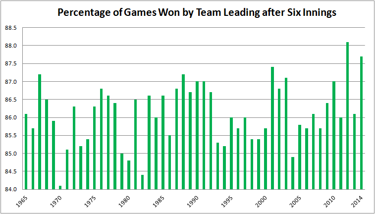
To test this, I checked the percentage of games in each year in which the team leading after six innings was the final victor. (These data are available at Baseball-Reference.com, using the Scoring and Leads Summary.) I went back 50 years, recording the data for every season from 1965 to 2014. In doing so, I got the 1968 Year of the Pitcher; the 1973 implementation of the DH; the expansions of 1969, 1977, 1993, and 1998; the Steroid Era; and the recent scoring lull. This chart summarizes the results:

The most important caveat here is this: In Darrell Huff’s 1954 classic, How to Lie with Statistics, he devotes a chapter to “The Gee-Whiz Graph,” in which he explains how an argument can be made or refuted visually by playing with the y-axis of a graph. This is a bit of a gee-whiz graph, in that the range of values, from 84.1% of leads maintained in 1970 to 88.1% in 2012, is only 4%. That’s not a lot. My choice of a y-axis varying from 84.0 to 88.5 magnifies some pretty small differences. Still, the average team was ahead or behind after six innings 140 times last season, so the peak-to-trough variance is five to six games per year (140 x 4% = 5.6). That’s five or six games in which a late-inning lead doesn’t get reversed, five or six games in which there isn’t a comeback, per team per season.

The least-squares regression line for this relationship is Percentage of Games Won by Team Leading After Six Innings = 85.756% + .015%X, where X = 1 for 1965, 2 for 1966, etc. The R-squared is 0.06. In other words, there isn’t a relationship to speak of. There is barely an upward trend, and the fit to the data is poor. And that makes sense from looking at the graph. The team leading after six innings won 86.5% of games in the Year of the Pitcher, 86.6% when the Royals were last in the Series, 85.7% in the peak scoring year of 2000, and 86.1% in 2013. That’s not a lot of variance. You might think that coming back from behind is a function of the run environment–it’s harder to do when runs are scarce–but the correlation between runs per game and and holding a lead after six innings, while negative (i.e., the more runs being scored, the harder it is to hold the lead), is weak (-0.22 correlation coefficient).

So what this graph appears to be saying, with one major reservation I’ll discuss later, is that the emergence of the modern bullpen hasn’t affected the ability of teams to come back after the sixth inning. Why is that? Isn’t the purpose of the modern bullpen to lock down the last three innings of a game? Why hasn’t that happened? Here are some possible explanations.

  • Wrong personnel. Maybe the relievers aren’t all that good. That seems easy to dismiss. In 2014, starters allowed a 3.82 ERA, 3.81 FIP, 102 FIP-. Relievers allowed a 3.58 ERA, 3.60 FIP, 96 FIP-. Relievers compiled better aggregate statistics. A pitcher whose job is to throw 15 pitches will have more success, on average, than one whose job is to throw 100.
  • Wrong deployment. Analysts often complain that the best reliever–usually (but not always) the closer–is used in one situation only, to start the ninth inning in a save situation. The best reliever, the argument goes, should be used in the highest leverage situation, regardless of when it occurs. For example, when facing the Angels, you’d rather have your best reliever facing Calhoun, Trout, and Pujols in the seventh instead of Boesch, Freese, and Iannetta in the ninth. Managers may have the right pieces to win the game, but they don’t play them properly.
  • Keeping up with the hitters. Maybe the reason teams over the past 50 years have been able to continue to come back in, on average, just under 14% of games they trail after six innings is that hitters have improved at the same time pitchers have. Batters are more selective, go deeper into counts, benefit from more extensive scouting and analysis of opposing pitchers, and get better coaching. So just as they face more and better pitchers every year, so do the pitchers face better and better-prepared hitters.

My purpose here isn’t to figure out why teams in 2013 came back after trailing after six innings just as frequently as they did in 1965, just to present that they did, despite advances in bullpen design and deployment.

Now, for that one reservation: The two years in which teams leading going into the seventh inning held their lead the most frequently were 2012 and 2014. Two points along a 50-point time series do not make a trend, so I’m not saying it’s recently become harder to come back late in a game. After all, the percentage of teams holding a lead were below the long-term average in 2011 and 2013. But I think this bears watching. Pace of game, fewer balls in play, ever-increasing strikeouts: all of these are complaints about the modern game. None of them, it seems to me, would strike at the core of what makes baseball exciting and in important ways different from other sports the way that fewer late-inning comebacks would.


Josh Donaldson: Changes in Approach and Mechanics

A short note: For those inclined only to GIFery, you can skip to the bottom.

The 2014 Oakland Athletics got taken out in the soul-crushing Russian roulette that was the Wild Card play-in game. The Billy Beane gambles didn’t pay off. On top of that, even though it rained on their parade, the San Francisco Giants won the World Series.

All is not lost for the A’s, however.

There are other great articles that go over the outlook for next year’s Athletics team in terms of payroll and contracts. Today, we’re going to squarely focus on the on-field performance of only one of those pieces – someone who has evolved into one of the best overall position players in the game.

Let’s dive into Josh Donaldson’s trends in the offensive arena, and attempt to find meaning in those trends for his performance in 2015 and beyond.

Josh Donaldson figured it out in the summer of 2012: after struggling through most of the early part of that year, he was sent down to AAA in mid-June, getting the call back up to the majors on August 14th. He batted .290/.356/.489 the rest of the way with 19 extra base hits, led the A’s to an unlikely division championship, and gave us a snapshot of the player we now expect him to be.

At his best, Donaldson is a middle of the order power bat that can hit to all fields and draws walks at an above average clip. Whether coincidentally or not, his overall plate approach fits that of the A’s organization: work into deep counts, get a good pitch to drive, and swing hard. He’s shown some subtle differences in rate statistics during the two highly successful years since his breakout, and that’s what we’re mainly going to look at before moving on to a discussion about his specific hitting mechanics.

One of the main differences between Donaldson’s 2013 and 2014 was his batted ball profile in regard to line drives and fly balls. At surface level, the continued evolution of Donaldson’s batted ball profile since his breakout in August of 2012 mirrors the Athletics’ high OBP/home run tendencies. As we’ll see later on with the mechanics portion of the article, there’s more here than meets the eye. However, to begin with, let’s look at his line drive and flyball tendencies.

Here we have Line Drives per Ball In Play for Donaldson in 2013 and 2014:

LDs_per_BIP

And here we have a breakdown of his Fly Balls per Ball In Play:

Flyballs_per_BIP

It’s not too difficult to tell what’s happened during the majority of Donaldson’s effectiveness at the major league level: he’s hit more fly balls and less line drives against fastballs over time. The obvious answer to why this has happened is that Donaldson could simply have changed his approach to try to elevate hard pitches for homeruns in 2014. His overall line drive rate fell along with his batting average and Batting Average on Balls In Play in 2014 as well, as fly balls don’t always (or even usually) go for homeruns, and also result in outs more often than line drives. Donaldson’s groundball rate stayed almost exactly the same between the two years.

His counting stats reflect this change in batted ball profile, as he shifted a few 2013 doubles to home runs in 2014. Let’s compare his stats from the past two years. Donaldson played in the same number of games in each of the past two years, with a few more plate appearances in 2014:

2013_2014_Compare

There isn’t a major difference in his strikeout and walk rates – strikeout rates are up for almost everyone, so proclaiming Donaldson’s slight increase a true trend has its problems. As we’ve seen, the strikezone expanded this year by a large degree, something that wasn’t lost on the All Star third baseman.

Another element in this comparison that we should keep in mind is the damage on his statistics wrought by his slump of over a month in June of 2014. It was one of the worst months of Donaldson’s career, as he hit .181 with a 4.5% walk rate, 6.0% line drive rate, and hit grounders 65.1% of the time (as a reminder, league average is around 44%). He would overcompensate his swing in July, causing a 52% flyball rate (league avg. = 36%), but his walks and power production came back to almost normal levels. As it is, we’re left to wonder what his 2014 could have looked like if not for the extended slump.

Given the changes in batted ball profile and rate statistics between 2013 and 2014, we need to go deeper into causation. Did Donaldson simply change his approach to hit more fly balls? Was this an unintended result of a change in his mechanics?

Let’s find out.

To help me with the technical specifics of Donaldson’s swing, I’ve brought in Jerry Brewer, a great hitting instructor and general swing mechanics wizard from the Bay Area. He runs East Bay Hitting Instruction, and posts great in-depth breakdowns of swing mechanics over at Athletics Nation. We talked about a few different topics on Donaldson’s swing over the past week.

Owen Watson: Hey Jerry! Thanks for lending your expertise to this – I’m a relative newcomer to the world of swing mechanics and it’s always great to talk to someone who really knows the subject. Can you briefly explain the basic mechanics of hitting, so we can get a baseline understanding of the subject?

Jerry Brewer: The goal of the swing is to put the bat behind the ball with speed on the bat. Pretty simple. Elements of a “good” swing include proper body position, movement sequencing, timing, consistency, and execution. These are the main things I look for when grading someone’s swing:

1) Swing time: how long it takes a player to start their swing to contact with the ball.

2) Swing path: the path the bat travels to meet the ball.

3) Finally, I look for body position as the hitter is completing the stride, which is where you can get a sense of whether the player can make adjustments to pitch location and speed. Donaldson is fantastic here.

OW: Great, so what are the main characteristics of Donaldson’s swing – how is he different from other hitters, and what does he do well/not so well?

JB: Donaldson’s swing in a word: athletic. The baseball swing is just a sequence of movements, and he moves his body optimally. What he does well: his front side mechanics. His rear mechanics are really good too, but his front side is incredible. In my opinion, it is what allows him to be such an all-fields hitter. The one knock could be his path to the ball is an inch or two long. But, to quote myself, “that’s like pointing out a scratched license plate on a Ferrari.”

OW: Donaldson is in many ways a classic poster boy for the A’s patience/power combo. Is his power increase from 2013 to 2014 a result of the coaching of the A’s offensive approach under (former) hitting coach Chili Davis?

JB: It’s hard to say how much influence Davis had on Donaldson’s approach. My guess is very little. Donaldson was a high walk/high power guy in the minors and it just took some time to gel in the show. I am of the mindset that a person’s approach is pretty ingrained and hard to coach. As for the power, Donaldson came into spring training in 2014 with a pretty pronounced bat tip (how far forward the bat head is brought during swing loading) toward the opposing dugout. Think of it like a bigger backswing. That told me right then that he was going for more power.

OW: How do we explain the increase in flyball rate, then? When I look at the jump in his flyball tendency in 2014 as opposed to 2013, one explanation is that it was an intentional attempt to try to elevate the ball for more power.

JB: The flyball tendency is a little difficult to explain on swing mechanics alone. For example, he got the bat tip completely out of control in June and still hit only 30% flyballs. My best guess is that the excessive bat tip caused him to be just a hair late on fastballs, sending more balls in the air. We saw this in his opposite field hitting: in 2013 his flyball rate to the opposite field was 52%, but in 2014 it went up to 62%.

I didn’t see a change in loft in his swing in 2014, it’s just a little more difficult to put the bat on the ball consistently with the aggressive bat tip. When he did hit the ball well, it travelled, as his HR/FB was way higher in the first half when he was tipping, but he had more mishits than in 2013.

Basically, Donaldson went Javier Baez for awhile.

OW: When I watch him, he seems like he has an entrenched timing mechanism with the leg kick. How does that function in his mechanics? I’ve always wondered whether it could be a cause for slumps if it gets mistimed.

JB: The leg kick is really secondary. The more important thing is Donaldson now has a lot more of a slower, longer movement with the bat before launching the swing. Most guys who do this (Ortiz, Bautista, Hanley Ramirez) go to a leg kick so the lower body is doing something while the upper body is doing something. I call this matching. On the other end of the spectrum are guys who don’t do much with the bat pre-launch, so their lower bodies are more quiet (Tulo, Utley, Brandon Moss). The positives of the bigger movements are that it can allow the player to get to the position they need. Stride type is really personal based on approach, habits, and anatomy.

Looking at Donaldson’s pre-leg lift swings, the high leg kick gives him time to open his front leg more, which is something he talked to me about. The negatives of the leg kick are that it simply may not be the right fit for a player based on the above factors. It takes some serious athleticism to be consistent with a swing like that.

OW: Let’s talk about that consistency. I’ve been wondering about the big slump he had in June when he hit .181 with just four extra base hits over the entire month, carrying the slump well into July. What happened to cause that?

JB: Mechanics wise, I think the excessive bat tip caught up with him, either from the grind of the season or taking a couple pitches off the hands/forearms in June and July. In late July he quieted down the bat tip and started rolling. If he goes back to the excessive bat tip, then yeah, he could fall into a slump. I think and hope that he’s got that figured out.

OW: What do you see as his ceiling, then? If he figures out the bat tipping and can cut down on extended slumps, where will that put him?

JB: It’s very high. The batting average is the big question. We were a little spoiled in 2013 when he hit .301. That was propped up by a ridiculous .448 average on balls hit the other way…

OW: Right, and a Batting Average on Balls In Play of .333.

JB: That is and was completely unsustainable. But I think he fits in somewhere between .300 and last year’s .255 in regard to the average. Last year he kind of got robbed on some hard hit balls, when he hit 131 of them and his average on those balls in play was 54 points under the league norm. Some of that is the Coliseum being a pitcher’s park, obviously. Also, he got rung up 10 more times on looking strike threes in 2014 than in 2013, so that could be an area of improvement. I would probably say his ceiling is around .277 with 27 HRs.

OW: Not bad for a third baseman with that kind of defensive prowess, too. Thanks a lot for your time, Jerry! This has been really informative. Here’s to spring training…

————————————————

After the discussion with Jerry, it became apparent that Donaldson’s change in mechanics toward a more aggressive bat tip could be a big reason behind the differences in batted ball profile between 2013 and 2014. I decided to look at some instances of tape over the past two years to see when he was going with a more controlled approach as opposed to a more aggressive one. While 2013 showed a very consistent approach throughout the entire year, 2014 didn’t have as much of a set pattern as I once thought. Let’s investigate.

Here we have Donaldson’s mechanics during almost all of 2013 – at the point of swing loading (just before the stride starts toward the pitcher when the balance of weight is on the back foot), Donaldson’s bat is almost perpendicular to the ground, and his stride forward is consistent and low. Here he is hitting an inside-out double to right center in mid-September of 2013:

091313_Controlled

Bat tipping is minimal here, allowing Donaldson to stay short enough from swing loading to contact to hit a 94 MPH fastball on the inside part of the plate into the right centerfield gap. Now let’s look at a swing from almost exactly a year later, in mid-August of 2014:

081214_Aggressive

Watching it a few times, it’s clear this is a highly aggressive swing. The leg kick is slightly higher than it was in 2013, and the bat movement is noticeably different. Instead of being almost perpendicular to the ground, the bat points strongly toward the opposing dugout at swing loading, whipping around to generate as much power as possible. One reason this swing could be so aggressive is that Bruce Chen was on the mound, and Donaldson could gear up on a slow fastball in a 1-0 count. Instead, he got an 83 MPH slider that didn’t slide, and stayed back on it enough to hit it 425 feet over the centerfield fence.

Looking at tape of early July 2014 following the terrible slump, it’s apparent that Donaldson all but ditched the aggressive bat tip, probably in order to make more consistent contact. Yet, with the example above during August, it was back in a major way.

This begs the question: is the aggressive bat tipping something that Donaldson turns on situationally, such as a 3-1 count? Or is this just noise, and part of the tweaking and maturation process that a relatively new major leaguer goes through?

The answer to that question may be for another time, but a cursory examination may support the situational hypothesis. Looking back through a few examples, the bat tip does change from situation to situation in a short span of time. Just three days before the hyper-aggressive swing against Bruce Chen, Donaldson showed almost no bat tipping on an RBI single with two out and the bases loaded versus the Twins. In mid-July, three weeks earlier than that, he showed very aggressive tipping on a three run walkoff home run against the Orioles. This could certainly be random, or noise, or something he doesn’t know he’s doing.

Or maybe, as Jerry says, Donaldson just wants to go a little Javier Baez sometimes.

————————————————

Special thanks to Jerry Brewer, who can be found at East Bay Hitting Instruction and on Twitter @JerryBrewerEBHI. All graphs are Brooks Baseball.


A Proposal for Regression Analysis of a Four-Seam Fastball

Hello, I am new to this, and this is my first post. I think I should introduce myself first. My name is Daniel Fendlason, and I am a first year graduate student at Tulane University, New Orleans, Louisiana, and I  am studying Economics, which is very fun stuff. I did my undergraduate studies at Northeastern University, Boston, Massachusetts, which is where I majored in Finance and minored in Economics.

Ok, now on to the point for doing this in the first place. I am taking Econometrics this semester, and it requires a research paper researching something that we find interesting. Since I am interested in baseball I decided to do my research paper on baseball. A proposal is due in a few days, and below is that proposal. Please read and tell me what you think. I will follow up and submit the full paper when it is due, which is in December. So, without further digressions, enjoy.

Proposed Title: “The effectiveness of the speed and movement of a four-seam fastball”

In my investigation, I would like to better understand the sport of baseball by answering the following questions: is it more difficult to hit a faster moving four-seam fastball than one that is slower moving? Also, is it more difficult to hit a four-seam fastball if it is moving in a more horizontal manner or a more vertical manner? My hypothesis is twofold: if a pitch is faster, it will be more difficult to hit, and if a pitch moves more, it will be more difficult to hit. If my hypothesis is true, then more speed and more movement will make a ball more difficult to hit. The ball from a specific pitch is difficult to hit if a skilled batter swings his bat and does not make contact with the ball, or the contact that is made is poor and results in the batter making a strike, if he swings and misses, or an out, if he puts the ball in play.

Independent Variables

A pitcher can throw many types of pitches. The pitcher can try to deceive the batter by throwing a pitch that has a lot of movement, like a curveball or slider, or a pitch that is slower than it looks when the ball leaves the pitcher’s hand, like a change-up. But the four-seam fastball is the only pitch the pitcher is not trying to intentionally deceive the hitter with movement or deception-of-speed. When a pitcher throws a four-seam fastball he is simply trying to throw it as hard, and as accurate, as he can.

Even though a pitcher is not trying to induce movement when he throws a four-seam fastball, the ball still moves—in fact, the ball can move horizontally, vertically, or both horizontally and vertically. This unintended movement has an effect on the batter to make contact, which means that there will be three independent variables: speed, vertical movement plus horizontal movement, and total movement plus speed. Since there are three independent variables, to analyze this situation three models will need to be created. This should not be difficult, as all that has to change is the variable on the left side of the equation; the dependent variables will remain the same for each model. 

Dependent Variables

The dependent variables will be all of the possible per-pitch outcomes that involve the batter attempting to hit the pitch by swinging his bat; this excludes pitches that an umpire calls a strike or a ball. These two outcomes are excluded, because the batter did not swing his bat, which means that the speed or movement of the pitch having any effect on avoiding contact, or inducing poor contact, cannot be discerned.

In addition, because the outcomes are per-pitch, the walks and strikeouts are excluded, because those outcomes are already accounted for. More specifically, if the batter walks, then he did not swing at the pitch and is therefore excluded. If the batter strikes out, then he swung and missed, which is accounted for with the swinging-strike outcome, or the umpire calls him out which is excluded, because the batter did not swing his bat.

The included outcomes are: swinging strike, foul ball, ground-out, infield fly-out, outfield fly-out, line-out, single, double, triple, and home run. I’ve included many types of outs, because each type of out can tell us what type of contact was made. For example, if the contact was poor, then the result will either be a ground-out or an infield fly-out. If the contact was solid, but the batter still made an out, then the result will be a line-out, or an outfield fly-out. If the contact did not result in an out, then it will be assumed that the contact was solid.

Error Term

The error term will include the sequencing of the previous pitches, the count, the base-out state, the location of the pitch, and the quality of the defense.

Each pitch will be context neutral; the pitches that preceded it will not be accounted for. This can affect the outcome of the pitch, because the absolute speed of the pitch may not matter as much if the previous pitches that a batter has seen in an at bat have been much slower than that of the four-seam fastball.

The count of the at bat can affect the outcome of the pitch, because batters know that, in some counts, pitchers are more likely to throw a four-seam fastball. In this case, the batter may be anticipating the four-seam fastball, which will give the batter an advantage. The base-out state can affect the outcome of the pitch, because it can dictate what pitch a pitcher is more likely to throw. The location can affect the outcome of the pitch, because some locations are more difficult for a batter to reach with his bat when he swings. The quality of the defense can affect the outcome of the pitch as well, because it can turn hits into outs, if the defense is good, or it can turn outs into hits, if the defense is poor.

Data

The data will be collected from www.baseballsavant.com. This website contains data on every pitch thrown from the seasons of 2008 to 2014. The website allows the user to apply filters, which means that the data can be filtered by pitch type, and pitch outcome.

The data will include every four-seam fastball that was thrown in seasons 2008 to 2014. Statistics for the fastballs will include speed, horizontal movement, vertical movement, and all outcomes except walks, strikeouts, called strikes, and balls. Since the outcomes are not numerical values, a numerical code will need to be assigned to each outcome. Table 1 illustrates the numerical code that will be used in this study.

Each year’s worth of data contains approximately 50,000 lines of data. Hence, the initial assumption is that the data is normally distributed and linear. Since there are seven years of data, each model can be run seven different times. This will render a much more unbiased coefficient for each dependent variable.


Peak Age Range for the Shortstop Position

Before we begin, we need to understand a few things.  First of all, in just the past ten years there have been more than 400 shortstops that have enjoyed the opportunity to play at the MLB level.  We will not be analyzing every single shortstop that has played the game over the past 100+ years.  This leads us to our next point, we will use a sampling of SS to reach our conclusions.  Some of those SS are, or will be, Hall of Famers, others were grinders.  We will take the sum of those samplings to reach our our conclusion.  Finally, we will base our findings on the following formula:

WAR per year rating above or below career WAR average.  Only years with a WAR above their career average are considered “peak years”.

By basing our findings on WAR we take into account the league average of any one given year.  Plus, we are able to negate the differential between offensive and defensive production.  Although that does raise a proposition for statistical analysis identifying peak offensive and defensive years…but I digress.  Let’s dive into our beloved SS peak-year analysis.

Derek Jeter (NYY)- Career Avg WAR:  3.9

Peak Age Years:  22 – 31

Caveat-  Jeter had one year (age 25 season) during his prime years where he performed below his career average WAR (3.7).  Also, Jeter had one year (age 34 season) during his sub-prime years in which he performed above his career average WAR (6.8).

Ozzie Smith (STL)- Career Avg WAR:  3.6

Peak Age Years:  25 – 34

Caveat-  The Wizard had two seasons (age 26 and 28 seasons) during his prime years where he underperformed his career average WAR (0.7 and 3.4 respectively).  He also outperformed his career average WAR twice (age 36 and 37 seasons) during his sub-prime years (both with a 5.1 WAR).

Alex Gonzalez (TOR)- Career Avg WAR:  0.7

Peak Age Years:  22 – 29

Caveat-  Alex Gonzalez had three seasons during his prime years (24, 26, 28 age seasons) that he underperformed his career average WAR (0.3, -0.3, 0.6).  During his subprime years he outperformed his career average (age 31 season) WAR once (1.5).

Edgar Renteria (STL)-  Career Avg WAR:  2.2

Peak Age Years:  25 – 30

Caveat- Renteria underperformed his career average WAR twice (1.7 and 1.7) during his peak years (age 27 and 28 seasons).  During his subprime years he outperformed his career average only once during his rookie year with a 3.5 WAR.

Rafael Furcal (ATL & LAD)- Career Avg WAR:  2.5

Peak Age Years:  24-31

Caveat-  Furcal underperformed his career average WAR twice (1.4, 2.1) during his peak years (age 28 and 29 seasons).  Furcal only outperformed his career average WAR once during his rookie year.

These are just a few examples of the types of shortstops we dissected through our research.  We used a combined 100 shortstops to find our conclusions.  What we found is a pronounced trend.  For shortstops who were able to play until at least their age 36 seasons, the more than 80% of those shortstops endured at minimum a slight drop in their WAR during their age 32 seasons and falling below their career-average WAR by their age 33 seasons.  For shortstops who played until they were at least 32 but not past 35, over 75% of them suffered a steep decline below their career-average WAR by age 30.

For such a demanding position which requires speed, athleticism, quick hands, quick feet, a good glove and at least a serviceable bat it was impressive to find that out of the 100 shortstops we evaluated, 9% were able to play until at least their age-40 seasons.  In order to compare the most like positions, our next analysis will evaluate second basemen.


The Unassailable Wisdom of Los Angeles Dodger Fans

Another exit from the postseason deprived the nation of tales of Dodger fandom and their proclivities–Dodger Dogs, Vin Scully, and, of course, leaving the game early. Why they leave early, beats me. Maybe they have premieres to attend. Maybe they’re going to foam parties. Maybe they’re trying to beat the traffic. Me, I don’t know. Like most FanGraphs readers, I’d guess, I have never been invited to a premiere. Or, for that matter, a foam party. (And I’m still not entirely clear as to what one is.) As for beating the traffic, yeah, I get it, average attendance at Dodger Stadium was 46,696 this year, highest in the majors, so I imagine that’s a lot of cars. But Dodger games took an average of 3:14 last year, which means that night games ended well after 10 PM, so one would assume that traffic on the 5 and the 10 and the 101 and the 110 would have eased by then, though I don’t live in a part of the country in which highways are referred to with articles, so what do I know.

Aesthetically, of course, the argument against leaving a game early is that you might miss something exciting–an amazing defensive play, a dramatic rally, last call for beer. That would seem to trump the concerns of early departers.

Especially a rally. A late-innings comeback is one of the most thrilling pleasures of baseball. But that made me wonder: Are they becoming less common? If so, wouldn’t that be an excuse, if not a reason, for leaving early?

During the postseason, you may have heard that the Royals have a pretty good bullpen. (It’s come up a couple times on the broadcasts.*) With Kelvin Herrera often pitching the seventh, Wade Davis the eighth, and Greg Holland the ninth, the Royals were 65-4 in games they led after six innings. Of course, a raw number like that requires context, so here is a list of won-lost percentage by teams leading after six innings:

Team W L  Pct.
Padres 60 1 98.4%
Royals 65 4 94.2%
Nationals 72 6 92.3%
Dodgers 81 7 92.0%
Twins 52 5 91.2%
Giants 62 6 91.2%
Orioles 72 7 91.1%
Indians 67 7 90.5%
Braves 62 7 89.9%
Tigers 70 8 89.7%
Rays 61 7 89.7%
Mariners 68 8 89.5%
Angels 76 10 88.4%
Marlins 51 7 87.9%
Cardinals 69 10 87.3%
Reds 61 9 87.1%
Yankees 67 10 87.0%
Cubs 59 9 86.8%
Brewers 63 10 86.3%
Athletics 65 11 85.5%
Phillies 53 9 85.5%
Mets 64 11 85.3%
Red Sox 52 9 85.2%
Pirates 61 11 84.7%
Blue Jays 61 11 84.7%
Reds 51 10 83.6%
Rangers 45 9 83.3%
Rockies 49 11 81.7%
Diamondbacks 49 12 80.3%
Astros 54 16 77.1%

Sure enough, the Royals did very well. The major league average was 87.7%. Kansas City, at 94.2%, easily eclipsed it. But, as you can see, so did the Dodgers. We certainly didn’t hear about their lockdown bullpen in their divisional series loss to the Cardinals. Presumably, the Dodger bullpen’s 6.48 ERA and 1.68 WHIP over the four games of the series had something to do with that. But during the regular season, the Dodgers held their leads.

How about the other way–what teams were the best at comebacks? Shame on Dodger fans if they were leaving the parking lot just as the home team was launching a rally, turning a deficit into victory. Here’s the won-lost record of teams that were trailing after six innings:

Team W L  Pct.
Nationals 14 54 20.6%
Athletics 12 52 18.8%
Angels 11 48 18.6%
Pirates 11 50 18.0%
Giants 13 60 17.8%
Marlins 14 66 17.5%
Royals 11 58 15.9%
Cardinals 8 47 14.5%
Indians 10 59 14.5%
Tigers 9 54 14.3%
Orioles 8 50 13.8%
Reds 10 64 13.5%
Astros 9 64 12.3%
Mariners 8 57 12.3%
Brewers 8 59 11.9%
Blue Jays 8 60 11.8%
Yankees 7 53 11.7%
Padres 9 71 11.3%
Mets 7 59 10.6%
Twins 9 77 10.5%
Phillies 8 71 10.1%
Red Sox 8 72 10.0%
Diamondbacks 8 73 9.9%
Rays 7 66 9.6%
Cubs 7 71 9.0%
Rockies 7 72 8.9%
Rangers 7 74 8.6%
Reds 5 67 6.9%
Braves 3 60 4.8%
Dodgers 2 54 3.6%

Whoa. Ignoring for now the late-inning heroics of the Nationals, who were able to come from behind to win over one of every five games that they trailed after six innings, look who’s at the bottom of the list! The Dodgers trailed 56 games going into the seventh inning this year, and won only two.

So maybe the Dodger fans who left games early are on to something. I devised a Forgone Conclusion Index (FCI) by combining the two tables above. It is simply the percentage of games in which a team leading after six innings comes back to win the game. For example, the Royals led after six innings 69 times and, by coincidence, trailed after six innings an equal number of times. Their Forgone Conclusion Index is 65 Royals wins when leading after six plus 58 opponents’ wins when the Royals trailed after six, divided by 138 (69 plus 69) games in which a team led after six innings. The Royals’ FCI is thus (65 + 58) / 138 = 89.1%. The team leading Royals games going into the seventh inning wound up winning just over 89% of the time. A Royals fan wishing to leave a game after six innings did so with 89% certainty that the team in the lead would go on to win. (Yes, I know, I should do a home/road breakdown, but this is a silly statistic anyway.)

Here’s the Foregone Conclusion Index for each team last year.

Team FCI   Team FCI   Team FCI
Dodgers 93.8% Rangers 88.1% Giants 86.5%
Padres 92.9% Indians 88.1% Blue Jays 86.4%
Braves 92.4% Tigers 87.9% Nationals 86.3%
Twins 90.2% Phillies 87.9% Diamondbacks 85.9%
Reds 90.1% Red Sox 87.9% Angels 85.5%
Rays 90.1% Yankees 87.6% Reds 85.2%
Royals 89.1% Mets 87.2% Marlins 84.8%
Orioles 89.1% Brewers 87.1% Athletics 83.6%
Cubs 89.0% Rockies 87.1% Pirates 83.5%
Mariners 88.7% Cardinals 86.6% Astros 82.5%

And there you have it. The Dodger patrons leaving the game early weren’t being fair-weather or easily-distracted fans. Rather, they were simply exhibiting rational behavior. They follow the team for which the team leading after six innings was the most likely in the majors to hold on to win. They were the least likely fans to deprive themselves of the excitement of a late-inning comeback by leaving early.

I know what you’re thinking: Single-season fluke. There have to have been more comebacks in Dodger games in recent years, right? As it turns out, yes, but not a lot. The Dodgers were eighth in the majors in Foregone Conclusion Index in 2013 (87.8%) and seventh in 2012 (90.4%). Maybe 2014 is an outlier in which there were an extremely small number of comebacks in their games, but over the 2012-2014 timeframe, only the Braves (91.8% FCI) and Padres (90.9%) have played a higher proportion of games in which the team leading entering the seventh inning has gone on to win than the Dodgers (90.8%).

So keep it up, Dodger fans. Get into your cars during the seventh inning, turn on Charlie Steiner and Rick Monday on the radio, and drive on your incrementally less crowded highways on the way to your premieres and foam parties. You probably won’t be missing a comeback, and by leaving early, you’re expressing your deep understanding of probabilities.


*TBS managed to botch a fun fact about Kansas City’s bullpen. At one point, they posted a graphic stating that the Royals are the first team to have three pitchers–the aforementioned Herrera, Davis, and Holland–to compile ERAs below 1.50 in 60 or more innings pitched. They forgot the key qualifier: Since Oklahoma became a stateThe 1907 Chicago Cubs featured three starters with ERAs below 1.50: Three-Finger Brown (1.39), Carl Lundgren (1.17), and Jack Pfiester (1.15). The Cubs’ team ERA was 1.73.


The Outcome Machine: Predicting At Bats Before They Happen

A player comes up to the plate. He’s a very good hitter; he’s hitting .300 on the year and has 40 home runs. On the mound stands a pitcher, also very good. The pitcher is a Cy Young candidate, and his ERA sits barely over 2.00. He leads the league in strikeouts and issues very few walks.

After a 10-pitch battle, the pitcher is the one to crack and the batter slaps a hanging curveball into the gap for a double. The batter has won. His batting average for the at bat is a very nice 1.000. Same for his OBP. His slugging percentage? 2.000. Fantastic. If he did this every time, he’d be MVP, no question, every year. The pitcher, meanwhile, has a WHIP for the at bat of #DIV/0!. Hasn’t even recorded a single out. His ERA is the same. He’s not doing too great. But let’s be fair. We’ll give him the benefit of the doubt, since we know he’s a good pitcher – we’ll pretend he recorded one out before this happened. Now his WHIP is 3.000. Yeesh – ugly. If he keeps pitching like this, his ERA will climb, too, since double after double after double is sure to drive every previous runner home.

Now, obviously, this is a bit ridiculous. Not every at bat is the same. The hitter won’t double every single at bat, and the pitcher won’t allow a double every time either. Baseball is a game of random variation, skill, luck, quality of opponents and teammates, and a whole bunch of other elements. In our scenario, all those elements came together to result in a two-bagger. But, like we said, you can’t expect that to happen every single time just because it happens once.

So… how do we predict what will happen in an at bat? Any person well-versed in baseball research knows that past performance against a specific batter or pitcher means little in terms of how the next at bat will turn out, at least not until you get a meaningful number of plate appearances – and even then it’s not the best tool.

Of course, if we knew the result of every at bat before it happened, it would take most of the fun out of watching. But we’re never going to be able to do that, and so we might as well try to predict as best we can. And so I have come up with a methodology for doing so that I think is very accurate and reliable, and this post is meant to present it to you.

To claim full credit for the inspiration behind this idea would be wrong; FanGraphs author and baseball-statistics aficionado Steve Staude wrote an article back in June 2013 aiming to predict the probability of a strikeout given both the batter’s and the pitcher’s strikeout rates, which led me to this topic. In that article he found a very consistent (and good) model that predicted strikeouts:

Expected Matchup K% = B x P / (0.84 x B x P + 0.16)
Where B = the batter’s historical K% against the handedness of the pitcher; and P = the pitcher’s historical K% against the handedness of the batter

He then followed that up with another article that provided an interactive tool that you could play around with to get the expected K% for a matchup of your choosing and introduced a few new formulas (mostly suggested in the comments of his first article) to provide different perspectives. It’s all very interesting stuff.

But all that gets us is K%. Which, you know, is great, and strikeouts are probably one of the most important and indicative raw numbers to know for a matchup. But that doesn’t tell us about any other stats. So as a means of following up on what he’s done (something he mentioned in the article but I have not seen any evidence of) and also as a way to find the probability of each outcome for every type of matchup (a daunting task), I did my own research.

My methodology was very similar. I took all players and plate appearances from 2003-2013 (Steve’s dataset was 2002-2012; also, I got the data all from retrosheet.org via baseballheatmaps.com – both truly indispensable resources) and for each player found their K%, BB%, 1B%, 2B%, 3B%, HR%, HBP%, and BABIP during that time. This means that a player like, say, Derek Jeter will only have his 2003-2013 stats included, not any from before 2003. I further refined that by separating each player’s numbers into vs. righty and vs. lefty numbers (Steve, in another article, proved that handedness matchups were important). I did this for both batters and pitchers. Then, for each statistic, I grouped the numbers for the batters and the numbers for the pitchers, and found the percentage of plate appearances involving a batter and a pitcher with the two grouped numbers that ended in the result in question. That’s kind of a mouthful, so let me provide an example:

1

These are my results for strikeout percentage (numbers here are expressed as decimals out of 1, not percentages out of 100). Total means the total proportion of plate appearances with those parameters that ended in a strikeout, while batter and pitcher mean the K% of the batter and pitcher, respectively. Count(*) measures exactly how many instances of that exact matchup there were in my data. Another important point to note – this is by no means all of the combinations that exist; in fact, for strikeouts, there were over 2,000, far more than the 20 shown here. I did have to remove many of those since there were too few observations to make meaningful assumptions…

2

…but I was still left with a good amount of data to work with (strikeout percentage gave me just over 400 groupings, which was plenty for my task). I went through this process for each of the rate stats that I laid out above.

My next step was to come up with a model that fit these data – in other words, estimate the total K% from the batter and pitcher K%. I did this by running a multiple regression in R, but I encountered some problems with the linearity of the data. For example, here are the results of my regression for BB% plotted against the real values for BB%:

3

It looks pretty good – and the r^2 of the regression line was .9653, which is excellent – but it appears to be a little bit curved. To counter that I ran a regression with the dependent variable being the natural logarithm of the total BB%, and the independent variables being the natural logarithms of the batter’s and pitcher’s BB%. After running the regression, here is what I got:

4

The scatterplot is much more linear, and the r^2 increased to .988. This means that ln(total) = ln(bat)*coefficient + ln(pitch)*coefficient + intercept. So if we raise both sides from the e, we get total = e^(ln(bat)*coefficient + ln(pit)*coefficient + intercept). This formula, obviously with different coefficients and intercepts, fits each of K%, BB%, 1B%, 3B%, HR%, and HBP% remarkably well; for some reason, both 2B% and BABIP did not need to be “linearized” like this and were fitted better by a simple regression without any logarithm doctoring.

Here are the regression equations, along with the r^2, for each of the stats:

Stat Regression equation r^2
K% e^(.9427*ln(bat) + .9254*ln(pit) + 1.5268) 0.9887
BB% e^(.906*ln(bat) + .8644*ln(pit) + 1.9975) 0.9880
1B% e^(1.01*ln(bat) + 1.017*ln(pit) + 1.943) 0.9312
2B% .9206*bat + .95779*pit – .03968 0.7315
3B% e^(.8435*ln(bat) + .8698*ln(pit) + 3.8809) 0.7739
HR% e^(.9576*ln(bat) + .9268*ln(pit) + 3.2129) 0.8474
HBP% e^(.8761*ln(bat) + .7623*ln(pit) + 2.995) 0.8963
BABIP 1.0403*bat + .9135*pit – .2573 0.9655

The first thing that should jump out to you (or at least one of the first) is the extremely high correlation for BABIP. It totally blew my mind to think that you can find the probability, with 96% accuracy, that a batted ball will fall for a hit, given the batter’s BABIP and pitcher’s BABIP.

Another immediate observation: K%, BB%, and HBP% generally have higher correlations than 1B%, 2B%, 3B%, and HR%. This is likely due to the increased luck and randomness that a batted ball is subjected to; for example, a triple needs to have two things happen to become a triple (being put in play and falling in an area where the batter will get exactly three bases), whereas a strikeout only needs one thing to happen – the batter needs to strike out. Overall, I was very satisfied with these results, since the correlations were overall higher than I expected.

Now comes the good part – putting it all together. We have all the inputs we need to calculate many commonly-used batting stats: AVG, OBP, SLG, OPS, and wOBA. So once we input the batter and pitcher numbers, we should be able to calculate those stats with high accuracy. I developed a tool to do just that:

For a full explanation of the tool and how to use it, head over to to my (new and shiny!) blog. I encourage you to go play around with this to see the different results.

One last thing: it is important to note that I made one big assumption in doing this research that isn’t exactly true and may throw the results off a little bit. The regressions I ran were based off of results for players over their whole career (or at least the part between 2003-2013), which isn’t a great reflector of true talent level. In the long run, I think the results still will hold because there were so many data points, but in using the interactive spreadsheet, your inputs should be whatever you think is the correct reflection of a player’s true talent level (which is why I would suggest using projection systems; I think those are the best determinations of talent), and that will almost certainly not be career numbers.


Hitting Wins Championships(?)

Over the past week or so, there have been baseball playoffs. And, like you, I have heard so many different opinions about what it takes to win a World Series Championship. Usually you hear “pitching wins championships”. This year, it’s “destiny”, “shut down bullpens”, and being a member of the San Francisco Giants. But what about hitting? Why is everyone so down on hitting? Isn’t it weird that the part of baseball people marvel at is brushed aside when trying to explain success in the postseason? Why have we never heard this?

Since I mostly despise the people that exclaim “THEY JUST KNOW HOW TO PLAY IN THE POSTSEASON” without any regard to statistics, I went back and looked at the World Series winners since 2002. I only went to 2002 because some data isn’t available on FanGraphs for the stats that I wanted to use.

The stats I used for this article

Starting Pitching and Relief Pitching

I used Wins, Saves, and Beard Length GB%, K%-BB%, and WAR because these are generally the three most looked at stats in terms of success for starting pitchers. I also felt it would give me a broader picture of the staff instead of just looking at WAR and being done with it.

Hitting

I used Runs, RBI, Bunts wRC+ instead of WAR because I wanted to isolate what the player did at the plate. We’ll look at defense and base running later. I also used K%, BB%, BB/K, ISO, and O-Contact%. I used the percentage and ratio stats to see if good discipline or free swinging mattered most. ISO is a better indicator of power than SLG and home runs. Using O-Contact%, however was a niche of mine that I threw in because I’ve always been scared of guys that have a bigger strike zone than others. It was also inspired by this Ken Arneson series of tweets. In theory, guys with higher O-Contact% rates are also harder to strike out, are more prone to BABIP luck, and also “put more pressure on the defense.”

Baserunning

I used BsR to measure both the weight in stolen bases and base running performance.

Defense

Even though it is far from perfect, I used UZR to quantify defense. Inspired by the Kansas City Royals, I also included outfielder UZR for this exercise.

Methodology

I picked out every WS winner since 2002 and wrote down the number of each stat mentioned above, and the league rank that went along with it. Here is my Excel spreadsheet, if you’re interested. I picked out the importance of each statistic based on top-5 and top-10 rank, and, to mirror the successes, bottom-10 and bottom-5 rank.

Results

If you looked at the spreadsheet that I linked to, you’ll notice that the statistic with the most top-5 rankings, the fewest bottom-10 rankings, AND the highest average ranking is wRC+. In fact, four of the top five stats with the highest average rank were hitting statistics. The top-5 with average rank: wRC+ 7.58, BB/K 9.17, SP WAR 10.17, ISO 10.25, O-Contact% 10.42. I’m not trying to say nothing else matters, but the data seems to suggest that teams need a better offense more than they do starting pitching, if only slightly so.

On the flip side of things, the statistic with the most bottom-10 ranks, and lowest overall ranking (K% would be lowest, but remember, lower is better with K%) is GB% for starting pitchers. Only the ’04 and ’11 Cardinals had a top-5 GB% while also getting league average (Rank > or = to 15) WAR from their starting pitchers. Six out of the 12 teams listed here posted bottom-10 ranks in GB%, which is incredibly interesting, given the theories behind ground ball pitchers that are so commonly found on the web nowadays. Does this mean ground balls are not important? Well, no. But it does mean that they may not be as important as they once were thought to be.

Base running didn’t end up being as big of a factor as I thought it would be, the Cardinals apparently care not for good defense, but look at O-Contact%! It was the fifth most important stat by average rank, and finished with only one team (’04 Red Sox) in the bottom ten, as opposed to six top ten placements. Furthermore, the rate at which teams struck out mattered more than how often they walked, but BB/K is the peripheral that seems to be the most telling.

We’ll probably never hear about how an offense won a team a World Series. In fact, we’ll probably instead hear it spun as a pitcher blowing the game. But at least now we have statistical evidence (even if it is only the past 12 years) that offense IS a major player in deciding who wins the World Series. We also have evidence to suggest that maybe hitters who expand the strike zone to their advantage are more valuable than has been discussed recently. Admittedly, this would take another article to deduce. Any takers?