Archive for Research

Using Statcast to Analyze the 2015/16 Royals Outfielders

I’m working under the hypothesis that you can use launch angle on balls hit to the outfield to determine an outfielder’s relative strength.

The more I look at the data, the more convinced I’m becoming.

So I downloaded the 2015 and 2016 KC Royals Statcast data to see if I could compare their major outfielders’ performance year to year and see a couple things. What I’ve done is bucket hits to the OF by launch angle (in two-degree increments) and calculate a percentage of that contact resulting in a HIT or an OUT. Simple as that. So what I’m comparing between years is:

1) Are the hit likelihood percentages for each angle by OF reasonably projectable year to year
2) Does improvement in my angle metric result in improvement in other defense metrics

First let’s look at Jarrod Dyson. He’s one of the best outfielders in MLB. He recorded, per FanGraphs, 11 DRS in 2015 and to date has 18 DRS in 2016. His 2015 UZR/150 was 18.4 and in 2016 to date it’s 28.7. So both of the “new-traditional” type defense stats are saying, he’s not only good but he’s getting better in 2016 versus 2015. What does my angular stat suggest?

The red points are for ’16 Dyson while the blue is ’15. The left linear regression equation (with the .837 R2) is 2015 while the right (R2 .7796) is 2016. This shows Dyson as a similar player year to year, but likely a bit better. On the higher-angle fly balls, it does appear that Dyson has done a better job this year tracking them down; however, it also appears that in 2015 he did a bit better catching some of the lower-angled fly balls. So it’s not entirely clear, from this graph, why Dyson is per DRS and UZR having such a better defensive year. To have something like this happen, it could indicate that maybe Dyson is starting to play deeper than before. This would limit the likelihood of him catching the low-angled line drives to the OF, but help track down more true fly balls. I’d certainly be interested to see if Dyson is actually doing that very thing this year.

When it comes to projecting year to year, the R2 for Dyson’s ’15 to ’16 hit likelihood % was: 0.532. In real life this is a pretty strong correlation, so I’d say it’s a reasonable estimator.

How about we look at KC OF defensive darling Alex Gordon:

Again the red points are for ’16 Gordon while the blue is ’15. The left linear regression equation (with the .939R2) is 2015 while the right (R2 .8424) is 2016. It jumps right out to you how much smoother Gordon’s regressions are than Dyson’s. Maybe experience leads to that, who knows. So the 2016 regression line (the dashed one) shows that contact to him in the OF is a bit more likely to land for a hit now in 2016 than it was in 2015. This would suggest that Alex Gordon is having a worse year defensively in ’16 than ’15.

How do DRS and UZR/150 compare? Well, Alex has a DRS of 3 in 2016 and had a DRS of 7 in 2015. So he does seem to be trending a bit lower, though not too much. And he has a UZR/150 in 2016 of 9.9 whereas that was 10.5 in 2015. So in this case it all sort of agrees. Gordon seems to be a step or two slower (age and injuries easily could account for that) and as a result his defense has stepped backward a bit. Interestingly he’s still doing about the same job on balls that are high-likelihood hits — the more difficult plays. It’s really at the end of the spectrum where the balls are unlikely to be hits anyway that Alex seems to be struggling. So maybe the “skills” are still there, but the athleticism has just faded a bit and he can’t run down those long fly balls anymore. This is sort of the opposite of Dyson. Maybe Gordon is in fact playing too shallow, cheating to ensure his reputation for robbing sure hits stays intact while losing a bit of overall range, creating a situation where some balls land that probably should have been outs.

When it comes to projecting year to year, the R2 for Gordon’15 to ’16 hit likelihood % was: 0.778. This is excellent and I think it is clearly visible from the chart just how projectable year to year this would be.

What about All-Star and defensive stalwart Lorenzo Cain?

Again the red points are for ’16 Cain while the blue is ’15. The left linear regression equation (with the .8876 R2) is 2015 while the right (R2 .9073) is 2016. Well this is interesting — it’s just as though you shifted the line up ever so slightly. A 2016 higher trendline would indicate that contact to the outfield around Lorenzo would be more likely than last year to result in a base hit. This would indicate he too has backslid some from his 2015 self. So what do UZR and DRS say? DRS in 2016 is 11 whereas it was 18 in 2015. But UZR/150 is currently 15.4 in 2016 and it was only 14.1 in 2015. So there is a bit of confusion as to Cain’s 2016 performance, relative to ’15. Clearly he is still an excellent outfielder by all measures, but I would lean toward him trending in the negative direction in ’16 and moving forward.

Given the two linear regressions and data sets, you’d have to believe you could use this data to project very accurately the future year. And you’d be right. Cain’s year-to-year R2 checks in at 0.955.

Well what about newcomer Paulo Orlando? he already seems to be living up to the newfound tradition of excellent KC outfield defense:

Paulo Orlando is sort of the exact reverse of Cain. His trend has basically just taken an entire step down. This means balls are less likely to be hits now than before. So do UZR and DRS agree with Orlando taking what appears to be a reasonable step forward? Surprisingly no. DRS from ’15 to ’16 has jumped from 8 to 12, but Orlando has played a lot more innings which more or less would explain that growth. And his UZR/150 went from 14.0 in 2015 to 8.7 now in 2016. So these metrics both seem to think Orlando is the same if not a little worse than in ’15.

Projecting using Orlando’s earlier year is, like with Cain, excellent. There is an R2 of .90 between the two data sets.

So for my questions:

1) Are the hit-likelihood percentages projectable year to year? This seems to be a resounding yes, at least in the case of KC Royals. The R2 was always greater than 0.5 with two instances of the four being over 0.9! I’m starting to believe this really could mean something in regards to defense evaluation.
2) How does my angle measure compare to UZR/DRS? There do seem to be some differences; however, this is basically the norm in the “new” defense evaluations. No universal system has been developed and there are plenty of cases where UZR and DRS themselves have disagreements.

I do think in the end this has some merit and I will be looking further into it. I also think similar work can be done with regards to hit speed, as I already alluded to in my earlier article:

http://www.fangraphs.com/community/using-statcast-to-substitute-the-kc-outfield-for-detroits/

I think it’s important to view both the angle and hit speed as two pieces and going forward that’s something I’m hoping to include for these players.


Looking at Baseball’s Youth for Signs of an Altered Ball

Baseball’s home-run surge this season is already well-documented, and analysts have turned over several theories for why this could be happening. Are steroids back? Has MLB juiced balls to give them more carry? Is this increase a result of an intentional shift toward power by baseball’s young sluggers? No matter what is happening, home runs are flying out of the park at record pace. At 4,459 home runs through 3,834 games, the 2016 HR/G rate is 1.16 – just barely trailing the all-time record of 1.17 HR/G set in steroid-heavy 2000.

Lately, baseball fans have been treated to a rookie performance for the ages, as New York Yankees catching phenom Gary Sanchez has hit .403/.459/.883 with 10 HR through only 20 games. Sanchez is only the third player in MLB history to swat 10 HRs through his first 20 games, joining George Scott of the 1966 Boston Red Sox and Trevor Story of the 2016 Colorado Rockies.

Sanchez has been a highly-regarded prospect for several years after signing with the Yankees as an international free agent in 2009, but he has never slugged at a rate like this before. Last season Sanchez swatted 18 HR in 365 minor league at-bats, and in 2014, he hit 13 HR in 429 minor league at-bats. In fact, Trevor Story is somewhat similar – he hit 14 HR in 396 minor-league at-bats in 2014 and 20 HR in 512 minor-league at-bats in 2015. Now in the big leagues, Story’s smashed 27 HR in 372 at-bats. Story’s home runs cannot all be credited to the homer-happy Coors Field which he calls home. Story has hit 11 HR in just 196 road at-bats, far outpacing his 2015 home-run rate.

While the success of Sanchez and Story can somewhat be credited to their power-friendly home-run parks and the natural tendency of talented ballplayers to grow into their power – they’re both only 23 years old – there may be more to this story than meets the eye. Below I compiled a list of all 2016 MLB rookies with more than 200 at-bats and compared their 2016 MLB home-run rates to their 2015 minor-league home-run rates. I had to exclude rookies who did not play in the U.S. minor-league system last year – Hyun Soo Kim, Dae-ho Lee, and Byung Ho Park. While this is far from a perfect science, the 200 at-bats should give us an interesting-enough sample size to examine.

Of the 16 rookies who qualify, 13 of them saw their AB/HR rate drop significantly, a counter-intuitive result as MLB pitching is far superior to that of Double-A or Triple-A pitching. Two of the three remaining rookies saw their AB/HR rates remain basically unchanged (Cheslor Cuthbert and Tyler White). And finally, Ramon Flores was the sole rookie who saw his AB/HR rate rise notably, though we could possibly point to the severe ankle injury he suffered at the end of last season as a partial culprit for his slip in play. Flores has seen dips in his batting average, on-base percentage, and other offensive rates as well this year.

The rookie home-run bounce is almost universal and includes: Jefry Marte (23.8 AB/HR in AAA in 2015 to 19.6 AB/HR in MLB in 2016), Alex Dickerson (21.7 AB/HR in AAA this season to 19.9 AB/HR after getting called up), and of course Sanchez (20.3 AB/HR in AAA in 2015 to 7.7 AB/HR in 2016).

Just two years ago, analysts were arguing that the jump from AAA to MLB may be getting harder for young players, but now we’re seeing exactly the opposite, at least for position players.

Let’s see how minor-league players transitioned to the major leagues in the past. With the HR spike occurring late in 2015, we’ll use data from 2014 rookies and their 2013 minor-league seasons. I compiled a list of 18 MLB rookies with at least 300 at-bats in 2014. I excluded Jose Abreu who did not have 2013 minor-league numbers.

This looks much more natural. The majority of rookies (11) saw their AB/HR rates rise, often dramatically, while others saw their AB/HR rates basically stay the same and a few others saw an decrease. Again, this aligns with the common knowledge that MLB pitching is tougher than minor league pitching.

So why are the 2014 and 2016 rookie tables so different? The data would indicate that something happened between these years to make graduating to the MLB so much easier for rookie position players.

Finally, we can look at rookie pitchers and compare their home runs allowed per 9 innings pitched from last year in the minor leagues to this year in the majors. I’ve compiled a list of the 13 MLB rookies to cross the 75-innings-pitched plateau this year. I had to exclude rookies Tyler Anderson (didn’t pitch in 2015) and Kenta Maeda (didn’t pitch in the U.S. in 2015).

Of the 13 rookies, nine saw their HR/9 rates rise notably, two saw their rates basically stay the same, and two saw their rates lower and improve in the majors. (It should be noted that Archie Bradley Jr. threw only 29.3 IP in 2015, and Devenski has shifted from a starter to primarily a reliever this year. This may have skewed their numbers.)

This chart should not come as a surprise, as rookie pitchers have historically allowed more hits, walks, and home runs to superior competition, at least in their first few months of big league time.

Yet the near-universal increase of home runs, whether hit or allowed, by players making a transition from the minor leagues to the major leagues indicates that something is happening at the major-league level specifically. We can likely dismiss sudden steroid use, as the majority of users historically have come from the minor leagues. (Unless major-league players have sole access to a super-drug that goes undetected in urine tests, but now we’re wading into something else completely.) We may also be able to disregard theories such as “young players are altering their swings to hit for more power and strikeouts,” because wouldn’t these “altered swings” result in more home runs in the minor leagues against inferior pitching? Once again an altered or juiced baseball at the major-league level appears to be the most obvious culprit, although no hard evidence has been discovered.

An increase in power transitioning from the minor leagues to the major leagues is counter-intuitive to everything we know about the game’s structure.


Hardball Retrospective – What Might Have Been – The “Original” 1978 Pirates

In “Hardball Retrospective: Evaluating Scouting and Development Outcomes for the Modern-Era Franchises”, I placed every ballplayer in the modern era (from 1901-present) on their original team. I calculated revised standings for every season based entirely on the performance of each team’s “original” players. I discuss every team’s “original” players and seasons at length along with organizational performance with respect to the Amateur Draft (or First-Year Player Draft), amateur free agent signings and other methods of player acquisition.  Season standings, WAR and Win Shares totals for the “original” teams are compared against the “actual” team results to assess each franchise’s scouting, development and general management skills.

Expanding on my research for the book, the following series of articles will reveal the teams with the biggest single-season difference in the WAR and Win Shares for the “Original” vs. “Actual” rosters for every Major League organization. “Hardball Retrospective” is available in digital format on Amazon, Barnes and Noble, GooglePlay, iTunes and KoboBooks. The paperback edition is available on Amazon, Barnes and Noble and CreateSpace. Supplemental Statistics, Charts and Graphs along with a discussion forum are offered at TuataraSoftware.com.

Don Daglow (Intellivision World Series Major League Baseball, Earl Weaver Baseball, Tony LaRussa Baseball) contributed the foreword for Hardball Retrospective. The foreword and preview of my book are accessible here.

Terminology

OWAR – Wins Above Replacement for players on “original” teams

OWS – Win Shares for players on “original” teams

OPW% – Pythagorean Won-Loss record for the “original” teams

AWAR – Wins Above Replacement for players on “actual” teams

AWS – Win Shares for players on “actual” teams

APW% – Pythagorean Won-Loss record for the “actual” teams

Assessment

The 1978 Pittsburgh Pirates 

OWAR: 49.0     OWS: 345     OPW%: .559     (91-71)

AWAR: 40.0      AWS: 263     APW%: .547     (88-73)

WARdiff: 9.0                        WSdiff: 82  

Pittsburgh emerged victorious from a three-team battle with Montreal and Philadelphia for the National League Eastern Division crown. The “Original” Pirates paced the Senior Circuit in OWS and accrued an 82-point Win Shares differential compared to the “Actual” Bucs.

Dave Parker (.334/30/117) collected his second straight batting crown and earned NL MVP and Gold Glove honors. “Cobra” scored 102 runs and topped the League with 340 total bases and a .585 SLG. Willie Randolph recorded 36 steals in 43 attempts and coaxed 82 bases on balls. Willie “Pops” Stargell (.295/28/97) achieved All-Star status for the seventh time. Al “Scoop” Oliver drilled 35 two-base knocks and posted a .324 BA. Mitchell Page (.285/17/70) supplied a solid sophomore season after placing runner-up in the Rookie of the Year balloting in the previous campaign. Don Money batted .293 with 30 doubles to secure his fourth All-Star invitation. Omar Moreno and Frank Taveras ran wild on the base paths, swiping 71 and 46 bases, respectively.

Willie Stargell rated ninth among left fielders in the “The New Bill James Historical Baseball Abstract” top 100 player rankings. “Original” Pirates teammates registered in the “NBJHBA” top 100 rankings include Dave Parker (14th-RF), Willie Randolph (17th-2B), Al Oliver (31st-CF), Manny Sanguillen (42nd-C), Dave Cash (50th-2B), Don Money (55th-3B), Richie Hebner (56th-3B), Richie Zisk (69th-RF), Freddie Patek (73rd-SS), Bob Bailey (79th-3B), Tony Armas (89th-RF) and Rennie Stennett (90th-2B). Jim Fregosi (15th-SS), Bert Blyleven (39th-P) and Phil Garner (41st-2B) achieved top-100 status among the individuals who played solely for the “Actual” 1978 Pirates.

  Original 1978 Pirates                                Actual 1978 Pirates

STARTING LINEUP POS OWAR OWS STARTING LINEUP POS AWAR AWS
Al Oliver LF 3.24 21.42 Bill Robinson LF 0.33 13.75
Omar Moreno CF 2.02 18.08 Omar Moreno CF 2.02 18.08
Dave Parker RF 6.91 36.75 Dave Parker RF 6.91 36.75
Willie Stargell 1B 2.42 22 Willie Stargell 1B 2.42 22
Willie Randolph 2B 5.16 22.83 Rennie Stennett 2B 0.34 4.95
Craig Reynolds SS 3.09 17.66 Frank Taveras SS 0.76 16.43
Don Money 3B/1B 3.32 18.96 Phil Garner 3B 2.86 19.58
Milt May C 0.94 8.46 Ed Ott C 1.3 11.76
BENCH POS OWAR OWS BENCH POS AWAR AWS
Mitchell Page LF 2.34 20.02 John Milner LF 0.93 10.1
Frank Taveras SS 0.76 16.43 Manny Sanguillen 1B -0.29 3.57
Richie Hebner 1B 2.81 16.19 Dale Berra 3B -0.14 2.82
Art Howe 2B 3.09 15.77 Duffy Dyer C -0.52 2.36
Richie Zisk DH 1.25 15.11 Steve Brye LF -0.11 2.26
Ed Ott C 1.3 11.76 Mario Mendoza 2B 0.05 1.32
Dave Cash 2B -0.6 11.31 Ken Macha 3B -0.1 1.08
Freddie Patek SS 0.28 10.8 Jim Fregosi 3B 0.05 0.52
Mike Edwards 2B -1.12 6.07 Alberto Lois LF 0.04 0.29
Rennie Stennett 2B 0.34 4.95 Cito Gaston LF 0.02 0.13
Bob Robertson DH 0.17 4.07 Fernando Gonzalez 2B -0.15 0.08
Gene Clines LF -0.56 3.66 Steve Nicosia C -0.06 0.05
Manny Sanguillen 1B -0.29 3.57 Doe Boyland 1B -0.05 0.01
Miguel Dilone LF -0.75 3.31 Matt Alexander -0.01 0
Tony Armas RF -0.36 2.95 Dave May -0.03 0
Jimmy Sexton SS 0.3 2.94
Dale Berra 3B -0.14 2.82
Bob Bailey DH -0.09 1.73
Mario Mendoza 2B 0.05 1.32
Ken Macha 3B -0.1 1.08
Nelson Norman SS -0.14 0.7
Alberto Lois LF 0.04 0.29
Butch Alberts DH -0.06 0.2
Steve Nicosia C -0.06 0.05
Doe Boyland 1B -0.05 0.01

Don “Caveman” Robinson (14-6, 3.47) produced a WHIP of 1.139 and placed third in the NL Rookie of the Year balloting. “The Candy Man” John Candelaria contributed 12 victories and a 3.24 ERA following a 20-win effort in the previous campaign. The bullpen trifecta consisted of Doug Bair (1.97, 28 SV), Gene Garber (2.15, 25 SV) and Kent Tekulve (2.33, 31 SV). Bert Blyleven tallied 14 victories for the “Actuals” while posting a 3.03 ERA.

  Original 1978 Pirates                               Actual 1978 Pirates

ROTATION POS OWAR OWS ROTATION POS AWAR AWS
Don Robinson SP 2.63 14.13 Bert Blyleven SP 3.65 16.94
John Candelaria SP 3.29 12.87 Don Robinson SP 2.63 14.13
Rick Langford SP 2.1 10.57 John Candelaria SP 3.29 12.87
Silvio Martinez SP 0.33 6.43 Bruce Kison SP 1.12 6.08
Bruce Kison SP 1.12 6.08 Jim Bibby SP 0.41 5.92
BULLPEN POS OWAR OWS BULLPEN POS AWAR AWS
Gene Garber RP 3.45 20.73 Kent Tekulve RP 2.88 19.7
Kent Tekulve RP 2.88 19.7 Grant Jackson RP 0.63 6.21
Doug Bair RP 3.83 17.45 Ed Whitson RP 0.56 5.44
Ed Whitson RP 0.56 5.44 Dave Hamilton RP -0.35 0.91
Clay Carroll RP 0.1 0.42
Dock Ellis SP -0.72 5.39 Jim Rooker SP -0.73 4.76
Woodie Fryman SP -0.04 5.17 Jerry Reuss SP -0.45 1.57
Rick Honeycutt SP -0.6 3.45 Odell Jones SP 0.18 1.17
Odell Jones SP 0.18 1.17 Will McEnaney RP -0.66 0

Notable Transactions

Willie Randolph 

December 11, 1975: Traded by the Pittsburgh Pirates with Ken Brett and Dock Ellis to the New York Yankees for Doc Medich. 

Al Oliver 

December 8, 1977: Traded as part of a 4-team trade by the Pittsburgh Pirates with Nelson Norman to the Texas Rangers. The Atlanta Braves sent Willie Montanez to the New York Mets. The Texas Rangers sent Tommy Boggs, Adrian Devine and Eddie Miller to the Atlanta Braves. The Texas Rangers sent a player to be named later and Tom Grieve to the New York Mets. The Texas Rangers sent Bert Blyleven to the Pittsburgh Pirates. The New York Mets sent Jon Matlack to the Texas Rangers. The New York Mets sent John Milner to the Pittsburgh Pirates. The Texas Rangers sent Ken Henderson (March 15, 1978) to the New York Mets to complete the trade. 

Mitchell Page 

March 15, 1977: Traded by the Pittsburgh Pirates with Tony Armas, Doug Bair, Dave Giusti, Rick Langford and Doc Medich to the Oakland Athletics for Chris Batton, Phil Garner and Tommy Helms. 

Gene Garber

October 25, 1972: Traded by the Pittsburgh Pirates to the Kansas City Royals for Jim Rooker.

July 12, 1974: Purchased by the Philadelphia Phillies from the Kansas City Royals. 

Don Money

December 15, 1967: Traded by the Pittsburgh Pirates with Harold Clem (minors), Woodie Fryman and Bill Laxton to the Philadelphia Phillies for Jim Bunning.

October 31, 1972: Traded by the Philadelphia Phillies with Bill Champion and John Vukovich to the Milwaukee Brewers for Ken Brett, Jim Lonborg, Ken Sanders and Earl Stephenson.

Craig Reynolds

December 7, 1976: Traded by the Pittsburgh Pirates with Jimmy Sexton to the Seattle Mariners for Grant Jackson.

Honorable Mention

The 2012 Pittsburgh Pirates 

OWAR: 46.1     OWS: 303     OPW%: .597     (97-65)

AWAR: 24.2       AWS: 236      APW%: .488    (79-83)

WARdiff: 21.9                        WSdiff: 67

The “Original” 2012 Bucs bested the Brew Crew by four games and trounced the “Actuals” by an 18-game margin. Andrew McCutchen (.327/31/96) established personal bests in batting average, home runs, RBI, runs (107), hits (194) and SLG (.553). He placed third in the NL MVP race and earned his first Gold Glove Award. Aramis Ramirez (.300/27/105) topped the circuit with 50 two-base hits. Pedro “El Toro” Alvarez dialed long distance 30 times and knocked in 85 baserunners. Jose A. Bautista bashed 27 long balls despite missing nearly half the season due to injury. Jeff Keppinger boasted a .325 BA in a platoon role.

On Deck

What Might Have Been – The “Original” 1992 Padres

References and Resources

Baseball America – Executive Database

Baseball-Reference

James, Bill. The New Bill James Historical Baseball Abstract. New York, NY.: The Free Press, 2001. Print.

James, Bill, with Jim Henzler. Win Shares. Morton Grove, Ill.: STATS, 2002. Print.

Retrosheet – Transactions Database

The information used here was obtained free of charge from and is copyrighted by Retrosheet. Interested parties may contact Retrosheet at “www.retrosheet.org”.

Seamheads – Baseball Gauge

Sean Lahman Baseball Archive


Is Exit Velocity Important?

Last season, MLB released Statcast, an innovative tool used to evaluate player movements and athletic skill. Defensively, it can track how efficiently a player’s line to the ball was, how much ground he covered, arm strength, top speed, and many other factors. It also can track baserunning metrics, such as lead distance, grabbing an extra base, max speed, and home-run trot, among other things. Statcast also tracks pitching and hitting metrics. MLB teams can now use iPads in the dugout, meaning they have an endless supply of information at the touch of a finger.

Recently, Albert Chen of Sports Illustrated wrote a piece on various teams’ use of Statcast. The article notes how Pirates hitters would review a pitcher’s spin rate before an at-bat. If the spin rate was high, they would expect something lower in the zone. Even Kris Bryant credits Statcast, saying he improved his launch angle, aiding in his breakout, possibly MVP season. All teams have been using the data, says Chen, and teams have used the data in different ways. Daren Willman, who heads BaseballSavant, describes the use of Statcast as an “arms race,” as teams now have this bank of information at their disposal. Willman analyzes this Statcast data himself, looking at player comparisons and evaluations. The tricky thing, according to Willman, is knowing what information to look at. He claims “It’s so massive, it’s just about asking the right questions . . . the answers are all there.”

The Tampa Bay Rays, a forward-thinking club, tell their players on the first day of spring training that the Rays value their batted-ball velocity, rather than batting average. Similarly, the New York Mets decided to take Lucas Duda over Ike Davis to be their 1st baseman of the future. Duda soon started to mash the ball, before struggling with injuries. Davis, on the other hand, is still looking for major-league employment.

Some of the highest exit velocities belong to sluggers like David Ortiz, Josh Donaldson, Miguel Cabrera, and Giancarlo Stanton. Perhaps this is not surprising. There are, however, some players who are not in the upper echelon of MLB, such as Chris Carter or Khris Davis. Both of these sluggers have low batting averages, but high exit velocities. At the same time, both of these players have solid slugging percentages, both fluttering around .500. What can this data tell us? Is exit velocity related to batting average? Slugging percentage? wOBA?

My initial thoughts pointed me towards BABIP (batting average on balls in play). My thinking was that if these players hit the ball harder, on average, then their contact will more likely than not will find its into being a hit. If the ball is hit harder, the defense has less time to react and make a play. I was looking at BABIP instead of just batting average, since BABIP will overlook a player’s tendency to strike out. A lot of the guys with high velocities are big swingers, so it would make sense if they tend to swing and miss. So I set out to test these hypotheses, and the results may surprise you.

At first, I looked at the relationship between BABIP and exit velocity by performing a linear regression between the two. Here is the result:

BABIPtovelocity

No relationship, at all. R-squared of 0.03. Looks like I’m 0 for 1 so far. My theory that harder-hit balls would result in more hits, on average, looks to be proved incorrect, as there is no relationship between the two in the data. Perhaps this aligns with the idea that a pitcher really has no control of a ball once it is put in play (unless it is a HR), as unless the batter hits a HR, he still has little or zero control over the result (as a reminder, HR is not included in BABIP since the ball is not in play).

So, I will continue to my next ideas. If these players are big swingers, they probably strike out more, right? Well, sort of; a weak correlation exists, if any at all. I’ll take the loss on this one — 0/2. With a correlation of 0.11, it is hard to say a relationship exists. Here is the graph:

exit_velocityTOk

I then looked at other hitting metrics to see if a relationship exists. Specifically, I looked at the stats generally associated with exit velocity: Home runs, slugging percentage, and isolated power.

First, I’ll show the relationship between the two. A relationship definitely exists here. It may not be a direct relationship, but players with high exit velocities had more home runs. Now, some of this is tied to other factors, such as how often they could make contact with a pitch, what their fly-ball and ground-ball rates are, and how often they strike out. These various factors will also play a role in the amount of home runs hit, as will exit velocity. Nonetheless, as one might expect, a relationship exists. The R-squared on the regression is 0.37. Here is the graph:

HRtovelocity

Next, I looked at slugging percentages as well as isolated power. The difference between these two metrics is that isolated power equals batting average subtracted from slugging percentage. It tracks how often a player hits for extra bases, since singles are subtracted out of the equation. Nonetheless, both of these metrics track total bases and include more information about the hitter’s power.

After running my regression between slugging percentage and exit velocity, the graph shows another relationship. Again, it is a weaker relationship, but a relationship exists. The R-squared on the regression again was 0.37, so about the same value as home runs and exit velocities. So again, players with higher exit velocities are more likely to have a higher slugging percentage. Here is the graph:

SLGtoexit

Isolated power again shows a similar relationship, as the R-squared on the regression was 0.39. Other factors explain isolated power, just as they do with slugging percentage and home runs, which goes to show that other factors are important as well, such as strikeout rate. Nonetheless, isolated power is related to exit velocity in a positive notion.

ISOtoVelocity

For those wondering, I left out metrics such as OBP and wOBA because they incorporate how often a player walks, which has nothing to do with how hard a player hits the ball. I did run the regressions, and the R-squared values were around 0.30 for both metrics.

So what does this all mean? Should teams focus on exit velocity? What about launch angle?

For the record, launch angle did seem to have a weak relationship with HR, with an R-squared value of 0.25, so another relationship seems to exist.

Wrapping it all up, it seems that exit velocity is a good way to determine the power of a player. Yes, there are other things, such as launch angle, strikeout rate, fly-ball and ground-ball rate, and other factors. Is it the end-all, be-all of a player? No, of course not, but it may be better able to tell a player’s true power than a recent stretch of hot play. Also, players must also learn to work the count and draw walks, which is separate from exit velocity.

Nonetheless, it is smart to look at exit velocities. There are other important factors, and teams should not neglect these factors, but focusing on exit velocities is a good way to determine the raw power of a player. Also, it can show the potential in an undervalued player, who may have a low batting average, but has an ability to hit for power that is hiding beneath a cold stretch.

Anyways, it looks like major-league baseball teams do know more than me. Oh well, I’m working on it.


Dave Dombrowski Still Can’t Value Relievers

In 2015, the Boston Red Sox had one of the worst bullpens in Major League Baseball. Red Sox relievers were worth -1.3 WAR with  a FIP of 4.64, finishing 30th in the league in both measures. They allowed opposing hitters to hit .261 with a BABIP of .300. Unsurprisingly last offseason, newly-installed president of baseball operations Dave Dombrowski set out to remake Boston’s bullpen. Throughout his long and storied career as a general manager, Dombrowski has consistently turned lagging franchises into contenders. His one weakness, as Dave Cameron pointed out last year, has been constructing bullpens. After examining Dombrowski’s tenure with the Detroit Tigers, Cameron wrote, “There was not a single aspect to pitching that the Tigers bullpen excelled at during Dombrowski’s tenure.” In the 2015 offseason, Dombrowski made two significant trades to bolster the back end of the Red Sox pitching staff. He shipped four prospects to the San Diego Padres for closer Craig Kimbrel and sent left-handed starter Wade Miley to the Seattle Mariners in exchange for reliever Carson Smith. Both of these moves reveal that despite his years of experience, Dombrowski still has difficulty properly valuing relievers.

THE KIMBREL TRADE

From 2011-2015, Craig Kimbrel led all relievers with 12.6 WAR. He struck out 40.9% of opposing hitters, allowing a .159 batting average with a 1.73 FIP. Only Aroldis Chapman struck out more hitters over the same time period. Kimbrel’s league-leading 224 saves were 58 more than the closest reliever, Huston Street. The difference between Kimbrel and Street is roughly equivalent to the difference between Street and Addison Reed, who had the 15th-most saves from 2011-2015.

A closer examination of Kimbrel’s peripheral stats, however, reveals that he’s been slipping from his career peak in 2011 and 2012. In 2015, Kimbrel’s FIP rose to 2.68. Opposing hitters hit more home runs against him and their batting average against his four-seam fastball rose from .180 from 2011-2014 to .212 in 2015. In 2016, this decline has continued. Kimbrel’s walk rate has ballooned to 12.2%. His ground-ball and fly-ball rates have reversed themselves and he’s allowing much more hard contact. Just take a look at the chart below.

GB/FB LD% GB% FB% IFFB% SOFT MED HARD
2011-2015 1.33 20.2% 45.6% 34.2% 12.3% 20.1% 55.6% 24.3%
2016 0.64 21.0% 30.9% 48.1% 5.1% 14.8% 53.1% 32.1%

Opposing hitters are now hitting more of Kimbrel’s pitches as fly balls, they’re grounding out less often, and they’re making more hard and less soft contact than ever before. These factors have turned Kimbrel from an otherworldly reliever to merely an effective one. Looking at his yearly WAR figures, we can see that this transformation has been underway for a while now.

2011 2012 2013 2014 2015
WAR 3.2 3.3 2.3 2.3 1.5

In 2015, Kimbrel ranked 19th in reliever WAR, right between Justin Wilson of the Yankees and Keone Kela of the Rangers. That’s hardly inspiring, especially since Kimbrel earned $9 million in 2015 while Wilson and Kela made the league minimum.

Considering the price in prospects the Red Sox paid to acquire Kimbrel, they need him to perform at an elite level. In November 2015, Boston sent 3B Carlos Asauje, SS Javier Guerra, OF Manuel Margot, and LHP Logan Allen to the Padres for Kimbrel. Asuaje profiles as a utility infielder. According to Ben Badler of Baseball America, Logan Allen, whom the Red Sox drafted in the 8th round, had the talent of a 2nd or 3rd round pick. Margot and Guerra were both among the top 100 or even top 50 prospects in the minors depending on which prospect list you prefer. Using the prospect valuation system developed by Kevin Creagh and Steve DiMiceli (you can read about their methodology here), I’ve estimated the cost to the Red Sox in terms of the surplus value of Margot and Guerra. Due to the varying nature of prospect valuations I’ve included the players’ rankings in Keith Law’s Top 100 prospects and Baseball America’s Top 100 as of February 2016.

Prospect BA Ranking Surplus Value Keith Law Ranking Surplus Value
Manuel Margot 56 $22,400,000 25 $62,000,000
Javier Guerra 54 $22,400,000 34 $38,200,000
Total $44,800,000 $100,200,000

Even if Kimbrel were the pitcher of 2011-2012 that would still be an astronomically high price to pay for a reliever who throws 60-70 innings per year. Now that Kimbrel is a 2-WAR reliever, it’s even worse.

THE SMITH TRADE

After acquiring Kimbrel, Dombrowski wasn’t finished remaking the Red Sox bullpen. On December 7, 2015 he traded left-handed starter Wade Miley and right-handed reliever Jonathan Aro to the Seattle Mariners for right-handed reliever Carson Smith and left-handed pitcher Roenis Elias. Aro is currently pitching at Triple-A Tacoma and Elias has a grand total of three appearances for the Red Sox this season, so the crux of the trade is Smith for Miley.

Based on their salaries and performances in 2015, Smith and Miley were both valuable pitchers and trade assets. Relying heavily on his slider, Smith held opposing hitters to a .194/.278/.262 batting line. He struck out 32.4% of opposing hitters with a 2.12 FIP and finished fifth among relievers with a 2.1 WAR. Additionally, Smith comes with five more years of team control. He isn’t arbitration-eligible until 2018 and won’t become a free agent until 2021. In 2015, Miley was a 2.6-WAR pitcher, best among any qualified starter on the Red Sox. From 2012-2015, Miley threw an average of 198 innings per season. Prior to the 2015 season, he signed a team-friendly three-year, $19.5-million contract from 2015-2017 with a $12-million club option in 2018.

After signing David Price to a seven-year contract in December 2015, the Red Sox believed they had an excess of starting pitching. With Price, Rick Porcello, Miley, Clay Buchholz, Joe Kelly, and Eduardo Rodriguez, they had six starters for five rotation spots. Additionally they had prospects Henry Owens, Brian Johnson, and knuckleballer Steven Wright waiting in the wings. In order to bolster the bullpen, Dombrowski decided to trade Miley, recognizing that he was the most valuable trade chip among the remaining starters. Porcello had just underperformed in 2015 and was entering the first year of a four-year, $82.5-million extension. Joe Kelly, while having an electrifying arm, had not really shown himself to be an effective starter. While Buchholz had pitched well in 2015, he managed only 18 starts. And Eduardo Rodriguez, the 23-year-old left-hander and potential top-of-the-rotation starter, was untouchable. This left Miley as the most logical trade chip.

By trading Miley, a serviceable innings eater, the Red Sox left themselves open to injuries and ineffectiveness. While Steven Wright effectively stepped into the rotation after Rodriguez dislocated his kneecap in spring training, Buchholz and Kelly were disasters. In 22.1 innings as a starter, Kelly allowed opposing hitters to hit .316/.437/.564 for a wOBA of .419 or the equivalent of Mike Trout this season. He sported a walk rate of 16% and a 5.88 FIP. In his 88 IP as a starter, Buchholz allowed opposing hitters to hit .268/.347/.470, good for a .349 wOBA and a 5.68 FIP. Since 2010, Buchholz has never been healthy and effective at the same time. For all of the talk about Kelly improving last season, a look at his peripheral numbers revealed a pitcher that was merely getting lucky with stranding runners as opposed to improving his underlying performance. By trading away Miley, the Red Sox cost themselves a cushion for the failures of Buchholz and Kelly. In order to fill the rotation void, Dombrowski traded highly-regarded pitching prospect Anderson Espinoza (the 19th-best prospect in baseball according to Baseball America) to San Diego for Drew Pomeranz. Carson Smith, meanwhile, underwent Tommy John surgery in May after straining a flexor muscle in spring training.

In trading for Craig Kimbrel and Carson Smith, Dave Dombrowski has revealed that his biggest weakness remains properly valuing bullpen talent. For a baseball executive with a generally sterling record, this may seem like a minor flaw, but it’s one that caused him to overpay for a declining closer, to trade Miley while relying on a pair of risky starters, and then to swap a prospect who garners comparisons to Pedro Martinez to fill the resulting void in the rotation. With Smith’s injury and the failings of Buchholz and Kelly, Dombrowski has little to show for all his bullpen efforts other than generously restocking the Padres’ farm system.


An Inquiry Into How Players are Ranked

Perspective
How we rank players in our own minds can tell us a lot about what we value in a ballplayer. For decades the statistics that mattered to sportswriters and the public at large were those that were simple, easily understood, and still relevant to the game. Stats like batting average (AVG), runs batted in (RBI), and home runs (HR) were regularly quoted when writing articles or voting for MVP awards. Each of these numbers tells a piece of the story of what a ballplayer is. AVG shows a players ability to put a ball in play and reach base, RBI is a representation of run creation and hitting while men are on base in front of you, and HR show your power in hitting.

These numbers still hold great significance today. That said, they are not flawless expressions of player prowess with the bat. A player could have a high average and still struggle to get on base often due to strikeouts or weak contact. RBI is often a product of opportunity as much as hitting success. After all, you can still receive RBI when creating an out. HR meanwhile can be a very one-sided affair if your average is low, leading to an all-or-nothing scenario for a hitter.

I’m not trying to disparage anyone from using AVG, RBI, and HR in a debate of great players, but when you use them keep in mind that they make up only a fraction of what a ballplayer can be.

Modern statisticians have begun using much more advanced numbers like WAR or OPS+ to determine a players quality. These numbers take into account positional skill differences, park factors, and many other aspects of the game. Much like the traditional stats mentioned before, these stats have both positive and negative aspects to them. No one stat can give you a complete picture of a player’s skillset and value.

Whenever an article comes out discussing the quality of a player’s career or season we often get quotes like these:

“Since Trout debuted in 2011, he leads all players with 37.9 WAR. Further, that 37.9 WAR through Trout’s age-23 season are the most by a player in the modern era.” — ESPN Stats & Information

OR…

“Harper finally displayed his prodigious tools last season, as he led the National League in runs (118) and home runs (42) while leading MLB in OBP (.460) and slugging percentage (.649).” — ESPN Stats & Information

While all of the numbers in these quotes are valuable, and even more so impressive, they come with very little context with respect to the league as a whole. It’s great that Trout has 37.9 WAR since 2011, but who is second? And by how much is he second? So Harper led the league in OBP, but what was the league average? Or how many plate appearances did he have? Did he miss any time with injury?

Each of these questions would further add to our understanding of the value and quality of the players mentioned, but that information is never going to be answered in this context. Additionally, this practice of “cherry picking” the best stats to fit our argument negates the whole and presents the players out of context. For example, these numbers neglect the fact that Harper struck out about 25% of the time that season. Even by today’s standards that is a lot of strikeouts. I understand of course that a lawyer is never going to give out unnecessary information about a client’s failings, but in the context of ranking players it is paramount that we take into account as much of the information as we can. Ultimately, we find ourselves back where we started.

If all stats are flawed, then how are we to determine an adequate ranking for players? I propose that we use more stats. That’s right. More stats, not less.

When you fixate a ranking on a single stat, then that stat accounts for 100% of your result every time. It doesn’t matter if the stat is meant to incorporate a host of stats together. Your results are the result of a singular point of reference. If you use three stats, then each is equivalent to one-third of your conclusion.

What would happen if we used 20 different stats to determine a ranking? While each individual stat is devalued, the whole average together will give us a better understanding of the whole spectrum of a player’s ability in the game. Be warned…results may incite head-scratching.

There is a great axiom in the world of baseball stats that goes something like this: “Just because a stat has Babe Ruth at the top and Mario Mendoza at the bottom does not mean it is a good stat.” Like all statistical analysis, take this one with a grain of salt.

Methodology
My process here is rather simple. Take a group of player data, a single year or all-time, across 20 stats. Rank each player individually against the others in the set from 1 to the total number of players across all the data. Finally, average each player’s rankings across the 20 stats. Our result…rAVG (Rank Average).

For ease in data gathering and processing, I’ve decided to use the 19 dashboard stats from FanGraphs plus hits to make 20 total stats. For all-time stats, the pool of players has been limited to players with a minimum of 5,000 plate appearances.

Notes:
• Each position has t50/b50: how many times a player ranks in the
  top 50 or bottom 50 across all categories.
• * denotes active player.

All-Time • Position Players (895 total)

Name - Pos
rAVG
t50
b50
1
Willie Mays - OF
93.2
17
0
2
Barry Bonds - OF
95.3
16
0
3
Tris Speaker - OF
105.3
15
0
4
Rogers Hornsby - 2B
110.7
16
0
5
Stan Musial - 1B/OF
113.6
17
0
6
Ty Cobb - OF
118.2
16
0
7
Alex Rodriguez* - SS/3B
118.9
15
1
8
Honus Wagner - SS
133.1
14
0
9
Mel Ott - OF
136.2
15
0
10
Eddie Collins - 2B
136.6
16
0
11
Babe Ruth - OF
137.2
16
1
12
Hank Aaron - OF
143.6
14
0
13
Mickey Mantle - OF
147.7
15
1
14
Ted Williams - OF
150.2
16
2
15
Lou Gehrig - 1B
156.1
15
1
16
Charlie Gehringer - 2B
158.5
13
0
17
Larry Walker - OF
159.7
13
0
18
Chipper Jones - 3B
162.4
15
0
19
Frank Robinson - OF
163.2
14
1
20
Jimmie Foxx - 1B
167.8
16
1
102
Mike Piazza - C
272.7
9
2

Thoughts

  1. Larry Walker. At first glance this list appears to contain all the requisite names for a best-of-all-time list… that is until you reach #17 Larry Walker. I can assure you that I have not fudged the data in anyway. I, like you, are equally as shocked to find Mr. Walker parading alongside greats like Ruth, Mays, and Gehrig. Maybe we all should re-evaluate our opinions on Larry Walker.
  2. Mike Piazza. I have included him at the bottom of the chart, because he is the highest-ranking catcher of the 73 that met the 5,000 plate appearance requirement. While ranking #102 would appear to be a slight to him, when viewed in the context of the total list of 895 players…Piazza ranks in the top 12% of all players in history.
  3. Babe Ruth. Many of you, me included, probably feel that there is no way that the Great Bambino could rank outside of the top 10 all-time. I will remind you that this list is a ranking of statistics. It cannot evaluate impact on the game, cultural relevance, or popularity. It simply counts each stat as 5% of the whole and spits out a result. A closer look at Babe’s numbers and you will find that he was a terrible baserunner (SB & BsR) and his defense left much to be desired as well. Out of 421 outfielders he ranks 229 in SB, 411 in BsR, and 110 in Def. All this serves to remind me that no player, however great they might be, is without deficiencies.

Conclusion
As part of my research into this topic I ran numbers for each of the nine positions all-time and the cumulative all-time list seen above. In order to keep this article from becoming a novel, I’ve chosen to only include the top 20 of all-time here. The rest of this information will be available for viewing some time in the near future either on here or on my website.

While I may not agree entirely with the outcomes of this exercise in rankings, I do feel that it has caused me to better consider the totality of a player’s stat line rather than a few simple metrics. No one stat can give you a well-rounded, complete view of a player’s value and skill.

I await your fevered comments below.


Using Statcast to Substitute the KC Outfield for Detroit’s

As I write this post the KC outfield defense is ranked No. 1 in Defensive Runs Saved (DRS) with 43, and is No. 2 in UZR at 28.6 (first is the Cubs with 29.0).  KC sports one of the best, if not the best defensive outfield in the majors this season.

Detroit on the other hand has a fairly poor one.  They rank last in DRS, with -44, and last in UZR at -31.8.  Though Baltimore gives them a good run for their money, Detroit is probably the worst defensive outfield in the majors so far this season.

So I wondered if we could do an analysis to show what would happen if we substituted them entirely for one another?  How would that work?  Well, one simple approach would be to just use the DRS metrics for each team and basically say that DET would go from -44 to +43, so that’s a swing of +77 runs. Using the 10 runs per win thumb-rule, that’d be a pretty big swing, nearly eight games. Detroit is a whole lot better.  But I’m not sure this method is really the best we can do.  After all, we have all this Statcast data now.  Could we use that?

I set out to try to do just that.  So my first step was to hypothesize that the likelihood of a ball hit to the outfield actually dropping for a base hit could be correlated to the launch angle provided by Statcast and then that this likelihood would change depending on the team.  So to test this theory out I went to Baseball Savant and grabbed all the Statcast data for balls hit to the outfield for KC and for Detroit.

The KC data consisted of 1722 balls hit to the OF (when removing the few points that had NULL data for launch angle).  I took these 1722 points and bucketed them by launch angle in buckets that were 2 degrees each.  I then calculated the percentage of hits to total (hits + outs) for each bucket.  This percentage was the likelihood that a ball hit to the outfield at a certain launch angle would end up being a base hit.  This led me to my first realization, which was that anything that was basically < 8 degrees on launch angle (so including all negative angles), and made it to the OF, was a guaranteed hit.

The results of this analysis for the 1722 KC points made a lot of sense intuitively.  As the launch angle increased, so did the likelihood that it was an out, so my hit percentage trend went down.  Using a simple linear regression projecting the likelihood of a hit by angle had a 92.5% R^2.  This equation was going to work nicely.

I then considered running the same drill but this time using exit velocity of the hit to see how that impacted the likelihood of a ball being a hit.  There have been at least a couple article written on this topic, and the results I got matched up with the projections I had seen in other articles on the topic.  That’s to say the trend isn’t linear, but more parabolic. Using a simple second-order polynomial trend, a very reasonable projection could again be made of a hit likelihood based on the exit velocity of a ball hit to the OF.
Using these two points of data for any ball put in play to the outfield (exit velocity and launch angle) it seems as though OF defense could be projected fairly reasonably.
I proceeded to re-run those same drills using Baseball Savant’s Detroit outfield data. Launch angle provided another great fit, 95% R^2 and a slightly higher overall trendline than KCs (notice the higher y-intercept or “b” value).  KC’s OF was almost 4% more likely to catch a ball just from the “b” value.
Using a simple second-order poly trend for Detroit’s exit velocity also resulted again in an 85% R^2, very similar to that of KC.  It also showed the expected parabolic action.
What I now had was a way to project the likelihood of the KC outfield or the DET outfield making a play on any ball hit to the outfield.  All I needed to know was what the angle and exit velocity was.  Lucky for us, Statcast gives us all that information.
My next step was to take all the OF plays made by Detroit and, using my newfound Detroit projection system, project the number of real hits based on the hit events to the OF.  My Detroit projection system projected 1089 hits, in reality there were 986 hits. Not perfect, and something that could undergo some more tweaking, but reasonable.  My projection system was overly simplistic — I took the likelihood from the angle * the likelihood from the exit velocity.  If the multiplication was > 25% (i.e. 50% for each as the minimum threshold) then I projected a hit; else, an out.
So my Detroit projecting Detroit resulted in 1089 hits.  When I substituted the KC projection equations in, the Detroit projected hit to the OF dropped to 903.  This was a reduction of 186 expected hits!  Wow.  That’s some serious work the KC outfielders would’ve done.
The last step here was then to attempt to convert this reduction in hits to a reduction in runs.  I grabbed FanGraphs’ year-to-date pitching stats by team and used that to do a simple regression on hits allowed to runs allowed.
This showed strong correlation with a ~77% R^2.  Using the slope of this equation it shows that each hit allowed correlates to 0.7298 runs.  This means that a reduction of 186 hits would correlate to a reduction of 136 runs! Again, using the 10-run thumb-rule, that’s a nearly 14-win move.  That’s amazing improvement.   Now of course we are expecting drastic improvement; we’re talking about replacing the worst OF defense in the league with the best!
Conclusions
Are there some bold assumptions made here? Yes.  However, I do think it’s a fairly reasonable approach.  It’s fun to see all the different ways this new Statcast data can be used.  This same drill could be run on all sorts of “swap” evaluations and could be a whole lot of fun for a variety of what-if scenarios.  I enjoyed attempting to answer this question using the new data and hopefully you found this entertaining as well!

Power and Strikeouts

Adam Dunn Photo.png
Adam Dunn is an all-time leader in both home runs and strikeouts, a connection that could be universal. (Photo by Danny Moloshok for the Associated Press.)


I’ve been a Washington Nationals fan since the team moved to D.C. in 2005. One of my favorite players to watch — though he was with the team for just two seasons — was Adam Dunn. The 6’6, 250-pound lefty masher was an incredible physical specimen who could hit home runs like nobody’s business. Unfortunately, the only thing he did better than hit homers was strike out. He’s 36th on the MLB all-time home run list with 462, and third on the all-time strikeout list with 2,379. Because of his high strikeout numbers and sub-par batting average on balls in play, he sported a lifetime batting average of just .237.

I bring up Adam Dunn because he’s a prime example of the baseball truism that I’ll be investigating today: Do power hitters tend to strike out more often?

This claim is deceptively tough to evaluate because there’s no one clear way to tell if, and to what degree, a player is a power hitter. I came up with as many rational ways to measure power as I could and compared each with strikeout rates. I’ll let you decide for yourself exactly how well each metric relates to power.

Traditional Stats

Let’s start with the most obvious measure of a power hitter: Home-run hitting.

Here’s the correlation between a player’s home-run rate (HR/AB) and strikeout rate (K/AB).

HR per AB v. K rate.png

r = 0.527

A correlation coefficient of 0.527 isn’t bad, and you can see a clear upward trend in the data, but let’s keep going.

Home runs obviously aren’t the only way to measure power. Let’s see what happens when we expand our study from home runs to all extra-base hits.

EBH per AB v. K rate.png

r = 0.427

So it turns out there’s actually even less of a correlation with extra-base-hit rate than with home-run rate.

There is a flaw to evaluating power using per at-bat rates. If a player has a high strikeout rate his rate of any type of hit will be lower. Here’s what happens when we redo the previous two graphs using home runs and extra-base hits per hit instead of per at-bat.

HRsperH vs. K rate

r = 0.609

EBHperH vs. K rate

r = 0.627

Much higher correlation. Correlation in the .600 range isn’t the goal — but it’s definitely an indication that something’s there. Since non-per-at-bat rates seem promising, let’s try per ball in play as opposed to per hit.

HRperBIP vs. K rate

r = 0.634

EBHperBIP vs. K rate

r = 0.669

Even stronger correlation. Let’s move on now to a classic measure of power: Isolated power (ISO).

ISO vs. K rate

r = 0.508

Good correlation, but not as strong as we just saw with HR and XBH per hit and per BIP. But when you look at what ISO actually is, it’s a per-at-bat rate statistic.

Screen Shot 2016-08-16 at 7.19.48 PM.png

Why don’t we redo ISO as per hit or and per ball in play instead of per at-bat?

ISOperH vs. K rate

r = 0.642

ISO per BIP v. K rate

r = 0.673

So it turns out reworking ISO as per ball in play actually gave us our strongest correlation yet at 0.673.

Side note: I tried adjusting the ISO coefficients a couple of different ways since valuing a triple twice as much as a double and a home run three times as much as a double but just 1.5 times as much a triple seemed odd to me. As it turned out, the correlation didn’t get any better. Touché sabermetrics community, touché.

Statcast Stats

One of the great things about doing this study in 2016 is that we aren’t limited to traditional outcome-based stats. That being said, one of the less great things about doing this study in 2016 is there’s only one full season of publicly available Statcast data. As a result, I’m lowering my minimum observations per player from 1000 plate appearances to 100 at-bats. For context Manny Machado led the league in plate appearances in 2015 with 713. So we’re clearly going to see decreased correlation because of poor sample size. To give you an idea of what that looks like, here’s a few of the correlations from the previous section compared with what they would have been had I used 2015 Statcast data instead:

Stat 1000 Plate Appearance Correlation 100 At-Bat Correlation
HR per BIP 0.634 0.457
EBH per AB 0.427 0.133
ISO per BIP 0.673 0.495
HR per AB 0.527 0.302

What you should take from this is that the strength of pretty much all of the correlations we’re going to look at will be diluted. Many stats that appear to have rather weak correlation could have a real relationship given more data, we just can’t know. It’s unlikely we’ll see some really indicting evidence that a specific measure of power implies a higher strikeout rate, but it could give us a good clue of where to look in the future. So with that out of the way, let’s crunch some numbers.

One obvious way to use Statcast to measure power is to look at exit velocity. If you tend to hit the ball hard, chances are you’re a power hitter. Here’s how average exit velocity correlates with strikeout rate.

Avg. EV vs. K rate

r = 0.338

There’s some correlation, albeit pretty weak. Perhaps power isn’t best represented by whose hits on average are the hardest but rather who has the highest rate of very hard-hit balls. Home runs tend to be hit at least 95 mph, so let’s check the correlation between rate of 95+ mph balls in play and strikeout rate.

HR.EV vs. K Rate

r = 0.393

There’s better correlation, but it’s still rather weak. Let’s move on.

Next up is launch angle. Power hitters hit more fly balls because that’s the only way to get a ball out of the park and a common way to hit a double.

Avg. LA vs. K rate

r = 0.260

There’s even less correlation than with exit velocity, and when I looked at the rate of “home-run launch angles” (25˚ – 30˚) the correlation went down even further to 0.093. While we’re on the subject, I checked the correlation for the rate of balls in play that both had an exit velocity of at least 95 mph and a launch angle between 25˚ and 30˚ and got 0.323 — lower than both exit velocity-only correlations.

Perhaps distance will yield better results. Below is the correlation between average ball in play distance and strikeout rate.

Avg. Dist. vs. K rate

r = 0.353

Still not much correlation, but as with exit velocity it would make sense for the true sign of power to be high rates of balls in the 300 feet range rather than the exact distribution of balls hit 100/200 feet.

300perBIP vs. K rate

r = 0.398

So we see improved correlation, but 300 feet was a rather arbitrary number. Let’s try 350 feet.

350perBIP vs. K rate

r = 0.481

There’s some decent correlation here, but maybe we’ve made a mistake in lumping together distances to all parts of the field. Here’s what happens when we redo the previous two graphs but only count balls hit to center field that went an extra 50 feet.

300:350perBIP v. K rate

r = 0.416

350:400perBIP vs. K rate

r = 0.463

The correlation went up from 300 to 300/350 and down from 350 to 350/400 (interestingly both by .018). This brings up an interesting question: Does power manifest itself more or less on balls in play in different parts of the field? In looking at this I organized players by their handedness — dividing balls in play by pull/center/opposite field not LF/CF/RF. (I omitted switch-hitters from this part and looked only at balls hit to the outfield.) Rather than show 21 graphs, I made a table below with the correlation coefficients.

Location Avg. Exit Velocity Avg. Launch Angle Avg. Distance HR Range Exit Velocities 300+ ft. 350+ ft. 400+ ft.
Pull .306 .433 .399 .327 .386 .442 .293
Center .410 .148 .270 .379 .267 .353 .388
Oppo .336 -.147 0.021 .293 .028 .054 .215

The last stat I’m going to look at is arc angle. Arc angle is a stat I created to evaluate a batted ball’s trajectory. You can find out more about it in my Hardball Times article. Just note that it’s only for balls hit in the air and lower angles are fly balls while higher angles are line drives.

Avg. AA vs. K Rate

r = -0.474

So none of the Statcast stats yielded a correlation coefficient of 0.5 or more. As I said at the top this is likely — at least in part — a sample-size issue. I’ll update these numbers after the season to see what difference that makes.

Recap

That was a lot, so here’s a table of all the correlation coefficients and increase in strikeout rate per unit of the stat for the comparisons we made.

Stat Correlation  Coefficient Increase in K Rate per 1 Unit of Stat
Home Runs per AB .527 2.16
Extra Base Hits per AB .427 1.40
Home Runs per Hit .609 0.63
Extra Base Hits per Hit .627 0.53
Home Runs per Ball in Play .634 1.85
Extra Base Hits per Ball in Play .669 1.44
Isolated Power .508 0.67
Isolated Power per Hit .642 0.21
Isolated Power per Ball in Play .673 0.61
Average Exit Velocity .338 0.01
Home Run Exit Velocity Rate .393 0.32
Average Launch Angle .260 0.01
Average Ball in Play Distance .353 0.002
300 + ft. Balls in Play Rate .398 0.49
350 + ft. Balls in Play Rate .481 0.77
300 + ft. LF/RF 350 + ft. CF Rate .416 0.72
350 + ft. LF/RF 400 + ft. CF Rate .463 1.12
Average Arc Angle -.474 -0.01
Location Avg. Exit Velocity Avg. Launch Angle Avg. Distance HR Range Exit Velocities 300+ ft. 350+ ft. 400+ ft.
Pull .306 .433 .399 .327 .386 .442 .293
Center .410 .148 .270 .379 .267 .353 .388
Oppo .336 -.147 0.021 .293 .028 .054 .215

As to our initial question: Does power correlate with strikeouts? I think it’s pretty clear that yes, power correlates with strikeouts in some capacity. As for how much it correlates and what exactly power is? That’s not clear. Hopefully additional seasons of Statcast data will help.


The Twins Gave Up on Pitching to Contact Before We Did

For many Minnesota Twins fans, the recently vintage dominance of the AL Central that spanned seemingly the entirety of the first decade of the 2000s had been taken for granted. I, for one, am guilty of this, and like many fans, am starting realize that winning is not easy, although the Twins made it seem as easy as Torii Hunter made robbing home runs look effortless. Nostalgia aside, the Twins, and their fall toward mediocrity, are an interesting topic to look into. To some, they seemed a similar team to the Oakland Athletics (perhaps aiding in the creation of a post-season rivalry). The Twins, who were not quite as much of a small-market team as Oakland, seemed to develop from within. They had a deep minor system, so deep that when Johan Santana or Torii Hunter deemed it time to cash in, the Twins were able to find a quick replacement and continue their success. Santana, and Hunter, as well as Joe Mauer and Justin Morneau (who have both had their careers altered due to more recent concussions) and many other corner pieces, all made their debut in a Twins uniform and became cornerstones, yet they could never win the big playoff series.

They did not have the ability to flex the financial muscle that the Red Sox, Yankees, and even division rivals Detroit Tigers were capable of; however, they still managed to win the AL Central six out of the 10 years in the previous decade, including a loss in a playoff game to decide the division winner in 2008. The success carried into the Target Field era, represented by a beautiful ballpark that fans spent what seems like an eternity waiting for. After another disappointing playoff loss to the hated Yankees, the Twins entered 2011 looking to improve, with a similar roster and the intrigue of Japanese second baseman, Tsuyoshi Nishioka. That year was filled with injuries, and despite a post-All-Star Game push, the Twins ended the year with the worst record in the American League. Since then, the Twins have failed to reach the playoffs, and are currently battling with the Atlanta Braves for the worst record in baseball. Not to mention, long-time general manager Terry Ryan, the one credited with building the farm system leading to the team’s prior success, was fired on July 18th. Time to find out where the Twins went wrong.

Those successful Twins teams were always credited for their small-ball and defensive skills. With Joe Mauer behind the plate, Torii Hunter (replaced by Carlos Gomez, who could also flash some leather) and many other solid defenders manning the diamond, a lot of the Twins’ success was credited to this defense.

Yet the Twins were far from a one-dimensional team. The Twins had a solid pitching staff, including, most famously, Johan Santana, who was a two-time Cy Young winner with the club, before being sent off to New York. The Twins also produced one of the most exciting pitching prospects at the time in Francisco Liriano. Liriano’s career was marred by injuries, which led to his inconsistency. Despite Johan’s departure and Liriano’s ineffectiveness, the Twins’ pitching was still an effective unit. The Twins raised their pitchers not on the attractive strikeouts, but on “pitching to contact.” The premise behind this was that pitchers would attack the lower half of the strike zone, induce weak contact, and show excellent control to give up few walks. It seemed to work, as pitchers with low to average strikeout rates were able to be effective pitchers, such as Scott Baker, Nick Blackburn, Kevin Slowey, and Brian Duensing.

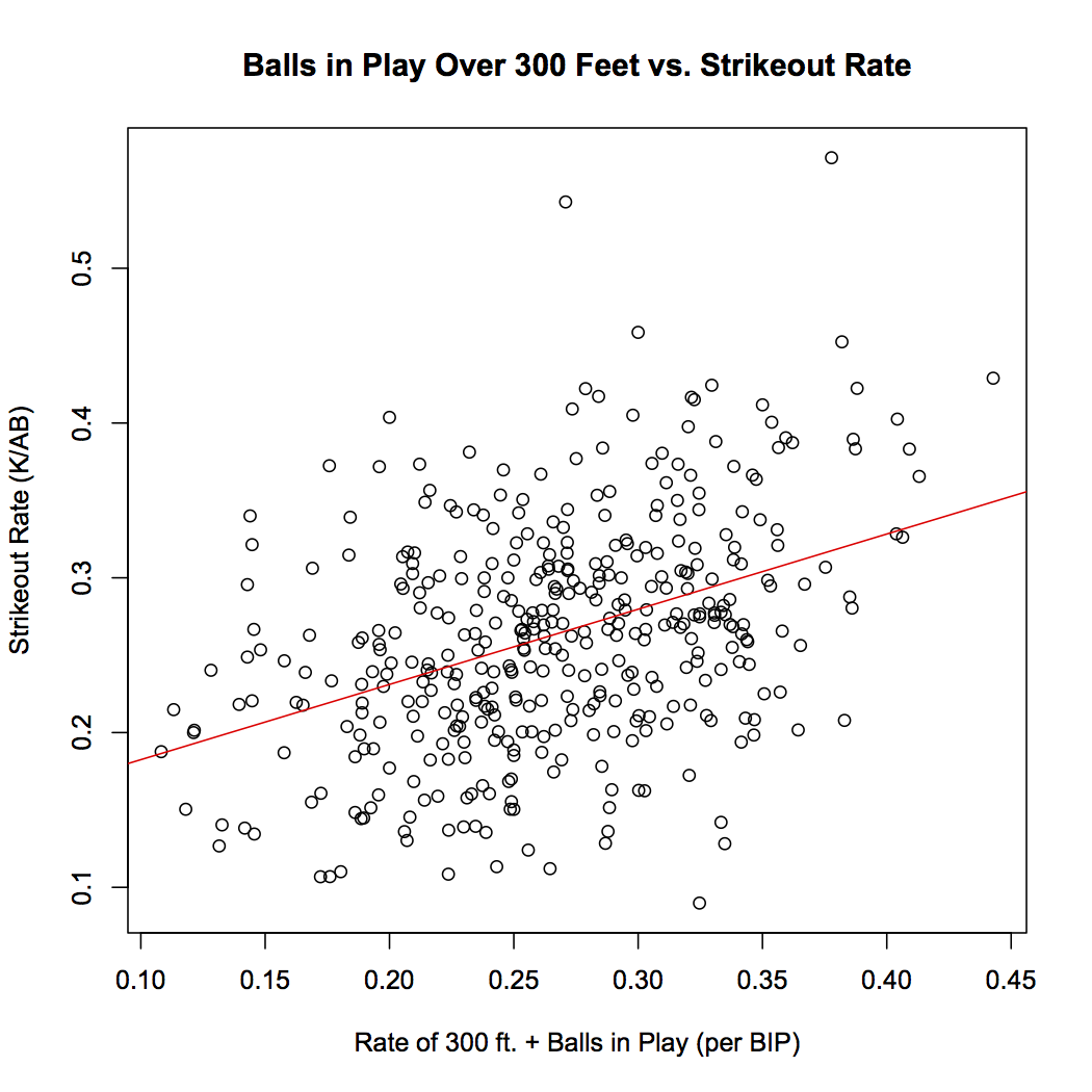
Before I delve into my research, I should point to Voros McCracken’s ideas about Defense Independent Pitching for those less sabermetrically inclined (if you are sabermetrically inclined, feel free to skip the next few paragraphs). If I were to give a brief summary of his work, I would say McCracken’s main point is that if a pitcher does not give up a home run or strike out or walk a batter, then he has little control of what happens to the batted ball in play. A lot of what happens can be credited to luck, sequencing, and how good his defense is. For those unaware of sequencing, it is the idea that if a pitcher gave up three singles and a home run in an inning, there are many different possibilities of what could happen. The three singles could come in a row, followed by the dinger, for a total of four runs, or, two singles could come early, the pitcher gets a double play or some other way to get out of the jam, then gives up a home run with the bases empty, followed by another single and an out. In that scenario, only one run was surrendered, despite an equal amount of hits. McCracken suggests there is randomness in this effect, which combined with the quality of defense behind the pitcher and a good deal of luck, can make ERA a poor indicator of a pitchers true skill.

McCracken looked at defense-independent pitching stats (HR, BB, K) and defense-dependent stats (ERA), and noticed that the defense-independent stats correlate much better from year to year, and are a better indicator of how a pitcher will perform, since a pitcher does not have control of what happens to balls in play.

While McCracken did not actually create FIP, his work was a building block for modern pitching analysis. FIP (Fielding Independent Pitching) tracks what a pitcher’s stats would look like if he played behind a league-average defense and experienced league-average luck. It is a much better indicator of future performance than ERA. All the data I used was from 2007-2014. Over that span, for pitchers who pitched more than 100 innings in at least a two-year span, a pitcher’s ERA from one year to the next (tracking how consistent the stat is in tracking performance) had a correlation coefficient of 0.338. FIP, conversely, had a correlation coefficient of 0.476. Clearly, FIP performs better when predicting future performance, as McCracken suggested.

To end my digression on McCracken’s importance, if I had to sum up its importance to this article, it is that pitchers have little or no control over what happens to a ball in play.

When I was talking Twins recently with some recent, justifiably uneasy Twins fans, they attributed the Twins’ recent troubles to injuries and inconsistent pitching. This was when I was reminded of the “pitch to contact” philosophy heralded by the Twins. Since the days of recently past successes, the Twins have changed management, and hopefully have let go of this ideology. Anyways, I thought to myself that McCracken’s work and subsequent furthering of the topic do not go along with the pitch-to-contact philosophy. Sure, if a pitcher can prevent walks and home runs, then it does go along with part of McCracken’s ideas. But, if the goal is to induce weak contact, yet the pitcher does not have control of what happens to a ball when it is contacted, then there is a bit of a discrepancy.

So, like any other statistically-oriented college mind looking for how to spend the rainy days of my summer break, I decided to run some regressions to test if “pitch to contact” actually succeeded and the Twins were able to induce weak contact, or if the relative success of the pitching staff is related to luck and a good defense.

To reiterate, the data I looked at came from the seasons of 2007-2014. To sum up the Twins’ pitching through the period, the period starts with solid pitching from guys who lack the ability to post high strikeout rates, excluding the one season Santana pitched in the study. Guys like Scott Baker and Nick Blackburn had solid seasons early on, but Blackburn and many others faded once things went downhill for the team. From the outside looking in, it may seem like a chicken-or-the-egg scenario, whether it was pitching that caused the downfall or some other factor that caused the pitching to fail.

I gathered data for Twins pitching over this span, and compared it to the rest of the league. The pitch-to-contact philosophy was easily visible, as over this eight-year span, only five Twins pitchers had higher strikeouts per nine innings than league average (Johan Santana, Phil Hughes, Scott Baker, Francsico Liriano, Kevin Slowey). At the same time, only four pitchers had a walks per nine innings above league average (Nick Blackburn, Boof Bonser, Sam Deduno, and Liriano), and most of those seasons came in that pitcher’s last season with the team. The data shows that despite few strikeouts, Twins pitchers found some success in limiting numbers of walks. However, for those pitchers who struggled with control, their combined ERA in those seasons was 4.82, with a FIP of 4.60. Clearly, if a pitcher struggled with control, their success was hindered by the high walk rate.

Much of the Twins’ pitching was inconsistent over this time as well, as pitchers such like Blackburn or Brian Duensing seemingly went from quality starters to below-average pitchers. For the most part, I found this to be a team-wide theme. For pitchers with multiple years with the club, I correlated year-by-year ERA and FIP, to see if any consistent trends arose. Amazingly, there was no correlation from ERA from one year to the next, as the R-squared value was 0.002, stressing no relationship at all (graph). FIP, on the other hand, showed an R-squared value of 0.15; so while not a concrete relationship, a weak relationship exists (graph).

Why this lack of consistent ERA and FIP? This is where I think BABIP comes into play. Since FIP does not take into account BABIP, it did produce more reliable data. A few outliers threw off the data, and since it is not a large sample size, those outliers did affect correlation. By the nature of the relationship, this probably did more to affect the FIP correlation than the ERA, but nonetheless, the small sample size of pitchers from this period did affect the relationship. Interestingly, but perhaps not surprisingly, I performed a regression graphing FIP to ERA, and a solid relationship exists, with an R-squared of 0.36 (graph). This would be even better of a correlation if I took out seasons by Phil Hughes and Liriano, as in those two seasons their FIP was almost a full point lower than their ERA, respectively. This shows the validity of FIP as a metric, as it accurately predicts how a pitcher likely will perform based on independent factors.

Nonetheless, there is a clear difference here in the two pitching metrics. FIP implies a relationship, while ERA does not. How can this be? My theory is that it has to do with the pitch-to-contact philosophy. If pitchers are constantly relying on luck and defense to produce outs, rather than getting batters out themselves, then random variation will play much greater of a role in a pitcher’s effectiveness. Additionally, a team’s defense will play much greater of a role in pitching.

How much can a defense affect pitching? Well, I graphed the total WAR produced by the various Twins defenses against the team ERA from the 2007-2014 seasons. I additionally graphed BABIP against team defense. Amazingly, an ERA to defense regression produces an R-squared of 0.47 (graph), while a Defense to BABIP regression produces a 0.37 R-squared value (graph). Team defense clearly has a relationship with team ERA and team BABIP, as when the Twins defense was in its prime (2007, 2010), pitching performed well. Similarly, in the defense’s worst two seasons, the team also had its highest BABIP (2013, 2014). For those wondering, FIP to team defense produces no correlation (as we expect, since it does not account for a team’s defense) with an R-squared of 0.003.

What does this all mean?

Putting it all together, we notice a few trends. After 2010, the defense took significant steps back, along with pitching (ERA). As we expect, the team’s BABIP was affected by the defense’s regression. FIP, on the other hand, remained fairly constant through the span, showing how the defense must play a role in team ERA. For example, we will look at 2014. This was the defense’s worst year in the span, with a defensive WAR of -46.5. Team ERA was second-worst in this year, at 4.58. FIP, conversely, showed the team had its second-best year in pitching, with a value of 3.97. This shows that if the Twins would have had an average defense, their ERA would have been much lower.

As team ERA ballooned, the quality of the Twins’ defense fell. Since Twins pitchers were taught to rely on their defense through the pitch-to-contact ideology, this relationship was amplified. Pitching to contact, although relying on luck and defense, may have had some merit when the Twins’ defense was in its prime. If the team could get to more balls, produce a few more outs, then as long as the pitchers kept batters from getting on for free via the walk, the team would succeed. The pitcher would not need to strike out as many batters since the defense would make more outs than the normal team. This sounds nice on paper, but as the team defense decayed, the pitching regressed. This is most evident in 2014, as a solid pitching staff was marred by the defense behind them.

If the Twins were to truly focus on pitching to contact, then they should have looked at the defense, not the pitcher. At the same time, pitching to contact is flawed in a way. Why should a pitcher rely on a defense if he can just get the batter out himself? Teaching a pitcher not to use his natural talent to strike out a batter is counter-productive. I am not saying the Twins’ coaching staff directly did this, but when only four pitchers in an eight-year span have above-average strikeout rates, it raises the question. Perhaps the Twins looked for pitchers who were undervalued because of their low strikeout rates, and used these undervalued pitchers in their pitch-to-contact system. Yet, this does not seem to be the case, as the Twins pitchers with the lowest ERAs and FIPs were the pitchers with the highest strikeout rate, excluding Brian Duensing, whose downfall could have been predicted by his 3.82 FIP (to a degree), as it showed is 2.62 ERA would be much closer to 4.00 with an average defense. Even in a pitch-to-contact system, the pitchers with the best ability to get the batter out without putting the ball in play were the best pitchers.

If pitching to contact were to have a textbook year, it would be 2007, where a team with a 4.37 FIP had an ERA of 4.18. Yet, soon after, the defense plummeted, bringing the team pitching down with it. Clearly, through the team’s porous defense, the Twins gave up on pitching to contact, too. They just hadn’t realized it yet.

Hopefully, with the new management in place, pitching to contact is forgotten. While it is also important to keep a viable defense behind the pitcher, I still can’t trust the pitch-to-contact ideology. It had a good run, but seriously, when was the last time the Twins were able to produce a consistent pitcher out of a highly-praised prospect? Liriano wasn’t consistent, Kyle Gibson has yet to dominate, and Jose Berrios has looked shaky is his brief appearances. I think Scott Baker might be the answer to my question, but if not him, then maybe Johan Santana?

Clearly, the Twins need a new philosophy for grooming pitching. It’s a team riddled with questions, and this is not the lone answer, but it can be one step in the right direction for the team currently pegged at the bottom of the AL barrel.


Hardball Retrospective – What Might Have Been – The “Original” 1904 Superbas

In “Hardball Retrospective: Evaluating Scouting and Development Outcomes for the Modern-Era Franchises”, I placed every ballplayer in the modern era (from 1901-present) on their original team. I calculated revised standings for every season based entirely on the performance of each team’s “original” players. I discuss every team’s “original” players and seasons at length along with organizational performance with respect to the Amateur Draft (or First-Year Player Draft), amateur free agent signings and other methods of player acquisition.  Season standings, WAR and Win Shares totals for the “original” teams are compared against the “actual” team results to assess each franchise’s scouting, development and general management skills.

Expanding on my research for the book, the following series of articles will reveal the teams with the biggest single-season difference in the WAR and Win Shares for the “Original” vs. “Actual” rosters for every Major League organization. “Hardball Retrospective” is available in digital format on Amazon, Barnes and Noble, GooglePlay, iTunes and KoboBooks. The paperback edition is available on Amazon, Barnes and Noble and CreateSpace. Supplemental Statistics, Charts and Graphs along with a discussion forum are offered at TuataraSoftware.com.

Don Daglow (Intellivision World Series Major League Baseball, Earl Weaver Baseball, Tony LaRussa Baseball) contributed the foreword for Hardball Retrospective. The foreword and preview of my book are accessible here.

Terminology

OWAR – Wins Above Replacement for players on “original” teams

OWS – Win Shares for players on “original” teams

OPW% – Pythagorean Won-Loss record for the “original” teams

AWAR – Wins Above Replacement for players on “actual” teams

AWS – Win Shares for players on “actual” teams

APW% – Pythagorean Won-Loss record for the “actual” teams

Assessment

The 1904 Brooklyn Superbas 

OWAR: 36.2     OWS: 250     OPW%: .500     (77-77)

AWAR: 21.5      AWS: 167     APW%: .366     (56-97)

WARdiff: 14.7                        WSdiff: 83  

Brooklyn placed fifth in ’04 as the Giants battered the opposition en route to the National League pennant. The “Original” Superbas bettered the “Actuals” by 19 games. Fielder Jones registered 25 stolen bases and Jimmy Sheckard added 21 for Brooklyn. “Honest” John Anderson and Claude “Little All Right” Ritchey laced 12 three-base hits apiece. Rookie outfielder Harry “Judge” Lumley paced the League with 18 triples and 9 home runs.

Jimmy Sheckard placed twenty-fourth among left fielders in the “The New Bill James Historical Baseball Abstract” top 100 player rankings. “Original” Superbas teammates listed in the “NBJHBA” top 100 rankings include Jimmy Sheckard (24th-LF), Fielder Jones (41st-RF), Claude Ritchey (59th-2B) and John J. Anderson (86th-LF).

  Original 1904 Superbas                                Actual 1904 Superbas

LINEUP POS OWAR OWS LINEUP POS OWAR OWS
Jimmy Sheckard LF 2.52 11.24 Jimmy Sheckard LF 2.52 11.24
Fielder Jones CF 4.16 22.7 Doc Gessler CF 0.93 11.12
Harry Lumley RF 2.37 19.43 Harry Lumley RF 2.37 19.43
John J. Anderson 1B/CF 0.64 18.84 Pop Dillon 1B 1.2 10.64
Claude Ritchey 2B 3.28 21.25 Sammy Strang 2B -0.27 3.56
Charlie Babb SS 1.61 18.36
Jack Dunn 3B 0.98 9.05 Mike McCormick 3B -0.9 5.68
Lew Ritter C 0.62 6.48 Lew Ritter C 0.62 6.48
BENCH POS OWAR OWS BENCH POS OWAR OWS
Candy LaChance 1B -2.98 8.02 John Dobbs CF -0.06 6.46
Mike McCormick 3B -0.9 5.68 Bill Bergen C -1.42 5.04
Emil Batch 3B -0.25 2.43 Emil Batch 3B -0.25 2.43
Dutch Jordan 2B -3.03 0.83 Fred Jacklitsch 1B 0.11 1.77
Deacon Van Buren LF -0.09 0.8 Jack Doyle 1B 0.09 0.89
Aleck Smith CF -0.21 0.37 Dutch Jordan 2B -3.03 0.83
Charlie Loudenslager 2B -0.03 0 Deacon Van Buren LF 0.05 0.18
Charlie Loudenslager 2B -0.03 0

Harry Howell accrued 21 losses in spite of a 2.19 ERA and a WHIP of 1.048. Oscar “Flip Flap” Jones completed 38 of 41 starts and recorded a 17-25 mark with a 2.75 ERA. Jack Cronin contributed 12 wins in his final campaign along with an ERA of 2.70.

  Original 1904 Superbas                             Actual 1904 Superbas

ROTATION POS OWAR OWS ROTATION POS OWAR OWS
Harry Howell SP 4.69 21.24 Oscar Jones SP 0.11 17.31
Oscar Jones SP 0.11 17.31 Jack Cronin SP 1.14 14.99
Jack Cronin SP 1.14 14.99 Ned Garvin SP 0.28 10.19
Doc Reisling SP 0.94 3.67 Doc Scanlan SP 1.02 6.89
BULLPEN POS OWAR OWS BULLPEN POS OWAR OWS
Bull Durham SP 0.03 0.83 Ed Poole SP -0.48 6.52
Joe Koukalik SP 0.07 0.49 Doc Reisling SP 0.94 3.67
Grant Thatcher RP -0.19 0.26 Fred Mitchell SP -0.32 1.96
Gene Wright SP -0.38 0 Bull Durham SP 0.03 0.83
Jack Doscher RP 0.24 0.79
Joe Koukalik SP 0.07 0.49
Grant Thatcher RP -0.19 0.26
Bill Reidy SP -1.42 0

Notable Transactions

Fielder Jones 

Before 1901 Season: Jumped from the Brooklyn Superbas to the Chicago White Sox. 

Claude Ritchey 

Before 1897 Season: Purchased by the Cincinnati Reds from the Brooklyn Bridegrooms for $500.

February 3, 1898: Traded by the Cincinnati Reds with Red Ehret and Dummy Hoy to the Louisville Colonels for Bill Hill.

December 8, 1899: Traded by the Louisville Colonels with Fred Clarke, Bert Cunningham, Mike Kelley, Tacks Latimer, Tommy Leach, Tom Messitt, Deacon Phillippe, Rube Waddell, Jack Wadsworth, Honus Wagner and Chief Zimmer to the Pittsburgh Pirates for Jack Chesbro, George Fox, Art Madison, John O’Brien and $25,000. 

John J. Anderson 

May 19, 1898: Sent to the Washington Senators by the Brooklyn Bridegrooms as part of a conditional deal.

September 21, 1898: Returned by the Washington Senators to the Brooklyn Bridegrooms as part of a conditional deal.

March 24, 1900: Purchased by Milwaukee (American) from the Brooklyn Superbas.

September 26, 1900: Drafted by the Brooklyn Superbas from Milwaukee (American) in the 1900 rule 5 draft.

February, 1901: Jumped from the Brooklyn Superbas to the Milwaukee Brewers. (Date given is approximate. Exact date is uncertain.)

October 6, 1903: Traded by the St. Louis Browns to the New York Highlanders for Jack O’Connor. 

Harry Howell

September, 1898: Purchased by the Brooklyn Bridegrooms from Meridan (Connecticut State).

March 11, 1899: Assigned to the Baltimore Orioles by the Brooklyn Superbas.

March, 1900: Assigned to the Brooklyn Superbas by the Baltimore Orioles.

Before 1901 Season: Jumped from the Brooklyn Superbas to the Baltimore Orioles.

Honorable Mention

The 1967 Los Angeles Dodgers 

OWAR: 45.4     OWS: 274     OPW%: .515     (83-79)

AWAR: 32.5       AWS: 218      APW%: .451    (73-89)

WARdiff: 12.9                        WSdiff: 56

The “Original” 1967 Dodgers placed fifth in the National League, 13 games behind the front-running Giants. Nevertheless the “Originals” outpaced the “Actuals” by a 10 game margin. Roberto Clemente (.357/23/110) collected his fourth batting crown, led the circuit with 209 base hits and secured the seventh of twelve consecutive Gold Glove Awards. Frank “Hondo” Howard dialed long distance 36 times. Maury Wills nabbed 29 bags and Tommy H. Davis scorched 32 doubles while producing matching batting averages at .302. Jim Merritt tallied 13 victories and delivered a 2.53 ERA along with a WHIP of 0.993. Don Drysdale equaled Merritt’s win total while fashioning an ERA of 2.74 with 196 strikeouts.

On Deck

What Might Have Been – The “Original” 1978 Pirates

References and Resources

Baseball America – Executive Database

Baseball-Reference

James, Bill. The New Bill James Historical Baseball Abstract. New York, NY.: The Free Press, 2001. Print.

James, Bill, with Jim Henzler. Win Shares. Morton Grove, Ill.: STATS, 2002. Print.

Retrosheet – Transactions Database

The information used here was obtained free of charge from and is copyrighted by Retrosheet. Interested parties may contact Retrosheet at “www.retrosheet.org”.

Seamheads – Baseball Gauge

Sean Lahman Baseball Archive