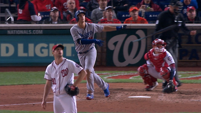
It was recently reported that the Nationals would not meet the hefty demands of Bryce Harper. These reports come from Bob Nightingale of USA Today and consist of a demand of $400 million for 10 years or more. This is beside the point though. After the report, I was browsing around on Facebook when I saw someone point out that because of Harper’s defense, he isn’t even worth $300 million. This got me thinking, what is Bryce Harper really worth?
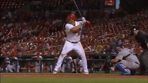
At first glance, I believe that Harper is worth at least $300 million. As a matter in fact, I won’t even make a final decision until the end of this article. I’m discovering his value with you. We’ll first look at his defense, since that is the claim against Harper. For continuity and consistency, I will use FanGraphs’ version of defensive, offensive, and base-running values.
When it comes to Harper’s defense, his values have been up and down for his career. Last year they were up. And down. But up, since I’m using FanGraphs stats, and thus UZR (Ultimate Zone Rating) will be used for my determination. The person from Facebook was likely using DRS (Defensive Runs Saved) because that was -3 while UZR was 8.7 for 2016.
Obviously defensive metrics like these are taken with a grain of salt because they have yet to be perfected. An 8.7 UZR is good. It isn’t top-tier, but it is definitely good. Plus the fact that right field isn’t the most inconsequential position. To make an impact in right field, a good arm is usually needed, and Harper had that in 2016. Yet 2015 was different, though, as both his arm rating and UZR were in the negative. Other than his 2014 UZR, everything else has been positive. His career totals are 17.4 for UZR and 16.3 for his arm. Like I said before, neither is is necessarily Gold Glove caliber, but he is definitely no scrub in the outfield. Even DRS, the metric I presume the Facebook man was using, has a total of 24 defensive runs saved for Harper on his career. So 2016 was his only year in the negative, and that was only -3.
Since I don’t want to only look at UZR and FanGraphs’ Arm ratings, I’ll also take a look at his Inside Edge fielding. All that does is show how often Harper executes on plays considered routine, likely, even, unlikely, remote, and impossible in descending order of probability. Except for routine plays, the rest have relatively small sample sizes on a season-wide basis for Harper. Each category has at least 30 samples for his career though, so the minimum number of samples to accurately represent the population is met. For routine plays, Harper performed as one would expect. He converted 99.6% of the plays in 2016 and 99.1% for his career, easily within the range of 90%-100% for the category. The next category, likely, has a range of 60%-90%. Harper was smack dab in the middle at 75% in 2016, but there were only 16 instances. Of the 70 in his career, he made 78.6% of the plays, well above the minimum expected of 60%. He performed even better in the even and unlikely categories. Remote plays were his only downside as he hasn’t made any of those plays in his career, but given the 39 instances it is hardly representative of his defensive play as a whole. He isn’t known as a burner and has been told by his coaches to tamp down the aggressiveness.
As a whole, his defense isn’t in question. Is it elite? No. He isn’t Jason Heyward or Mookie Betts in right field, but he was still fourth in the MLB in UZR for right fielders, so I don’t think his fielding is holding back his earning potential. If anything it may even be boosting it. Who wouldn’t want one of the premier hitting threats who can play a solid right field?
Because I want to save the more debatable part of Harper for last, we’re going to look at his base-running ability now. FanGraphs has the BsR (Base-Running Runs above average) stat, which sums up a player’s runs above average in terms of stolen bases, caught stealing, extra bases taken on hits, and double plays hit into. That gets boiled down to how many wins a player adds on the base paths. Harper’s BsR in 2016 stood at 2.4, or 2.4 runs added above the average player. He has 11.2 on his career.
To break it down, we will look at Harper’s wSB (weighted stolen bases), UBR (Ultimate Base Running), and wGDP (weighted ground into double plays). The wSB stat basically calculates how much a player helps by successfully advancing a base or hurts by being caught stealing. The Book gives success rates necessary for a base-stealer to add positive value in different situations. wSB simply adds together all the successes and failures and their weighted values (after all, a caught stealing is more costly than a stolen base is rewarding). In Harper’s case, he stole 21 bases in 2016, his highest total. He was also caught stealing 10 times. In all, he cost his team -0.3 runs trying to steal bases last year. It is an inconsequential amount, but for his career it is at -1.0. That is still too small to matter, but he is probably better off staying put unless he is sure he can make it to the next base. UBR and wGDP are higher on Harper. They are 5.5 and 6.7 for his career, respectively. Overall, Harper is a good base-runner. Still not elite, but he isn’t costing his team when running.
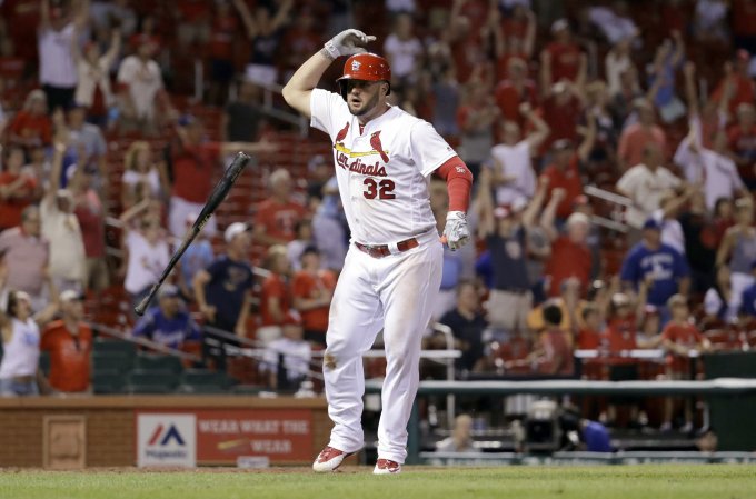
So far, Harper has graded well in both fielding and base running. In neither aspect of the game is Harper an elite player (though he’s arguably pretty close in the field). For Harper, and pretty much every player that makes big money in the MLB that isn’t a pitcher, the hitting is what will make and break him. The last two years have shown both sides of the spectrum of what Harper may turn out to be. In 2015, he was one of the two best players in baseball. Okay, he was the best. He flat-out outperformed Mike Trout (the true 2015 AL MVP, but that’s a debate for another time). Harper dominated in every form at the plate two years ago. If it weren’t for his negative defensive grade for the year, he would have broken the 10 fWAR barrier that only Trout has broken since 2004. He hit 42 home runs with 118 runs score and 99 RBI. If you don’t like those raw stats, he went and hit a batting line of .330/.460/.649. If you prefer metric stats, he went out and led in every iteration of runs created as well as wOBA. That stat line alone is worth $400 million.
But, we aren’t looking at one year of production. His 9.5 fWAR of 2015 is an anomaly so far. His second-highest is 4.6 in his rookie year. Last year it was 3.5. A 3.5-win player is not worth $400 million. A 4.6-win player is not worth $400 million. A 9.5-win player is. So, what is Harper really worth? Some (most) point to a reported injury that Harper had this past year that he played through anyway. This injury would have held him back. How much, though, we don’t know. We also don’t know if he will rebound to the 2015 version of him. Was that year a breakout year put on pause or was it in fact an anomaly?
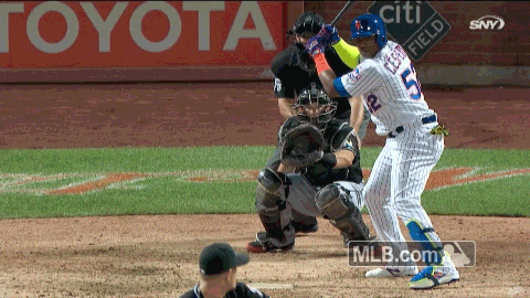
To answer those questions, we need to dig a bit deeper than just his metric stats. In terms of exit velocity, Harper took a large step back from 91.4 mph to 89.5 mph in 2015 and 2016, respectively. In terms of home runs, Harper hit 19 in 2015 off of fastballs while regressing to eight last year. If it is a matter of catching up to fastballs, an injury definitely makes sense. 23-year-olds don’t suddenly lose their bat speed. That begins to happen at 33. When it comes to Harper’s batted balls, he increased the number of fly balls he hit and decreased in line drives. That usually translates to more home runs, but a drop in exit velocity answers that. Harper did hit more infield flies that in 2015. It was only a 3.1% change, but it does suggest he was just missing a bit more than the year prior.
Looking at the differences between the two years and what changed, I’m going to believe that he was injured. When reading online, most analysts believe that, and Harper even said he was injured. Only the Nationals said he wasn’t. With an injury, I have to believe that Harper was hampered by that rather than just a complete regression in skill. Harper has his hitting, and with the offseason to rest and heal he should come back and mash again.
One more tidbit about Harper’s hitting before we’re done here, though. His batting average of balls in play (BABIP) sat at a measly .264. That is well below the average of .300. One could look at Harper’s diminished exit velocity and how often he hit the ball soft, medium, and hard. Well, his average exit velocity is right around league average. He also was under league average for soft hits and above in hard hits. So that should translate to a bit above a .300 BABIP. Because of this, I’m going to factor in that Harper was pretty unlucky last year and his stats would look better if more balls fell into play like they should have.
Unfortunately, we aren’t quite done in determining Harper’s value. Since I’m going to believe that Harper was injured last year, that just adds to a pretty lengthy injury history. Lengthy injury histories aren’t something that teams like, but most of his have come from his aggressiveness on defense in his first few years. He took the pedal off the metal in 2015 and it translated to on-field success. If he continues to do that, I think he should be able to stay on the field.
Harper will also be 26 years old when he hits the open market in the 2018-2019 offseason. That is quite a bit younger than most free agents and it gives enough time for teams to lower their payrolls in time for a bidding war of great magnitude if they so choose (looking at you, Yankees). He will still have about six more years in his prime after he signs his potential mega-deal.
In prior years, teams have spent about $8 million per win above replacement. Obviously some players produce more than what they are being compensated for. No one is going to pay Mike Trout $80 million for one year. But, $40 million for a year isn’t out of the question, especially for someone of Trout’s caliber. This isn’t about Trout though, this is about Harper and what teams will pay him. He is said to be demanding $400 million for 10+ years. Is it conceivable that a team will pay him $40 million per year for 10 years if they expect similar success to 2015? Yes. He outperformed Trout and I think we can agree teams would hand him that amount of money in a pinch. It’s just a matter of whether or not it will happen.
Because I think Harper had an injury that didn’t allow him to play to his standard last year and he was unlucky with his hits, I do believe he can again reach his 2015 production. And because I believe he can get there again, I then have to believe a team will pay him at least $40 million for at least 10 years. I wouldn’t be surprised to see a contract similar to Giancarlo Stanton’s in terms of length — 13 years. For 13 years, Harper would only have to reach an annual average of $30 million, which is much, much easier to come by. So yes, when Bryce Harper reaches free agency where teams can bid as much as they can, some team will pay him that much. Of course, Harper can underperform again this coming season, and it would be hard for him to command that kind of contract. I don’t think that will happen. Based on what he showed in 2015 and why he didn’t do as well last year, he is more than likely to ramp up production in 2017.


