Archive for Research

Kinda Juiced Ball: Nonlinear COR, Homers, and Exit Velocity

At this point, there’s very little chance you are both (a) reading the FanGraphs Community blog and (b) unaware that home runs were up in MLB this year. In fact, they were way up. There are plenty of references out there, so I won’t belabor the point.

I was first made aware of this phenomenon through a piece written by Rob Arthur and Ben Lindbergh on FiveThirtyEight, which noted the spike in homers in late 2015 [1]. One theory suggested by Lindbergh and Arthur is that the ball has been “juiced” — that is, altered to have a higher coefficient of restitution. Since then, one of the more interesting pieces I have read on the subject was written by Alan Nathan at The Hardball Times [2]. In his addendum, Nathan buckets the batted balls into discrete ranges of launch angle, and shows that the mean exit speed for the most direct contact at line-drive launch angles did not increase much between first-half 2015 and first-half 2016. He did observe, however, that negative and high positive launch angles showed a larger increase in mean exit speed. Nathan suggests that this is evidence against the theory that the baseball is juiced, as one would expect higher mean exit speed across all launch angles. I have gathered the data from the excellent Baseball Savant and reproduced Nathan’s plot for completeness, also adding confidence intervals of the mean for each launch angle bucket.

Figure 1. Mean exit speed vs. launch angle.

At the time of this writing, I am not aware of any concrete evidence to support the conclusion that the baseball has been intentionally altered to increase exit speed. This fact, combined with Nathan’s somewhat paradoxical findings, led me to consider a subtler hypothesis: some aspect of manufacturing has changed and slightly altered the nonlinear elastic characteristics of the ball. Now, I’ve been intentionally vague in the preceding sentence; let me explain what I really mean.

Coefficient of restitution (COR) is a quantity that describes the ratio of relative speed of the bat and ball after collision to that before collision. The COR is a function of both the bat and the ball, where a value of 1 indicates a perfectly elastic collision, during which the total kinetic energy of the bat and ball in conserved. The simplest, linear, approximation of COR is a constant value, independent of the relative speed of the impacting bodies. It has long been known that, for baseballs, COR takes on a non-linear form, where the value is a function of relative speed [3]. Specifically, the COR decreases with increasing relative speed, and can vary on the order of 10% across a typical impact speed range. My aim is to show that, for some reasonable change in the non-linear COR characteristics of the baseball, I can reproduce findings like Alan Nathan’s, and offer yet another theory for MLB’s home-run spike.

In order to explore this, I first need a collision model to incorporate a non-linear COR. I want this model to be relatively simple, and also to be able to account for different impact angles between bat and ball. This is what will allow me to explore the effect of non-linear COR on exit speed vs. launch angle. I will mostly follow the work of Alan Nathan [4] and David Kagan [5]. I won’t show my derivation; rather, I will include final equations and a hastily drawn figure to explain the terms.

Figure 2. Hastily drawn batted-ball collision.

The ball with mass is traveling toward the bat with speed , assumed exactly parallel to the ground for simplicity. The bat with effective mass is traveling toward the ball with speed , at an angle  from horizontal. We know that in this two-dimensional model, the collision occurs along contact vector, the line between the centers of mass, which is at an angle from horizontal. This will also be the launch angle. Intuition, and indeed physics, tells us that the most energy will be transferred to the ball when the bat velocity vector is collinear with the contact vector. When the bat is traveling horizontally and the ball impacts more obliquely, above the center of mass of the bat, the ball will exit at a lower speed. These heuristics are captured with the following equations, where COR as a function of relative speed will be denoted , and the exit speed .

                                                             (1)

                                                   (2)

                                                               (3)

                                                                              (4)

                                           (5)

Now all we must do is choose a functional dependence of the COR on relative speed. Following generally the data from Hendee, Greenwald, and Crisco [3], and making small modifications, I produced the following models of COR velocity dependence:

Figure 3. Hypothetical non-linear COR.

Note that, for the highest relative bat/ball collisions, the “old” and “new” ball/bat collisions will result in similar amounts of energy transferred, while in the “new” ball model, slightly more energy will be transferred to the ball in lower-speed collisions. This difference seems to me quite plausible given manufacturing and material variation of the baseball. It is also worth emphasizing that this difference need only be on average for the whole league; some variation ball-to-ball would be expected.

Taking the new and old ball COR models from Figure 3 and plugging into equations (1)-(5) allows us to simulate the exit speed across a range of launch angles. I have assumed a bat swing angle of 9 degrees. Calculations and plots are accomplished with Python.

Figure 4. Exit speed as a function of launch angle for non-linear COR.

The first thing to note about Figure 4 is that the highest exit speed is indeed at 9 degrees, which was the assumed bat path. The second is the remarkable likeness between Figure 4, the model, and Figure 3, the data. Clearly, I have cheated by tweaking my COR models to qualitatively match the data, but the point is that I did not have to make wildly unrealistic assumptions to do so. I have not looked deeply into the matter, but this hypothesis would also suggest that from ’15 to ’16, a larger home-run increase would be expected for moderate power hitters than from those who hit the ball the very hardest. In fact, Jeff Sullivan suggests almost exactly this [6], although he also produces evidence somewhat to the contrary [7].

There is certainly much complexity that I am ignoring in this simple model, but it is based on solid fundamentals. If one accepts that baseball manufacturing could be subject to small variations, and perhaps a small systematic shift that alters the non-linear coefficient of restitution of the ball, it follows that the exit speed of the baseball is also expected to change. Further, the exit speed is expected to change differently as a function of launch angle. That a simple model of this phenomenon can easily be constructed to match the actual data from suspected “before” and “after” timeframes is at least interesting circumstantial evidence for the baseball being juiced. Perhaps not exactly the way we all expected, but still kinda juiced.


References:

[1] Arthur, Rob and Lindbergh, Ben. “A Baseball Mystery: The Home Run Is Back, And No One Knows Why.” FiveThirtyEight. 31 Mar. 2016. Web. 30 Aug. 2016.

[2] Nathan, Alan, “Exit Speed and Home Runs.” The Hardball Times. 18 Jul. 2016. Web. 23 Aug. 2016.

[3] Hendee, Shonn P., Greenwald, Richard M., and Crisco, Joseph J. “Static and dynamic properties of various baseballs.” Journal of Applied Biomechanics 14 (1998): 390-400.

[4] Nathan, Alan M. “Characterizing the performance of baseball bats.” American Journal of Physics 71.2 (2003): 134-143.

[5] Kagan, David. “The Physics of Hard-Hit Balls.” The Hardball Times. 18 Aug. 2016. Web. 23 Aug 2016.

[6] Sullivan, Jeff. “The Other Weird Thing About the Home Run Surge.” FanGraphs. 28 Sept. 2016. Web. 4 Dec. 2016.

[7] Sullivan, Jeff. “Home Runs and the Middle Class.” FanGraphs. 28 Sept. 2016. Web. 4 Dec. 2016.


Examining Net Present Value and Its Effects

Going back to January 2016, Dave Cameron wrote an article detailing the breakdown of money owed to Chris Davis over the life of the deal he signed last year. For myself, this provided insight into how teams value long-term contracts, but more importantly it led me to more questions about how money depreciates over time. Fast-forward to the present and we start to see some articles and comments with people speculating about how much money teams are going to throw at Bryce Harper when he reaches free agency in a few years. The numbers have been pretty incredible; $400 million? $500 million? Even $600 million? Then someone threw out an even larger number: $750 million.

The best thing to do is ignore these numbers because we are still a couple of years away from free agency and he just had a down year where he was “only” worth 3.5 WAR, which gave the team a value of $27.8 million. At some point the numbers don’t even make sense because the contract values are getting so inflated. But at the same time, good for him, maybe he’ll buy a baseball team once he retires, or a mega-yacht. But unfortunately we will need to wait until after the 2018 season before we find out the value of this contract. In the meantime, speculation will run rampant and the media will throw out inflated numbers for the amusement of the masses.

Now, the purpose of this article is not to predict the value of Bryce Harper’s future contract, but to examine a few scenarios as to the actual value in present-day dollars. To do this I will use the concept of Net Present Value (NPV) from Dave Cameron’s Chris Davis article and then use some of the numbers from his article predicting a contract for Bryce Harper. Let’s set a couple rules; (1) Match the length of contract given to Stanton — 13 years, (2) use nice round numbers and get as close to the total values as possible, (3) use a discount rate of 4%, (4) this is an exercise in futility and not to be taken too seriously and finally (5) to estimate NPV for a massive contract.

Here are the scenarios for a 13-year contract totaling in excess of $400M, $500M and $600M.

13 Year Contract Structure
Year Age
2019 26 $31,000,000 $38,500,000 $46,500,000
2020 27 $31,000,000 $38,500,000 $46,500,000
2021 28 $31,000,000 $38,500,000 $46,500,000
2022 29 $31,000,000 $38,500,000 $46,500,000
2023 30 $31,000,000 $38,500,000 $46,500,000
2024 31 $31,000,000 $38,500,000 $46,500,000
2025 32 $31,000,000 $38,500,000 $46,500,000
2026 33 $31,000,000 $38,500,000 $46,500,000
2027 34 $31,000,000 $38,500,000 $46,500,000
2028 35 $31,000,000 $38,500,000 $46,500,000
2029 36 $31,000,000 $38,500,000 $46,500,000
2030 37 $31,000,000 $38,500,000 $46,500,000
2031 38 $31,000,000 $38,500,000 $46,500,000
Total $403,000,000.00 $500,500,000.00 $604,500,000.00
NPV $309,555,083.25 $384,447,442.10 $464,332,624.87

Over the life of this contract, the value of each in NPV is significantly less than the actual amount signed. That’s because $5 today won’t buy you as much five years down the road. To get a little more numerical, 13 years from now currency will lose ~40% of its value. Quoting the Chris Davis article again, the league and the MLBPA have agreed to use a 4% discount rate to calculate present-day values of long-term contracts. Since important people within the industry take this into account, that’s likely why we don’t see too many contracts with a significant amount of deferred money.

Since players are taking — and I use this term very lightly — a “hit” when they sign a long-term deal, I wondered what kind of contract structure would benefit a player the most. Again, I wanted to use nice round numbers, so I settled on a 10-year, $100M contract, looking at an equal payment structure, a front-loaded contract, and a back-loaded contract. Here’s what I came up with:

Hypothetical 10 Year $100M Contract
Year Equal Front-loaded Back-loaded
1 $10,000,000 $14,500,000 $5,500,000
2 $10,000,000 $13,500,000 $6,500,000
3 $10,000,000 $12,500,000 $7,500,000
4 $10,000,000 $11,500,000 $8,500,000
5 $10,000,000 $10,500,000 $9,500,000
6 $10,000,000 $9,500,000 $10,500,000
7 $10,000,000 $8,500,000 $11,500,000
8 $10,000,000 $7,500,000 $12,500,000
9 $10,000,000 $6,500,000 $13,500,000
10 $10,000,000 $5,500,000 $14,500,000
Total $100,000,000 $100,000,000 $100,000,000
NPV $81,108,957.79 $83,726,636.52 $78,491,279.06

There’s not a huge difference, but a player would gain just over $5M by signing a front-loaded contract as compared to a back-loaded contract. It seems as though the agents and the MLBPA are more concerned about total dollars rather than NPV since they probably want to drive up total contracts.

And in case you’re wondering what those annual salaries would look like in NPV from the table above, I’ve created another table to show what those salaries actually look like in NPV over the life of our hypothetical 10-year contract.

NPV Of Hypothetical 10 Year $100M Contract
Year Expected Equal Front-loaded Back-loaded
1 $10 $9.62 $13.94 $5.29
2 $10 $9.25 $12.48 $6.01
3 $10 $8.89 $11.11 $6.67
4 $10 $8.55 $9.83 $7.27
5 $10 $8.22 $8.63 $7.81
6 $10 $7.90 $7.51 $8.30
7 $10 $7.60 $6.46 $8.74
8 $10 $7.31 $5.48 $9.13
9 $10 $7.03 $4.57 $9.48
10 $10 $6.76 $3.72 $9.80

What I was hoping to show you next was a cool interactive plot similar to the table above, but instead of showing you the annual salaries it will show cumulative earnings as the life of our 10-year/$100M contract as time progresses. Well unfortunately I am unable to get this plot to show up on this webpage; it has something to do with WordPress being unable to use Javascript. If you’ll bear with me, you can click the link below (it just opens a new window and shows the plot).

https://docs.google.com/spreadsheets/d/19qGcrwGmdZemmYG_LaP_Ay6_5g6hL3VKT8z-Q3-PWXI/pubchart?oid=422413074&format=interactive
Front-loaded contracts seem to have the most benefit to the players themselves since they actually get more value out of any long-term contracts they might sign. For a player to maximize their career earnings it looks like it would be way more beneficial to sign shorter-length contracts with higher AAV than those long-term contracts. Maybe that is why we are beginning to see more deals with opt-out clauses in them.


Batted Balls and Adam Eaton’s Throwing Arm

Adam Eaton, he of 6 WAR, is now on the Nationals and there is a lot of discussion happening regarding that.  It would seem that maybe 2 – 3 of those WAR wins are attributable to his robust defensive play in 2016. 20 DRS!

In Dave Cameron’s article “Maybe Adam Eaton Should Stay in Right Field,” Dave points out that Eaton led MLB with 18 assists and added significant value by “convincing them not to run in the first place.”

What Dave and most of the other defensive metrics that I’ve seen on the public pages tend to ignore is the characteristics of the ball in play, i.e. fielding angle and exit velocity, and these impacts on the outfielders performance.  So with only a bit of really good Statcast data I understand this is still hard to do, but it’s time to start.  You can easily envision that balls hit to outfielders in different ways (i.e. launch angle and velocity) can result in different outfield outcomes.  Whether it is the likelihood of an out being made on that ball in play, or whether it is how that ball interacts with runners on base.  Ignoring this data has nagged me for a while now, as I love to play with the idea of outfield defense (just look at my other community posts).

So can some of these stats explain Adam Eaton’s defensive prowess this season?  Maybe it’s possible.  I had downloaded all the outfield ball-in-play data from the 2016 Statcast search engine so I fired it up.  I have cleaned the data up to include the outfielder name and position for each play.  Using this I can filter the data for the situation Dave describes, which is:

A single happens to right field with a runner on first base.

Before we go into the individual outfielders, let’s look in general:


By looking in general at the plays, you can see that a player is significantly less likely to advance from 1st to 3rd on a single to right field if the ball is hit at 5 degrees vs 15 degrees.  It’s nearly double from ~20% at 5 degrees to ~40% at 15 degrees.  Wow. That’s huge, and with an R-squared of nearly 50%, we’re talking half of the decision to go from 1st to 3rd can be tied to the launch angle.  (The chart is basically parabolic if you go to the negative launch angles which do appear in the data set, but with much less frequency, which is why I removed those data points.  But it makes sense that it would be way.)

I did this same analysis using exit velocity and it wasn’t nearly as conclusive, though there was a trend downward, i.e guys were less likely to advance on singles hit at 100mph then they were for singles hit at 60 mph. The r-squared was ~13%.

So now that we see that the angle the BIP comes to the outfield can make a big difference, who were the lucky recipients in the outfield of runner-movement-prevention balls in play?  When filtered to remove anybody who made fewer than 20 of this type of play, you end up with Eaton at No. 2 with an average angle of 4.44 (Bryce Harper, his now-teammate and also mentioned in Dave’s article in conjunction with his similarly excellent runner-movement-prevention, comes in at No. 3.  Possibly not a coincidence.)


You may notice my total number of plays for Eaton doesn’t match the total referenced by Dave per Baseball-Reference. I filtered out the plays where Eaton was in center field (which were several).  I believe that my analysis from the Statcast data had Eaton with 48 plays of this type (I think Dave’s article mentioned 52 per BR? Not sure what the difference is).

So in conclusion, I do think it’s very possible that Adam Eaton’s defensive numbers this past season, in particular with regards to his “ARM” scoring, could have been dramatically influenced in a positive direction simply by the balls that were hit to him and the angle they came.  Clearly this is something he has absolutely no control over whatsoever and it could fluctuate to another direction entirely next year.  I do think this area of analysis, in particular for outfield plays, whether it’s catches, assists, or even preventing advancement for runners, is a very ripe field for new approaches which in time should give us a much better idea of players’ defensive value.

That said, in this simple analysis the angle only accounted for ~50% of that runner-movement-prevention and that still leaves arm strength and accuracy as likely significant contributors, both of which I believe Eaton excels at.  And of course he did throw all those guys out.  So Eaton should be fine, likely well above average, but just don’t expect those easy singles to keep coming to him.


Where Bryce Harper Was Still Elite

Bryce Harper just had a down season. That seems like a weird thing to write about someone who played to a 112 wRC+, but when you’re coming off a Bondsian .330/.460/.649 season, a line of .243/.373/.441 seems pedestrian. Would most major-league baseball players like to put up a batting line that’s 12% better than average? Yes (by definition). But based on his 2015 season, we didn’t expect “slightly above average” from Bryce Harper. We expected “world-beating.” We didn’t quite get it, but there’s one thing he is still amazing at — no one in the National League can work the count quite like him.
Read the rest of this entry »


wERA: Rethinking Inherited Runners in the ERA Calculation

There are many things to harp on about traditional ERA, but one thing that has always bothered me is the inherited-runner portion of the base ERA calculation. Why do we treat it in such a binary fashion? Shouldn’t the pitcher who allowed the run shoulder some of the accountability?

As a Nationals fan, the seminal example of the fallacy of this calculation was Game 2 of the 2014 Division Series against the Giants. Jordan Zimmermann had completely dominated all day, and after a borderline ball-four call, Matt Williams replaced him with Drew Storen, who entered the game with a runner on first and two outs in the top of the 9th and the Nats clinging to a one-run lead. Storen proceeded to give up a single to Buster Posey and a double to Pablo Sandoval to tie the game, but he escaped the inning when Posey was thrown out at the plate. So taking a look at the box score, Zimmermann, who allowed an innocent two-out walk, takes the ERA hit and is accountable for the run, while Storen, who was responsible for a lion’s share of the damage, gets completely off the hook. That doesn’t seem fair to me!

I’ve seen other statistics target other flawed elements of ERA (park factors, defense), but RE24 is the closest thing I’ve found to a more context-based approach to relief pitcher evaluation. RE24 calculates the change in run expectancy over the course of a single at-bat, so it’s applicable beyond relief pitchers and pitchers in general, and is an excellent way to determine how impactful a player is on the overall outcome of the game. But at the same time, it does not tackle the notion of assignment, but simply the change in probability based on a given situation.

wERA is an attempt to retain the positive components of ERA (assignment, interpretability), but do so in a fashion that better represents a pitcher’s true role in allowing the run.

The calculation works in the exact same way as traditional ERA, but assigns inherited runs based on the probability that run will score based on the position of the runner and the number of outs at the start of the at-bat when a relief pitcher enters the game. These probabilities were calculated using every outcome from the 2016 season where inherited runners were involved.

Concretely, here is a chart showing the probability, and thus the run responsibility, in each possible situation. So in the top example – if there’s a runner on 3rd and no one out when the RP enters the game, the replaced pitcher is assigned 0.72 of the run, and the pitcher who inherits the situation is assigned 0.28 of the run. On the flip side, if the relief pitcher enters the game with two outs and a runner on first, they will be assigned 0.89 of the run, since it is primarily the relief pitcher’s fault the runner scored.

Screen Shot 2016-12-04 at 9.35.13 AM.png
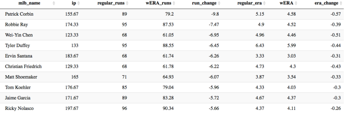
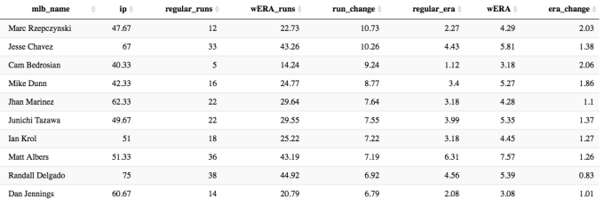
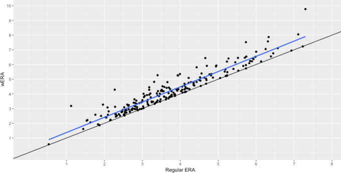
Let’s take a look at the 2016 season, and see which starting and relief pitchers would be least and most affected by this version of the ERA calculation (note: only showing starters with at least 100 IP, and relievers with over 30 IP).

Screen Shot 2016-12-07 at 9.39.40 PM.png

The Diamondbacks starting pitchers had a rough year this year, but they were not helped out by their bullpen. Patrick Corbin would shave off almost 10 runs and over half a run in season-long ERA using the wERA calculation over the traditional ERA calculation.

On the relief-pitcher side the ERA figures shift much more severely.

Screen Shot 2016-12-07 at 9.40.37 PM.png

Cam Bedrosian had by normal standards an amazing year with an ERA of just 1.12. Factoring inherited runs scored, his ERA jumps up over two runs to a still solid 3.18, but clearly he was the “beneficiary” of the traditional ERA calculation. So to be concrete about the wERA calculation – it is saying that Bedrosian was responsible for an additional 9.22 runs this season stemming directly from his “contribution” of the runners who he inherited that ultimately scored.

The below graph shows relief pitcher wERA vs. traditional ERA in scatter-plot form. The blue line shows the slope of the relationship of the Regular ERA vs wERA, and the black line shows a perfectly linear relationship. It’s clear that the result of this new ERA is an overall increase to RP ERA, albeit to varying degrees based on individual pitcher performance.

Screen Shot 2016-12-07 at 10.04.15 PM.png

While I believe this represents an improvement over traditional ERA, there are two flaws in this approach:

  • In complete opposite fashion compared to traditional ERA, wERA disproportionately “harms” relief pitcher ERA, because they enter games in situations that starters do not which are more likely to cause a run to be allocated against them.
  • This does not factor in pitchers who allow runners to advance, but don’t allow that runner to reach base or score. Essentially a pitcher could leave a situation worse off than he started, but not be negatively impacted.

The possible solution to both of these would be to employ a similar calculation to RE24 and calculate both RP and SP expected vs. actual runs based on these calculations. This would lose the nature of run assignment to a degree, but would be a more unbiased way to evaluate how much better or worse a pitcher is compared to expectation. I will attempt to refactor this code to perform those calculations over the holidays this year.

All analysis was performed using the incredible pitchRx package within R, and the code can be found at the Github page below.

Baseball/wERA.R


The Homer Numbers of a Hypothetically-Healthy Giancarlo Stanton

Giancarlo Stanton has missed significant playing time since his MLB debut in 2010 and has never played more than 150 games of a 162-game season (145 and 123 games being his next two highest totals). In spite of his injury-shortened seasons, Stanton has still been among the league home-run leaders in 2011, 2012, and 2014 (his 150, 123, and 145-game seasons, respectively).

Giancarlo Stanton Since Debut (June 2010)
Season Games PA HR HR MLB Rank Injury Report
2010 100 396 22 T-55 ——
2011 150 601 34 9 Hamstring issues limited time
2012 123 501 37 7 15-day DL: Arthroscopic knee surgery
2013 116 504 24 T-31 15-day DL: Strained right hamstring
  2014* 145 638 37 2 Season-ending facial fracture
2015 74 318 27 T-25 15-day DL: Season-ending hamate (hand) fracture
2016 119 470 27 48 15-day DL: Strained left groin
*=finished 2nd in NL MVP race (Clayton Kershaw)

Career-wise, Stanton has amassed a total of 208 home runs, good enough for 16th-most of any player through their age-26 season and among the likes of Miguel Cabrera and Jose Canseco.

HR-leaders through Age-26 season
Rank Player HR
1 Alex Rodriguez 298
2 Jimmie Foxx 266
3 Eddie Matthews 253
4 Albert Pujols 250
5 Mickey Mantle 249
6 Mel Ott 242
7 Frank Robinson 241
8 Ken Griffey, Jr. 238
9 Orlando Cepeda 222
10 Andruw Jones 221
11 Hank Aaron 219
12 Juan Gonzalez 214
13 Johnny Bench 212
14 Miguel Cabrera 209
14 Jose Canseco 209
16 Giancarlo Stanton 208

Given Stanton’s injury-plagued career, his career home-run numbers are a lower bound on what he may have accomplished had he played full, injury-free seasons following his debut. To quantify how Stanton’s injuries have suppressed Stanton’s career power numbers thus far, I extrapolated the home-run totals of Stanton’s injury-shortened seasons into full-season hypothetical home-run totals (hHR) using the formula below:

hHR = FLOOR(HR/G * 162)

The formula simply assumes that Stanton maintains his HR/G rate through a whole 162-game season and then conservatively rounds down. We can now compare home-run totals between the real Giancarlo Stanton and our hypothetical Giancarlo Stanton. I excluded his 2010 debut from the extrapolation.

Real Giancarlo Stanton vs. Hypothetical Giancarlo Stanton
Season Games HR HR MLB Rank hGames hHR hHR MLB Rank
2010 100 22 T-55 100 22 T-55
2011 150 34 9 162 36 8
2012 123 37 7 162 48 1
2013 116 24 T-31 162 33 T-9
2014 145 37 2 162 41 1
2015 74 27 T-25 162 59 1
2016 119 27 48 162 36 T-16

The real Stanton never led the MLB in home runs, but our hypothetical Stanton climbs into the MLB lead in three of his hypothetical seasons (2012, 2014, and 2015).

Career-wise, our hypothetical Stanton would have hit 275 total home runs. This hypothetical Stanton adds 67 home runs to his real total, jumping from 16th to second place on the Age-26 leaderboard, only 23 home runs behind the far-away leader, Alex Rodriguez.

HR-leaders through Age-26 season
Rank Player HR
1 Alex Rodriguez 298
2 Giancarlo Stanton (hypothetical) 275
3 Jimmie Foxx 266
4 Eddie Matthews 253
5 Albert Pujols 250
6 Mickey Mantle 249
7 Mel Ott 242
8 Frank Robinson 241
9 Ken Griffey, Jr. 238
10 Orlando Cepeda 222
11 Andruw Jones 221
12 Hank Aaron 219
13 Juan Gonzalez 214
14 Johnny Bench 212
15 Miguel Cabrera 209
16 Jose Canseco 209
17 Giancarlo Stanton (real) 208

Of note, using the same formula to calculate Stanton’s career strikeout totals predicts a whopping 1271 strikeouts for our hypothetical Stanton. His 977 strikeout “real” total through age 26 (second-highest) balloons and surpasses Justin Upton’s age-26-leading 1026 for a clear command of first place.

In reality, Stanton is a three-time All-Star, a Silver Slugger (2014), and a Home Run Derby champion (2016), and he historically ranks among the best in home-run totals for his age, all while facing injury issues in all of his first six full big-league seasons. Our hypothetically-healthy Giancarlo Stanton greatly improves his career numbers and garners himself a few MLB home-run crowns, giving a glimpse into how much larger his career numbers could be today had his first six full seasons been injury-free. As Stanton’s career progresses, it will be interesting to see where his home-run totals end up, and, unfortunately, how much greater they could have been.

Credit to Baseball-Reference for all publicly available data.


The Reds Have a Spin Rate Problem

With baseball’s annual winter meetings taking place this past week near Washington D.C, I want to take a look at the Cincinnati Reds and a potential way of looking to improve upon a historically bad pitching staff in 2016.  While they did just post the worst WAR by a pitching staff since 1900, they were completely average somewhere else, which likely aided them towards the path of history no team wants to make.  The Reds threw the highest amount of average four-seam spin-rate fastballs in 2016.

We are just scratching the surface on spin-rate research.  While we can’t say much for sure about ways to improve spin rate or why it differs from pitcher to pitcher, we do have a pretty good idea it’s good to be different.  The ultimate goal of pitching is to disrupt timing, create mis-hits and have swings and misses.  The more deception a pitcher can create by being further away from average spin on either the high end or low end of the spectrum, the better off they appear to be.  This was a major problem for the Reds last season as the they threw a whole bunch of average towards the plate.

Taking spin-rate data from baseballsavant.com, I looked at all 30 teams and their four-seam fastball data.  I set a minimum of 50 four-seams thrown by a pitcher to be included in the data set.  Team-by-team totals show that the Reds threw the fifth-most four-seam fastballs in 2016:

  1. Rays: 10823
  2. Diamondbacks: 10667
  3. Marlins: 10606
  4. Rockies: 10102
  5. Reds: 9991

The average spin rate for the four-seam fastball in 2016 was 2241 revolutions per minute.  This season, the Reds pitching staff was pretty close to the MLB mean at 2232 RPMs. Only the Astros, Athletics and Mets were closer to the mean (2240, 2245, 2248 respectively).  Now, let’s create a bucket we will call “four-seams around average” and see what we collect. This bucket will include pitches that were 50 RPMs higher than 2241 and 50 RPMs lower than 2241 for a 100-RPM range of 2191-2291. Next, I’ll use data from the 10 teams closest to the MLB mean, the most “average” spin teams, to determine who threw the most “average fastballs.”  Here are the top five totals:

  1. Reds: 3165
  2. Mets: 2674
  3. Athletics: 2072
  4. Angels: 2056
  5. Braves: 1973

As you can see, the Reds ran away with what we have designated as “average fastballs” with nearly 500 more than the Mets and over 1,000 more than the third-place A’s.  You could be saying to yourself that the Reds may have thrown so many average-spin fastballs because they threw the fifth-most four-seams in the majors this past season.  And you would be right since a larger sample size obviously affords the chance of more average pitches to be thrown (especially if the data follows a normal distribution like ours does). So I’ll bring in another measurement to further support that the Reds were very average in 2016: standard deviation

I’m sure most people are familiar with standard deviation (SD) so I won’t waste time going into formula, but an easy explanation is it’s one way of measuring dispersion in a given data set.  The lower the SD, the closer all the data points are to the mean.  Looking again at our 10 average spin-rate teams and the standard deviation for each team’s data set, here are the five lowest teams in terms of SD:

  1. Reds: 123.99
  2. Mets: 138.56
  3. Angels: 142.838
  4. Astros: 153.105
  5. Cardinals: 157.645

There are the Reds leading the way again!  Let’s attempt to put all 10 teams on an even playing field by taking a sample of 1,000 four-seam fastballs from each group.  The mean of this sample is our random variable.  In R, we will use the replicate function to generate 10,000 of these random variables to learn about its distribution.  After running the simulation, the random variables follow normal distribution which is something we already knew.  What I was interested in is if the team with the lowest standard deviation would have changed after each team had the same sample size. Here are the lowest five teams in SD after 10,000 simulations:

  1. Reds: 3.68
  2. Mets: 4.106
  3. Angels: 4.126
  4. Astros: 4.472
  5. Cardinals: 4.637

No change. By having the lowest SD in the group that was deemed to be the closest to the MLB mean in four-seam spin, and a test of a random sample of 1,000 pitches simulated 10,000 times, this further supports that the Reds pitching staff has a spin-rate problem, and is not just a product of a larger sample size.  In fact, the Reds had the lowest standard deviation of all 30 teams!

So where can the Reds look over the rest of the offseason to improve upon a pitching staff in need of upgrades in spin rate?  Well, a lot of the work in finding spin value from this year’s crop of free agents was done a few weeks ago on this site.  While Cincinnati won’t be in on the top-tier free agents available, there are more than a few options available that shouldn’t cost any more than $5-6 million in annual value that the Reds can afford to not only improve the bullpen, but move further away from the average spin that may have caused them problems all season.


Hardball Retrospective – What Might Have Been – The “Original” 2013 Marlins

In “Hardball Retrospective: Evaluating Scouting and Development Outcomes for the Modern-Era Franchises”, I placed every ballplayer in the modern era (from 1901-present) on their original team. I calculated revised standings for every season based entirely on the performance of each team’s “original” players. I discuss every team’s “original” players and seasons at length along with organizational performance with respect to the Amateur Draft (or First-Year Player Draft), amateur free agent signings and other methods of player acquisition.  Season standings, WAR and Win Shares totals for the “original” teams are compared against the “actual” team results to assess each franchise’s scouting, development and general management skills.

Expanding on my research for the book, the following series of articles will reveal the teams with the biggest single-season difference in the WAR and Win Shares for the “Original” vs. “Actual” rosters for every Major League organization. “Hardball Retrospective” is available in digital format on Amazon, Barnes and Noble, GooglePlay, iTunes and KoboBooks. The paperback edition is available on Amazon, Barnes and Noble and CreateSpace. Supplemental Statistics, Charts and Graphs along with a discussion forum are offered at TuataraSoftware.com.

Don Daglow (Intellivision World Series Major League Baseball, Earl Weaver Baseball, Tony LaRussa Baseball) contributed the foreword for Hardball Retrospective. The foreword and preview of my book are accessible here.

Terminology

OWAR – Wins Above Replacement for players on “original” teams

OWS – Win Shares for players on “original” teams

OPW% – Pythagorean Won-Loss record for the “original” teams

AWAR – Wins Above Replacement for players on “actual” teams

AWS – Win Shares for players on “actual” teams

APW% – Pythagorean Won-Loss record for the “actual” teams

Assessment

The 2013 Miami Marlins 

OWAR: 33.0     OWS: 255     OPW%: .468     (76-86)

AWAR: 18.5      AWS: 185     APW%: .383     (62-100)

WARdiff: 14.5                        WSdiff: 70  


The “Original” 2013 Marlins tied with the Phillies for last place, yet the ball club managed to school the “Actuals” by a 14-game margin. Miguel Cabrera seized MVP honors for the second consecutive season and notched his third straight batting title. “Miggy” produced a .348 BA, dialed long-distance 44 times and knocked in 137 baserunners. Adrian Gonzalez swatted 22 big-flies and reached the century mark in RBI for the sixth time in his career. Matt Dominguez drilled 25 two-base hits and blasted 21 round-trippers. Giancarlo Stanton supplied 26 doubles and 24 four-baggers as a member of the “Originals” and “Actuals”.

  Original 2013 Marlins                              Actual 2013 Marlins

STARTING LINEUP POS OWAR OWS STARTING LINEUP POS OWAR OWS
Josh Willingham LF 0.23 9 Christian Yelich LF 1.34 8.34
Marcell Ozuna CF/RF 0.16 6.68 Justin Ruggiano CF 1.11 9.23
Giancarlo Stanton RF 3.14 16.66 Giancarlo Stanton RF 3.14 16.66
Adrian Gonzalez 1B 4.12 21.17 Logan Morrison 1B 0.32 6.16
Josh Wilson 2B -0.11 0.54 Donovan Solano 2B 0.44 6.95
Robert Andino SS -0.26 0.82 Adeiny Hechavarria SS -2.33 4.28
Miguel Cabrera 3B 6.8 33.13 Ed Lucas 3B 0.42 7.2
Brett Hayes C 0.17 1.01 Jeff Mathis C -0.17 3.22
BENCH POS OWAR OWS BENCH POS OWAR OWS
Matt Dominguez 3B 0.84 11.34 Marcell Ozuna RF 0.16 6.68
Gaby Sanchez 1B 1.91 10.36 Placido Polanco 3B -0.35 5.41
Christian Yelich LF 1.34 8.34 Chris Coghlan LF 0.32 5.35
Logan Morrison 1B 0.32 6.16 Derek Dietrich 2B 0.63 5.29
Chris Coghlan LF 0.32 5.35 Juan Pierre LF -0.27 4.38
Jim Adduci LF 0.03 0.59 Rob Brantly C -0.98 2.61
Alex Gonzalez 1B -0.94 0.32 Greg Dobbs 1B -0.6 2.5
Mark Kotsay LF -1 0.17 Jake Marisnick CF 0.13 1.54
Kyle Skipworth C -0.05 0.01 Miguel Olivo C 0.17 1.17
Scott Cousins LF -0.06 0 Nick Green SS -0.01 1.05
Chris Valaika 2B -0.13 0.58
Joe Mahoney 1B -0.04 0.54
Koyie Hill C -0.55 0.54
Austin Kearns RF -0.13 0.25
Matt Diaz LF -0.14 0.15
Casey Kotchman 1B -0.25 0.06
Kyle Skipworth C -0.05 0.01
Jordan Brown DH -0.06 0
Gil Velazquez 3B -0.01 0

Jose D. Fernandez (12-6, 2.19) merited 2013 NL Rookie of the Year honors and an All-Star invitation while placing third in the NL Cy Young balloting. Portsider Jason Vargas contributed 9 victories with a 4.02 ERA to the “Originals” rotation and Henderson “The Entertainer” Alvarez fashioned a 3.59 ERA and 1.140 WHIP for the “Actuals” in 17 starts. The Marlins’ bullpen featured Steve Cishek (2.33, 34 SV). A.J. Ramos whiffed 86 batsmen in 68 relief appearances.

  Original 2013 Marlins                             Actual 2013 Marlins 

ROTATION POS OWAR OWS ROTATION POS OWAR OWS
Jose D. Fernandez SP 5.57 16.22 Jose D. Fernandez SP 5.57 16.22
Jason Vargas SP 2 7.04 Henderson Alvarez SP 1.89 6.19
Tom Koehler SP 0.46 3.96 Nathan Eovaldi SP 1.39 5.63
Brad Hand SP 0.4 1.43 Ricky Nolasco SP 1.13 4.92
Alex Sanabia SP -0.33 0.6 Jacob Turner SP 0.87 4.56
BULLPEN POS OWAR OWS BULLPEN POS OWAR OWS
Steve Cishek RP 1.62 12.99 Steve Cishek RP 1.62 12.99
A. J. Ramos RP 0.34 5.23 Mike Dunn RP 1.06 6.64
Ronald Belisario RP -0.9 2.61 Chad Qualls RP 1.22 6.22
Sandy Rosario RP 0.24 2.53 A. J. Ramos RP 0.34 5.23
Dan Jennings RP 0.08 1.95 Ryan Webb RP 0.6 5.02
Ross Wolf SW 0.14 1.92 Tom Koehler SP 0.46 3.96
Arquimedes Caminero RP 0.16 0.95 Kevin Slowey SP 0.46 3.15
Logan Kensing RP 0.02 0.1 Dan Jennings RP 0.08 1.95
Josh Johnson SP -1.25 0.04 Brad Hand SP 0.4 1.43
Josh Beckett SP -0.81 0 Arquimedes Caminero RP 0.16 0.95
Chris Hatcher RP -0.93 0 Alex Sanabia SP -0.33 0.6
Chris Leroux RP -0.17 0 Brian Flynn SP -0.59 0.14
Edgar Olmos RP -0.68 0 Steve Ames RP -0.02 0.02
Chris Resop RP -0.6 0 Duane Below RP -0.19 0
Chris Volstad RP -0.49 0 Sam Dyson SP -0.59 0
Chris Hatcher RP -0.93 0
Wade LeBlanc SP -0.41 0
John Maine RP -0.66 0
Edgar Olmos RP -0.68 0
Zach Phillips RP -0.03 0
Jon Rauch RP -0.71 0

 Notable Transactions

Miguel Cabrera 

December 4, 2007: Traded by the Florida Marlins with Dontrelle Willis to the Detroit Tigers for Dallas Trahern (minors), Burke Badenhop, Frankie De La Cruz, Cameron Maybin, Andrew Miller and Mike Rabelo. 

Adrian Gonzalez 

July 11, 2003: Traded by the Florida Marlins with Will Smith (minors) and Ryan Snare to the Texas Rangers for Ugueth Urbina.

January 6, 2006: Traded by the Texas Rangers with Terrmel Sledge and Chris Young to the San Diego Padres for Billy Killian (minors), Adam Eaton and Akinori Otsuka.

December 6, 2010: Traded by the San Diego Padres to the Boston Red Sox for a player to be named later, Reymond Fuentes, Casey Kelly and Anthony Rizzo. The Boston Red Sox sent Eric Patterson (December 16, 2010) to the San Diego Padres to complete the trade.

August 25, 2012: Traded by the Boston Red Sox with Josh Beckett, Carl Crawford, Nick Punto and cash to the Los Angeles Dodgers for players to be named later, Ivan De Jesus, James Loney and Allen Webster. The Los Angeles Dodgers sent Rubby De La Rosa (October 4, 2012) and Jerry Sands (October 4, 2012) to the Boston Red Sox to complete the trade. 

Matt Dominguez

July 4, 2012: Traded by the Miami Marlins with Rob Rasmussen to the Houston Astros for Carlos Lee.

Gaby Sanchez

July 31, 2012: Traded by the Miami Marlins with Kyle Kaminska (minors) to the Pittsburgh Pirates for Gorkys Hernandez.

On Deck

What Might Have Been – The “Original” 1985 Expos

References and Resources

Baseball America – Executive Database

Baseball-Reference

James, Bill. The New Bill James Historical Baseball Abstract. New York, NY.: The Free Press, 2001. Print.

James, Bill, with Jim Henzler. Win Shares. Morton Grove, Ill.: STATS, 2002. Print.

Retrosheet – Transactions Database

The information used here was obtained free of charge from and is copyrighted by Retrosheet. Interested parties may contact Retrosheet at “www.retrosheet.org”.

Seamheads – Baseball Gauge

Sean Lahman Baseball Archive


What Will Bryce Harper Really Be Worth in 2018?

It was recently reported that the Nationals would not meet the hefty demands of Bryce Harper. These reports come from Bob Nightingale of USA Today and consist of a demand of $400 million for 10 years or more. This is beside the point though. After the report, I was browsing around on Facebook when I saw someone point out that because of Harper’s defense, he isn’t even worth $300 million. This got me thinking, what is Bryce Harper really worth?

At first glance, I believe that Harper is worth at least $300 million. As a matter in fact, I won’t even make a final decision until the end of this article. I’m discovering his value with you. We’ll first look at his defense, since that is the claim against Harper. For continuity and consistency, I will use FanGraphs’ version of defensive, offensive, and base-running values.

When it comes to Harper’s defense, his values have been up and down for his career. Last year they were up. And down. But up, since I’m using FanGraphs stats, and thus UZR (Ultimate Zone Rating) will be used for my determination. The person from Facebook was likely using DRS (Defensive Runs Saved) because that was -3 while UZR was 8.7 for 2016.

Obviously defensive metrics like these are taken with a grain of salt because they have yet to be perfected. An 8.7 UZR is good. It isn’t top-tier, but it is definitely good. Plus the fact that right field isn’t the most inconsequential position. To make an impact in right field, a good arm is usually needed, and Harper had that in 2016. Yet 2015 was different, though, as both his arm rating and UZR were in the negative. Other than his 2014 UZR, everything else has been positive. His career totals are 17.4 for UZR and 16.3 for his arm. Like I said before, neither is is necessarily Gold Glove caliber, but he is definitely no scrub in the outfield. Even DRS, the metric I presume the Facebook man was using, has a total of 24 defensive runs saved for Harper on his career. So 2016 was his only year in the negative, and that was only -3.

Since I don’t want to only look at UZR and FanGraphs’ Arm ratings, I’ll also take a look at his Inside Edge fielding. All that does is show how often Harper executes on plays considered routine, likely, even, unlikely, remote, and impossible in descending order of probability. Except for routine plays, the rest have relatively small sample sizes on a season-wide basis for Harper. Each category has at least 30 samples for his career though, so the minimum number of samples to accurately represent the population is met. For routine plays, Harper performed as one would expect. He converted 99.6% of the plays in 2016 and 99.1% for his career, easily within the range of 90%-100% for the category. The next category, likely, has a range of 60%-90%. Harper was smack dab in the middle at 75% in 2016, but there were only 16 instances. Of the 70 in his career, he made 78.6% of the plays, well above the minimum expected of 60%. He performed even better in the even and unlikely categories. Remote plays were his only downside as he hasn’t made any of those plays in his career, but given the 39 instances it is hardly representative of his defensive play as a whole. He isn’t known as a burner and has been told by his coaches to tamp down the aggressiveness.

As a whole, his defense isn’t in question. Is it elite? No. He isn’t Jason Heyward or Mookie Betts in right field, but he was still fourth in the MLB in UZR for right fielders, so I don’t think his fielding is holding back his earning potential. If anything it may even be boosting it. Who wouldn’t want one of the premier hitting threats who can play a solid right field?

Because I want to save the more debatable part of Harper for last, we’re going to look at his base-running ability now. FanGraphs has the BsR (Base-Running Runs above average) stat, which sums up a player’s runs above average in terms of stolen bases, caught stealing, extra bases taken on hits, and double plays hit into. That gets boiled down to how many wins a player adds on the base paths. Harper’s BsR in 2016 stood at 2.4, or 2.4 runs added above the average player. He has 11.2 on his career.

To break it down, we will look at Harper’s wSB (weighted stolen bases), UBR (Ultimate Base Running), and wGDP (weighted ground into double plays). The wSB stat basically calculates how much a player helps by successfully advancing a base or hurts by being caught stealing. The Book gives success rates necessary for a base-stealer to add positive value in different situations. wSB simply adds together all the successes and failures and their weighted values (after all, a caught stealing is more costly than a stolen base is rewarding). In Harper’s case, he stole 21 bases in 2016, his highest total. He was also caught stealing 10 times. In all, he cost his team -0.3 runs trying to steal bases last year. It is an inconsequential amount, but for his career it is at -1.0. That is still too small to matter, but he is probably better off staying put unless he is sure he can make it to the next base. UBR and wGDP are higher on Harper. They are 5.5 and 6.7 for his career, respectively. Overall, Harper is a good base-runner. Still not elite, but he isn’t costing his team when running.

So far, Harper has graded well in both fielding and base running. In neither aspect of the game is Harper an elite player (though he’s arguably pretty close in the field). For Harper, and pretty much every player that makes big money in the MLB that isn’t a pitcher, the hitting is what will make and break him. The last two years have shown both sides of the spectrum of what Harper may turn out to be. In 2015, he was one of the two best players in baseball. Okay, he was the best. He flat-out outperformed Mike Trout (the true 2015 AL MVP, but that’s a debate for another time). Harper dominated in every form at the plate two years ago. If it weren’t for his negative defensive grade for the year, he would have broken the 10 fWAR barrier that only Trout has broken since 2004. He hit 42 home runs with 118 runs score and 99 RBI. If you don’t like those raw stats, he went and hit a batting line of .330/.460/.649. If you prefer metric stats, he went out and led in every iteration of runs created as well as wOBA. That stat line alone is worth $400 million.

But, we aren’t looking at one year of production. His 9.5 fWAR of 2015 is an anomaly so far. His second-highest is 4.6 in his rookie year. Last year it was 3.5. A 3.5-win player is not worth $400 million. A 4.6-win player is not worth $400 million. A 9.5-win player is. So, what is Harper really worth? Some (most) point to a reported injury that Harper had this past year that he played through anyway. This injury would have held him back. How much, though, we don’t know. We also don’t know if he will rebound to the 2015 version of him. Was that year a breakout year put on pause or was it in fact an anomaly?

To answer those questions, we need to dig a bit deeper than just his metric stats. In terms of exit velocity, Harper took a large step back from 91.4 mph to 89.5 mph in 2015 and 2016, respectively. In terms of home runs, Harper hit 19 in 2015 off of fastballs while regressing to eight last year. If it is a matter of catching up to fastballs, an injury definitely makes sense. 23-year-olds don’t suddenly lose their bat speed. That begins to happen at 33. When it comes to Harper’s batted balls, he increased the number of fly balls he hit and decreased in line drives. That usually translates to more home runs, but a drop in exit velocity answers that. Harper did hit more infield flies that in 2015. It was only a 3.1% change, but it does suggest he was just missing a bit more than the year prior.

Looking at the differences between the two years and what changed, I’m going to believe that he was injured. When reading online, most analysts believe that, and Harper even said he was injured. Only the Nationals said he wasn’t. With an injury, I have to believe that Harper was hampered by that rather than just a complete regression in skill. Harper has his hitting, and with the offseason to rest and heal he should come back and mash again.

One more tidbit about Harper’s hitting before we’re done here, though. His batting average of balls in play (BABIP) sat at a measly .264. That is well below the average of .300. One could look at Harper’s diminished exit velocity and how often he hit the ball soft, medium, and hard. Well, his average exit velocity is right around league average. He also was under league average for soft hits and above in hard hits. So that should translate to a bit above a .300 BABIP. Because of this, I’m going to factor in that Harper was pretty unlucky last year and his stats would look better if more balls fell into play like they should have.

Unfortunately, we aren’t quite done in determining Harper’s value. Since I’m going to believe that Harper was injured last year, that just adds to a pretty lengthy injury history. Lengthy injury histories aren’t something that teams like, but most of his have come from his aggressiveness on defense in his first few years. He took the pedal off the metal in 2015 and it translated to on-field success. If he continues to do that, I think he should be able to stay on the field.

Harper will also be 26 years old when he hits the open market in the 2018-2019 offseason. That is quite a bit younger than most free agents and it gives enough time for teams to lower their payrolls in time for a bidding war of great magnitude if they so choose (looking at you, Yankees). He will still have about six more years in his prime after he signs his potential mega-deal.

In prior years, teams have spent about $8 million per win above replacement. Obviously some players produce more than what they are being compensated for. No one is going to pay Mike Trout $80 million for one year. But, $40 million for a year isn’t out of the question, especially for someone of Trout’s caliber. This isn’t about Trout though, this is about Harper and what teams will pay him. He is said to be demanding $400 million for 10+ years. Is it conceivable that a team will pay him $40 million per year for 10 years if they expect similar success to 2015? Yes. He outperformed Trout and I think we can agree teams would hand him that amount of money in a pinch. It’s just a matter of whether or not it will happen.

Because I think Harper had an injury that didn’t allow him to play to his standard last year and he was unlucky with his hits, I do believe he can again reach his 2015 production. And because I believe he can get there again, I then have to believe a team will pay him at least $40 million for at least 10 years. I wouldn’t be surprised to see a contract similar to Giancarlo Stanton’s in terms of length — 13 years. For 13 years, Harper would only have to reach an annual average of $30 million, which is much, much easier to come by. So yes, when Bryce Harper reaches free agency where teams can bid as much as they can, some team will pay him that much. Of course, Harper can underperform again this coming season, and it would be hard for him to command that kind of contract. I don’t think that will happen. Based on what he showed in 2015 and why he didn’t do as well last year, he is more than likely to ramp up production in 2017.


Finding the Real Eric Thames

On Tuesday (11/29), the Brewers signed former failed prospect Eric Thames to a three-year, $16-million contract. In doing so, they also DFA’d the co-leader for home runs in the National League, Chris Carter. Now, there has been some speculation that the Brewers made this move to save money, but regardless of what you think the motives behind the move may be, it certainly is an interesting one that deserves a closer look.

Thames came up with the Blue Jays after being drafted in the 7th round of the 2008 draft. He showed good power in the minors, belting 27 homers at AA to the tune of a .238 ISO in 2010. He continued this surge into 2011 and did a decent job with the Jays at the major-league level, but struggled to hit lefties. Then, in 2012, it fell apart. His ISO dropped nearly 30 points from the year before, and his strikeout rate increased to an even 30% from 22%. After bouncing around in the minors in 2013, he then went overseas to the Korean Baseball Organization (KBO) and signed with the NC Dinos, where he almost immediately ascended to god status, hitting 124 home runs in 388 games with a .371 ISO in three years. Not only that, but he won a Gold Glove in Korea and stole 40 bases in 2015.

Now, of course, it’s never that easy. You don’t get a 40/40 guy with decent defense in the MLB for $5 million a year. The KBO is notorious for being a hitter’s paradise, as the skill level isn’t nearly that of the MLB. Think of the KBO as essentially being AA, where any major-league-caliber player will thrive, just like Thames did. But does that mean Thames has actually improved? If you look at some former KBO stars like Jung-Ho Kang and Hyun-Soo Kim, you can see that both have had success in the majors, even though they haven’t come close to matching their numbers in Korea. Thames’ Davenport translations (per Eno Sarris) suggest he’ll be a beast, slashing .333/.389/.628. Looking at those numbers, you could easily argue that Thames would be a bargain for the Brewers, essentially matching Carter’s output while even adding more value on the base paths and in the field.

That being said, Thames is a rare case. We have his stats from when he flopped in the big leagues, and we also have his stats from when he tore up the KBO. Barring some sort of complete technical and mental overhaul, one could also easily argue that Thames’ weaknesses the first time around will be his downfall the second time around. Let’s take a look at some stats from the KBO and compare them to his time in the MLB.

As stated before, one of the issues Thames had was that when he made contact, the balls didn’t go anywhere worthwhile (like the stands). He slugged .431 with a .182 ISO from 2011-2012, which does not look good if you’re a major-league first baseman. In the KBO, he put that issue to rest, where he slugged .718 with a .371 ISO, which is essentially unheard of in the MLB. Let’s check that problem with power off the list. However, there still stands the issue of his strikeouts and walks. He struck out 26% of the time during his time in the bigs while walking only 6% of the time, which is a recipe for disaster. In Korea, he struck out 18% of the time and walked a whopping 14% of the time. Other KBO imports have shown that both strikeout and walk rates regress when moving from Korea to the majors. So, Thames solved that second problem, although based on available data, we can assume he’ll regress in both categories. Thames improved in both areas that he needed to, but was this only because he was facing lesser pitching in a hitter’s paradise, or did he make technical changes to his swing in addition to improving his plate discipline?

Below are two screen shots: the top is Thames getting ready to take Ryan Dempster yard in 2013, the bottom is Thames hitting one of his 47 home runs in 2015.

mlbthames


kbothames


Look at the hands. In the top picture, Thames keeps his hands roughly around his ears right before his swing, while in Korea, he appears to load his swing lower, near his shoulders. This allows Thames to stay in the zone with his bat longer and have a bit of an upswing, which leads to higher exit velocity and an improved launch angle. Both of these qualities translate into more power and more strikeouts. Ted Williams first pioneered this idea, saying that a slight upswing leads to extended contact on the ball, while a level swing leads to a smaller impact zone.

ted


This is a change many players have made, such as Josh Donaldson, Jake Lamb, and Ryon Healy. Eno Sarris wrote an excellent article on the changes Ryon Healy made to his swing. It looks like this is something Thames is trying to emulate and will hopefully carry over to the MLB.

It looks like Thames has made the adjustments that he has needed to become a successful player. Trying to project what player he’ll be is a bit difficult. Personally, I look at the Davenport projections and I’m a little hesitant to say Thames will hit .333 and slug .628, seeing as how his strikeout rate will almost certainly regress to levels close to his former major-league self. I don’t see his walk rate regressing down to that level, mainly because plate discipline is a skill that accrues over time, and pitchers will have to be more careful with Thames and his new approach at the plate.

Let’s look at his slash line from his time in the MLB — in 633 at-bats, Thames hit .250/.296/.431 with 21 homers and a walk rate of 6% and a strikeout rate of 26%. Assuming regression from Korea, let’s keep the strikeouts at 25%, up from 18% in Korea, and let’s up the walk rate to account for added patience and power to 10%. With the technical changes in his swing, we can also assume his batted balls will go further and get hit harder, so let’s bump the slugging up to .500, which translates into something like 30-35 HR. This puts his ISO right at .250, a step up from what we saw earlier in his career. We’re now looking at a slash line of roughly .250/.350/.500 with an above-average glove at first and 10 steals (the Brewers love to let their players run). That’s good. In fact, that’s better than Chris Carter, and the Brewers are getting this at half the price of what Chris Carter would cost. I think there are plenty of reasons to be excited about Eric Thames in 2017.