Archive for Research

What About Batted Ball Spin?

Recently, for my job, I got to mess around with Statcast data for fly balls. I have a good job. As part of the task I was working on, I attempted to calculate the maximum heights and travel distances of fly balls using my extensive ninth-grade physics knowledge. Now, I was excellent at ninth-grade physics, especially kinematics, but my estimates, compared to the official Statcast numbers, were terrible. Figuring the discrepancies must be due to air resistance, I did my best to remember AP physics (with the help of NASA) and adjusted my calculations for drag. The results improved, but were still way off. There are many additional factors that affect the flight of a fly ball such as wind, air temperature and altitude, but I think the biggest factor causing the inaccuracy of my estimates is batted-ball spin. (If you disagree, let me know in the comments.) Exit velocity and launch angle get all the attention when discussing batted-ball metrics, but the data I was looking at suggested that batted-ball spin merits attention too. Are there batters who are consistently better at spinning the ball than others, and if so, is this a valuable skill?

We already know that balls hit with top-spin sink faster than normal while balls hit with back-spin stay in the air longer. It’s unclear, though, whether it’s better for the batter to hit the ball with more or less spin, and whether top-spin or back-spin is more beneficial. Back-spin would seem to be better if you are a home-run hitter while top-spin might be more beneficial if you are a line-drive hitter.

As far as I know, Statcast doesn’t measure batted-ball spin, and if it does, it’s not available on Baseball Savant. So to act as a proxy for spin, I calculated the estimated travel distance (adjusted for air resistance) from its launch angle and exit velocity for every line drive, fly ball and pop up hit in 2016 and subtracted this number from the distance estimated by Statcast. The bigger the deviation between these two numbers, the faster the ball was spinning, theoretically. Balls with positive deviations (actual distance > estimated distance) must have been hit with back-spin and balls with negative deviations (actual distance < estimated distance) must have been hit with top-spin.

The following table shows the 20 hitters (min. 50 fly balls hit) who gained the most distance on average in 2016 due to back-spin:

Batter Name Number of batted balls Avg Statcast Distance (ft) Avg Estimated Distance (ft) Avg Deviation (ft)
Travis Jankowski 87 254 235 19
DJ LeMahieu 213 282 264 18
Carlos Gonzalez 226 293 276 17
Daniel Descalso 102 285 270 14
Max Kepler 150 285 271 14
Billy Burns 108 234 221 13
Rob Refsnyder 57 269 257 12
Jarrod Dyson 98 243 232 11
Martin Prado 256 262 251 11
Ketel Marte 154 250 239 11
Justin Morneau 73 278 268 11
Gary Sanchez 66 323 312 11
Tyler Saladino 107 270 260 10
Phil Gosselin 77 264 253 10
Jose Peraza 107 257 248 10
Mookie Betts 311 279 270 9
Melky Cabrera 280 271 261 9
Ichiro Suzuki 137 251 242 9
Omar Infante 68 269 261 9

With a few exceptions, these are not home-run hitters. This group of 20 players averaged 8.25 home runs in 2016. The players who are getting the most added distance on their fly balls are not the ones who need it most. (Note: four players on this list and three of the top four players played their home games at Coors Field. Did you forget that Daniel Descalso played for the Rockies last year? Me too.)

What about the other end of the spectrum? The following are the 20 players who lost the most distance on average in 2016 due to top-spin:

Batter Name Number of batted balls Avg Statcast Distance (ft) Avg Estimated Distance (ft) Avg Deviation (ft)
Colby Rasmus 136 285 306 -21
Tommy La Stella 72 273 294 -21
Brian McCann 195 273 294 -22
Todd Frazier 248 276 297 -22
Jorge Soler 88 278 300 -22
Brian Dozier 263 287 309 -22
Curtis Granderson 238 284 306 -22
Franklin Gutierrez 76 304 327 -23
James McCann 131 277 300 -23
Miguel Sano 158 301 324 -23
Khris Davis 213 303 326 -23
Freddie Freeman 269 289 312 -23
Mike Napoli 205 290 315 -25
Chris Davis 207 304 330 -26
Tyler Collins 54 270 296 -26
Ryan Howard 129 306 334 -28
Kris Bryant 284 281 309 -28
Jarrod Saltalamacchia 96 290 321 -31
Mike Zunino 63 295 327 -33
Ryan Schimpf 122 298 331 -33

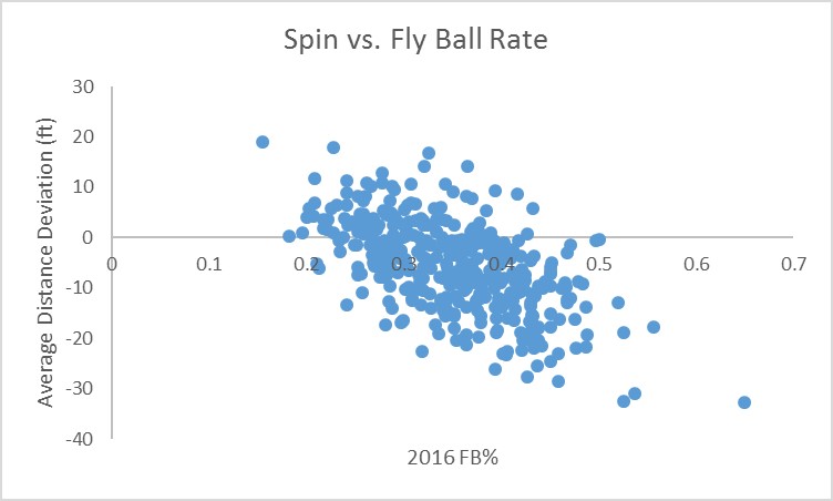
Kris Bryant, Miguel Sano, Ryan Schimpf: this list is full of extreme fly-ball hitters with an average of 24 home runs last year. The scatter plot below with a correlation of -0.58 shows the relationship between batting spin and fly-ball percentage for all players in 2016.

Mountain View

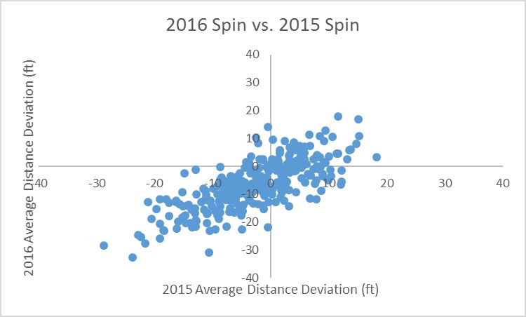
And this isn’t just a one-year phenomenon. I was relieved to find out that the correlation between 2016 average distance deviations and 2015 average distance deviations is 0.75. Players who hit balls with a lot of spin in 2015 overwhelmingly did so again in 2016. Again, the plot below shows the strong relationship.

Mountain View

Mechanically, this is not such a surprising result. Players with a more dramatic uppercut swing (like a tennis swing) will impart more top spin onto the ball while the opposite should be true for players with a more level swing.

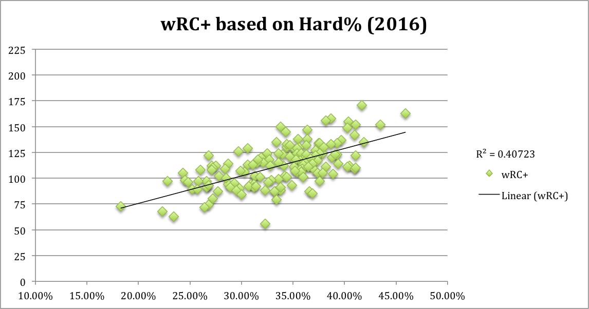
It remains to be seen whether this knowledge is useful in any way or if it falls more into the “interesting but mostly irrelevant” category of FanGraphs articles. There is essentially no relationship between a player’s average distance deviation and his wRC+ (correlation = -0.13), so we cannot say that spinning the ball more or in either direction leads to better results. And I imagine it is difficult to alter one’s swing to decrease top-spin while still trying to hit fly balls. At best, maybe this is a cautionary tale for players who want to be more hip and trendy and hit more fly balls like James McCann (FB% = 0.41), but don’t have the raw power to absorb a loss of 28 feet per fly ball (HR = 12, wRC+ = 66).

Let me know what you think in the comments.


The Value of Hitting the Ball Hard

There is value in the fly ball. That statement isn’t something that will surprise any fan. Even someone who knows very little about baseball could piece together the logic behind it. The most valuable individual outcome is a home run. How do you hit a home run? Hit a fly ball. As Travis Sawchik found for 2016, fly balls produced a wRC+ of 139, while ground balls put up a mark of 27 wRC+.

Of course, the sabermetrically inclined will quickly point out that it’s not that simple. Judging the value of a hit based on whether it is a fly ball or a ground ball is a futile exercise. You have to consider batted ball distance, launch angle, and exit velocity. Much has been made about the recent “fly ball revolution” occurring throughout the league. And while some believe hitting more fly balls really does increase the value of a player, data suggests that the fly ball revolution is hurting as many batters as it’s helped.

It’s possible that there are benefits to hitting more fly balls, but that doesn’t seem to correlate to an increased value.

2LMPbub.0.png

There really is no correlation between fly ball % and wRC+. So, it seems that value is added not by hitting the ball higher, but by hitting the ball harder.

Ll87TiG.0.png

Now this is a pretty clear correlation. Hit the ball harder and a better outcome is more likely. A soft liner toward the second baseman will probably be an out. But, a laser to right-center field could be a triple.

This trend is not a new development or a new discovery. As far back as 2002, when batted-ball data became available, there has always been a positive correlation between Hard% and wRC+. In fact, the average correlation (R-squared value) between these two variables over the last 15 years is .475.

Hard% also has predictive value. Take a look at the data for 2017 thus far.

yKhUSON.0.png

Although the correlation from past years isn’t there, it doesn’t need to be. We should no more expect the data to already have an R-squared value above .4 than we would expect an MVP to have a WAR higher than 6 at this point of the season. Because there are quite a few outliers that will come back to the mean, Hard%, based on its historical data, has considerable predictive value.

Ignoring the one point above the 200 wRC+ line (Mike Trout, whose entire career is an outlier), let’s examine a couple outliers. First, the point on the far right toward the bottom. Nick Castellanos is hitting the ball harder than Aaron Judge, who just set a Statcast record for hardest home run ever hit, but only has a wRC+ of 82 — well below average. Towards the top of the chart at the 175 wRC+ mark, we see that Zack Cozart is making hard contact only 32% of the time.

It is reasonable to expect, based on this chart, that Castellanos’s numbers will start to improve and Cozart’s will regress. As it turns out, Andrew Perpetua found the same outliers by looking at exit velocity and xOBA in a RotoGraphs article last week. These statistics all point toward the same thing — Castellanos has been very unlucky and Cozart has been just the opposite. The takeaway here is that Hard% can be used as a predictor for value even over a smaller sample size.

If Hard% is such a good indicator of success, what is the actual value of hitting the ball hard? Hitting the ball hard has been a hallmark of both HR leaders and batting champions. Over the last five years, the HR champion has an average Hard% of 40.12 and the batting champion has one of 35.16%. Although the almost five-point spread is a lot, a Hard% above 35% is nothing to laugh at — it’s still in the upper half of all players.

For the last full season (2016), increasing Hard% by even just 5% added 13 points to the wRC+ value. That is pretty significant. For context, 13 wRC+ is the difference between Aaron Judge and Yonder Alonso so far this year. But has it always been this way? Not exactly. In 2002, a 5% increase in Hard% increased a player’s wRC+ by 20 points. This points toward an interesting trend.

J3hjnZi.0.png

For the last 15 years, the correlation between Hard% and wRC+ has decreased. In other words, hitting the ball hard is not as valuable as it once was. My initial thought was that players aren’t hitting as many HRs as they did in 2002. But that is simply not true. 14.2% of flies result in HRs — the highest rate ever recorded. Perhaps this trend is a result of defenses shifting. Are batters hitting the ball harder than ever, but fielders are now better positioned? The shift is certainly a powerful tool — it kept Ryan Howard out of the Hall of Fame. Still, I’m not convinced the shift is solely responsible for this eerie trend.

Hitting a ball hard is much more important than hitting it high, that is, if you can’t have it both ways. However, the value of hitting the ball hard has decreased for more than a decade. Looking at the data, is it possible that in 10 years we’ll see a sort of “v” shape, indicating a return to the value of hitting the ball hard? Maybe. But for now, this is an interesting trend with no clear indicator.


Mechanics of the Shift

Earlier this week, 538 put out an article on Ryan Howard, arguing the shift had killed his career…

Rather than the fact he was 37 years old and could not hit or field.

The article paints a picture of a stubborn player who refused to adapt when the league had figured him out:

While some hitters try to overcome the shift with well-timed bunts or tactical changes, Howard always stubbornly refused. “All you can do is continue to swing,” Howard said in a 2015 interview with MLB.com.

Howard’s stubbornness is contrasted with a link to an ESPN article about how a similar slugger (David Ortiz) learned to adjust, and imagines an alternate shift-free universe where Howard remains an MVP threat and HoF material.

This is crap.

Ortiz did not “figure out” the shift. He is a good hitter, who ran a 13% strikeout rate last year. Howard’s is over 28% for his career. I’m sure that the shift hurt him to some extent, but Ortiz and him both had BABIPs around .300 for their careers. He could make that work when he was hammering 40-plus homers, but take that away and there’s not much left. My guess, old age is what did him in. But this lead me to wonder, how does the shift actually work?

Many people treat the shift like some mystic boogeyman, out there to either ruin the game, or certain players in particular unless they “adjust.” As a Twins fan, I know many people who blame Joe Mauer’s decline on the shift.

Personally, I would like to just throw this chart out there:

Groundball BABIP
2017 0.240
2016 0.239
2015 0.236
2014 0.239
2013 0.232
2012 0.234
2011 0.231
2010 0.234
2009 0.232
2008 0.237
2007 0.239
2006 0.236
2005 0.233
2004 0.235
2003 0.215
2002 0.224
Average 0.234

This is the MLB BABIP on groundballs over the last 16 years. Notice how it didn’t go down at all. I don’t have the numbers to prove it, but I think we all know shift usage has exploded since 2002. Not a huge change in ground-ball outcomes. So where has it changed the game? A decline in line-drive BABIP over time. However, counteracting that’s the fact that fly-ball BABIP has gone up. Again, to the charts!

Season liner flyball
2017 0.675 0.126
2016 0.682 0.127
2015 0.678 0.129
2014 0.683 0.123
2013 0.683 0.149
2012 0.682 0.152
2011 0.695 0.143
2010 0.719 0.124
2009 0.722 0.138
2008 0.698 0.150
2007 0.732 0.129
2006 0.713 0.138
2005 0.700 0.126
2004 0.709 0.117
2003 0.743 0.095
2002 0.733 0.083
Average 0.703 0.128

I wondered if some “line drives” of the past were simply fly balls that landed for hits, while outs were labeled “flies.” I don’t actually know if that’s true, if the process where line drives/fly balls are defined has been altered, but I decided to take a look at combined “air-ball” BABIP to see if it has changed over time. So here is the BABIP on all non-ground balls:

2017 0.324
2016 0.335
2015 0.339
2014 0.335
2013 0.338
2012 0.339
2011 0.331
2010 0.332
2009 0.340
2008 0.339
2007 0.335
2006 0.343
2005 0.350
2004 0.332
2003 0.349
2002 0.330
Average 0.337

2017 is pretty clearly an outlier, but considering less than half the season’s in the books so far, and I have no idea how “air-ball” BABIP moves over the course of a season (more hits find grass when weather is warmer? no idea), I wouldn’t put too much stock in that just yet. Another option I had considered was that maybe the breakdown of line drives vs fly balls has changed over time. Since 2002, 36% of air balls have been line drives, and while some years are higher and some lower, there doesn’t seem to be any particular “trend” with respect to that number; the first eight years average 36% and the last eight have as well.

I know the shift has an impact on run scoring in aggregate. But in my opinion, skyrocketing strikeouts and the home-run explosion are the markers of the modern version of this nation’s pastime, not on which side of second base the shortstop stands.


Ichiro Might Have Been Able to Be a Power Hitter

Earlier this month, Eno Sarris posted an article called “Could Ichiro Have Been a Power Hitter?,” which began with a launch angle and exit velocity analysis of Ichiro himself, and developed into a wider examination which led to the interesting proposition that “players may have their own ideal launch angles based on where their own exit velocity peaks.”  In this article, I’ll look at a larger sample of players whose fly-ball rates increased from 2015 to 2016 and see if their peak exit velocity range changed or stayed constant.  First I’ll re-examine Elvis Andrus, then I’ll look at Jake Lamb, Xander Bogaerts and Salvador Perez.

Elvis Andrus

As mentioned by Eno, Andrus’ average launch angle went from 8.1 in 2015 to 8.6 in 2016, but his fly-ball rate actually decreased.  It seems like he started the change in 2015, but was only able to translate it into results (a 112 wRC+) in 2016.  Regardless, let’s look at the data again, and see what we can find.

Instead of just qualitatively looking at the distribution and giving an approximate range of maximum exit velocity, I split the data set into launch angle buckets, and found the bucket with the highest median exit velocity.  For example, if I set the bucket size at 5 degrees and applied it to Elvis Andrus in 2015, I got a range (-2°, 3°) (I’ll omit the degree symbol from now on).  If I set the size at 10 degrees, I got a range (-2, 8).  For the rest of the article, I’ll keep it set at a range of 5 degrees.

The peak range for Andrus’ 2016 was (-3, 2).

Using the method outlined, the peak range for 2015 was (-2, 3), and for 2016 it was (-3, 2), so Andrus’ peak exit velocity range did not change much from 2015 to 2016, just as Eno pointed out, and as we can see with the two years overlaid.

Jake Lamb

Comparing 2015 and 2016, Jake Lamb raised his average exit velocity from 89.7 to 91.3 MPH, and his fly-ball rate from 32.4% to 36.7%.  His adjustments were chronicled by August Fagerstrom during his breakout (http://www.fangraphs.com/blogs/jake-lambs-revamped-swing-made-him-an-all-star-snub/).

The peak 5 degree range for Jake Lamb’s 2015 was (3, 8).

The peak 5 degree range for Lamb’s 2016 was (15, 20)!

Unlike Andrus, Jake Lamb’s peak exit velocity range increased along with his launch angle distribution!  This seems to be the kind of effective swing change that players attempting to join the fly-ball revolution strive for.  Lamb managed to revamp his swing to not only elevate the ball more, but to hit the ball harder at high launch angles, and actually increase the angle at which he hit the ball the hardest.  However, as the next two cases show, this is far from a guaranteed outcome.

Salvador Perez

Perez’s peak 2015 range: (9, 14).

Perez’s peak 2016 range: (0, 5).

From 2015 to 2016, Perez increased his fly-ball rate from 37.4% to 47.1%, and increased his average exit velocity from 87.3 to 88.8 miles per hour.  He also increased his average launch angle from 13.7° to 19.1°.  But curiously, his peak exit velocity range actually went down from (9, 14) to (0, 5)!  When I saw this, I thought I’d have to change my methods, because it didn’t make sense to me at first.  But if you look at Perez’s exit velocity vs. launch angle graphs for 2015 and 2016, these ranges actually seem to qualitatively fit.  Somehow, the Royals backstop managed to hit the ball harder and higher, but become more effective at lower launch angles.  This could be a rising tide lifts all ships situation, whereby his swing adjustments let him hit tough low pitches hard at lower angles, or it could just be a sample size issue.  By splitting the data set into buckets, the sample size gets dangerously small, and prone to strange results.  But I think the results fit the picture, and either Sal Perez needed to hit more balls for us to get reliable results, or he just had a strange batted-ball distribution.  We have a similar, more extreme situation with Xander Bogaerts next.

Xander Bogaerts

Bogaerts’ peak 2015 range: (5, 10).

Bogaerts’ peak 2016 range: (-6, -1).

Bogaerts, like the other three players here, hit the ball harder in 2016 than in 2015.  He raised his fly-ball rate and his average launch angle, and was rewarded with a 113 wRC+, a slight improvement on his 109 wRC+ from 2015.  But his peak exit velocity range for 2016 was, like Perez, lower than in 2015.  Looking at his plots, it looks like he hit his ground balls harder in 2016, while not changing the exit velocity of his line drives and fly balls as significantly.  I’m not sure what else to say about Xander, other than that he’s kind of a weird player, as already noted by Dave Cameron (http://www.fangraphs.com/blogs/xander-bogaerts-is-a-very-weird-good-player/).

Summary

The following table summarizes the findings for each player.

Avg EV Fly Ball % Avg Launch Angle Peak EV range wRC+
2015 2016 2015 2016 2015 2016 2015 2016 2015 2016
Elvis Andrus 85.2 86.9 31.8% 28.5% 8.1 8.4 (-2, 3) (-3, 2) 78 112
Jake Lamb 89.7 91.3 32.4% 36.7% 11.4 10.4 (3, 8) (15, 20) 91 114
Salvador Perez 87.3 88.8 37.4% 47.1% 13.7 19.1 (9, 14) (0, 5) 86 88
Xander Bogaerts 87.6 88.8 25.8% 34.9% 6.6 11.3 (5, 10) (-6, -1) 109 113

It seems like Andrus improved by simply hitting the ball harder and staying within his peak exit velocity range of launch angles (which fits Eno’s hypothesis), whereas Jake Lamb improved by hitting the ball harder, raising his average launch angle, and shifting his peak exit velocity range (which runs contrary to Eno’s hypothesis).  Perez and Bogaerts didn’t really improve, and their Statcast data yielded some strange results, which suggests that this method is far from foolproof, and that there may have been better choices of players to investigate.

Many thanks to Eno for the inspiration for this article, and to Baseball Savant for all of the Statcast data.


Statistical Analysis of a Few College Hitters

As the 2017 MLB Draft quickly approaches, I thought it may be fun to analyze some of the best college hitters available.  On May 23, Eric Longenhagen released the 2017 Sortable Draft Board on FanGraphs.  This article looks at the statistics of each college hitter on the list.  In this article, I tried to not lean on literature and scouting reports of the players.  Rather, I decided to calculate some statistics to use as guides in building an outsider’s perspective of their offensive profiles.  This body of work does not include much information about attributes or skills not published on a school’s statistics page on their website.

Nobody real cares about the counting statistics of college players.  So, for my table of numbers to fit on a page, I left them out.  The statistics I focused on are a hitter’s slash line (AVG, OBP, and SLG), OPS, BABIP, ISO, RC, K% and BB%.  These are relatively easy to calculate and provide some sort of worth when evaluating prospects.  AVG, OBP, and SLG are simple and widely understood.  OPS provides a good gauge of a hitter’s overall offensive ability.  BABIP is an important indicator of a hitter’s talent at the plate, but can be inflated or deflated depending on the talent level of the different defenses faced by the hitter.  ISO is a good indicator of how well each hitter demonstrated their power and XBH ability.  Runs Created (RC) is a crude but effective measurement of total, individual offensive output.  K% and BB% give us some idea of how well the batter demonstrated their understanding of the strike zone and discipline at the plate.  For more information on each statistic, as well as how to apply it, I suggest checking out the Glossary tab.

Below is the table of numbers I made.  Even further below is where you will find a quick summation of each hitter discussed.

Name

AVG OBP SLG OPS BABIP ISO RC K%

BB%

Jeren Kendall

.306 .379 .570 .949 .333 .264 50.31 18.9%

20.8%

Adam Haseley

.400 .498 .688 1.186 .393 .288 70.21 7.7%

38.8%

Keston Hiura

.419 .556 .672 1.228 .486 .253 67.80 14.5%

40.3%

Pavin Smith

.348 .433 .581 1.013 .311 .233 53.78 3.2%

42.7%

Logan Warmoth

.336 .410 .562 .972 .374 .226 53.10 15.3%

20.8%

Jake Burger

.343 .459 .686 1.145 .319 .343 63.50 12.0%

35.1%

Evan White

.380 .454 .654 1.108 .414 .274 51.08 13.5%

17.3%

Brian Miller

.336

.412 .504 .917 .365 .168 49.78 11.7%

28.1%


Jeren Kendall (#9 on FanGraphs Sortable Draft Board)

Vanderbilt                   OF                   (B- L/ T- R)

Jeren Kendall is considered by many to be the best college hitter, outside of Louisville two-way player Brendan McKay.  Kendall showed some impressive pop out of center field this past year, knocking 15 balls over the fence in 235 at bats.  However, he also managed to record 50 strikeouts.  Kendall did manage to produce an excellent walk rate and ISO, but his total output was “middle of the pack” as far as the guys on this list go.  He should go off the board within the first 20 picks this upcoming draft.

Adam Haseley (#15 on FanGraphs Sortable Draft Board)

Virginia                       OF                   (L/L)

Hitting from the left side of the plate, Virginia outfielder Adam Haseley managed to put up the best statistical profile of any hitter on this list.  He comes into June’s draft with an impressive OPS (1.186) and an even more entertaining strikeout rate — a board-best 7.7% (only 19 punch outs in 205 ABs).  While Haseley’s power numbers may not translate at the next level, his affinity for driving the ball into deeper parts of the ballpark should make for a high doubles count at the next level.

Keston Hiura (#17 on FanGraphs Sortable Draft Board)

UC Irvine                     2B                    (R/R)

While Keston Hiura’s .486 BABIP may be a good indicator as to why his batting average is north of .400, it is also a good indicator of just how good he is with a bat in his hand.  He did not just hit singles — his 21 doubles come in second on the list.  He displayed an excellent walk rate, which contributed to the highest on base percentage on the shortlist.  While some teams may elect to take a prep shortstop over a college second baseman, Hiura still plays a premium position with solid presence at the plate and would fit in nicely in any class as a second to third-round pick.

Pavin Smith (#18 on FanGraphs Sortable Draft Board)

Virginia                       1B                    (L/L)

The second UVA Cavalier on our list slashed an impressive .348/.433/.581 this past season, and posted an impressive 3.2% strikeout rate.  While his numbers do not match those of his teammate Adam Haseley, Pavin Smith could very well be the first college first baseman off the board, assuming you do not count Brendan McKay as a first baseman.  His demonstrated knowledge of the strike zone, coupled with a list-best walk rate, are both very good indicators of a first baseman with a high ceiling.

Logan Warmoth (#20 on FanGraphs Sortable Draft Board)

North Carolina            SS                    (R/R)

Tar Heel shortstop Logan Warmoth, when compared to the rest of this list, does not really stand out.  However, he should be taken early, as he still has the best odds of being the first college shortstop off the board.  He hit well in the ACC this past season, compiling 18 doubles, 4 triples, and 9 home runs.  Though his demonstrated power will likely not follow him up the minors, any team would love to have a strong bat such as his at the most premium of all premium positions.

Jake Burger (#22 on FanGraphs Sortable Draft Board)

Missouri State            3B                    (R/R)

Our only hot corner prospect on the list is a power threat through and through, according to his numbers.  While his average will continually drop as he climbs the minors, Burger’s 20 homers showcased his raw power.  Although there may be some questions about his tendency to punch out, plus power paired with an excellent walk rate at a corner position are a recipe for success.  Everybody loves a little yak sauce on their Burger every now and then.

Evan White (#29 on FanGraphs Sortable Draft Board)

Kentucky                      1B                    (R/L)

A first baseman who hits from the right side is very common.  A First Baseman who hits from the right side but throws left is very uncommon.  A first baseman who hits from the right side but throws left with plus speed is downright unique.   Evan White legged out a list leading 23 doubles this past year, and posted all-around great offensive numbers.  He will be a very interesting draft choice, and his excellent statistics project a demonstrate a solid offensive background.

Brian Miller (#49 on FanGraphs Sortable Draft Board)

North Carolina            OF                   (L/R)

Rounding out our list is North Carolina outfielder Brian Miller.  Miller slashed a very impressive .336/.412/.504 line this past year, and should be a good mid-grade prospect in the upcoming draft.  His statistics do not lean to one type of offensive profile over another, but his high BABIP and excellent walk rate generate some reasons to believe his bat will continue to develop at the next level.

Again, this article is meant to simply provide a statistical overview of a few college prospects in the upcoming draft.  It should be looked at as a tool for anybody who cares enough to concern themselves with college statistics.


Theodore Hooper is an undergraduate student at the University of Tennessee in Knoxville.  He can be found on LinkedIn at https://www.linkedin.com/in/theodore-hooper/ or on Twitter at @_superhooper_


Fastball Confidence a Focal Point for Harvey

To express the extent of a player’s confidence is difficult, and using numbers to back up this assertion is even harder. When a player lacks confidence, it can be seen through a slew of on-field mannerisms that don’t always present themselves inside statistics. Instead, the numbers tell us the story of a pitcher, once of dominant form, who is struggling to get outs and display any sort of consistent performance. The statistics paint this picture about Matt Harvey. They tell us a tale of dominance, hindered and erased by injury and ineffectiveness. Although this story is told, it seems to be far from the truth. I believe in an alternate story. A story that displays a human being struggling with the confidence to throw his pitches and retire hitters. A lack of confidence stemming from a large set of off-field hindrances and a set of recent on-field struggles. A problem that will be moved past and put behind in the months to come, making it only a distant memory to both Matt and Met fans.

If we rewind back to September of 2015, we can see that Harvey is no stranger to hardships or headlines. After Tommy John surgery following his stellar 2013 campaign, he seemed back to form throughout 2015, culminating in an impeccable playoff start against the Cubs and a World Series game 1 nod. Throughout the season, questions about Harvey’s innings limit hovered around the Mets clubhouse, reaching its climax in early September. After a start against the Philadelphia Phillies where Harvey exited early due to dehydration, agent Scott Boras spoke about the doctor’s indication that Matt should not exceed 180 innings pitched that season. With Matt already at 166 1/3 innings, it seemed like the Mets organization was directly ignoring these suggestions.

This back and forth between the front office and Boras propelled Matt into the spotlight preceding his next start against Washington, who had become their rival in the midst of a pennant race. He pitched poorly, to the tune of 7 R (4 ER) in only 5 1/3 innings. This tough outing doesn’t hold a torch to his current struggles, but the difference in approach between this start and his recent starts form an interesting comparison.

Throughout this start in particular, and the entirety of the 2015 season, Matt Harvey was unafraid to throw his fastball to any hitter. He challenged hitters like Bryce Harper, in the midst of an MVP season, with fastball after fastball. In Harvey’s most recent start, he wouldn’t even challenge Manuel Margot with the same. Of his 74 pitches in that 2015 start, he threw 51 fastballs 95 and above, constantly pounding the zone. In his most recent start, Harvey nibbled around corners, he never challenged hitters, and he relied on his breaking ball (usually out of the zone) even when behind in the count. This tendency showed a lack of confidence to throw his fastball and challenge hitters, something that Harvey needs desperately to be successful. Overall, the dichotomy in approach between 2015 and 2017 for Matt is striking. Here are some of the numbers based on his position in the count:

2015, 2017
AHEAD
CU, CH: 22.3%, 19.7%
SL: 15.5%, 23.4%
FA, FT: 62.2%, 56.9%
BEHIND
CU, CH: 19.0%, 25.3%
SL: 16.5%, 21.7%
FA, FT: 64.6%, 53.0%
TOTALS
AHEAD% 32.6%, 20.8%
BEHIND% 20.8%, 25.9%

In 2015, when ahead in the count, Matt threw 62.2% fastballs. When behind, he threw even more, to the tune of 64.6% of the time. Because of his ability to pound the zone with his fastball, he spent 32.6% of his time ahead in the count while only 20.7% behind. This allowed him to control the pace of the at-bat and the expectations of the hitter. When he wanted to break off a curveball or a slider it became much more effective in relationship to his established fastball.

So far in 2017, he’s been unable to get ahead in the count or develop any rhythm with the pitch. His inability to challenge hitters has left him nibbling around the plate, leaving him ahead in the count only 20.7% of the time. This problem grows when behind in the count, as Harvey continues to throw off-speed pitches 47% of the time. His inability to command these pitches leads to even worse counts, and compounds the problem. Throughout his most recent start again San Diego, Harvey continued to nibble around the corners of the zone, seemingly afraid to challenge hitters with his fastball or throw off-speed pitches consistently in the zone.

This tendency, pointed out by Ron Darling during the SNY Broadcast, can be evidenced by his complete change in pitch usage as shown above. Although diminishing fastball usage is occurring league round, Harvey has to use his fastball more consistently to be more effective this season. By establishing his fastball early, he can play off of it, creating more effective offspeed pitches as well as more powerful fastballs. To be a Cy Young caliber pitcher, you have to trust your stuff and believe in your ability to dominate. As of now, Matt doesn’t believe in either.


Is the Lead-off Revolution a Bust?

2017 has been full of surprises so far. The Cubs were supposed to run away with the NL Central, but are struggling to stay above .500. The Backstreet Boys were supposed to drop an album sometime this year, but it’s May and we’ve heard squat from Nick Carter. And most intriguingly, this was the year we were supposed to see a radical change in who batted lead-off — but not much has changed.

Journalists were forecasting 2017 as the year of the slugging-lead-off hitter. Zach Kram of The Ringer boldly proclaimed “The Batting Order Revolution Will Be Televised” in explaining how more and more managers are batting sluggers, bonafide power bats like Kyle Schwarber and Carlos Santana, lead-off. This season seemed poised to be the year that we saw managers reaping the benefits of giving their best hitters more at-bats.

The folks over at The Ringer weren’t the only ones — 538, Fox Sports, and ESPN have all described the coming revolution. But there’s one small problem — the revolution isn’t having that big of an impact so far.

Okay, sure — lead-off hitters have, technically, hit for more power than they have in years past. League-wide, we have seen ISO for lead-off hitters in the past few years jump up faster than Bartolo Colon when he hears the words “unlimited buffet.”

MLB Leadoff Hitters ISO per year 2002-2017

What could be to blame for such a power surge from the leadoff spot? Hint: it has a lot less to do with the fact that managers are batting their sluggers in the lead-off position than you’d think.

Remember the league-wide power surge that the MLB encountered last season? Power across the league skyrocketed — curiously enough, in the exact same manner in which lead-off hitters’ power skyrocketed.

MLB Lead-off Hitters' ISO v. MLB ISO

While there are some variations from 2002-2013, the recent power spike from lead-off hitters is almost entirely explained by the league-wide power spike. In fact, if we look at lead-off hitters’ ISO relative to league ISO, we find that lead-off hitters are hitting for less power than they did in 2016.

Lead-off hitters' ISO as a % of MLB ISO

This is not to say that there has been no power surge among lead-off hitters — as you can see above, adjusted ISO in the lead-off spot has risen steadily since 2012. Perhaps that is the result of batting sluggers as lead-off hitters. But the leaps and bounds in production from the lead-off spot as predicted above simply haven’t come to fruition. These lead-off hitters are power-surge imposters! It looks like they’re maintaining the same power from last year, when relative to the league, they’ve actually lost power.

The narrative of the power-hitting lead-off batter taking the MLB by storm seems legitimate on the surface, in no small part thanks to Michael Conforto‘s renaissance as a top-five hitter while starting off games, or Charlie Blackmon’s position atop the RBI leaderboards despite spending his season in the lead-off spot — and indeed, these players are providing additional value by leading off.

But these are only individual cases. The “lead-off hitter revolution” isn’t having as much of an impact league-wide as the revolutionaries might like to think — after all, Dee Gordon and Billy Hamilton still occupy lead-off slots with their .066 and .084 ISOs respectively, nevermind the fact that the poster-child of the revolution, Schwarber, is making up for the sophomore slump that he missed by being injured for all of 2016.

Lead-off hitters are technically hitting for more power, but so is everyone else. Blaming the huge spike in power in the lead-off spot on managers batting hitters lead-off is to ignore significant league-wide trends, and miss the big picture. Maybe there is a small impact caused by the new lead-off philosophy, but it certainly is not bringing unheralded power and production to the lead-off slot. The revolution might not be a bust (yet), but it still has long ways to go in order to make an impact.


Is Launch Angle Having a Contact Cost?

This is for now the final article of my launch angle series (Sorry Carson, or whoever edits all those articles).

Alan Nathan wrote an article that suggested that a steeper attack angle (upward swing angle of the bat) produces more extra-base hits but has a cost in power.

That makes sense since the average pitch only has a downward angle of like 5-10 degrees and if you swing up at 20 degrees you are on plane with the pitch for a shorter time.

Unfortunately, we don’t have attack angles for pro players in games, because there are cheap bat sensors that measure that now but they have only been used in ST and futures games (suggesting attack angles of like 8-15 in most cases I have seen), but I will assume that the average exit angle over a long sample should be pretty similar to the attack angle, or at least correlate closely.

For that, like in my last post, I looked at guys that had at least 500 ABs in 2015-2016.

I looked at LAs of <7, 7-9, 9-11, 11-13, 13-15, 15-17 and >17 degrees.

LA <7  7-9 9-11 11-13 13-15 15-17 >17
K% 18.2 18.2 20.7 19.7 20.3 19.3 20.7

I did not really find very big differences. Below 9 degrees it was about 2 percent lower than at the higher angles, but after that there isn’t a big change. Even looking at the small sample above 19 degrees, it was only elevated to 21.6%, which is higher but not spectacular (and it was a small sample of only seven batters).

To look further I looked at exit velo. If I looked at the batters above 91 mph they averaged 23% Ks, vs 19.1% for the below-91 group.

So there may be some penalty for swinging hard, but there also might be a selection bias, since low-power swing-and-miss guys are weeded out while power hitters with bad contact skills produce more and stay in the league longer.

Overall, looking at those data, I would say that contact is mostly a skill that is separate from launch angle. In my prior articles I have shown that there is a punishment for  angles that are too high, but it seems to come more in the form of pop-ups and routine fly outs and thus lower BABIP, and not in the form of whiffs. Now we know there are some high-LA, high-whiff guys like Chris Davis for example, and those guys do trade BABIP for ISO with higher LAs to get the most out of their contact, but the more extreme uppercut likely isn’t the source of their whiffs but an attempt to compensate for them by trying to strengthen their strength while “punting” their weakness.


How Important Is Exit Velocity for the Optimum Launch Angle?

I looked at the Statcast leaderboard from 2015 to early 2017 and sorted for below-average (88 MPH) and above-average exit velo for batters who had at least 500 ABs in these two and something years as an arbitrary cutoff.

The Top 15 in wOBA above with an EV of above 88 MPH averaged a wOBA of .402 while the top 15 below 88 MPH averaged .351. As expected, the higher EV Group has a higher wOBA than the lower group.

The average LA for the harder-hitting group was 14.16 +- 2.5 while the LA for the softer-hitting group was 11.75+- 4.3. It seems like the softer group does better at a lower LA and there also is a greater variance for different LAs.

I also looked at the worst hitters of each group. The bottom 20 in the soft-hitting group came in at 10.15 degrees +- 4.2.

In the hard-hitting group, the worst wOBA hitters averaged 11.15 degrees +- 3.8.

So there seems to be some relationship of LA in the harder-hitting group, while it doesn’t matter much for the below-average group.

Now, if we expand it to 90+ MPH you get an average angle of 13.43 +- 2.9 for the good wOBA group and 12.26 +- 3.7 for the lower level group.

So the conclusion seems to be that harder hitters benefit more from increasing the LA while for the soft hitters it doesn’t seem to make a difference. Of course, I did not factor in Ks and BB in my calculations (I unfortunately had no access to wOBA/con in the leaderboard) and that is probably a big influence.

Overall, when I did a correlation test of wOBA and LA, I didn’t really find anything significant for both groups.

Where it got interesting was when we got into more extreme launch angles. The top 15 wOBA below 9 degrees was .328 (-23 points compared to the best soft hitters) while for the harder hitters the average was .358 (-44 compared to the best hard hitters).

At 7 degrees, the performance of the hard hitters was .340 (- 62 and the first time it was worse than the best soft hitters) while for the best soft hitters below 7 degrees the average was .320 (-27) and only marginally worse than minus 9.

Looking at the other end, the top hitters above 15 degrees had a wOBA of .376 (-26 compared to all LA) — maybe this is due to sacrificing contact for more lift?

And finally, in the softer-hitting group, there were only 12 guys with a LA above 15 degrees, and their wOBA was .314 (-37).

Overall, it seems like LA only has an effect if you get farther away from the average (around 11-12 degrees). Harder hitters can benefit from going higher, while for soft hitters it doesn’t matter much, as long as they stay somewhere near the vicinity of average.

The guys who really benefit from a LA change are the really hard hitters with really low angles.


A Model of Streakiness Using Markov Chains

In the modern MLB, the record for the longest losing streak sits at 23 games, set by the 1961 Philadelphia Phillies, while the longest winning streak sits at 21 games, set by the 1935 Chicago Cubs.  In recent memory, the 2002 Oakland Athletics come to mind, with their Moneyball-spurred 20-gamer, taking them from 68-51 to 88-51 and first in their division.  Winning streaks captivate a fan base, and attract league-wide attention, but little is understood about their nature.  How much luck is involved?  Are certain teams or players more inclined to be streaky?  Are teams really more likely to win their next game if they’ve already won a few in a row?  In this piece, I’ll outline a simple model for what legitimate team-level streakiness might look like, and see if any interesting behaviour arises.  I was able to do this after reading the section on Markov Chains in Linear Algebra by Friedberg, Insel and Spence.

The Model

This model only requires two inputs: the probability of a team winning a game given that they won the previous game (hereafter P(W|W)), and the probability of a team losing a game given that they lost the previous game (hereafter P(L|L)).  Admittedly, this assumes ballplayers have very short memories, but.  The first thing we need to generate is what’s called a transition matrix:

The first row contains the probabilities that a team will win a game based on what happened in the previous game, and the second row contains the probabilities of losing.  Notice that the entries of each column sum to 1, so we can rewrite this as

Without going into too much detail, all we need to do is multiply matrix A with itself a lot, and find the limit as we do this infinitely many times.  This will give us another matrix which will contain two identical columns, each of which will correspond to the long-term probabilities of winning given a team’s P(W|W) and P(L|L) values.

For example, if our team has P(W|W) = 0.6 and P(L|L) = 0.5, we’ll have
,
and the limit of Am as m goes to infinity is
.
So our long-term probability of winning will be around 0.56.  Over the course of a full season, then, this team would expect to win around 90 games.

Now we can examine various cases.  It may not be surprising to find that if we have P(W|W) + P(W|L)  = 1, we’ll have a long-term probability P(W) = P(L) = 0.5.  That is, no matter how streaky a team is, if their probabilities of winning after a win and after a loss sum to 1, their expected win total over a 162-game season is 81.  But what if we look at a given long-term probability P(W), and see what conditional probabilities P(W|W) and P(L|L) give us P(W)?  In the table below, pay special attention to the boxes with P(W) values of 0.5, 0.667 (our incredible team) and 0.333 (our really really bad team).

P(L|L)\P(W|W) 0 0.1 0.2 0.3 0.4 0.5 0.6 0.7 0.8 0.9
0 0.500 0.526 0.556 0.588 0.625 0.667 0.714 0.769 0.833 0.909
0.1 0.474 0.500 0.529 0.562 0.600 0.750 0.818 0.900
0.2 0.444 0.471 0.500 0.533 0.571 0.615 0.667 0.727 0.800 0.889
0.3 0.412 0.438 0.467 0.500 0.538 0.583 0.636 0.700 0.778 0.875
0.4 0.375 0.400 0.429 0.500 0.600 0.667 0.750 0.857
0.5 0.333 0.357 0.385 0.417 0.455 0.500 0.556 0.625 0.714 0.833
0.6 0.286 0.308 0.333 0.364 0.400 0.444 0.500 0.571 0.667 0.800
0.7 0.231 0.250 0.273 0.300 0.333 0.375 0.429 0.500 0.600 0.750
0.8 0.167 0.182 0.200 0.222 0.250 0.286 0.333 0.400 0.500 0.667
0.9 0.091 0.100 0.111 0.125 0.143 0.167 0.200 0.250 0.333 0.500

(Pardon the gaps in the table — my code had a bug that made it output zeros for those parameters, and I didn’t feel like the specific numbers were integral to this article so I didn’t calculate them manually.)

For P(W) = 0.5, we notice a straight line down the diagonal – which makes sense, given that we know P(W|W) + P(W|L) = 1 for these entries.  For P(W) = 0.667 and P(W) = 0.333, we have the following pairs of P(W|W) and P(L|L):

P(W) = 0.667 — (P(W|W), P(L|L)) = (0.5, 0) or (0.6, 0.2) or (0.7, 0.4) or (0.8, 0.6) or (0.9, 0.8)

P(W) = 0.333 — (P(W|W), P(L|L)) = (0, 0.5) or (0.2, 0.6) or (0.4, 0.7) or (0.6, 0.8) or (0.8, 0.9)

So our two-thirds winning team could just never lose two games in a row and play at a .500 clip in games following a win.  Or they could lose a full 80% of their games after a loss, but be just a little bit better at 90% in games after they win!  How could a team that never loses two games in a row be the same as a team that is so prone to prolonged losing streaks?  It’s because we selected this team for its high winning percentage, so even though P(W|W) and P(W|L) actually sum to less in this case (1.1 instead of 1.5), the fact that this team wins more games than it loses means it’ll have more opportunities to go on winning streaks than losing streaks.

Likewise, our losing team could never win two games in a row but play at .500 in games following a loss, or they could be the streaky team who wins 80% of games following a win but loses 90% of games following a loss.

These scenarios are illustrated below.  The cyan dots correspond to the following pairs of points (P(L|L), P(W)) from top left in a clockwise direction: (0,0.667), (0.8, 0.667), (0.9, 0.333), (0.5, 0.333).  These are exactly the scenarios discussed above.


(Insert caption here)


These observations indicate a more general property, which will sound trivial once we put it in everyday baseball terms.  If your long-term P(W) is above 0.5, and you have to choose between two ways of improving your club – you can improve your performance after wins, or you can improve your performance after losses – you should choose to improve your performance after wins.  And if your long-term P(W) is below 0.5, you should choose to improve your performance after losses (up until you become an above-average team through your improvements, of course).  In other words, if you expect to win 90 games (and hence lose 72), you want to improve your performance in the 89 or 90 games following your wins rather than in the 71 or 72 games following losses.

Conclusions, Future Steps

I don’t have anything groundbreaking to say about this experiment.  It’s obviously an extremely simplified model of what real streakiness would look like – in the real world, the talent of your starting pitcher matters, your performance in more than just the immediately preceding game matters, as well as numerous other factors that I didn’t account for.  However, I feel comfortable making one tentative conclusion: that the importance of the ace of a playoff contender being a “streak stopper” (i.e. one who can stop losing streaks) may be overstated, simply because the marginal benefit from such a trait is smaller than the marginal benefit from being a “streak continuer.”  I have never heard of an ace referred to as a “streak continuer,” even though this model indicates that on a good team, this is more beneficial than being a “streak stopper”.

I don’t think it’s worth examining historical win-loss data to compare with this model, as this was not intended to be an accurate representation of what actually happens; rather more of a fun mathematical exploration of Markov chains applied to baseball.

Thank you for reading!  Questions, comments, and criticisms are welcome.