Archive for Research

Stealing Bases and Splitting the Rewards

The contextual revolution (don’t really know if that’s a thing, but it sounds official) emerged in the MLB the past few years, attempting to control for more situational effects than current sabermetric-driven baseball stats. These models build upon Bill James’s work, Tom Tango’s all-important linear weights, and similar metrics that account for league, park, and positional production.

Baseball Prospectus (BP) writers developed baseball statistics that further quantify performance using mixed models . You can find a good introduction to mixed models in this article written by Jonathan Judge, Harry Pavlidis and Dan Brooks of BP, but if you are familiar with linear or logistic regression, a mixed model attempts to estimate the average performance over the course of the season (fixed linear model) and use the residuals (or error) to simultaneously quantify the contributions of “random” participants in any given play. Now, why do I say random? It isn’t so much that these participants are random, but that the baseball players are always changing and the number of “random” interactions they have throughout a season is endless, while the effect of an 0-2 count on run production stays relatively consistent or fixed throughout a whole season.

Some existing baseball stats based on mixed models include:

  1. Called Strikes Above Average (CSAA) — defensive statistic that measures catcher framing skills controlling for the batter, pitcher, catcher, and umpire
  2. Swipe Rate Above Average (SRAA) — base running metric that attempts to quantify base stealing ability for batters, and stolen base prevention for pitchers and catchers
  3. Take Off Rate Above Average (TRAA) — player specific effects on base stealing attempts
  4. cFIP — a new version of Fielding Independent Pitching (FIP) taking into account many aspects of a plate appearance. Read more about it here.

By the title, you can probably guess this article is about stolen bases, and you are correct. Specifically, I will be discussing Swipe Rate Above Average, or SRAA for short. SRAA is derived from a mixed model that attempts to account for the inning, the stadium, the quality of the pitcher, and the pitcher, catcher, and lead runner involved. SRAA is directly derived from a player’s random effect and is a single number, generally ranging from -10% to 10%, describing the additional probability a player contributes to a successful steal. For example,  Mike Trout had a 4% SRAA in 2016. Given the average stolen-base situation, Trout is 4% more likely to successfully steal than the average baserunner in 2016.

While SRAA accounts for pitcher skill using cFIP (See above link for more information), the quality of a pitcher can’t necessarily control for all variation in a pitcher’s pitch sequence or the occasional mistake in the dirt. Pitches in the dirt, pitch-outs, off-speed, and fastballs are treated equally in SRAA. Consequently, SRAA values may be lacking for runners that disproportionately get thrown out on pitch-outs or for catchers that consistently block balls in the dirt while still throwing out the runner.

Let’s explore some evidence of these effects before we include them in the pitch adjusted (pSRAA) model. I started by subsetting Retrosheet play-by-play data from the 2016 season to only stolen-base attempts by lead runners. For example, events with a steal of second base with a man on third were not included. I only included situations where a pitch preceded a stolen-base attempt. I supplemented the play-by-play data with PITCHf/x data which tracks trajectories of every pitch in the MLB. I aligned the pitch data with each stolen base with minimal missing connections between the two data sets. Only three stolen bases did not have PITCHf/x data since there technically wasn’t a pitch that occurred (e.g., steal of third, then steal home on a passed ball). An additional eight did not have valid trajectory readings in PITCHf/x.  I ended up with 2,809 total attempts. Excluding some of these stolen bases means, for those who are familiar with SRAA, my SRAA numbers will not match up directly with BP’s numbers.

I first examined pitch speed and its effects on stolen-base percentage. It’s no surprise that, in 2016, runners succeeded more often on slower pitches.

Notice a slightly higher success rate for pitch speeds that fall above 95 mph. This phenomenon is not unique to 2016, and Jeff Sullivan hypothesized that good base-stealers are the ones stealing against fireballers. Indeed, while only 8% of stolen bases occur during a pitch that is 95 mph or higher, speedsters Billy Hamilton and Starling Marte attempted over 12% of their stolen bases in these situations. These situations tend to arise later (about one inning later on average) in closer games (stealing team is only .39 runs ahead rather than .46 runs ahead on average), meaning base-stealers ought to be more certain of success before attempting to steal.

In addition to pitch speed, we also have access to pitch location data through PITCHf/x. As you can see in the figure below, the SB probability varies more drastically by location, and therefore, is the most meaningful of the two pitch metrics. The results below mirror the results I would expect. High SB probability along the right side of the plate for left-handed hitters confirms that most catchers (if not all) are right-handed, which makes it hard to throw over left-handed hitters. Similarly, catchers have more success with right-handed hitters and pitches closer to their throwing shoulder. And finally, the most obvious of all: It’s hard to throw a runner out when the ball hits the ground.

I also included the PITCHf/x pitch descriptions since they help improve the model slightly. Some descriptions occurred only a few times, so I combined them into larger categories:

  • Dirt: Ball in Dirt, Swinging Strike (Blocked)
  • Pitch-out: Pitch-out, Swinging Pitch-out
  • Strike/Ball: Ball, Called Strike,
  • Swinging Strike: Foul Tip, Missed Bunt, Swinging Strike

Below is a table detailing the SB success rates in each of the four groups. Dirt and Pitch-out are the most extreme categories, with “normal” pitches falling in-between. Something that jumped out at me was the lower success rate on swinging strikes, as I would expect this to distract the catcher. Two explanations I can come up with are: 1) catchers tend to hold the no-swing pitches a split second longer to get the call from the ump, or 2) swinging pitches occur during a hit and run play where runners tend to be less skilled at stealing bases.

Controlling for the lead runner’s base is the last addition I made to the original SRAA model. Adding this effect improved the model (AIC to be specific), indicating runners stealing third were more likely on average to be successful than runners attempting to steal second and especially home. A likely explanation is that runners stealing third need to be more confident in their ability to steal in the current situation and have a right-handed hitter obstructing the catchers throw about 65% of the time.

So now that we have this new metric pSRAA, lets take a look at how it deviates from SRAA. As you can see in the figure below, the distribution of both metrics are fairly similar.

pSRAA has a slightly tighter distribution for pitchers and runners, meaning pSRAA has absorbed some of the expected SB probability in these new variables and pushed pitcher and runner SB skills closer to the mean. This phenomenon occurs most likely because the variables we are trying to control for are largely out of control for these players and are not rectifiable or exploitable. By that, I mean pitchers can’t control whether the one pitch they throw in the dirt happens to coincide with a runner taking off, but catchers can use this event to prove their skill. While a pitcher “loses control” of the SB situation when the ball is released, a catcher can make a brilliant play, saving a potential wild pitch and converting it into an out. Thus, we see a wider variation in pSRAA for catchers, as pSRAA identifies the increasingly elite talent and the replacement players that struggle to nab runners on pitch-outs.

Examining how players’ metrics improved or worsened after controlling for these additional effects reveals some drastic changes, but mostly small adjustments. The figure below illustrates the change from the old metric to the new metric. The closer a player is to the dotted line (pSRAA = SRAA), the less that player deviated from the original SRAA measure. If a player ends up above this line, it means that pSRAA is higher than SRAA, so when controlling for pitches, pSRAA attributes more success (for runners — less success for pitchers and catchers) to their ability rather than luck.

How does this new pSRAA model help us as baseball fans or analysts? pSRAA can identify where SRAA was under or overvaluing players’ skills. For example, SRAA undervalues catcher Chris Iannetta at a 0.86% SRAA when pSRAA pegs him at whopping -4.19% (negative is good for catchers)!  In other words, Iannetta jumps from the 43rd percentile of catchers to the 70th percentile!

To give you an idea of the kind of adjustments pSRAA makes, here is a sample stolen-base attempt against Iannetta (video has no sound for those of you who are watching at work; for sound go to 1:51:40 here), specifically a SB attempt that the model predicts will happen 85.5% of the time. Actually, it is more like 88.4% if you account for the runner, Lorenzo Cain, the 15th-fastest baseball player according to Statcast’s speed measure.

Now let’s just freeze that frame. The ball is almost on the ground, and not to mention, only thrown at 80 mph, giving Cain almost an extra tenth of a second to get to second base. Regardless, Iannetta guns him out with an impeccable throw.

Not only can we use pSRAA to uncover insights such as above, but we can also abuse pSRAA to easily find awesome plays like this top 5 play. J.T. Realmuto, known for his unbelievable pop time, throws out Ben Revere on this gem of a play. The pSRAA model gives Realmuto a 10% chance of throwing out Ben Revere, but Realmuto pops up in a staggering 1.78 seconds (via Statcast) and throws a perfect 85mph toss to second.

Or this scenario, which had a 92% stolen-base probability. A.J. Pierzynski picks a throw off the ground, then navigates around Brandon Phillips to beat Suarez by a mile.

And finally, here is an example of a successful stolen base the model predicts will happen 15% of the time — not a surprise when you see where the pitch is thrown (actually 43% when you account for the speedy Rajai Davis and the way below average Kurt Suzuki).

pSRAA does well for these purposes, but may not illustrate the total value a player adds to his team’s success. A runner with a high pSRAA value with only a couple stolen-base attempts hasn’t added much value to his team since he didn’t utilize his skill often enough. We can leverage pSRAA and stolen base/caught stealing (CS) run values to come up with a more useful metric, which I have aptly named Pitch Adjusted Swipe Rate Runs Above Average (pSRrAA) —a mouthful, I know. I based pSRrAA upon linear-weights metrics like FanGraphs’ Weighted Stolen Base Runs (wSB). The term linear weights, often used in the world of baseball statistics, translates to the average run value of a certain action and its effect on run scoring over the course of an inning. For example, let’s say there is a man on first base with no outs. The average number of runs scored in an inning in 2016 starting with this exact situation is 0.8744 runs. He gets caught stealing, and now the situation is nobody on and 1 out. Starting in this situation, the run expectancy drops to 0.2737. Thus, the value of this specific play was about -0.6 runs. Examining these situations over the course of the whole season leaves us with average run values that we can assign to SB and CS. Combining the run values for SB (runSB = .2 runs) and CS (runCS = -.41 runs) produced by FanGraphs for the 2016 season, we can use pSRAA to attribute the run values more accurately:

pSRrAA = pSRRA x (runSB-runCS) x Attempts

This method for calculating pSRrAA works because of the following:
  1. pSRRA already determines the probability a certain player adds to a SB above average.
  2. If a player adds 10% probability to a SB, they are contributing runSB 10% more than the average player and runCS 10% less.
  3. pSRRA x (runSB-runCS) quantifies the average attempt value, so then we just multiply by attempts to get a full run value over the course of the season.

Of course, as I alluded to in the beginning, pSRAA doesn’t account for all types of stolen bases, only ones with pitches involved. Consequently, pSRrAA doesn’t account for the total value runners and pitchers contribute to their teams because attempts are excluded in which catcher isn’t involved. Finally, to take a look at the top 10 and bottom 10 performers for each position according to pSRrAA, see my original article here. And as always, you can find the code associated with pSRAA/pSRrAA and the analysis on my GitHub page here. Checkout my new Facebook page to stay up to date on new articles.

A previous version of this article was published at sharpestats.com.


Newcomers Find Their Way at Home

The Boston Red Sox have been tightly related with highly-touted prospects during the past months and even years. Taking a quick look at MLB.com’s Top 100 Prospects rankings from 2015 to 2017, we find two names come up fairly consistently. Those belong to infielders Yoan Moncada and Rafael Devers. The former entered the 2015 ranks as “the best teenage prospect to come out of Cuba since Jorge Soler in 2011” and signed with Boston for $31.5 million, which smashed the biggest amount to date registered by the Reds’ signing of Aroldis Chapman for $16.25 million. While Devers’ price ($1.5 million) was nothing close to Moncada’s, he was also praised as “the best left-handed bat on the 2013 international market.”

Multiple names from the 2015 class of prospects have already seen large major-league play time (Byron Buxton, Corey Seager, Joey Gallo and Aaron Judge), and the time has come for Moncada and Devers to start writing their full-time MLB stories. In the case of Moncada, Boston opted to trade him to the White Sox for Chris Sale during the past off-season while keeping Devers in town. Anyway, and as things have turned out, both have practically debuted in parallel during this season for their franchises, being called up for quite different reasons. In the midst of a complete rebuild, Chicago will count on Moncada to take on the third-base position from now on. Boston, on the other hand, wanted to improve their infield a hair and seem to have opted for Devers as an in-house solution to their woes.

As the date of the writing of this article, this is, Tuesday, July 25 (better known as National Rafael Devers’ Day given his major-league debut with the Red Sox), Moncada will have the chance to play as much as 65 games and Devers 60. They will probably not reach those numbers — at least not Devers, knowing Boston’s contender status and probable use of platoon hitters during the rest of the season. Another fact of interest is that Yoan Moncada is 22 years old and Rafael Devers is just 20. So, those numbers will make for a baseline on what to look for during the rest of this article, which will focus on how call-ups perform in their debut seasons, both home and away.

Prospects made huge jumps just going from the minors to the majors, change cities and clubhouses, meet new teammates, and much more, but you would guess that after settling in they’d produce more at home than far away from it. In order to actually know if this holds true, I ran a set of queries on Baseball-Reference.com to find out. I’ll be looking at rookie-season splits from 2000 to 2017 in which the players debuting were between 20 and 22 years of age (such as those of Moncada and Devers). A total of 87 players within those parameters have seen major-league action during the selected time span. So we’ll be working with 174 home/away splits in order to know if rookies of ages 20-22 have historically played better at home or away from it as we may expect.

First of all, I’ve looked at “playing time” stats, this is: games, games as a starter and plate appearances. As much as we could expect players to perform better at home than away over their first few games, we could expect teams to “protect” their rookies and deploy them more frequently at home than on the road. As it turns out, though, the statistics for the home and away splits are virtually the same for the three mentioned categories. First myth debunked.

Moving on to what really matters, production, we can try and see how well players have hit in their ballparks compared to other venues, and whether there are or not big differences in this aspect.

Subtle differences start to appear between the games played at home and those played away in terms of runs scored and hitting. There are no big differences between the splits, surely, but it seems that home performances have edged away ones by a hair during the past 17 years on average. The biggest different in any of the studied statistics comes in both the doubles and home-run categories at 0.3 points each in favour of the home split.

Another interesting set of statistics to look at are those related with base-stealing. By logic, players would be expected to feel more comfortable, confident and willing to steal bases at home rather than in other parks. Again, that preconception seems to be wrong. Between the 87 players studied, the average of steal attempts was higher away than at home, and even the success was five points higher when stealing in other ballparks rather than in their own one.

Finally, we must turn our attention to the game of percentages and look at the slash line of the analyzed players in terms of BA, OBP and SLG. On top of that, I included the average tOPS+ and sOPS+ values. The former of those last two is meant to represent the player’s OPS in the split relative to that player’s total OPS during the full season (not accounting for the home/away split), with a value greater than 100 indicating that he did better than usual in the split. The second one is the OPS in the split relative to the league’s split OPS (again, a value greater than 100 indicates the player did better than the league in this split).

And here is where our home/away splits, once for all, truly separate themselves. Not one, not two, not three, but every percentage value posted at home by the average 20-to-22 year-old rookie from 2000 to 2017 has been better than the number registered far from it, and not by little. The difference in BA is of 15 points, in OBP of 23, in SLG of 23, in tOPS+ of 13 and in sOPS+ of 4. That yields an average difference of 20.3 points in the slash line and of 8.5 in the OPS+ metrics, which is huge. It is interesting to see how the average rookie performance is under the league-average level (under 100 sOPS+) both at home and away, but how said average was able to put up much better numbers at home (106 tOPS+) than away (93 tOPS+).

Just in case the rest of the data didn’t make it clear, which it actually didn’t, this leaves no doubt or case for equity open. After all, rookies probably prefer to play at home, sweet home.

But now that we know that newcomers not older than 22 years when they play their first major-league games tend to perform better at home, it is just a thing of curiosity to explore some of the unique cases that have occurred during the past 17 seasons to the 88 players of our study. We have been looking at the average rookie during the past few paragraphs, but as expected, each case is unique in itself and would make for a complete study on its own. Next is a table containing the rookies with a 45+ point differential in tOPS+ (with at least 60 games played), so we can measure how different their production was at home and on the road. Players are ordered by the absolute difference, with negative values meaning their production away was better than that at their home ballpark.

As it turns out, only 16 of 72 players had differences of 45+ points in tOPS+ between their games at home and those played away. Of those 16, though, seven were better far from their team’s stadium, something not really expected, much less in the case of Stanton and his minus-94 differential.

Just for fun, let’s look at Giancarlo’s case, whose split numbers are radically different while having played almost the same amount of games home and away during his rookie season. In 180 PA at home he hit 29 balls, including 7 home runs, for a BA/OBP/SLG line of .182/.272/.599 and 52 total bases. In 216 PA away he hit 64 balls with 15 home runs, posting a .320/.370/1.020 slash line and getting 130 total bases. What could be seen as a terrible entry year by looking at just the production at home (league-relative sOPS+ of 60) turns into a monster season while considering what Stanton was able to do outside of Miami (183 sOPS+). Something similar happened to Jay Bruce, Logan Morrison or more recently Miguel Sano, only in opposite venues.

As a final note, it can also be seen how only six of the 16 players in the table above had a big differential while debuting prior to 2010. The other 10 players made their debuts from 2010 on, which could mean that the trend is for rookies to have much more variable productions in different venues that the average historical newcomer.

We still don’t know how Moncada and Devers will perform during the rest of the season, but if that last supposition holds true, then White Sox and Red Sox fans just can hope for their players to at least do more damage at home than away, so they get to watch their jewels explode in front of their own eyes instead of between different ballparks around the nation.


A Surprisingly Close 18-4 Game

On July 19, 2017, the Colorado Rockies beat the San Diego Padres by a score of 18-4. Padres starter Clayton Richard left the game after 3 2/3 innings, having given up 14 hits and with his team down 11-0. After the game, Richard took responsibility for his rough outing, but also pointed out that the Rockies may have benefited from some luck. “It just seemed like mis-hit balls found the right spots,” said Richard. Let’s see if Richard is right; let’s try to eliminate the effects of luck and see how this game should have turned out.

Because the score of the game affects how teams play, I am only going to predict what the score should have been after four innings, at which point the Rockies had a 12-0 lead. In lopsided games, teams often rest their everyday players (as the Padres did with Wil Myers) and don’t bring in their top relievers (Kevin Quackenbush, who gave up six runs, relieved Richard with two outs in the 4th), so it would be unfair to use what happened after the 4th inning to estimate what the score of the game should have been.

I looked at Baseball Savant’s hit probability and expected wOBA (xwOBA) of every plate appearance in the first four innings of the game. These stats only consider a batted ball’s exit velocity and launch angle. Although I will generally refer to the difference between xwOBA and wOBA as luck, keep in mind that defensive positioning and defensive ability are also factors that can affect this difference (the Rockies are, in fact, an above-average defensive team, while the Padres are one of the worst in the National League). In the first four innings, the Padres had 16 hitters come up to the plate, and they averaged a .254 xwOBA, compared to an actual wOBA of .281, for a difference of .027 per hitter. I gave Manuel Margot’s first-inning plate appearance, in which he walked but was later picked off, an xwOBA and wOBA of 0. Meanwhile, the Rockies’ 29 hitters averaged an xwOBA of .420 and a wOBA of .664, for a difference of .244 per hitter. Two things are immediately clear. First, the Rockies certainly out-hit the Padres in the first four innings of the game. Second, as Richard noted, the Rockies’ hitters benefited from a lot of luck.

First, I will calculate the number of runs each team would have had through four innings if their wOBA was exactly their xwOBA (this estimate will be a little low for both teams, as xwOBA does not take into account that the game was played at Coors Field). To do this, I will find their weighted runs above average (wRAA), and then add that to four times the average number of runs per inning in the National League.


wRAA = ((wOBA – league wOBA) / wOBA scale) x PA

league wOBA = .320

wOBA scale = 1.25


When calculating wRAA, we run into a problem: we can’t use the actual number of PAs each team had because this number depends on the number of baserunners they had, which should change when we convert wOBA to xwOBA.  To come up with an expected number of baserunners, I added the hit probability of all balls put in play and added 1.000 for each walk and hit-by-pitch (with the exception of Margot’s 1st-inning walk). Strikeouts, as you might expect, were worth 0 points. The Padres had 3.24 expected baserunners (.203 xOBP) while the Rockies had 11.70 (.404 xOBP). With a .203 OBP, it would take roughly 15 hitters to get through four innings (15 x .203 = 3.045 baserunners; 15 hitters – 3 baserunners = 12 outs). With a .404 OBP, it would take roughly 20 hitters to get through four innings (20 x .404 = 8.08 baserunners, 20 hitters – 8 baserunners = 12 outs). Therefore, we use 15 PAs for the Padres and 20 PAs for the Rockies (notice that reducing the number of hitters doesn’t ignore what happened to the Padres’ last hitter or the Rockies’ last nine, as I use the average xwOBA of all the hitters that came up and simply apply that to a smaller sample).

The Padres’ expected wRAA through four innings is then -.79 while that of the Rockies is 1.60. The National League averages .5533 runs per inning, which comes out to 2.21 runs per four innings. Add each team’s wRAA to this number and a reasonable score of this game through four innings would be 1.42 to 3.81 in favor of the Rockies. It is still the Rockies’ lead, but nowhere near the 12-run difference that actually took place.

Of course, we know that luck and defense do exist. Let’s say that in one of the oddest trades in MLB history, the Padres and the Rockies decided to swap their luck and their defenses before the game. I will add to the Padres’ xwOBA the difference between the Rockies’ xwOBA and wOBA and vice versa (I will call this new number “swapped wOBA”). I will do the same with the teams’ xOBP and OBP to determine the number of hitters that would have come up through four innings in this scenario.  Here’s a chart summarizing all the numbers:


Padres Rockies
xwOBA 0.254 0.420
wOBA 0.281 0.664
wOBA – xwOBA 0.027 0.244
swapped wOBA 0.498 0.447
xOBP 0.203 0.404
OBP 0.250 0.586
OBP – xOBP 0.047 0.182
swapped OBP 0.385 0.451
PA 19 22


Using the same process as before, we use the teams’ swapped wOBA to calculate their wRAA through four innings and add 2.21 to each. With the Rockies’ luck, the Padres would have been expected to score 4.92 runs (2.71 wRAA + 2.21) through four innings. Meanwhile, with the Padres’ luck, the Rockies would have been expected to score 4.45 runs (2.24 wRAA + 2.21) through four innings. Not only was the game not as lopsided as it appeared, but with the teams’ luck and defense swapped, the Padres would have held the lead (if you round to the nearest whole number) through four innings. That is a 13-run difference solely due to luck and defense!

Now, there is a slight issue with the calculation I performed above. I took data from only 16 Padres hitters and then applied it to 19, assuming the extra three performed at the same level as the first 16. To fix this, we can look instead at the Padres’ expected run value for only the first 16 hitters. We end up with a wRAA of 2.28. Using their swapped OBP of .385, roughly six hitters would have reached base, meaning that these 16 hitters would have come up in 3 1/3 innings. So through only 3 1/3 innings, the Padres would have had basically the same wRAA as the Rockies would have had through four. This is amazing. If only the Padres were given the luck that the Rockies received on this day, they would have at least been tied through four innings, a far cry from the 12-run deficit they unfortunately had to face.


What Went Wrong With Chihiro Kaneko

In the 2014 offseason, many free agents changed teams, some even changed leagues. Hiroki Kuroda went back to Japan to pitch for his hometown team, the Hiroshima Toyo Carp, while the Yankees got an upgrade (when healthy) in Masahiro Tanaka on a seven-year, $155-million deal (with a $20-million posting fee that they spent to talk to him), which he can opt out of after this season.

There was a second pitcher who was almost as good as Tanaka, who had worse stuff but excellent command. He also had some injury concerns after his 2011 injury where he missed a few starts, and in 2012 where only pitched nine starts, albeit with 63 1/3 IP in those starts though. Heading into the 2014 offseason, he had two excellent seasons, with ERAs of around 2 in 2013 and 2014, pitching 223 1/3 IP, with 200 strikeouts and 58 walks allowed, then 191 IP with 199 K and only 42 BB respectively in those seasons. He had a 1.98 ERA in those 191 innings in 2014, and a 2.01 ERA in 2013, generating interest from big-league teams and making an appearance in Bradley Woodrum’s article as a pitcher of note that might come over. He ultimately re-signed with the Orix Buffaloes on a four-year deal.

The injury bug bit him again in 2015 as he pitched in 16 starts, throwing 93 IP, and he had a lower strikeout rate than he had in 2013 and 2014 (7.6 K/9) with an ERA of 3.19. He pitched in 2016 and had a mostly healthy season, save for a declining strikeout rate (6.9 K/9) and an increased walk rate (3.3 BB/9), with an ERA of 3.83 in 162 IP. This year his strikeouts (5.7 K/9) and walks (3.0 BB/9) have stayed bad, with a slightly better 3.57 ERA in 116 IP.

What has caused this drastic downturn in performance? It seems that some of his downturn is because he’s getting older, but that doesn’t explain his increased walk rate or his severe decrease in strikeouts. Most of this is likely due to injuries he sustained in the 2015 season. And given that he hasn’t gotten better, it seems as if he’s been pitching despite an injury which has been sapping his effectiveness. He went from being as good as Alex Cobb was in 2014 (considering the thought of the average active hitter in Japan being slightly better than AAA quality) to performing like Ervin Santana this year.

He was a great pitcher with some downside, like Jered Weaver was, but Kaneko hasn’t declined that far yet. Weaver is too bad to even be on an MLB team until he gets medical help to fix his hip and/or shoulder. Weaver is one of the other pitchers who had declined that quickly. So far, he hasn’t rebounded and has continued to get worse, worse than he was last year when he was the second-worst pitcher qualified for the ERA title. It appears that Weaver is virtually unfixable. I think that Kaneko’s issues can be fixed, though, and if they are fixed, he could be an interesting buy-low opportunity.

After the 2014 season, if I were Dayton Moore (armchair GM ideas away), I would’ve signed him to a three-year, $30-million deal with lots of incentives, which could’ve raised the value to $51 million if all were reached. And I think he would’ve done quite well; we might not have this article at all. I must digress, as what-ifs are all around us. (Look at Yordano Ventura, who died far too young with so much untapped potential left.)

He looks like a potential project for the Pirates if he can show signs of improvement in his performance and peripheral stats. The Pirates and Ray Searage could definitely turn Kaneko into something of value, like they did with A.J. Burnett, Edinson Volquez, JA Happ, Ivan Nova, Juan Nicasio, Joel Hanrahan, Mark Melancon, Tony Watson and more. There’s a good amount of upside in trying for this — some prospects that can help the team in the future.

Here is a link to his player page so you can see it for yourself and make your own conclusions about him, and what he can do to remedy himself.

I don’t own any stats used; all stats are from either FanGraphs or the NPB website linked above.


Follow-Up: Which Player Would You Rather Have For the Rest of the Season?

Last week I offered a poll in the Community Blog. The poll compared three anonymous players — Frank, Tom, and Dan, asking: which player would you rather have for the rest of the season?

The descriptions of each player provided a brief background of their performance in the first half of this season, some non-relevant details of how they have been described by others, and their history of performance, to the extent that there was any. Additionally, the poll provided the major-league averages of certain offensive statistics for the first half of this season. These stats were comparable to the stats given about the individual players.

The poll was not meant to take defense into account and the descriptions were quiet on any defensive characteristics of the players, including the position they played. There was also no indication that one player was more susceptible to injury than another. Therefore, the poll selection should have been focused solely on the player’s offensive potential for the second half of this season.

I came into the poll thinking that Dan is the player I would prefer to have for the rest of the season. I started leaning towards Tom as responses to the poll came in. I never considered Frank a viable option.

After doing some research, I think all three players are viable options. However, I think Tom stands above the rest and resembles the closest thing to an objective choice when faced with a decision to take only one of these players for the rest of the season. Before explaining why, the results of the poll can be found here. Here is a summary of the 62 responses:

Question 1: Which Player Would You Rather Have For The Rest of This Season?

Dan: 37.1% (23)

Frank: 32.3% (20)

Tom: 30.6% (19)

Question 2: What Best Describes You?

I am a professional. I get paid to assess baseball players for a team, media, or other company: 3% (2)

I am extremely knowledgeable in sabermetric analytics, but not a professional: 22% (13)

I am knowledgeable in sabermetric analytics: 53% (31)

I am familiar with sabermetric concepts: 22% (13)

No Response: (3)

The Analysis of Dan

There are likely three scenarios you have in mind if you would choose Dan for the rest of the season. They all revolve around the idea that he will likely perform at a level that he has over the course of his career or above that level, bringing his total season number closer to his career average.

Below are the results of the three likely scenarios you could play out in your mind when you choose Dan.

The “Good” result is Dan performing at career averages.

The “Better” result is Dan performing 50% better or worse than his under-/over-performance in the first half of the season, on top of his career averages. For example, Dan’s BABIP of .234 was .067 points lower than his career average. Therefore, his BABIP in this scenario is .0335 better than his career average of .301, bringing it to .334 in this scenario. Conversely, his BB% was 1.6% better in the first half, so in this projection it would be .08% worse than his career average, or 6.2%.

The “Best” result is Dan performing 100% better or worse than his under-/over-performance in the first half of the season, on top of his career average. For example, his .234 BABIP, .067 point lower than his career average, is reversed completely in this projection, where his BABIP is .368. His 1.6% improvement on his career BB% is reversed completely, and his BB% is projected to be 5.4%. 

PA BABIP K BB HR BIP 1B 2B 3B wOBA
Good 360 0.301 61 25 14 259 58 18 2 0.336
Better 360 0.334 56 22 13 269 67 21 2 0.358
Best 360 0.368 50 19 12 278 76 24 2 0.380

The Analysis of Tom

The analysis for Tom isn’t quite as complicated. That may be why you chose Tom.

Tom’s numbers are very close to his career averages. The three likely scenarios you have for Tom were probably one where he hits at his career averages, one where he hits as he did in the first half, or one where he performs as Dan did in the “best” case scenario, described above.

This is what those three scenarios look like:

PA BABIP K BB HR BIP 1B 2B 3B wOBA
Same 352 0.299 84 37 23 208 46 15 1 0.373
Career Average 352 0.320 99 39 26 188 44 14 1 0.383
Best 352 0.341 113 39 29 172 44 14 1 0.399

The Analysis of Frank

The analysis of Frank is the most difficult because we have very little information about what we should expect from him. You should be confident that, despite his first half, he will not go on to have one of the luckiest and best baseball seasons in history, only because those seasons are extremely rare.

The prospect of someone having something good happen over 50% of the time his bat touches the ball is untenable. So is Frank’s .427 BABIP, which you could have backed into or just ballparked by the numbers given. In light of the league averages, and our general knowledge of baseball, we know that these results are on the extreme of a spectrum and are a product of a great talent coupled with a large amount of luck.

So, these numbers tell us Frank is talented and that he has been really lucky, but we have no context of historical performance to place that talent and luck in. Therefore, I thought the following three scenarios would be most appropriate for Frank.

The “League Average” scenario, where Frank’s performance reverts to league average for the rest of the season. These numbers coupled with his first-half numbers still result in an impressive rookie season.

The “Towards Average” scenario, where Frank’s  performance comes back toward, but not all the way to the league average. In this scenario I have brought all his numbers back half-way. Therefore, his 30% strikeout rate, 8.6% above league average, is scaled back to 25.7%, which is 4.3% lower than it was during the first half of the season.

The “Best” case scenario, where Frank’s performance from the first half of the season continues.

PA BABIP K BB HR BIP 1B 2B 3B wOBA
League Average 352 0.301 76 30 12 234 51 16 1 0.314
Towards Average 352 0.334 91 45 21 195 49 15 1 0.377
Best 352 0.427 104 59 29 160 51 16 1 0.468

Which Player Would I Rather Have For the Rest of The Season?

I’d imagine everyone knew Frank was Aaron Judge. The other two may have been more mysterious, but Tom is Giancarlo Stanton and Dan is Manny Machado.

The one scenario that I didn’t account for in my analysis is things going very poorly for any of these players in the second half. That is a real possibility, but it’s unlikely things will get much worse than what I projected for these players (I’ll discuss that a little more for each player below).

I thought Machado would be the best answer when I created the poll. A lot of that was based on bias, not the information given. Machado’s most recent seasons have been much better than his career averages suggest. That probably shaded my thoughts about how he would perform for the rest of this season. In reality, the career numbers look right, particularly in light of the struggles Machado faced in the first half of the season, which is factored into those career numbers.

I mentioned the lack of exploration of a “worst” case scenario above. In my opinion, the projection for Machado is most vulnerable to this omission. I don’t think the vulnerability is that large, though. Machado’s .234 BABIP is on the opposite, yet nearly as extreme, end of the spectrum as Aaron Judge’s .427 BABIP. While it’s possible that the bad luck continues, it’s probable it does not. The BABIP number from the first half says a lot more about luck, not Machado’s talent level.

Machado’s main issue, in a comparison with these players, is that his best-case scenario is needed to get him in the conversation. The mean wOBA of his three scenarios is .358, which is very good, but it’s not on the level of the others. His wOBA in the best scenario is .380. It is a level where the risk is not worth the reward (in the context of this poll).

In actuality, Machado has another asset: he is a very good third baseman, but for purposes of this poll that is irrelevant. Based on this, Manny Machado is not the player I would want for the rest of the season.

I’m an Aaron Judge skeptic. I think he’s likely to remain an All-Star player, but I don’t think he is one of the best players ever.  The average wOBA of his three scenarios is .386, with a high of .468 in the “best” scenario, replicating his first-half performance. The potential of such high performance tempers the risk of Judge’s floor of a .314 wOBA laid out in the “League Average” scenario.

There are a lot of scenarios that I’m leaving out here. I have brought all of Judge’s numbers down to league average, or half-way to league average. That predicts regression in areas such as BABIP and power, but it also attributes a fake ability to not swing and miss to Judge.  However, even if we said that the “League Average” scenario has a 20% chance of happening, the “Towards Average” scenario has a 70% chance of happening, and the “Best” has a 10% chance of happening, Judge’s average wOBA would be .374. This does not necessarily eliminate the issue of attributing “fake” qualities to Judge, but those “fake” qualities run both ways, as the “League Average” scenario severely underestimates his ability to hit home runs and draw walks. Either way, I hesitantly will take Aaron Judge over Manny Machado for the rest of the year.

That leaves Stanton. Why is he the best bet? Because he is not much of a gamble at all. Stanton is performing very close to his career averages, if not a shade under many of them. His projected scenarios reflect this. Stanton is close enough to his career averages that it’s not unreasonable to believe he can perform above those averages in the second half of this season and create a season meeting his career averages. It’s certainly not an unreasonable thought that he will close out the year performing in line with his career averages, nor is it unreasonable to think that his first half represents a new, slightly lower level of baseline performance for Stanton. All of this adds up to very little uncertainty. The average wOBA of the three scenarios is .385. If you had to take one of these player for this second half of the season you would take Stanton. He’s much of the upside and none of the downside. You know what’s coming and it’s going to be very good to great.

Notes:

  • These projections aren’t very scientific or complex. They are based on three scenarios that come to mind and then a basic application of standard baseball stats.
  • I used wOBA to measure the players projected success in the scenarios laid out. This version of wOBA does not account for the value of  a stolen base, caught stealing, hit by pitch, or sacrifice fly. I used the 2017 weights from FanGraphs’ GUTS to calculate wOBA. I used the weights that were available around July 21st.
  • I projected how many hits were singles, doubles, and triples by determining the percentage of non-home-run hits that were singles, doubles, and triples, respectively, between 2012-2016 and applying that percentage to each player’s overall hits (which is calculated using BABIP).
  • I projected home runs using HR/PA.

Thank you to everyone that voted in the poll!


Giancarlo Stanton Is on Fire

The millionaire slugger from Miami has had some misfortune in the past few seasons of his promising career, from common injuries to freak accidents. However, while these unfortunate happenings ended his season early each year, they are no testament to the achievements he accumulated during that time and the possibilities shown by his ability.

With a somewhat slow start to this 2017 season, the G-train seems to be picking up speed. In the month of July, he is hitting and fielding better than all three previous months of the season. For reference, I will put up his stat line that I am basing this interpretation off and add some more graphs later for easier visual interpretation.

Month G PA HR K% ISO BABIP AVG wOBA Def HR/FB Hard%
April 23 100 7 27.0% 0.264 0.296 0.264 0.366 -1 28.0% 39.3%
May 27 115 7 20.0% 0.28 0.325 0.299 0.382 -1.1 23.3% 33.3%
June 27 112 7 25.9% 0.274 0.271 0.242 0.365 -1.1 29.2% 34.9%
July 15 67 9 20.9% 0.526 0.235 0.298 0.487 -0.7 45.0% 44.2%

The first thing that grabs my attention is his home-run numbers in the month of July. Compare them to the home-run totals from each previous month and it does not seem like much of a difference, but when you take into consideration the plate appearances the difference is more discernible. On average it took Stanton 109 at-bats throughout the first three months of the season to reach the seven-home-run mark. In July however, at only 67 at-bats, he has already passed his previous monthly home run total by two home runs. At that rate, by the time he reaches that 109th plate appearance he could have 14 home runs in total for the month of July. That is double the home-run production that he has given in any other previous month this season (after writing this he just put up another two home runs in one game!).

To speak more on his power, take a look at his ISO, which is a metric that basically measures just that, his power.

View post on imgur.com

As you can see, it has shot up tremendously in the month of July, far higher than any previous month (in which they were still very high. The .270 mark is still far above league average). And while it is almost certain that he will not be able to maintain an above .500 ISO for the rest of the season, it is still a remarkable achievement to obtain throughout the duration of a whole month, as July is almost over. Another stat to look at is his weighted On Base Average (wOBA). League-average wOBA consistently sits around .315 – .320 season to season, and Giancarlo’s is currently at .487 (at the time of writing this article). The explanation for that can be summed up in two words. He’s mashing.

View post on imgur.com

He is hitting the ball harder, higher and farther. More consistently too, and the proof is all in the numbers. His home-run-to-fly-ball ratio is up, along with the percentage of balls he hits hard.

View post on imgur.com

And while I, like most other people in the world, would attribute this surge of excellence to a lucky hot streak, this might not be the case. In fact, he might not be getting lucky at all. Batting Average on Balls in Play, or BABIP, is a statistic that is useful for getting a sense of how “lucky” or “unlucky” a position player has been in terms of offense. League-average BABIP usually sits around, again, .300. Anything far above or below that number could point to a batter being “lucky” or “unlucky,” respectively. Stanton’s BABIP is .235, far below the league average and even further below his career average (.318). This means that when he puts the ball in play, excluding home runs, he only gets on base roughly two out of ten times. Sounds pretty unlucky to me, especially for a player of his known caliber, which would explain his lackluster batting average that sits at .298. When his BABIP starts regressing back to the normal .300 area, who knows just how good he could be playing.

View post on imgur.com

I also thought it would be a good idea to take a look at some of the charts and heat maps that FanGraphs offers to see if I can gather some more information, and what I found was pretty interesting. I have seen a lot of Stanton’s at-bats, and through visual memory, I can recall that most of the bad ones end with him striking out on a breaking ball low and away. After taking a look at the heat maps for the percentage of pitches he gets in specific locations of the zone, my memory served me pretty well.

View post on imgur.com

As you can see, during the first three months of the season Stanton got a lot of pitches low and away. Pitchers would pitch him there because, well, that is a hard place to hit, and for the most part it worked for them. But during the month of July, they are no longer going after that weak spot. More of the pitches that Stanton has seen this month have been concentrated in the middle and upper part of the zone, the part of the zone that he thrives in. This serves to further explain his monstrous July!

The future for the Marlins slugger is beyond bright, and as a Marlins fan, I cannot wait to sit by and watch.


*Side note*

This is my second post in the FanGraphs community! And while I am very excited, I at the same time want to be sure to improve with each and every post and write about things that people want to hear. If you, the readers, do not have anything to say about the content of the articles but do have some constructive criticisms please feel free to leave a comment! Have a good one!


Do Sluggers Really Swing More on 3-0?

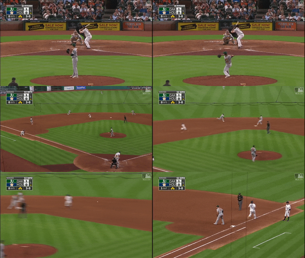
According to Baseball Prospectus’s set of Run Expectations matrices, when Evan Gattis stepped up to the plate in the fifth inning of Houston’s June 27 game against Oakland, the Astros were expected to score an average of 2.26 runs (taking the three-year mean from 2014-2016). The bases were loaded for Houston, which was down 1-0, and in over four innings of work thus far, opposing pitcher Sean Manaea had already walked a trio of batters, including the previous hitter. Against Gattis, Manaea had gotten himself into even more trouble, with the first three pitches missing outside. On the fourth pitch, the Astros’ mighty slugger, evidently with the green light to swing, did exactly that, with the following result:

gattis_gif

By the time Houston’s next batter, Brian McCann, stepped to the plate with two outs and a runner on third, the Astros were only projected to add an average of 0.352 runs to the one that had already crossed home plate. As it turns out, McCann grounded out to shortstop, and the ‘Stros ended up scoring only one total run from a bases loaded, no-out situation. As calculated by Baseball Reference’s wWPA metric, Gattis’s run-scoring double play actually decreased the team’s chances of winning by ten whole percentage points, and they’d eventually drop the game to Oakland, 6-4.

To an innocent MLB.TV subscriber who happened to see the preceding events play out, it seemed an odd scenario for Gattis to get a 3-0 green light. After all, Manaea had been relatively wild up to that point in the game, and he’d even walked the previous batter, Carlos Correa. It got me thinking about league-wide trends on 3-0 swings, and thanks to Baseball Savant, there’s a wealth of 3-0 count-related data to pore through.

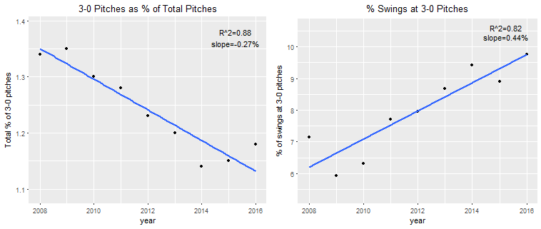
First, there are some interesting trends involving the overall league frequency of 3-0 pitches and swings. Using R’s ggplot data visualization package, I graphed the frequency of pitches in a 3-0 count, relative to pitches in other counts, as well as the swing rates on those pitches:

totalandswingpct

Batters are swinging more and more at 3-0 pitches, even though those pitches are steadily becoming less common. In a league that’s been increasingly prioritizing power, it’s possible that batters are responding accordingly to the fact that they know, with a high degree of accuracy, what pitch they’re about to see. Of the 4,721 3-0 pitches through the 2017 All-Star break, nearly 87% of them were categorized as some type of fastball, as categorized by Baseball Savant.

But which batters are most frequently given the go-ahead to swing away in a 3-0 count? Common perception is that the more powerful the batter, the more likely he is to be given a green light from his manager; this would certainly fit the Gattis anecdote above, and a 2014 Beyond the Box Score article noted that “the guys who swing 3-0 are sluggers,” citing Albert Pujols and Ryan Howard’s high swing numbers as evidence.

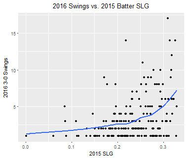
I graphed the number of each batter’s 2016 3-0 swings against his 2015 SLG, limiting the data set to batters who saw at least ten 3-0 pitches to avoid outliers (among these outliers: pitchers Jose Fernandez, Jake Arrieta, and Madison Bumgarner, each of whom swung at at least one 3-0 pitch). If powerful hitters really do swing more often on a 3-0 count, we’d expect to see a positive relationship in the data. Of course, this analysis does come with the caveat that batters, once given the freedom to swing, still can choose not to, and pitchers are likely less inclined to groove a 3-0 fastball to hitters they know are more likely to punish them for doing so.

As it turns out, the five batters with the highest number of swings were all notable sluggers — Joey Votto (17), David Ortiz (14), Mike Napoli (14), Giancarlo Stanton (14), and Josh Donaldson (12). Take a look at the below graph:

batter_SLG_2015_swings

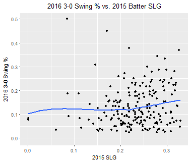
Evidently, there is some sort of relationship between the number of 3-0 swings a batter takes, and that batter’s power. It might, however, make more sense to look at the rate of 3-0 pitches a batter swings at, rather than the absolute amount. After all, one might expect a batter with a high slugging percentage to have (a) more at-bats that reach 3-0, as the pitcher would be more likely to pitch around him; and (b) more at-bats total, as his high slugging percentage would warrant more frequent appearances in the starting lineup.

As illustrated below, I charted each batter’s 2016 3-0 swing rate against his 2015 SLG:

batter_SLG_2015

Interestingly, there doesn’t seem to be much of a correlation between a batter’s prior-year slugging percentage and his current-year 3-0 swing rate, although we should acknowledge the small sample sizes of the pitches driving each individual batter’s swing rate. (For what it’s worth, I performed the same analysis using ISO, rather than SLG, and limiting the data to batters who saw at least twenty 3-0 pitches, rather than ten, and got very similar results.) A list of the top batters by swing rate, again including only those batters facing at least ten 3-0 pitches, doesn’t exactly comprise an All-Star team, either — while Stanton and Pujols are numbers four and five, respectively, the swing leaders also include Rickie Weeks Jr. (1), Wilson Ramos (2), and Hernan Perez (7).

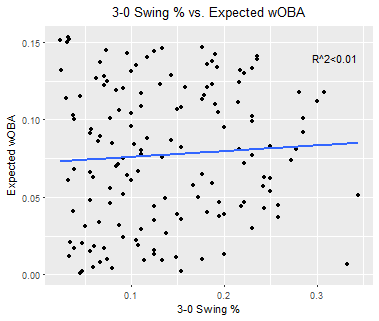
There’s also not much reason to believe that the batters who do swing most often at 3-0 pitches tend to make any better contact than those who don’t. The following chart compares batters’ 3-0 swing rates with their 3-0 swings’ expected wOBA, and, as the R^2 indicates, their relationship is nonexistent:

results_swingVSxwOBA

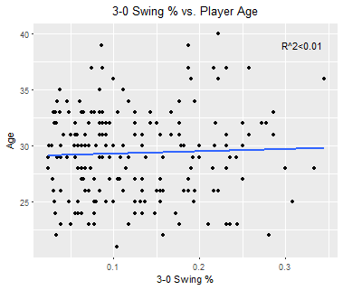
Finally, let’s observe the relationship, if there is one, between 3-0 swing rates and player age. Sam Miller, now an ESPN writer, penned an excellent 2014 article for Baseball Prospectus in which he listed a few managers’ respective 3-0 strategies. Ned Yost, for example, did only grant the green light to the most powerful members of his lineup — but only with one out, and only in certain game situations. On the other hand, Davey Johnson, then in charge of Washington, was far more liberal. My hunch, though, is that managers are generally most inclined to let their veteran players swing away. What follows is a plot of 2016 3-0 swing rates against player age:

swingVSage2

As it turns out, there’s not much of a reason to suspect a relationship here, either. But again, each analysis comes with the caveat that batters don’t have to swing when given a 3-0 green light, and some batters may not even need an explicit green light signal to know that they’re allowed to swing.

Even so, we can conclude the following: although 3-0 counts are occurring less often, relative to other counts, batters are swinging at a steadily increasing rate — perhaps to take advantage of the grooved fastball they’re virtually guaranteed to see. Pitchers, therefore, shouldn’t necessarily take for granted that the hitter won’t swing at their 3-0 pitch, and shouldn’t necessarily expect younger and/or less powerful hitters to refrain from swinging. And while batters’ wOBA on 3-0 is significantly higher than on any other pitch, in a stark contrast to common perception, it surprisingly doesn’t appear that powerful batters make any better contact than weaker hitters. I may eventually replicate this analysis with a focus on different game scenarios — for example, whether sluggers behave differently in blowouts, or in high-leverage situations — but for now, I’ll definitely be paying extra attention next time I see a power hitter or veteran up with a 3-0 count.


Maikel Franco Is Adjusting

Baseball Prospectus, in their 2015 scouting report of Maikel Franco, had this to say:

“Extremely aggressive approach; will guess, leading to misses or weak contact against soft stuff; gets out in front of ball often—creates hole with breaking stuff away; despite excellent hand-eye and bat speed, hit tool may end up playing down due to approach…”

We saw early this year, and even last year, that exact prediction come to life. Franco seemed to be flailing about vs the soft stuff, beating too many pitches into the ground, and even popping too many up. He never really stopped hitting the ball hard, but we saw too many of those hit in non-ideal ways. For most of the first part of this year the slider gave him absolute fits, and Alex Stumpf wrote about that here. He’s striking out at a career-low rate (13% on the year), but he still isn’t really walking that much although it’s bounced up a percentage point from last year (7.3% in 2017).

Here’s a rundown of his career batted-ball profiles:

ballprofile

I was watching the Phillies game vs. the Marlins on the 18th, and Franco went 3-4 with the go-ahead HR off Dustin McGowan. His HR came on a slider middle-away — literally the exact pitch that’s done nothing but given him fits all year. I also noticed that his batting stance seemed to be different. More upright, quieter. I pulled up a highlight video of an at-bat from early May. Here’s a screencap of his stance just before the pitcher starts his delivery:

francold

That AB ended in an RBI line drive to right. Here’s a screencap of the HR in question from Tuesday, at a similar point in the pitcher’s delivery:

franconew

Now if that’s not a mechanical change, I don’t know what is. He’s closed off his stance, eliminated a lot of the knee bend, and seems to have raised his hands juuuuuust a touch. It could be the difference in the camera angle though. Phillies hitting coach Matt Stairs mentioned they’d been trying to get Franco to cut down on his leg kick, so let’s look at that too:
Old leg kick:

oldlegkick

New:

newlegkick

Shortly after contact, old:

pocold

and the recent HR, similar point:

newpoc

The “leg kick” seems to be more of a toe tap, and hasn’t changed. What did change, though, is the quality of his follow-through. His head is on ball, he’s better transferred his weight to his front foot, and the results follow. The old AB was a line-drive single opposite field, which looks less of an intentional opposite-field hit and more of a product of bad mechanics. Being so open, he really could only go to right field with authority. If he tried to pull it he’d roll over the pitch. That also would cause him to struggle with the breaking pitch away, which he’d bounce to second. Closing off has allowed him to better get the bat head into a more ideal position to cover the whole plate with authority. He’s always had the bat control to make contact everywhere, but it looks now like he’s improved his chances of making quality contact all over the zone. Here’s the same look at his batted-ball profile since the start of July:

bballnew

Here’s some assorted metrics, same time period:

kbbnew

vs. his career metrics:

metricscareer

He’s cut his grounders by over 10%, raised his liners by 3%, and turned the rest into fly balls (8%). He’s likely always going to have a pop-up issue, but his pull/center/oppo profile is back to where he was at in 15/16, and he’s hitting the ball hard at a higher rate than ever. Also, his strikeout rate is 6%(!!!!!!)!!!!! He’s making more contact than ever, and that contact is better than ever.

We’ve seen Franco get us hyped before, but never before has there been this type of major mechanical change to point to. Miguel Sano did something similar preseason by raising his hands and quieting his pre-swing load, and it’s paid dividends. Since I started this article, Franco went 2-4 with a single, double, and sac fly; and three of those batted-ball events were hit at 100+mph (the single and double; he was robbed by the 3B on a sharp liner as well).

Going back to his 2015 scouting report: Franco’s still aggressive, if not slowly becoming less aggressive the more he’s in the majors. By changing up his stance, however, he’s closed up the two major holes in his report: getting out in front of the breakers away, and bad contact on soft stuff. Keep an eye on this. One of the more frustrating hyped prospects seems to have made the transformation we all hoped he would, right in front of our eyes.


The Opportunity Baseball Organizations Are Missing: Part II

In Part I, I suggested the “How” and “Why” as to what organizations might be missing. In Part II, I will give you the “What” – the specific findings that underpin an unprecedented opportunity for an organization to capture a significant competitive advantage.

At the major league level, approximately 20-30% of players suffer from significant swing path issues. Since path issues are likely the single largest factor in player failure and underperformance, an organization with a systematic approach to “cure path” would be at significant advantage relative to the remaining teams. Not only would the club benefit directly through improved offensive production, but having an effective cure to path would provide superior insight into “true talent” as the largest remaining factor.  There are also logical extensions into how this could be further monetized in potential areas such as player arbitrage, draft selection, etc.

In summary, the comprehensive solution can be simply stated as follows:

1) The optimal swing paths that exist in the muscle memory of the best hitters can be quantified and visually represented to players performing below potential.

2) A systematic process can be built around the above for significantly improved performance.

Before getting into the key findings, I would like to talk about process using another parallel to investing. There is a popular view that all hitters are different and a “systematic process” cannot be utilized for fixing the ones performing below potential. Successful investors are also presented with a significant amount of uniqueness in their decision process. They have all developed a process that effectively deals with uniqueness, not avoid it all together. So if a process isn’t effective in getting hitters to potential, it’s not that you need to abandon process, you just need a different one. Swing path is a core mechanic that can be systematized and as you will see, there is plenty of room for customization within a systematic process.

The findings below are presented with an extremely high level of conviction based on several years of research including a patent filing in 2013. History will be the ultimate judge but based on communication with a handful of organizations, there is a strong possibility that many clubs will be unwilling to consider such non-traditional sources of value.

The Findings – Quantifying the Optimal Swing Path

Variables:
1) X Axis – Swing Loft
2) Y Axis – Bat Angle (vertical)
3) Z Axis – Swing Direction (Very small changes – Not considered here)
4) Timing (technically, horizontal Bat Angle but we’ll just call it timing for simplicity)
5) Ball Contact Point (Relative to ball equator – Not considered here in terms of loft)

Constraint – The Bat Angle for any given pitch height represents a straight line from the ball to the chest area such that the intersection between the body and the swing plane is a point in the chest area not the mid-section or waist.

Nothing major yet – just some visual representations of the Variables and the Constraint.

Although not a major finding, many are still of the opinion that the bat should be relatively level resulting in a much lower swing plane/body intersection as in the illustration above. The importance of Bat Angle will become more clear shortly. For now, I’ll use two extreme Infield Fly Ball Rates (IFFB%) as a general proxy for a path quality. Below, you will see the Bat Angle (and plane/body intersection) for one of the lowest IFFB rates (Joey Votto) and one of the highest (Kevin Kiermaier). Note the significant 10° difference between the Bat Angles for the same height pitch.

Looking more broadly, the average Bat Angle on low-middle pitches for the players with the five lowest IFFB rates (2015 and 2016) was 34° while the average Bat Angle on low middle pitches for the players with the five highest IFFB rates  was 26°. An example application is screening for players with high IFFB rates on low pitches. Since a relatively flat bat is required for an infield fly ball, this type of screen can highlight players with consistently insufficient Bat Angle.  However, this is only a small part of a more comprehensive approach to identifying players with poor paths as discussed below.

Timing is a Separate Loft Factor

To illustrate Timing Loft, consider the model below in which Swing Loft has been set to zero, thus 100% of the loft is a result of Timing Loft (Bat Angle set to theoretical maximum to illustrate the point).

Conversely, for a high pitch (Bat Angle set to theoretical minimum), 100% of the loft comes from Swing Loft while Timing determines the direction of the hit – pull, center, or oppo (below).


Loft Goals, Angle Mix, and Loft Contribution

Given the principles previously illustrated, optimal angle combinations can be constructed for each pitch location. Each location will have different loft contributions from Timing and Swing Loft based on the height of the pitch. So ball height determines Bat Angle which determines the mix of loft contribution. We will discuss customization shortly. For now, let’s just assume a launch angle goal of 15 degrees for a particular player.


High Pitch Low-Middle Pitch* Very Low Pitch
Bat Angle 20° 45° 65°
Swing Loft 11.7° 7.5° 4.2°
Timing Loft 3.3° 7.5° 10.8°
Total (Goal) Loft 15° 15° 15°


*Note – A middle to low pitch was used to illustrate a 50/50 mix of loft contribution which occurs at a 45° Bat Angle. A true middle pitch has approximately 30-35° of Bat Angle


Thus, the optimal Swing Loft for a low-middle-height pitch for a player with a 15 degree loft goal is only 7.5 degrees – the other 7.5 degrees comes from timing


AND Swing Loft is not the major loft factor for low pitches – which is a lot of them.


Extending these concepts, the optimal loft goal and loft contribution mix can and should be adjusted for different hitter types. Pull hitters will have a greater relative contribution from Timing Loft while opposite field hitters will have a greater relative contribution from Swing Loft. While adjusting the loft goal higher for more powerful hitters is an option, there are potential drawbacks that should be carefully considered and are discussed below.


Reconciling the Swing Up / Swing Down Views

It is interesting to consider the above in light of baseball ignoring Ted Williams for so many years. Usually, there is some rationale for significant movement in a particular direction. In hindsight, it is not too difficult to consider that the “swing down” movement came about (in part) because the bat path / ball path matching issue can’t be solved with a simple one-factor (i.e. Swing Loft) solution as Williams proposed (specifically, page 67 of The Science of Hitting where he shows front knee bend to hit low pitches). While Swing Loft should never be negative, one can certainly appreciate how minimal Swing Loft and relying on Timing Loft for low pitches might feel down to a player. A few takeaways:

1) I am convinced that the failure of Williams’ teachings to fully catch on as well as the highly variable success rates today in adding loft is because some players are able to intuitively arrive at the correct mix of loft contribution while others are forcing too much Swing Loft.

2) Since “timing adjustments” are clearly required to achieve high levels of loft using an optimal mix of angles, excessive loft goals are problematic for many hitters, particularly those who are not natural “pull” (early timing) hitters.

3) Given the significant number of consistent hitters in the 13-15 average LA range, this indicates a Swing Loft on average, of 6.5 to 7.5 degrees for a low-middle-height pitch – nowhere close to what many believe is required to become a card carrying member of the “Fly Ball Revolution.”

Visually Representing Optimal Swing Paths to Hitters

I am by no means an expert in neuroscience; however, it seems relatively straightforward that the more information hitters can transfer out of conscious thought into subconscious/muscle memory, the better they will perform. Hitters don’t want to (and shouldn’t) think about complex angle combinations. Consequently, a visual representation of the optimal combination of angles tailor made for each considering their power (i.e. to determine goal loft) and pull vs oppo tendencies can quickly correct a consistently poor swing path. Yes, “Keep it Simple” but solve the complexity first.

Below is the device that allows a hitter to train for optimal angle mixes through seeing and feeling the optimal paths for different pitch locations. The ball joint allows flexibility for any mix of angles while the angle guide provides compound angle settings based on a hitter’s customized loft goal and pull/oppo preference.

I will keep the product plug to a minimum. Additional information may be found here.


Finding Great Paths in the Data

Statcast data confirms that the best (most consistent) hitters hit the ball significantly flatter (in terms of bat/ball contact, not launch angle) than average. You can read more about the details of this here. I refer to estimated spin impact as Mean Unexpected Distance (MUD).

In addition to hitting the ball flat, one of the best indicators of a great swing path is low variability (Standard Deviation) of a player’s launch angles. After witnessing significant reduction in launch-angle variability through focused training, I had a significantly high level of conviction that this was a key indicator of “quality of path” several years ago. The availability of Statcast data through Baseball Savant changed everything. The data not only confirmed the benefits of flat contact previously discussed but also proved that data combined with video analysis can assess  “quality of path” with a very high degree of accuracy. Considering no other data than (low) MUD scores and (low) Standard Deviation,  the following hitters are returned (based on 2015 and 2016 data):

Player Avg MUD Avg Std Dev
Chris Davis -16.0 21.5
Freddie Freeman -14.3 20.3
Joe Mauer -13.2 21.4
Joey Votto -12.8 20.1
Brandon Belt -9.9 19.6
Miguel Cabrera -9.9 20.4
Paul Goldschmidt -8.7 21.5
J.D. Martinez -8.6 21.6
Nick Castellanos -7.8 19.4
Adrian Gonzalez -6.9 21.0
Matt Carpenter -6.6 20.0
Yan Gomes -4.5 22.0
Christian Yelich -3.9 21.1
Mike Trout -3.0 20.6
Logan Forsythe -2.7 21.0
Howie Kendrick -2.4 21.8
Daniel Murphy -2.0 21.9
Justin Turner -1.2 21.4

The average wRC+ and BABIP for the hitters above are 129 and .330, respectively. Given the return of Cabrera, Votto, Mauer, Trout, Freeman, J.D. Martinez, and several others considering no other performance factors, the benefits of low Standard Deviation of LA and flat contact seem relatively clear.


Putting It All Together – A Better Training Approach

I believe it would be a mistake to ignore the iterative training process that the best hitters have utilized up to this point. Hit a lot of balls, keep what works, discard what doesn’t and repeat the process over a very long period of time. In many cases, the only thing differentiating good from bad paths is that a player’s “filter” allowed something to get through that should have been discarded.

The drawback of the iterative approach is that it takes a very long time. If a player gets off track, it can take a frustratingly long time to go through the process to fix something that may have a very simple solution. Combining what we know from the discussion above, the variability of launch angles can be used in training sessions to quickly determine if a path is moving in the right direction or not before a player fully commits to a contemplated change.

In other words, path issues can be effectively addressed from opposite directions – static/device training  to improve path and dynamic (pitched balls)  training focused on reducing LA volatility. In training sessions with BP-type pitching, players with good paths are able to get down to a 13-14 degree standard deviation.

Implications From The Findings

Part I  pointed out the first step in the research process (as I have known it) is “Identify the Key Drivers”. I believe it is fairly safe to say that most, if not all organizations, believe that path is a key factor. This leads to the logical question of – Why didn’t MLB organizations “go deep” on one of the largest factors of player performance?  I believe there are two primary reasons:

1)  They assumed there was nothing of significance to be found – they concluded before they considered.

2)  It was outside the scope of responsibilities for employees on both the data/analytics side and the player development side of the organization.

Looking more broadly, it would be my guess that most organizations would say they do not believe significant “Moneyball-size opportunities” exist. It is this type of thinking that suggests that they likely do. I’m currently looking into another key driver of performance that could possibly be addressed through a similar systematic approach. Until baseball organizations change their thinking (and possibly their organizational structure), it’s likely that these opportunities will continue to exist. The source is the same – the “Gap in the Middle” that was outlined in Part I.

Clearly, all of the findings presented here are “known” in the muscle memory of the best hitters with great paths.  To this point, however, this muscle memory knowledge had not been understood or quantified in a way that could be systematically transferred to other players. By separating the loft factors, quantifying optimal paths for each location, and presenting a simplified visual representation of the optimal combination of angles, hitters can correct path issues with a very high rate of success.

Going forward, it will be interesting to see how organizations change in regard to considering non-traditional sources of value such as the “Gap in the Middle” previously discussed. At least one, the Houston Astros, announced in March (two days after Part I but likely just a coincidence) that they were moving their lead analyst, Sig Mejdal, to get “on-field experience.” This move, combined with his title of “Process Improvement,” indicates that they might be ahead of the pack in terms of considering new ideas. If you are aware of other clubs moving in this direction, please indicate in the comments. Based on my communication with a few organizations, I believe several are going to be late to the party as they appear unwilling to challenge existing assumptions.

Given the possibility of more “meat on the bone” for the findings above, I will likely take another short break before publishing the next article. However, for those interested in considering opportunities where data and mechanics intersect such as what has been presented above, there is considerably more material for your future consumption.


The Bad Aaron Judge Comps

Aaron Judge is good.  Some might say he is great.  The front-runner for AL Rookie of the Year and MVP is the face of MLB for 2017, but the face of MLB for the future?  Unfortunately, maybe not.

It’s hard to find something negative to say about the New York Yankees right fielder, but in order to play devil’s advocate and not get our hopes up too high about Aaron Judge, just in the event that he has a down season, I was able to find some rather unflattering comps for the slugger.

First, there’s his minor-league career.  Aaron Judge was a pretty good prospect ranking first in the Yankees’ system in 2015 and 17th in baseball according to MLB Pipeline.  However, just because a prospect is ranked highly does not mean they are without flaws.  Judge would strike out in at least 21 percent of his plate appearances in all levels in the minor leagues.  This article from 2016 even identified Judge’s proficiency to strikeout:  

Judge’s Triple-A debut at the end of 2015 did not go well. He slashed .224/.308/.373, well below both his career levels and expectations. More alarming, he struck out a career high 28.5-percent of the time (74 times in 260 plate appearances). [The 2016 season] has been more of the same. His batting average is a bit deceiving sitting at .284 (heading into this weekend), considering he currently has a nice .354 BABIP compared to last seasons .289. His plate discipline is troubling.

Perhaps the lofty expectations of Judge have him pressing. You simply can’t overlook the fact that his strikeout rate is nearly identical to the small sample size of last season’s Triple-A numbers (27.2-percent). It has to be at least a slight bit worrisome that this is a trend and not a slump. His walk right is dropping daily to a new career low (6.8-percent or eight walks in 103 plate appearances).

The article seems to point to his plate discipline as his main flaw — as other evaluators have — but is overall positive with his prospect status.  But his strikeout tendency should not be overlooked.  He has failed to improve on that statistic in his short major-league career, where he has struck out in 32 percent of his plate appearances between his call-up in 2016 and now.  However, because he also takes his walks, his walk percentage is rather high, which puts him in exclusive company.

Since 2000, there have only been four players with at least 300 plate appearances who have struck out in over 29 percent of their plate appearances and walked in at least 16 percent of them: Jack Cust (2007, 2008, 2010, 2011), Ryan Howard (2007), Adam Dunn (2012), and Aaron Judge (2017).  All of these seasons resulted in wRC+ well above 100, which means that they were productive players; however, these player were known to be the embodiment of the “three-true-outcome” hitters.  Dunn had five consecutive seasons of 40 or more home runs, but also led the league in strikeouts four times; Cust led the league in walks once and strikeouts three times; and Howard led the league in home runs twice and strikeouts twice.  Admittedly, these comps are not encouraging.  Although these players were not horrible in the simplest definition, their careers were short-lived and their production sharply declined.  For Cust and Dunn, it forced an early retirement, and Howard a well-publicized and sad end to an illustrious career.

But it’s not just Aaron Judge’s strikeout and walk percentage — it’s also his raw strikeout numbers.  Judge is on pace to strike out over 200 times this season.  While it’s already been established that he is strikeout-prone, it does not serve him justice that the 200-strikeout threshold is upon him.  No player who has struck out 200 or more times in a season has had a very high average.  As the legendary Pete Rose noted, the highest single-season average for a player with 200 or more strikeouts was .262 (Chris Davis holds that honor).  The short list of 200 single-season strikeout players is a whopping five players long: Mark Reynolds, Adam Dunn, Chris Davis, Chris Carter, and Drew Stubbs.  Kris Bryant had 199 in his rookie season (he was called up late to the bigs due to service-time considerations, so it’s likely that he would have joined this club), and Ryan Howard had 199 twice and Jack Cust had 197 once.  Dunn, Howard, and Cust again…

I love Aaron Judge, and I love 500-plus foot home runs, but we also have to be realistic and rational in our love and praise for the slugger.  The worst thing that the New York sports world can do is rattle this kid if, and when, he goes from being an All-Star to the 25th man on a roster.  There is nothing I want to see more, as a Yankees fan and a baseball fan, than Judge succeed; it’s good for the sport.  But I also don’t want to get my hopes up too high, because nothing stings more than a player of his caliber going down the path of Adam Dunn, Jack Cust, or Ryan Howard.