Author Archive

Justin Upton: A Potential Value Trap for the Tigers

Justin Upton’s recent $132.75M/6-year contract with the Tigers does not seem, on the surface, like an outrageous contract. And right now it isn’t; at age 28, Justin should be hitting his prime. Since breaking in with the Diamondbacks, he has been a consistent power threat in a league where consistent power bats are few and far between. To pay $22 million for an outfielder that the Tigers control for two years, potentially six years (Upton has an opt-out clause after two seasons), does not sound extreme when you consider other contracts signed by young, dynamic outfielders; in fact the contract came in below MLB Trade Rumors’ projection of a 7-year/$147 million deal[1]. So why anyone would be concerned about Justin Upton’s deal? Maybe it’s the fact that it took a while for his market to develop this offseason, or maybe it is because he shares the same bloodline as Melvin (formerly known as B.J.) Upton whose production went in the tank after his age-28 season? I get the feeling that Justin could end up as a bad investment for the Tigers. Here’s why.

Exit Speed and Park Factors

Fortunately for Justin, he is getting out of the notorious pitcher’s kingdom that is Petco Park. Unfortunately for Justin, he is moving to another pitcher’s park, Comerica Park. Poor guy can’t catch a break. One concern that I noticed about Upton’s metrics was his exit speed on home runs. According to the ESPN Home Run Tracker, Upton had an average home-run exit speed of 105.2 mph. The concern here lies when you compare the average exit speed versus his prior years. Take a look at the chart below which compares his FB/HR%, HR totals, and average home-run exit speed.

Year HR HR/FB% Exit Speed
2011 31 14.8 107.3
2012 17 11.0 107.2
2013 27 17.9 106.8
2014 29 17.9 105.5
2015 26 15.2 105.2

The numbers here do not look all that out of line, other than his 2012 season where his HR/FB% was off from the average. Upton usually sits around the high 20’s in terms of total home runs, being pretty consistent except for the outlier 2012 season. But the home-run exit speeds have decreased each of the last five seasons — some seasons the decrease was more than others, but still they have decreased nonetheless. Another aspect of Upton’s stats to look at is his 2015 home-run landing spots overlaid with an outline of Comerica’s dimensions.

comericaPetco

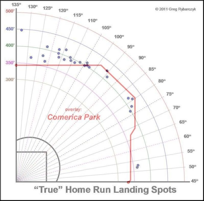
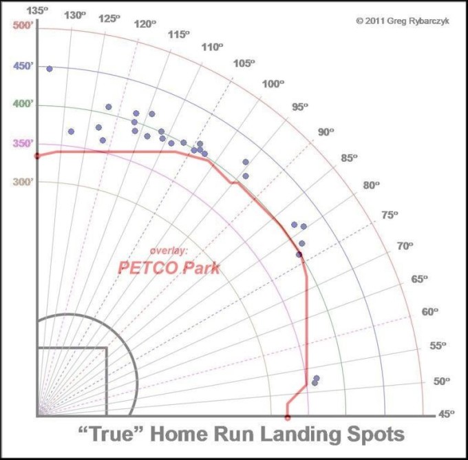
The graphs show the “True” Landing spots according to the ESPN Home Run tracker for the 2015 season. Notice that roughly eight of Upton’s 2015 home runs would not have made it out of Comerica. Only one would have stayed inside Petco, Upton’s 2015 home field. If we used the Comerica park numbers, Upton would have hit 26-8, so 18 home runs. This creates a reason to be concerned, especially since most of Upton’s value is supplied by his ability to drive the ball out of the park, and not his ability to hit for average.

So a value trap you say?

Yes, a value trap. Considering that Upton is 28, paying $22 million a year seems pretty reasonable. In fact, some baseball commentators saw it as a solid investment (and it may turn out to be such). But the caveat is Upton’s opt–out option after two years, similar to the deal Jason Heyward has. If Upton is able to continue to produce nearly 30 home runs a year, he could easily opt out and test the free-agent market again. But if an underlying metric like home-run exit speeds continues to dip and the power numbers take off downhill with it, there is no rational reason for him to opt out and test the market again when he has a $22 million/year deal locked up for four more years.

Therein lies the trap: In an effort to win now by the Tigers, they will either lose Upton after two seasons or they will get trapped by a contract that could eat $22 million of payroll a year, for four years, for a player whose power numbers have dropped and will struggle to provide value in other areas. Is it a great deal for Upton? Of course. Is it good for the Tigers? Short-term, yes. Long-term, there are very few scenarios where they emerge as a winner in the deal. Either they have to pay for Upton again after the 2017 season, or they get stuck with a player who isn’t as good as he once was. Maybe it’s just a hunch but I think the Tigers may be getting the shaft.

[1] www.mlbtraderumors.com/2015/10/justin-upton-mlb-free-agent.html


Bud Norris: A $150,000 Band-Aid

Note: Norris has now signed with the Padres.

Hey, remember Bud Norris? The guy who was an opening day starter for the 2013 Astros (although that team lost 111 games, so that might not be something to brag about). He then was traded for prospect Josh Hader (who was just traded for Carlos Gomez), and a replacement level player in L.J. Hoes and a compensatory 1st round pick. The draft pick turned out to be Virginia’s Derek Fischer who has hit 19 dingers for the Astros single-A club in 2015. He won 19 of his first 35 starts with the Orioles. This O’s pitcher got released on August 8th after clearing waivers. He is now free to sign with any team willing to take on his services. Norris has been a huge disappointment in 2015 — actually huge disappointment would be an understatement. The Orioles signed Norris to a one-year, $8.8 million contract last winter to avoid an arbitration hearing. He was slated to solidify the middle/back end of the O’s rotation. A solid veteran who over his first five full years in the league averaged a WAR right around 2. He has never been flashy but always solid, until 2015. 2015 is the year of the Bud Norris Apocalypse. Norris sported an ERA of 7.06, and a Win-Loss record of 2-9. So is Norris this bad, or is he a victim of bad luck, and is picking him up for a pro-rated portion of the league minimum worth it?

What changed in 2015 versus the rest of Norris’ career that saw him deliver an average ERA of 4.20 over parts of six seasons? There’s a few factors that snakebite Norris in 2015. The first is Norris had a brutal increase in his FB/HR rate. For his whole career (2015 included), 11.4% of the fly balls hit against Norris went over the wall. This year that number ballooned to 17.7%. That is over a 55% jump. Why the huge jump in FB/HR rate? Well, it is not that his fastball velocity dipped, in fact his fastball velocity is over .6 mph faster than his career average of 92.9 mph. Norris is throwing the same rate of strikes vs. his career rate (63%). He has not been throwing in the middle of the plate any more than usual either. In fact, on pitches in the middle third of the strike zone he has thrown 0.7% less pitches than his career average.

Perhaps the reason behind the change in FB/HR rate is luck, but Norris is also throwing 7% more fastballs than the career average. Batters may have been sitting on his fastball more than usual and were teeing off. My thinking is that when a pitcher does not have a huge drop in velocity or major change in strikes thrown, the huge increase in FB/HR rate must be something of a fluke. Norris also got snakebitten by an awful LOB% of 59.5%. His career rate is 72%. Maybe this is just a product of being unlucky. But Norris has been miserable in situations with men on base; with runners in scoring position, batters were hitting .313. No pitcher on earth is going to have a good ERA when batters are hitting over .300 with RISP.

To recap, it seems that Norris may have been much more unlucky this year than other years in his career. He has not been good by any means, but he is not as bad as the 7.06 ERA he has this season. The xFIP and SIERA projections give Bud an estimated ERA of 4.55 and 4.48 much closer to his career mark of 4.20. It seems that Norris has been plagued this season by an inability to pitch with RISP and an awful FB/HR rate. I highly doubt anyone is going to confuse Norris for a top-tier starter, but he should still be a serviceable back of the rotation option.

Signing Bud Norris at this point in the season has practically no risk. If Norris signed for the league minimum, it would be pro-rated to roughly $150,000. Norris could serve as a $150,000 insurance policy in the event that a starting pitcher goes down. He could get picked up and put in the bullpen in a long-relief role with the capability of making a spot start. Having a viable long-relief man is huge during the late months of the season as teams try to save their bullpens. He could easily be picked up by a team like Minnesota who is 4 games back of the wild card. They could use back of the rotation help with the injury to Tommy Milone. The Giants could use rotation help with the recent injury to Mike Leake. And unless Kansas City feels comfortable running Jeremy Guthrie out to the mound every 5th day, Norris could be a good fit. Even a team like St. Louis or Tampa could use him for a spot start to give some rest to fairly young starting rotation. There could potentially be multiple landing spots for Bud. While Norris is not a flashy option by any means, he is a veteran who could easily be a band-aid for a team with a banged up rotation or just simply looking for someone to eat innings.

*Stats acquired from FanGraphs.com and Baseball-Reference.com.


Analyzing the Impact of Early At Bat Strikeouts on Overall Offensive Production

Long ago, the baseball deities descended upon our humble planet and created this wonderful game that we call baseball. When they did this, they created the strikeout. Striking out is arguably the most unproductive out in the game. Like many things, not all strikeouts are created equal. If a batter has a three-pitch strikeout, it is considered a miserable and wasted at-bat. But if a batter has an eight-pitch at-bat that was grinded out to a full count and then strikes out, it is consider a much better at-bat. The batter forced the pitcher to work harder and throw more pitches, even though the end result was a strikeout.

It would also make sense that an eight-pitch strikeout would give the hitter a much better understanding of the pitcher’s “stuff” and this could enhance his ability to hit the same pitcher in the next at-bat or down the road in a future game. In baseball stats, strikeouts are generally lumped into total strikeouts and K%. This brings the question of does it make more sense to lump all strikeouts together, or does it make more sense to look at them through the filter of when they occur in terms of the count? The purpose of my analysis today is to decipher if there is any kind of correlation between a player’s offensive production and the percentage of his strikeouts that occur early in an at-bat (0-2 or 1-2 counts) in the 2014 season. My theory is that as a hitter’s early at-bat strikeout % increases, his offensive production will decrease.

For my data points, I took the top 50 hitters in the 2014 season in terms of wRC+ and then calculated the number of strikeouts the each player had in either 0-2 or 1-2 counts (Early At Bat Strikeouts or EABK) and divided this number by the player’s plate appearances to create the EABK%. I then took the data points and looked for correlations in the basic slash line stats: Average/On Base Percentage/Slugging Percentage. I also looked for correlation in more advanced metrics like wRC+, wOBA, and OFF, which give a better overview of a player’s overall production.

The Slash Line Stat Analysis: (AVG/OBP/SLG)

The first set of statistics I looked at were the basic stat line statistics and how they correlate to EABK%. The strongest correlation of the three was between batting average and EABK%. With a .47 correlation (1 being a perfect correlation), 22% of the data points fit the trend line which itself had a -.5 slope. So in terms of batting average, there was a strong inverse correlation to EABK%. As EABK% goes up, average tends to decrease.  The highest average was Jose Altuve who had a microscopic EABK% of 4.95%. There was only one .300 hitter in this group with an EABK% over 10% (Jose Abreu).

OBP had a similar, but not as strong, correlation. With a correlation of .38 and a trend line slope of -.46, it was clear that as EABK% increased, OBP decreased. SLG% saw virtually no correlation at all. I believe there was such a little correlation in this category because slugging percentage is strongly influenced by the number of total bases a player earns with each hit. Players like Mike Trout an Giancarlo Stanton have a large number of their hits go for extra bases and also have EABK% of the higher end of the spectrum (EABK% of 11% and 14%). Since they have a large number of XBH, this neutralized the negative effect of the early at bat strikeouts on their slugging percentage.

The most interesting correlation, or non-correlation, I found was that there was no correlation between EABK% and BB% (walk percentage). I would have thought there would be a clear downward trend in BB% as EABK% went up. If a hitter strikes out early, he never had the chance to walk, in contrast a hitter who work a deep count consistently is more likely to walk since it is much easier to walk deeper in counts. This none correlation could just be a product of the small sample size of only fifty players, a larger study could yield different results. Nonetheless, I thought it was interesting because if a batter strikes out out early in an at-bat, it would limit the chances he draws a walk. It appears that the trend did not support this thought process.


vs EABK%
Multiple R R Squared Slope
AVG. 0.47 0.22 -0.55
OB% 0.38 0.14 -0.46
SLG% 0.05 0.003 0.04
BB% 0.01 0.0001 0.0117
 

BA EABK

Overall Offensive Production Numbers (wOBA, wRC+, OFF)

While it is interesting to see if there was a correlation between basic offensive stats like batting average, on base %, etc., I was most interested to find out if there was a correlation between overall offensive production stats like wOBA (weighted on base average), wRC+ (weighted runs created plus), and OFF (Offense). These metrics take much more into account rather than just the percentage of the time a batter gets a hit or gets on base. Here, I expected to see a slight correlation because I saw there was a strong correlation between OBP and average. What I did find though was nowhere near a slight correlation. The data analysis showed there was practically no correlation between any of these three metrics and EABK%. By looking at the analysis, the strongest correlation was wOBA and at .14 and while there was a slight downward sloping trend, for all practical purposes there was not a connection between EABK% and these advance offensive metrics,


vs EABK%
Multiple R R Squared Slope
wRC+ 0.12 0.015 -0.00027
wOBA 0.14 0.02 -0.19
OFF 0.08 0.006 -0.00021

wrc+wOBA

So what does it all mean?

To recap my analysis, let’s go back to the beginning. My original hypothesis was that for the 2014 season, the top 50 batters, as determined by wRC+, would have a drop in overall offensive production as the Early At Bat Strikeout % rose. Initially, by looking at basic slash line stats of batting average, On Base percentage, and Slugging %, I did see a correlation between a rise in EABK% and a drop in average and OB%, but slugging % did not show a correlation. When looking at overall offensive metrics, the correlation was not strong at all. I believe that since these metrics are based more on how many runs the player creates and incorporate different values for the type of hit contributes to the lack of correlation between EABK% and more advance offensive metrics. I do think EABK% could be a useful stat for analyzing players who are more valuable by getting on base. For example, comparing leadoff batters’ EABK% would be useful because it could help explain which leadoff hitters are more adept to work counts and the impact on the offensive production of a lineup as a whole.

Coming back to my original hypothesis, it was proved wrong by the data from the 2014 season. Perhaps looking at multiple seasons, with a larger sample size would provide a different conclusion. But using the 2014 season as a snapshot, there was not a strong correlation between offensive production and EABK%.


[1] All batting count statistics were taken from brooksbaseball.net and other statistics other than EABK and EABK% were taken from fangraphs.com


Re-examining Top NL Outfield Prospects of 2015

Earlier this year, Alex Chamberlain of FanGraphs took a look at the top NL outfield prospects for the 2015 season. On this list of five outfielders, three of them have had significant time in the big leagues: Joc Pederson, Jorge Soler, and Randal Grichuk. They were ranked 1, 2, and 5 respectively prior to the season (Andrew Lambo and Eury Perez were ranked 3 and 4 but due to both playing less than 25 games, I did not include them in my analysis). The purpose of my writing today is to analyze these three outfielders and see if the preseason rankings has translated to the regular season. To understand if the rankings hold true, I will compare how each player has hit to this point in the season as well as their ability to help their team on defense.

Offensive Analysis

Using simply batting average as a definitive metric for determining which player is succeeding is especially tough considering the snapshot is only the first half of the 2015 season. That being said I think it is important to look at simple batting average to see if there is any outliers when comparing it to BABIP. In terms of batting average, Randal Grichuk is leading the way with a .277 average, followed by Soler and Pederson at .260 and .230 respectively. While this is a good baseline, comparing it to BABIP and % of hard hit balls identify if these averages are sustainable or unsustainable over the course of a season.

Pederson has a BABIP below the league average at .282, while Soler and Grichuk have BABIP almost 80 points higher than the league average. One of the factors that could be contributing to Pederson’s significantly lower average is simply being unlucky. In terms of Hard Hit%, Pederson is tops of the three with 41.5% of the balls he makes contact with being classified as hard hit. Soler and Grichuk have a 38.6% and 39.2% Hard Hit%. Another factor to consider is K%, but this is somewhat of a moot point considering that each outfielder has a K% within one point of 30%, nearly 12% above league average. This is to be expected of young players who are adjusting to big-league pitching and have a large amount of raw power. These percentages indicate that Pederson’s average should not be nearly as low as compared to the other two and would be considered an outlier and his .230 average is not indicative of how he is hitting overall. But it stands to reason that both Soler and Grichuk could see a regression in average if their BABIP falls towards league average.

Another factor that is important to look at when ranking these three budding All-Stars is their raw power. Hitting for average is important but in today’s game it is much harder to string together multiple hits, so being able to drive the ball in gaps or over the walls is a premium quality in a young player. Isolated Power is a great metric to look at when evaluating the raw power a player is displaying because it takes out the batting average variable out of Slugging %. Grichuk and Pederson have the exact same ISO at .257 while Soler’s is much lower at .128, just below the league average of .135. What this metric means is that Soler’s actual slugging% is somewhat inflated by his average. If his average falls, which would be due to a decline BABIP, his slugging% will suffer. It seems that even if Grichuk’s BABIP slumps he will continue to make an impact at the plate in terms of slugging% since his ISO is over 120 points higher than Soler.

To wrap up the offensive portion of my analysis, I would rank the three rookie outfielders 1) Pederson. This is based on the fact he has made a huge impact on the Dodger’s lineup (20 HR, 40 RBIs) although he has been hampered by an unlucky BABIP.  2) Grichuk. Due to the higher ISO than Soler against major league pitching. Grichuk has not only produced more this year than Soler but he projects to continue to have an impact on his team through his higher ISO even if his batting average drops. 3) Soler, is ranked third because the high BABIP and lower ISO make him less appealing throughout the course of the long MLB season.

Average BABIP Hard% ISO K%
Pederson 0.230 0.282 41.5 0.257 29.2
Grichuk 0.277 0.374 39.2 0.257 30.4
Soler 0.260 0.376 28.6 0.128 31.8
League Avg. 0.256 0.296 0.135 17.9


Defensive Analysis

Defensive metrics also help determine which outfielder is helping save runs for their team which in turn improves the chance of winning a ball game. Revised Zone Rating or RZR is a good indicator of how well a player has been able to make plays in their fielding zone. In terms of RZR, Grichuk is the low man on the totem pole with .902 RZR. Pederson is tops in the group with .926 and Soler in the middle with .916. While RZR is a helpful stat it does not tell the full story of which outfielder is saving the most runs for his team.

DRS or the total defensive run saved helps give an idea of how many runs a fielder has saved above the average player. In terms of DRS, Grichuk has saved 6 runs above average even though he had the lowest RZR. Whereas Pederson has saved 1 run and Soler has saved 0 runs even though both have more outfield assist with than Grichuk (4 each vs. 1). Soler’s low DRS can be attributed to the fact on balls where Soler has between a 60-90% chance of making a play, he has only made the play 66.7% of the time compared to Grichuk and Pederson who have made those same plays 100% of the time.

In terms of defense, I would rank Grichuk number one due to his high DRS. Since saving runs is vital to a team’s success. Pederson would rank second and Soler would be third.


 DRS RZR Assist
Pederson 1 0.926 4
Grichuk 6 0.902 1
Soler 0 0.916 4


Conclusion

To wrap up my analysis, I think it is important to look at total WAR when evaluating players. Especially when breaking down these three young outfielders. I think it is clear that to this point in their 2015 seasons, Jorge Soler would be ranked third of the three due to the fact that his WAR is only .4 and he lags Grichuk and Pederson in almost every metric I have discussed. Grichuk’s WAR of 1.9 places him second. Even though he saves more runs than Pederson with his glove, the offensive impact Pederson has made even with his .230 batting average is extremely impressive. With 20 home runs at the All-Star break and a WAR of 3.3 Pederson would have to be ranked as still the top NL rookie outfielder that was ranked in the preseason.


WAR
Pederson 3.3
Grichuk 1.9
Soler 0.4


All stats for this article were taken from FanGraphs.com


The Escape from Boston: Analysis of Allen Craig in Fenway

Some people do not believe in “clutch”. The timing of hits is based on luck. If that is the case, then Allen Craig who hit .454 with runners in scoring position in 2013 is the luckiest man in baseball. But the baseball gods are a fickle bunch, and just as they bestow greatest on Allen Craig they quickly took it away. At the end of 2013, the baseball gods sent the injury plague to Mr. Craig. It was diagnosis as a Lisfranc fracture, and it has morphed Craig from a perfect fit for Fenway Park to a surefire disaster.

Without a doubt Craig is a professional hitter, he has been at all levels of professional baseball. But since that injury, the ability to turn on a baseball as evaded him. He has never been a dead pull hitter but most of his power has historically been to left field. In 2012-2013, nearly 63% of Craig’s long balls were to the left of center field (he hit 35 total home runs in 253 games)[1]. In case you have not heard of Fenway Park, there is a big green wall in left field that is only 310 feet away from home plate, not a bad place for a right handed power hitter. But as car companies know, the new model is not always better. In 2014, Craig devolved into a light hitting outfielder with little power to left field and the inability to crush inside fastballs. In 2013 before the injury, Craig hit .382 (50 of 131)[2] against inside fastballs. Post injury, he hit .189 (28 of 148).

Without the ability to pull the ball, power numbers to left field plummeted. Three of Craig’s eight home runs were to the left field side of center field in 2014[3].

Bostonians beware; shipping up to Boston may be the worst thing for Craig if he continues his trend.  Fenway is a haven for right handed power hitters who can play pepper off the Green Monster. But just a few feet left of Pesky’s Pole; right field at Fenway deepens to 380 feet and walks back to 420 feet before reaching straightaway center field. These are not exactly ideal conditions for a guy who just hit five of his eight home runs to the right of center field in 2014.In fact, only five of Craig’s home runs would have been home runs in Fenway[4].

Acquiring Allen Craig before 2014 would have been a masterful move for the Red Sox who were trying to acquire some depth in the outfield and at first base. But now they might be better off resurrecting the career of Mark Reynolds by letting him play pepper with the Green Monster (ironically the Cardinals signed him earlier this offseason) and shipping Craig out of Boston. If Craig’s 2014 season is any indication of 2015, only having limited power to the right side will not bode well for the Red Sox and Craig. If Craig cannot adjust to the inside fastball, he may be shipping out of Boston even faster than Bobby V.