Archive for September, 2016

NY-Penn League Scouting: Chalmers, Shore, Chatham, Dalbec, and Dawson

I watch a lot of baseball. I get to see a lot of players. Some of them will go on to have productive major-league careers, but most will not. The point of this article is to look at some of those who may, at the the very least, reach the show.

This report comes after observing two NY-Penn League (low-A) series in late August/early Sept. and includes players from the Oakland Athletics, Boston Red Sox, and Houston Astros organizations.

I will introduce each player as follows:

Name, Position, Organization, Organizational Prospect Rank, Age


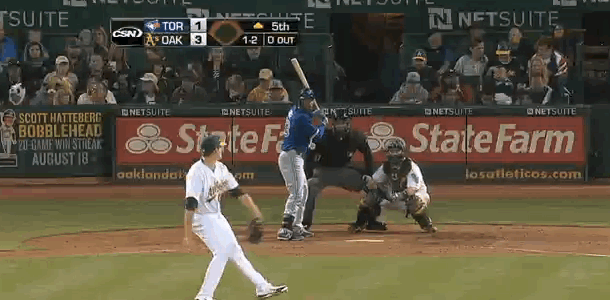
Dakota Chalmers, RHP, Oakland Athletics, Rank: 9, Age: 19

Chalmers was drafted out of a Georgia high school in 2015. He’s a four-pitch pitcher– fastball, changeup, curveball, slider. Though, there’s only a 2-3 mph difference between his slider and curveball and not much of a visible difference. His fastball sat 91-93 when I saw him last week; I’ve seen him as high as 93-95. He has a high-effort delivery and control remains his biggest issue, which I’d say is a pretty good place to be as a 19-year-old. His fastball and curveball/slider look above-average, while his changeup shows potential but still is inconsistent in terms of location. I imagine he didn’t have to throw it that often in high-school competition last year.


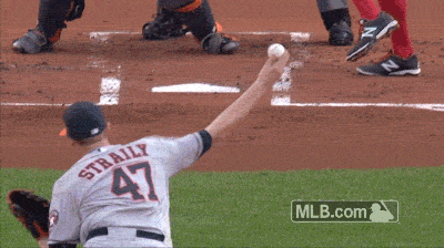
Logan Shore, RHP, Oakland Athletics, Rank: 12, Age: 21

Shore’s strength is his command. His fastball sits 90-92 and he also throws a changeup (his best pitch) and slider. He pounds the zone and shows the ability to throw any pitch for a strike in any count. He made one (big) mistake during his last outing – an opposite-field three-run home run– but otherwise was solid. His slider remains his weakest pitch, but when it’s on (and it mostly is) he sees a lot of quick and easy outs. I would imagine he won’t add much velocity in the future as he’s already filled out, but can still see him being an effective pitcher nonetheless.


C.J. Chatham, SS, Boston Red Sox, Rank: 15, Age: 21

Interestingly, Chatham is a tall (6’4) shortstop whose biggest strength is his defense. Many at his size project better as third basemen, but it looks like Chatham has the ability to stay at short. He uses his long frame well to cover ground and also shows good arm strength. At the plate, the first thing that stood out was his aggressiveness as he swung at seven of nine first pitches. He also showed some line-drive power, hitting two doubles (one over the center fielder’s head and one down the left-field line) in the two games I saw.


Bobby Dalbec, 3B, Boston Red Sox, Rank: 21, Age: 21

This guy hits the ball really really hard. I saw him in eight at-bats – three strikeouts and five very well-hit balls. Even his outs were hit hard. He looks like an all-or-nothing type hitter. Lots of doubles and home runs but a lot of strikeouts. A former pitcher in college, Dalbec definitely has the arm to remain at third base. His range looked good too — he made one nice play to his right, a charging backhand near third base while having to throw across his body to get the out.


Ronnie Dawson, OF, Houston Astros, Rank: 18, Age: 21

Another all-or-nothing-type hitter, Dawson was drafted in the second round of the 2016 draft out of Ohio State. He looks like he could have been a running back at OSU too — standing 6’2 and 225 lbs. His power and bat speed definitely show – he smoked a line-drive double down the right-field line when I saw him. But so do the swings and misses – he struck out in his other three at-bats. Defensively, Dawson projects more as left fielder as his arm and speed aren’t two of his better tools. From the eye test, Dawson reminds me of the Indians’ Carlos Santana, except Santana strikes out a lot less (14% compared to Dawson’s 24%).


An Early Look at the AL MVP Race

[This analysis is also featured in our emerging blog www.theimperfectgame.com]

With less than one month to go, the American League MVP race is very close. While usually nothing is set on stone in early September, during the last few years the AL MVP has been a two-man race (Mike Trout with either Josh Donaldson or Miguel Cabrera). This year, however, features five remarkable candidates: Mookie Betts, David Ortiz, Jose Altuve, Mike Trout and Josh Donaldson. Yes, I expect a few other to grab a few top-five votes (e.g. Cano, Cabrera, Lindor and Machado) but I don’t anticipate the award to fall outside those five players.

Let’s look at the classic, old-school numbers first, which not only are sometimes referenced in casual conversations at local bars and pubs but also frequently (and occasionally unfortunately) followed by voters. I’ve plotted R, RBI, HR, OBP, SLG and SB as percentiles of the entire population. Let’s take a quick look.

Picture

If you like well-rounded players, probably this year you’re excited with Altuve, Trout and Betts, who dominate across the board. In an era where stolen bases keep declining, 20+ SB will get you to the 90th percentile. On the other hand, if you’re into true sluggers, then the show Ortiz has put this season should be one to remember. However, then again, these metrics paint only part of the picture — they don’t take into account when or where each event happened nor they include defense or base running on its most complete form.

Let’s take a deeper look at WAR and a quick indicator for each batting, fielding and base-running performance.


Player WAR wRC+ UZR/150 BsR
David Ortiz 4.0 164 0 -7.4
Jose Altuve 6.6 160 -0.4 0.3
Josh Donaldson 7.1 161 10.6 -0.8
Mike Trout 8.1 175 -2 8.0
Mookie Betts 6.6 138 16.4 8.0

Obviously when we move away from batting, David Ortiz loses ground — he only contributes in one aspect of the game, and while he has been outstanding in the batter’s box, likely it will not be enough for him to win. When we adjust by park and league, we realize the Trout – Betts race for the best OF is not as close as I initially thought. Trout has quietly put a(nother) great season on an awful team (again) — he’s already at 8.1 WAR and a 175 wRC+, with both easily leading the league. His defense is slightly below average at best but he compensates by running extremely well. Altuve and Donaldson have had similar seasons offensively. However, Altuve is having a down season in both defense and base-running (remarkably low on Ultimate Base Running (UBR), which measures how frequently and effectively a runner takes an extra base via running). Betts drives his value largely from his defense, where he’s settled in nicely as one of the best OF this year.

One of the metrics I tend to assess when I look at awards is how performance was spread the entire season. I want an MVP to be someone that I rely throughout the year, not only during a hot stretch. Additionally, having a big month can really uplift the numbers and build up a misleading argument in favor of someone. Let’s understand how wRC+ is split by month.

Picture

This picture to me is interesting for a couple of reasons. First, part of the argument on Betts’ candidacy is that he’s getting better, and delivering when it matters the most — in the middle of a pennant race. After a below-average March/April, Betts has been a beast since July, when Ortiz cooled off a bit. Now, then again, Mike Trout has also followed an upward-trending curve — peaking at 206 in August — and his lowest point is at 144, which is the highest of all lowest points in the sample. From my perspective, if everything else is equal, I’d rather have a Trout-esque curve than Donaldson’s one, who has the highest single-month wRC+ (213 in June) but also with the largest swing (118 difference between May and June). And then you have remarkably constant Altuve — with the narrowest gap between highest and lowest points throughout the season and at least 140 wRC+ in any given month.

Now, most of what we have shown up to now is context-neutral. An argument could be made that every single game is worth the same, regardless of whether it’s in April or July — what’s really important is to deliver in key, high-leverage situations. There is where true MVPs show their full potential to influence a team and define its fate. As they say, a home run against a non-contender team when you are losing by five runs is not as valuable as a game-winning double against our wild-card-rival’s closer in the 9th inning. I’ll admit neither OPS in high-leverage situation or Win Probability Added (WPA) is the perfect metric to evaluate this, but they provide a very good proxy to how well they have fared in tough, game-changing situations. If you are not familiar with WPA, please click here.

Picture

Again we see the usual suspect — Mike ‘King’ Trout — leading not only this graph but the MLB with his 5.66 WPA, closely followed by Josh Donaldson, and they’re the only two players from this sample to have a higher OPS in high-leverage situations than in low-leverage ones. Interestingly, Boston’s Betts and Ortiz’s OPS go down 9% and 15% respectively when the stakes are high. I definitely don’t want to say that Altuve’s 0.841 OPS in high leverage is bad, but I certainly want to recognize Donaldson’s and Trout’s clutchier performance.

Another way of looking at the MVP is to ask yourself: Where would that team be if that player wouldn’t have been part of it? While in essence it is impossible to know for sure the answer, a nice proxy is to measure what percentage of position-player WAR is that player responsible for, i.e. what percentage share does this player represent.

Player WAR Team WAR %
David Ortiz 4.0 28.7 14%
Jose Altuve 6.6 18.8 35%
Josh Donaldson 7.1 21.4 33%
Mike Trout 8.1 17 48%
Mookie Betts 6.6 28.7 23%


Well, this is another way to see Mike Trout’s leadership on the field. Almost half of the Angels’ WAR have Trout’s name attached to it, which is amazing. (For reference, the leaders in this table are Khris Davis and Marcus Semien with 122% (2.2 WAR each out of 1.6 Athletics total WAR). Now, Donaldson and Altuve have, too, a remarkable 33% and 35% of their total, but probably Betts falls short again with his 23%.

At the end, when all is said and done, it looks like numbers indicate it should go down to a Donaldson vs. Trout race, just as it was in 2015. Ortiz has had an amazing season but his base-running and defense (or lack thereof) limit his overall impact on his team. Betts is definitely an exciting, five-tool player, but his performance hasn’t been as good as Donaldson’s or as consistent as Trout’s. Additionally, Boston’s talent-loaded team reduces his value (this is the opposite of the Trout-Angels argument – how valuable can you be when your team would perform well, even if you’re not there?). His future is extremely bright though. Finally you have Altuve, who may have a legitimate case but falls (a bit) short on overall performance to Donaldson and Trout. Houston has under-performed and arguably that’s a worse outcome than Trout’s, because we knew the Angels were going to be bad, but we thought the Astros would be better.

Last year, Donaldson built his case with a magnificent August, when he posted a 1.132 OPS and Toronto got to first place in the AL East. This year it was Trout who had a torrid August, but the Angels are not in the wild card race. It surely seems to me as if we are measuring the MVP as a team award. Though I understand the rationale of having an MVP on a winning team, there is more to it. If I had a vote, and still being a few games away from the end of the season, I’d support Trout in his quest for his second MVP (as of today), but it looks like momentum and narrative are gaining traction around Donaldson — who has posted much better numbers than in his MVP season — Altuve — who brings new blood to the MVP discussion and might get an extra push if Houston makes it to the playoffs — and Betts — who is clearly the face of Boston’s extremely talented young generation. They, though, despite great Septembers, will post worse numbers than Trout. Yes, the Angels are a bad team — but to what extend is that Trout’s fault? What else could he have done? When did ‘valuable’ translate into ‘winning by himself beyond reasonable expectations’? When did we change this award to ‘best player on the best team’? In 2012 it was Cabrera’s Triple Crown and in 2015 it was Donaldson’s ‘ability’ to get Toronto to the postseason for the first time in many years. In 2016, Trout has been comprehensively better, avoided any deep slumps during the season, and performed very well under pressure and shown that you can put counting stats up on a bad team. We are running out of excuses this year.


Examining Baseball’s Most Extreme Environment

“The Coors Effect.”

These three words evoke a strong reaction from most people and are impossible to ignore when discussing the offensive production of a Rockies player. Ask anyone who was around for the Rockies of the ‘90s and they will tell horror stories of games with final scores of 16-14. Ask anyone at FanGraphs and they will laugh and point at the Rockies’ 2015 Park Factor of 118. Heck, ask Dan Haren and see what he has to say:

Suffice it to say that Coors is a hitter’s park. Nobody will argue that. But there have been murmurs recently about another effect of playing 81 games at altitude, an effect that actually decreases offensive production. These murmurs have evolved into a full-blown theory, which has been labeled the “Coors Hangover.”

This theory supposes that a hitter gets used to seeing pitches move (or, more accurately, not move) a certain way while in Denver. When they go on the road, the pitches suddenly have drastically different movement, making it difficult to adjust and find success at lower elevations. In other words, Coors not only boosts offensive numbers at home, it actively suppresses offensive numbers on the road, which can take relatively large home/road splits for Rockies players and make them absolutely obscene.

The concept seems believable, but thus far we have no conclusive evidence of its merit. FanGraphs’ Jeff Sullivan recently tested this theory, as did Matt Gross from Purple Row. Although neither article revealed anything promising, Jeff is still a believer, as he recently shared his personal opinion that the Coors Hangover might simply last longer than any 10-day road trip. With this is mind, I decided to approach the problem by examining the park factors themselves.

If you haven’t read the article about how FanGraphs calculates its park factors, I highly recommend you do so before continuing. The basic approach detailed in that article is the same approach that I use here. As a quick example, the park factor for the Rockies is calculated by taking the number of runs scored in Rockies games at Coors (both by the Rockies and the opposing team) and comparing that to the number of runs scored in Rockies games away from Coors. Add in some regression and a few other tricks, and we have our final park factors.

This method makes a number of assumptions, most of which are perfectly reasonable, but I was interested in taking a closer look at one critical assumption. By combining the runs scored by the Rockies with the runs scored by their opponents, we are assuming that any park effect is having an equal (or at least, an indistinguishable) impact on both teams. This seems like an obvious assumption, but it becomes invalid when the Rockies play on the road. According to the Coors Hangover, Rockies hitters experience a lingering negative park effect after leaving Coors which the opposing team is not experiencing.

In other words, we expect a gap to exist between a hitter’s performance at Coors and his performance at an average park. If the Coors Hangover is true, this gap would be larger for Rockies hitters than anyone else.

Let’s start by taking a look at the park factors we have now. The following tables only contain data from NL teams for simplicity sake.

Park Factors, 5-year Regressed (2011-2015)
Team Total Runs (team + opponent) Park Factor
Home Away
Rockies 4572 3205 1.18
D-backs 3657 3328 1.04
Brewers 3588 3306 1.04
Reds 3385 3215 1.02
Phillies 3365 3341 1.00
Nationals 3240 3213 1.00
Cubs 3346 3345 1.00
Marlins 3200 3229 1.00
Braves 3086 3199 0.99
Cardinals 3243 3397 0.98
Pirates 3070 3394 0.96
Dodgers 2995 3323 0.96
Mets 3109 3556 0.95
Padres 2936 3440 0.94
Giants 2900 3537 0.92

No surprises. Teams score a ton of runs at Coors and hardly ever score at AT&T Park in San Francisco. Now let’s split up those middle columns to get a closer look at who is scoring these runs.

Runs Scored, 2011-2015
Team Home Stats Away Stats
Team Opponent Team Opponent
Rockies 2308 2264 1383 1822
D-backs 1844 1813 1641 1687
Brewers 1823 1765 1619 1687
Reds 1731 1654 1606 1609
Phillies 1676 1689 1576 1765
Nationals 1749 1491 1651 1562
Cubs 1625 1721 1547 1798
Marlins 1541 1659 1464 1765
Braves 1606 1480 1569 1630
Cardinals 1779 1464 1797 1600
Pirates 1586 1484 1688 1706
Padres 1443 1493 1604 1836
Dodgers 1557 1438 1758 1565
Giants 1481 1419 1797 1740
Mets 1482 1627 1817 1739

These are the two pieces of run differential — runs scored and runs allowed — and we generally see agreement between the home and away stats. If a team out-scores their opponents at home, they can be expected to do the same on the road. Good teams are better than bad teams, regardless of where they play. Although, if you subtract a team’s run differential on the road from their run differential at home, the difference will actually be around 100 runs due to home-field advantage. Doing this for all 30 teams yields a mean difference of 83 runs with a standard deviation of 122.

Where do the Rockies fall in this data set? Not only have they scored over 400 more runs at home than the next-best NL team — they have also scored almost 200 runs less on the road than the next-worst NL team. Comparing their home and road run differentials, we see a difference of 483 runs (+44 at home, -439 on the road), or 3.3 standard deviations above the mean. To put it plainly: that’s massive. This is a discrepancy in run differentials that cannot be explained by simple home-field advantage.

Furthermore, I followed the same process of calculating park factors for each team explained above, but I split up the data to calculate a park factor once using the runs scored by each team (tPF), and again using the runs scored by each team’s opponents (oPF). Generally, these new park factors are closely aligned with the park factors from before…except for, of course, the Rockies.

Alternate Park Factors, 5-year Regressed (2011-2015)
Team tPF (Team Park Factor) oPF (Opponent Park Factor)
Rockies 1.27 1.10
D-backs 1.05 1.03
Brewers 1.05 1.02
Reds 1.03 1.01
Phillies 1.03 0.98
Nationals 1.02 0.98
Cubs 1.02 0.98
Marlins 1.02 0.97
Braves 1.01 0.96
Cardinals 1.00 0.96
Pirates 0.97 0.94
Padres 0.96 0.92
Dodgers 0.95 0.97
Giants 0.93 0.92
Mets 0.92 0.97

On average, a team’s tPF is about two points higher than its oPF — again, this can be attributed to home-field advantage. The Rockies, however, are in an entirely different zip code with a discrepancy of 17 points. We aren’t talking about home-field advantage anymore. We are talking about something deeper, something that should make us stop and think before averaging the two values to get a park factor that we apply to the most important offensive statistics.

We have no reason to believe that any team should have a 17-point difference between their tPF and oPF; the fact that the Rockies are in this situation either means that they are enjoying hidden advantages at home, or they are suffering hidden disadvantages on the road. To date, we don’t have a theory supporting the former, but we do have one supporting the latter. This is the Coors Hangover.

Does this mean that the Rockies’ Park Factor should actually be their oPF of 110? Should it be some weighted average of different values? I don’t know. But I do know these numbers can’t be ignored. Something is going on here, and we need to talk about it.


Using Statcast to Analyze the 2015/16 Royals Outfielders

I’m working under the hypothesis that you can use launch angle on balls hit to the outfield to determine an outfielder’s relative strength.

The more I look at the data, the more convinced I’m becoming.

So I downloaded the 2015 and 2016 KC Royals Statcast data to see if I could compare their major outfielders’ performance year to year and see a couple things. What I’ve done is bucket hits to the OF by launch angle (in two-degree increments) and calculate a percentage of that contact resulting in a HIT or an OUT. Simple as that. So what I’m comparing between years is:

1) Are the hit likelihood percentages for each angle by OF reasonably projectable year to year
2) Does improvement in my angle metric result in improvement in other defense metrics

First let’s look at Jarrod Dyson. He’s one of the best outfielders in MLB. He recorded, per FanGraphs, 11 DRS in 2015 and to date has 18 DRS in 2016. His 2015 UZR/150 was 18.4 and in 2016 to date it’s 28.7. So both of the “new-traditional” type defense stats are saying, he’s not only good but he’s getting better in 2016 versus 2015. What does my angular stat suggest?

The red points are for ’16 Dyson while the blue is ’15. The left linear regression equation (with the .837 R2) is 2015 while the right (R2 .7796) is 2016. This shows Dyson as a similar player year to year, but likely a bit better. On the higher-angle fly balls, it does appear that Dyson has done a better job this year tracking them down; however, it also appears that in 2015 he did a bit better catching some of the lower-angled fly balls. So it’s not entirely clear, from this graph, why Dyson is per DRS and UZR having such a better defensive year. To have something like this happen, it could indicate that maybe Dyson is starting to play deeper than before. This would limit the likelihood of him catching the low-angled line drives to the OF, but help track down more true fly balls. I’d certainly be interested to see if Dyson is actually doing that very thing this year.

When it comes to projecting year to year, the R2 for Dyson’s ’15 to ’16 hit likelihood % was: 0.532. In real life this is a pretty strong correlation, so I’d say it’s a reasonable estimator.

How about we look at KC OF defensive darling Alex Gordon:

Again the red points are for ’16 Gordon while the blue is ’15. The left linear regression equation (with the .939R2) is 2015 while the right (R2 .8424) is 2016. It jumps right out to you how much smoother Gordon’s regressions are than Dyson’s. Maybe experience leads to that, who knows. So the 2016 regression line (the dashed one) shows that contact to him in the OF is a bit more likely to land for a hit now in 2016 than it was in 2015. This would suggest that Alex Gordon is having a worse year defensively in ’16 than ’15.

How do DRS and UZR/150 compare? Well, Alex has a DRS of 3 in 2016 and had a DRS of 7 in 2015. So he does seem to be trending a bit lower, though not too much. And he has a UZR/150 in 2016 of 9.9 whereas that was 10.5 in 2015. So in this case it all sort of agrees. Gordon seems to be a step or two slower (age and injuries easily could account for that) and as a result his defense has stepped backward a bit. Interestingly he’s still doing about the same job on balls that are high-likelihood hits — the more difficult plays. It’s really at the end of the spectrum where the balls are unlikely to be hits anyway that Alex seems to be struggling. So maybe the “skills” are still there, but the athleticism has just faded a bit and he can’t run down those long fly balls anymore. This is sort of the opposite of Dyson. Maybe Gordon is in fact playing too shallow, cheating to ensure his reputation for robbing sure hits stays intact while losing a bit of overall range, creating a situation where some balls land that probably should have been outs.

When it comes to projecting year to year, the R2 for Gordon’15 to ’16 hit likelihood % was: 0.778. This is excellent and I think it is clearly visible from the chart just how projectable year to year this would be.

What about All-Star and defensive stalwart Lorenzo Cain?

Again the red points are for ’16 Cain while the blue is ’15. The left linear regression equation (with the .8876 R2) is 2015 while the right (R2 .9073) is 2016. Well this is interesting — it’s just as though you shifted the line up ever so slightly. A 2016 higher trendline would indicate that contact to the outfield around Lorenzo would be more likely than last year to result in a base hit. This would indicate he too has backslid some from his 2015 self. So what do UZR and DRS say? DRS in 2016 is 11 whereas it was 18 in 2015. But UZR/150 is currently 15.4 in 2016 and it was only 14.1 in 2015. So there is a bit of confusion as to Cain’s 2016 performance, relative to ’15. Clearly he is still an excellent outfielder by all measures, but I would lean toward him trending in the negative direction in ’16 and moving forward.

Given the two linear regressions and data sets, you’d have to believe you could use this data to project very accurately the future year. And you’d be right. Cain’s year-to-year R2 checks in at 0.955.

Well what about newcomer Paulo Orlando? he already seems to be living up to the newfound tradition of excellent KC outfield defense:

Paulo Orlando is sort of the exact reverse of Cain. His trend has basically just taken an entire step down. This means balls are less likely to be hits now than before. So do UZR and DRS agree with Orlando taking what appears to be a reasonable step forward? Surprisingly no. DRS from ’15 to ’16 has jumped from 8 to 12, but Orlando has played a lot more innings which more or less would explain that growth. And his UZR/150 went from 14.0 in 2015 to 8.7 now in 2016. So these metrics both seem to think Orlando is the same if not a little worse than in ’15.

Projecting using Orlando’s earlier year is, like with Cain, excellent. There is an R2 of .90 between the two data sets.

So for my questions:

1) Are the hit-likelihood percentages projectable year to year? This seems to be a resounding yes, at least in the case of KC Royals. The R2 was always greater than 0.5 with two instances of the four being over 0.9! I’m starting to believe this really could mean something in regards to defense evaluation.
2) How does my angle measure compare to UZR/DRS? There do seem to be some differences; however, this is basically the norm in the “new” defense evaluations. No universal system has been developed and there are plenty of cases where UZR and DRS themselves have disagreements.

I do think in the end this has some merit and I will be looking further into it. I also think similar work can be done with regards to hit speed, as I already alluded to in my earlier article:

Using Statcast to Substitute the KC Outfield for Detroit’s

I think it’s important to view both the angle and hit speed as two pieces and going forward that’s something I’m hoping to include for these players.


Looking at Baseball’s Youth for Signs of an Altered Ball

Baseball’s home-run surge this season is already well-documented, and analysts have turned over several theories for why this could be happening. Are steroids back? Has MLB juiced balls to give them more carry? Is this increase a result of an intentional shift toward power by baseball’s young sluggers? No matter what is happening, home runs are flying out of the park at record pace. At 4,459 home runs through 3,834 games, the 2016 HR/G rate is 1.16 – just barely trailing the all-time record of 1.17 HR/G set in steroid-heavy 2000.

Lately, baseball fans have been treated to a rookie performance for the ages, as New York Yankees catching phenom Gary Sanchez has hit .403/.459/.883 with 10 HR through only 20 games. Sanchez is only the third player in MLB history to swat 10 HRs through his first 20 games, joining George Scott of the 1966 Boston Red Sox and Trevor Story of the 2016 Colorado Rockies.

Sanchez has been a highly-regarded prospect for several years after signing with the Yankees as an international free agent in 2009, but he has never slugged at a rate like this before. Last season Sanchez swatted 18 HR in 365 minor league at-bats, and in 2014, he hit 13 HR in 429 minor league at-bats. In fact, Trevor Story is somewhat similar – he hit 14 HR in 396 minor-league at-bats in 2014 and 20 HR in 512 minor-league at-bats in 2015. Now in the big leagues, Story’s smashed 27 HR in 372 at-bats. Story’s home runs cannot all be credited to the homer-happy Coors Field which he calls home. Story has hit 11 HR in just 196 road at-bats, far outpacing his 2015 home-run rate.

While the success of Sanchez and Story can somewhat be credited to their power-friendly home-run parks and the natural tendency of talented ballplayers to grow into their power – they’re both only 23 years old – there may be more to this story than meets the eye. Below I compiled a list of all 2016 MLB rookies with more than 200 at-bats and compared their 2016 MLB home-run rates to their 2015 minor-league home-run rates. I had to exclude rookies who did not play in the U.S. minor-league system last year – Hyun Soo Kim, Dae-ho Lee, and Byung Ho Park. While this is far from a perfect science, the 200 at-bats should give us an interesting-enough sample size to examine.

Of the 16 rookies who qualify, 13 of them saw their AB/HR rate drop significantly, a counter-intuitive result as MLB pitching is far superior to that of Double-A or Triple-A pitching. Two of the three remaining rookies saw their AB/HR rates remain basically unchanged (Cheslor Cuthbert and Tyler White). And finally, Ramon Flores was the sole rookie who saw his AB/HR rate rise notably, though we could possibly point to the severe ankle injury he suffered at the end of last season as a partial culprit for his slip in play. Flores has seen dips in his batting average, on-base percentage, and other offensive rates as well this year.

The rookie home-run bounce is almost universal and includes: Jefry Marte (23.8 AB/HR in AAA in 2015 to 19.6 AB/HR in MLB in 2016), Alex Dickerson (21.7 AB/HR in AAA this season to 19.9 AB/HR after getting called up), and of course Sanchez (20.3 AB/HR in AAA in 2015 to 7.7 AB/HR in 2016).

Just two years ago, analysts were arguing that the jump from AAA to MLB may be getting harder for young players, but now we’re seeing exactly the opposite, at least for position players.

Let’s see how minor-league players transitioned to the major leagues in the past. With the HR spike occurring late in 2015, we’ll use data from 2014 rookies and their 2013 minor-league seasons. I compiled a list of 18 MLB rookies with at least 300 at-bats in 2014. I excluded Jose Abreu who did not have 2013 minor-league numbers.

This looks much more natural. The majority of rookies (11) saw their AB/HR rates rise, often dramatically, while others saw their AB/HR rates basically stay the same and a few others saw an decrease. Again, this aligns with the common knowledge that MLB pitching is tougher than minor league pitching.

So why are the 2014 and 2016 rookie tables so different? The data would indicate that something happened between these years to make graduating to the MLB so much easier for rookie position players.

Finally, we can look at rookie pitchers and compare their home runs allowed per 9 innings pitched from last year in the minor leagues to this year in the majors. I’ve compiled a list of the 13 MLB rookies to cross the 75-innings-pitched plateau this year. I had to exclude rookies Tyler Anderson (didn’t pitch in 2015) and Kenta Maeda (didn’t pitch in the U.S. in 2015).

Of the 13 rookies, nine saw their HR/9 rates rise notably, two saw their rates basically stay the same, and two saw their rates lower and improve in the majors. (It should be noted that Archie Bradley Jr. threw only 29.3 IP in 2015, and Devenski has shifted from a starter to primarily a reliever this year. This may have skewed their numbers.)

This chart should not come as a surprise, as rookie pitchers have historically allowed more hits, walks, and home runs to superior competition, at least in their first few months of big league time.

Yet the near-universal increase of home runs, whether hit or allowed, by players making a transition from the minor leagues to the major leagues indicates that something is happening at the major-league level specifically. We can likely dismiss sudden steroid use, as the majority of users historically have come from the minor leagues. (Unless major-league players have sole access to a super-drug that goes undetected in urine tests, but now we’re wading into something else completely.) We may also be able to disregard theories such as “young players are altering their swings to hit for more power and strikeouts,” because wouldn’t these “altered swings” result in more home runs in the minor leagues against inferior pitching? Once again an altered or juiced baseball at the major-league level appears to be the most obvious culprit, although no hard evidence has been discovered.

An increase in power transitioning from the minor leagues to the major leagues is counter-intuitive to everything we know about the game’s structure.


Hardball Retrospective – What Might Have Been – The “Original” 1978 Pirates

In “Hardball Retrospective: Evaluating Scouting and Development Outcomes for the Modern-Era Franchises”, I placed every ballplayer in the modern era (from 1901-present) on their original team. I calculated revised standings for every season based entirely on the performance of each team’s “original” players. I discuss every team’s “original” players and seasons at length along with organizational performance with respect to the Amateur Draft (or First-Year Player Draft), amateur free agent signings and other methods of player acquisition.  Season standings, WAR and Win Shares totals for the “original” teams are compared against the “actual” team results to assess each franchise’s scouting, development and general management skills.

Expanding on my research for the book, the following series of articles will reveal the teams with the biggest single-season difference in the WAR and Win Shares for the “Original” vs. “Actual” rosters for every Major League organization. “Hardball Retrospective” is available in digital format on Amazon, Barnes and Noble, GooglePlay, iTunes and KoboBooks. The paperback edition is available on Amazon, Barnes and Noble and CreateSpace. Supplemental Statistics, Charts and Graphs along with a discussion forum are offered at TuataraSoftware.com.

Don Daglow (Intellivision World Series Major League Baseball, Earl Weaver Baseball, Tony LaRussa Baseball) contributed the foreword for Hardball Retrospective. The foreword and preview of my book are accessible here.

Terminology

OWAR – Wins Above Replacement for players on “original” teams

OWS – Win Shares for players on “original” teams

OPW% – Pythagorean Won-Loss record for the “original” teams

AWAR – Wins Above Replacement for players on “actual” teams

AWS – Win Shares for players on “actual” teams

APW% – Pythagorean Won-Loss record for the “actual” teams

Assessment

The 1978 Pittsburgh Pirates 

OWAR: 49.0     OWS: 345     OPW%: .559     (91-71)

AWAR: 40.0      AWS: 263     APW%: .547     (88-73)

WARdiff: 9.0                        WSdiff: 82  

Pittsburgh emerged victorious from a three-team battle with Montreal and Philadelphia for the National League Eastern Division crown. The “Original” Pirates paced the Senior Circuit in OWS and accrued an 82-point Win Shares differential compared to the “Actual” Bucs.

Dave Parker (.334/30/117) collected his second straight batting crown and earned NL MVP and Gold Glove honors. “Cobra” scored 102 runs and topped the League with 340 total bases and a .585 SLG. Willie Randolph recorded 36 steals in 43 attempts and coaxed 82 bases on balls. Willie “Pops” Stargell (.295/28/97) achieved All-Star status for the seventh time. Al “Scoop” Oliver drilled 35 two-base knocks and posted a .324 BA. Mitchell Page (.285/17/70) supplied a solid sophomore season after placing runner-up in the Rookie of the Year balloting in the previous campaign. Don Money batted .293 with 30 doubles to secure his fourth All-Star invitation. Omar Moreno and Frank Taveras ran wild on the base paths, swiping 71 and 46 bases, respectively.

Willie Stargell rated ninth among left fielders in the “The New Bill James Historical Baseball Abstract” top 100 player rankings. “Original” Pirates teammates registered in the “NBJHBA” top 100 rankings include Dave Parker (14th-RF), Willie Randolph (17th-2B), Al Oliver (31st-CF), Manny Sanguillen (42nd-C), Dave Cash (50th-2B), Don Money (55th-3B), Richie Hebner (56th-3B), Richie Zisk (69th-RF), Freddie Patek (73rd-SS), Bob Bailey (79th-3B), Tony Armas (89th-RF) and Rennie Stennett (90th-2B). Jim Fregosi (15th-SS), Bert Blyleven (39th-P) and Phil Garner (41st-2B) achieved top-100 status among the individuals who played solely for the “Actual” 1978 Pirates.

  Original 1978 Pirates                                Actual 1978 Pirates

STARTING LINEUP POS OWAR OWS STARTING LINEUP POS AWAR AWS
Al Oliver LF 3.24 21.42 Bill Robinson LF 0.33 13.75
Omar Moreno CF 2.02 18.08 Omar Moreno CF 2.02 18.08
Dave Parker RF 6.91 36.75 Dave Parker RF 6.91 36.75
Willie Stargell 1B 2.42 22 Willie Stargell 1B 2.42 22
Willie Randolph 2B 5.16 22.83 Rennie Stennett 2B 0.34 4.95
Craig Reynolds SS 3.09 17.66 Frank Taveras SS 0.76 16.43
Don Money 3B/1B 3.32 18.96 Phil Garner 3B 2.86 19.58
Milt May C 0.94 8.46 Ed Ott C 1.3 11.76
BENCH POS OWAR OWS BENCH POS AWAR AWS
Mitchell Page LF 2.34 20.02 John Milner LF 0.93 10.1
Frank Taveras SS 0.76 16.43 Manny Sanguillen 1B -0.29 3.57
Richie Hebner 1B 2.81 16.19 Dale Berra 3B -0.14 2.82
Art Howe 2B 3.09 15.77 Duffy Dyer C -0.52 2.36
Richie Zisk DH 1.25 15.11 Steve Brye LF -0.11 2.26
Ed Ott C 1.3 11.76 Mario Mendoza 2B 0.05 1.32
Dave Cash 2B -0.6 11.31 Ken Macha 3B -0.1 1.08
Freddie Patek SS 0.28 10.8 Jim Fregosi 3B 0.05 0.52
Mike Edwards 2B -1.12 6.07 Alberto Lois LF 0.04 0.29
Rennie Stennett 2B 0.34 4.95 Cito Gaston LF 0.02 0.13
Bob Robertson DH 0.17 4.07 Fernando Gonzalez 2B -0.15 0.08
Gene Clines LF -0.56 3.66 Steve Nicosia C -0.06 0.05
Manny Sanguillen 1B -0.29 3.57 Doe Boyland 1B -0.05 0.01
Miguel Dilone LF -0.75 3.31 Matt Alexander -0.01 0
Tony Armas RF -0.36 2.95 Dave May -0.03 0
Jimmy Sexton SS 0.3 2.94
Dale Berra 3B -0.14 2.82
Bob Bailey DH -0.09 1.73
Mario Mendoza 2B 0.05 1.32
Ken Macha 3B -0.1 1.08
Nelson Norman SS -0.14 0.7
Alberto Lois LF 0.04 0.29
Butch Alberts DH -0.06 0.2
Steve Nicosia C -0.06 0.05
Doe Boyland 1B -0.05 0.01

Don “Caveman” Robinson (14-6, 3.47) produced a WHIP of 1.139 and placed third in the NL Rookie of the Year balloting. “The Candy Man” John Candelaria contributed 12 victories and a 3.24 ERA following a 20-win effort in the previous campaign. The bullpen trifecta consisted of Doug Bair (1.97, 28 SV), Gene Garber (2.15, 25 SV) and Kent Tekulve (2.33, 31 SV). Bert Blyleven tallied 14 victories for the “Actuals” while posting a 3.03 ERA.

  Original 1978 Pirates                               Actual 1978 Pirates

ROTATION POS OWAR OWS ROTATION POS AWAR AWS
Don Robinson SP 2.63 14.13 Bert Blyleven SP 3.65 16.94
John Candelaria SP 3.29 12.87 Don Robinson SP 2.63 14.13
Rick Langford SP 2.1 10.57 John Candelaria SP 3.29 12.87
Silvio Martinez SP 0.33 6.43 Bruce Kison SP 1.12 6.08
Bruce Kison SP 1.12 6.08 Jim Bibby SP 0.41 5.92
BULLPEN POS OWAR OWS BULLPEN POS AWAR AWS
Gene Garber RP 3.45 20.73 Kent Tekulve RP 2.88 19.7
Kent Tekulve RP 2.88 19.7 Grant Jackson RP 0.63 6.21
Doug Bair RP 3.83 17.45 Ed Whitson RP 0.56 5.44
Ed Whitson RP 0.56 5.44 Dave Hamilton RP -0.35 0.91
Clay Carroll RP 0.1 0.42
Dock Ellis SP -0.72 5.39 Jim Rooker SP -0.73 4.76
Woodie Fryman SP -0.04 5.17 Jerry Reuss SP -0.45 1.57
Rick Honeycutt SP -0.6 3.45 Odell Jones SP 0.18 1.17
Odell Jones SP 0.18 1.17 Will McEnaney RP -0.66 0

Notable Transactions

Willie Randolph 

December 11, 1975: Traded by the Pittsburgh Pirates with Ken Brett and Dock Ellis to the New York Yankees for Doc Medich. 

Al Oliver 

December 8, 1977: Traded as part of a 4-team trade by the Pittsburgh Pirates with Nelson Norman to the Texas Rangers. The Atlanta Braves sent Willie Montanez to the New York Mets. The Texas Rangers sent Tommy Boggs, Adrian Devine and Eddie Miller to the Atlanta Braves. The Texas Rangers sent a player to be named later and Tom Grieve to the New York Mets. The Texas Rangers sent Bert Blyleven to the Pittsburgh Pirates. The New York Mets sent Jon Matlack to the Texas Rangers. The New York Mets sent John Milner to the Pittsburgh Pirates. The Texas Rangers sent Ken Henderson (March 15, 1978) to the New York Mets to complete the trade. 

Mitchell Page 

March 15, 1977: Traded by the Pittsburgh Pirates with Tony Armas, Doug Bair, Dave Giusti, Rick Langford and Doc Medich to the Oakland Athletics for Chris Batton, Phil Garner and Tommy Helms. 

Gene Garber

October 25, 1972: Traded by the Pittsburgh Pirates to the Kansas City Royals for Jim Rooker.

July 12, 1974: Purchased by the Philadelphia Phillies from the Kansas City Royals. 

Don Money

December 15, 1967: Traded by the Pittsburgh Pirates with Harold Clem (minors), Woodie Fryman and Bill Laxton to the Philadelphia Phillies for Jim Bunning.

October 31, 1972: Traded by the Philadelphia Phillies with Bill Champion and John Vukovich to the Milwaukee Brewers for Ken Brett, Jim Lonborg, Ken Sanders and Earl Stephenson.

Craig Reynolds

December 7, 1976: Traded by the Pittsburgh Pirates with Jimmy Sexton to the Seattle Mariners for Grant Jackson.

Honorable Mention

The 2012 Pittsburgh Pirates 

OWAR: 46.1     OWS: 303     OPW%: .597     (97-65)

AWAR: 24.2       AWS: 236      APW%: .488    (79-83)

WARdiff: 21.9                        WSdiff: 67

The “Original” 2012 Bucs bested the Brew Crew by four games and trounced the “Actuals” by an 18-game margin. Andrew McCutchen (.327/31/96) established personal bests in batting average, home runs, RBI, runs (107), hits (194) and SLG (.553). He placed third in the NL MVP race and earned his first Gold Glove Award. Aramis Ramirez (.300/27/105) topped the circuit with 50 two-base hits. Pedro “El Toro” Alvarez dialed long distance 30 times and knocked in 85 baserunners. Jose A. Bautista bashed 27 long balls despite missing nearly half the season due to injury. Jeff Keppinger boasted a .325 BA in a platoon role.

On Deck

What Might Have Been – The “Original” 1992 Padres

References and Resources

Baseball America – Executive Database

Baseball-Reference

James, Bill. The New Bill James Historical Baseball Abstract. New York, NY.: The Free Press, 2001. Print.

James, Bill, with Jim Henzler. Win Shares. Morton Grove, Ill.: STATS, 2002. Print.

Retrosheet – Transactions Database

The information used here was obtained free of charge from and is copyrighted by Retrosheet. Interested parties may contact Retrosheet at “www.retrosheet.org”.

Seamheads – Baseball Gauge

Sean Lahman Baseball Archive


Is Exit Velocity Important?

Last season, MLB released Statcast, an innovative tool used to evaluate player movements and athletic skill. Defensively, it can track how efficiently a player’s line to the ball was, how much ground he covered, arm strength, top speed, and many other factors. It also can track baserunning metrics, such as lead distance, grabbing an extra base, max speed, and home-run trot, among other things. Statcast also tracks pitching and hitting metrics. MLB teams can now use iPads in the dugout, meaning they have an endless supply of information at the touch of a finger.

Recently, Albert Chen of Sports Illustrated wrote a piece on various teams’ use of Statcast. The article notes how Pirates hitters would review a pitcher’s spin rate before an at-bat. If the spin rate was high, they would expect something lower in the zone. Even Kris Bryant credits Statcast, saying he improved his launch angle, aiding in his breakout, possibly MVP season. All teams have been using the data, says Chen, and teams have used the data in different ways. Daren Willman, who heads BaseballSavant, describes the use of Statcast as an “arms race,” as teams now have this bank of information at their disposal. Willman analyzes this Statcast data himself, looking at player comparisons and evaluations. The tricky thing, according to Willman, is knowing what information to look at. He claims “It’s so massive, it’s just about asking the right questions . . . the answers are all there.”

The Tampa Bay Rays, a forward-thinking club, tell their players on the first day of spring training that the Rays value their batted-ball velocity, rather than batting average. Similarly, the New York Mets decided to take Lucas Duda over Ike Davis to be their 1st baseman of the future. Duda soon started to mash the ball, before struggling with injuries. Davis, on the other hand, is still looking for major-league employment.

Some of the highest exit velocities belong to sluggers like David Ortiz, Josh Donaldson, Miguel Cabrera, and Giancarlo Stanton. Perhaps this is not surprising. There are, however, some players who are not in the upper echelon of MLB, such as Chris Carter or Khris Davis. Both of these sluggers have low batting averages, but high exit velocities. At the same time, both of these players have solid slugging percentages, both fluttering around .500. What can this data tell us? Is exit velocity related to batting average? Slugging percentage? wOBA?

My initial thoughts pointed me towards BABIP (batting average on balls in play). My thinking was that if these players hit the ball harder, on average, then their contact will more likely than not will find its into being a hit. If the ball is hit harder, the defense has less time to react and make a play. I was looking at BABIP instead of just batting average, since BABIP will overlook a player’s tendency to strike out. A lot of the guys with high velocities are big swingers, so it would make sense if they tend to swing and miss. So I set out to test these hypotheses, and the results may surprise you.

At first, I looked at the relationship between BABIP and exit velocity by performing a linear regression between the two. Here is the result:

BABIPtovelocity

No relationship, at all. R-squared of 0.03. Looks like I’m 0 for 1 so far. My theory that harder-hit balls would result in more hits, on average, looks to be proved incorrect, as there is no relationship between the two in the data. Perhaps this aligns with the idea that a pitcher really has no control of a ball once it is put in play (unless it is a HR), as unless the batter hits a HR, he still has little or zero control over the result (as a reminder, HR is not included in BABIP since the ball is not in play).

So, I will continue to my next ideas. If these players are big swingers, they probably strike out more, right? Well, sort of; a weak correlation exists, if any at all. I’ll take the loss on this one — 0/2. With a correlation of 0.11, it is hard to say a relationship exists. Here is the graph:

exit_velocityTOk

I then looked at other hitting metrics to see if a relationship exists. Specifically, I looked at the stats generally associated with exit velocity: Home runs, slugging percentage, and isolated power.

First, I’ll show the relationship between the two. A relationship definitely exists here. It may not be a direct relationship, but players with high exit velocities had more home runs. Now, some of this is tied to other factors, such as how often they could make contact with a pitch, what their fly-ball and ground-ball rates are, and how often they strike out. These various factors will also play a role in the amount of home runs hit, as will exit velocity. Nonetheless, as one might expect, a relationship exists. The R-squared on the regression is 0.37. Here is the graph:

HRtovelocity

Next, I looked at slugging percentages as well as isolated power. The difference between these two metrics is that isolated power equals batting average subtracted from slugging percentage. It tracks how often a player hits for extra bases, since singles are subtracted out of the equation. Nonetheless, both of these metrics track total bases and include more information about the hitter’s power.

After running my regression between slugging percentage and exit velocity, the graph shows another relationship. Again, it is a weaker relationship, but a relationship exists. The R-squared on the regression again was 0.37, so about the same value as home runs and exit velocities. So again, players with higher exit velocities are more likely to have a higher slugging percentage. Here is the graph:

SLGtoexit

Isolated power again shows a similar relationship, as the R-squared on the regression was 0.39. Other factors explain isolated power, just as they do with slugging percentage and home runs, which goes to show that other factors are important as well, such as strikeout rate. Nonetheless, isolated power is related to exit velocity in a positive notion.

ISOtoVelocity

For those wondering, I left out metrics such as OBP and wOBA because they incorporate how often a player walks, which has nothing to do with how hard a player hits the ball. I did run the regressions, and the R-squared values were around 0.30 for both metrics.

So what does this all mean? Should teams focus on exit velocity? What about launch angle?

For the record, launch angle did seem to have a weak relationship with HR, with an R-squared value of 0.25, so another relationship seems to exist.

Wrapping it all up, it seems that exit velocity is a good way to determine the power of a player. Yes, there are other things, such as launch angle, strikeout rate, fly-ball and ground-ball rate, and other factors. Is it the end-all, be-all of a player? No, of course not, but it may be better able to tell a player’s true power than a recent stretch of hot play. Also, players must also learn to work the count and draw walks, which is separate from exit velocity.

Nonetheless, it is smart to look at exit velocities. There are other important factors, and teams should not neglect these factors, but focusing on exit velocities is a good way to determine the raw power of a player. Also, it can show the potential in an undervalued player, who may have a low batting average, but has an ability to hit for power that is hiding beneath a cold stretch.

Anyways, it looks like major-league baseball teams do know more than me. Oh well, I’m working on it.


Ken Giles is Back to His Dominant Self

It didn’t take long for Ken Giles to make a name for himself, despite coming up as “just” a set-up man on a relatively bad Philadelphia Phillies team. In his debut season in 2014, Giles struck out 64 batters in 45.2 innings and posted a minuscule 1.18 ERA and 1.34 FIP as a 23-year old. Last year, Giles followed up his stellar freshman season with an equally impressive sophomore campaign, fanning 87 batters in 70.0 innings of work, notching a 1.80 ERA and 2.13 FIP. After a trade-deadline deal sent incumbent closer Jonathan Papelbon to the Washington Nationals, Giles officially took over the closer role in Philadelphia and finished the year with 15 saves, all coming after July 28.

After those two fantastic seasons in the back end of Philadelphia’s bullpen, the rebuilding Phillies decided that their young relief ace was more valuable to them as a trade chip than a current player, and on December 12, 2015 Giles was traded (along with a low-level prospect) to the Houston Astros for a quintet of players, including former No. 1 overall draft pick Mark Appel and young right-hander Vince Velasquez.

Giles’ role with his new club was not immediately obvious, but many speculated he would be the team’s closer heading into spring training. The club, however, kept quiet on the matter, further fueling public debate over Giles’ best fit on the team. On April 4, Astros manager AJ Hinch announced that club veteran Luke Gregerson would begin the season as the team’s closer. This displeased some — despite Gregerson’s success within the role in 2015 — due to the seemingly steep price the club paid to acquire Giles.

Hinch’s decision was validated almost immediately, as Giles’ season began about as poorly as one could’ve imagined. In 115.2 innings pitched between 2014 and 2015 in Philadelphia, Giles allowed just three home runs — a number he matched in less than four innings with the Astros, as he allowed longballs in three of his first four outings with Houston. Through April, Giles had allowed 10 earned runs in 10 innings. However, his peripheral numbers were not awful, as he struck out 14 batters and walked just four, giving him an xFIP of 3.23 despite the 6.75 FIP and 9.00 ERA. Giles’ HR/FB rate was an astounding 40 percent, compared to the league average of 11.8 percent over the season’s first month.

May was a slight improvement for Giles, as he went the entire month without allowing a home run and continued to strike out batters at a good rate. Over 11.1 innings, he fanned 14 batters and walked five while allowing five earned runs. For the month, he accumulated a 3.97 ERA, 2.00 FIP, and 3.93 xFIP. At the end of May, Giles had pitched 21.1 innings with a 28:9 K:BB ratio, and had a 6.33 ERA, 4.23 FIP, and 3.60 xFIP. Perhaps the most troubling statistic, however, was Giles’ ground-ball rate, which sat at just 31.1 percent after his first two months. Over his first two seasons, Giles’ ground ball rate was much higher, at 44.6 percent. Giles’ strand rate was also nearly 78 percent in his time with Philadelphia, but stood at just 66.9 percent over April and May of 2016.

While May was an improvement over April, Giles was still not nearly as effective as he was in his stint with the Phillies. June was a bigger step in the right direction, though, and Giles once again brought down his monthly ERA to 2.31. He allowed three earned runs in 11.2 innings of work, striking out 14 and walking just two. That month, his FIP and xFIP were both around 2.50 and his strand rate and ground-ball rate increased to 88.2 and 38.7 percent respectively.

July went even better than Giles could’ve hoped, as he allowed just three hits and no runs over 8.2 innings, striking out an astounding 18 batters while walking just two. Once again, his strand rate and ground-ball rate increased, posting 100 percent and 45.5 percent marks, respectively. For the month, his FIP was actually negative, at -0.31. August has gone well for Giles, too, as he’s struck out 21 batters against two walks in 10.2 innings (through 8/30). The long ball has hurt him a bit — solo homers accounting for two of the three earned runs allowed in the month — but his ERA for the month sits at 2.53 ERA, and he owns a 2.49 FIP. His strand rate in August sits at 88.2 percent, and his ground-ball rate has gone up again to 52.4 percent. On August 7, Giles even had a game in which he struck out six batters in just 1.2 innings.

Since the beginning of June, Giles’ numbers are eye-popping, especially when compared to his numbers through May:

BaseballEssential.com

Giles is a pitcher who relies heavily on his “stuff” to get outs. He throws just two pitches — fastball and slider — so getting hitters to guess on a wide variety of pitches isn’t his game. However, both his fastball and slider are excellent offerings, which gives him the ability to succeed despite a limited arsenal. When working with just two pitches, location is important to keep hitters off-balance. In the first two months of the season, Giles’ location was his issue — the velocity and movement on both pitches has been comparable throughout the season — as you can see from the heat maps of his pitches through May:

Fastball:

BaseballSavant.com/Plotly

Slider:

BaseballSavant.com/Plotly

The fastball seemed to be erratic, with no one area particularly heavily-worked compared to others. The highest-concentrated area was inside to right-handers, which is an area that allows batters to hit to the pull field, where the most damage is done. His slider was also left close to the zone most of the time, which limited his ability to generate swings and misses on the pitch. Since the beginning of June, however, Giles has improved his command considerably, as evidenced by the second set of heat maps from June-August:

Fastball:

BaseballSavant.com/Plotly

Slider:

BaseballSavant.com/Plotly

Giles’ fastball is more consistently located closer to the middle of the zone and towards the lower half, which not only allows him to force batters to swing at the pitch but keeps them from turning on balls and doing damage to the pull field. His slider heat map is almost identical to the one from April and May, but shifted lower by almost a foot. Instead of working from the middle of the zone to the bottom, he’s now working the slider from the bottom of the zone to down below the knees. This has given Giles the ability to not only get more whiffs on balls out of the zone, but to generate more ground balls with the pitch. The fact that the fastball and slider locations are more similar also likely gives Giles an advantage, as he can play the slider off of the fastball or vise versa.

giles table 2

Giles has also — perhaps even more importantly — changed his usage patterns since the end of May. He’s not only used the slider much more, and more effectively, but he’s also changed when he uses the slider, particularly to right-handed hitters. Compare Giles’ usage charts from the first and second “halves” of his season:

April-May:

BrooksBaseball.com
BrooksBaseball.com

June-August:

BrooksBaseball.com
BrooksBaseball.com

As you can see, Giles has begun to pitch to right-handed batters the same way he has pitched to left-handers this year. All season, Giles has used his fastball heavily to begin at-bats against lefties, and even more so when behind in the count. However, to righties — the majority of the batters he’s faced — he’d more or less mixed the two pitches equally in all situations. Yet, since the start of June, Giles has leaned more towards using the slider when ahead of righties and with two strikes. The adjustment has worked to perfection, as Giles has allowed just a .083 batting average and .167 slugging percentage to righties on the slider since June 1.

Thanks to both of the major adjustments he’s made, Ken Giles has been able to reclaim what looked in May to be a down year. Due to other struggles in the Houston bullpen, he’s even taken over the closer role, recording saves in four of his last five appearances. With the Astros desperately needing to make a push for the playoffs in the season’s final month — they enter play on August 30 two games behind Baltimore for the second American League Wild Card spot — Giles is the type of power reliever that could help the team’s playoff chances immensely down the stretch. If Giles could be the difference between winning and losing just a game or two in September, he could be the difference between the Astros making and missing the playoffs. With the way he’s been performing lately, there’s no reason to doubt that he will be a dominant closer down the stretch for Houston.


Can Dan Straily Keep Beating BABIP?

As a former prospect struggling to find his footing in the majors, Dan Straily wasn’t given an extended look in a big-league rotation after 2013. He bounced around from the A’s to the Cubs to the Astros. Now he’s on the rebuilding Reds. With the Reds, he has finally gotten another shot. The Reds were looking for someone with any kind of upside to fill the hole in their rotation. Straily fit the bill. 154 innings later, Straily is running an insanely low .239 BABIP, the third-lowest among qualified starting pitchers. That has helped him to a solid 3.92 ERA, which was at 3.50 before a recent blowup against the Angels. Before then, however, he had managed 10 starts in a row without allowing more than three runs. Can Straily keep running a BABIP this low? Let’s find out.

The first thing that sticks out to me about Straily is that he’s an extreme fly-ball pitcher. He has the third-lowest groundball percentage and the eighth-highest fly-ball percentage among qualified starters. He also has allowed the 11th-highest average launch angle on batted balls out of the 92 pitchers who have thrown at least 2000 pitches this year. Ground balls go for hits far more often than do fly balls (although fly balls go for extra-base hits far more often), so that explains part of why Straily has such a low BABIP.

If you’re like me, you would have thought that since Straily gets a lot of fly balls, maybe he gets a lot of popups. That would certainly help him keep a low BABIP, as popups almost never go for hits. Although Straily’s fastball has good rise (he’s tied for 27th out of the 78 qualified starters who throw four-seamers), he doesn’t actually generate many popups. In fact, his IFFB% of 7.9% this year puts him firmly below the league average of 9.7%. While his career IFFB% is at 11.8%, that doesn’t help explain why he’s run such a low BABIP this year specifically. Let’s look elsewhere.

Does he do a good job of limiting quality contact? He has allowed the 39th-highest exit velocity out of the 92 pitchers who have thrown at least 2000 pitches this year. That’s below average. He’s also below average in terms of hard-hit rate: he has the 30th-highest out of the 81 qualified pitchers. Worse, he’s tied for the seventh-lowest soft-hit rate. His line-drive rate is worse than average, the 32nd-worst out of 81. These are some troubling signs.

On the other hand, there is some good news. Straily has a nasty changeup. Observe:

DanStraily_original.gif

Of the 73 qualified pitchers who throw a changeup, Straily’s is tied for the sixth-most drop. That’s not surprising, especially when you consider this: there are 133 pitchers who have thrown at least 150 changeups this year, and Straily’s has the fifth-lowest average spin rate. A low spin rate allows gravity to do its job and make that sucker drop right off the table.

Straily has a nice slider, too. It’s a frisbee, with solid horizontal movement and decent drop, without sacrificing too much velocity. Observe:

giphy.gif

I don’t think that Straily will maintain a .239 BABIP. Although his extreme fly-ball tendencies seemingly make it easier for him to maintain a lower BABIP, he doesn’t do enough things right otherwise. He allows too much quality contact. On the other hand, he has three solid pitches, which are also his three most-used pitches (his sinker and curve aren’t great, and he uses them accordingly). His four-seamer has good rise, and, despite mediocre velocity, that can work. Just look at what Marco Estrada is doing with a four-seamer that has good rise and averages a mere 88 MPH.

Straily’s change and slider have above-average swinging-strike rates, at 15.8% and 14.5%, respectively. The change and slider even have average groundball rates (44.9% and 46.7%). They both have lofty O-Swing percentages as well, which leads me to believe their swinging-strike rates are for real (45.5% and 38.8%). My advice for Straily would be to stop pitching to contact. He seems to be pitching to contact because his Zone% this year is at 46.9%, the highest of his career. That mark ties him for 20th-highest among the 81 qualified starters. It is far above the league average of 44.8%. So, he should stop pitching to contact because 1) he has strikeout potential and it would be worth trying to tap into it and 2) his luck with BABIP will probably run out soon.

Data from FanGraphs and Baseball Savant. Gifs courtesy of Bleacher Report and MLB.com.

Thanks for reading!