Archive for January, 2014

Do International Players Contribute More than Domestic Players: Part II

Last week I wrote an article on a little bit of research I had done regarding the contributions of domestic vs. international players in 2013, among players who had accumulated at least 300 plate appearances. See the link below in case you are interested to see the first piece:

http://www.fangraphs.com/community/do-international-players-contribute-more-than-domestic-players/

I got several great comments and ideas, which was the idea, so thank you for that, and I moved ahead to further the research with an extra question that was raised in a few of the comments. I investigated whether most of the international players are All-Star caliber. Obviously, “All-Star caliber” is a very vague description, but the idea is essentially to see if front offices aim to sign international players that they believe will contribute a significant amount at the Major League level, rather than just acting as an organizational filler.

In my experience in international baseball, players are not brought States-side from the Dominican academies because the front office believes the player will be a great organizational piece, so let’s bring him over and groom him to be a coach or scout some day when his playing days are over. That’s not the thought process. Those types of players are likely never going to make it off the island as a player.

So the first thing I did was to take all the position players from the 2013 All-Star team and average all of their WAR values. That value comes out to 4.7 (WAR values taken from Baseball-Reference.com). I then sorted through each team to find how many players, domestic and international, had at least 4.7 WAR for the 2013 season. As I started to do this, however, I realized quickly that this 4.7 value might not be such a great marker. The All-Star roster is not the best way to find the best players in the game. Instead, I decided to make several markers and find the percentages of players that reached each of those marks. The average (4.7), median (4.4), and first (3.1) and third quartiles (6.1) were used to find percentages over a spectrum.

The results are summarized in the Table 1 below:

 photo war.jpg

The data shows that there was a slightly higher percentage of international players that contributed at least 4.7 and 6.1 WAR when compared to domestic players in 2013 – 1.20% and 1.36%, respectively. This is an insignificant increase to make any great conclusions, especially given the small sample size of looking only at the 2013 season.

At the lower levels of the spectrum, there is a much more sizable difference in the proportion of players that have contributed certain levels of WAR – at least 3.1 and at least 4.4 WAR. 3.1 WAR is not elite, but it still represents a significant role in a team’s lineup. The most interesting piece of information I gathered from the results came from looking at the percentage of players that contributed less than 3.1 WAR in 2013. The percentage is significantly higher (41.12%) for domestic players than international (26.39%). This indicates that the hypothesis was correct in saying that roster filler spots are more likely to be composed of domestic players. Almost 75% of all international players contributed at least 3.1 WAR, whereas only 58.88% of domestic players contributed at least 3.1 WAR. Keep in mind this sample only takes into account players that accumulated at least 300 plate appearances.

This might be due to the fact that there are so many more players that come through each organization’s system from the Rule 4 draft compared to from international talent. It’s easier to find, easier to scout, and overall a cheaper process to go through. As mentioned earlier, teams are probably looking to promote international prospects from their academies that will be more than organizational fillers in the minor leagues.

Thanks so much for reading and, as always, I’d love to hear thoughts, criticism, and possible future directions to continue!


The Top Five Yankee Second Basemen

Something very strange happened this offseason: the Yankees were outbid for a player they have a clear need for (although all teams need players of this caliber). This player is the best second basemen, and one of the top 10 position players, in all of baseball. Of course this player is Robinson Cano, perennial All-Star, Silver Slugger, Gold-Glover and MVP candidate. I do not need to tell you that Robinson Cano is a great baseball player. But I thought it would be interesting, as a matter of reflection to appreciate Cano’s talent/ be slightly depressed watching him rack up his numbers in Seattle, to rank the best second basemen in Yankee history and to determine where Cano fits in.

First, I think it is important to put the five players to be discussed in some historical context. When one thinks about the great “Yankee positions,” second base does not particularly stand out, at least to me. Like most Yankee fans (I imagine), I immediately think of center field (Mantle, DiMaggio), catcher (Berra, Dickey, Posada, Munson), first base (Gehrig) and right field (Ruth). But is this justified? Lets look at the top five fWAR (FanGraphs’ WAR) totals for each position in Yankee history:

Position

Top 5 Total fWAR

Rank

First Base

231.6

4th

Second Base

216.7

5th

Third Base

178.9

7th

Shortstop

194.9

6th

Catcher

237.5

3rd

Left field

170.2

8th

Center Field

310.7

1st

Right Field

269.8

2nd

*NOTES: (1) Babe Ruth was counted as a right fielder (2) Stats courtesy of FanGraphs.

As we can see, second base places 5th behind the four positions I think Yankee fans most associate with greatness. However, no other team in history has had at least five second basemen accumulate at least 37.1 fWAR, and only one team’s top five (the Reds) beat the Yankees’ top five in total fWAR, albeit barely (220.3 to 216.7). Of course not all teams have been around as long as the Yankees have (and some have been around longer) but you get the idea. Suffice to say, second base has been an excellent position in the history of an organization that has had several excellent positions. So while second base places right around where we would expect in terms of other Yankee positions, it is important to reiterate that (1) the four Yankee positions ahead of second basemen on the aforementioned list are insanely good and include some of the greatest players of all time, and (2) the top five Yankee second basemen, compared to other teams’ top second basemen, are among the best ever.

That being said, here are some stats for my top five Yankee second basemen of all time, in no particular order:

Player

Games

HR

BsR

AVG

OBP

SLG

wRC+

Def

fWAR

Gordon

1000

153

-7.8

.271

.358

.467

121

140.1

40.1

Cano

1374

204

-4.9

.309

.355

.504

126

-10.4

37.1

Randolph

1694

48

17.6

.275

.374

.357

110

143.9

51.4

Lazzeri

1659

169

-8.2

.293

.379

.467

121

48.6

48.4

McDougald

1336

112

-4.5

.276

.356

.410

114

128.6

39.7

*NOTES: (1) Stats courtesy of FanGraphs; (2) These stats are what each player accumulated as a Yankee only.

Like I said before, this is more or less as good a list of top-five second basemen that any team has. Every player on this list was an above-average hitter that played exceptional defense (except for Cano). The one glaring weakness, with the exception of Randolph, is baserunning. This strikes me as a bit odd because second basemen are typically solid in this aspect of the game. Even still, these are five very, very good ballplayers. Now to the top five:

5. Gil McDougald

Gil McDougald’s inclusion on this list is somewhat dicey because he played all over the infield save for first base (he appeared in 599 games at second, 508 at third, and 284 at short as a Yankee). McDougald is included because 1) he did in fact play most of his games at second, and 2) in my opinion, he is one of the most underrated players in Yankee history. The Rookie of the Year in 1951 (his best season with the bat with a 142 wRC+) McDougald was a five-time All Star and a member of the five Yankee World Series championship teams. A player with his versatility is extremely valuable to any team and the fact that he was making his contributions to an organization in the midst of the greatest dynasty in sports history (1949-1964) is all the more impressive. Throw in his above-average bat and you have one great ballplayer. McDougald does not rank 1st in any of the aforementioned categories but he is the definition of a “jack of all trades” player: he played multiple positions and did everything well.

4. Willie Randolph

Millennials like myself remember Randolph mostly (and quite fondly) from his time as the Yankee third-base coach during the most recent dynasty years (and less fondly as the manager of the Mets), but he had a fantastic playing career in pinstripes as well. Representing the Yankees in four All-Star games (including in 1977, the Yankees’ first World Series title since 1962), Randolph had the reputation as a defensive wizard. The statistics back that assertion up nicely, as his 143.9 Def rating is best among second basemen in franchise history (and his career Def rating of 168.2 is ninth all time among second basemen). Randolph is easily the best baserunner of the five, with a 17.6 BsR (no other player is above -4.5). Randolph was no slouch with the bat either, although his power pales in comparison to the other four players on the list. However, it is known that on-base ability is more valuable than power, and Randolph’s .374 career OBP ranks second. McDougald and Randolph are strikingly similar players (even their fWAR/game is an identical .030) but I decided to rank Randolph higher due to his superior on-base ability.

3. Robinson Cano

The inspiration for this post, Robinson Cano checks in as the third-greatest second baseman in Yankee history. A five-time All-Star and five-time Silver Slugger, Cano’s Yankee career began somewhat randomly during the teams’ terrible start to the 2005 season, and he never looked back.  His 126 wRC+ is tops on the list. He also leads in home runs, batting average, and slugging. However, his Def rating of -10.4 is easily the worst on the list (acknowledging that defensive metrics are far less reliable than offensive and base running metrics). Cano has been one of the very best players in baseball the past several years. Neither McDougald nor Randolph could claim such during their playing days. Cano has been top-five in all of baseball in bWAR (Baseball-Reference WAR) in four different seasons, whereas McDougald has two such seasons, and Randolph none. Had Cano signed with the Yankees this offseason, he most likely would have ended up #1 on this list.

2. Tony Lazzeri

Hall of famer Tony Lazzeri checks in at #2. In his 12 seasons as a Yankee from 1926-1937, Lazzeri played less than 123 games only once, hit at least 10 home runs in every season but two (in those two seasons, 1930 and 1931, he hit 9 and 8 home runs, respectively) and had a wRC+ greater than 100 in 11 straight seasons. He also accumulated at least 2 fWAR every year he was with the Yankees. Suffice to say, Lazzeri was a very consistent ballplayer on same great Yankee clubs (including arguably the great of all time, the 1927 squad). His 48.4 WAR is second on the list. Unlike Cano, Lazzeri was not one of the best players in all of baseball during his playing career, but was simply with the Yankees longer and his counting stats reflect as much, giving him a slight edge over Cano.

1. Joe Gordon

Completely disregarding my reasoning for ranking Lazzeri ahead of Cano, I decided to rank Joe Gordon, another of the most underrated Yankees of all time, as the best second baseman in the teams’ history. He, like many big leaguers in the 1940s, missed time (in Gordons’ case, the 1944 and 1945 seasons) to serve in WWII. In 1942 and 1943, Gordon put up 8.8 fWAR and 6.8 fWAR, respectively, and save for a 2.1fWAR season in 1946, bounced right back and put up 6.9 fWAR in 1947 and 7.1 fWAR in 1948. The point of all of this is that Gordon would have, in all likelihood, continued to dominate in the two seasons he missed, but we’ll never know.

Even though his time in pinstripes, and in baseball for that matter, was shorter than it could have been, Gordon did not disappoint when he was on the field. A Yankee for seven seasons, he was an All-Star in six of them (although his 1946 selection is a bit odd. Check out his numbers that year). In those seven seasons he accumulated 40.1 fWAR, an average of 5.7 fWAR per season. This is easily the highest per-season average of any player on this list (Cano is second at 4.1 with the other three each at 4.0). On a fWAR/game basis, Gordon’s .040 is well ahead of the others (McDougald and Randolph are tied for second at .030). He, like Cano, could claim to be one of the best ballplayers of his time, having placed in the top 10 in overall bWAR five times as a member of the Yankees. Gordon was an elite defender, rating second all-time in Def for a second baseman. Randolph barely has him beat in terms of what they did as Yankees, but Gordon’s per-season average of 20.0 Def easily eclipses Randolph’s 11.1. Couple his historic defensive abilities with his great bat (his 121 wRC+ trails only Cano) and you have a fantastic ballplayer and the best second baseman in the teams’ storied history.

So there is my top five Yankee second basemen of all time. What sets Gordon apart from the rest are his per-season averages, but if you place a higher value on longer-term consistency I suppose Lazzeri would be your guy. But no other player did more in a shorter amount of time than Gordon, hence my ranking of him as #1. Honestly, I could be talked into changing this list around in a number of different ways (exlcuding McDougald and including Stirnweiss and flipping Lazzeri and Gordon just to name a couple) but I think the purpose of a post like this is to try and initiate some interesting debate while admiring the careers of past Yankee greats. Like I previously stated, I think second base is an under-appreciated Yankee position, but the organization has had some truly great second basemen in its history.


Using kwERA to Project Masahiro Tanaka

Masahiro Tanaka

In just a few months Masahiro Tanaka is very likely to throw his first pitch in the major leagues. Hopefully, he will do so as a very wealthy member of the Los Angeles Dodgers.

If you’re reading this post, you probably have some interest in how Tanaka will perform.

A lot of people who know a lot more about baseball, Tanaka, and statistics have tried to answer this question. But, I’m going to throw in my two Yen anyway.

To my count there have been seven starting pitchers who have transitioned from Nippon Professional Baseball to Major League Baseball since 2007. A pretty arbitrary date that leaves out guys like Kaz Ishii, Hideki Irabu, Masato Yoshii and Hideo Nomo. I chose 2007 because between Ishii in 2002 and Dice-K and Igawa in 2007 there weren’t any starters that came from Japan that made regular starts and that five-year gap made for a convenient, if nothing else, endpoint.

The pitchers that I included in the study were: Yu Darvish, Hisashi Iwakuma, Hisanori Takahashi, Kenshin Kawakami, Hiroki Kuroda, Daisuke Matsuzaka, and Kei Igawa.

While gazing upon the stats of these pitchers I noticed that, for the most part, they were able to maintain their strikeout rates after moving to the MLB. I also noticed that most had a significant increase in walk rate.

Looking at the pitchers’ last three years in the NPB and first two season in the MLB:
K and BB rates for NBP pitchers

Overall the pitchers in the NPB K’d 22.7% of hitters and 21.4% in the MLB while walking 6.1% in the NPB and 9.5% in the MLB. Most of the pitchers in the sample followed this pattern of similar K rates and increased BB rates. The correlation between the K%’s had an r-squared of .37 and the BB%’s had an r-squared of .32.

This lead me to kwERA. kwERA uses only walks and strikeouts to project ERA. The formula is quite simple: 5.40 – 12*((K-BB)/PA).

There’s some problem with this. kwERA uses a constant (5.40) instead of a factor that changes each year. I could have found that constant, but didn’t. The correlation between K% and BB% isn’t THAT strong. But, it is what it is.

The kwERA for the combined K% and BB% of all the pitchers in the sample for their last three NPB seasons was 3.38. Their kwERA for their first two seasons in the MLB was 3.83. That’s an increase of .46 runs or 14%.

Next, I calculated Tanaka’s kwERA for his last three NPB seasons. It came out to 2.81 (24.9% K-rate and 3.3% BB-rate). Adding .46 runs to that gives an expected MLB ERA of (2.81 + 0.46) 3.27. Increasing his kwERA by 14% gives an expected MLB ERA of (2.81 * 1.14) 3.19. I then averaged these to get an expected MLB ERA of about 3.23.

I went back and looked at how well this expected kwERA compared to how the pitchers actually performed in their first two MLB seasons. I did this by comparing the average of adding 0.46 to the expected kwERA and increasing expected kwERA by 14% (xkwERA) to the average of the pitchers’ ERA, FIP, xFIP, and SIERA over their first 2 MLB seasons (EXFS AVG).

By far the biggest miss was Igawa. His MLB struggles are well documented. Also this method could not have accounted for Iwakuma performing better in the MLB than he did in the NPB. The other cases are within around half of a run difference.

If Tanaka signs with the Dodgers and pitches to something like 3.23 earned runs allowed I’ll be ecstatic.

Comments, criticisms, suggestions all welcomed.


2013 in Baseball: Without the Luck

DISCLAIMER: I know certain players are more likely to outperform/underperform the league-average BABIP based on their specific player profiles. This is just a fun exercise to consider if everyone’s “luck” was the same.

With that disclaimer out of the way, I began wondering who the best/worst hitters are in baseball if batted-ball luck didn’t figure into the equation. We hear analysis frequently about Player X who’s having a breakout year, and the refrain is consistently that he is having better luck on batted balls than he had been having in the past. For example, BABIP was one of the main reasons cited for how Chris Johnson batted .321 in 2013 after hitting .268 over the previous two seasons. Many people look for fantasy sleepers based on a much lower than normal BABIP. The effects of BABIP are undeniably real and have been well documented. If we take BABIP out of the equation though, who rises to the top?

Before we get to the results, let me go over my methodology. It’s extremely simple, and you can probably guess how this is done. If you don’t want the boring details, please skip ahead. The first step to these calculations was to keep all factors not included in the BABIP formula constant. Each player still hits the same number of home runs. Each player still walks at the same rate. Each player still strikes out the same amount. The only component that changes is hits that don’t leave the yard (1B, 2B, 3B). I took the denominator of the BABIP equation for each player (AB-K-HR+SF) and multiplied it by the league-average BABIP (.297). This gives us the number of non-HR hits a player would have tallied if luck was removed. To get the number of singles, doubles, and triples each player hit, I took the ratio of Actual Hit Type/Actual Total non-HR and multiplied by expected non-HR. For example, Mike Trout hit 115 singles, 39 doubles, and 9 triples in 2013. That means that 70.6% of his non-HRs were singles, 23.9% were doubles, and 5.5% were triples. When adjusted for BABIP, we would expect Trout to hit roughly 129 non-HRs this past season. Multiplying 129 by the component percentages gives us roughly 91 singles, 31 doubles, and 7 triples. Everything else remains the same.

Batting Average Leaders

To answer the question posed in the introduction, we can look at many different stats. We already discussed how much an effect BABIP can have on a batting average, so maybe we should start there. For what it’s worth, the MLB leader in BABIP in 2013 was Chris Johnson at .394, and the worst BABIP belonged to Darwin Barney at .222.

AL Adjusted Batting Average Leaders – 2013 (min. 500 PA)

Player

2013 AVG (Adjusted)

2013 AVG (Actual)

Difference

Edwin Encarnacion

.313

.272

+.041

Miguel Cabrera

.304

.348

-.044

Adrian Beltre

.295

.315

-.020

Coco Crisp

.294

.261

+.033

J.J. Hardy

.291

.263

+.028


NL Adjusted Batting Average Leaders – 2013 (min. 500 PA)

Player

2013 AVG (Adjusted)

2013 AVG (Actual)

Difference

Andrelton Simmons

.291

.248

+.044

Martin Prado

.290

.282

+.008

Norichika Aoki

.288

.286

+.002

Jonathan Lucroy

.287

.280

+.007

Yadier Molina

.283

.319

-.035

Looking at those tables, the first thing that jumps out to me is that only two players (Edwin Encarnacion and Miguel Cabrera) in all of Major League Baseball would have hit .300 last year if luck is removed. The American League seems to possess better luck-independent hitters as the NL “batting champ” would have finished tied for fifth in the AL. Also, if Andrelton Simmons could actually hit .291 each season, he’d be an MVP candidate. I also find it interesting to look at which players benefited and suffered the most from their respective BABIPs.

Most Positive Batting Average Changes – 2013 (min. 500 PA)

Player

2013 AVG (Adjusted)

2013 Average (Actual)

Difference

Darwin Barney

.273

.208

+.065

Andrelton Simmons

.292

.248

+.044

Dan Uggla

.220

.179

+.042

Edwin Encarnacion

.313

.272

+.041

Matt Wieters

.275

.235

+.040


Most Negative Batting Average Changes – 2013 (min. 500 PA)

Player

2013 AVG (Adjusted)

2013 Average (Actual)

Difference

Chris Johnson

.248

.321

-.073

Joe Mauer

.257

.324

-.067

Michael Cuddyer

.267

.331

-.064

Mike Trout

.265

.323

-.058

Freddie Freeman

.264

.319

-.055

On-Base Percentage Leaders

Perhaps we shouldn’t limit ourselves to just simply batting average. Isn’t it more important to avoid outs that it is to just get hits? Let’s look at the OBP results.

AL Adjusted On-Base Percentage Leaders – 2013 (min. 500 PA)

Player

2013 OBP (Adjusted)

2013 OBP (Actual)

Difference

Edwin Encarnacion

.406

.370

+.035

Miguel Cabrera

.404

.442

-.037

Mike Trout

.384

.432

-.047

Jose Bautista

.383

.358

+.025

David Ortiz

.379

.395

-.016


NL Adjusted On-Base Percentage Leaders – 2013 (min. 500 PA)

Player

2013 OBP (Adjusted)

2013 OBP (Actual)

Difference

Shin-Soo Choo

.399

.423

-.024

Joey Votto

.399

.435

-.037

Paul Goldschmidt

.373

.401

-.027

Matt Holliday

.372

.389

-.017

Troy Tulowitzki

.366

.391

-.025

Once again, only two hitters (Encarnacion and Cabrera) would have reached based at a .400 clip. A trend is definitely starting to emerge. The gap between the AL and the NL is much less pronounced here though. As for the biggest changes in the MLB, consider the following tables.

Most Positive On-Base Percentage Changes – 2013 (min. 500 PA)

Player

2013 OBP (Adjusted)

2013 OBP (Actual)

Difference

Darwin Barney

.325

.266

+.059

Andrelton Simmons

.337

.296

+.041

Matt Wieters

.323

.287

+.036

Edwin Encarnacion

.406

.370

+.036

Dan Uggla

.344

.309

+.035


Most Negative On-Base Percentage Changes – 2013 (min. 500 PA)

Player

2013 OBP (Adjusted)

2013 OBP (Actual)

Difference

Chris Johnson

.289

.358

-.069

Joe Mauer

.345

.404

-.059

Michael Cuddyer

.331

.389

-.058

Allen Craig

.323

.373

-.050

Freddie Freeman

.347

.396

-.049

As you might expect, these tables don’t look all that much different from the batting average change tables. Other than some reordering, the only difference here sees Allen Craig replace Mike Trout on the most negative change table.

On-Base + Slugging Leaders

Getting on base a lot is a promising start, but you win baseball games by scoring runs. What hitters were best at driving the ball while avoiding outs? Let’s look at the OPS results.

AL Adjusted On-Base + Slugging Leaders – 2013 (min. 500 PA)

Player

2013 OPS (Adjusted)

2013 OPS (Actual)

Difference

Edwin Encarnacion

.993

.904

+.088

Miguel Cabrera

.988

1.078

-.090

Chris Davis

.953

1.004

-.051

David Ortiz

.918

.959

-.041

Jose Bautista

.918

.856

+.062


NL Adjusted On-Base + Slugging Leaders – 2013 (min. 500 PA)

Player

2013 OPS (Adjusted)

2013 OPS (Actual)

Difference

Paul Goldschmidt

.883

.952

-.069

Troy Tulowitzki

.871

.931

-.060

Jayson Werth

.839

.931

-.092

Matt Holliday

.837

.879

-.042

Domonic Brown

.835

.818

+.017

Once again, our Top 2 are Encarnacion and Cabrera, with a considerably gap between Cabrera and third place Chris Davis. The AL/NL split is at its most pronounced here. To see if our trend in the biggest changes tables continues, consider the following tables.

Most Positive On-Base + Slugging Changes – 2013 (min. 500 PA)

Player

2013 OPS (Adjusted)

2013 OPS (Actual)

Difference

Darwin Barney

.712

.569

+.143

Andrelton Simmons

.790

.692

+.098

Edwin Encarnacion

.993

.904

+.089

Dan Uggla

.759

.671

+.088

Matt Wieters

.790

.704

+.086


Most Negative On-Base + Slugging Changes – 2013 (min. 500 PA)

Player

2013 OPS (Adjusted)

2013 OPS (Actual)

Difference

Chris Johnson

.657

.816

-.159

Joe Mauer

.736

.880

-.144

Michael Cuddyer

.779

.919

-.140

Mike Trout

.863

.988

-.125

Allen Craig

.712

.830

-.118

The trend continues as expected. Also, the negative regressers are harder hit than the positive regression candidates.

Weighted Runs Created Plus Leaders

This is FanGraphs though, so we can’t simply look at traditional stats. We need something that’s park-adjusted and comparative to league average. Let’s look at wRC+. (NOTE: These numbers aren’t adjusted for individual leagues as is normally done with wRC+. I’m lazy and didn’t take the time to do that extra step, so the wRC+ values won’t make up exactly with what is listed elsewhere on this site.)

AL Adjusted wRC+ Leaders – 2013 (min. 500 PA)

Player

2013 wRC+ (Adjusted)

2013 wRC+ (Actual)

Difference

Edwin Encarnacion

161

137

+24

Miguel Cabrera

155

180

-25

David Ortiz

155

167

-12

Coco Crisp

154

132

+22

Chris Davis

154

168

-14


NL Adjusted wRC+ Leaders – 2013 (min. 500 PA)

Player

2013 wRC+ (Adjusted)

2013 wRC+ (Actual)

Difference

Paul Goldschmidt

148

168

-20

Hunter Pence

142

148

-6

Andrew McCutchen

141

170

-29

Shin-Soo Choo

141

158

-17

Buster Posey

140

149

-9

As you might expect, Encarnacion and Cabrera top the charts again. Paul Goldschmidt is once again the National League leader. As for the biggest movers, they look very similar as well as you might expect.

Most Positive wRC+ Changes – 2013 (min. 500 PA)

Player

2013 wRC+ (Adjusted)

2013 wRC+ (Actual)

Difference

Darwin Barney

79

40

+39

Andrelton Simmons

127

97

+30

Dan Uggla

122

97

+25

Matt Wieters

111

86

+25

Edwin Encarnacion

161

137

+24


Most Negative wRC+ Changes – 2013 (min. 500 PA)

Player

2013 wRC+ (Adjusted)

2013 wRC+ (Actual)

Difference

Chris Johnson

85

135

-50

Joe Mauer

105

147

-42

Allen Craig

113

150

-37

Michael Cuddyer

88

125

-37

Mike Trout

147

183

-36

Since we looked at the leaders in each category, let’s look at those who failed to meet such lofty standards in 2013.

Batting Average Laggards

AL Adjusted Batting Average Laggards – 2013 (min. 500 PA)

Player

2013 AVG (Adjusted)

2013 AVG (Actual)

Difference

Chris Carter

.216

.223

-.007

Mike Napoli

.219

.259

-.040

Mark Reynolds

.230

.220

+.010

Michael Bourn

.232

.263

-.031

Stephen Drew

.237

.253

-.016


NL Adjusted Batting Average Laggards – 2013 (min. 500 PA)

Player

2013 AVG (Adjusted)

2013 AVG (Actual)

Difference

Dan Uggla

.220

.179

+.042

Starling Marte

.234

.280

-.046

Chase Headley

.235

.250

-.015

Giancarlo Stanton

.240

.249

-.009

Gregor Blanco

.241

.265

-.024

The most startling thing I notice from these tables is that Dan Uggla gained .042 points in his batting average and still finished last in the league. Now, that’s impressive.

On-Base Percentage Laggards

AL Adjusted On-Base Percentage Laggards – 2013 (min. 500 PA)

Player

2013 OBP (Adjusted)

2013 OBP (Actual)

Difference

Alcides Escobar

.287

.259

+.028

Michael Bourn

.288

.316

-.028

Manny Machado

.294

.314

-.019

Leonys Martin

.297

.313

-.015

Torii Hunter

.300

.334

-.035


NL Adjusted On-Base Percentage Laggards – 2013 (min. 500 PA)

Player

2013 OBP (Adjusted)

2013 OBP (Actual)

Difference

Adeiny Hechavarria

.288

.267

+.021

Chris Johnson

.289

.358

-.069

Starlin Castro

.290

.284

+.006

Zack Cozart

.294

.284

+.010

Marlon Byrd

.300

.336

-.036

Michael Bourn is our only carryover from the batting average tables that appears on the OBP tables as well. Probably not a great sign for Cleveland.

On-Base + Slugging Laggards

AL Adjusted On-Base + Slugging Laggards – 2013 (min. 500 PA)

Player

2013 OPS (Adjusted)

2013 OPS (Actual)

Difference

Michael Bourn

.609

.676

-.066

Alcides Escobar

.621

.559

+.062

Elvis Andrus

.633

.659

-.026

Jose Altuve

.643

.678

-.035

Leonys Martin

.661

.698

-.037


NL Adjusted On-Base + Slugging Laggards – 2013 (min. 500 PA)

Player

2013 OPS (Adjusted)

2013 OPS (Actual)

Difference

Adeiny Hechavarria

.615

.565

+.050

Eric Young

.638

.645

-.007

Gregor Blanco

.639

.690

-.051

Starlin Castro

.644

.631

+.013

Chris Johnson

.657

.816

-.158

Uh-oh, Bourn is back again, and the only player relatively close to him is Adeiny Hechavarria. Hechavarria is a fine defensive shortstop who has noted offensive woes. Bourn was a big free agent signing for Cleveland expected to jump start the Indians offense. Those represent completely different expectations.

Weighted Runs Created Plus Laggards

AL Adjusted wRC+ Laggards – 2013 (min. 500 PA)

Player

2013 wRC+ (Adjusted)

2013 wRC+ (Actual)

Difference

Alcides Escobar

64

45

+19

Jose Altuve

70

80

-10

Ichiro Suzuki

75

68

+7

Michael Bourn

77

98

-21

Elvis Andrus

81

89

-8


NL Adjusted wRC+ Laggards – 2013 (min. 500 PA)

Player

2013 wRC+ (Adjusted)

2013 wRC+ (Actual)

Difference

Starlin Castro

62

58

+4

Adeiny Hechavarria

68

53

+15

Nolan Arenado

70

70

0

Darwin Barney

79

40

+39

Eric Young

80

82

-2

Nothing here is meant to be used to draw conclusions about any hitters. I’m not advocating for Edwin Encarnacion as the best regular in baseball or Starlin Castro as the worst. I just thought this would be an interesting simple exercise to consider. Just for fun though, let’s look at the AL MVP race one more (“luck-independent”) time.

Statistic

Miguel Cabrera

Mike Trout

AVG

.304

.265

SLG

.584

.479

OBP

.404

.384

OPS

.988

.863

wOBA

.418

.374

wRC+

155

147

If we take luck out of the debate, Cabrera is an 8% better hitter compared to league average than is Trout. I guess the BBWAA doesn’t think Trout is an 8% better fielder and base runner than Cabrera. Surely they know what they’re talking about though. I mean they do get to decide who belongs in the Hall of Fame after all. They’re the smartest baseball folks out there.


A Brief Follow-Up on Elite RP and @Ottoneu LWTS

The debate on relievers in fantasy baseball continues to rage in our Ottoneu league – and today, RotoGraphs’ Brad Johnson joined the fray with an article on the subject inspired by our intrepid commissioner @Fazeorange.  To be fair to Brad, he stated up front that his goal was not to resolve the argument, but rather to present a framework to answering the question.  Given my trademark immodesty, I’d like to offer a high-level (and what I consider rather obvious) answer to the question.

Beyond my endless rants on the subject, this question arises from a real-world situation: one of our best and most active owners (and a former champion) has, at least on the message boards, been championing a strategy whereby he stacks his bullpen with “elite” relievers, thereby projecting an enormous bullpen advantage that not only confers extra points, but added flexibility elsewhere (because elite RPs are cheaper than elite position players or starting pitchers).  His bullpen currently includes 3 of the top 5 RPs from last year, and were LWTS scoring retrospective (like a Strat-o-Matic league, perhaps), this makes sense.  However, the question is whether it is likely his bullpen is filled with elite 2014 RPs.  Unfortunately, that is unlikely the case.

To attempt to gather data that might answer the question (if you want the entire spreadsheet, please email me), I went back and gathered the list of Top 10 projected players at each position (25 for the OF) in March 2012 and March 2013 (i.e., immediately prior to the beginning of the season).   I used ESPN rankings, though I’m not sure that the lists matter, the variation at the top is minimal each year.  I then pulled each players Ottoneu LWTS point total for that season, and compared that number to the replacement level for his position in that year.  Brad’s replacement level for RPs was 72 (on the assumption that each team rostered about 5 RPs, and perhaps a bench player – in other words, sorting by RP scoring the 72nd-ranked player).  For my positions, I defined the “replacement” player as follows:

C 18
1B 24
2B 24
SS 24
3B 18
OF 72
SP 72
RP 72

[** Interestingly, the replacement 3B in each year, finishing 18th each year, was Alberto Callaspo – at the gut level, this gives me some confidence we are defining replacement level appropriately]

Next, I summed the PAR (or, in some cases, the points below replacement) for each position.  Broken down by position and year, the results are as follows:

2012 Total PAR PAR/Player 2013 Total PAR PAR/Player
C 2706 271 C 2018 202
1B 1118 112 1B 1978 198
2B 3301 330 2B 2457 246
SS 3295 330 SS 2476 248
3B 3091 309 3B 3126 313
OF 6805 272 OF 6924 277
SP 3431 343 SP 3537 354
RP 686 69 RP 528 53

What do we see?  Surprisingly, the level of production for the top 10 projected players across the positions versus our replacement level is remarkably constant – except for RP.  If you invest in Robinson Cano, or Adrian Beltre, or Clayton Kershaw, you can be expecting 300-350 Points Above Replacement.  The only outlier here is RP – if you invest in an elite RP, you can expect to receive and extra 50-60 points from that investment.  Why?  Well, because even amongst the top 10, the flame-out rate is significant.  In 2012, here is the projected top 10, along with their actual production and PAR:

Player Points PAR
Craig Kimbrel 747 377
Mariano Rivera 79 -291
Jonathan Papelbon 582 212
John Axford 480 110
Brian Wilson 7 -363
Rafael Betancourt 449 79
Joel Hanrahan 439 69
Jose Valverde 498 128
Jason Motte 620 250
J.J. Putz 485 115

Craig Kimbrel was the #1 ranked RP and performed like it.  Mariano Rivera blew out his knee shagging flies, while Brian Wilson wrecked his elbow as pitchers do, and both delivered far below replacement-level value.  Rafael Betancourt and Joel Hanrahan managed to deliver replacement-level to slightly above performance – but presumably at elite prices.

Was 2012 an outlier?  Here is the same table from 2013:

Player Points PAR
Craig Kimbrel 722 323
Aroldis Chapman 603 204
Jonathan Papelbon 449 50
Rafael Soriano 501 102
Fernando Rodney 553 154
Mariano Rivera 547 148
J.J. Putz 215 -184
Joe Nathan 649 250
Joel Hanrahan -11 -410
John Axford 290 -109

Is there a pattern?  Sort of.  Craig Kimbrel?  Monster – go get him if you can.  3 of the 10 posted wildly below replacement level.  A couple other big names Papelbon and Rodney) managed slightly above replacement, and a couple (Chapman and Nathan) were excellent.

Of course, this is a first-level review – as always in Ottoneu, price matters, so a $2 Brian Wilson headed to Tommy John doesn’t affect things very much.  However, the question we’re trying to answer here is whether or not investing in the best RPs pre-season makes sense.  Regardless of price, in my view it doesn’t because there is such little likelihood that we can identify them if they’re not wearing a Braves jersey and closing in Atlanta.  Why does this debate rage, at least in our league?  My suspicion is that, as we look back year over year, it can be difficult to remember which relievers were expected to be elite – those sitting on Koji Uehara now can scarcely remember a time when he wasn’t atop the RP leaderboards.  Nevertheless, if we look at the numbers, RP is the one position that investing in anyone not named Craig Kimbrel makes little sense from the perspective of Points Above Replacement.

Thoughts?  Issues?  Problems with my methodology?  General screeds?  All are welcome, either though the site or via email at bill dot porter at gmail dot com.

(Also posted on my blog:  sportsbythenumbers.wordpress.com


Adjusted Quality Starts

Ah, the quality start. It’s one of several stats (along with Bill James’ Game Score and even the venerable, much-maligned pitcher win) designed to answer an age-old question: How well did the starting pitcher do his job? Most would agree that a pitcher’s job is to keep his team in the game and give his offense a good chance to win, and most would agree that even the bare-minimum quality start (6 IP, 3 ER) is at least an acceptable performance.

That said, the criteria for a quality start are pretty arbitrary, and they’ve invited a bit of criticism. Why is a six-inning, three-run performance a QS, but an eight-inning, four-run outing is not? Why do we say a pitcher had a “quality” performance if he pitched to the tune of a 4.50 ERA? What if a pitcher has a quality start through six, then blows it in the seventh inning or later?

The usual response to those criticisms is that, hey, they tend to get worked out in the aggregate. Overall, pitchers actually do post very good numbers in their quality starts. The 4.50 ERA “quality” pitcher is a myth.

Then again, if we want something that works out in the aggregate, why bother with QS? Most of the issues with plain old pitcher wins get worked out over time, too. Aren’t they a good enough proxy for quality performances?

Of course not. The idea behind quality starts is a good one. All we need is a clearer look at the question the stat is designed to answer, and we’ll have a better definition for the stat itself.

The question: “How many times did the pitcher give his team a good chance to win?”

The definition: A pitcher is awarded an Adjusted Quality Start (AQS) if he:

  1. Starts the game.
  2. Pitches at least six innings.
  3. Posts a run average (RA9) no worse than the league average.

#1 is, well, a requirement for something with the word “start” in its name. Moving on.

#2 is admittedly still arbitrary, but it’s a pretty good criterion, I think. A six-inning performance leaves only three innings to the bullpen, which isn’t all that much strain for most teams.

#3 is the change that gets to the heart of the issue. If the starter gives his team a decent number of at least league-average innings, then his teammates (assuming an average offense and average bullpen) should have at least a 50/50 shot at winning.

I use RA9 rather than ERA partly because of the well-documented issues with the definition of “earned” runs and partly because, as far as winning is concerned, it doesn’t especially matter whether a run is “earned” or not. A team that loses 4-3 because of four unearned runs still loses.

So, let’s put this metric to the test. In the American League in 2013, the league-average RA9 was 4.29, yielding three ways to post an AQS.

1) Pitch at least 6 innings, give up 2 or fewer runs.

This is by far the most common AQS because it includes all the zero-, one- and two-run starts. The top 10 in this sort of AQS were:

James Shields 20
Max Scherzer 20
Hisashi Iwakuma 19
Felix Hernandez 19
Bartolo Colon 19
Derek Holland 17
Ervin Santana 16
Anibal Sanchex 16
Justin Masterson 16
5 tied with 15

2) Pitch at least 6.1 innings, give up 3 runs.

Chris Sale was the master of the exactly-three-run AQS, as he did it 8 times in 2013. The top 10:

Chris Sale 8
Justin Verlander 7
James Shields 7
CC Sabathia 6
Jarrod Parker 6
Doug Fister 6
Yu Darvish 6
C.J. Wilson 5
7 tied with 4

3) Pitch at least 8.1 innings, give up 4 runs.

Unsurprisingly, this was by far the least common sort of AQS. It’s not often that a starter who gives up that many runs is allowed to pitch into the ninth. In fact, it only happened twice in the AL last year: CC Sabathia’s four-run, complete-game victory on June 5, and Corey Kluber’s 8.2-inning, four-run win on July 31.

Overall, your 2013 AL leaders in AQS:

James Shields 27
Max Scherzer 23
Hisashi Iwakuma 22
Chris Sale 22
Bartolo Colon 21
Doug Fister 21
Jarrod Parker 21
Justin Verlander 21
Yu Darvish 20
Felix Hernandez 20

Over in the National League, the average RA9 was a tick lower at 4.04. That’s not going to affect the two-and-fewer starts, but it’ll set the bar for the three- and four-run AQS a little higher.

1) Pitch at least 6 innings, give up 2 or fewer runs.

I doubt anyone will be surprised by the name at the top of the list.

Clayton Kershaw 22
Cole Hamels 20
Patrick Corbin 20
Jordan Zimmermann 19
Travis Wood 19
Madison Bumgarner 19
Zack Greinke 18
Gio Gonzalez 18
6 tied with 17

2) Pitch at least 7 innings, give up 3 earned runs.

Adam Wainwright 6
Cliff Lee 6
Mike Minor 4
Kris Medlen 4
Clayton Kershaw 4
Kyle Lohse 3
Cole Hamels 3
Andrew Cashner 3
Bronson Arroyo 3
13 tied with 2

(As an aside, the 6.2-inning, 3-run start just missed the cut-off in the NL, as that would be a 4.05 RA9 against a league average of 4.04. There were 22 starts that met those criteria in the NL last year, and I debated including them, but it would only make minor changes to the leaderboard. Mat Latos takes home the Just Missed Award with three such starts.)

3) Pitch at least 9 innings, give up 4 earned runs.

Only one NL pitcher pulled this one off in 2013. That was Brandon McCarthy, who gave up four in a complete-game loss on September 2.

Finally, your 2013 NL leaders in AQS:

Clayton Kershaw 26
Cole Hamels 23
Adam Wainwright 23
Cliff Lee 22
Madison Bumgarner 21
Patrick Corbin 21
Travis Wood 21
Jordan Zimmermann 21
Matt Cain 18
Zack Greinke 18
Gio Gonzalez 18
Lance Lynn 18

(If we include the 6.2-inning, 3-run starts, Gonzalez and Lynn take sole possession of ninth and tenth place with 20 and 19 AQS, respectively.)

There’s more that could be done with Adjusted Quality Starts – park factors, for instance – but that’s probably too much work for a stat that’s supposed to answer a pretty narrow question. If you want to know how often a starter kept his team in the game, this is a good, er, start.


Are $20 Million Per Season Contracts Ever Worth It?

When I saw that Clayton Kershaw signed a seven-year contract with an average salary of over $30 million per season, my first thought was: that’s definitely going to be an albatross contract. In my mind, anything over $20 million per season has always seemed to be that threshold where a player no longer has a realistic chance of performing to the value of the contract. But, I am smart enough to know that what is in my mind is not always the same as what is in reality, so this brief post will look at every player during the 2013 MLB season that collected a salary of $20 million or more. My goal was to get a rough idea of exactly how many players either outperformed, adequately performed, or underperformed their salary.

I collected data from the website baseballplayersalaries.com. In the table below, I’ve reported the names, teams, and estimated salaries of each $20 million plus player in the 2013 MLB season. I’ve also reported the percent of their team’s payroll each player received and the percent contribution that player made to the team’s on-field performance.

Table 1: Players with $20 million or greater salaries for the 2013 MLB Season

Player Name Team Salary % Team’s Payroll % Team’s On-field Performance
Alex Rodriguez New York Yankees

$28,000,000

11.76%

0.97%

Johan Santana New York Mets

$25,500,000

32.93%

0.00%

Cliff Lee Philadelphia Phillies

$25,000,000

14.80%

40.56%

CC Sabathia New York Yankees

$23,000,000

9.66%

0.97%

Joe Mauer Minnesota Twins

$23,000,000

32.15%

27.00%

Prince Fielder Detroit Tigers

$23,000,000

14.84%

3.27%

Mark Teixeira New York Yankees

$22,500,000

9.45%

-0.65%

Tim Lincecum San Francisco Giants

$22,000,000

15.19%

-2.14%

Vernon Wells New York Yankees

$21,000,000

8.82%

-0.65%

Miguel Cabrera Detroit Tigers

$21,000,000

13.55%

13.85%

Adrian Gonzalez Los Angeles Dodgers

$21,000,000

9.19%

9.09%

Carl Crawford Los Angeles Dodgers

$20,000,000

8.75%

3.86%

Barry Zito San Francisco Giants

$20,000,000

13.81%

-9.29%

Matt Kemp Los Angeles Dodgers

$20,000,000

8.75%

1.14%

Roy Halladay Philadelphia Phillies

$20,000,000

11.84%

-5.00%

Ryan Howard Philadelphia Phillies

$20,000,000

11.84%

3.33%

Matt Cain San Francisco Giants

$20,000,000

13.81%

1.79%

Justin Verlander Detroit Tigers

$20,000,000

12.90%

8.85%


The first thing I noticed was the number of players that underperformed their salary — 13 of 18. That’s just over 72%!

When it comes to players that I consider underperformed, there are too many to list. So, instead I’ll list the players who I consider adequately performed to their salary for the team they were on: Joe Mauer, Miguel Cabrera, Adrian Gonzalez, and Justin Verlander. That’s only 4 of 18, or about 22%. I did not include Cliff Lee in the list because he clearly outperformed his salary based on this measure. He was the only one of 18 players to do so. That translates to only 6% of players with $20 million plus salaries outperforming.

Even more staggering was when I calculated the average percent of team payroll an individual player on my list made, and compared it to the average percent of team on-field performance. The average player on the list made 14% of their team’s payroll, but only contributed to 5% of their team’s performance.

I realize that the criteria I have used is limited in many ways. For example, players on a poor-performing team (ex. Cliff Lee) will have a higher percent of on-field team performance, and vice versa. Or players on a team with a low total payroll will have a higher percentage of team payroll. However, I feel these numbers are so overwhelmingly lopsided that I’m not sure if you would be able to find any objective criteria that would show an opposite trend.

Given that these high-paid players consistently underperform their salary, an entire new set of questions arise. Why are teams still so willing to hand out these contracts? Do underperforming ‘star’ players really generate enough additional team revenue to justify their cost? What would happen if a large-market team properly valued their players?

With the precedent set by the Kershaw contract, maybe in the not-so-distant future $30 million will be the new $20 million, but as of the 2013 season a $20-million salary almost guarantees the player will not be getting the short end of the stick on that deal (in terms of performance at least).


Can Studies of Bosses Help us Figure Out How Good Sports Managers Are?

This post originally appeared on my blog Biotech, Baseball, Big Data, Business, Biology…

The world would be a simpler place, although maybe a much more boring and predictable one, if every aspect of performance could be measured directly. My completely unoriginal thought here is that one of the reasons sports appeal to so many people is because they provide clarity. In a confusing, complex world where the NSA is sucking up our information like a Dyson vacuum sucks feathers in a henhouse, and we’re told this is for our own good, clarity can be refreshing.

The simple view of an athlete’s performance is that all the accolades (or jeers), all the milestones (or flops), all the accumulated statistical totals (or lack thereof) are because of that athlete’s ability: his or her drive, passion, training, and natural ability. And that performance is measured via the statistics each sport collects and chooses to honor and promote. Performance is right there, what more do you need? What more could you want?

But much as we might find the simple view intuitive and appealing, it’s also incorrect. Not only are some of those statistics, at best, clearly crude proxies for true ability, they are also often (always?) dependent upon context. Where and to whom did that quarterback throw all those touchdown passes? Which coach directed that basketball player during the prime of her career to play in a style that complimented (or confounded) her natural tendencies and strengths? What elements of that slugger’s personal life were in shambles the year he broke into the major leagues and thrived/struggled, and what difference did it make?*

If sports analysis is moving in any direction, I like to think it’s moving towards a nuanced, humble view of sports performance that accepts the statistics, the measured performance, the team won-loss record, as proxies at best, distant cousins twice-removed from what we are most curious about: who’s good? How good? Was/were he/she/they ever the best? What does this record mean in absolute terms, if such a Platonic thing could ever exist? We might try to find better ways to measure performance and context, but we’ll always be approaching the asymptote, never quite getting there.

And if athletic performance is so hard to measure, how much harder is it to measure those whose actions are another step yet away from the statistics, the solid measurements produced on the field?

What makes a good manager or coach, and how can we tell?

This is a topic of endless debate, and for good reason. Although they are not often paid like it, there is among many a feeling that the manager or head coach is one of the key elements underlying athletic and team success. As Bum Phillips said of Bear Bryant, “He could take his’n and beat your’n, or take your’n and beat his’n.” This is maybe the ultimate expression of the belief that a coach is what makes the team what it is.

Whether that’s true or not is the question, though. It’s clearly not simple. There have been efforts in the sports analysis community to try and figure out how much coaches and managers matter although sometimes these efforts suffer a little too much from retrospective analysis. For example, “these managers’ teams had winning won-loss records, so therefore they are better managers. Let’s look at the traits they have in common and say those are the traits that let us classify managers into good and bad.” These kinds of analyses are, I believe, over-fitting the data, and it’s often not long before contrary examples pop up.

So what to do? Well, a working paper put out by the National Bureau of Economic Research showed one possible way (thanks to @freakonomics and @marketplaceAPM)
https://twitter.com/MarketplaceAPM/statuses/284078246906175490

The methodology may not be completely applicable to the sporting environment, or even to most business environments but sports I think is a closer match than most because of the nature of player and coach movements (as we’ll see in a bit).

This study, by researchers at Stanford and the University of Utah, attempted to answer the question of how much bosses are worth to employee performance. And the method they used, frankly, was based on brute force. They first had to find a business situation that would offer them a huge sample size (23,878 workers, 1940 bosses, and 5,729,508 worker-day measurements of productivity) and a clearly quantifiable and electronically captured measure of productivity: technology-based services (TBS). Think of jobs like retail clerks or call center operators where specific actions are repeated and logged; the specific business that was studied remains nameless as a condition of the research. And the third characteristic that made this work is that this particular company also moves employees from boss to boss on a regular basis — in general once or twice a year.

Let me digress for just a second to expand on why this is so important. In clinical research the gold standard is the double-blinded, placebo controlled trial. Which this was not. But it’s a good deal more rigorous than an anecdotal, under-powered observational study. Essentially, their study design is a retrospective, (effectively) randomized crossover study. This allows the performance of each individual to be compared both within the period of time he or she is working for a given boss as well as across different bosses. The accumulation of so many data points allowed the researchers to build statistical models that could isolate the effect of specific bosses on performance even given the vast amounts of noise that are inherent in the day-to-day performance of these employees.

In addition, their model is designed to discovery, a priori, which bosses are best rather than relying on any information from the company under study. In other words, factors such as won-loss records and championships and media savvy don’t enter into the equation. Whether the company or the researchers are going back to their data and corroborating it now with surveys and opinions of the employee, bosses and upper management I don’t know, but that would be fascinating, wouldn’t it?

To give a very high level of summary of their work, they created a mixed model of human capital as the product of talent and effort. Each of those two elements was then further broken down into components that are and are not under the influence of one’s boss. Next, estimation methods were used to approximate the relative effect of different components within the model, including those due to the boss, based on the shape of the overall dataset.**

They uncovered several possible effects in their analysis, the primary one being that top bosses can result in about a 10% increase in the productivity of his or her group relative to the worst bosses. They also found that a good boss seemed to affect worker retention, and that there was a small but significant effect of pairing good workers with good bosses.

Generalizing the specific findings directly in any way to sports management is completely unwarranted. There are several key differences between the situation they analyzed and the team environment; these should not be overlooked, such as: the diversity of actions taken by any individual athlete in a team setting (as opposed to rote, repetitive work like taking reservations in a call center); the effect of peers in a sports environment likely being greater than the work situation described in this study (i.e., workers being generally autonomous in their tasks), and that athletes often get different bosses by moving between establishments (teams) whereas the current study examined a single company.

However, what I think is worth exploring is the question of whether a similar methodology could be applied to sports teams. Let me just say that I will not attempt an exploration myself, I’m just pointing out the possibilities. So anyone hoping for a big take-home message can stop now. Sorry for taking five minutes of your life!

Here are what I see as the requirements of a sport that would allow generation of a large and diverse enough dataset.

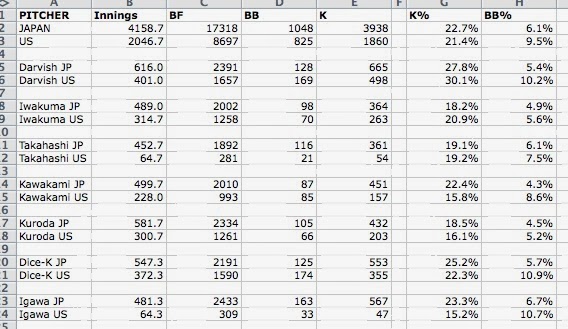
1) Specific measurements of output. As discussed above in the way-too-long-winded introduction, one thing sports has plenty of are measurements of output. Except soccer. What do people measure in soccer? YouTube video highlights of great runs followed by missed kicks?***

2) A large number of transitions of coaches/managers and players between situations. Fortunately in this age of free agency, trades and hot seats, there are routinely numerous changes of players and coaches/managers every season. Also fortunately, players and coaches/managers often get multiple chances with different teams and situations.

3) Enough data. This is a tough one. Off the top of my head it seems baseball and basketball are really the only sports that have enough granularity, a long enough season, and sufficient numbers of teams and players to make this work. Maybe hockey. American football, probably not.

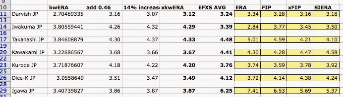
However, it seems worth a try. To explore this idea further with baseball as an example, one could choose to isolate one component of performance such as a hitting statistic. Since we would want to measure something that is both generally agreed upon as positive and also something that stabilizes relatively quickly to best reflect effect of coaching, one could pick strikeout rate (60 plate appearances (PA)), walk rate (120 PA), or singles rate (290 PA). It should be stated up front that this means the effect of the manager only on that particular skill will be seen. Probably the entire analysis would need to be repeated for each of several offensive statistics to create a composite and granular picture of how a given manager influences players under his direction.

One could then use individual game performance as the time component of the model and collect data on that specific metric over time and relate that to which managers a given player had and for how long. The null hypothesis would be that the effect of managers would be nothing, and so the result of the model we would look for are signs that specific managers do make a substantial difference in performance by the players under his instruction compared to those same players before and after being on that manager’s team.

Is there enough data for a signal to be seen? You know, in my day job as a genomics researcher this is probably the main question I get from scientists wanting to perform an experiment: is the number of experimental subjects big enough? And my answer is always the unsatisfying, “We won’t know for sure until we do the experiment and compare the natural variation to the effect size.” Same answer here.

And why bother? Well, I go back to what I said earlier about approaching the asymptote and trying to learn more. Not just in sports, but in so many other parts of life, there are elements that right now are in the realm of intuition and anecdote and subjectivity. Who’s a good CEO? What public policy interventions do good and, more important perhaps, are the most cost effective? Wired magazine just had a nice article about the use of controlled trials to measure the actual effect of public policy interventions in the developing world. In our search to make the world a better and more understandable place, we owe it to ourselves to keep asking questions and trying to come up with ways to answer them.

*Notice here, by the way, that you can take either situation–thriving or failing–and make up a completely believable story in your head about how that player’s personal life played a role in his performance. How he rose above the conflict, or the field was his refuge, or his anger or frustration fed his on-field performance. Alternatively, how he’s a tragic figure, his potential derailed by drugs/philandering/emotions, making him an all too human and very sympathetic figure. This is because our minds are programmed to make up stories, to find cause and effect, to indulge in the narrative fallacy. Be careful of that. It will screw up your thinking faster than anything else.

**Just for fun, here’s one of the equations from their model.

Equation for effort

This roughly translates as: An individual worker (i)’s output (q)  at time t is equal to the ability of the mean worker (alpha sub zero) plus the specific worker’s innate ability (alpha sub i) plus the set of variables outside the worker-boss interaction (X sub it times capital Beta) plus the ability of an average boss (d sub 0t) divided by team size (N sub jt) to the theta power, where theta is related to public versus private time with the boss plus the ability of the current boss (d sub jt) divided by the team size to theta. This equation relates to the current effect. A longer version of the equation tries to take into account the effect of past bosses and the persistence of boss effects.

***I am reminded of one of the fine haikus inspired by the 1994 World Cup tournament in the US, source sadly lost to me although if anyone remembers it, let me know:
“Run, run, run, run, run
Run, run, run, run, run, run, run
Run, run, pass, shoot, miss.”


Joey Votto: 6-WAR Player

In spite of the ridiculous scrutiny regarding his 2013 season, Joey Votto is one of the best hitters in baseball. He also has a large contract that begins in 2014. Big contracts have seemingly brought bad baseball voodoo to some of baseball’s best (injury to Pujols noted). As Votto begins his mega-deal, both ZiPS and Steamer show him declining by over a win in WAR in 2014.  Because of how good he has been for the last four years, I found this projected decline somewhat surprising. I decided to dive into the numbers and found some really interesting things.

Votto has had four straight years of excellence. Since 2010, he has the third-best WAR among position players (25.1), the second-best wRC+ (164), the second-best wOBA (418) and the best OBP (434). Votto is at least in the conversation as the best hitter in baseball over this four-year stretch. But for some more perspective, let’s look at his last four years in detail.

Year

AVG

OBP

SLG

BB%

ISO

BABIP

wRC+

wOBA

Def

WAR

2010

324

424

600

14%

276

361

172

438

-10.1

6.8

2011

309

416

531

15.3%

222

349

157

406

-5.2

6.5

2012

337

474

567

19.8%

230

404

178

438

-2.1

5.6

2013

305

435

491

18.6%

186

360

156

400

-10.1

6.2

Quite impressive. Votto has earned over six WAR every year except 2012, the year he injured his knee and played in only 111 games. He played many of those games injured as well. The only reasonable complaints are that Votto’s power dropped some in 2013, and his defense was poor (decent for a first baseman). The extent to which Votto’s knee surgery affected his power in 2013 remains to be seen, but it isn’t like his power numbers fell off a cliff.  So what do our beloved projection systems say about Votto’s age-30 season in 2014? They say he will be good but not quite as elite as he has been.

Projection System

AVG

OBP

SLG

BB%

ISO

BABIP

wRC+

wOBA

Def

WAR

ZiPS

289

416

506

17.5%

217

334

N/A (149 OPS+)

386

3

4.8

Steamer

296

424

507

17.8%

211

341

156

400

-9.7

5.0

The encouraging part for Reds fans is that both Steamer and ZiPS think Votto’s power will tick up a little. The hope is that Votto’s knee will be healed, and he will return to the doubles machine he once was, with a few more home runs as well. But Votto is also entering his age-30 season. His best power days may very well be behind him. Or maybe not. I’ll get to that shortly.

The other numbers are similar to the four previous years with one noticeable difference. Both projection systems predict Votto’s batting average to drop below 300 for the first time since his rookie season in 2008, where he struggled to a 297 average.  The cause of this decline in batting average is our old friend BABIP. ZiPS has Votto’s BABIP dropping to 334 even though Votto has averaged a 368.5 BABIP for the last four years. BABIP can fluctuate wildly from year to year,  but Votto has shown the ability to maintain a high BABIP throughout his career. We can expect him to do a little better than these projections. If every 10 points of BABIP equals about 0.3 in WAR, Votto is likely to gain between half a win and one full win.

But the equation 10 points of BABIP=0.3 WAR is with all other stats being equal. If Votto’s BABIP is higher than these projections, he is likely to also have some more extra-base hits, including a couple more home runs. This added power would raise his value even more. Both projection systems already have his power rising from last year. Votto could have a few years of solid power left, especially if his knee is fully healthy.

This puts Votto around six-WAR territory. The other important factor will be his defense. Votto’s defense was poor in 2013 compared to his previous two seasons. He was a top-five defensive first baseman in 2011 according to FanGraphs’ Def and would have been top-three in 2012 had he played enough games to qualify. To remain a six-WAR player, Votto will likely need to return to an above-average defensive first baseman. Steamer has his defense at about the same level as 2013. I do not believe ZiPS Def adjusts for position, but it appears they think he will be average to slightly above-average defensively for a first baseman.

The Reds have much bigger problems than their superstar first baseman. They lack the ability to get on base consistently. They have serious question marks in left field and center field. The reality is that the Reds are a borderline playoff team right now and need Votto to be an elite player to have a legitimate chance of returning to the postseason. After looking at the numbers and with the prospect of a fully healthy knee, It is easy to see Votto continuing his run of excellence.


Do International Players Contribute More than Domestic Players?

I have always wondered what the contribution of international players, players signed as amateur free agents, was compared to that of domestic players, players who went through the Rule 4 Draft process. So much money is spent annually on academies in the Dominican Republic and, to a lesser extent, in Venezuela. Of course, each team has a different budget for these international operations. The Yankees’ complex in the Dominican Republic is much more extravagant than the Marlins’, for example. Regardless, a question I have always asked is what the return on investment (ROI) is for these teams, seeing as greater than 90% of the players that come through these academies don’t ever reach the big leagues or develop into true prospects.

A little background on why I am so interested in this topic: I spent a year in the Dominican Republic, initially volunteering at a successful amateur agency in San Pedro de Macoris (an hour east of Santo Domingo), then helping out with the Dominican Prospect League’s showcases and tournaments, eventually landing with the Yankees as a Player Development/Video Operations intern.

Without access to financial statements, it is nearly impossible to determine a ROI for each team. Instead, I decided to do something much more simple. I looked at the WAR contributions for each team from international players and from domestic players.

I used Baseball-reference.com for all my information, sorting position players by plate appearances and used an arbitrary minimum of 400PA in order to include players that had enough opportunity to contribute in 2013, either positively or negatively.

On the extremes, in 2013 the Cardinals, Orioles, Nationals, and Phillies all had zero international players with at least 400PA, whereas the Diamondbacks, Rangers, Tigers, and Brewers each had four international players with the minimum plate appearances. Overall, 48 international players with at least 400PA combined for 141.6 WAR in 2013. On the other side, 151 domestic players combined for 396.5 WAR. Translated into WAR per player, international players contributed a rate of 3.0WAR/player and domestic players at a rate of 2.6WAR/player.

While going through the players of each team, I realized that I am leaving out players who contributed a significant WAR even though they did not accumulate 400PA, so I decided to lower the minimum to 300PA and change the rate statistic to WAR per 600PA, instead of per player. Players such as Hanley Ramirez were previously left out due to injury. Also, players who were traded midseason and did not have sufficient playing time to post 400PA with one team were previously excluded, such as Alfonso Soriano, are now included with the lowered minimum. Here is what the new results show:

Table 1: WAR per 600PA for international and domestic players during 2013 season. Minimum 300PA. WAR values taken from Baseball-reference.com.

PA

WAR

WAR/600PA

Int’l Players

32851

154.1

2.8

Domestic Players

101805

432.8

2.6


The results show that international players contributed a slightly higher rate of WAR per 600PA in 2013. The 0.2 greater WAR/600PA is not significant enough to conclude that international players contribute more talent per PA than did domestic players.

The next question I had was to determine what percentage of players who had 300PA were international and what percentage of WAR they contributed out of the total players with 300PA. What I found was that 24% of players with at least 300PA were international and they contributed 26% of WAR out of a total of 586.9 WAR. The percentage of players that are international seem to have contributed a similar percentage of overall WAR in 2013.

One small issue I came across was that there were a handful of players that went through the draft even though they are international players. A few examples are Jose Bautista (Dominican), Edwin Encarnacion (Dominican), Yan Gomes (Brazilian), Pedro Alvarez (Dominican), and Yonder Alonso (Cuban). I decided to switch this group of players from domestic to international. Table 2 shows WAR per 600PA, while changing this group of players from domestic to international.

Table 2: WAR per 600PA for international and domestic players during 2013 season, taking into account international players who were part of Rule 4 Draft. Minimum 300PA. WAR values taken from Baseball-reference.com.

PA

WAR

WAR/600PA

Int’l Players

36495

171.9

2.8

Domestic Players

98161

415.0

2.5


The data from Table 2 shows that the gap between international and domestic players of WAR/600PA increased to 0.3, but this gap is still not significant. The question about percentage of WAR contributed changes slightly, but also not significantly. International players contribute 29% of total WAR while international players only make up 27% of total players who had at least 300PA in 2013.

In conclusion, from this short study, I cannot say that international players contributed significantly more WAR than do domestic players in 2013, but there was a difference of 0.3 WAR/600PA in favor of international players. Furthermore, 27% of players with at least 300PA were international and they contributed 29% of the total WAR in 2013 of all players with at least 300PA.

I did not look at pitchers yet, but am open to hear thoughts, criticism, and possible future directions to continue this brief study!