Archive for Toronto Blue Jays

Patrick Murphy Is in a Rhythm at New Hampshire

Prior to his start on Tuesday night when he allowed seven earned runs, Blue Jays No. 26 prospect Patrick Murphy was mowing down opponents in the Double-A Eastern League.

After allowing 12 earned runs through his first four starts of the season, the 6-foot-4, 220-pound right-hander really turned things around, dropping his ERA from 6.11 to 3.14 before Tuesday’s game. In three of his six starts since, he had gone seven innings while allowing one or zero runs.

Here is a comparison of his first four starts compared to the five that followed:

First four starts: 17.2 IP, 19 H, 12 ER, 8 BB, 18 K

Following five starts: 34 IP, 17 H, 6 ER, 4 BB, 39 K

The bottom numbers are the Patrick Murphy Dunedin fans became accustomed to watching last season when he posted some of the best stats in the organization among pitchers.

He started 26 games in Dunedin last year, throwing 146.2 innings with an ERA of 2.64, and he even got a start in Double-A New Hampshire, where he allowed two runs and struck out six over six innings. Read the rest of this entry »


Joe Biagini’s xwOBA and RISP Spread

Would you believe me if I told you that Joe Biagini did a better job minimizing contact quality last year than Marcus Stroman?  I didn’t believe it at first, but it turns out he had slightly better contact quality control on the whole. See the arranged summary table below: (min 500 pitches, showing data for batted balls)

player_name xwOBA
1 Danny Barnes 0.306589888
2 Aaron Loup 0.307355422
3 Roberto Osuna 0.326513158
4 Joe Biagini 0.334128342
5 Ryan Tepera 0.33518593
6 J.A. Happ 0.339169336
7 Dominic Leone 0.340634286
8 Marco Estrada 0.341392086
9 Marcus Stroman 0.355793677
10 Joe Smith 0.368621951
11 Francisco Liriano 0.371231373
12 Aaron Sanchez 0.37646281
13 Mike Bolsinger 0.378370079

xwOBA in this case is a statcast proxy for contact quality, based on launch speed and angle. I’d go on a limb to say it essentially imputes an expected number of wOBA based on the quality of how the hitter squared up the ball, irrespective of what happens after that. Last year, the average xwOBA for a Blue Jays pitcher included in this sample above was 0.344.

Interesting. Biagini’s contact quality was fourth best on the team, but his ERA was third highest among the group. The two higher ERAs were Liariano and Bolsinger (also 11th and 13th highest expected wOBA). This is an example of how situational pitching can ruin you if you let it. Let’s factor in runners in scoring position and compare the same analysis. Below is the same table, except now showing one for runner in scoring position (RISP), 0 for not:

player_name RISP xwOBA
1 Joe Biagini 0 0.299694737
2 Aaron Loup 0 0.302101695
3 Roberto Osuna 0 0.309736842
4 Ryan Tepera 0 0.325156463
5 Danny Barnes 0 0.339150794
6 J.A. Happ 0 0.350223214
7 Marco Estrada 0 0.350911628
8 Marcus Stroman 0 0.352419087
9 Francisco Liriano 0 0.363611702
10 Dominic Leone 0 0.364512605
11 Aaron Sanchez 0 0.369082353
12 Mike Bolsinger 0 0.372388235
13 Joe Smith 0 0.395754386
14 Danny Barnes 1 0.227692308
15 Dominic Leone 1 0.289892857
16 J.A. Happ 1 0.30239604
17 Joe Smith 1 0.30676
18 Marco Estrada 1 0.308904762
19 Aaron Loup 1 0.320270833
20 Ryan Tepera 1 0.363538462
21 Marcus Stroman 1 0.369462185
22 Roberto Osuna 1 0.376842105
23 Mike Bolsinger 1 0.39047619
24 Francisco Liriano 1 0.39261194
25 Aaron Sanchez 1 0.393888889
26 Joe Biagini 1 0.444393258

Look at the two Biaginis! At the very top and very bottom. Without runners in scoring position, Biagini was the best pitcher on the roster in terms of limiting contact quality. Put a guy in scoring position, and he starts getting lit up. Here’s that same table, but sorted by the differences.

player_name RISP.x xwOBA.x RISP.y xwOBA.y diff
1 Danny Barnes 0 0.339150794 1 0.227692308 -0.111458486
2 Joe Smith 0 0.395754386 1 0.30676 -0.088994386
3 Dominic Leone 0 0.364512605 1 0.289892857 -0.074619748
4 J.A. Happ 0 0.350223214 1 0.30239604 -0.047827175
5 Marco Estrada 0 0.350911628 1 0.308904762 -0.042006866
6 Marcus Stroman 0 0.352419087 1 0.369462185 0.017043098
7 Mike Bolsinger 0 0.372388235 1 0.39047619 0.018087955
8 Aaron Loup 0 0.302101695 1 0.320270833 0.018169138
9 Aaron Sanchez 0 0.369082353 1 0.393888889 0.024806536
10 Francisco Liriano 0 0.363611702 1 0.39261194 0.029000238
11 Ryan Tepera 0 0.325156463 1 0.363538462 0.038381999
12 Roberto Osuna 0 0.309736842 1 0.376842105 0.067105263
13 Joe Biagini 0 0.299694737 1 0.444393258 0.144698522

Biagini was not the same person on the mound when threatened with a runner past first. To offer some perspective, that very difference is larger than that between Mike Trout (1st @ 0.437) and Kevin Pillar (130th @ 0.302). You must wonder what some possible explanations of this could be .Sign stealing? The yips? Pitch selection? Let’s look at the 2016 differences table and see if this affected him at all. (min 500 pitches)

player_name RISP.x xwOBA.x RISP.y xwOBA.y diff
1 Jason Grilli 0 0.429316 1 0.229538 -0.19978
2 Drew Storen 0 0.475368 1 0.320645 -0.15472
3 Joe Biagini 0 0.345207 1 0.270319 -0.07489
4 R.A. Dickey 0 0.39697 1 0.337583 -0.05939
5 Aaron Sanchez 0 0.366077 1 0.328248 -0.03783
6 Roberto Osuna 0 0.386113 1 0.350638 -0.03547
7 Brett Cecil 0 0.411931 1 0.379067 -0.03286
8 Marcus Stroman 0 0.362472 1 0.334 -0.02847
9 Francisco Liriano 0 0.351901 1 0.369333 0.017432
10 J.A. Happ 0 0.363058 1 0.386705 0.023646
11 Marco Estrada 0 0.335267 1 0.359102 0.023835
12 Jesse Chavez 0 0.340885 1 0.48161 0.140725

Runners on second and or third in 2016, Biagini pitched to better contact quality.  He was coming out of the bullpen, but it still leaves our question of consistency from last year unresolved. It wasn’t Biagini’s pitch selection either. Based on the table below, his distribution of pitches with and without RISP last year was more or less the same. It’s not as though he wasn’t throwing the breaking ball with RISP.

pitch_type RISP n Frequency
1 CH 0 207 0.146393
2 CU 0 278 0.196605
3 FC 0 145 0.102546
4 FF 0 784 0.554455
5 CH 1 80 0.154739
6 CU 1 138 0.266925
7 FC 1 39 0.075435
8 FF 1 260 0.502901

I don’t know what the real explanation for this is. It likely could just be chance, but I’d like to think there’s a more probable explanation for it. I say the yips! Pitchers aren’t robots, some pitchers must get phased more than others by the pressure of potential runs scoring. But last year on the whole Toronto pitching allowed very similar contact quality regardless of having runners in scoring position.

RISP xwOBA
1 0 0.343178
2 1 0.345718

P.S. first time posting! let me know what you think. had a lot of fun doing this.


Gary Sanchez Should Bat Second

What do Mike Trout, Josh Donaldson, Dustin Pedroia, Corey Seager and Manny Machado all have in common? Besides the numerous accolades that they share between the Rookies of the Year, the Silver Sluggers, the MVP awards and the combined 16 All-Star appearances, they all share one less obvious trait: they have more career plate appearances batting second in the lineup than anywhere else. Gone are the days of your team’s best player batting third or fourth. The new normal is now MVP-caliber players batting second. It has worked for Pedroia and the Boston Red Sox, Machado and the Baltimore Orioles, Donaldson and the Toronto Blue Jays and Seager and the Los Angeles Dodgers. Not for nothing, but those teams all made the postseason last year with large contributions from their second-hole hitters AND Trout was the AL MVP for the second time in his career on a last-place Los Angeles Angels team. And as more teams continue to adopt this trend, the New York Yankees should also look to bump up their best hitter.

In an appearance the other week on a YES Network interview, GM Brian Cashman has stated that the Yankees have kicked the tires on splitting Brett Gardner and Jacoby Ellsbury in the lineup. This makes a lot of sense when looking at their game; they both rely on their ability to get on base and set the table more so than their ability to drive in runs. Additionally, both players have slowly, but noticeably, been in decline in recent seasons, primarily due to age and injury. Gardner has been the subject of trade rumors over the past few seasons and Ellsbury has been the ire of the New York media for largely failing to live up to the seven-year, $153-million deal he signed before the 2014 season. River Ave Blues has already had a look at how the Yankees would approach this situation and they have provided a solid solution, but they almost immediately toss out the idea of Gary Sanchez batting there for one reason or another, while Sanchez is most deserving of the promotion.

Sanchez has established himself as the Yankees’ most dominant hitter after bursting on the scene last year. The Yankees, their fans, and the nation all expect Sanchez to hit in the third spot in the lineup, a prestigious position considering the history of the franchise, but moving the young slugger to second would not only better suit the team, but would also play to his strengths. Sanchez, despite the short sample size of 231 plate appearances, has proved to be a pretty good fastball hitter. Of the 294 fastballs he has seen, he has connected for a .328 AVG and .781 SLG, and nine of his 20 home runs. Why does this matter? Traditionally, number-two hitters have seen more fastballs than elsewhere in the lineup, and to further cement his commitment to the fastball, per Brooks Baseball, Sanchez had an exit velocity of 94.3 MPH against the heater (Sanchez ranked in the top 10 in overall exit velocity last year). Young players are also traditionally late to adapt to major-league breaking pitches. Can you blame them when they’re up against this or this?

Secondly, it has been proven that two-hole hitters collect more plate appearances per season than the three through nine spots. This is not new information, but the exact number of plate appearances has been up for debate for years. Beyond the Box Score might’ve ended the debate while also examining how the two hole has changed, stating that “[e]ach drop in the batting order position decreases plate appearances by around 15-20 a year,” which might explain why MVPs Trout and Donaldson have made a living there over the past few seasons. An extra 10-20 plate appearances could mean an extra home run or two over the course of the season. Baseball is a game of inches, but it’s also a game of runs.

With a lineup bereft of veteran power and more intent on utilizing the “Baby Bombers,” as they’ve been so aptly named, moving Sanchez up to second could and should give the lineup a much-needed boost if the reliance on Greg Bird and Aaron Judge should go somehow awry. Veterans Matt Holliday, Chase Headley and Starlin Castro have had good seasons and impressive resumes, but they need to return to All-Star form to carry a team of youngsters and a questionable starting rotation. No one really expects Sanchez to produce at the same rate that he did last year, but perhaps a bump up would allow him to produce at an above-average level again.


Where to Bat Your Best Hitter: A Computational Analysis (Part 1)

Prior to the August, 2015, non-waiver trade deadline, the Toronto Blue Jays sent their leadoff hitter Jose Reyes to the Colorado Rockies for Troy Tulowitzki, a classic middle-of-the-order bat. Everyone assumed from his career power numbers that Tulowitzki would slot in the heart of the Jays order, but with Josh Donaldson, Jose Bautista, and Edward Encarnacion already comfortably set at 2-4 (over 200 RBIs between them at the time) they instead used him in the vacated leadoff spot. The move seemed to work as Tulo went 3 for 5 in his first game, and the Jays proceeded to rattle off a tidy 11-0 streak with their new top-of-the-order guy.

Troy Tulowitzki
Shortstop B/T: R/R
.297 / .370 / .510
29 HR 100 RBI 8 SB
TT José Reyes
Shortstop B/T: B/R
.290 / .339 / .432
12 HR 65 RBI 50 SB
JR

One doesn’t mess with success, but everyone knows Tulowitzki is not an ideal leadoff hitter, never having batted there before in his 10-year MLB career, and with all of 3 stolen bases in the last 3 seasons. His above-average pop suggests a traditional run-producing spot: 29 HR and 100 RBI career numbers over an averaged 162-game season (Baseball-Reference.com), but with the Jays on a 22-5 tear, Tulo, touch wood, wasn’t moving anywhere.

A leadoff hitter naturally gets more at bats per season, one reason Jays manager John Gibbons gave for putting Tulowitzki at the top of the order, given his career .297 BA and .370 OBP. But tradition and common sense dictate that top RBI men are more valuable with men on base, impossible for a leadoff man in the first inning, and presumably sub-optimal afterwards. As Tulowitzki’s new teammate 3B Josh Donaldson noted in the midst of an August run that saw the Jays go from 6 back of the Yankees to 1 1/2 up in the AL East, “I feel like every time I’m coming up I have someone in scoring position or someone on base.” Exactly.

Fine-tuning a lineup is an argument for the ages, but can we determine where a power hitter should bat, where his numbers best fit 1 to 9? Should high-average batters hit before the sluggers, or should we just bat 1-9 in order of descending batting average (or OBP)? Can we calculate how to arrange a team’s lineup to maximize the optimum theoretical run production?

Enter Monte Carlo simulations, used to model the motion of nuclei in a DNA sequence, temperatures in a climate-change projection, even determine the best shape and size of a potato chip. In Do The Math!, Monte Carlo simulations were used to calculate where a Monopoly player will most likely land (Jail and Community Chest, followed by the three orange properties: St James, Tennessee, and New York), and whether to hit or stick in Black Jack against any dealer’s up card.

In some cases, algebraic probabilities are difficult (using Markov chains, a continuously iterative system with a finite countable sample space), whereas brute force computation does the trick over a large number of trials. If a picture is worth a thousand words, a simulation is worth a thousand pictures.

BOO V1 (Batting Order Optimization Version 1) is a Monte Carlo program written in Matlab that randomly selects a hit/out event over a 9-inning, 27-out game, averaged over a large number of games, e.g., 1 million. It uses a flat lineup where all hitters have a .333 OBP (roughly the Jays average), but doesn’t include errors, hit batsmen, sacrifices, double plays, stolen bases, etc., or opposing pitchers’ numbers. (In Part II, I will include the hitting stats of a real lineup: 1B, 2B, 3B, HR, BB, K, GO/AO.)

The mathematical guts are fairly simple, essentially a random number generator and some modulo math (think of leap-frogging 3 or more chairs at a time in a circle of 9), and elegantly captures some interesting trends, in particular, the distribution of end-game batters 1-9 and thus the most likely batter to end a game. From such a simulation, we can calculate where best to slot a team’s best hitter to maximize his chances of coming to the plate with the game on the line, another stated reason for putting Tulo in the Blue Jays number 1 spot.

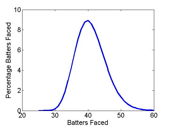
Figure 1a shows the distribution of batters faced (BF) over 1,000,000 simulated BOO games, where the most likely end was 40 batters faced followed by 39 and 41 (the 3-5 hitters), as might be expected with a hard-wired OBP = .333 (binomial p = .33). It seems the custom of having your clutch hitters in the 3-5 slots matches the computational results.
BOOFigure1a BOOFigure1b

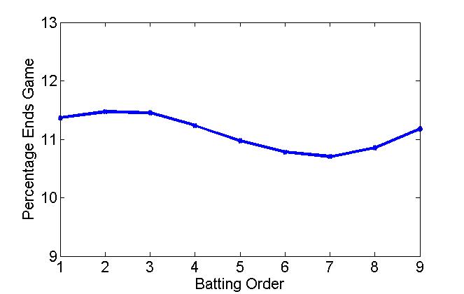
Figure 1a: Distribution of # of batters faced   Figure 1b: Distribution of end-game batters

Interestingly, however, the leadoff hitter doesn’t end a game more often than a middle-order batter. Figure 1b shows the distribution of end-game batters (EGB) for a 1-9 lineup, and is perhaps counter-intuitive. In fact, the number 2 and 3 hitters are more likely to end a game than the leadoff hitter, while there is an obvious dip 3-7. Table 1 shows the frequency of end-game batters 1-9 (number and percentage).

1 2 3 4 5 6 7 8 9
# of games ended 18.4 18.6 18.6 18.2 17.8 17.5 17.3 17.6 18.1
% games ended 11.4 11.5 11.5 11.2 11.0 10.8 10.7 10.9 11.2

Table 1: Number of games ended and percentage versus lineup position (OBP = .333)

Initially, I expected a constant drop-off from 1 to 9, or perhaps following some form of a Benford’s Law distribution, for example, in the wear pattern on a ATM pad or the leading digit in a collection of financial data (1 appears about 30%, 2 about 18%, 3 about 12%, 4 about 10%, . . . , and 9 about 5%). Note, if the data were randomly distributed, each number would appear 11.1% or 1/9. But the modulo aspect of a repeated baseball lineup creates another distribution, one that has a clear maximum after the leadoff spot and a mid-lineup dip at batter number 7.

Of course, the leadoff hitter will always have more plate appearances over an entire season, but somewhat surprisingly does not end a game more often. Table 2 shows the number of at bats 1-9 averaged over a 162-game season (I have assumed 8.5% of plate appearances are walks). As can be seen, the leadoff hitter gets about 130 more ABs than the number 9 hitter, or 21% more per season, reason enough to put your best hitter at the top of the order. From one batter to the next, however, the difference is only about 17 ABs (monotonically decreasing), about an extra AB every 10 games. Not that much difference one spot to the next.

1 2 3 4 5 6 7 8 9
# of ABs 757 740 723 706 689 673 657 641 625
% ABs 12.2 11.9 11.6 11.4 11.1 10.8 10.6 10.3 10.1

Table 2: Number of ABs and percentage ABs over 162 games (OBP = .333)

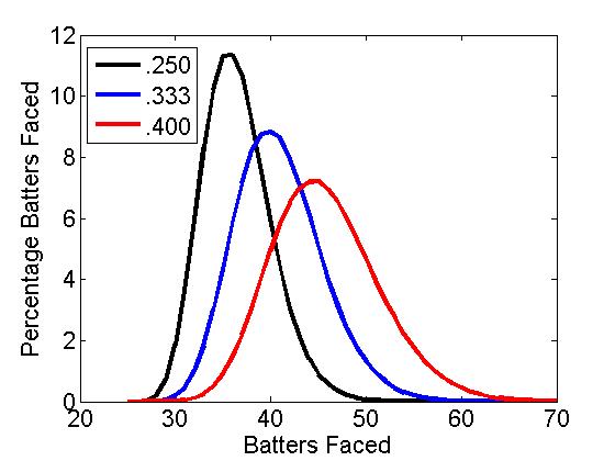
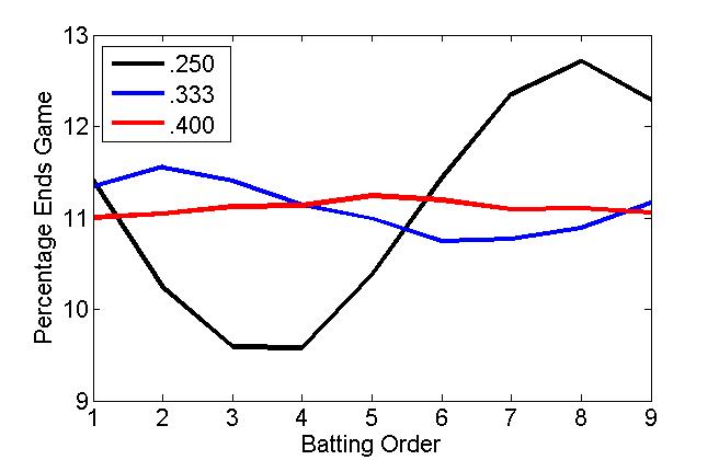
Using BOO, we can also analyse how the EGB distribution changes for a good and a bad team, modelled using an OBP of .250 and .400. The results are shown in Figure 2 including our .333 OBP team. Here, it seems that the lineup order matters more on a bad team than a good team (a practically flat EGB). Indeed, it is often said that you can run any lineup out with a good team. Conversely, losing teams are always juggling their lineups to find the right mix.
BOOFigure2a BOOFigure2b

Figure 2a: Distribution of # of batters faced   Figure 2b: Distribution of end-game batters (OBP = .250, .333. .400)

Of course, baseball is not just statistics over a large number of sample-sizes (or simulations). Baseball is played in bunches and hunches. It would take a little over 400 years to play 1,000,000 games in a 30-team, 162-game schedule. Matchups, streaks, situational hitting, and team chemistry may be more important than any theoretical trends. And, of course, a real, non-flat, batting lineup (which I’ll look at in Part II).

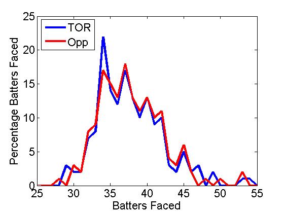
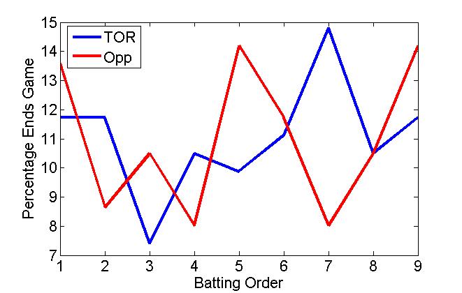
In an actual BF and EGB distribution for the 2014 Toronto Blue Jays and their opponents over a 162-game season, we see the small-sample versions of our super-sized theoretical distributions (Figure 3). The actual BF distribution is comparable to the theoretical binomial/Gaussian BF, though positively skewed, showing the effect of blowouts, not adequately covered in the hit/out simulation. The EGB distribution seems quite random, but late peaks may indicate the use of pinch hitters in the closing parts of a game. It is also interesting to note that BOO “throws” a perfect game about once every 10 seasons, a bit less than the official 23 over the last 135 years.
BOOFigure3a BOOFigure3b

Figure 3a: Distribution of # of batters faced   Figure 3b: Distribution of end-game batters (2014 Toronto Blue Jays and opposition)

So do the calculations mean anything? According to the numbers, your best hitter should bat 2 or 3, that is, if you want him coming up more often with the game on the line. In “The Batting Order Evolution,” Sam Miller noted that “the anecdotal evidence is strong” to put your best hitter in the number 2 spot. The worst spot for heroics is number 7.

Furthermore, a classic run producer such as Troy Tulowitzki shouldn’t bat leadoff, something the Jays found out after he struck out 4 times, almost a month to the day after acquiring him. Dropping him to the number 5 spot, the manager John Gibbons stated, “Maybe this’ll jump-start him a little bit.” Or maybe, he saw the wisdom of inserting the 2014 NL hit leader and speedster Ben Revere in the leadoff spot and using Tulowitzki’s power in a proven RBI position.

Mind you, with a scorching hot lineup that has scored 100 more runs than the next-best hitting team, it may not matter who bats where. That is, if the game is on the line.

Do The Math! is available in paperback and Kindle versions from the publisher Sage Publications, on-line at Amazon.com, and on order at local book stores. Do The Math! (in 100 seconds) videos are on You Tube.


The R.A. Dickey Effect – 2013 Edition

It is widely talked about by announcers and baseball fans alike, that knuckleball pitchers can throw hitters off their game and leave them in funks for days. Some managers even sit certain players to avoid this effect. I decided to analyze to determine if there really is an effect and what its value is. R.A. Dickey is the main knuckleballer in the game today, and he is a special breed with the extra velocity he has.

Most people that try to analyze this Dickey effect tend to group all the pitchers that follow in to one grouping with one ERA and compare to the total ERA of the bullpen or rotation. This is a simplistic and non-descriptive way of analyzing the effect and does not look at the how often the pitchers are pitching not after Dickey.

Dickey's Dancing Knuckleball
Dickey’s Dancing Knuckleball (@DShep25)

I decided to determine if there truly is an effect on pitchers’ statistics (ERA, WHIP, K%, BB%, HR%, and FIP) who follow Dickey in relief and the starters of the next game against the same team. I went through every game that Dickey has pitched and recorded the stats (IP, TBF, H, ER, BB, K) of each reliever individually and the stats of the next starting pitcher, if the next game was against the same team. I did this for each season. I then took the pitchers’ stats for the whole year and subtracted their stats from their following Dickey stats to have their stats when they did not follow Dickey. I summed the stats for following Dickey and weighted each pitcher based on the batters he faced over the total batters faced after Dickey. I then calculated the rate stats from the total. This weight was then applied to the not after Dickey stats. So for example if Janssen faced 19.11% of batters after Dickey, it was adjusted so that he also faced 19.11% of the batters not after Dickey. This gives an effective way of comparing the statistics and an accurate relationship can be determined. The not after Dickey stats were then summed and the rate stats were calculated as well. The two rate stats after Dickey and not after Dickey were compared using this formula (afterDickeySTAT-notafterDickeySTAT)/notafterDickeySTAT. This tells me how much better or worse relievers or starters did when following Dickey in the form of a percentage.

I then added the stats after Dickey for starters and relievers from all four years and the stats not after Dickey and I applied the same technique of weighting the sample so that if Niese’12 faced 10.9% of all starter batters faced following a Dickey start against the same team, it was adjusted so that he faced 10.9% of the batters faced by starters not after Dickey (only the starters that pitched after Dickey that season). The same technique was used from the year to year technique and a total % for each stat was calculated.

The most important stat to look at is FIP. This gives a more accurate value of the effect. Also make note of the BABIP and ERA, and you can decide for yourself if the BABIP is just luck, or actually better/worse contact. Normally I would regress the results based on BABIP and HR/FB, but FIP does not include BABIP and I do not have the fly ball numbers.

The size of the sample was also included, aD means after Dickey and naD is not after Dickey. Here are the results for starters following Dickey against the same team.

Dickey Starters

It can be concluded that starters after Dickey see an improvement across the board. Like I said, it is probably better to use FIP rather than ERA. Starters see an approximate 18.9% decrease in their FIP when they follow Dickey over the past 4 years. So assuming 130 IP are pitched after Dickey by a league average set of pitchers (~4.00 FIP), this would decrease their FIP to around 3.25. 130 IP was selected assuming ⅔ of starter innings (200) against the same team. Over 130 IP this would be a 10.8 run difference or around 1.1 WAR! This is amazingly significant and appears to be coming mainly from a reduction in HR%. If we regress the HR% down to -10% (seems more than fair), this would reduce the FIP reduction down to around 7%. A 7% reduction would reduce a 4.00 FIP down to 3.72, and save 4.0 runs or 0.4 WAR.

Here are the numbers for relievers following Dickey in the same game.

Dickey Bullpen

Relievers see a more consistent improvement in the FIP components (K, BB, HR) between each other (11.4, 8.1, 4.9). FIP was reduced 10.3%. Assuming 65 IP (in between 2012 and 2013) innings after Dickey of an average bullpen (or slightly above average, since Dickey will likely have setup men and closers after him) with a 3.75 FIP, FIP would get reduced to 3.36 and save 3 runs or 0.3 WAR.

Combining the un-regressed results, by having pitchers pitch after him, Dickey would contribute around 1.4 WAR over a full season. If you assume the effect is just 10% reduction in FIP for both groups, this number comes down to around 0.9 WAR, which is not crazy to think at all based off the results. I can say with great confidence, that if Dickey pitches over 200 innings again next year, he will contribute above 1.0 WAR just from baffling hitters for the next guys. If we take the un-regressed 1.4 WAR and add it to his 2013 WAR (2.0) we get 3.4 WAR, if we add in his defence (7 DRS), we get 4.1 WAR. Even though we all were disappointed with Dickey’s season, with the effect he provides and his defence, he is still all-star calibre.

Just for fun, lets apply this to his 2012. He had 4.5 WAR in 2012, add on the 1.4 and his 6 DRS we get 6.5 WAR, wow! Using his RA9 WAR (6.2) instead (commonly used for knucklers instead of fWAR) we get 7.6 WAR! That’s Miguel Cabrera value! We can’t include his DRS when using RA9 WAR though, as it should already be incorporated.

This effect may even be applied further, relievers may (and likely do) get a boost the following day as well as starters. Assuming it is the same boost, that’s around another 2.5 runs or 0.25 WAR. Maybe the second day after Dickey also sees a boost? (A lot smaller sample size since Dickey would have to pitch first game of series). We could assume the effect is cut in half the next day, and that’d still be another 2 runs (90 IP of starters and relievers). So under these assumptions, Dickey could effectively have a 1.8 WAR after effect over a full season! This WAR is not easy to place, however, and cannot just be added onto the teams WAR, it is hidden among all the other pitchers’ WARs (just like catcher framing).

You may be disappointed with Dickey’s 2013, but he is still well worth his money. He is projected for 2.8 WAR next year by Steamer, and adding on the 1.4 WAR Dickey Effect and his defence, he could be projected to really have a true underlying value of almost 5 WAR. That is well worth the $12.5M he will earn in 2014.

For more of my articles, head over to Breaking Blue where we give a sabermetric view on the Blue Jays, and MLB. Follow on twitter @BreakingBlueMLB and follow me directly @CCBreakingBlue.


Current Edwin Encarnacion vs. Vintage Albert Pujols

Toronto Blue Jays 1B/DH Edwin Encarnacion had another great year with the bat in 2013. He posted a .272/.370/.534 line with a 148 wRC+ that was 6th in the AL. This was on the heels of a 2012 season where Encarnacion managed a .280/.384/.557 line with a 151 wRC+.

In his late-career resurgence, Encarnacion has become the rarest of players, a power hitter that rarely strikes out. Only Chris Davis and Miguel Cabrera had more home runs than Encarnacion’s 36. The previous year, Encarnacion slammed 42 home runs.

Meanwhile, Encarnacion struck out in only 10% of his plate appearances. Only seven qualified hitters struck out at a lower rate than Encarnacion. None of them had more than 17 home runs.

In fact, you’ll have to go back to the glory days of Albert Pujols (2001-11) to find someone who matched Encarnacion’s home run total with a similarly low strikeout rate.

Here’s a look at their numbers side by side.

HR BB% K%
Vintage Pujols 40 13.1 9.5
Encarnacion ’12-13 39 13.1 12.3

Pretty impressive, huh? Well, let’s dig even further. From 2001-11, the MLB average walk and strikeout rates were 8.5% and 17.3%, respectively. In 2012-13, they were 7.9%, and 19.9%, respectively. So, here are Pujols’ and Encarnacion’s numbers expressed as a percentage of the MLB average.

HR/PA BB% K%
Vintage Pujols 222% 154% 55%
Encarnacion ’12-13 238% 165% 62%

So if we adjust for the MLB average, Edwin Encarnacion’s home run and walk rates from 2012-13 were better than those of vintage Albert Pujols. His strikeout rate was a shade worse. If I restricted the comparison to 2013, Encarnacion would be better in all three categories.

Does this mean that Encarnacion from 2012-13 has been the offensive equivalent of vintage Pujols? Well, not quite. Let’s revisit wRC+. Pujols’ average from 2001-11 was a robust 167. Encarnacion’s wRC+ from 2012-13 is 148. Where does this big difference come from?

Pujols in-play batting average in his prime years was .311. On the other hand, Encarnacion has just a .256 in-play average from 2012-13. That’s a very big difference. Only Darwin Barney had a worse in-play batting average than Encarnacion in that time frame.

Does Pujols hit more line drives? What’s the reason for this big split? Here are their batted-ball ratios.

LD% GB% FB% IFFB%
Vintage Pujols 19.0 40.9 40.0 13.0
Encarnacion ’12-13 19.6 34.1 46.3 10.7

Pretty similar. Pujols hits more ground balls, Encarnacion does a better job of avoiding the infield fly. In fact, based on these ratios, you would expect Encarnacion to have a higher in-play average than Pujols.

Recently teams have been using a unique shift against Encarnacion, where they put three infielders on the left side of second base. Here’s a picture below.

This shift has been successful in taking away hits from Encarnacion. Since 2012, he’s hit just .222 on ground balls, compared to .262 for vintage Pujols. In 2013, just 25 of the 170 groundballs Encarnacion hit found a hole. Here’s a link to his spray chart.

On balls he pulls, Encarnacion has a .376 batting average. That might sound very good, but compare it to Pujols, who hit .477 on balls he pulled in his vintage years.

Edwin Encarnacion is an elite hitter. In terms of walks, strikeouts, and home runs, he’s every bit the hitter that Albert Pujols was during his prime years. Sure, his pull-heavy approach might allow the shift to take away some hits, but the shift can’t do anything about the balls he puts over the fence.


Why the Blue Jays should have dealt Casey Janssen

The Blue Jays were in a tough spot this trade deadline. They came into the season with huge expectations and as you may know they have failed to live up to those lofty expectations. They should have been sellers in my opinion this deadline; instead they decided to hold, which is understandable as most of the core is at least signed though next season. Casey Janssen is considered one of those core pieces.

With that being said here are three reasons why I think that Janssen should not be a core piece and should have been dealt this past deadline.

Reason #1 Get a piece for the future.

Here’s how Janssen compares to the other “proven closer” who got traded this deadline.

Name ▾ IP BB% K% HR/9 BABIP LOB% GB% HR/FB ERA FIP xFIP WAR RA9WAR
Casey Jannsen 34.1 6.7% 25.4% 0.26 0.225 67.6% 48.3% 3.7% 2.36 2.32 3.03 1.1 0.9
Jose Veras 44.0 8.1% 25.6% 0.82 0.234 76.7% 45.9% 9.3% 2.86 3.39 3.56 0.6 0.9


The numbers are similar but clearly Janssen has been better this season, meaning he could have brought back something better than Danry Vasquez who the Astros got for Veras. That type of prospect could have helped the Blue Jays’ depleted system recover somewhat from all the off-season trades.

Reason #2 Blue Jays have a replacement closer in the wings.

If Janssen had been dealt the Blue Jays could have handed the closer’s job to all-star Steve Delabar. Delabar has all the traits you look for in a closer: he throws hard, averaging a touch over 94mph this season. He gets strikeouts, 13.59 K/9 and 34.7% K rate. He is also getting good results sporting a pitching triple slash line (ERA/FIP/xFIP) of 2.90/2.44/3.11.  He also doesn’t have a platoon issue, allowing a .297 wOBA against righties and a .304 wOBA against lefties. I don’t see how the Blue Jays management could have a problem giving Delabar a shot at the closer’s job if they had dealt Janssen.

Reason #3 Janssen is declining

This is the big reason why the Blue Jays should have dealt Casey Janssen. His skills are declining and selling him now would have been the perfect time before he potentially implodes next season. Here’s why I see Janssen declining and not being the same next season. He will turn 32 this September so he is on the wrong side of the pitcher aging curve. He is at that age where across the board numbers usually begin to decline, and we are already starting to see that this season.  Let’s start with velocity; he is down almost 2MPH this season from 91.7mph the last 2 seasons to 90.0mph this season. We know velocity is highly correlated with strikeouts so it’s not surprising to see a significant drop in both his K/9 and K%. His K/9 is down from 9.47 last season to 8.91 this season and his K% has dropped from 27.7% to 25.4%. His swinging strike rate has never been great but it peaked last season at 9.5% which was just barely above the league average. It has dropped back to 2010-2011 levels at 8.2% and is now below average. His O-Swing rate is down, which leads me to believe his stuff isn’t fooling batters as it had in the past, and it supports why his walk rate has shot up from 1.55 BB/9 last season to 2.36 this season.

We can clearly see his skills are declining, but despite all that Janssen has managed to post the best FIP and xFIP of his career. I see this as being significantly influenced by luck. He is posting the lowest BABIP of his career at .225 vs. a career .290; his HR/9 and HR/FB% are also at career lows sitting at 0.26 and 3.7% respectively. Pitching in Toronto you have to figure there is no way he keeps suppressing home runs at his current rate.

To sum this up, we have a closer who has declined across the board, who will be 32 next month, and who is getting results by suppressing home runs in a hitter-friendly park. Yet he was kept around despite the possibility of being able to get a decent prospect and having a potential closer replacement waiting. But hey who knows what will happen in a year from now, maybe Janssen will keep it up for one more season and make me look like an idiot, but I wouldn’t bet on it.


The True Dickey Effect

Most people that try to analyze this Dickey effect tend to group all the pitchers that follow in to one grouping with one ERA and compare to the total ERA of the bullpen or rotation. This is a simplistic and non-descriptive way of analyzing the effect and does not look at the how often the pitchers are pitching not after Dickey.

I decided to determine if there truly is an effect on pitchers’ statistics (ERA, WHIP, K%, BB%) who follow Dickey in relief and the starters of the next game against the same team. I went through every game that Dickey has pitched and recorded the stats (IP, TBF, H, ER, BB, K) of each reliever individually and the stats of the next starting pitcher if the next game was against the same team. I did this for each season. I then took the pitchers’ stats for the whole year and subtracted their stats from their following Dickey stats to have their stats when they did not follow Dickey. I summed the stats for following Dickey and weighted each pitcher based on the batters he faced over the total batters faced after Dickey. I then calculated the rate stats from the total. This weight was then applied to the not after Dickey stats. So for example if Francisco faced 19.11% of batters after Dickey, it was adjusted so that he also faced 19.11% of the batters not after Dickey. This gives an effective way of comparing the statistics and an accurate relationship can be determined. The not after Dickey stats were then summed and the rate stats were calculated as well. The two rate stats after Dickey and not after Dickey were compared using this formula (afterDickeySTAT-notafterDickeySTAT)/notafterDickeySTAT. This tells me how much better or worse relievers or starters did when following Dickey in the form of a percentage.

I then added the stats after Dickey for starters and relievers from all three years and the stats not after Dickey and I applied the same technique of weighting the sample so that if Niese’12 faced 10.9% of all starter batters faced following a Dickey start against the same team, it was adjusted so that he faced 10.9% of the batters faced by starters not after Dickey (only the starters that pitched after Dickey that season). The same technique was used from the year to year technique and a total % for each stat was calculated.

Here is the weighted year by year breakdown of the starters’ statistics following Dickey and a total (- indicates a decrease which is desired for all stats except K%):

2012:
ERA: -46.94%  with 5/5 starters seeing a decrease
WHIP: -16.16% with 4/5 seeing a decrease
K%: 47.04% with 4/5 seeing an increase
BB%: 6.50% with 3/5 seeing a decrease
HR%: -50.53% with 5/5 seeing a decrease
BABIP: -14.08% with 4/5 seeing a decrease
FIP: -25.17% with 5/5 seeing a decrease

2011:
ERA: 17.92%  with 0/3 seeing a decrease
WHIP: -9.63% with 2/3 seeing a decrease
K%: -2.64% with 2/3 seeing an increase
BB%: -15.94% with 2/3 seeing a decrease
HR%: -9.21% with 2/3 seeing a decrease
BABIP: -15.14% with 2/3 seeing a decrease
FIP: -5.58% with 2/3 seeing a decrease

2010:
ERA: -23.82%  with 5/7 seeing a decrease
WHIP: 1.68% with 5/7 seeing a decrease
K%: -22.91% with 1/7 seeing an increase
BB%: -2.34% with 5/7 seeing a decrease
HR%: -43.61% with 5/7 seeing a decrease
BABIP: -3.61% with 4/7 seeing a decrease
FIP: -10.61% with 5/7 seeing a decrease

Total:
ERA: -17.21%  with 10/15 seeing a decrease
WHIP: -8.10% with 11/15 seeing a decrease
K%: -3.38% with 7/15 seeing an increase
BB%: -5.17% with 10/15 seeing a decrease
HR%: -32.96% with 12/15 seeing a decrease
BABIP: -11.04% with 10/15 seeing a decrease
FIP: -13.34% with 12/15 seeing a decrease

So for starters that pitch in games following Dickey against the same team, it can be concluded that there is an effect on ERA, WHIP, BABIP, and FIP and a slight effect on BB% and on K%. There is also a large effect on HR rates which we can attribute the ERA effect to. This also tells us that batters are making worse contact the day after Dickey.

So a starter (like Morrow) who follows Dickey against the same team can expect to see around a 17.2% reduction in his ERA that game compared to if he was not following Dickey against the same opponent. For example if Morrow had a 3.00 ERA in games not after Dickey he can expect a 2.48 ERA in games after Dickey.

So if in a full season where Morrow follows Dickey against the same team 66% of the time (games 2 and 3 of a series) in which he normally would have a 3.00 ERA without Dickey ahead of him, he could expect a 2.66 ERA for the season. This seams to be a significant improvement and would equate to a 7.6 run difference (or 0.8 WAR) over 200 innings.

Here is a year by year breakdown of relievers after Dickey (these are smaller sample sizes so I will not include how many relievers saw an increase or decrease):

2012:
ERA: -25.51%
WHIP: -1.57%
K%: 27.04%
BB%: -49.25%
HR%: -34.66%
BABIP: 30.23%
FIP: -38.34%

2011:
ERA: -17.43%
WHIP: 8.45%
K%: 6.74%
BB%: -5.14%
HR%: 7.34%
BABIP: 9.75%
FIP: -2.05%

2010:
ERA: -2.55%
WHIP: 7.69%
K%: -9.28%
BB%: 10.84%
HR%: 2.11%
BABIP: 4.23%
FIP: 9.43%

Total:
ERA: -16.61%
WHIP: 5.38%
K%: 7.50%
BB%: -12.65%
HR%: -8.53%
BABIP: 13.38%
FIP: -10.40%

As expected there was a good effect on the relievers’ ERA, FIP, K%, and BB%, but the WHIP and BABIP were affected negatively. This tells me that the batters were more free swinging after just seeing Dickey (more hits, less walks, more strikeouts).

So in a season where there are 55 IP after Dickey in games (like in 2012) there would be a 16.6% reduction in runs given up in those 55 innings. If the bullpen’s ERA is 4.20 without Dickey it can be expected to be 3.50 after Dickey. Over 55 IP this difference would save 4.3 runs (or 0.4 WAR).

Combine this with the saved starter runs and you get 11.9 runs saved or (1.2 WAR). This is Dickey’s underlying value with the team that he creates by baffling hitters. This 1.2 WAR is if Morrow has a 3.00 ERA normally and the bullpen has a 4.00 ERA. If Morrow normally had a 4.00 ERA than his ERA would reduce to 3.54 over the season with 10.2 runs saved for 200 innings (1.0 WAR) and if the bullpen has a 4.00 ERA normally as well, 4.1 runs would be saved there, equating to 14.3 runs saved or a 1.4 WAR over a season.


Blurred Expectations Unavoidable for Adam Lind

After an apparent breakout season in 2009, Adam Lind regressed somewhat drastically trying to follow it up in 2010. The idea of Lind being able to play left field was all but completely abandoned in 2010 and he served as the team’s primary DH for much of the season. That was a move that couldn’t be argued against heading into 2010 because his defense was well below average and he looked to have a good enough bat to bring solid value from a DH role.

That however, is not what happened last season as Lind went from being a 3.5 WAR player in 2009 to a -.3 WAR player in 2010. His health had nothing to with the drop in production either, Lind played in 150 games last year after playing in 151 in 2009. The drop came entirely from his bat as his batting runs above average fell by 40 runs, from 35.9 to -5.9. Moving almost exclusively to DH actually helped his fWAR in 2010. His fielding and positional adjustment cost him 22.4 runs in 2009 but only 17.2 runs last year.

Read the rest of this entry »