Reframing Catcher Pop Time Grades Using Statcast Data
With the advent of Statcast, statistics like exit velocity, spin rate, and launch angle have become easily accessible to baseball fans. Catcher pop time data has also become available. However, unlike some of the other Statcast metrics, catcher pop time data has existed for much longer, with scouts measuring pop times in the minor leagues years before Statcast entered the mix.
This sounds all well and dandy, right? Well, it would be, if the Statcast numbers were consistent with scouting pop time tool grades. Baseball Prospectus, for example, calls a pop time from 1.7-1.8 a 70 pop time, which sounds reasonable enough without any context. However, considering the best average Statcast pop time to second base from 2015 to 2019 was JT Realmuto’s 1.88 (minimum 10 throws to second), something seems amiss here. I decided to take a deeper look into Statcast’s pop time data to get a better idea of what’s going on.
Methodology
First, I downloaded all of the catcher pop times from Baseball Savant, minimum one throw to second base, from 2015 through 2019. Each player-season combination is its own data point (e.g. Realmuto’s 2018 and 2019 pop times are separate data points). Next, I combined these CSV files into one big data set.
From this data set, I created two new data sets. In the first, I set a minimum of 10 throws to second base. This is the data set I am using in this article. In the second one, I tried to weight every throw equally. The first set treats every player that meets the minimum as its own equal data point; that is, no matter if a player had 10 throws or 50, they are equally weighted. However, in the second data set, I first dropped the throw minimum and then replicated each player’s average pop time by the amount of throws they had to create the data set. This is easier to understand with an example. Let’s say the data set had Catcher A with two throws at an average of 1.84 seconds, Catcher B with three throws at an average of 1.99 seconds, and Catcher C with only one throw at 2.04. The data set, using the second methodology, would be (1.84, 1.84, 1.99, 1.99, 1.99, 2.04). Unfortunately, because Statcast only offers average pop times and not each individual pop time, I cannot truly account for each and every throw, but I think this is a pretty good alternative.
The main reason I used these two different approaches was because of the variety of ways one could evaluate tool grades for players. On the one hand, a 50 grade tool could mean the average of player averages. On the other hand, an average tool could be the actual numerical average of that tool, such as a 50-grade exit velocity tool being equivalent to the average exit velocity of every single batted ball. I will discuss the results of the second approach more in depth in a follow-up article.
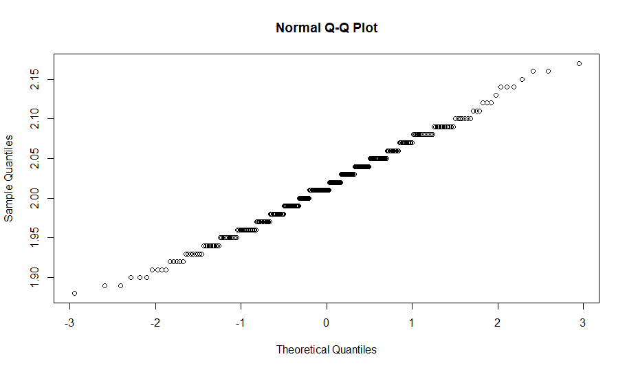
Based on the data, I created new pop time tool grades. I did this simply by finding the standard deviation of the sample and adding/subtracting SDs to the mean to find all the grades. As a reminder, a 10-point difference in scouting grades represents one standard deviation shift in the tool. I also created another set of tool grades based on the Empirical Rule, as the distribution seemed approximately normal. I tested the normality of the data sets using the Anderson-Darling test along with Q-Q plots. The first data set passed the AD test (p-value greater than 0.05) and had a very linear Q-Q plot, so it is safe to say the data set is approximately normal.
For more insight on my methodology, you can check out my Github here. My code for this project is in the Project 3 folder.
Results
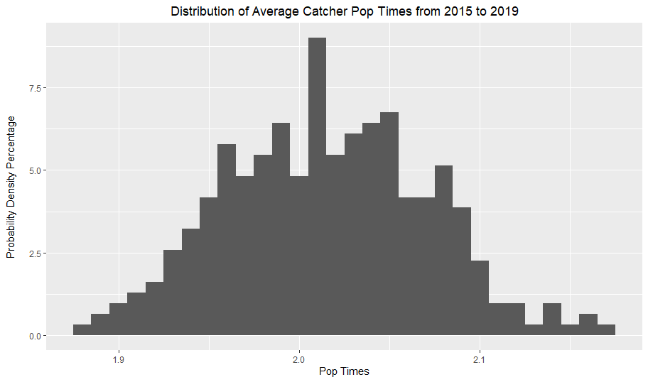
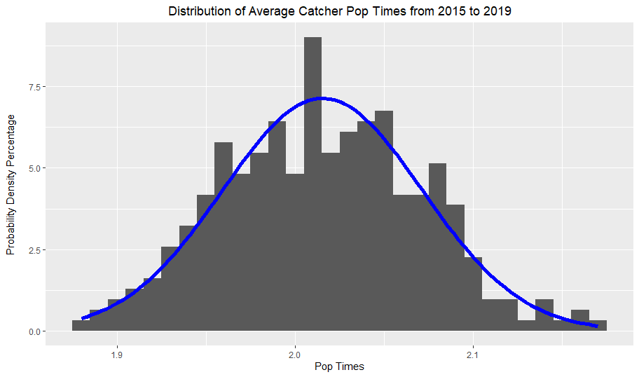
These graphs simply plotted the average pop times of catcher seasons from 2015 to 2019. As I established earlier, the distribution is approximately normal, which the blue normal curve demonstrates by fitting the data quite nicely.
Next, I graphed the blue normal curve above with a red normal curve based on Baseball America’s catcher arm strength grades from the 2018 Prospect Handbook. Their 50 grade pop time was 1.95-2.04, so I simply averaged the two to find the mean and used 0.10 as the standard deviation to create the red normal curve.
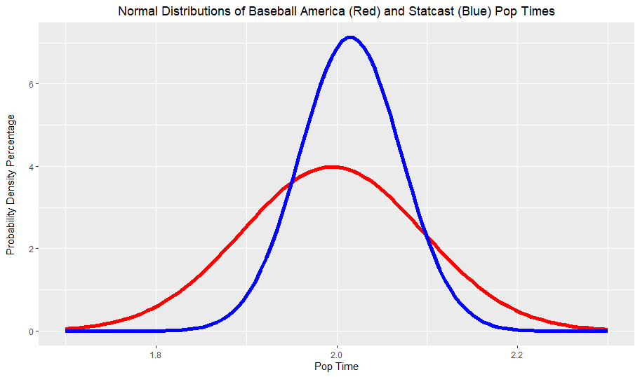
There are two main takeaways from this graph. Firstly, the Statcast curve has a slightly higher mean than the BA curve. Secondly and more notably, the Statcast data has far smaller spread than the BA grades, in both directions. Like I said earlier, the best average pop time grade from 2015 to 2019 was 1.88 (Realmuto’s 2019), which would only be a 60 grade pop time according to both Baseball America and Baseball Prospectus. Clearly, there is a strong disconnect between Statcast pop times and traditional scouting grades.
Using the first data set, I created two new pop time grade scales. The Empirical Rule scale is based on, you guessed it, the empirical rule for normal distributions. The Data Scale is simply based on the actual standard deviation of the data rather than assuming the percentiles and standard deviations match up a certain way like the Empirical Rule does.
The BA Grades were ranges rather than concrete values, so I just averaged the ranges to find the grades.
| Tool Grade | BA Pop Times | Empirical Rule Pop Times | Data Pop Times |
| 80 | < 1.74 | < 1.89 | < 1.85 |
| 70 | 1.795 | 1.93 | 1.90 |
| 60 | 1.895 | 1.99 | 1.96 |
| 50 | 1.995 | 2.01 | 2.02 |
| 40 | 2.095 | 2.04 | 2.07 |
| 30 | 2.195 | 2.10 | 2.13 |
| 20 | > 2.25 | > 2.16 | > 2.18 |
Conclusions
Obviously, something strange is happening here. While I don’t know why this is the case, I’ve thought of a couple potential explanations.
- Measurement Error. To the best of my knowledge, scouts typically measure pop times using a stopwatch. Perhaps the human error with stopwatches is a contributor, or the Statcast measurements are off.
- Different Measurement Methods. The most common definition of pop time is “time elapsed from when the catcher catches the ball and the fielder catches the throw.” However, Statcast pop times measure “the time elapsed from the moment the pitch hits the catcher’s mitt to the moment the intended fielder is projected to receive his throw at the center of the base”. This seems to imply that catching the ball in front of the base would underestimate pop times relative to the Statcast measures. While this explanation makes sense, it doesn’t explain why the mean Statcast pop times aren’t significantly higher than the scouting pop times.
- Max Pop Time versus Average. Some scouts could grade pop times based on maximum pop times rather than averages, which is what data set 1 is comprised of. Once again, this doesn’t explain why the averages are relatively close.
- Catching Arm Talent is Down. Perhaps the current major league catcher arm talent is lower than it typically is.
- Total throws versus averages. This is essentially what I talked about in my methodology, and is why I wanted to look at two separate data sets. Spoilers on the results of data set 2; the distribution was essentially the same to data set 1, so this probably isn’t the issue.
I am really curious if anyone in the scouting industry or from Statcast has any explanations for this discrepancy. I will try to reach out and see if I can get an answer.
While labeling pop times doesn’t actually change how hard catchers are throwing, I think this issue is very important from a data consistency standpoint. When you evaluate minor league players, you want to be sure that you properly contextualize their tools from a current major league standpoint. Assuming the data measurements on both the scout and Statcast sides are accurate, then it’s possible that the scouting industry should reevaluate their pop time tool scale.
Soon I will also put up my results for data set 2, although they aren’t much different. If you are interested in reading about my future projects, you can follow me on Twitter here. Thanks to John Matthew and Srikar for looking this over and thanks for reading!
This article was originally published on my personal blog, Saberscience.
There can be a lot of things that effect pop time, and I’m glad you mentioned some of them. Let’s also point out that these catchers are receiving all kinds of different pitches when these pop times are documented. In theory, high fastballs will result in faster pop times than in-the-dirt curveballs. What happens to the data points when you separate pop times by pitch type? I’d also be curious about pop times separated by pitchers to see if there’s any kind of noise in that data.
Great analysis!
Statcast’s Poptime measure adjusts for accuracy. It takes the speed of the throw and then projects how long it would have taken to reach the center of the given base. In other words, the average of all the throws unadjusted would probably be quicker than the average they’re showing us and more reflect what a scout measures with a standard stopwatch.