Pitch Mix Variation and Ways to Measure It

Earlier this year, I took a hack at defining what I referred to as pitch mix variation. Pitch mix variation, as I conceived of it at least, would be a single number to capture how much any given pitcher mixes his offerings. A higher pitch mix variation (PMV) would indicate first that a pitcher has a relatively diverse mix of pitches and, second, throws each pitch roughly as much as any other. A lower PMV would indicate a pitcher has fewer pitches and relies on just one or maybe two of those the vast majority of the time.
Among other things, baseball types are quick to measure the quality of stuff, command, control, and the number of offerings of pitchers. That said, to my knowledge there doesn’t appear to be a standardized catch-all metric for how often those pitches are utilized. There also seems to be value for such a metric. For instance, a college starter might have a 3,000-rpm curveball that plays up in models, but if he doesn’t trust it and therefore throws it just ~5% of the time, that elite spin might somewhat belie long term bullpen risk.
Put simply, a pitcher who throws a four-seamer, sinker, curveball, and changeup all 25% of the time is quite possibly tougher to square up than one who throws just a four-seam (80%) and curveball (20%), all else held equal.
However, this post isn’t about assigning value or finding an optimal PMV (surely that depends on the individual pitcher), but rather juxtaposing various potential measures. To that end, this post will include the following: (1) a recap of the original formula and logic I previously cobbled together, (2) an overview of two more formalized models for quantifying variation, and (3) a comparison of those three measures across several hundred pitchers in 2021.
The first time around, I essentially went wandering. It is tough to create a measure for what is maybe more art (or preference) than science. In certain ways, polling hitters might even be the most helpful to address questions like “would you rather face a two-pitch pitcher who throws each pitch 50% of the time or a three-pitch pitcher who relies more on a single pitch (60%) but who additionally has two offspeed offerings featuring varying movement profiles?”
In any event, these musings gave way to the following formula.

Following this calculation, all PMV values were mean normalized around 100 for easier interpretation. For a clearer description of my motivations for incorporating these factors, here is another link to the original post.
In essence though, here are those considerations:
- The “1 – ” ensures that greater variance between offering frequency corresponds to a smaller number as opposed to a larger one (less pitch mix variation).
- Taking the standard deviation of pitch percentages (i.e. 50% fastball, 25% curve, 25% slider) measures the spread of those usage rates – i.e. the variation.
- Tacking on the final piece ensures some weight is lent to pitchers with more pitches. Four pitches thrown 25% of the time has a S.D. of zero, and five pitches thrown 20% of the time also results in zero, so it was necessary that a hypothetical pitcher with five distinct pitches should have the larger PMV than one with four. The numerator of that final piece dilutes the weight of “# Distinct Pitches” based on how heavily any given pitcher’s primary offering is relied upon.
For all intents and purposes, this crude formula passed the eye test for measuring PMV; Combing through the labels for PMV created in that prior exercise gave way to no obvious inconsistencies, in my mind at least. Of course, there had to be more established and formalized alternatives to what was homemade. That is what this post is about.
Covering the two forthcoming formulas necessitates a brief tangent into machine learning, specifically decision tree classifiers. Decision trees are classifiers because they are quite effective in classifying unlabeled data. Have a dataset of unclassified movies you’d like grouped into specific genres? Have a bunch of unlabeled pitches that you’d like to classify as being fastballs, offspeed, or breaking pitches? Decision trees might be a good option.
Decision trees can get complicated quickly, so in order to counteract that possibility and keep things computationally inexpensive as well as relatively simplified, decision tree algorithms work to identify the most informative features in a dataset by which to split up data into various classes. Should you be splitting pitch data into broad fastball and offspeed classes, pitch velocity might be the most “helpful” feature. For classifying fastballs as either of the two- or four-seam variety, in that case horizontal movement might be the more “helpful” feature than velocity.
The word “helpful” has been put in quotations because it might be a bit of a misnomer. Really, what is “helpful” for a decision tree is reducing entropy, which could be defined as a measure of impurity of the elements in a set. Correctly labeling seven of 10 pitches as four-seams based on pitch velocity means more entropy than if pitches were split based on horizontal movement and nine of 10 pitches were correctly labeled. Hence homogeneity is negatively related to entropy.
Decision trees identify the feature that most reduces entropy (heterogeneity) and splits data based on that, ideally resulting in two groups that are as homogenous as possible. Following that initial splitting of the data, the search is on for the next-most informative feature for reducing entropy (also representing information gain).
Readers who could follow that hurried synopsis might be connecting some dots. There is no “entropy” in a four-pitch “dataset” wherein each pitch is thrown exactly 25% of the time. However, there is entropy (as it relates to pitch percentages) in a four-pitch dataset in which pitches are thrown at vastly differing rates (ex. 55%, 25% 13%, 7%).
As such, I have borrowed a measure of entropy used in some decision trees that is based on Shannon’s Entropy Model. Below is both the formula using slightly adjusted notation for that model and, what might be most helpful, an example for a pitcher who throws one pitch 50% of the time and two more exactly 25% of the time.

Another measure of entropy that follows the same line of reasoning for reducing entropy (or maximizing information gain) and that is sometimes employed in decision tree algorithms is the Gini Index. The Gini Index is possibly most popularly applied by economists to evaluate wage disparity by indicating how disparate wages are for any given population. In short, a high Gini Index means high income inequality and a lower Gini Index indicates less income inequality (I’ll give you one guess where the U.S. lies on that scale). Here that index is applied to pitch percentages: a high Gini Index suggests disparate pitch usage rates (low pitch mix variation) and a low Gini Index indicates similar usage rates.
The equation for the Gini Index as well as another example are depicted below.

In order to compare these metrics, data was pulled from Baseball Savant for all pitchers who, as of September 5th, had thrown at least 500 pitches in 2021. There were 438 qualifying pitchers given this modest filter, plenty of both starters and relief pitchers. After applying the homemade “original” PMV formula as well as both the adapted entropy model and the Gini Index model to those 438 pitch percentages, all three metrics were mean normalized around 100. The cross table below illustrates how they compare to one another.

At a glance, it is a positive sign to see some healthy correlations between these metrics. As far as the homemade PMV calculation goes, it correlates demonstrably more with the Gini Index than it does with the adapted entropy model. Still, the leaderboards below do more to elucidate more specific differences between the formulas alongside actual player data.
Below are the pitch arsenals of those players with the highest PMV, as measured by the Gini Index (I chose the Gini Index for no other reason than it being quite simple/elegant). As a final note regarding pitcher arsenals, I have removed all pitches that were thrown <2% of the time; I did so believing those pitches possibly to be noise as well as to avoid skewing these results for pitches really only barely employed by particular pitchers.

Perhaps unsurprisingly, starting pitchers appear to have the highest PMV values, regardless of measure.
All three calculations suggest these pitchers have well-above-average PMVs. These measures again pass the eye test, given that almost all of the listed pitchers throw five distinct pitches according to Baseball Savant. On top of that, no pitcher here relies on one single pitch even close to half the time. Chris Bassitt employs his sinker at 36.8%, topping the usage percentage for any single pitch on this leaderboard.
Next, hopping over to the other end of the spectrum, here’s the 15 players with the lowest PMV.

Behold Matt Wisler, slider-throwing extraordinaire. He looks to lead this list according to any of the three formulas applied. The fastball/slider combination is the most common PMV-extreme two-pitch arsenal. While four of 15 pitchers on this reliever-heavy list actually throw four distinct pitches, in each case their two least-frequently utilized combined do not make up even 10% of their offerings.
Comparing the models, it looks as though the entropy model again has the widest bounds while the homemade calculation has the smallest. The largest sources of disagreement correspond to four-pitch pitchers, which both the entropy and homemade models rate as closer to average PMV relative to the Gini Index.
The penultimate chart of this post features those middle-most players; as you’ll see, all three models appear to line up pretty closely in these cases.

The general consensus to “most typical/middle-most” pitch mix variation appears be characterized by three- and four-pitch pitchers who rely on a single pitch roughly half of the time. Blake Snell’s four-seamer is the most commonly thrown pitch by percentage on this chart at 52.5%. This group is easily the most evenly split between starting and relief pitchers as well.
Each of the prior three leaderboards laid bare the discrepancies between the three variation measurements. In order to check in on those particularly extreme instances, the final chart below ranks those pitchers whose repertoires made for the biggest discrepancies between variation metrics.

There is a fair bit to unpack here. To start, the models don’t know quite what to make of two-pitch pitchers who mix their pitches near evenly; the top 12 most disparate values, as measured by the standard deviation among the three numbers, are each for two-pitch pitchers. The Gini Index and my homemade formula consider those types of pitchers to have well-below-average PMVs, whereas the entropy model actually grades them as above-average given how frequently each pitch is thrown, even if there are just two.
Another interesting case is that of Adam Cimber, who throws three distinct pitches at impressively similar rates. Where this breakdown results in roughly average PMV values for the homemade and Gini models, it is considered to have well-above-average entropy by the model’s measure.
As aforementioned, none of these models are perfect. There are no labels for actual PMV values which one may model these results against. Still, they largely agree, and they offer (in my opinion at least) a somewhat useful snapshot for pitch variation.
There remains some fairly obvious potential adjustments to this work. For one, pitchers are not presently grouped by starting and relief statuses, which undoubtedly impacts the mean value all the PMV figures hover around. Second, these PMV measures are context-neutral so they do not recognize pitch usage to, say, specifically left-handed hitters or in 2-0 counts, etc. In all though, each model is at least largely in agreement and those discrepancies might best be left up to taste.
This piece was originally published on my personal blog.
This is really interesting. In theory, having a diverse arsenal can be helpful. But perhaps only if you get true diversity of movement from the same arm slot. Consider Patty Sands from this article: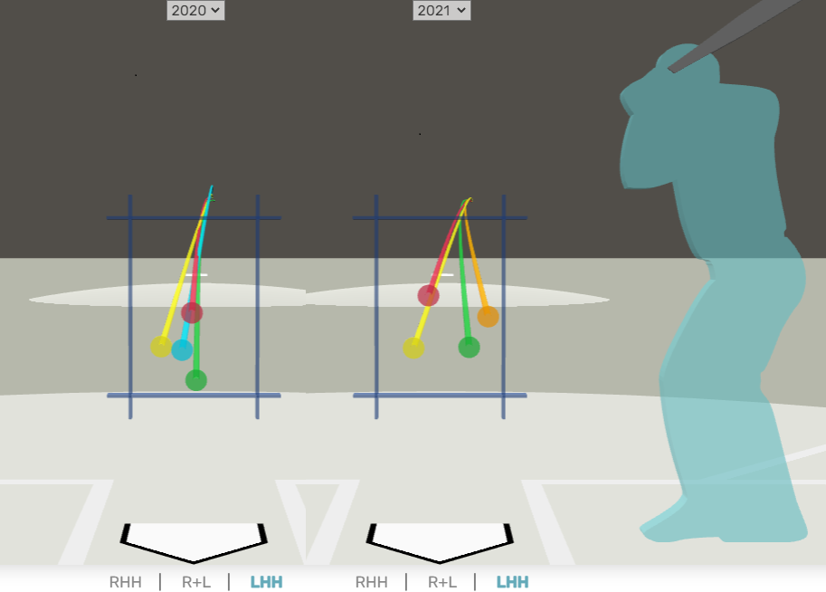
Clearly 2021 his movement is “wider” and thus more troubling to batters from that same release slot. So to really make this metric useful, IMO, you’ll want to consider release point consistency and “width” between pitches.
Counterpoint is perhaps some pitchers can be successful with various release points. And some pitchers could have two pitches that move the exact same way but just at different speeds, and find success that way (I believe this is what Lance Lynn does). So I guess the answer is that pitch mix variation is important for some pitchers but not all.
Thanks for adding to the discussion! I agree – diversity in pitch types alone leaves out a considerable portion of the story here. At present, this pitch mix variation is subject to the limitations of those classifications and entirely neglects the individual pitch profiles (release pts, movement, spin, etc) for any given pitcher. It additionally is count/context neutral and thus does not consider likelihood of pitches thrown when facing LHHs or while ahead in the count, for instance. Still, I found it to be an interesting starting point for a quick descriptive metric capturing what degree any pitcher diversifies their offerings, specifically by pitch classification.