Mark Trumbo, Pedro Alvarez, and Perception

We have come a long way in evaluating players and yet, perception still clouds our judgment. Perception awarded Derek Jeter several Gold Gloves during years where he was a poor defensive player. Perception will likely award Nelson Cruz a hefty contract this winter. While there is no way to know for sure, I fear that perception may have played a role in the biggest trade so far this offseason: the well-documented Mark Trumbo trade.

Plenty of writers have covered why this trade looks like a poor move for the Diamondbacks so I won’t dive deeply into that. I desire to understand how Trumbo could be valued so highly (assuming the Diamondbacks feel they gave up quality for quality). Dave Cameron wrote an interesting article about how Trumbo was both overrated and underrated. He stated that Trumbo’s one great skill, breathtaking power, is a frequently overvalued skill. Kevin Towers seems to be one of those who overvalues power and made the trade based on that one skill.  But is Trumbo’s power the only reason that a team might overvalue him? With this in mind, I decided to find a comparable player and at least speculate to the perception differences that may cause a team to overvalue someone like Trumbo.

That player is Pedro Alvarez. The similarities are actually quite amazing. The following table contains combined information from the 2012 and 2013 seasons, the two years that Trumbo and Alvarez were both full-time players.

2012-2013

HR

RBI

BB%

K%

ISO

BABIP

AVG

OBP

SLG

wOBA

wRC+

WAR

Mark Trumbo

66

195

7.1%

26.7%

.221

.293

.250

.305

.471

.333

114

4.7

Pedro Alvarez

66

185

8.8%

30.5%

.232

.292

.238

.307

.470

.332

112

5.4

Holy smokes! Every time I look at these numbers, I am shocked at how similar these two players were over a two-year span. Trumbo is one year older and right-handed, but that’s where the differences end. Neither gets on base much or is a great defender, but Alvarez wasn’t terrible at third in 2013. They both derive their value almost entirely from their power and strike out way too much. They are the right-handed and left-handed versions of each other from an offensive standpoint.

I’ll admit that if someone had forced me to pick between the two players before doing the research, I may have gone with Trumbo. Why does Trumbo seem to get more attention than Alvarez?  Well, the markets are obviously different. Los Angeles draws a lot more attention than the finally revived corpse that is Pittsburgh baseball. What else does Trumbo have that Alvarez doesn’t? Trumbo has one giant first half in 2012 where he flashed skills he probably doesn’t have.

Pedro Alvarez’s best half of baseball was probably the first half of 2013. Alvarez hit .250/.311/.516 with 24 home runs. That is an impressive stat line, but it doesn’t show any growth in other skills outside of Alvarez’s impressive power. He didn’t get on base much more than other stretches of his career, and his average remained similar to his 2012 line of .244. He has never given anyone any reason to believe he is more than a one-trick pony.

During the first half of 2012, Trumbo hit .306/.358/.608 with 22 home runs. He was an All-Star, and some people thought he had taken a big leap forward. It was the kind of first half that can change perceptions, even though it was a small sample size. The second half proved unkind. Trumbo hit .227/.271/.359 with 10 home runs. But what a first half!

I have no idea whether Towers put any stock into Trumbo’s first half in 2012. Probably not. But it isn’t hard to see how teams could talk themselves into thinking that Trumbo has untapped potential based on that half. Regardless, the perception of Mark Trumbo as an above-average player likely comes from his undeniable power and one monster half of baseball that he has never come close to duplicating. It makes me wonder whether Towers would have given up two young players with potential for Alvarez if he had been available. Considering Alvarez is another “100-plus RBI, 30 home run guy”, he may have. But then again, he may secretly be banking on Trumbo as a real impact bat that produces in more ways than one. While there is no definitive answer to that, this comparison is another precautionary tale to overvaluing short sample sizes.


Team Construction, OBP, and the Importance of Variance

A recent article by ncarrington brought up an interesting point, and it’s one that merits further investigation. The basis of the article points out that even though two teams may have similar team average on-base percentages, a lack of consistency within one team will cause them to under-perform their collective numbers when it comes to run production. A balanced team, on the other hand, will score more runs. That’s our hypothesis.

How does the scientific method work again? Er, nevermind, let’s just look at the data.

In order to gain an initial understanding we’re going to start by looking at how teams fared in 2013. We’ll calculate a league average runs/OBP number that will work as a proxy for how many runs a team should be expected to score based on their OBP. And then we’ll calculate the standard deviation of each team’s OBP (weighted to plate appearances), and compare that to the league average standard deviation. If our hypothesis is true, teams with a relatively low OBP deviations will outperform their expected runs scored number.

Of course, there’s a lot more to team production than OBP. We’re going to conquer that later. Bear with me–here’s 2013.

A few things to keep in mind while dissecting this chart: 668.5 is the baseline number for Runs/(OBP/LeagueOBP). Any team number above this means that they are outperforming, while any number below represents underperformance. The league average team OBP standard deviation is .162

Team Runs/(OBP/LeagueOBP) OBP Standard Deviation
Royals 647.71 0.1
Rangers 710.22 0.17
Padres 632.53 0.14
Mariners 642.88 0.15
Angels 700.75 0.17
Twins 618.61 0.16
Tigers 723.95 0.12
Astros 642.5 0.15
Giants 620.1 0.15
Dodgers 627.18 0.21
Reds 673.82 0.19
Mets 638.45 0.18
Diamondbacks 668.02 0.16
Braves 675.02 0.16
Blue Jays 705.27 0.17
White Sox 622.92 0.15
Red Sox 768.53 0.19
Cubs 631.74 0.12
Athletics 738.61 0.15
Nationals 662.76 0.18
Brewers 650.02 0.16
Rays 669.46 0.18
Orioles 749.95 0.19
Rockies 689.93 0.18
Phillies 627.95 0.14
Indians 717.08 0.18
Pirates 637.87 0.17
Cardinals 744.3 0.2
Marlins 552.48 0.14
Yankees 666.17 0.14

That chart’s kind of a bear, so I’m going to break it up into buckets. In 2013 there were 16 teams that exhibited above-average variances. Of those, 11 outperformed expectations while only 5 underperformed expectations. Now for the flipside–of the 14 teams that exhibited below-average variances, only 2 outperformed expectations while a shocking 12(!) teams underperformed.

That absolutely flies in the face of our hypothesis. A startling 23 out of 30 teams suggest that a high variance will actually help a team score more runs while a low variance will cause a team to score less.

Before we get all comfy with our conclusions, however, we’re going to acknowledge how complicated baseball is. It’s so complicated that we have to worry about this thing called sample size, since we have no idea what’s going on until we’ve seen a lot of things go on. So I’m going to open up the floodgates on this particular study, and we’re going to use every team’s season since 1920. League average OBP standard deviation and runs/OBP numbers will be calculated for each year, and we’ll use the aforementioned bucket approach to examine the results.

Team Seasons 1920-2013

Result Occurrences
High variance, outperformed expectations 504
High variance, underperformed expectations 508
Low variance, outperformed expectations 492
Low variance, underperformed expectations 538

Small sample size strikes again. Will there ever be a sabermetric article that doesn’t talk about sample size? Maybe, but it probably won’t be written by me. Anyways, the point is that variance in team OBP has little to no effect on actual results when you up your sample size to 2000+. As a side note of some interest, I wondered if teams with high variances would tend have bigger power numbers than their low variance counterparts. High variance teams have averaged an ISO of .132 since 1920. Low variance teams? .131. So, uh, not really.

If you want to examine the ISO numbers a little more, here’s this: outperforming teams had an ISO of .144 while underperforming teams had an ISO .120. These numbers remain the same for both high and low variance teams. It appears that overachieving/underachieving OBP expectations can be almost entirely explained by ISO.

I’m not satisfied with that answer, though. Was 2013 really just an aberration? What if we limit our samples to only teams that significantly outperformed or underperformed expectations (by 50 runs) while having a significantly large or small team standard deviation OBP.

Team Seasons 1920-2013, significant values only

Result Occurrences
High variance, outperformed expectations 117
High variance, underperformed expectations 93
Low variance, outperformed expectations 101
Low variance, underperformed expectations 119

The numbers here do point a little bit more towards high variance leading to outperformance. High-variance teams are more likely to strongly outperform their expectations to the tune of about 20%, and the same is true for low-variance teams regarding underperforming. Bear in mind, however, that that is not a huge number, and that is not a huge sample size. If you’re trying to predict whether a team should outperform or underperform their collective means then variance is something to consider, but it isn’t the first place you should look.

Being balanced is nice. Being consistent is nice. It’s something we have a natural inclinations towards as humans–it’s why we invented farming, civilization, the light bulb, etc. But when you’re building a baseball team it’s not something that’s going to help you win games. You win games with good players.


What If: The St. Louis Cardinals Were Two Teams

Much has been made of the Cardinals’ amazing depth and seeming ability to pull All-Star-caliber players from their minor leagues at will.

In today’s FanGraphs After Dark chat with Paul Swydan I asked what place in the NL Central the Cardinals would finish in were they to be forced to field two separate (but equal) teams in 2014.

Swydan’s answer:

Probably third and fourth. They’re not THAT good.
Maybe even lower than that. It’s an interesting question.

Well, I too thought it was interesting and decided to try to find out.

I looked at the Oliver projections for the Cardinals and tried to divide them into equal teams. Then I did my best (well, my most efficient, it is 9 at night) to divide up playing time equally between both teams. STEAMER projections assume 600 PA’s for all position players so I prorated each player’s WAR projection for the number of PA’s that I estimated (I tried to stick to 600 PA’s for each position – too much work to do otherwise).

For pitchers I used Oliver’s projected number of starts for starters and innings pitched for relievers to make sure that both teams were equal. I didn’t do any prorating for pitchers. I wanted to, but that started to look like more work than I was willing to put in right now — and I was sort of worried that Paul would do his own post on this, so I wanted to beat him to the punch.

There weren’t quite enough players projected for the Cardinals so for the missing positions I just assumed a replacement-level player.

These were the teams and their projected WAR totals that I came up with.

null

null

So each team was at about 25 .5 WAR.

How about the rest of the NL Central?

For this I just looked at the STEAMER projections since they already adjust playing time and I didn’t want to have to do it for each team. This is what STEAMER had for the other NL Central teams:

Pirates 34.5 WAR
Reds 30.5 WAR
Brewers 27.6 WAR
Cubs 26.9 WAR

So, our Cardinals teams look like they’d finish just behind the rest of the NL Central, but it’s close enough that we can say that the Cardinals might literally be twice as good as the Cubs and Brewers.


Team On-Base Percentage and a Balanced Lineup

Teams that get on base often score more runs than those that don’t. We know this, and it comes as no surprise. In 2013, the Red Sox had the highest team OBP (.349) and also scored the most runs in MLB. The Tigers had the second-highest team OBP (.346), and they scored the second-most runs. Team OBPs can tell us a lot about the effectiveness of an offense (obviously not everything), but they can also be misleading if proper context isn’t applied.

The Cardinals scored 783 runs in 2013, good enough for third in MLB. The rival Reds scored 698 runs, 85 fewer than the Cardinals. There are many reasons for this gap in runs scored, but I would like to examine just one of them.  The Cardinals had a team OBP of .332 while the Reds had a team OBP of .327. On first look, it appears that the Cardinals and Reds got on base at a similar rate. But a major difference exists below the surface. Take a look at the chart below of the top eight hitters by plate appearance for both teams (Chris Heisey gets the nod over Ryan Hanigan as to not have two Reds’ catchers on the list).

Reds OBP Cardinals OBP
Joey Votto .435 Matt Carpenter .392
Shin Soo Choo .423 Matt Holliday .389
Jay Bruce .329 Allen Craig .373
Todd Frazier .314 Yadier Molina .359
Brandon Phillips .310 John Jay .351
Devin Mesoraco .287 David Freese .340
Zack Cozart .284 Carlos Beltran .339
Chris Heisey .279 Pete Kozma .275

The difference is quite evident. The average OBP in 2013 was .318. Seven of the top eight Cardinal hitters got on base at an above-average clip. Besides the pitcher, there is one easy out in that lineup. The Cardinals maintained a ridiculous batting average with RISP, but that matters much more because they always had people on base.

On the other hand, the Reds had two on-base Goliaths. Joey Votto and Shin-Soo Choo camped out on the bases. They became one with the bases. The problem was that the Reds had only one more player with an above-average OBP, Jay Bruce at .329. The other five players struggled to get on base consistently. Three of them had OBPs under .300.

So while the Cardinals achieve a high team OBP through balance, the Reds had two hitters who significantly raised the team OBP. Take Votto and Choo away, and the other six Reds on this list have a combined OBP of .305. That is a staggering low number for six of the top hitters on a playoff team.

What does this teach us? Well, team OBPs do not provide insight into how balanced a lineup a team has. The Reds would be foolish to think they have a lineup that gets on base enough to be an elite offense. With the loss of Choo, the Reds offense may struggle to produce runs at a league-average clip as Votto and Bruce could be stranded on base countless times.

A balanced lineup was a major factor in the Cardinals scoring the most runs in the National League. Their team may have had an excellent .332 OBP, but their top eight hitters by plate appearance had a .355 OBP. As a group they were excellent. The Red Sox were similar in that their top eight hitters by plate appearances all had above-average OBPs with Stephen Drew coming in eighth at .333. Think about that! The Red Sox eighth-best hitter at getting on base was 15 points above league average.

Even though the Reds finished 6th in team OBP in 2013, their on-base skills were lacking. While the Cardinals had only a five-point advantage in team OBP over their rival, they were much more adept at clogging the bases. Team OBPs are great, they just don’t always tell the whole story.


A New Metric of High Unimportance: SCRAP

It’s something we hear all the time: “He’s a scrappy player” or “He’s always trying hard out there, I love his scrappiness.” Maybe chicks don’t dig the long ball anymore; maybe they’re into scrappiness. I’m not really in a position to accurately comment on what chicks dig though, so I don’t know.

Even from a guy’s perspective, scrappiness is great. It’s hard to hate guys that overcome their slim frames by just out-efforting everyone else and getting to the big leagues. It’s not easy to quantify scrappiness, though. Through the years it’s always been a quality that you know when you see, but there’s never been a number to back it up. Until now.

Scrap is a metric that is scaled on a similar scale to Spd, where 5 is average and anything above that is above average, and anything below 5 is below average. Here are the components that make it up (each component is factored onto a Spd-like scale, assigned a weight, and then combined with all of the other components to give a final number).

  • Infield hit% — Higher is better.
  • .ISO — Less power means more scrappiness.
  • Spd –The ability to change a game with legs.
  • balls in play% — (PA-BB-K)/PA — Go up there looking to fight.
  • zSwing%. — Higher is better. Measures willingness to defend the zone.
  • oSwing%. — Lower is better. These guys can’t hit the low and away pitch to deep center.
  • zContact%. — Higher is better. These guys swing for contact.

Without further ado, here are the Scrap rankings of all qualified batters in 2013.

# Name Scrap
1 Alcides Escobar 6.31
2 Eric Young 6.27
3 Leonys Martin 6.25
4 Jacoby Ellsbury 6.24
5 Starling Marte 6.23
6 Jean Segura 6.19
7 Ichiro Suzuki 6.13
8 Alexei Ramirez 6.13
9 Elvis Andrus 6.08
10 Denard Span 6.08
11 Jose Altuve 6.08
12 Erick Aybar 5.93
13 Adeiny Hechavarria 5.9
14 Daniel Murphy 5.9
15 Brett Gardner 5.89
16 Carlos Gomez 5.89
17 Gregor Blanco 5.87
18 Michael Bourn 5.8
19 Alex Rios 5.76
20 Will Venable 5.72
21 Norichika Aoki 5.7
22 Jimmy Rollins 5.64
23 Shane Victorino 5.63
24 Michael Brantley 5.63
25 Howie Kendrick 5.63
26 Gerardo Parra 5.61
27 Nate McLouth 5.58
28 Nolan Arenado 5.54
29 Torii Hunter 5.53
30 Austin Jackson 5.53
31 Chris Denorfia 5.52
32 Jon Jay 5.52
33 Brandon Phillips 5.5
34 Alejandro De Aza 5.48
35 Dustin Pedroia 5.45
36 Darwin Barney 5.45
37 Ian Desmond 5.42
38 Starlin Castro 5.42
39 A.J. Pierzynski 5.4
40 Eric Hosmer 5.39
41 Asdrubal Cabrera 5.39
42 Josh Hamilton 5.39
43 Alex Gordon 5.39
44 Adam Jones 5.38
45 Coco Crisp 5.35
46 Andrew McCutchen 5.34
47 Marco Scutaro 5.34
48 Ian Kinsler 5.33
49 Andrelton Simmons 5.33
50 Desmond Jennings 5.32
51 Jonathan Lucroy 5.32
52 Chase Utley 5.3
53 Brandon Belt 5.3
54 Hunter Pence 5.26
55 Jason Kipnis 5.22
56 Ben Zobrist 5.21
57 Alfonso Soriano 5.2
58 Pablo Sandoval 5.19
59 Manny Machado 5.18
60 Brian Dozier 5.18
61 Matt Holliday 5.17
62 Brandon Crawford 5.17
63 Allen Craig 5.15
64 Matt Carpenter 5.14
65 Michael Young 5.13
66 Yunel Escobar 5.12
67 Yoenis Cespedes 5.11
68 Yadier Molina 5.11
69 Nick Markakis 5.11
70 Zack Cozart 5.1
71 Mike Trout 5.1
72 Nate Schierholtz 5.08
73 Todd Frazier 5.07
74 Michael Cuddyer 5.07
75 Domonic Brown 5.06
76 Chase Headley 5.03
77 Salvador Perez 5.03
78 Marlon Byrd 5.02
79 James Loney 5.0
80 Neil Walker 5.0
81 Kyle Seager 4.97
82 Andre Ethier 4.97
83 Freddie Freeman 4.96
84 Mike Moustakas 4.95
85 Robinson Cano 4.95
86 Jed Lowrie 4.95
87 David Freese 4.92
88 Shin-Soo Choo 4.91
89 Adam LaRoche 4.91
90 Chris Johnson 4.88
91 Martin Prado 4.87
92 Carlos Beltran 4.86
93 Ryan Zimmerman 4.85
94 Victor Martinez 4.83
95 Justin Morneau 4.81
96 Adrian Gonzalez 4.8
97 Anthony Rizzo 4.79
98 Alberto Callaspo 4.79
99 Trevor Plouffe 4.79
100 Ryan Doumit 4.77
101 Brandon Moss 4.74
102 Mark Trumbo 4.74
103 Matt Wieters 4.7
104 Josh Donaldson 4.69
105 Adrian Beltre 4.69
106 Justin Upton 4.68
107 Daniel Nava 4.67
108 Paul Konerko 4.65
109 Billy Butler 4.65
110 Matt Dominguez 4.64
111 Jayson Werth 4.62
112 Russell Martin 4.62
113 Jay Bruce 4.62
114 J.J. Hardy 4.6
115 Joey Votto 4.59
116 Buster Posey 4.59
117 Dan Uggla 4.57
118 Nick Swisher 4.55
119 Kendrys Morales 4.52
120 Carlos Santana 4.51
121 Pedro Alvarez 4.49
122 Mark Reynolds 4.48
123 Jedd Gyorko 4.48
124 Paul Goldschmidt 4.47
125 Prince Fielder 4.47
126 Edwin Encarnacion 4.45
127 David Ortiz 4.45
128 Adam Lind 4.4
129 Jose Bautista 4.38
130 Justin Smoak 4.37
131 Miguel Cabrera 4.37
132 Mitch Moreland 4.36
133 Joe Mauer 4.34
134 Evan Longoria 4.24
135 Chris Carter 4.23
136 Giancarlo Stanton 4.1
137 Mike Napoli 4.09
138 Troy Tulowitzki 4.07
139 Chris Davis 3.94
140 Adam Dunn 3.81

That’s quite a bit to look at. Here are a few of my takeaways:

  • The general perception of a player’s scrappiness is pretty close to what this metric spits out.
  • There are some surprises, such as Tulo being near the bottom. In his case it’s caused by an extremely low speed rating and a low z-swing%.
  • Little dudes that run hard tend to be scrappy (duh).
  • Big oafy power guys tend not to be scrappy (duh).
  • Upon removing the qualified batter restriction the ‘Scrap’ leader is Hernan Perez. Tony Campana is a close second. I think we can all agree that Campana is more or less the definition of scrappiness.

This isn’t a stat that’s going to forever change how we view baseball. But this does give us a way of quantifying, however imperfectly, a skillset that we haven’t been able to before. Now we not only know that Jose Altuve is scrappy, we know just how scrappy he is. I’ll let you decide how important that is.

If you have any suggestions regarding different ways to calculate Scrap let me know in the comments. It’s a metric that requires a good amount of arbitrary significance since, well, what does it even mean to be scrappy? We’ve always had an idea, and now we have a number.


The idea for this metric was spurned on by Dan Syzmborksi on this episode of the CACast podcast, somewhere around the 75-minute mark.


Baseball’s Most Ridiculous Patented Equipment

Background – what does a patent get you?

Long ago, governments recognized that protecting inventors’ efforts was essential to encourage technological advancement but realized that limiting the time in which an inventor had the exclusive right to market their invention served the greater good by preventing the inventor from controlling a useful product forever.  Patents were first granted in Europe in the late 1400s and the patent system was first enacted in the United States in 1790.  To date, there have been thousands of baseball-related patents issued covering everything from game equipment to methods of compressing game broadcasts.

In the United States, a patent is an intellectual property right granted by the government to an inventor that “excludes others from making, using, offering for sale, or selling the invention throughout the United States or importing the invention into the United States” for a limited time in exchange for public disclosure of the invention when the patent is granted.  Currently, a utility patent is enforceable for 20 years from the date on which the application was submitted, assuming that periodic maintenance fees are paid as scheduled.

What can be patented?

A utility patent will be granted for a machine, process, article of manufacture, composition of matter (or any improvement to an existing machine, process, article of manufacture, composition of matter) as long as it is “new, nonobvious and useful.”  There are certain things that cannot be patented, however, such as laws of nature, abstract ideas and inventions that are morally offensive or “not useful.”

The “non useful” component is somewhat interesting in that the patent examiner is charged only with making a decision whether an invention will function as expected and otherwise has a “useful purpose.”  As you will see below, “useful” does not always mean that the invention will be marketable.

So how did James Bennett hope to change baseball?

While it is not clear whether inventor James E. Bennett of Momence, Illinois is the same James Bennett who played for the Sharon Ironmongers in the 1895 Iron and Oil League, it seems clear that he did not exert any forethought as to whether his inventions would be practical when used under baseball game conditions.  Either that or he just really hated catching a ball with the existing baseball glove technology available at the turn of the 20th Century.

By the early 1900s, baseball gloves had undergone constant improvement.  Starting with George Rawlings in 1885, (Pat. No. 325,968) protective gloves were becoming more acceptable to protect fielders’ hands.  In 1891, Harry Decker added a thick pad to the front of the glove (Pat. No. 450,355) and Bob Reach added an inflatable chamber (Pat. No. 450,717).  By 1895 Elroy Rogers had designed the classic “pillow-style” catcher’s mitt (Pat. No. 528,343) that would be used with little change until Randy Hundley pioneered the one-handed catching technique in the 1960s using a hinged catcher’s mitt.

Regardless of the existence of the baseball glove technology in use at the time, James Bennett tried to think outside the box by eliminating the catcher’s mitt altogether and, instead, attaching that box to the catcher’s chest.  Here is 1904’s “Base Ball Catcher” in all of its ill-conceived glory:

Front View
Side View

Bennett apparently envisioned the catcher squatting behind home plate acting as a passive target for the pitcher’s offerings and designed this contraption to accept the pitched ball into the cage such that it would strike the padding and drop through a chute into the catcher’s hand so it could be returned to the mound.  As you can see, however, the device would have significant shortcomings should the catcher have to attempt to throw out a would-be base stealer, be required to catch the ball for a play at the plate, attempt to block a wild pitch or especially to field his position on a ball put in play in front of the plate.

But Bennett was not finished yet! In 1905, he patented a two-handed “Base Ball Glove” with an oversized pocket to trap the ball:
Front and Back View

Bennett claims that this poorly imagined glove is easy to use because the fingers on the player’s throwing hand were specially designed to “permit the easy and quick removal of that hand to grasp and throw the ball.”  Just as with the “Base Ball Catcher,” however, this design does not offer the player much in the way of a catching radius.

So what happened to James E. Bennett’s inventions?
As of 1918, he was still looking for investors, according to this advertisement he placed in the August and October issues of “Forest and Stream” magazine.

The Rockies’ One Through Eight: the Small Successes and Failures of Lineup Construction

Given the speedy obsolescence of my last blog post, I am left to conclude that Dan O’Dowd and Bill Geivett either don’t read my blog, or they don’t give a shit what an immodest blogger has to say about the Rockies. It’s likely both. Indeed, after the Rockies traded Dexter Fowler and signed Justin Morneau last week, there’s no use rehashing alternatives and possible failures. The task now is to think about what the Rockies can do with the roster that they do have. Last week, I wrote about the construction of the Rockies’ roster in the long-term and on a macro scale. This week, I want to think about what the lineup might—and, yes, should—look like on a micro level. What did the daily lineup look like in 2013? What will the daily lineup look like in 2014? Can it be a recipe for immediate success? What does the structure of the lineup tell us about the organization? Because the pitching staff is the area most likely to go through changes between now and opening day, I’m limiting myself to the position players and their offensive production.

The consensus among those who think about these things is that most managers follow orthodoxies that determine what types of hitters can hit where—speedy guys are lead-off hitters, and power hitters hit in the four or five hole. However, there is evidence that these managerial codes are non-optimal. The big caveat, however, is that research indicates optimizing lineups might only account for a handful of runs a year, and maybe one or two wins. But sometimes one or two wins can be the difference between postseason play and spending October noting the changing leaves. My goal here is not to compare the probable 2014 lineup with a more optimal one and argue that it constitutes the difference between success and failure. Rather, I suggest that a daily glance at the Rockies one through eight in 2014 can illuminate broader directions regarding where the team is going. Or not going, as the case may be.

Here is what I think the Rockies daily lineup will look like come April (for the sake of simplicity, I’ll only consider lineups against right-handed starting pitchers):

1)      Charlie Blackmon, LF

2)      DJ LaMahieu, 2B

3)      Carlos Gonzalez, CF

4)      Troy Tulowitzki, SS

5)      Michael Cuddyer, RF

6)      Wilin Rosario, C

7)      Justin Morneau, 1B

8)      Nolan Arenado, 3B

9)      Pitcher

The immediate result of the Fowler trade is that the Rockies have lost their leadoff hitter. Fowler fit the profile of a conventional choice to lead off games. Namely, he is fast. Still, Fowler was a good fit to hit leadoff, but it was not because of his speed, but because he was among the best on the team in getting on base. This should be the primary metric for a leadoff hitter because guys need to get on base in order to score runs. Despite hitting just .263, Fowler’s 13% walk rate elevated his OBP to .368. For comparison, Rosario hit .292, but his free swinging style and 3% walk rate put his OBP at just .315. Even without the threat to steal (Fowler stole 19 bases in 28 attempts), his ability to get on base made him the best candidate on the team to hit in the one hole. Without Fowler, I think Walk Weiss (or Bill Geivett, or whoever the hell makes these clubhouse decisions) is going to go with Blackmon (and sometimes Corey Dickerson) in the leadoff spot, only because Blackmon fits the profile that values speed first. If we assume that Blackmon splits time with Dickerson in left field as well as leading off games, they collectively project (per Steamer) to get on base at a .325 clip in about 700 plate appearances, hardly enough to justify hitting first.

Whereas the decision to bat Fowler first made sense both by conventional and unconventional thinking, the number-two hitter is where the Rockies really made a mistake. I expect it to be repeated in 2014. Over the course of the year, a mélange of as-of-now below average hitters were placed in the two spot—mostly whoever happened to be playing second base, meaning either Josh Rutledge or LaMahieu. The total slash line of all two hitters for the 2013 Rockies? .256/.290/.341. Aside from the pitcher’s spot, the collective average and OBP of the two hitter was better than only the seven spot, and the slugging percentage was the worst among position players. The Rockies essentially placed their worst hitter between the one and three spot. If the Rockies, as I suspect, go with LaMahieu to hit second, they’re going to repeat the error. The other player I can envision Weiss placing in the two hole is Arenado—who projects to be the only position player with worse offensive numbers than LaMahieu.

What throws this mistaken lineup construction into such stark relief is that research suggests that the two spot is precisely where the team’s best hitter should be placed. Sky Kalkman argues that a team’s three best hitters should be placed in the one, two, and four holes, with high OBP leaning towards the one and two spots and power at the four spot. The next best two should be hitting in the three and five spots, and the worst hitters placed in spots six through eight (in the National League). If the Rockies daily lineup looks like what I think it will, then two of the team’s three worst hitters will regularly hit one and two.

Then what should the lineup look like? Baseball Musing’s lineup analysis allows the interested fan to input a name, OBP, and slugging percentage, and it purports to output the optimal team lineup based on runs per game. The calculus is based on past performance taken from data either from 1959-2004 or the steroid inflated statistics from 1989-2002. As Jack Moore observes, both models are flawed because neither is applicable to the game today and the simulations take place in a vacuum without context. Additionally, the RPG outputs are inflated beyond reason. But regardless of whether or not the RPG outputs can be taken at face value, the tool has some use because it enables you to see RPG differentials among different lineup constructions. Using the more inclusive 1959-2004 model and 2014 Steamer projections, the supposed optimal lineup—the one that ostensibly would produce just over five runs per game—looks like this:

1)      Tulowitzki

2)      Gonzalez

3)      Blackmon

4)      Morneau

5)      Cuddyer

6)      Arenado

7)      LaMahieu

8)      Rosario

9)      Pitcher

This lineup is enticingly unconventional. It provides for the Rockies’s best hitters to have the most opportunities to get on base and score runs. Still, I wouldn’t follow it. For one, the team’s best hitters at getting on base also happen to be the ones with the most pop. So there is no easy way to favor OBP at the one and two spots and power at the four and five spots. I would love to have an OBP Carlos Gonzalez and a home run hitting one, but we have to make do with the fortunate curse that they are the same person—at least we do now, as Fowler reached base about as often as Gonzalez in 2013. This lineup would also be risky because the two through four hitters are all left-handed, which would make it easy for the opposition to marshal its lefty specialist late in a close game. Conversely, I would construct the Rockies daily lineup as follows, this time with projected slash line (again, per Steamer):

1)      Gonzalez – .297/.376/.547

2)      Cuddyer – .281/.343/.474

3)      Rosario – .278/.316/.515

4)      Tulowitzki – .300/.376/.534

5)      Morneau – .276/.345/.461

6)      LaMahieu – .289/.328/.392

7)      Arenado – .277/.318/.446

8)      Blackmon/Dickerson – .276/.326/.455

9)      Pitcher (based on 2013 production) – .140/.176/.165

In my mind, this lineup is the one most likely to produce the most runs for the Rockies. Ideally, I would rather have Gonzalez hitting second rather than first, but the rest of the roster limits this flexibility. The possibility of Gonzalez leading off has been raised, but I don’t think there is much to the talk. Other than Gonzalez’s first half season with the Rockies in 2009, he’s only led off when Jim Tracy thought it could pull him out of a horrid slump. Tulowitzki is certainly a better hitter than Cuddyer, but Tulo’s power coupled with Cuddyer’s ability to get on base (even if he’s in for some serious regression in 2014) make hitting Cuddyer second and Tulo fourth the best play. The three and five spots will produce more outs than the one, two, and four spots, but the upside of Rosario’s power mitigates the risk of those outs, as would Morneau’s relatively higher OBP and ability to hit about one fifth of his balls in play as line drives.

Again, this exercise does not identify the path to success and the path to failure for the Rockies in 2014. The team is unlikely to make the playoffs regardless of how the lineup is structured. But what it should do is serve as a reminder to pay attention to the daily details and to think beyond inherited baseball wisdom. If the daily lineup turns out to replicate past mistakes, then I think it points to a much larger organizational problem of resisting even the simplest and most easily integrated baseball analytics. But if Weiss runs out lineups that defy convention, then it might suggest that the franchise has a baseball plan in addition to a business plan.


The Impact of Defensive Prowess on a Pitcher’s Earned Runs Average

EXECUTIVE SUMMARY

  • This study attempts to determine how much the fielders’ prowess, measured by the metric UZR (Ultimate Zone Range), affects a pitcher’s Earned Runs Average.
  • The data used for the regression (collected from FanGraphs.com) includes collective ERA, BABIP, HR/9, BB/9, K/9 and UZR for every Major League Baseball team for the past three years.
  • ERA (Earned Runs Average) is the amount of earned runs a pitcher allows per nine innings pitched. BABIP (Batting Average per Balls in Play) is the batting average against any given pitcher, but only including the at bats where the hitter puts the ball in play. HR/9 is home runs allowed per nine innings pitched. BB/9 is walks allowed per nine innings pitched. K/9 is batter struck out per nine innings pitched. UZR (Ultimate Zone Range) is a widely used metric to evaluate defense. It summarizes how many runs any given fielder saved or gave up during a season compared to the league average in that position.
  • The model passed the F-test, the adjusted “R” squared came out at 91.2 percent and every one of the independent variables passed their respective t-test.
  • The model tested negative for both Multicollinearity (using Variance Inflation Factors) and Heteroskedasticity (using the second version of the White’s test).
  • The regression equation looks like this: ERA = -2.55 – 0.187 K/9 + 0.413 BB/9 +16.9 BABIP + 1.72 HR/9 – 0.00157 UZR. Even though the independent variable UZR has a low coefficient, it definitely affects a pitcher’s ERA, and in the way it was suspected. As the UZR goes up the ERA goes down.

INTRODUCTION

Since Bill James started to write about baseball in the late 1970’s and started to defy the traditional stats used to evaluate players, hundreds of baseball fans have tried to follow his footsteps creating new ways to evaluate players and defy the existing ones. One of the stats that has been brought to light lately is Earned Runs Average (ERA).

According to several baseball analysts ERA is not an efficient way to evaluate how good or bad a pitcher performs. The rationale behind this thinking is pretty simple; ERA is the amount of earned runs that any given pitcher allows per nine innings pitched, but the pitcher is not always 100 percent responsible for every earned run allowed. Sometimes, a fielder’s lack of defensive prowess will allow hitters to reach base safely (I am not talking about errors), and when it happens, rather often, those hits will translate into earned runs, thus affecting the pitcher’s ERA.

One of the metrics that has been used to determine any given fielder’s prowess is UZR (Ultimate Zone Range). UZR compiles data on the outfielders arms, fielder range and errors and summarizes the amount of runs those fielders saved or gave up during a season compared to the league average in that position. Using that metric along with other metrics that affect the ERA, we can answer the question “How much does defensive prowess impacts a pitcher’s ERA?”

If in fact defensive prowess affects ERA, we could also determine how much it affects it. With that kind of information, cost-effective teams (Tampa Bay Rays and Oakland Athletics) can help improve their pitching staff without investing heavily on new pitchers.

DATA

The unit of observation for this study is one Major League Baseball team. And the number of observations is 90. Currently, there are 30 Major League Baseball teams, so data was collected for the past three Major League Baseball seasons. So the time period covered goes from 2010 to 2012, including both seasons.

The dependent variable used in this project was Earned Runs Average, and the independent variables are as follow:

  • BABIP: Batting average per balls in play
  • HR/9: Homeruns allowed per nine innings pitched
  • BB/9: Walks allowed per nine innings pitched
  • K/9: Hitters struck out per nine innings pitched
  • UZR: Runs saved or given up by any given fielder during a season

All the data for this study is cross-sectional because all the observations have been collected at the same point of time.

All the data for this study was collected from the baseball website FanGraphs.com. FanGraphs is a widely known source of baseball stats and news, but the data they publish on their website is collected by another company called Baseball Info Solutions.

REGRESSION ESTIMATIONS

            Regression Analysis: ERA versus BABIP, HR/9, BB/9, K/9 and UZR

The regression equation is

ERA = – 2.55 – 0.187 K/9 + 0.413 BB/9 + 16.9 BABIP + 1.72 HR/9 – 0.00157 UZR


Predictor       Coef         SE Coef              T           P             VIF

Constant      -2.5474     0.5594        -4.55    0.000

K/9              -0.18718    0.02428     -7.71     0.000    1.099

BB/9            0.41261     0.04671        8.83     0.000    1.052

BABIP          16.914        1.876             9.02     0.000     1.741

HR/9            1.7222       0.1105          15.58    0.000    1.180

UZR        -0.0015743  0.0006219  -2.53  0.013       1.669


S = 0.133650   R-Sq = 91.7%   R-Sq(adj) = 91.2%


Analysis of Variance


Source                  DF        SS            MS              F             P

Regression          5     16.5663   3.3133   185.49   0.000

Residual Error  84   1.5004     0.0179

Total                     89   18.0668

The first step used to evaluate the model was the F-test, and since the model has a p-value less than 0.05, it is safe to say that the model passed the F-test. The adjusted “R” squared for the model was 91.2 percent, which means that 91.2 percent of the variation in ERA is explained by at least one of the independent variables used in this model. The method used to evaluate the relevance of the independent variables was the t-test, and each one of them, as mentioned earlier, had a p-value below 0.05, so in conclusion, they all passed the t-test. The p-value for K/9, BB/9, BABIP and HR/9 was 0.000 for each one of them, and the p-value for UZR was 0.013.

MODEL ESTIMATION SEQUENCE

  1. Correct functional form: To check for correct functional form, each one of the independent variables was plotted against the dependent variable. The scatter plots that resulted from this check show a linear relationship between each one of the independent variables and the dependent variable.
  2. Test for Heteroskedasticity: The data for this study is cross-sectional, so it was necessary to test for Heteroskedasticity, and such test was conducted by the second version of White’s test. To do so, the residuals for the original regression were stored. Those squared residuals were regressed against the Independent variables and the independent variables squared. After running the regression, an the F-test was applied to it and since the p-value was over 0.05, it can be concluded that the regression fails the F-test, therefore Heteroskedasticity does not exist in the initial model.
  3. Multicollinearity: This model also tested for Multicollinearity and it is done by using the correlation matrix and the Variance Inflation Factors, observed in the initial regression.
    1. Since none of the VIF’s is larger than 10, it can be concluded that Multicollinearity does not exist and the p-values from the t-tests can be trusted.
    2. A correlation matrix was calculated using all the independent variables but since every one of them passed the t-test, none will be dropped from the model.
  • K/9: p-value (0.000), VIF (1.099), rho (0.252)
  • BB/9: p-value (0.000), VIF (1.052), rho (0.195)
  • BABIP: p-value (0.000), VIF (1.741), rho(0.604)
  • UZR: p-value (0.013), VIF (1.669), rho (0.604)
  1. Drop any irrelevant variable from the model: Since all the independent variables in this model are relevant, none of them will be dropped from the model.

FINAL MODEL

The final model is exactly the same as the initial model because the it passed the F-test, all of the independent variables passed their t-tests and neither Heteroskedasticity or Multicollinearity are present in the model, so it was not necessary to run another regression or drop any variable.

COEFFICIENT INTERPRETATION

  • K/9: When the team strikes out one extra batter per nine innings, the team’s ERA should go down by 0.187 runs per nine innings holding everything else constant.
  • BB/9: When the team walks one extra batter per nine innings, the team’s ERA should go up by 0.413 runs per nine innings holding everything else constant.
  • BABIP: If every time a batter puts the ball in play he records a hit, the ERA will go up by 16.9 runs per nine innings. This variable is hard to explain since it will never go up by 1, it will go up or down depending on how many hits the team allows in any given number of at-bats where the batter puts the ball in play. For example, if a team averages eight hits every 27 outs, the BABIP will be 0.296 throughout the entire season. Taking into account that every batter put the ball in play (no strikeouts). The expected increase in ERA given a 0.296 BABIP during a season, and holding everything else constant, would be 5.00.
  • HR/9: When the team allows one more homerun per nine innings, ERA should go up by 1.72 runs per nine innings holding everything else constant.
  • UZR: When the team saves one extra run defensively, ERA should go down by 0.00157 runs per nine innings holding everything else constant.

SUMMARY

The null hypothesis for this project stated that defensive prowess didn’t affect ERA, but the results showed otherwise, so it is safe to reject the null hypothesis. Defensive prowess appears to affect ERA although in a small scale. This might not seem like much, but cost-effective teams like the Rays and Athletics can acquire premium defensive players at a much cheaper cost than a premium pitcher, and although they won’t be “game changers,” they will definitely improve the team’s ERA.

Baseball is a game of numbers, and these numbers don’t lie. A good defender will help his team save runs; a lot of good defenders will help their team save multitude of runs. Is this enough to get to the postseason or win a World Series? Absolutely not, but it has been proven already that finding edges in the game, as little as they might be, will help a team in the long run. The findings in this study are a concise proof that taking advantage of defense is an edge that can be exploited for the betterment of the organization.


Confounding: Are the Rockies Rebuilding?

In the 2014 Hardball Times Baseball Annual, Jeff Moore analyzes six teams undergoing some form of “rebuilding.” He correctly notes that the concept has become a platitude in sports media, but that it still has explanatory value. In order to highlight the utility of “rebuilding,” he parses the concept to represent different forms of practice implemented by a variety of organizations. Moore covers the “ignorance” of the Philadelphia Phillies who continue on as if their core of players wasn’t aging and Ryan Howard was ever a reliable contributor; the “recognition” of the New York Mets that they have to be patient for one or two more years before the pieces come together and, they hope, work as well as Matt Harvey’s new elbow should; the “overhauling” of the Houston Astros evident in their fecund farm system and arid big league squad; the “perpetual” rebuilding of the Miami Marlins in a different key from anyone else, most recently using the public extortion and fire sale method; the Kansas City Royals’ “deviation” by trading long-term potential for a short-term possibility; and the “competition” exemplified by the 2013 Pittsburgh Pirates as they seemingly put everything together in 2013, though it remains to be seen whether or not they will need to rebuild again sooner rather than later.

Although the Colorado Rockies are not on Moore’s radar, I think they fall into an altogether different category. They appear to be in a confoundingly stagnant state of non-rebuilding. The mode of rebuilding can be as stigmatizing as it is clichéd, and it is as if the Rockies are avoiding the appellation at the cost of the foresight it might bring. Or, I don’t know what the hell is going on, and I’m not convinced there is a clear plan.

That might sound unfair. But if we, like Moore, take the definition of rebuilding to essentially mean identifying a future window of opportunity and working towards fielding a competitive team to maximize that opportunity, but with the acceptance of present limitations, then I don’t think I’m far off. General Manager Dan O’Dowd is, inexplicably, the fourth-longest tenured general manager in all of baseball, despite overseeing just four winning clubs in 14 full seasons. The only GMs who have held their current job longer are the dissimilarly successful Brian Sabean of the San Francisco Giants, Brian Cashman of the New York Yankees, and Billy Beane of the Oakland Athletics. The possible moves that have been rumored suggest that Dan O’Dowd and de facto co-GM Bill Geivett are frozen by anything more than a one-year plan.

Let’s look at some of the possible moves that are garnering notice. Beat writer Troy Renck reports that the Rockies are eying first baseman Justin Morneau to replace the retired Todd Helton. Of all of the speculative deals, this one is most likely to happen. But what would this accomplish in the short and long-term? In the short term, it would provide a replacement for Todd Helton and possibly provide a bridge for either Wilin Rosario or prospect Kyle Parker to take over full-time at first. The long-term effects are not as easy to identify, as his contract probably wouldn’t exceed two years.

It might sound just fine, until you realize that Morneau would be a “replacement” in more than one sense. Per FanGraphs’ Wins Above Replacement (WAR), Morneau hasn’t accrued an average major-league season since the half-season he played in 2010. Hayden Kane over at Rox Pile notes that he slashed .345/.437/.618 before a concussion ended his 2010 season and most of the next, but those numbers were inflated by a .385 Batting Average on Balls in Play (BABIP), over .100 points higher than his career average. He was still well on his way to a successful season, but the effects the concussion had on his productivity cannot be overstated. Morneau accrued 4.9 war in the 81 games he played in 2010, and 0.4 since. Optimistically, if Morneau out-produces his projected line next year (.258/.330/.426, per Steamer projections), which he likely would do playing half of his games in Coors Field (except against lefties, who he can’t hit), he would at best be a league-average hitter to go along with his average defense. Sure, it would be an improvement from the lackluster production from first base in 2013, but not enough to build beyond current listlessness.

Fundamentally, I believe that the Rockies do need a bridge before easing Rosario into a defensive position where he is less of a liability or seeing what the team has in Parker. But they already have the link in Michael Cuddyer. While he’s unlikely to reproduce the career year he had in his age 34 season in 2013, having Cuddyer play out his contract sharing time at first seems to be the better allocation of resources in the short-term. In January of 2013, Paul Swydan characterized the Rockies as an organization on a “quest for mediocrity.” Signing Morneau would go a long way toward realizing that goal.

In addition to possible additions via free agency, trade rumors are aren’t helping to clarify where the team is. It has been rumored that the Rockies are interested in trading for Anaheim’s Mark Trumbo, which would also fill the hole at first base that I don’t think actually exists yet. Trumbo, a power hitter, is misleadingly tantalizing. As opposed to Morneau, Trumbo is at least on the right side of 30; similarly though, Trumbo doesn’t get on base enough to provide the offense the boost it needs, especially on the road. He’d be a virtual lock to hit 30+ home runs, but he would also be sure to have an OBP hovering around .300. It’s unclear who would be involved in such a deal, as the Angels wouldn’t be interested in the Rockies’ primary trading piece, Dexter Fowler.

Speaking of Fowler, he’s going to be traded. In an interview with Dave Krieger, O’Dowd said that the organization has given up on him. Not in those words of course—rather, he noted that Fowler lacks “edge,” which is a bullshit baseball “intangible” that doesn’t tell us anything about the player in question, but rather that the front office seeks amorphous traits that can only be identified retrospectively. Reports have the Rockies in talks with Kansas City that would result in the teams swapping Fowler for a couple of relievers, likely two of Aaron Crow, Tim Collins, and Wade Davis. This, too, would maintain organizational stagnation.

The Rockies are practicing a confounding type of non-rebuilding, wherein veterans are brought in not with the idea that they can be valuable role players (like Shane Victorino, Mike Napoli, and Stephen Drew were for the Boston Red Sox last off-season), but as immediate solutions to problems that should be viewed in the long-term. I’m not as pessimistic as I might sound. The Rockies finished in last place for the second straight season in 2013, but with just two fewer wins than the Padres as Giants, and a true-talent level of about a .500 team. The thing about teams with a win projection of about 80 is that they can reasonably be expected to finish with as much as 90 wins—and as few as 70. If the Rockies are competitive in 2014, it will likely be due to health and a lot of wins in close games. I do, however, think they can be competitive starting in 2015. That’s the rebuilding window of opportunity the team should be looking at. If they are, it won’t be because of who is playing first base or right field, or even an improvement in hitting on the road, but progress in the true source of their problems: run prevention.

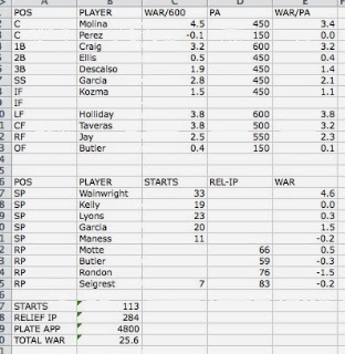
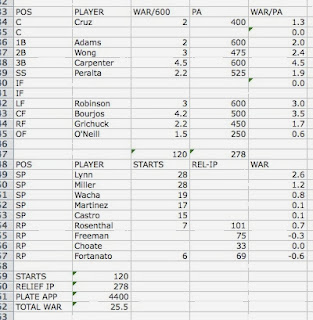
Last year, only the Twins and the lowly Astros allowed more runs per game. Despite this, for the first time in a while Rockies’ fans can be optimistic about the engine of run prevention, quality starting pitching. This is an area where the team can build a clear agenda for the future. Tyler Chatwood and Jhoulys Chacin should be reliable starters for the next few years. It’s unclear how many good years Jorge de la Rosa has left in him, and it’s also unclear whether or not Juan Nicasio can be a legitimate starter. But the Rockies have two polished, nearly big-league-ready pitching prospects in Jonathan Gray and Eddie Butler—Rockies’ fans should be really excited about these two—so long as one of them is not one of the “young arms” rumored to be in play for Trumbo. If Gray and Butler can be shepherded to the big leagues in a timely manner and learn to pitch to major leaguers quickly, they could join Chatwood and Chacin for possibly the best rotations in Rockies history. And if the front office really wants to make a big free-agent splash, the answers aren’t in the Brian McCanns or Jose Abreus of the world, but in splitter-throwing, ground-ball inducing, 25-year-old starting pitcher Masahiro Tanaka. His presence would likely push a rotation in 2015-2016 and possibly beyond from dependable to exceptional. Of course, it won’t happen. The Rockies, if they bid, will be outbid, and it’s precisely starting pitchers in demand that tend to stay away from Colorado.

In a sense, every major-league team is always in some stage of rebuilding, whether they admit it or not. My point is that I think there can be power in the admission of it. De-stigmatizing the “rebuilding process” might contribute to the recognition that it’s not necessarily a multiyear process, and that being in the process is not an acknowledgement of failure. Recognition of this, which by itself should provide more foresight, should lead the organization and armchair observers like myself from a state of confusion due to the team’s pursuit of stagnation, to one of encouragement where progress can be visualized.


Weighting Past Results: Starting Pitchers

My article on weighting a hitter’s past results was supposed to be a one-off study, but after reading a recent article by Dave Cameron I decided to expand the study to cover starting pitchers. The relevant inspirational section of Dave’s article is copied below:

“The truth of nearly every pitcher’s performance lies somewhere in between his FIP-based WAR and his RA9-based WAR. The trick is that it’s not so easy to know exactly where on the spectrum that point lies, and its not the same point for every pitcher.”

Dave’s work is consistently great. This, however, is a rather hand-wavy explanation of things. Is there a way that we can figure out where pitchers have typically laid on this scale in the past  so that we can make more educated guesses about what a pitcher’s true skill level is? We have the data–so we can try.

So, how much weight should be placed on ERA and FIP respectively?  Like Dave said, the answer will be different in every case, but we can establish some solid starting points. Also since we’re trying to predict pitching results and not just historical value we’re going to factor in the very helpful xFIP and SIERA metrics.

Now for the methodology paragraph: In order to test this I’m going to use every pitcher season since 2002 (when FanGraphs starts recording xFIP/SIERA data) where a pitcher had at least 100 innings pitched, and then weight all of the relevant metrics for that season in order to create an ERA prediction for the following season. I’ll then look at the difference between the following season’s predicted and average ERA, and then calculate the average miss. The smaller the average miss, the better the weights. Simple. As an added note, I have weighted the importance of a pitcher’s second (predicted – actual) season by innings pitched so that a pitcher who pitched 160 innings in his second (predicted – actual) season will assume more merit than the pitcher who pitched only 40 innings.

How predictive are each of the relevant stats without weights? I am nothing without my tables, so here we go (There are going to be a lot of tables along the way to our answers. If you’re just interested in the final results, go ahead and skip on down towards the bottom).

Metric Miss Average
ERA .8933
FIP .7846
xFIP .7600
SIERA .7609

This doesn’t really tell us anything we don’t already know: SIERA and xFIP are similar, and FIP is a better predictor than ERA. Let’s start applying some weights to see if we can increase accuracy, starting with ERA/SIERA combos.

ERA% SIERA% Miss Average
50% 50% .7750
75% 25% .8218
25% 75% .7530
15% 85% .7527
10% 90% .7543
5% 95% .7571

We can already see that factoring in ERA just a slight amount improves our results substantially. When you’re predicting a pitcher’s future, therefore, you can’t just fully rely on xFIP or SIERA to be your fortune teller. You can’t lean on ERA too hard either, though, since once you start getting up over around 25% your projections begin to go awry. Ok, so we know how SIERA and ERA combine, but what if we use xFIP instead?

ERA% xFIP% Average Miss
25% 75% .7530
15% 85% .7530
10% 90% .7549
5% 95% .7560

Using xFIP didn’t really improve our results at all. SIERA consistently outperforms xFIP (or is at worst only marginally beaten by it) throughout pretty much all weighting combinations, and so from this point forward we’re just going to use SIERA. Just know that SIERA is basically xFIP, and that there are only slight differences between them because SIERA makes some (intelligent) assumptions about pitching. Now that we’ve established that, let’s try throwing out ERA and use FIP instead.

FIP% SIERA% Average Miss
50% 50% .7563
25% 75% .7543
15% 85% .7560
10% 90% .7570

It’s interesting that ERA/SIERA combos are more predictive than FIP/SIERA combos, even though FIP is more predictive in and of itself. This is likely due to the fact that a lot of pitchers have consistent team factors that show up in ERA but are cancelled out by FIP. We’ll explore that more later, but for now we’re going to try to see if we can use any ERA/FIP/SIERA combos that will give us better results.

ERA% FIP% SIERA% Average Miss
25% 25% 50% .7570
15% 15% 70% .7513
10% 10% 80% .7520
5% 15% 80% .7532
10% 15% 75% .7517
15% 25% 60% .7520
15% 25% 65% .7517

There are three values here that are all pretty good. The important thing to note is that ERA/FIP/SIERA combos offer more consistently good results than any two stats alone. SIERA should be your main consideration, but ERA and FIP should not be discarded since the combo offers a roughly .05 better predictive value towards ERA than SIERA alone. It’s a small difference, but it’s there.

Now I’m going to go back to something that I mentioned previously–should a player be evaluated differently if he isn’t coming back to the same team? The answer to this is a pretty obvious yes, since a pitcher’s defense/park/source of coffee in the morning will change. Let’s narrow down our sample to only pitchers that changed teams, to see if different numbers work better. These numbers will be useful when evaluating free agents, for example.

ERA% FIP% SIERA% Average Miss (changed teams)
10% 15% 80% .7932
5% 15% 80% .7918
2.5% 17.5% 80% .7915
2.5% 20% 77.5% .7915
2.5% 22.5% 75% .7917

As suspected ERA loses a lot of it’s usefulness when a player is switching teams, and FIP retains its marginal usefulness while SIERA carries more weight. Another thing to note is that it’s just straight-up harder to predict pitcher performance when a pitcher is changing teams no matter what metric you use. SIERA itself goes down in accuracy to .793 when only dealing with pitchers that change teams, a noticeable difference from the .760 value above for all pitchers.

For those of you who have made it this far, it’s time to join back in with those who have skipped down towards to bottom. Here’s a handy little chart that shows previously found optimal weights for evaluating pitchers:

Optimal Weights

Team ERA% FIP% SIERA% Average Miss
Same 10% 15% 75% .7517
Different 2.5% 17.5% 80% .7910

Of course, any reasonable projection should take more than just one year of data into account. The point of this article was not to show a complete projection system, but more to explore how much weight to give to each of the different metrics we have available to us when evaluating pitchers. Regardless, I’m going to expand the study a little bit to give us a better idea of weighting years by establishing weights over a two-year period. I’m not going to show my work here mostly out of an honest effort to spare you from having to dissect more tables, so here are the optimal two year weights:

ERA% Year 1 FIP% Year 1 SIERA% Year 1 ERA% Year 2 FIP% Year 2 SIERA% Year 2 Average Miss
5% 5% 30% 7.5% 7.5% 45% .742

As expected using multiple years increases our accuracy (by roughly .15 ERA per pitcher). Also note that these numbers are for evaluating all pitchers, and so if you’re dealing with a pitcher who is changing teams you should tweak ERA down while uptweaking FIP and SIERA. And, again, as Dave stated each pitcher is a case study–each pitcher warrants their own more specific analysis. But be careful when you’re changing weights. When doing so make sure that you have a really solid reason for your tweaks and also make sure that you’re not tweaking the numbers too much, because when you begin to start thinking that you’re significantly smarter than historical tendencies you can start getting in trouble. So these are your starting values–carefully tweak from here. Go forth, smart readers.

As a parting gift to this article, here’s a list of the top 20 predictions for pitchers using the two-year model described above. Note that this will inherently exclude one-year pitchers such as Jose Fernandez and pitchers that failed to meet the 100IP as a starter requirement in either of the past two years. Also note that these numbers do not include any aging curves (aging curves are well outside the scope of this article), which will obviously need to be factored in to any finalized projection system.

# Pitcher Weighted ERA prediction
1 Clayton Kershaw 2.93
2 Cliff Lee 2.94
3 Felix Hernandez 2.95
4 Max Scherzer 3.01
5 Stephen Strasburg 3.03
6 Adam Wainwright 3.11
7 A.J. Burnett 3.22
8 Anibal Sanchez 3.22
9 David Price 3.24
10 Madison Bumgarner 3.33
11 Alex Cobb 3.36
12 Cole Hamels 3.36
13 Zack Greinke 3.41
14 Justin Verlander 3.41
15 Doug Fister 3.46
16 Marco Estrada 3.48
17 Gio Gonzalez 3.53
18 James Shields 3.53
19 Homer Bailey 3.57
20 Mat Latos 3.60