Modeling Walk Rate Between Minor League Levels
After reading through Projecting X by Mike Podhorzer I decided to try and predict some rate statistics between minor league levels. Mike states in his book “Projecting rates makes it dramatically easier to adjust a forecast if necessary.”; therefore if a player is injured or will only have a certain number of plate appearances that year I can still attempt to project performance. The first rate statistic I’m going to attempt project is walk rate between minor league levels. This article will cover the following:
Raw Data
For my model I used data from Baseball Reference and am using the last seven years of minor league data(2009-2015). Accounting for the Short-Season A (SS-A) to AAA affiliates I ended up with over 28,316 data points for my analysis.
Data Cleaning
I’m using R and the original dataframe I had put all the data from each year in different rows. In order to do the calculations I wanted to do I needed to move each player’s career minor league data to the same row. Also I noticed I needed to filter on plate appearances during a season to make sure I’m getting rid of noise. For example, a player on a rehab assignment in the minor leagues or a player who ended up getting injured for most of the year so they only had 50-100 plate appearances. The minimum plate appearances I ended up settling on was 200 for a player to be factored into the model. Another thing I’m doing to remove noise is only attempting to model player performance between full-season leagues (A, A+, AA, AAA). Once the cleaning of the data was done I had the following data points for each level:
- A to A+ : 1129
- A+ to A: 1023
- AA to AAA: 705
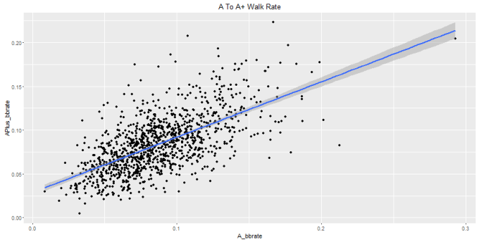
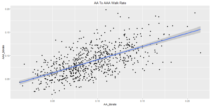
Correlation and Graphs
I was able to get strong correlation numbers for walk rate between minor league levels. You can see the results below:
- A to A+ : .6301594
- A+ to AA: .6141332
- AA to AAA: .620662
Here’s the graphs for each level:

Model and Results
The linear models for each level are:
- A to A+: A+ BB% = .63184*(A BB%) + .02882
- A+ to AA: AA BB% = .6182*(A+ BB%) + .0343
- AA to AAA: AAA BB% = .5682(AA BB%) + .0342
In order to interpret the success or failure of my results I compared how close I was to getting the actual walk rate. FanGraphs has a great rating scale for walk rate at the major league level:
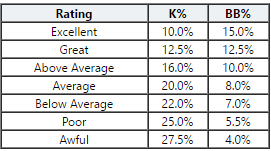
The image above gives a classification for multiple levels of walk rates. While based on major league data it’s a good starting point for me to decide a margin of error for my model. The mean difference between each level in the FanGraphs table is .0183. I ended up rounding and made my margin for error .02. So if my predicted value for a player’s walk rate was within .02 of being correct I counted the model as correct for the player and if my error was greater than that it was wrong. Here are the models results for each level:
- A to A+
- Incorrect: 450
- Correct: 679
- Percentage Correct: ~.6014
- A+ to A
- Incorrect: 445
- Correct: 578
- Percentage Correct: ~.565
- AA to AAA
- Incorrect: 278
- Correct: 427
- Percentage Correct: ~.6056
When I moved the cutoff up a percentage to .03 the model’s results drastically improve:
- A to A+
- Incorrect: 228
- Correct: 901
- Percentage Correct: ~.798
- A+ to AA
- Incorrect: 246
- Correct: 777
- Percentage Correct: ~.7595
- AA to AAA
- Incorrect: 144
- Correct: 561
- Percentage Correct: ~.7957
Examples
Numbers are cool but where are the actual examples? OK, let’s start off with my worst prediction. The largest error I had between levels was A to A+ and the error was >10% (~.1105). The player in this case was Joey Gallo. A quick glance at the player page will show his A walk rate was only .1076 and his A+ walk rate was .2073 which is a 10% improvement between levels. So why did this happen and why didn’t my model do a better job of predicting this? Currently the model is only accounting for the previous season’s walk rate, but what if the player is getting a lot of hits at one level and stops swinging as much at the next? In Gallo’s case he only had a .245 BA his year at A-ball so that wasn’t the case. More investigation is required to see how the model can get closer on edge cases like this.

The lowest I was able to set the error to and still come back with results was ~.00004417. That very close prediction belongs to Erik Gonzalez. I don’t know Erik Gonzalez, so I continued to look for results. Setting the min error to .0002 brought back Stephen Lombardozzi as one of my six results. Lombo’s interesting to hardcore Nats fans (like myself) but I wanted to continue to look for a more notable name. Finally after upping the number to .003 for A to A+ data I was able to see that the model successfully predicted Houston Astros multi-time All-Star 2B Jose Altuve’s walk rate within a .003 margin of error.

What’s Next:
- Improve algorithm for generating combined season dataframe
- Improve model to get a lower error rate
- Predict strikeout rate between levels
- Eventually would like to predict more advanced statistics like wOBA/OPS/wRC+
Former College student-athlete, turned software engineer that wants to use Data Science to combine sports & technology.