Got Projections?
Back in college, I remember being fascinated by a concept I learned in one of the first chemistry classes I took: the atomic orbitals. Contrary to what I thought at the time, electrons don’t orbit around the atom’s nucleus in a defined path, the way the planets orbit around the sun. Instead, they move randomly in the vicinity of the nucleus, making it really hard to pinpoint their location. In order to describe the electrons’ whereabouts within the atom, scientists came up with the concept of orbitals, which, simply put, are areas where there’s a high probability of finding an electron. That’s pretty much how I see baseball projections.
A term that is very often used by the sabermetric community is “true talent level,” and just like an electron’s position, is a very hard thing to pinpoint. Projections, however, do a very good job of defining the equivalent of an atomic orbital, sort of like a range of values where there’s a high probability of finding a certain stat. I know what you’re thinking; projections are not a range of values. But you can always convert them very quickly just by adding a ±20% error (or any other percentage you consider fitting). So, for example, if a certain player is projected to hit 20 home runs, you can reasonably expect to see him slug 16 to 24 homers.
As a 12-year veteran fantasy baseball manager (and not a very good one at that), I’ve never used projected stats as a player-evaluating tool when I’ve gone into a draft. For some reason (probably laziness), I’ve mainly focused on “last year’s” stats, and felt that players repeating their last season’s numbers was as good a bet as any. This year, after taking a lot of heat for picking Francisco Lindor and Joe Panik much higher than what my buddies thought they should’ve been taken, I started wondering how much of a disadvantage was using a simple prior-year data instead of a more elaborate method.
To satisfy my curiosity, I decided to evaluate how good a prediction are “last year” numbers, and compare them to other options such as using the last two or three years, and using some projections publicly available. In this particular piece, I’ll limit the study to offensive stats, but I’ll probably tackle pitching stats in a second article.
The first step for this little research was to establish the criteria with which to compare the different projections. A simple way to evaluate projection performance is using the sum of the squared errors; the greater the sum, the worse the projection (in case you’re wondering, squared errors are used in order to make negative errors positive so they can be added, it also penalizes bigger errors more than smaller errors). In this particular case however, I wanted to evaluate projections for a number of different stats, so a simple sum of squared errors would have an obvious caveat in that stats with bigger values have bigger errors. For example, an error of 10 at-bats is a very small one, given that most players log 450+ of them per season. On the other hand, an error of 10 HR is huge. Additionally, not every stat has the same variation among players. Home runs, for example, have a standard deviation of around 70% of the mean, while batting average’s standard deviation is only about 11% of the mean. So, you could say that it’s harder to predict HR than it is to predict AVG.
Long story short, I divided each squared error by the squared standard deviation, and calculated the average of all those values for each stat. Finally, I converted those averages to a 0 to 1 scale, with 1 being a perfect prediction (in reality, these values could be less than zero when errors are greater than 1.5 standard deviations, but I scaled it so that none of the averages came out negative).
For this study, only players with at least 250 AB on the season were considered. Also, players that were predicted to have less than 100 AB were not considered, even if they did amass more than 250 AB on the season. The analysis was done on five different sets of predicting data:
- Last season stats.
- A weighted average of the two preceding seasons, with a weight of 67% for year n-1, and 33% for year n-2.
- A weighted average of the last three seasons, with 57.5% for year n-1, 28.5% for year n-2, and 14% for year n-3.
- ZiPS projections (Created by Dan Szymborski, available at FanGraphs)
- Steamer projections (Created by Jared Cross, Dash Davidson, and Peter Rosenbloom. Also available at FanGraphs)
The following graph shows the average score of each of the 5 projections for each individual stat considered in this study. The graph also shows the overall score for each stat, in order to have an idea of the “predictability” of each one of them. Remember, higher scores indicate better performance, with 1 being a perfect prediction.
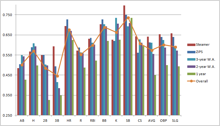
Other than hinting that it is in fact a very poor decision to use only last year’s data, this graph doesn’t tell us much about which predicting data has a better overall performance. It does provide, however, a very good idea of the comparative reliability of each stat within the projections.
Aside from stolen bases (which honestly surprised me as being the most predictable stat of the bunch), the three most reliable stats are the ones you would’ve expected: HR, BB, and K. They’re called “true outcomes” for a reason, they depend a great deal on true talent level, and involve very few external factors such as luck or opponent’s defensive ability.
On the other end of the spectrum, it’s really no surprise to find three-baggers as the least reliable stat. This may seem counterintuitive at first, given that players that lead the league in triples have a distinctive characteristic in being usually speedy guys. Nonetheless, 3B almost always involve an outfielder misplaying a ball and/or a weird feature of the park such as the Green Monster in Fenway or Tal’s Hill in Minute Maid’s center field, making triples unusual and random events. Playing time (represented in this case by at-bats) has also an understandably low overall score. Most injuries, which are a major modifier of playing time, are random and hard to predict. Also, managerial or front-office decisions can affect a player’s playing time. It does surprise me, however, to see doubles so far down in this graph, and I really can’t find a logical explanation for it.
Let’s move on now to the real reason why we started doing all this in the first place. Here’s a graph that shows the average score for each predicting data, for years 2013, 2014, and 2015. It also shows the three-year average score.
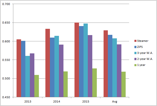
The one fact that clearly stands out in this graph is that last-year numbers are a very poor predicting tool. Its performance is consistently and considerably worse than any other set of data used. So my initial question is answered in a pretty definite way: it is a huge mistake to rely on just last season’s number when trying to predict future performance.
Turning our attention to the other four projections, it becomes a bit harder to separate them from each other, especially using only three years’ worth of data. The average performance of the three-year period gives us a general idea of the accuracy of each option, but looking at the year-by-year numbers, it’s not really clear which one is better. Steamer seems to be the winner here, since it had the better score on all three years. ZiPS, on the other hand, despite having a better overall score than the three-year weighted average, has a worse score in two of the three years. They were really close in 2014 and 2015, but ZiPS was considerably better in 2013, which interestingly, was a less predictable year than the other two.
The biggest point in favor of ZiPS when comparing against the three-year weighted average is that ZiPS doesn’t actually need players to have three years’ worth of MLB data in order to predict future performance, and that makes a huge difference. Another major point in favor of ZiPS is that it’s doing all the work for you! Believe me, you do not want to be matching data from three different years every time drafting season comes around (I just did it for this piece and it’s really dull work).
After all is said and done, projection systems such as Steamer or ZiPS do a fine job of giving us a good indication of what to expect from players. We’re much better off using them as guidelines when constructing our fantasy teams than any home-made projection we could manufacture (unless you’re John Nash or Bill freaking James). I know next March I’ll be taking advantage of these tools, hoping they translate into my very elusive first fantasy league title.
Juan Pablo is a Venezuelan Chemical Engineer who spends unhealthy amounts of time watching, reading and writing about baseball. You can also read him at: www.theimperfectgame.com