Author Archive

Dr. Hendricks and Mr. Gray

Randomness and circumstances are important driving forces in everything that happens in the world. Although they usually work hand in hand with our own actions and decisions, they have the ability to pick you up when you hit the jackpot at the casino, or throw you down when your car gets crushed by a falling tree (hopefully you’re comfortably sleeping in your bed when that happens).  They can also be the difference between a pitcher having an average season on the mound, and having an outstanding one. Such is the case with the seasons Jon Gray and Kyle Hendricks had this year.

I’m not going to make the argument that these two pitchers performed equally well this season, with the main differences being random chance and circumstances, because they didn’t. Hendricks was the better pitcher; it just wasn’t the 2.48-run difference their ERAs show. The similarities between the two performances can be summarized in basically two stats. If we take a look at xFIP and SIERA (two important ERA estimators available here at FanGraphs), Hendricks’ numbers of 3.59 and 3.70, respectively, are eerily similar to Gray’s 3.61 and 3.72. From there on, however, the numbers separate abruptly.

Much like Dr. Jekyll and Mr. Hyde represent the good and the bad within a person, Hendricks’ and Gray’s seasons represent two sides of the same coin. On the one hand, circumstantial factors and good fortune turned Hendricks’ very good performance into a historical season, while a different set of circumstances and some bad fortune turned Gray’s good performance into merely an average one. In this piece, we’ll take a look at the factors that influenced these diametrically opposed results.

I’ll start by saying that Kyle Hendricks had a remarkable and impressive season. He had an average strikeout rate (8.05 K/9), didn’t walk many batters (2.08 BB/9), and allowed very few longballs (0.71 HR/9), which resulted in a really good 3.20 FIP, which ranked 4th in the majors. His ERA, however, ended up all the way down to 2.13; a whopping 1.07 runs less than his FIP. Despite being a big difference, it’s not all that uncommon, as nearly 2% of individual seasons by starters in the history of the game have had an E-F (ERA minus FIP) of -1.07 or lower. Nonetheless, that difference is hardly sustainable through multiple seasons. In major-league history, out of 2259 pitchers with at least 500 innings pitched, only two had a career E-F below -1.00, and both of them were full-time relievers (in case you’re curious, they are Alan Mills and Al Levine).

On the other side of the spectrum, Jon Gray also had a very solid season. He had an outstanding 9.91 strikeouts per 9 innings (that ranked him 9th among qualifying starters), an average walk rate of 3.16 BB/9, and a solid home-run rate (0.94 HR/9), lower than league average despite pitching half of his innings at Coors Field. His performance was good enough for a 3.60 FIP, but his actual ERA rocketed to 4.61. This 1.01 positive difference is just as unusual as Hendricks’ negative one, as about 2% of individual seasons throughout history have resulted in differences of 1.01 or higher. For visualizing purposes, here’s a table summarizing both pitchers’ numbers.

Picture

So the question still remains: what were the determining factors in these two pitchers having such a massive difference in results? Let’s dive right into it.

First of all, I decided to look at the correlation factors between E-F and a wide array of pitching stats, using data from every pitcher in MLB history with 500+ innings. As a general rule of thumb, a correlation factor between 0.40 and 0.69 indicates a strong relationship between the two variables. The following table shows the stats that had at least a 0.40 correlation factor with E-F:

Picture

Welp, that’s a pretty lame table. Keep in mind, I analyzed correlations for stats as varied as pitch-type percentages, pitch-type vertical and horizontal movements, and Soft, Medium, and Hard-hit rates, as well as K, BB, and HR per 9, or HR/FB%. None of those had even a moderate relationship with E-F. So let’s stick with the stats presented on the table.

The first two stats are really no surprise. FIP basically assumes league-average BABIP and LOB% to estimate what a pitcher’s ERA should look like. So, if a pitcher has a high BABIP, FIP is going to estimate a lower ERA than the actual one, resulting in a higher E-F; thus the positive correlation. On the other hand, if a pitcher has a higher LOB%, he’ll allow fewer runs than his FIP would suggest, resulting in a lower E-F. This explains the negative correlation shown in the table. The last stat, however, came as a real surprise, at least for me. ERA seems to be positively correlated with E-F, which means that pitchers with higher ERA tend to have higher E-F than pitchers with lower ERA.

The next logical step would be to determine which factors, if any, explain BABIP and/or LOB% among pitchers. Using the same pitching stats than in the previous step, I ran correlations with BABIP and LOB% separately. The following table shows the stats that had a strong (0.40 to 0.69) or moderate (0.30 to 0.39) relationship.

Picture

As was the case in the first table, both of these stats are correlated strongly with E-F, showing factors of 0.58 and -0.42, respectively. It doesn’t come as a shock either, that they are strongly correlated with each other. The negative correlating factor (-0.42) indicates, as you would expect, that a high BABIP leads to a low LOB%, and vice versa. On the BABIP side, a positive strong relationship with ERA is almost too obvious, as more balls in play falling for hits leads to more runs being scored. Also, since fly balls in play (not counting home runs) turn more often into outs than ground balls do, it makes sense that BABIP holds a negative relationship with the former, and a positive one with the latter. This fact, however, goes against a somewhat popular belief that ground-ball pitchers tend to have lower BABIPs.

The factors that correlate to LOB% are more interesting. The first one is not unexpected: a higher strikeout rate seems to lead to more runners getting stranded, and that’s a pretty easy concept to wrap your head around. The second one, however, is really mind-boggling, and I really can’t say I can find a reasonable explanation for it. It indicates that the higher the home-run rate allowed by a pitcher, the more runners are going to be left on base. It is quite possible that this is just a spurious correlation, having no causality at all. Finally, the last factor listed on the table is very interesting and useful in this particular case. It suggests that high percentages of soft contact lead to higher LOB%. We’ll get to that later on in this article.

So let’s go back to our pitchers and check if any of this makes sense. We know that E-F is mainly affected by BABIP and LOB%. Hendricks and Gray had very different numbers in these two stats. The Cubs’ righty had a .250 BABIP and a LOB% of 81.5, while the Rockies’ fireballer had .308 and 66.4%. Considering that the league averages were .298 and 72.9%, respectively, we can say that Hendricks did considerably better than average, while Gray did just the opposite. So far so good, right? These facts go a long way towards explaining the differing outcomes. However, BABIP and LOB% aren’t exactly pitcher-dependent; in fact, they’re the marquee stats for the generic term “luck.”

Looking at the stats from the second table, few of them help out in figuring this out. High strikeout rates, for example, are supposed to increase LOB%, but Gray still managed a really low 66.4% despite a 9.91 K/9. On the other hand, Hendricks’ 81.5% LOB ranked 5th among qualified starters, even though his strikeout rate of 8.05 was right around league average. Similarly, groundball percentage is shown to have a positive correlation with BABIP. Nonetheless, Hendricks’ higher-than-average rate of 48.4% (league average was 44.7%) resulted in a ridiculously low BABIP of .250, while Gray’s below-average rate of 43.5% came with a .308 BABIP. Almost the same thing happens when you look at the fly-ball rates.

The only factor from that second table that does make sense in these particular examples is soft-contact rate. Hendricks ranked 1st in this regard among qualified starters, with an impressive 25.1% (league average was 18.8%), while Gray had a below-average rate of 17.8%, which ranked him 50th out of 73 qualified starters. This stat is very much pitcher-dependent, and it does help explain some of the differences in LOB%. It has, however, a moderate relationship with LOB%, as evidenced by its factor of -0.37. Is that enough to account for the massive difference in the results? Intuitively, I’ll say no. There is one more factor, however, that we haven’t even discussed yet.

FIP stands for Fielding Independent Pitching, so the very thing that FIP is trying to subtract from the equation might hold the key to answering our question. Defensive performances can heavily influence the outcome of the game, and make up a big chunk of what we generally call “luck” in a pitcher’s final results. In order to have a numerical confirmation of this idea, I looked at the correlations between teams’ yearly defensive component of WAR and its staff’s BABIP, LOB%, and E-F. The data I used for this exercise was every individual team season from 1989 (the first year in which play-by-play data contained information on hits and outs location) to 2016.

Picture

We can see here that a team’s defense has a strong correlation with all three of the stats, especially E-F. Higher values of the defensive component of WAR lead to lower BABIP, higher LOB%, and lower E-F, just as you would expect.

Saying that the Cubs had a great defensive performance this year is an understatement. Not only was it the best defense in 2016 by a bunch — it was also the best defense of the last 17 years, according to FanGraphs’ defensive component of WAR. Of the 814 individual team seasons played in MLB since 1989, this year’s Cubs rank 8th. That’ll put a serious dent on opponents’ BABIP. In fact, the Cubs’ average on balls in play of .255 (yes, that is the whole pitching staff’s BABIP) is the absolute lowest since the ’82 Padres. Oh, and also the Cubs pitching staff’s LOB% of 77.5% is tied for 2nd highest since 1989. All of this adds up to a team E-F of -0.62. Wow. Just wow.

The Rockies defense, on the other hand, wasn’t bad, but it also wasn’t great. According to FanGraphs, it was 17.9 runs above average, which ranked 12th in MLB. Again, that’s really not bad at all, just miles away from the 115.5 runs above average the Cubs had. The Rockies’ staff as a whole had a .317 BABIP, and a 68.0% LOB%; not unexpected from a team that plays half their games at altitude. Still, both of these values are worse than league average, resulting in a team E-F of 0.54.

All in all, Kyle Hendricks still had a better season than Jon Gray, and people will remember the 2.13 ERA and not the 4.61. This analysis just puts it a little bit more in perspective, and helps shed some light on the little details that make big differences in the course of a long season.

The old football adage says that “defense wins championships.” That doesn’t really apply to baseball, but in the future, when I think back to the 2016 Cubs, I’ll definitely think about their defense.
Got Projections?

Back in college, I remember being fascinated by a concept I learned in one of the first chemistry classes I took: the atomic orbitals. Contrary to what I thought at the time, electrons don’t orbit around the atom’s nucleus in a defined path, the way the planets orbit around the sun. Instead, they move randomly in the vicinity of the nucleus, making it really hard to pinpoint their location. In order to describe the electrons’ whereabouts within the atom, scientists came up with the concept of orbitals, which, simply put, are areas where there’s a high probability of finding an electron. That’s pretty much how I see baseball projections.

A term that is very often used by the sabermetric community is “true talent level,” and just like an electron’s position, is a very hard thing to pinpoint. Projections, however, do a very good job of defining the equivalent of an atomic orbital, sort of like a range of values where there’s a high probability of finding a certain stat. I know what you’re thinking; projections are not a range of values. But you can always convert them very quickly just by adding a ±20% error (or any other percentage you consider fitting). So, for example, if a certain player is projected to hit 20 home runs, you can reasonably expect to see him slug 16 to 24 homers.

As a 12-year veteran fantasy baseball manager (and not a very good one at that), I’ve never used projected stats as a player-evaluating tool when I’ve gone into a draft. For some reason (probably laziness), I’ve mainly focused on “last year’s” stats, and felt that players repeating their last season’s numbers was as good a bet as any. This year, after taking a lot of heat for picking Francisco Lindor and Joe Panik much higher than what my buddies thought they should’ve been taken, I started wondering how much of a disadvantage was using a simple prior-year data instead of a more elaborate method.

To satisfy my curiosity, I decided to evaluate how good a prediction are “last year” numbers, and compare them to other options such as using the last two or three years, and using some projections publicly available. In this particular piece, I’ll limit the study to offensive stats, but I’ll probably tackle pitching stats in a second article.

The first step for this little research was to establish the criteria with which to compare the different projections. A simple way to evaluate projection performance is using the sum of the squared errors; the greater the sum, the worse the projection (in case you’re wondering, squared errors are used in order to make negative errors positive so they can be added, it also penalizes bigger errors more than smaller errors). In this particular case however, I wanted to evaluate projections for a number of different stats, so a simple sum of squared errors would have an obvious caveat in that stats with bigger values have bigger errors. For example, an error of 10 at-bats is a very small one, given that most players log 450+ of them per season. On the other hand, an error of 10 HR is huge. Additionally, not every stat has the same variation among players. Home runs, for example, have a standard deviation of around 70% of the mean, while batting average’s standard deviation is only about 11% of the mean. So, you could say that it’s harder to predict HR than it is to predict AVG.

Long story short, I divided each squared error by the squared standard deviation, and calculated the average of all those values for each stat. Finally, I converted those averages to a 0 to 1 scale, with 1 being a perfect prediction (in reality, these values could be less than zero when errors are greater than 1.5 standard deviations, but I scaled it so that none of the averages came out negative).

For this study, only players with at least 250 AB on the season were considered. Also, players that were predicted to have less than 100 AB were not considered, even if they did amass more than 250 AB on the season. The analysis was done on five different sets of predicting data:

  1. Last season stats.
  1. A weighted average of the two preceding seasons, with a weight of 67% for year n-1, and 33% for year n-2.
  1. A weighted average of the last three seasons, with 57.5% for year n-1, 28.5% for year n-2, and 14% for year n-3.
  1. ZiPS projections (Created by Dan Szymborski, available at FanGraphs)
  1. Steamer projections (Created by Jared Cross, Dash Davidson, and Peter Rosenbloom. Also available at FanGraphs)

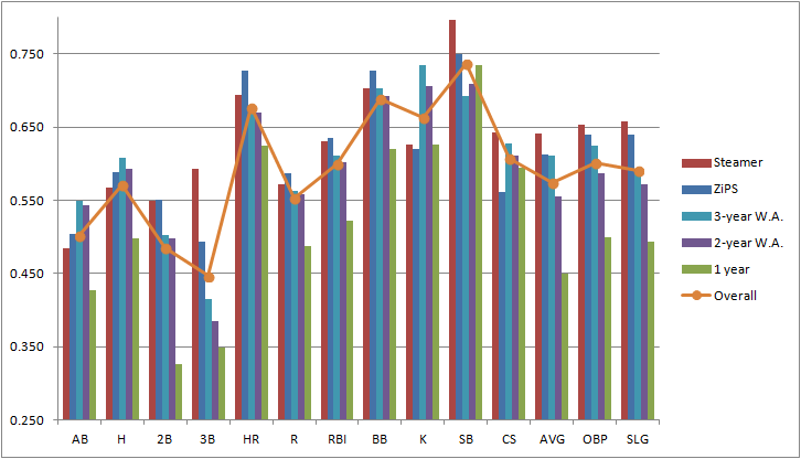
The following graph shows the average score of each of the 5 projections for each individual stat considered in this study. The graph also shows the overall score for each stat, in order to have an idea of the “predictability” of each one of them. Remember, higher scores indicate better performance, with 1 being a perfect prediction.

Picture

Other than hinting that it is in fact a very poor decision to use only last year’s data, this graph doesn’t tell us much about which predicting data has a better overall performance. It does provide, however, a very good idea of the comparative reliability of each stat within the projections.

Aside from stolen bases (which honestly surprised me as being the most predictable stat of the bunch), the three most reliable stats are the ones you would’ve expected: HR, BB, and K. They’re called “true outcomes” for a reason, they depend a great deal on true talent level, and involve very few external factors such as luck or opponent’s defensive ability.

On the other end of the spectrum, it’s really no surprise to find three-baggers as the least reliable stat. This may seem counterintuitive at first, given that players that lead the league in triples have a distinctive characteristic in being usually speedy guys. Nonetheless, 3B almost always involve an outfielder misplaying a ball and/or a weird feature of the park such as the Green Monster in Fenway or Tal’s Hill in Minute Maid’s center field, making triples unusual and random events. Playing time (represented in this case by at-bats) has also an understandably low overall score. Most injuries, which are a major modifier of playing time, are random and hard to predict. Also, managerial or front-office decisions can affect a player’s playing time. It does surprise me, however, to see doubles so far down in this graph, and I really can’t find a logical explanation for it.

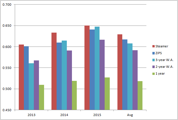
Let’s move on now to the real reason why we started doing all this in the first place. Here’s a graph that shows the average score for each predicting data, for years 2013, 2014, and 2015. It also shows the three-year average score.

Picture


The one fact that clearly stands out in this graph is that last-year numbers are a very poor predicting tool. Its performance is consistently and considerably worse than any other set of data used. So my initial question is answered in a pretty definite way: it is a huge mistake to rely on just last season’s number when trying to predict future performance.

Turning our attention to the other four projections, it becomes a bit harder to separate them from each other, especially using only three years’ worth of data. The average performance of the three-year period gives us a general idea of the accuracy of each option, but looking at the year-by-year numbers, it’s not really clear which one is better. Steamer seems to be the winner here, since it had the better score on all three years. ZiPS, on the other hand, despite having a better overall score than the three-year weighted average, has a worse score in two of the three years. They were really close in 2014 and 2015, but ZiPS was considerably better in 2013, which interestingly, was a less predictable year than the other two.

The biggest point in favor of ZiPS when comparing against the three-year weighted average is that ZiPS doesn’t actually need players to have three years’ worth of MLB data in order to predict future performance, and that makes a huge difference. Another major point in favor of ZiPS is that it’s doing all the work for you! Believe me, you do not want to be matching data from three different years every time drafting season comes around (I just did it for this piece and it’s really dull work).

After all is said and done, projection systems such as Steamer or ZiPS do a fine job of giving us a good indication of what to expect from players. We’re much better off using them as guidelines when constructing our fantasy teams than any home-made projection we could manufacture (unless you’re John Nash or Bill freaking James). I know next March I’ll be taking advantage of these tools, hoping they translate into my very elusive first fantasy league title.


Coors Field: Blessing or Curse?

Being a Rockies fan for most of my life, I’ve had my fair share of discussions about how a ballpark can affect not only the performance of the home team, but also that of the visiting team. At this point, I don’t think anyone has any doubt that Coors Field is a hitter’s park. However, there are a couple of questions regarding this park I’d like to address. First of all, is Coors Field alone in its capacity of enhancing offense, or is it comparable to other parks around the league? And secondly, is this effect stronger among Rockies’ hitters than it is for hitters from other teams?

To answer the first question, let’s compare offensive production at home versus on the road for each team, so we can see where the Rockies stand among the rest of the league in this regard. I selected a time frame from 1995 to 2015, simply because it is the same time frame that Coors Field has been hosting baseball games. For teams that moved to a new park during that time, we’ll consider only the seasons played in the newest stadium. The comparing stat we’ll use is OPS. I chose OPS instead of runs scored (which many park factors out there use) to take sequencing out of the equation. The order in which individual events occur in baseball can depend on things like lineup construction or managerial in-game decisions, but mostly it’s just random chance. I could have chosen a sounder, more sophisticated stat like wOBA, but OPS is more readily available, and a wider array of audiences are familiar with it.

After constructing a table for each team, consisting of year by year home and away OPS, I calculated the percent change of the two means, using the away value as the base. But simply comparing means can be very misleading. Randomness will always create a difference between two means, even if there is no actual effect causing it. In order to have some confidence that the differences we observe are statistically significant, I ran a Student’s t-test to each set of data (i.e. yearly home and away OPS for each team). The threshold of significance was set at 0.10, which means that there would be a 10% chance of seeing these differences if there were no real effect.  Anything above that value was considered not significant.

The following table contains the percent change for every team, along with its p-value. Red values don’t satisfy the significance criterion.

Park Change p-value Park Change p-value
COL 27.01% <0.01 BAL 4.10% 0.01
TEX 10.44% <0.01 DET 3.92% 0.03
ARI 9.52% <0.01 PIT 3.45% 0.02
BOS 8.39% <0.01 ATL 2.61% 0.10
HOU 7.48% <0.01 STL 2.30% 0.13
NYY 6.86% 0.07 MIA 2.20% 0.29
MIN 6.10% 0.04 CLE 1.81% 0.21
CIN 6.00% <0.01 OAK 1.33% 0.23
TOR 5.85% <0.01 TB 1.22% 0.20
CHC 5.70% <0.01 LAA 0.36% 0.41
CWS 5.12% 0.01 SF 0.22% 0.46
MIL 4.86% <0.01 LAD -1.64% 0.14
KC 4.76% <0.01 NYM -2.69% 0.15
WAS 4.65% 0.01 SEA -3.11% 0.12
PHI 4.55% 0.06 SD -5.46% 0.01

According to these numbers, 19 out of 30 ballparks have a statistically-significant positive effect on the home team’s offense, while 10 of them can be considered “neutral” due to the non-significant nature of the data, and just one (San Diego) has a significant negative effect on the home team’s offense.

At first glance, Coors Field seems to be in a league of its own when it comes to enhancing the home team’s offensive production. A common rule of thumb is that in a normally distributed data set, 99.7% of its values fall within three standard deviations of the mean. Any value outside of that range is considered an outlier. In this case, that range goes from -12.43% to 20.96%. Colorado, with its variation of 27.01%, falls way outside these limits, making it the only outlier of the group. This answers our first question, confirming that there’s no park that increases offense for the home team quite like Coors does. Which takes us to the second question: does it have a similar effect on visiting teams? Let’s crunch some numbers and see what they tell us.

The idea is to repeat the same process we used for answering the first question, only this time we’re going to use opponents OPS or OPS against, instead of the team’s own OPS. Basically, what we’re trying to do is compare how opponents’ offenses as a whole, change when they visit a particular park. In other words, and using Colorado as an example, we want to know how the league’s OPS against the Rockies is affected by playing at Coors Field as opposed to anywhere else.

Using the same methodology, here’s the opponents OPS change by park:

Park Change p-value Park Change p-value
COL 9.00% <0.01 WAS -4.28% 0.14
ARI 1.41% 0.18 MIN -4.37% 0.01
TEX 0.32% 0.43 LAA -4.53% 0.01
KC -0.13% 0.47 SEA -4.67% 0.14
BOS -0.62% 0.32 DET -4.76% 0.01
NYY -0.92% 0.27 ATL -4.76% 0.01
CIN -1.09% 0.35 TB -6.29% 0.01
PHI -1.86% 0.23 MIA -7.02% <0.01
TOR -1.95% 0.12 NYM -7.26% 0.01
CWS -2.05% 0.08 PIT -7.57% <0.01
CHC -2.33% 0.09 SF -7.60% <0.01
BAL -2.96% 0.04 OAK -8.34% <0.01
MIL -3.21% 0.07 STL -8.74% <0.01
CLE -3.58% 0.02 LAD -9.21% <0.01
HOU -3.85% 0.03 SD -11.79% <0.01

There are a couple of things to digest from of this table. First off, the fact that Colorado has the only park in which visiting hitters significantly increase their offensive production is pretty mind-blowing. It seems to me that we’ve been using the term “hitter’s park” way too lightly. Out of the 30 ballparks actively housing an MLB team, 19 have a statistically-significant negative effect on the visiting team’s offense. Just like in our first analysis, 10 of them can be considered “neutral”, with p-values above 0.10, and just one (of course, Coors Field) has a positive effect with a good degree of significance.

This seems to contradict the numbers showed in our first table. In fact, out of the 19 parks that enhanced offensive performance for the home team, 10 of them also have a negative effect on visiting hitters. How can this apparent contradiction be explained? Well, it probably has a lot to do with the all-encompassing concept that is Home Field Advantage. For whatever combination of reasons (familiarity with the park, sleeping in their own beds, having dinner with their families), playing at home seems to get the best out of most players. If you think of the visiting teams’ OPS as a pitching stat for the home team (which it is), then you can interpret the numbers in the second table as having 19 out of 30 parks with a positive effect on the home-team pitching staff, 10 being neutral, while just one of them having a negative effect. Coincidentally, that’s precisely a mirror image of the results we got when analyzing the first table.

Going back to the second question, does Coors Field have a greater impact on Rockies’ hitters than on the rest of the teams? The short answer is yes. The variation in OPS for Colorado players is 27.01%, while the equivalent for non-Rockies players is “just” 9.00%. So by just comparing these two values, it seems evident that the effect is in fact greater among Rockies’ hitters. The explanation could be again simply Home Field Advantage, but the difference is just too big. If we merge both tables in one, and consider the visiting hitters as a control group, then a simple subtraction should give us a rough estimate of the net effect of Home Field Advantage on home-team hitters.

Here’s that table. Red values were not considered in the subtraction since they were deemed non-significant.

Park Home Visiting Net Effect Park Home Visiting Net Effect
COL 27.01% 9.00% 18.01% NYM -2.69% -7.26% 7.26%
HOU 7.48% -3.85% 11.33% CWS 5.12% -2.05% 7.17%
PIT 3.45% -7.57% 11.02% BAL 4.10% -2.96% 7.05%
MIN 6.10% -4.37% 10.47% MIA 2.20% -7.02% 7.02%
TEX 10.44% 0.32% 10.44% NYY 6.86% -0.92% 6.86%
ARI 9.52% 1.41% 9.52% SD -5.46% -11.79% 6.33%
LAD -1.64% -9.21% 9.21% TB 1.22% -6.29% 6.29%
STL 2.30% -8.74% 8.74% CIN 6.00% -1.09% 6.00%
DET 3.92% -4.76% 8.68% TOR 5.85% -1.95% 5.85%
BOS 8.39% -0.62% 8.39% KC 4.76% -0.13% 4.76%
OAK 1.33% -8.34% 8.34% WAS 4.65% -4.28% 4.65%
MIL 4.86% -3.21% 8.06% PHI 4.55% -1.86% 4.55%
CHC 5.70% -2.33% 8.03% LAA 0.36% -4.53% 4.53%
SF 0.22% -7.60% 7.60% CLE 1.81% -3.58% 3.58%
ATL 2.61% -4.76% 7.37% SEA -3.11% -4.67% 0.00%

Coors Field sits comfortably at the top, way ahead of Minute Maid, the second park on the list. Applying the same criteria for outliers we used before, Colorado’s Net Effect of 18.01% is not within the range of three standard deviations around the mean (-1.60% , 16.74%), once again being the lone outlier. It doesn’t look like that this is simply a result of Home Field Advantage; it seems there’s something else. This brings up a new question, one for which I’m not sure I have a definite answer: Does Coors Field undermine the Rockies’ ability to have a healthy offense on the road?

Let’s go back for a moment to the 27% increase in OPS for Rockies’ hitters at home. That number could mean a huge spike in offensive production when they play at Coors Field or a massive collapse when they hit the road; it depends on how you see it. Colorado ranks dead last in the majors in OPS away from home in the same time span we’re studying, so either they have been the worse offensive team in two decades (which is certainly an option) or something is causing them to consistently under-perform on the road. Of course, it doesn’t help that almost half of their games away from Denver are played in places like San Diego, Los Angeles, and San Francisco. In fact, according to the numbers in the second table presented in this piece, Colorado’s division rivals have the toughest combination of parks for visiting hitters. The average drop-off in opponents OPS in NL West parks (excluding Coors Field) is -7.15%. The following table shows that value for every team in the majors (for the purpose of this exercise, Houston was considered an NL Central team).

Team

Average Change in division rivals’ parks

Team

Average Change in division rivals’ parks

COL -7.15% MIA -3.01%
CIN -5.14% SF -3.00%
ARI -4.90% NYM -2.95%
PHI -4.76% CLE -2.79%
WAS -4.76% LAA -2.78%
CHC -4.68% LAD -2.60%
MIL -4.50% MIN -2.60%
HOU -4.37% DET -2.50%
SEA -4.29% BOS -2.31%
TEX -4.29% NYY -2.31%
KC -3.69% TOR -2.31%
PIT -3.63% SD -1.95%
ATL -3.57% BAL -1.57%
STL -3.39% OAK -1.51%
CWS -3.18% TB -0.74%

This definitely helps explain, at least partially, the abnormal home/away splits that Rockies’ hitters have had historically. Not only do they play their home games in the biggest, if not the only true hitter’s park in the game, but they also play a big chunk of their road games in three of the toughest pitcher’s parks in MLB.

The last question remains unanswered; the thesis of a Coors Field Hangover effect is largely unproven. Still, there’s a good amount of circumstantial evidence that points to the existence of something like it.