Archive for Strategy

Albert Pujols Bunted Once

One time, Albert Pujols bunted.

If we include minor-league play, he’s bunted twice in his professional career. But in the major leagues, the major leagues where he’s played for 12.5 years and hit (as of July 10) 489 home runs, 523 doubles, and on average 1.198 hits per game, the major leagues where his career batting average is .321 and he hits twice as many doubles as double plays, Albert Pujols has bunted once.

It was in his rookie season, of course. But what exactly happened? Why did he bunt?

Theory #1: Pujols was an untested rookie.

Strike one. Albert Pujols bunted on June 16, 2001. When the baseballing world awoke that day, he was a rookie batting .354/.417/.654, with 20 home runs. He’d already been intentionally walked three times. (Compare to our latest Rookies of the Year: Mike Trout was intentionally walked four times in all of 2012; Bryce Harper, zero.) Pujols had 11 hits in the previous seven games, including four homers.

Now, this was only two and a half months of gameplay, a small track record. But if you’re savvy enough to realize that ten weeks is not enough time to assess a player’s quality, you’re probably also savvy enough to realize that this is not the type of player who should bunt.

Unless, of course, it’s a critical situation in the game.

Theory #2: Pujols was bunting at a time when the Cardinals really needed a bunt.

Strike two. Albert Pujols bunted in the bottom of the seventh inning, with the Cardinals ahead 6-3. In the top of the same inning, the White Sox had scored two runs, but St. Louis’ win probability was a healthy 96% when Pujols came to the plate. After he bunted, their odds of winning were still 96%.

Now, in some ways it was a textbook bunt situation. The Cardinals had two men on base. They also had zero outs. No outs and two on is a good time to bunt. But they also had a three-run lead in the seventh. And Albert Pujols was batting cleanup. He bunted.

Theory #3: Pujols was facing a pitcher against whom he might have trouble.

Strike three. The White Sox did bring in a new pitcher to face Albert Pujols, a thirty-year-old right-hander named Sean Lowe.

Now, Sean Lowe was pretty good against right-handed hitters. In 2001, righties hit .233 off him. They didn’t strike out much, but they didn’t walk much either, and they made unusually weak contact. We can suppose this because when lefties put balls into play against Lowe, their batting average was .308, but righties’ batting average on balls in play against Lowe was only .243.

On the other hand, the Sox didn’t trust Lowe that much. According to Baseball Reference, he was placed into low-leverage situations more than half the time in 2001. In 17 of his 34 relief appearances, the Sox were already losing–as they were on this day, losing by three runs with only six outs left. (That’s 17 of 34 in a year when the team had a winning record.)

Oh, and there’s another thing. Albert Pujols was killing right-handed pitching; when 2001 was over, his AVG/OBP/SLG against righties was .342/.408/.624.

No, the White Sox brought Sean Lowe into the game not as a magic bullet, but as something simpler: a Band-Aid. Ken Vining had allowed two runners to reach base without getting the inning’s first out. They simply needed somebody new.

Theory #4: Bonus Dan Szymborski theory: the element of surprise.

I asked Dan Szymborski why he might have Pujols bunt in a FanGraphs chat. His reply: “It may be a good surprise play if he’s confident he can get it down and the 3B is super deep or is Mark Reynolds.”

Strike four. Pujols bunted successfully on the second pitch; the first was a foul bunt attempt, terminating the element of surprise and any super-depth on the part of the defense. The third baseman was Joe Crede.

Theory #5: We’re out of theories.

Let’s set the scene, shall we?

The game is in St. Louis. As the fans sit down after their seventh-inning stretch, the Cardinals are winning 6-3. They’re six outs from victory, with odds of 95%, and their 2-3-4 hitters are due up. Chicago reliever Ken Vining starts the inning by walking third baseman Placido Polanco on four pitches. Next J.D. Drew hits a line drive single to right field on a 1-2 pitch, and Polanco advances to second.

This brings up cleanup-hitting right fielder Albert Pujols. The White Sox replace the flailing Ken Vining with Sean Lowe, a middle relief righty who induces weak contact. (Within a month, Vining will pitch his last major-league game.) The Cardinals have their best hitter at the plate: he’s a rookie, but he’s batting fourth, already has 20 homers, and sees two runners on base with no outs.

On the first pitch, Pujols bunts foul. On the second pitch, Pujols bunts fair.

It works, technically. Polanco and Drew advance, and Bobby Bonilla steps up to the plate. This was the 38-year-old Bonilla’s final season, and at the time of this game, his triple slash was a pitiful .217/.321/.391. (It would get worse, but remember, this is who Pujols bunted in front of.) Bonilla has had four home runs all year, one of them the day previous.

Bobby Bonilla is issued the second-to-last intentional walk of his major league career. (Yes, there was another one; he drew three IBBs that year.)

This brings up left fielder Craig Paquette, staring down loaded bases. He delivers a two-run single, putting the Cardinals up 8-3. Sean Lowe gets Edgar Renteria and Mike Matheny out to end the inning. The Cardinals win the ballgame by the same score, and in the ninth inning the last White Sox hitter to go down is a pinch-hitter making his major-league debut, named Aaron Rowand.

So Why Did Pujols Bunt?

Pujols tried to bunt twice, once hitting the ball foul. This suggests that it wasn’t Albert’s idea but his manager’s. If Pujols was the kind of player who liked to bunt spontaneously, he might have done it again by now.

Why did Tony La Russa have Pujols bunting? His team up by three runs, late in the game, two runners, no outs, best hitter at the plate. Perhaps he was overly concerned about Sean Lowe’s ability to get righties out, but there weren’t any outs and a double play would still leave a baserunner. Perhaps he recognized a classic bunting scenario, but Pujols was his best hitter and Bobby Bonilla, with a slugging percentage .263 lower, may have been his worst. Maybe he wanted to spring a surprise, but then came the foul bunt.

The St. Louis Post-Dispatch archives don’t turn up any hits for “Pujols bunt.” One blog post about the bunt groundlessly speculates that Pujols was improvising. Googling “why did Pujols bunt” in quotation marks yields zero hits. And, looking at the evidence we have, there’s no rational explanation. I’ve hand-written Tony La Russa a letter asking about this, but that was over three months ago and there’s not much chance he writes back.

Aaron Rowand played for eleven seasons, was an All-Star, and won two World Series. His entire career has taken place since the last time Albert Pujols bunted. That’s interesting, but not surprising. What’s surprising is that the only time Pujols bunted, there was no reason for him to do so.

Albert Pujols bunted once. We may never know why.


Rebuilding on a Crash Diet: The Brewers and a Calamitous May

To describe May, 2013 as an awful month for the Milwaukee Brewers would not do it justice.

In fact, the Brewers were downright putrid, winning only six games the entire month.  Their record in May was so bad (6-22) that it tied the worst month in franchise history: the August turned out by the 1969 Seattle Pilots, who ended the following season in bankruptcy, followed by a permanent road trip to become the Milwaukee Brewers.

The Brewers ended the month of April only a half game out of first place.  The Brewers ended the month of May 15 games behind the St. Louis Cardinals, managing the impressive feat of losing 14.5 games in the standings in one month.  Now that is a tailspin.

CoolStandings.Com currently gives the Brewers a 1 in 250 chance of making even the wild-card play-in game.  GM Doug Melvin admitted there is no chance the Brewers will be buyers this year at the trade deadline.  Rather, they will either be in a sell mode, seeking high-ceiling prospects a few years away, or keeping the assets they have, presumably only if they cannot get anything in return.  In short, the Brewers are suddenly rebuilding, and are focusing on  stocking up their farm system and developing controllable rotation talent.

But, rebuilding is a complicated topic in small markets like Milwaukee.  As Wendy Thurm has noted, the Brewers, with their limited geographic reach, have one of the smallest television contracts in the league.  Thus, the Brewers rely upon strong attendance to deliver profits for Mark Attanasio and his ownership group.  In recent years, the Brewers’ attendance fortunately has been some of the most impressive in baseball, particularly in comparison to the size of the Milwaukee metropolitan area.  Over the last five years, the Brewers have consistently approached or exceeded three million fans, despite challenging economic times.  So, one thing the Brewers cannot afford is a collapse akin to the mere 1.7 million fans they drew in 2003 during a terrible season — not if they want to make the investments in future talent required to make the franchise a perennial contender.

So, the Brewers face an obvious challenge: the team needs to lose enough games to obtain a prime draft position, and thereby maximize its chances to draft a top-ceiling player with minimum bust potential.  At the same time, the Brewers need to avoid losing in any drawn-out fashion, because a corresponding and sustained decline in attendance could hemorrhage desperately-needed cash from their balance sheet.  As Ryan Topp and others have argued, this need to maintain attendance in the short term seems to be one reason why the Brewers have systematically traded away what previously was an excellent farm system, with the apparent goal of maintaining the aura of a competitive team.

How does one navigate this problem?  Well, the best solution could be to experience a May like the Brewers just suffered.  Doing so addresses two problems: (1) it abruptly puts the team on course to get a top 5 draft pick, and (2) it achieves this result so abruptly, and in this case so early in the season, that the fan base can still — at least in theory —enjoy much-improved baseball for the remainder of the season without jeopardizing that draft slot.  In short, when you can take your medicine over the course of one month, instead of over an entire season, you really ought to do it.

As to the draft:

Thanks to May, the Brewers currently have the fifth-worst record in baseball at 23–37.  As of the morning of June 8, 2013, FanGraphs predicted that the Brewers will end the season tied for baseball’s fourth-worst record with the New York Mets at 73–89.  Provided that 2013’s top five draft picks all reach agreement with their teams, the Brewers are on pace for a top-5 draft slot in 2014.

The Brewers have not had a top-5 pick in the Rule 4 draft since 2005, when they picked some guy named Ryan Braun.  Before 2013, the top five slots in the draft provided, among others, Buster Posey (#5, 2008), Stephen Strasburg (#1, 2009), Manny Machado (#3, 2010), Dylan Bundy (#4, 2011), and Byron Buxton (#2, 2012) — the types of superstar prospects the Brewers have been denied for years, and which they need to anchor their next generation of players.  At the end of April, and before May occurred, the Brewers were on track for yet another mid-round pick slot.

As to the rest of the season:

It is unlikely that the Brewers will continue to suffer the combination of injuries and dreadful rotation pitching that helped ruin their May.  FanGraphs seems to agree, predicting that the current Brewers roster (or something like it) will essentially play .500 baseball for the rest of the season, even while maintaining one of the five worst records in the game.

Average baseball is not contending baseball, but average baseball at least would offer Brewers fans — already pleased with Miller Park’s immunity from rain delays — a reasonable likelihood of seeing a win on any given day.  In 2009, the Brewers were able to bring in over three million fans, despite finishing under .500 overall.  In 2010, the Brewers ended up eight games under .500, but still brought in 2.7 million fans.  It remains to be seen whether playing .500 baseball for the rest of the 2013 season would be sufficient to keep fans coming through the Miller Park turnstiles, but if so, the increasing remoteness of May could be a significant factor, particularly if the team can convince fans that “one bad month” does not represent the current Miller Park experience or true caliber of the team.

Of course, it is also possible that the Brewers will be able to trade significant assets at the deadline in exchange for the prospects Doug Melvin wants.  If so, their projected record could, and probably would decline.  (This is necessarily not a bad thing, given that 68.5 wins is the average cut-off to secure a top 5 draft spot from 2003 through 2012).  If that happens, the Brewers will have a further challenge on their hands in trying to provide even average baseball for their fans, and maintain the attendance they need.

That said, the Brewers’ remarkable close to 2012 — an incredible .610 winning percentage from August through October — was accomplished after trading away Zack Greinke and calling up minor league talent to plug gaps in the rotation left by Greinke’s trade and Shaun Marcum’s injuries.  If the Brewers are once again able to make advantageous trades at the deadline, and also able to play even .500 ball for the rest of the year, they are still in a position to do so without hurting their chances to get the impact player they need in the 2014 Rule 4 draft.

If they can pull both of these things off, much of the thanks should be given to the horrible month of May.


Does it matter which side of the pitching rubber a pitcher starts from throwing a sinker?

As we start a new baseball season, I start a new season of my own. This is my first – of many I hope – analysis and write-up on baseball that I am submitting. I am an avid fan, a numbers geek, an aspiring writer and lastly a bored software engineer. I am also very fortunate. I have a close connection with a former major league player and the ability to leverage his vast experience and knowledge of the game. Hopefully, I can parlay the knowledge I have learned from many years of observation along with the knowledge I have gleaned from my connection to realize my goal as a contributor to the sabermetric community and to the enjoyment of baseball fans everywhere. Here we go!

Question

Is the effectiveness of a sinker dependent on from which side of the rubber the pitcher throws?

I was in Florida in mid March for spring training, talking with a minor league coach when he mentioned that he and a former all star pitcher were in a disagreement about how to throw a sinker. Their debate centers on where a pitcher should stand on the rubber to throw a sinker most effectively. We all understand that a pitcher should not move all over the rubber to become more effective on a single pitch. This would obviously tip off the hitters as to what type of pitch might be coming. But for argument’s sake, a team might have some newly transformed position players learning to throw different pitches. Wouldn’t a team want to know if, for some pitches, it was more beneficial to stand on one side of the rubber than another?

I consider myself a pretty observant guy, but I will have to admit that I never really paid much attention to where a pitcher stood on the rubber. To me the juicy part is watching the ball just after it is released. The dance, dip, duck and dive a pitcher is able to command of the ball is where the action is as far as I am concerned. So watching what a pitcher does before he even starts his motion was asking a little much. Nonetheless, I was certain that with so many pitchers in the majors, that a breakdown of data would show that there was not a singular starting point on the rubber. Every pitcher is different, right?

Setup

I started my analysis by downloading the last 4 years (2009-2012) of PitchFx data. Most of us know this already but by using PitchFx data there are some limitations to analysis. Unlike Trackman, PitchFx initially records each pitch at 50’ from home plate, not the actual release point of the pitch. For PitchFx this data point is called “x0”, and for all intents and purposes this is pretty good data, as for most pitchers their strides are approximately 5 to 6’ from the rubber, and with arms length added in we are talking about a difference of a couple of percentage points from being the same as the release point metric from Trackman. But full disclosure, it is not exactly the release point. Another factor that I didn’t measure is a pitcher’s motion to the plate. Some pitchers throw “across” their bodies and not down a straight line, and even fewer open up their body to the batter (stepping to stride leg’s baseline). Also, there is probably a bit to glean from going between the stretch and wind-up, but again without doing a very in-depth study I assume no factor in the analysis. Lastly, arm length is an unmeasured factor. For example, I didn’t check to see if there were any right-handed pitchers with extra long arms standing on the first-base side of the rubber distorting the data.

I started by combining the PitchFx Sinker (SI) and Two-seam fastball (FT) data into a single database. The reason to combine the data is due to the fact that the grips for each pitch are the same, combine this with a two-seam fastball can and a sinker break the same way (down and in to a RH batter from a RH pitcher), and lastly they are also somewhat synonymous in major league vernacular. Maybe somewhere along the line the pitch was invented twice (north or south), the name given is based on region like when asking for a Coke… it’s a “soda”, a “pop”, or a “tonic” depending on where you are in the states. Maybe in the South it was labeled a sinker and the North it was taught as a “two-seamer”? Either way it’s the same pitch as far as I am concerned, and the etymology of pitch naming is a different topic for a different time.

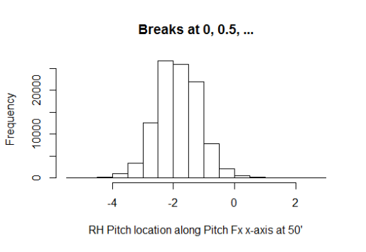
Back to the question above about every pitcher being different, I was wrong. Using the 2012 data I created a frequency distribution for right-handed pitchers (figure 1), and as you can see there is definite focal area at around -2’ point from the centerline of the pitching rubber (and home plate).

Image

Figure 1 – Right-handed pitchers in 2012

This shows that most pitchers start from about the same side; which I determined to be the right side of the rubber (3rd base side). I determined this by adding 9” to one-half the length of the pitching rubber (24”) which comes to 21” (9”+12”). Add in arm length and you can see that using an x0 that is less than or equal to 2’ (remember we are using negatives here) should prove that the pitcher is throwing from the right side.  I would like to add that the 9” used above is based on the shoulder width of an average man, which is around 18”. This metric is based on studies on the “biacromial diameter” of male shoulders in 1970 (pg. 28 Vital and Health Statistics – Data from the National Health Survey). I think we can all agree that the 18” is probably conservative by today’s growth standards. I mentioned in the limitations of the analysis written above, I don’t account for arm length or pitcher motion. Therefore I needed to make sure that there are right-handed pitchers who are throwing from the left hand side of the rubber; just not a bunch of super long-armed, cross bodied throwers.  With the data in hand I was able to identify which pitchers had thrown the ball closer to centerline of the rubber and therefore would be good candidates for standing on the left side of the rubber. The first pitcher who had a higher (>-2) x0 value was Yovani Gallardo of the Milwaukee Brewers. Without knowing Gallardo’s motion I needed to go to the video. From the video, you can clearly see that Gallardo starts on the left side of the rubber and throws fairly conventionally, straight down the line to the batter.

I wanted to keep this as simple as possible, breaking up the pitchers in two categories – Left side or Right side. Without looking at video for each pitcher I had to come up with a tipping point for classifying the side based on the x0 data I had available. If we simply take what we determined above and correlate it to the left hand side we will come up with 1 (starting on left side of rubber) and an x0 of 0. But it isn’t quite that simple. The frequency chart shows that there are less than 1000 balls thrown in 2012 with an x0 greater than or equal to 0. Gallardo threw 504 pitches himself in 2012. So we have to increase the scope a bit. By arranging the x0 data into quartiles we see that upper or lower quartile – depending on handedness – is around -1 or 1 (remember we are using negatives) so for a right handed pitcher the x0 splits are:

Min

25%

Med

Avg

75%

Max

-5.264

-2.315

-1.868

-1.849

-1.372

2.747


For left handers:

Min

25%

Med

Avg

75%

Max

-3.787

1.455

1.953

1.924

2.401

5.378


As I am trying to stay conservative, and the fact that these are not release point numbers I use 1 and -1 as the cut off for classification based on the handedness of the pitcher. Using these numbers provided a pretty clean break in the distributions (90-10%).

Findings

So who was right, the all star pitcher or the minor league pitching coach? Is there an advantage depending on where the pitcher stands on the rubber? Neither – both of them. It’s a tie.

What can I say; my initial analysis is a bit anticlimactic, but not because of lack of effort.  To denote the labels below:

  • LH or RH (Handedness)
  • RR or LR (Right or Left Rubber)
  • B – Balls
  • K – Strikes
  • P – In play (No Outs)
  • O – In play (Outs)
  • BackK – Called Strikes
  • FT – Two seam fastballs
  • SI – Sinkers
  • Efficiency – O/(P+O)
  • XSide – Cross Side (i.e. RH-LR or LH-RR)
  • Same side – LH-LR or RH-RR


LHData

194487

pitches
LH_LR

173145

89.03%

LH_RR

21342

10.97%

LH_LR_B

62957

36.36%

LH_RR_B

7932

37.17%

LH_LR_K

75241

43.46%

LH_RR_K

9067

42.48%

LH_LR_O

22610

13.06%

LH_RR_O

2843

13.32%

LH_LR_P

12335

7.12%

LH_RR_P

1500

7.03%

LH_LR_FT

108600

62.72%

LH_RR_FT

15846

74.25%

LH_LR_SI

64545

37.28%

LH_RR_SI

5496

25.75%

LH_LR_BackK

34932

46.43%

LH_RR_BackK

4406

48.59%

RHData

473032

pitches
RH_LR

48791

10.31%

RH_RR

424241

89.69%

RH_LR_B

18266

37.44%

RH_RR_B

153014

36.07%

RH_LR_K

20486

41.99%

RH_RR_K

180611

42.57%

RH_LR_O

6453

13.23%

RH_RR_O

58895

13.88%

RH_LR_P

3583

7.34%

RH_RR_P

32459

7.65%

RH_LR_FT

21781

44.64%

RH_RR_FT

194582

45.87%

RH_LR_SI

27010

55.36%

RH_RR_SI

229659

54.13%

RH_LR_BackK

10520

51.35%

RH_RR_BackK

82482

45.67%

Xside  667519

pitches

Same Side
LH_RR&RH_LR

70133

10.51%

LH_LR&RH_RR

597386

89.49%

LH_RR&RH_LR_B

26198

37.35%

LH_LR&RH_RR_B

215971

36.15%

LH_RR&RH_LR_K

29553

42.14%

LH_LR&RH_RR_K

255852

42.83%

LH_RR&RH_LR_O

9296

13.25%

LH_LR&RH_RR_O

81505

13.64%

LH_RR&RH_LR_P

5083

7.25%

LH_LR&RH_RR_P

44794

7.50%

LH_RR&RH_LR_FT

37627

53.65%

LH_LR&RH_RR_FT

303182

50.75%

LH_RR&RH_LR_SI

32506

46.35%

LH_LR&RH_RR_SI

294204

49.25%

BackK

14926

50.51%

BackK

117414

45.89%

Efficiency

64.65%

Efficiency

64.53%


The efficiency is so very close. Twelve-hundredths (.12) of a percent is not a lot – 169 outs out of 140678 – but give any Chicago Cub fan five of those outs in 2003 and Mr. Bartman would be an afterthought. Which, I am sure is the way he and all Cub fans around the world would like it. The efficiency is the same, no other way to put it which is the beauty of statistics and sabermetrics. Numbers can say so much, even when they are the equal.

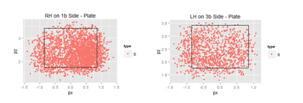
But the analysis wasn’t all for naught, there are some nuggets to glean from the numbers above. As a segue, I am currently watching Derek Lowe of the Texas Rangers pitch on opening night and from the left side of the rubber he throws a sinker and it dips back over the rear part of the plate for a called strike. With all of the similarities within my analysis the most striking observation is the difference in called strikes depending on the side of the rubber. If a pitcher, coach or manager could get a strike or a strike out without the fear of having a batter get a hit or moving a runner forward they would do it every time. With a five percent difference in getting a strike and not having the worry of the ball being put into play would be an interesting thing to know in some tight situations with runners on base. My thought on the difference revolves around the back door being open a little wider when it comes to getting called strikes. With a pitcher throwing X-side you can definitely see a pattern of called strikes on the same side of the plate from which the pitcher throws from. Positive numbers in figures below indicate right side of plate (1st base side)

Image

With today’s specialization where pitchers are matched up to batters based on handedness, the ability for a pitcher to throw a strike as it tails back over the plate or close to the plate (or maybe not even close for some of the pitches above ) is essential. It appears that umpires are a little more flexible with their perception of the strike zone for these pitchers as well.

Closing

I didn’t get the results that I anticipated when I started this analysis, and that is great! As a society we are determined to have a winner! Just as there is “no crying in baseball”, there are no ties in baseball. Even when there is a tie; like on a close play at first – it proverbially goes to the runner. We can’t settle for a tie…. hockey reduced ties by adding a shootout after overtime.  College football removed the tie by introducing sudden death (hopefully the bowl playoff with help eliminate the subjective BCS tie). With no clear cut advantage (read – TIE) identified in my analysis means that a more in depth analysis could/should be performed to validate. Maybe expanding the percentage of X-side pitchers to 15-20, or identifying when pitchers are throwing from the stretch and removing those instances would alter the results and provide a much needed winner? If after all analytical statistical avenues have been exhausted there’s still not a proven advantage, we can always resort to having the coach and player settle it with a coin flip?


A Case Study in Lineup Construction

Controversy and speculation have surrounded the Texas Rangers’ lineup for the better part of a year.  First, Michael Young was a consistent presence in the middle of the Rangers’ order despite lackluster performance.  More recently, the departure of Josh Hamilton and Mike Napoli have led many to speculate the Rangers’ offense would take a step back in 2013.  But how did Ron Washington’s lineups compare to an optimized lineup? How will the loss of Hamilton and Napoli affect the Rangers’ run production?

To find out, I wrote a Monte Carlo program which simulated 50 seasons of games for all 362,880 (9!) lineup combinations. It takes as input the percentage of singles, doubles, triples, home runs, walks, and strikeouts with respect to their number of plate appearances for each batter in the lineup. The outcomes of each at bat is determined by a random number generator as if each batter faces a league average pitcher, and base runners advance according to the league averages for taking extra bases. While not including all the variations of pitcher quality, player speed and defensive quality, it allows for an adequate picture of the effectiveness of various lineups.

Let’s first look at the effect of moving Young from the 5th spot to the 9th spot. We’ll start with the most frequently occurring lineup from 2012:

Ian Kinsler
Elvis Andrus
Josh Hamilton
Adrian Beltre
Micheal Young
Nelson Cruz
David Murphy
Mike Napoli
Mitch Moreland

We’ll plot a histogram of the runs per game (labeled rpg in the plots, always full 9 innings games) scored by all 362,880 possible lineup combinations, all 40,320 lineup combinations with Young batting 5th, and all 40,320 lineup combinations with Young batting 9th (y-axis is frequency of occurrence, note the logarithmic scale).

2012 Lineup distribution, Young in 5 slot vs 9 slot

Most possible lineup combinations produce the same number of runs to within a 0.1 runs per game. No matter the lineup combination, the variation of runs scored is around 16 runs a year. For the Rangers’ lineup, lineup optimization is a relatively small effect. Lineups with different hitters may show a greater or lesser dependence of lineup construction on run scoring.

The difference between moving Michael Young from 5th in the order to 9th in the order is smaller; 0.02 runs per game, or 3 runs over the course of a year. Given the hitters in the Rangers lineup, batting Young 5th in the order did not make a significant difference. But there was another option, Ron Washington could have substituted Craig Gentry for Michael Young. We again plot a histogram of the runs per game scored for all possible lineup combinations with Gentry batting (red) or Michael Young batting (blue).

Rangers Lineup Distribution, Young vs. Gentry

Again, we find the difference to be minimal; this time roughly 0.01 runs per game, or a mere 1.6 runs per season. While it was painful to watch Young batting 5th in 2012, the increased production at the bottom of the lineup largely offset the loss of production in the middle of the lineup. So what happens now that the Rangers’ lineup has lost Hamilton, Napoli and Young in exchange for AJ Pierzynski, Lance Berkman, and Leonys Martin/Craig Gentry? Based on Ron Washington’s lineups in spring training, a likely common lineup for the Rangers in 2013 is as follows:

Ian Kinsler
Elvis Andrus
Lance Berkman
Adrian Beltre
Nelson Cruz
AJ Pierzynski
David Murphy
Mitch Moreland
Leonys Martin

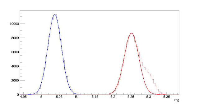
I ran all possible lineup combinations in which Adrian Beltre batted 2nd, 3rd or 4th for both the 2012 and likely 2013 Rangers’ lineup. For the 2013 Rangers’ lineup, I used projections (ZiPS, Steamer, Oliver, Bill James) for the upcoming season to seed the simulation with the hitters’ likely production. Again, a histogram of runs scored per game for all these lineup combinations, with 2012 in blue and 2013 in red.

2013 Rangers Lineup Distribution vs 2012 Lineup Distribution

The peaks as fit predict a 0.22 runs per game increase for the Rangers in 2013, or roughly 36 runs over the course of the year. The non-Gaussian (or normal distribution) tail of the 2013 distribution indicates it might be possible to improve even more.

We will finish with comparisons of the optimized lineups for 2012 and 2013 to the most usual/expected lineups for those years.

2012 Lineup 2012 Optimized 2013 Lineup 2013 Optimized
5.03 rpg 5.11 rpg 5.29 rpg 5.34 rpg
Ian Kinsler David Murphy Ian Kinsler Ian Kinsler
Elvis Andrus Adrian Beltre Elvis Andrus Lance Berkman
Josh Hamilton Josh Hamilton Lance Berkman Leonys Martin
Adrian Beltre Mitch Moreland Adrian Beltre Adrian Beltre
Micheal Young Nelson Cruz Nelson Cruz Nelson Cruz
Nelson Cruz Mike Napoli AJ Pierzynski Mitch Moreland
David Murphy Ian Kinsler David Murphy AJ Pierzynski
Mike Napoli Micheal Young Mitch Moreland David Murphy
Mitch Moreland Elvis Andrus Leonys Martin Elvis Andrus

We’ll start with the big picture. While moving/substituting for Michael Young in 2012 would have made little difference in run production, an optimized lineup would have increased the Rangers’ run total by 13 runs over the course of the year. Not much, but it would likely have been enough to have won the division instead of losing to the A’s. Of course, it is much easier to optimize a lineup when you already know how everyone is going to perform; using an optimized lineup based on 2012 projections wouldn’t have netted the 13 run increase. Most notably, leading off with Murphy (in his breakout year) instead of Kinsler (in his down year) to increase production is not a move one could expect an organization to predict before any games had been played in 2012.

Second, the probable lineup for the Rangers in 2013 is projected to score 8 runs a year less than an optimized lineup. Given the large variance in the production of a hitter as compared to his projections, these lineups seem virtually equivalent.

The optimized lineups show different characteristics than the lineups generated by Ron Washington. The optimized lineups forego Elvis Andrus batting second in preference for a power hitter with good average. Elvis Andrus is instead relegated to the 9th spot. The 2013 optimized lineup puts a lot of faith in rookie Leonys Martin, due entirely to some very respectable projections for the coming year (and not knowing he’s a rookie). Given the uncertainty of how much offense Martin will produce in 2013, have Martin bat in the bottom of the order, as in Ron Washington’s lineup, seems prudent. Finally, Mitch Moreland is preferred in the middle of the lineup in the optimized lineups instead of the bottom of the order as in Washington’s lineups.

If the Rangers are looking to optimize their lineup for 2013, this simulation indicates the two main points to consider: moving Moreland to the middle of the order, and considering batting Andrus 9th.


Evaluating 2012 Projections

Evaluating 2012 Projections

Hello loyal readers.  It’s time for the annual evaluation of last year’s player projections.  Last year saw Gore, Snapp, and Highly’s Aggpro forecasts win among hitter projections (http://www.fangraphs.com/community/comparing-2011-hitter-forecasts/) and Baseball Dope win among pitchers http://www.fangraphs.com/community/comparing-2011-pitcher-forecasts/ .  In general, projections computed using averages or weighted averages tended to perform best among hitters, while for pitchers, structural models computed using “deep” statistics (k/9, hr/fb%, etc.) did better.

2012 Summary

In 2012, there were 12 projections submitted for hitters and 12 for pitchers (11 submitted projections for both).  The evaluation only considers players where every projection system has a projection.

Read the rest of this entry »


To Throw, or Not to Throw

With a runner on first, a pitcher’s approach to a batter changes in many ways. The most obvious is the delivery out of the stretch. More subtly, the pitcher can be distracted by the runner potentially stealing a base. To mitigate the runner’s chances of stealing a base, the pitcher has the option to throw over to first, thereby keeping the runner closer to the bag.

After a few throw overs, I often hear announcers remarking that the pitcher is “distracted” by the base runner, implying that the pitcher is compromising his effort to get the batter out. By expending his mental, and maybe also his physical, energy on the base runner, he commits less towards the batter. In this article, we attempt to demonstrate this proposed effect with a statistical analysis.

Read the rest of this entry »


Plugging the Cardinals’ Shortstop Hole

It’s been nine months since the trade that brought Ryan Theriot to St. Louis, and the shortstop picture for the Cardinals is no clearer today than it was then. With their playoff hopes all but officially extinct, the prospect of another offseason spent looking for up-the-middle help looms large.

The trio of players who have garnered playing time at short for the Cards this season have been unimpressive, producing a combined 0.4 WAR in approximately a season’s worth of plate appearances. Theriot is an obvious non-tender candidate, while newly acquired Rafael Furcal will almost certainly have his $12 million option declined and become a free agent at the end of the season. This leaves the Cards with only Tyler Greene as an internal option, and the free agent market for shortstops is about as thin (the obvious exception being Jose Reyes, who the Cardinals have almost no hope of signing if they expect to keep Chris Carpenter and/or Albert Pujols). While the Cardinals will likely either give Greene a shot to hold down the job, or pick up another bargain during the free agency period, I’d like to propose that the Cardinals consider a radical alternative that could provide the team with a definitive edge: Albert Pujols.

Read the rest of this entry »


Do Catchers Influence Pitcher Performance? The Story of Spanky and Sluggo

From Opening Day to April 20th, Red Sox pitchers posted a 7.14 ERA when Jarrod Saltalamacchia was behind the plate versus a 2.40 ERA when Jason Varitek started. The resulting hubbub about this split made one fact extremely clear, when comparing the influence of different catchers, sample size is really really important.

Already by June 24th, Varitek and Salty’s split has been greatly reduced, with pitchers now throwing a 3.44 ERA to the veteran captain and a 4.36 ERA to the new guy. I would bet that these numbers will continue to converge as the season drags on, but even after 182 games it’s unlikely that either catcher will have enough innings to statistically test whether one is calling a better game. This is the difficulty of assessing catcher performance: comparing catchers between teams is near impossible (because the pitching staffs are different), and comparing catchers within teams is difficult (because sample sizes are small and different pitchers use different catchers). Nevertheless, many still believe that catchers do influence pitcher performance. Where can we find the data to support this hypothesis?

Read the rest of this entry »


Brett Gardner, Good Eye or Non-Swinger?

On the surface, Brett Gardner looks like a Bobby Abreu protege (without any power). Since 2010, Brett has shown off his great eye for pitches, posting the 2nd lowest chase rate in baseball at 18.1%.

His ability to make contact with pitches is also astonishing, as he makes contact with 97.2% with pitches in the strike zone, behind only Juan Pierre and Marco Scutaro. Of the 2789 pitches Brett has seen since the start of 2010, he has only swung and missed at 265 pitches.

Where Brett Gardner lacks is in his ability to swing at pitches in the strike zone. Over the last two seasons, Brett has swung at a major league low 45.2% of pitches in the strike zone. He owns this record almost 6% (next lowest is Elvis Andrus at 50.9%) and is almost 20% below the league average. Combined with his low chase rates, its only natural also that Brett has the lowest swing rate in MLB at 31.3%, compared to the league average of 45.6%.

Read the rest of this entry »


Comparing 2010 Pitcher Forecasts

In two previous articles, I considered the ability of freely available forecasts to predict hitter performance (part 1 and part 2), and how forecasts can be used to predict player randomness (here).  In this article, I look at the performance of the same six forecasts as before (ZIPS, Marcel, CHONE, Fangraphs Fans, ESPN, CBS), but instead look at starting pitchers’ wins, strikeouts, ERA, and WHIP.

Results are quite different than for hitters. ESPN is the clear winner here, with the most accurate forecasts and the ones with the most unique and relevant information. Fangraphs Fan projections are highly biased, as with the hitters, yet they add a large amount of distinct information, and thus are quite useful.  Surprisingly, the mechanical forecasts are, for the most part, failures. While ZIPS has the least bias, it is encompassed by other models in every statistic.*  Marcel and CHONE are also poor performers with no useful and unique information, but with higher bias.

Read the rest of this entry »