Archive for Outside the Box

Why the White Sox Should Relocate

On opening day of this season the White Sox attracted a crowd of 37,422 in a win over the Minnesota Twins. In much contrast to their sell out crowd on opening day, their 2nd and 3rd home games drew much less people. The White Sox reported that their 2nd home game of the year was attended by 10,625 people however, there appeared to be much less people in the park then the club reported. You can decide for yourself, but there are clearly less than 10,000 people at this game and the attendance figure was probably closer to 1,000. The Sox saw very similar attendance in their 3rd home game of the season as well. These numbers are pathetic but people might argue it’s because the team is in a rebuilding stage and fans have no expectations for their team this year.

That might be part of the issue but the amount of people that have attended their games so far is embarrassing to the organization. Also, in White Sox history when the team is contending for a playoff spot they have always struggled to sell to tickets to very important games. A prime example of their woeful attendance when they are in contention was on September 25, 2012. The White Sox were tied atop the AL Central with the Detroit Tigers. With 8 games remaining in the season, the Sox were facing the Cleveland Indians in a crucial home game. Almost any other big league team would get a sell out crowd but the Sox only attracted 13,797 people which filled about a third of their stadium. These attendance figures should be very alarming to the Sox organization and show that changes of some type are needed.

Another interesting part of the Sox’s attendance problems is that offseason signee Jose Abreu isn’t helping draw crowds at all. Typically if a big name player, is debuting for a team, fans will come out to see them play. Abreu, had tons of hype surrounding him as he had shown elite power and the ability to hit for average in the Cuban league. The signing of Abreu is obviously not a publicity stunt, and is a move to improve the quality of the team. fans however, have shown no interest is seeing their potential all-star 1st baseman play. The fact that this young, exciting player is a negligible factor in whether or not fans will attend games is problematic to the franchise.

Another problem with the White Sox is that the games are fun to go to, yet people still don’t go. From first hand experience going to White Sox games, I actually really enjoy the environment there. As an fan who will go to US Cellular Field not to root for a particular team but just to watch baseball, I have always enjoyed my experiences there. The park is in very good condition and the food is unique and pretty good. The firework shows at the end of night games I have always found to be very cool and have been known to attract people to games who aren’t necessarily big baseball fans but just want to have a good time. Ticket prices aren’t unreasonably high as the average ticket cost $29 as of 2012. Going to White Sox games are an enjoyable and affordable experience yet nobody goes.

Not attracting crowds when in contention, when having high profile players, and having a quality stadium suggests that people in Chicago flat out do not care about the team at all. The organization might need to do something drastic to attract more fans. An option for the Sox that might help the organization is relocation. There are many cities that would love to have and MLB franchise and I think that Portland, Oregon would be an excellent option for the White Sox.

Portland is a city populated with just over 600,000 people similar to Seattle and Denver. Portland only has one major sports team (Portland Trail Blazers, NBA) and has shown in their attendance figures that they love and will support their team (5th in the NBA in attendance). Another notable piece of information is that the Portland Timbers the Major League Soccer franchise based out of Portland sells out every single game and attracts over 20,000 people for home games. In a very low market sport that is in the shadow of the major four sports in the USA, Portland has supported their MLS team. If Portland were to receive the Chicago White Sox, attendance figures would skyrocket and the team would be a much more relevant part of the city. The change from Chicago to Portland might be a problem with the fact that the Sox are in the AL central and Portland is dead west, but the MLB could easily realign to make things more easier in terms of travel.

Another problem people might point out is that Portland is a much smaller market than Chicago and the franchise might not make enough money. However, around the MLB the White Sox are widely considered a smaller market team as they are in the shadows of the Cubs who have a much larger fan base and is the more prominent team in Chicago. A move to Portland would allow the team to receive much more attention, and would help the organization sell more tickets. This is why Portland would be an excellent fit for the Sox and would drastically improve the state of the franchise.


Pitch Count Trends – Why Managers Remove Starting Pitchers

I. Introduction

A starting pitcher should have the advantage over opposing batters throughout a baseball game, yet as he pitches further into the game this advantage should slowly decrease.  The opposing manager hopes that his batters can pounce on the wilting starting pitcher before his manager removes him from the game.  But what would we see if the manager decided against removing his starting pitcher?  The goal of this analysis is to determine the consequences of allowing an average starting pitcher to pitch further into the game instead of removing him.  There are several different ways this situation can unfold for a starting pitcher, but we should be able to tether our expectations to that of an average starting pitcher.

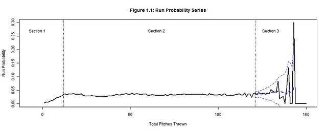
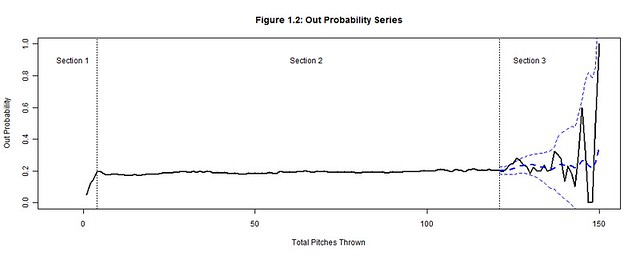
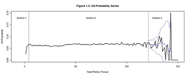
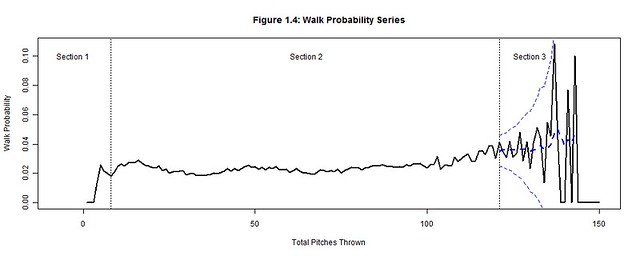
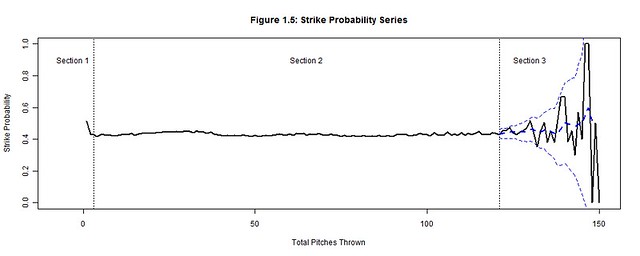
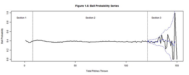
We will focus on how the total pitches thrown by starting pitchers (per game) affects runs, outs, hits, walks, strikes, and balls by analyzing their corresponding probability distributions (Figures 1.1-1.6) per pitch count; the x-axis represents the pitch count and the y-axis is the probability of the chosen outcome on the ith pitch thrown.  Each plot has three distinct sections:  Section 3 is where the uncertainty from the decreasing pitcher sample sizes exceeds our desired margin of error (so we bound it with a confidence interval); Section 1 contains the distinct adjustment trend for each outcome that precedes the point where the pitcher has settled into his performance; Section 2, stable relative to the others sections, is where we hope to find a generalized performance trend with respect to the pitch count for each outcome.  Together these sections form a baseline for what to expect from an average starting pitcher.  Managers can then hypothesize if their own starting pitcher would fare better or worse than the average starting pitcher and make the appropriate decisions.

Figure 1.1
Figure 1.2
Figure 1.3
Figure 1.4
Figure 1.5
Figure 1.6

II.  Data

From 2000-2004, 12,138 MLB games were played; there should have been 12,150 games but 12 games were postponed and never made up.  During this period, starting pitchers averaged 95.12 pitches per game with a standard deviation of 18.21.  The distribution of pitch counts is normal with a left tail that extends below 50 pitches (Figure 2).  It is not symmetric about the mean because a pitcher is more likely to be inefficient or injured early (left tail) than to exceed 150 pitches.  In fact, no pitcher risked matching Ron Villone’s 150 pitch count from the 2000 season.

Figure 1.1

This brief period was important for baseball because it preceded a significant increase in pitch count awareness.  From 2000-2004, there averaged 192 pitching performances ≥122 pitches per season (Table 2); 122 is the sampling threshold explained in the next section.  Since then, the 2005-2009 seasons have averaged only 60 performances ≥122 pitches per season.  This significant drop reveals how vital pitch counts have become to protecting the pitcher and controlling the outcome of the game.  Now managers more frequently monitor their pitchers’ and the opposing pitchers’ pitch counts to determine when they will expire.

Table 2:  2000-2009 Starting Pitcher Pitch Counts ≥122

Year

2000

2001

2002

2003

2004

2005

2006

2007

2008

2009

Pitch Counts ≥122

342

173

165

152

129

81

70

51

36

62

III. Sampling Threshold (Section 3)

122 pitches is the sampling threshold deduced from the 2000-2004 seasons (and the pitch count minimum established for Section 3), but it is not necessarily a pitch count threshold of when to pull the starting pitcher.  Instead this is the point when starting pitcher data becomes unreliable due to sample size limitations.  Beyond 122 pitches, the probabilities of Figures 1.1-1.6 violently waver high and low as very few pitchers threw more than 122 pitches.  A smoothed trend, represented by a dashed blue line and bounded by a 95% confidence interval was added to Section 3 of Figures 1.1-1.6 to contain the general trend between these rapid fluctuations.  But the margin of error (the gap between the confidence interval and the smoothed trend) grows exponentially beyond 3%, so the actual trend could be anywhere within this margin.  Thereby, we cannot hypothesize whether it is more or less likely that the pitcher’s performance will excel or plummet after 122 pitches.

To understand how the 122 sampling threshold was determined, we first extract the margin of error formula (e) from the confidence interval formula (where  zα/2 = z-value associated with the (1-α/2)th percentile of the standard normal distribution, S = standard error of the sample population, n = sample size, N = population size):

Figure 1.1

Next, we back-solve this formula to find the maximum sample size n for when the margin of error exceeds 3%; we use S = 0.5, z2.5% = 1.96, N = 2 pitchers × 12,138 games = 24,276:

Figure 1.1

There is no pitch count directly associated with the sample size of 1,022, but 1,022 can be bounded between the 121 (n=1,147) and 122 (n=971) pitch counts.  At 121 pitches the margin of error is still less than 3%, but it becomes greater than 3% at 122 pitches and begins to increase exponentially.  This is the point the sample size becomes unreliable and the outcomes are no longer representative of the population.  Indeed only 4% (971 of 24,276) of the pitching performances from 2000-2004 equaled or exceeded 122 pitches thrown in a game (Figure 3).
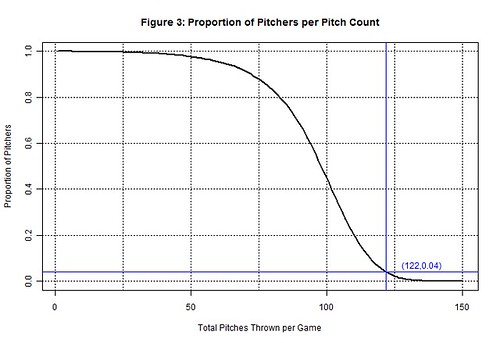
Figure 1.1

A benefit of the sampling threshold is that it separates the outcomes we can make definitive conclusions about (<122 pitches) from those we cannot (≥122 pitches).  If were able to increase the sampling threshold another 10 pitches, we could make conclusions about the throwing up to 131 pitches in a game.  However, managers will neither risk the game outcome nor injury to their pitcher to accurately model their pitcher’s performance at high pitch counts.  Instead, the sampling thresholds have steadily decreased since 2005 and the 2000-2004 period is likely the last time we’ll be able to make generalizations about throwing 121 pitches in a game.

Yet, even for the confident manager, 121 pitches is still a fair point in the game to assess a starting pitcher.  Indeed the starting pitcher must have been consistent and trustworthy to pitch this deep into the game.  But if the manager wants to allow his starting pitcher to continue pitching, he is only guessing that this consistency will follow because there is not enough data to accurately forecast his performance.  Instead he should consider replacing his starting pitcher with a relief pitcher.  The relief pitcher is a fresh arm that offers less risk; he must have a successful record based on an even smaller sample size of appearances, smaller pitch counts, and a smaller margin of error.  The reliever and his short leash are the surer bet than a starting pitcher at 122 pitches.

IV.  Adjustment Period (Section 1)

The purpose of the adjustment period is to allow the starting pitcher a generous period to find a pitching rhythm.  No conclusions are made regarding the probabilities in the adjustment period as long as an inordinate amount of walks, hits, and runs are not allowed.  The most important information we can impart from this period is the point when the adjustment ends.  Once the rhythm is found, we can be critical of a pitcher’s performance and commence the performance trend analysis.

In order to be effective from the start, starting pitchers must quickly settle into an umpire’s strike zone and throw strikes consistently; most pitchers do so by the 3rd pitch of the game (Figure 1.5).  Consistent strike throwing keeps the pitcher ahead in the count and allows him to utilize the outside of the strike zone rather than continually challenging the batter in the zone.  Conversely, a pitcher must also include (pitches called) balls into his rhythm, starting approximately by the 8th pitch of the game (Figure 1.6).  Minimal ball usage clouds the difference between strikes and balls for the batter while frequent usage hints at a lack of control by the pitcher.  Strikes and balls furthermore have a predictive effect on the outcomes of outs, hits, runs, and walks:  a favorable count for the batter forces the pitcher to deliver pitches that catch a generous amount of the strike zone while one in favor of the pitcher forces the batter to protectively swing at any pitch in proximity of the strike zone.

On any pitch, regardless of the count, the batter could still hit the ball into play and earn an out or hit.  Yet as long as the pitcher establishes a rhythm for minimizing solid contact by the 4th pitch of the game (Figure 1.2-1.3), he can decrease the degree of randomness that factors into inducing outs and minimizing hits.  A walk contrarily cannot occur on any pitch because walks are the result of four accumulated balls.  Pitchers should settle into a rhythm of minimizing walks by using minimal ball usage; so when the ball rhythm stabilizes (on the 8th pitch of the game) the walk rhythm also stabilizes (Figure 1.4).  After each of these rhythms stabilizes, a rhythm can be established for minimizing runs (a string of hits, walks and sacrifices within an inning) by the 12th pitch of the game (Figure 1.1).  It is possible for home runs or other quick runs to occur earlier, but pitchers who regularly put their team in an early deficit are neither afforded the longevity to pitch more innings nor the confidence to make another start.

V.  Performance Trend (Section 2)

Each of the probability distributions in Figures 1.1-1.6 provides a generalized portrayal of how starting pitchers performed from 2000-2004, but in terms of applicability they do not depict how an average starting pitcher would have performed.  Not all pitchers lasted to the same final pitch (Figure 2).  The better a pitcher performed the longer he should have pitched into the game, so we would expect each successive subset of pitchers (lasting to greater pitch counts) to have been more successful than their preceding supersets.  Thereby, in order to accurately project the performance of an average starting pitcher the probability distributions need to be normalized, by factors along the pitch count, as if no pitchers were removed and the entire population of pitchers remained at each pitch count.

The pitch count adjustment factor (generalized for all pitchers) is a statistic that must be measurable per pitch rather than tracked per at-bat or inning, so we cannot use batting average, on-base percentage, or earned run average.  The statistic should also be distinct for each outcome because a starting pitcher’s ability to efficiently minimize balls, hits, walks, and runs and productively accumulate strikes and outs are skills that vary per pitcher.  Those who are successful in displaying these abilities will be allowed to extend their pitch count and those who are not put themselves in line to be pulled from the game.

We accommodate these basic requirements by initially calculating the average pitches per outcome x, Rx(t), for any pitcher who threw at least t pitches (where PCt = sum of all pitch counts and xt = sum of all x for all pitchers whose final pitch was t):

Figure 1.1

This statistic, composed of a starting pitcher’s final pitch count divided by his cumulative runs allowed (or the other outcome types), distinguishes the pitcher who threw 100 pitches and allowed 2 runs (50 pitches per run) versus the pitcher with 20 pitches and 2 runs (10 pitches per run).  At each pitch count t, we calculate the average for all starting pitchers who threw at least t pitches; we combine their various final pitch counts (all t), their run totals (occurring anytime during their performance), and take a ratio of the two for our average.  At pitch count 1, the average is calculated for all 24,276 starting pitcher performances because they all threw at least one pitch; the population of starting pitchers allowed a run every 32.65 pitches (Table 5.1).  At pitch count 122, the average is calculated for the 971 starting pitcher performances that reached at least 122 pitches; this subset of starting pitchers allowed a run every 57.75 pitches per game.

Table 5.1:  2000-2004 Pitches per Outcome

Pitch Rate

Pitches per Outcome
(t=1; All Pitchers)

Pitches per Outcome
(t=122; Pitchers w/ ≥122 pitches)

Pitches per Run

32.65

57.75

Pitches per Out

5.37

5.57

Pitches per Hit

15.44

20.38

Pitches per Walk

45.05

44.03

Pitches per Strike

2.38

2.23

Pitches per Ball

2.64

2.62

Starting pitchers will try to maximize the pitches per outcome averages for runs, hits, walks, and balls while minimizing the probabilities of these outcomes, because the pitches per outcome averages and the outcome probabilities have an inverse relationship.  Conversely, starting pitchers will also try to minimize the pitches per outs and strikes while trying to maximize these probabilities for the same reason.  Hence, we must invert the pitches per outcome averages into outcomes per pitch rates, Qx(t), to be able to create our pitch count adjustment factor, PCAx(t), that will compare the change between the population of starting pitchers and the subset of starting pitchers remaining at pitch count t:

Figure 1.1

The ratio of change is calculated for each outcome x at each pitch count t.  The pitch count adjustment factor, PCAx(t), will scale px(t), the original probability of x from the starting pitchers at pitch count t back to the expected probability of x for an average starting pitcher from the entire population of starting pitchers at pitch count t.

The increases to the pitches per run and pitches per hit rates strongly suggest that the 971 starting pitchers remaining at 122 pitches were more efficient at minimizing runs and hits than the overall population of starting pitchers.  The population performed worse than those pitchers remaining at 122 pitches by factors of 176.85% and 131.98% with respect to the runs per pitch and hits per pitch rates (Table 5.2).  Thereby, we would expect the probability of a run to increase from 3.40% to 6.01% and the probability of a hit to increase from 7.21% to 9.51% if we allowed an average starting pitcher from the population of starting pitchers to throw 122 pitches.

Table 5.2:  2000-2004 Average Pitcher Probabilities at 122 Pitches

Outcome

Original Pitcher Probability
px(t=122)

Pitch Count Adjustment
PCAx(t=122)

Average Pitcher Probability
px(t=122) x PCAx(t=122)

Run

3.40%

176.85%

6.01%

Out

19.26%

103.77%

19.98%

Hit

7.21%

131.98%

9.51%

Walk

3.50%

97.72%

3.42%

Strike

45.21%

93.78%

42.40%

Ball

39.44%

99.21%

39.13%

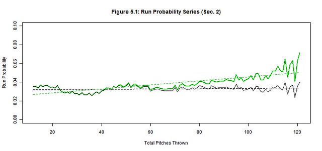
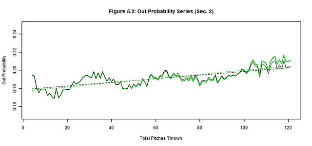
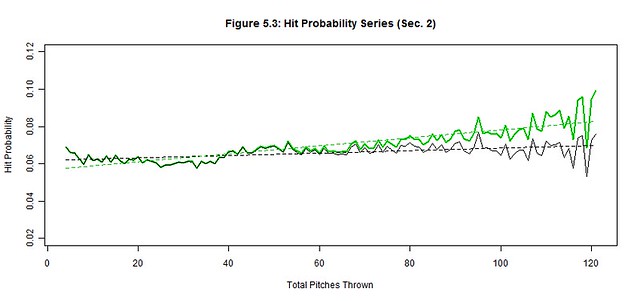
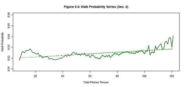
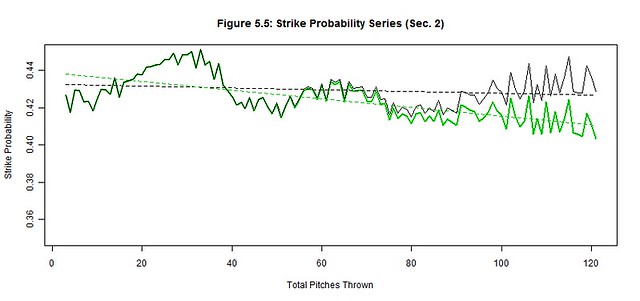
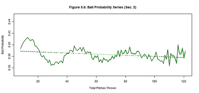
We apply the pitch count adjustment factors, PCAx(t), at each pitch count t to each of the original outcome probability distributions (black) to project the average starting pitcher outcome probabilities (green) for Section 2 (Figures 5.1-5.6); the best linear fit trends (dashed black and green lines) are also depicted.  The reintroduction of the removed starting pitchers noticeably worsened the hit, run, and strike probabilities and slightly improved the out probability in the latter pitch counts.  There were no significant changes to ball and walk probabilities.  These are the general effects of not weeding out the less talented pitchers from the latter pitch counts as their performances begin to decline.

Figure 5.1
Figure 5.2
Figure 5.3
Figure 5.4
Figure 5.5
Figure 5.6

Next we quantify our observations by estimating the linear trends of each original and average pitcher series and then compare their slopes (Table 5.3).  The linear trend (where t is still the pitch count) provides a simple approximation of the general trend of Section 2 while the slope of the linear trend estimates the deterioration rate of the pitcher’s ability to control these outcomes.  The original pitcher trends show that the way managers managed pitch counts, their starting pitchers produced relatively stable probability trends as if the pitch count little or no effect on their pitchers; only the out trend changed by more than 1% over 100 pitches (2.00%).  Contrarily, the average pitcher trends increased by more than 2% over 100 pitches for the run, out, hit, and strike trends, indicating a possible correlation between the pitch count and the average pitcher performance; the walk and ball trends were unchanged from the original to the average starting pitcher.

We must also measure these subtle changes between the original and average trends that occur in the latter pitch counts of Figures 5.1-5.6.  There is rapid deterioration in the ability to throw strikes and minimize hits and runs between the original and average starting pitchers as suggested by the changes in slope.  The 368.21% change in the strike slopes clearly indicates that fewer strikes are thrown by the average starting pitcher in the latter pitch counts.  The factors of 222.53% and 1206.13% for the respective hit and run slopes indicate that the average starting pitcher is not only giving up more hits but giving up more big hits (doubles, triples, home runs).  There is a slight improvement in procuring an out (14.45%), but the pitches that were previously strikes became hits more often than outs for the average starting pitcher.  Lastly, the abilities to minimize balls (4.87%) and walks (8.23%) barely changed between pitchers, so control is not generally lost in the latter pitch counts by the average starting pitcher.  Therefore, the average starting pitcher isn’t necessarily pitching worse as the game progresses but the batters may be getting better reads on his pitches.

Table 5.3:  Section 2 Linear Trend

Linear Trend

Correlation

Trend

Range

Original
Pitcher

Average
Pitcher

% Change in Slope

Original Pitcher

Average Pitcher

Run Probability

[12,121]

0.03+0.16×10⁻⁴t

0.02+2.13×10⁻⁴t

1206.13%

0.17

0.8

Out Probability

[4,121]

0.18+2.00×10⁻⁴t

0.18+2.30×10⁻⁴t

14.45%

0.75

0.76

Hit Probability

[4,121]

0.06+0.66×10⁻⁴t

0.06+2.12×10⁻⁴t

222.53%

0.54

0.85

Walk Probability

[8,121]

0.02+0.74×10⁻⁴t

0.02+0.78×10⁻⁴t

4.87%

0.57

0.6

Strike Probability

[3,121]

0.43-0.50×10⁻⁴t

0.44-2.33×10⁻⁴t

368.21%

-0.19

-0.7

Ball Probability

[8,121]

0.39-0.97×10⁻⁴t

0.39-1.05×10⁻⁴t

8.23%

-0.29

-0.32

The correlation coefficients also support our assertion that the average starting pitcher became adversely affected by the higher pitch counts, but even the original starting pitcher showed varied signs being affected by the pitch counts.  There were moderate correlations between the pitch count and hit and walks and a very strong correlation between the pitch count and outs.  So even though some batters improved their ability to read an original starting pitcher’s pitches, this improvement was not consistent and the increases to hits and walks were only modest.  Contrarily, the original starting pitcher did become more efficient and consistent at procuring outs as the pitch count increased.   We also found weak correlations between the pitch count and strikes and balls for the original starting pitcher, so strikes and balls were consistently thrown without any noticeable signs of being affected by the pitch count.   However, out of all of our outcomes, the pitch count of the original starting pitcher had the weakest correlation with runs.  Either the original starting pitchers could consistently pitch independent of the pitch count or their managers removed them before the pitch count could factor into their performance; the latter most likely had the greater influence.

It is also worth noting the intertwined patterns displayed in Figures 5.1-5.6 and Table 5.1.  Strikes and balls naturally complement each other, so it should come as no surprise that the Strike Probability Series and Ball Probability Series also complement each other; a peak in once series is a valley in the other and vice-versa.  The simple reason is that strikes and balls are the most frequent and largest of our outcome probabilities – they are used to setup other outcomes and avoid terminating at-bats in one pitch.  However, fewer strikes and balls are thrown in the latter pitch counts as evidenced by the decline in the Strike and Ball Probability Series, which make the at-bats shorter.  Consequently, there are fewer pitches thrown between the outs, hits, and runs, so these other probability series increase.  Hence, the probabilities of outs, hits, and runs become more frequent per pitch as the pitch count increases (further supported by the drop in pitches per strike and ball rates in Table 5.1).

VI.  Conclusions

Context is very important to the applicability of these results, without it we might conjecture that these trends would continue year over year.  Yet, the 2000-2004 seasons were likely the last time we’ll see a subset of pitchers this large pitching into extremely high pitch counts.   Teams are now very cautious about permitting starting pitchers to throw inconsequential innings or complete games, so the recent populations of starting pitchers have shifted away from the higher pitch counts and throw fewer pitches than before.  Yet, these pitch count restrictions should not affect the stability of our original probability trends.  The sampling threshold will indeed lower and the length of stable Section 2 will shorten, but the stability of the current original trends should not compromise.  Capping the night sooner for the starting pitchers only means they are less likely to tire or be read by batters.

We also cannot generalize that these original probability trends would be stable for any starting pitcher.  The probability trends and their stability are only representative of the shrinking subset of starting pitchers before their managers removed them due to performance issues, injury, strategy, etc.  These starting pitchers subsets may appear unaffected by the pitch count, but their managers created this illusion with the well-timed removal of their starting pitchers.  They understand the symptoms indicative of a declining pitcher and only extend the pitch count leash to starting pitchers who have shown current patterns of success.  Removing managers from the equation would result in an increased number of starting pitchers faltering in the latter pitch counts as their pitches are better read by batters.  Likewise, any runners left on base by the starting pitcher, but now the responsibility of a relief pitcher, would have an increased likelihood of scoring if the starting pitchers were not removed as originally planned by their managers.  Starting pitchers do notice these symptoms and may gravitate to finishing another inning, but each additional pitch could potentially damage the score significantly.  Trust in the manager and let him bear the responsibility at these critical points.

Building a “Smart” Team from Scratch – What Would You Do?

If you had a team that was in complete or semi- “rebuilding” mode, and you wanted to start quite nearly from scratch, and implement some of the smartest analytical techniques into your team philosophy, what might you do?  In the rest of this article, I detail some examples of what said hypothetical team might want to do.  I assume that the team has a middle-of-the-road farm system and an average operating budget, and that they want to accrue wins as efficiently and cost-effectively as possible.  I also assume that they have installed all of the state of the art ball and player tracking systems in their major and minor league ball parks that they possibly can.

What’s first?  Well, the ballpark.  Build the field to have a lot of foul territory–mimic the current Oakland A’s stadium.  Even though park factors seemingly have no effect on wins, I think mimicking the A’s would be a good choice for cost efficiency.  This move would allow you to stockpile high FB% pitchers who are going cheap nowadays.  It would enable you to take cheap, mediocre pitchers–the price for pitching is getting out of control nowadays–and give them a chance to put up great numbers.

Next, infield shifting–do it more.  No one shifted more than the Orioles last year, and studies have shown, along with even player anecdotes, that there should be even more shifting done than the O’s did.  Use opposing batter spray charts to determine where and when to shift, and do it as much as possible.  You might even look to hire more multi-position eligible players as they might find it easier to handle shifting abilities.  Ben Zobrist might be the most important player for the Tampa Bay Rays, defensively.

Next, develop and train hitters who can pull the ball with power.  It would be nice if your team was full of guys with all-fields power, but they are more rare, and thus more expensive.  Start teaching them to bunt well from the minors in order to be able to beat the eventual shifts they will see in the majors.  Hire the foremost bunting coach in the world for your staff.

Pitch framing–teach it from the minors and don’t let players like Jose Molina get signed by the Rays for so cheap money.  If possible, make clones from Molina DNA.

Keep your best relievers in the 7th, 8th, or high leverage situations only.  Sign a cheap closer each year from the scrap heap and watch him go to another team the next year as a free agent!  Game the system to keep your best young relievers stuck at a low price.  Their low save totals will help keep their arbitration numbers down.

Try to sign your best young players to long term deals.  The more Dustin Pedroias you can accrue the more payroll flexibility and WAR you will have at your disposal.  This one is easier said than done.  But if you can pull it off, you will make your team more attractive for incoming free agents.  And don’t be afraid to commit long-term to speedy players, as the data seems to say they age well.  The more tools a player has, obviously, the less risk his contract is if one of the tools breaks down.

Speaking of signing free agents, try to stay flexible in your 5th SP or 4th OF spot.  It seems like there are always guys left over at the end of the FA signing season who are forced to sign bargain contracts–Ervin Santana and Nelson Cruz, for examples from this year.  Try to find cheap platoon solutions when you have a player who struggles against a certain type of pitcher.

At the end of the day, this article is just a collection of some of the ideas that a mediocre team could implement to try to win now and for the near future.  Many teams are already implementing some of these ideas.  If you have any further “smart” hacks that you think should be the gold standard for teams looking to improve in a cost-efficient manner, I’d love to hear it in the comments section.


Better Stat Awareness Through Acronyms

Advanced statistics in baseball have an image problem. A romance problem, if you will. Specifically: the idea of a grizzled scout looking out onto the battlefield and seeing the kind of gritty player who wins ballgames, well, that has romance. A dude plugging wOBA and wRC+ into a spreadsheet? In the words of ESPN, “We’re all gonna go dateless!

A point must be made: the opacity of the acronyms themselves is a major factor in the perceived complexity of the statistics. Imagine integrating them into regular conversations, if you don’t already do so (and still have friends). “He’s above average as a hitter. You can tell from his double-you are see plus.” “Whoa, dude, that sounds too damn complicated.” “The guy’s got terrible range at shortstop, though. That’s why he can make highlight-reel plays with a terrible UZR.” “Oozer? I hardly know ‘er!” And so forth.

We statheads, cocooning ourselves in things like RA-9 WAR and expecting our friends to catch up, might make it easier on them by explaining what we measure in plain English. There are FanGraphs writers who are very good at this; it’s why they get paid money for what they do. Some other folks need a little help.

My modest proposal is to revise the acronyms we use to signify some of our favorite statistics. With a little luck, a little savvy, and a medium-height English literature graduate, we can create new terms which both summarize the needed statistic and are catchy to say aloud. For example:

isolated power (ISO). ISO is used to show a hitter’s raw power. Batting average is hits divided by chances for hits; ISO is extra bases taken divided by chances for hits. And we can make that even more clear by calling it Hitting Ultra Long, Knowledgeable Statistic Measuring Ability to Stroke Homers (HULKSMASH).

EXAMPLE: “Jose Bautista was a pretty unremarkable hitter for most of his career, until September 2009, when he came out of nowhere with an amazing HULKSMASH.”

weighted runs created plus (wRC+). What lies behind this dorky name? Well, we first measure roughly how many runs a player creates with his bat, using hits, walks, and so on. Then we create a putative average and set that at 100. Then everything’s scaled so that, for instance, 120 means you’re 20% better and 5 means you’re 95% worse than average.

Wouldn’t it be useful if the name wRC+ explained itself in plain English? For instance, we might explain that we’re comparing runs added by a player to a putative average. In other words, Comparing Runs Added to Putative Mean of All Players (CRAPMAP).

EXAMPLE: “The New York Mets lineup is all over the CRAPMAP. Last year David Wright’s CRAPMAP coordinate was 155 but Kirk Nieuwenhuis was way down at 72.”

In light of the negative connotation of “crap,” we might consider reversing the scale so that higher numbers mean more crappiness.

ultimate zone rating (UZR). This measures how good you are at defense, but I don’t know how it works. The proposed replacement acronym reflects this central mystery, but it also describes the statistic much better than UZR, which for all I know could measure how “in the zone” somebody is. Let’s change it to Fielding: Official Numerical Descriptive Utility of Excellence (FONDUE).

EXAMPLE: “Last year, with all his throwing issues, Ryan Zimmerman was one of the worst defenders in baseball as measured by FONDUE.”

baserunning (BsR). Okay, this one’s pretty simple, so simple I don’t even know why we gave it such a silly abbreviation. Was BSR taken? Or just BR? Anyway, we don’t need to worry about it anymore, because now we’re checking on Hitters Effectively Running Bases, Assessed Logically (HERBAL).

EXAMPLE: “The Colorado Rockies are hoping that outfielder Charlie Blackmon will supply them with a lot of HERBAL this year.”

batting average on balls in play (BABIP). Simple, you think. But more descriptive yet is Batting Average Regarding Fair Contact Only if Playable (BARFCOP).

EXAMPLE: “I don’t think he can sustain that success going forward. No hitter, no matter how good, can escape the consequences of having such an erratic BARFCOP.”

weighted on-base average (wOBA). First of all, what’s with the lowercase W? Is wOBA the iPad of stats? Second, this is another term whose meaning is unclear. We could explain to readers that wOBA weighs various outcomes (single vs. home run) and makes the more important outcomes a more important part of the equation.

Or we could go with the coolest acronym and call it Weighted Hitting Assessment Measuring Meaningful Outcomes (WHAMMO).

EXAMPLE: “Joey Votto is a great guy. He’s always going to have his WHAMMO sitting among the very best.”

And finally, the most important stat of all:

wins above replacement (WAR) or victories over replacement player (VORP). To the average baseball fan, WAR is a bit of a nebulous concept. “Mike Trout is worth ten wins.” “Uh, whaddya mean?” Now, if you explain it for twenty more seconds, they’ll understand just fine. But wouldn’t you rather we had something everyone can understand and get behind? Wouldn’t you rather have it that nobody would dare speak an ill word about WAR?

Well, that’s possible. We just call it Baseball Excellence Exceeding Replacements (BEER). Same concept. Same math. Same powerful analysis. Just measured in BEER.

“Well, it’s like this. Imagine if the average AAA guy was worth zero BEERs, and the average major leaguer was worth, say, two BEERs.”
“Okay.”
“Mike Trout is worth ten BEERs.”
“I’ll be damned.”

Before you know it, everyone in baseball will be talking the language of statistical analysis. And we won’t all be going dateless. We’re the ones with the BEER.


The Top Five Yankee Second Basemen

Something very strange happened this offseason: the Yankees were outbid for a player they have a clear need for (although all teams need players of this caliber). This player is the best second basemen, and one of the top 10 position players, in all of baseball. Of course this player is Robinson Cano, perennial All-Star, Silver Slugger, Gold-Glover and MVP candidate. I do not need to tell you that Robinson Cano is a great baseball player. But I thought it would be interesting, as a matter of reflection to appreciate Cano’s talent/ be slightly depressed watching him rack up his numbers in Seattle, to rank the best second basemen in Yankee history and to determine where Cano fits in.

First, I think it is important to put the five players to be discussed in some historical context. When one thinks about the great “Yankee positions,” second base does not particularly stand out, at least to me. Like most Yankee fans (I imagine), I immediately think of center field (Mantle, DiMaggio), catcher (Berra, Dickey, Posada, Munson), first base (Gehrig) and right field (Ruth). But is this justified? Lets look at the top five fWAR (FanGraphs’ WAR) totals for each position in Yankee history:

Position

Top 5 Total fWAR

Rank

First Base

231.6

4th

Second Base

216.7

5th

Third Base

178.9

7th

Shortstop

194.9

6th

Catcher

237.5

3rd

Left field

170.2

8th

Center Field

310.7

1st

Right Field

269.8

2nd

*NOTES: (1) Babe Ruth was counted as a right fielder (2) Stats courtesy of FanGraphs.

As we can see, second base places 5th behind the four positions I think Yankee fans most associate with greatness. However, no other team in history has had at least five second basemen accumulate at least 37.1 fWAR, and only one team’s top five (the Reds) beat the Yankees’ top five in total fWAR, albeit barely (220.3 to 216.7). Of course not all teams have been around as long as the Yankees have (and some have been around longer) but you get the idea. Suffice to say, second base has been an excellent position in the history of an organization that has had several excellent positions. So while second base places right around where we would expect in terms of other Yankee positions, it is important to reiterate that (1) the four Yankee positions ahead of second basemen on the aforementioned list are insanely good and include some of the greatest players of all time, and (2) the top five Yankee second basemen, compared to other teams’ top second basemen, are among the best ever.

That being said, here are some stats for my top five Yankee second basemen of all time, in no particular order:

Player

Games

HR

BsR

AVG

OBP

SLG

wRC+

Def

fWAR

Gordon

1000

153

-7.8

.271

.358

.467

121

140.1

40.1

Cano

1374

204

-4.9

.309

.355

.504

126

-10.4

37.1

Randolph

1694

48

17.6

.275

.374

.357

110

143.9

51.4

Lazzeri

1659

169

-8.2

.293

.379

.467

121

48.6

48.4

McDougald

1336

112

-4.5

.276

.356

.410

114

128.6

39.7

*NOTES: (1) Stats courtesy of FanGraphs; (2) These stats are what each player accumulated as a Yankee only.

Like I said before, this is more or less as good a list of top-five second basemen that any team has. Every player on this list was an above-average hitter that played exceptional defense (except for Cano). The one glaring weakness, with the exception of Randolph, is baserunning. This strikes me as a bit odd because second basemen are typically solid in this aspect of the game. Even still, these are five very, very good ballplayers. Now to the top five:

5. Gil McDougald

Gil McDougald’s inclusion on this list is somewhat dicey because he played all over the infield save for first base (he appeared in 599 games at second, 508 at third, and 284 at short as a Yankee). McDougald is included because 1) he did in fact play most of his games at second, and 2) in my opinion, he is one of the most underrated players in Yankee history. The Rookie of the Year in 1951 (his best season with the bat with a 142 wRC+) McDougald was a five-time All Star and a member of the five Yankee World Series championship teams. A player with his versatility is extremely valuable to any team and the fact that he was making his contributions to an organization in the midst of the greatest dynasty in sports history (1949-1964) is all the more impressive. Throw in his above-average bat and you have one great ballplayer. McDougald does not rank 1st in any of the aforementioned categories but he is the definition of a “jack of all trades” player: he played multiple positions and did everything well.

4. Willie Randolph

Millennials like myself remember Randolph mostly (and quite fondly) from his time as the Yankee third-base coach during the most recent dynasty years (and less fondly as the manager of the Mets), but he had a fantastic playing career in pinstripes as well. Representing the Yankees in four All-Star games (including in 1977, the Yankees’ first World Series title since 1962), Randolph had the reputation as a defensive wizard. The statistics back that assertion up nicely, as his 143.9 Def rating is best among second basemen in franchise history (and his career Def rating of 168.2 is ninth all time among second basemen). Randolph is easily the best baserunner of the five, with a 17.6 BsR (no other player is above -4.5). Randolph was no slouch with the bat either, although his power pales in comparison to the other four players on the list. However, it is known that on-base ability is more valuable than power, and Randolph’s .374 career OBP ranks second. McDougald and Randolph are strikingly similar players (even their fWAR/game is an identical .030) but I decided to rank Randolph higher due to his superior on-base ability.

3. Robinson Cano

The inspiration for this post, Robinson Cano checks in as the third-greatest second baseman in Yankee history. A five-time All-Star and five-time Silver Slugger, Cano’s Yankee career began somewhat randomly during the teams’ terrible start to the 2005 season, and he never looked back.  His 126 wRC+ is tops on the list. He also leads in home runs, batting average, and slugging. However, his Def rating of -10.4 is easily the worst on the list (acknowledging that defensive metrics are far less reliable than offensive and base running metrics). Cano has been one of the very best players in baseball the past several years. Neither McDougald nor Randolph could claim such during their playing days. Cano has been top-five in all of baseball in bWAR (Baseball-Reference WAR) in four different seasons, whereas McDougald has two such seasons, and Randolph none. Had Cano signed with the Yankees this offseason, he most likely would have ended up #1 on this list.

2. Tony Lazzeri

Hall of famer Tony Lazzeri checks in at #2. In his 12 seasons as a Yankee from 1926-1937, Lazzeri played less than 123 games only once, hit at least 10 home runs in every season but two (in those two seasons, 1930 and 1931, he hit 9 and 8 home runs, respectively) and had a wRC+ greater than 100 in 11 straight seasons. He also accumulated at least 2 fWAR every year he was with the Yankees. Suffice to say, Lazzeri was a very consistent ballplayer on same great Yankee clubs (including arguably the great of all time, the 1927 squad). His 48.4 WAR is second on the list. Unlike Cano, Lazzeri was not one of the best players in all of baseball during his playing career, but was simply with the Yankees longer and his counting stats reflect as much, giving him a slight edge over Cano.

1. Joe Gordon

Completely disregarding my reasoning for ranking Lazzeri ahead of Cano, I decided to rank Joe Gordon, another of the most underrated Yankees of all time, as the best second baseman in the teams’ history. He, like many big leaguers in the 1940s, missed time (in Gordons’ case, the 1944 and 1945 seasons) to serve in WWII. In 1942 and 1943, Gordon put up 8.8 fWAR and 6.8 fWAR, respectively, and save for a 2.1fWAR season in 1946, bounced right back and put up 6.9 fWAR in 1947 and 7.1 fWAR in 1948. The point of all of this is that Gordon would have, in all likelihood, continued to dominate in the two seasons he missed, but we’ll never know.

Even though his time in pinstripes, and in baseball for that matter, was shorter than it could have been, Gordon did not disappoint when he was on the field. A Yankee for seven seasons, he was an All-Star in six of them (although his 1946 selection is a bit odd. Check out his numbers that year). In those seven seasons he accumulated 40.1 fWAR, an average of 5.7 fWAR per season. This is easily the highest per-season average of any player on this list (Cano is second at 4.1 with the other three each at 4.0). On a fWAR/game basis, Gordon’s .040 is well ahead of the others (McDougald and Randolph are tied for second at .030). He, like Cano, could claim to be one of the best ballplayers of his time, having placed in the top 10 in overall bWAR five times as a member of the Yankees. Gordon was an elite defender, rating second all-time in Def for a second baseman. Randolph barely has him beat in terms of what they did as Yankees, but Gordon’s per-season average of 20.0 Def easily eclipses Randolph’s 11.1. Couple his historic defensive abilities with his great bat (his 121 wRC+ trails only Cano) and you have a fantastic ballplayer and the best second baseman in the teams’ storied history.

So there is my top five Yankee second basemen of all time. What sets Gordon apart from the rest are his per-season averages, but if you place a higher value on longer-term consistency I suppose Lazzeri would be your guy. But no other player did more in a shorter amount of time than Gordon, hence my ranking of him as #1. Honestly, I could be talked into changing this list around in a number of different ways (exlcuding McDougald and including Stirnweiss and flipping Lazzeri and Gordon just to name a couple) but I think the purpose of a post like this is to try and initiate some interesting debate while admiring the careers of past Yankee greats. Like I previously stated, I think second base is an under-appreciated Yankee position, but the organization has had some truly great second basemen in its history.


Grading 2013 AL SP Performance with Attention to the 2-D Direction of Batted Balls

Foreword

Two years ago, I began developing a system for evaluating the performance of minor-league pitchers relative to their minor-league level/league peers. My goals were to use only game data that could be extracted from the MLB Advanced Media Gameday archives for every level of the minors (ruling out any of the pitch-outcome data that is available for AA and AAA games), to ignore whether batted balls went for hits or home runs, and to ignore runs allowed. In brief, the challenge amounts to using whatever else information can be compiled from the game-specific dataset to arrive at the best approximation of the pitcher’s true performance, as judged independent of those factors which tend to fall outside their control (defense, park effects, etc.). What eventually follows are the results of applying the latest iteration of this “Fielding and Ballpark Independent Outcomes” method to 2013’s American League starting-biased pitchers.

Basic Steps of Applying the Method to a League

  1. Download the relevant details of every plate appearance (PA) from the league’s season into a spreadsheet/database
  2. Derive a 24-outs-baserunners-state run expectancy matrix à la Tango in The Book
  3. Quantify how each PA of the season impacted the inning’s run expectancy
  4. Exclude all bunts and foulouts, plus every PA taken by a pitcher
  5. Reweight the proportion of line drives (LD), outfielder fly balls (OFFB), ground balls (GB), and infielder flyballs (IFFB) by ballpark to offset any stadium- or stringer-related anomalies in play event classifications
  6. Referencing the run-expectancy value determined for each PA in Step 3, the corresponding basic description of the play (BB vs HBP vs K vs GB vs IFFB vs OFFB vs LD), and the 2 coordinates indicating where the batted ball was fielded (if there was one), quantify what each of the following 12 general PA event types were worth in terms of runs, on average, for the season: 1) walk or hit-by-pitch, 2) strikeout, 3) IFFB, 4) GB to batter’s pull-field-third of the diamond, 5) GB to batter’s center-field-third, 6) GB to batter’s opposite-field-third, 7) LD to pull-third, 8) LD to center-third, 9) LD to opposite-third, 10) OFFB to pull-third, 11) OFFB to center-third, and 12) OFFB to opposite-third.
  7. For each pitcher in the study sample, tally up the number of each of the 12 event types that they allowed and in each instance charge them with the exact number of runs determined in Step 6 for the corresponding event type; divide the resulting sum by the total number of events to arrive at a single number for each pitcher that quantifies how a PA against them that season should have affected the inning’s run expectancy, on average (the more negative this number the better the pitcher should have performed on the year)
  8. Quantify how high or low the pitcher rated on the value in Step 7 versus the mean of the sample on a standard deviation (SD) basis

What were the 12 Event Types Worth in 2013?

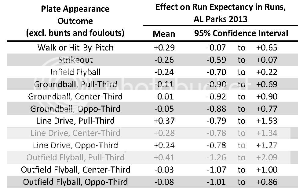
The table below shows how the studied event types impacted run expectancy in AL Parks during 2013, on average. The 2-D direction of the batted ball does tend to be rather consequential for LD and even more so for OFFB.

 photo 2013ALParksPAEventType-EffectofRunExpectancies2_zps4e1054de.jpg

So as far as Step 7 described above goes, each pitcher in what follows will be charged +0.29 runs for every BB and HBP, -0.26 runs for every K, … and -0.08 runs for every OFFB to the Opposite-Field-Third, with that sum ultimately divided by the total number of PA events to arrive at a single number that quantifies what an average PA against the pitcher in 2013 was worth in terms of runs (per run expectancies). Think of that as the equation being used to evaluate each pitcher’s performance.

Study Sample

The 101 pitchers who faced more than 200 batters as an American Leaguer in 2013 while averaging more than 10 batters faced per game. Data they accumulated as relievers is included in the analysis. Data they accumulated as National Leaguers is not. As before, any PA that resulted in a bunt or foulout or that was taken by a pitcher was excluded.

Scores Computed

The overall rating number described in Step 8 above is termed Performance Score. Steps 7 and 8 can be repeated with the non-batted-ball events (BB,HBP,K) stricken from the numerator and denominator at Step 7, and this result is termed Batted Ball Subscore (in short, how should the pitcher have rated versus their peers on batted balls?). To further understand how the pitcher achieved their Performance Score, a Control Subscore (how many SDs high or low was the pitcher’s BB+HBP% versus the study population’s mean?) and a Strikeout Subscore (how many SDs high or low was the pitcher’s K% ?) are computed. An Age Score is also calculated that quantifies how young the pitcher was versus the population’s mean age, per SDs. Given the method’s minor-league origins, the scores are typically expressed on a 20-to-80 style scouting scale where 50 is league-average, scores above 50 bettered league-average, and any 10 points equates to 1 SD (percentiles will be listed for those who prefer them).

2013 American League Starting Pitcher Results

In the tables to follow, green text indicates a value that beat league-average by at least 1 SD (“very good”) while red text indicates a value that trailed league-average by at least 1 SD. Asterisks indicate left-handed throwers.

Sorting by Performance Score

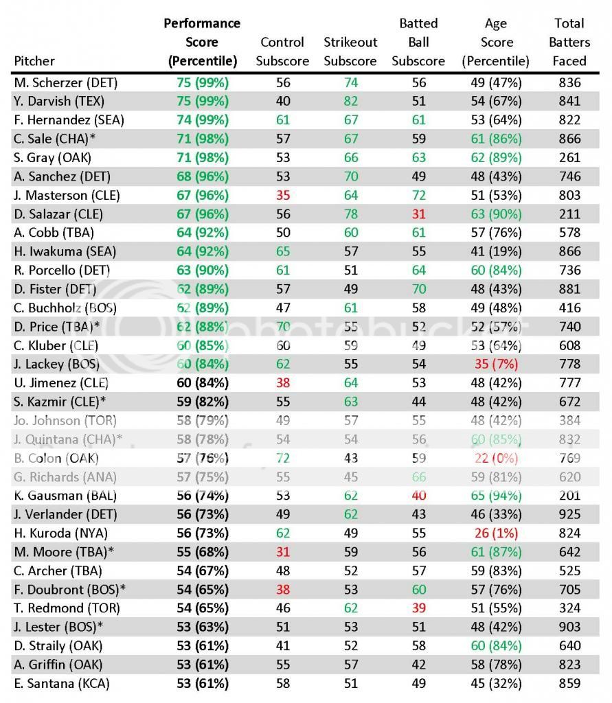
Here are the Top 33 2013 AL SP per the Performance Score measure. Scherzer edged Darvish for the #1 spot as the top of the list somewhat mimicked the BBWAA’s Cy Young vote.

 photo FG-2013ALSPScoresTop33_zps7510f67e.jpg

Detroit and Cleveland each landed five in the Top 33 while Boston, Oakland, and Tampa Bay each placed four. Perhaps not coincidentally, those clubs were also the playoff teams.

And below are the Middle 34 by Performance Score.

 photo FG-2013ALSPScoresMid34_zps31e63487.jpg

And below are the Bottom 34 by Performance Score.

 photo FG-2013ALSPScoresBot34_zps37b53dab.jpg

Pedro Hernandez took last place by a comfortable margin as five other Twins joined him on this dubious list of 34. To further corner the market on these sorts of arms, the club has since inked another of the 34 to a three-year free-agent contract.

Sorting by Batted Ball Subscore

Given the system’s unique weighting of batted-ball types by direction, let us examine how the pitchers grade out on this metric. Below are the Top 20 sorted by Batted Ball Subscore. Masterson nosed out Deduno for top honors. Here, the Twins fare better as three besides Deduno crack the Top 20.

 photo FG-2013ALSPBattedBallSubscoresTop20_zps83100793.jpg

 One unique angle of this approach is that a pitcher can be a relatively strong batted-balls performer without being a noteworthy groundball-inducer if their outfield flyballs, line drives, and groundballs are skewed optimally to the least dangerous zones of the field per the batter’s handedness. Colon serves as a prime example of such a pitcher.

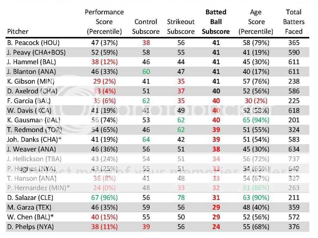
Below are the laggards who comprise the Bottom 20.

 photo FG-2013ALSPBattedBallSubscores2Bot20_zps7c4024d0.jpg

Garza’s 29 number as an American Leaguer is somewhat scary for the sort of money he’s likely to command as a free agent (he’d earn about a 35 Batted Ball Subscore if the Cubs NL data were factored in). Salazar’s numbers show how a very high rate of strikeouts and good control can successfully offset a dangerous distribution of batted balls by type and direction.

Admittedly, there is a third dimension to each of these batted balls (launch angle off the bat relative to the plane of the field) that would stand to further improve the batted-balls assessment if such information were available.

Other Directions

A variety of things can be done with these numbers, such as breaking them down further into LHB values and RHB values, identifying comparable pitchers who share similar subscores (MLBers to MLBers, MiLBers to MLBers), studying how these values evolve as the minor leaguer rises through the farm towards the majors and their predictive value as to future MLB performance, and so on. And then there’s also the reverse analysis — evaluating hitter performance under a similar lens.

On Tap

Perhaps the most intriguing research question that application of this system raises is, “Would advanced metrics familiarly used to grade pitcher performance yield better results if their equations included batted-ball directional terms?” As a first attempt to test those waters, I plan to follow this up with a post that shows how these results compare to those obtained by variants of more familiar advanced statistical-evaluation methods (SIERA, FIP, etc.). In the interim, I welcome whatever comments, criticisms, and suggestions this readership has to offer.


Another Highly Unimportant Stat: Pitcher Craftiness

In this post on measuring a player’s scrappiness, commenter Eric Garcia said “Next up, measuring a pitchers’ craftiness.” I liked this idea and thought I would give it a shot. Of course, the first problem is deciding what makes a pitcher “crafty”. Eric Garcia gave his suggestions and we will look at them eventually. I, however, thought about pitchers that came to my mind when the word “crafty” is used and looked at what they had in common. Generally, they do not have an overpowering fastball and don’t throw it that often. They usually don’t have that many strikeouts, but also don’t walk that many, so they still have a decent WHIP. The perception is that they are good at pitching out of jams, either by inducing ground-ball double plays or popups.

There were 81 pitchers that qualified for the ERA title in 2013. I found the average of this group in four categories: fastball velocity, strikeout percentage, WHIP, and LOB%. For each player I calculated how many standard deviations from the mean they were in each of these categories. I then summed these up (using the negatives for fastball velocity, strikeout percentage, and WHIP). Though “crafty” often seems to be used as a synonym for “left-handed”, I feel that you should be able to be crafty with either hand, so I did not use handedness at all. I considered using fastball percentage instead of velocity, but felt velocity better captured what we are looking for. Pitchers I think of as crafty seem to often outperform their FIP, so I considered using ERA-FIP, but felt that since the outperformance is often the result of a low strikeout rate and generally good WHIP, that it was already taken into account. The numbers are not league adjusted, so National League pitchers get a slight advantage.  So, using these criteria, here are the 2013 leaders in craftiness:

Name Craftiness Score
Bronson Arroyo 4.70
R.A. Dickey 4.44
Hisashi Iwakuma 4.03
Bartolo Colon 3.80
Kyle Lohse 3.65
Mark Buehrle 3.38
Travis Wood 3.20
Mike Leake 2.55
A.J. Griffin 2.50
Dillon Gee 2.38
Zack Greinke 2.25
Eric Stults 2.03
Kris Medlen 1.94
Clayton Kershaw 1.89
Hyun-Jin Ryu 1.86
Jeremy Guthrie 1.68
Julio Teheran 1.60
Kevin Correia 1.43
Hiroki Kuroda 1.39
Chris Tillman 1.30
Cliff Lee 1.26
Ervin Santana 1.26
Mike Minor 1.24
Jhoulys Chacin 1.22
Andy Pettitte 1.11
Doug Fister 1.04
John Lackey 0.94
Jose Quintana 0.83
Jarrod Parker 0.79
James Shields 0.77
Miguel Gonzalez 0.73
Adam Wainwright 0.72
Madison Bumgarner 0.68
Wade Miley 0.69
Scott Feldman 0.64
Jorge de la Rosa 0.55
Jeff Locke 0.47
Patrick Corbin 0.44
Jordan Zimmermann 0.35
Ricky Nolasco 0.01
Dan Haren -0.03
Matt Cain -0.13
Shelby Miller -0.23
Yu Darvish -0.32
Jose Fernandez -0.35
Chris Sale -0.39
Cole Hamels -0.47
Mat Latos -0.50
Andrew Cashner -0.57
Justin Masterson -0.55
Kyle Kendrick -0.64
Felix Hernandez -0.77
Anibal Sanchez -0.86
Matt Harvey -0.94
C.J. Wilson -0.89
Jon Lester -0.93
Jerome Williams -1.00
Max Scherzer -1.05
David Price -1.05
Rick Porcello -1.04
Ryan Dempster -1.09
Yovani Gallardo -1.10
Gio Gonzalez -1.16
Homer Bailey -1.32
Joe Saunders -1.28
Derek Holland -1.38
Ubaldo Jimenez -1.42
Jeremy Hellickson -1.83
Felix Doubront -1.85
Tim Lincecum -1.88
Ian Kennedy -1.94
Justin Verlander -2.12
Stephen Strasburg -2.17
Bud Norris -2.19
CC Sabathia -2.20
Lance Lynn -2.26
A.J. Burnett -2.35
Jeff Samardzija -3.60
Wily Peralta -3.64
Edwin Jackson -4.26
Edinson Volquez -4.84

Considering the model used here, Bronson Arroyo being on top is not really a surprise (though I really thought Dickey would probably wind up on top and he would have easily if I had used fastball percentage instead of fastball velocity).  Now some people might protest that a low strikeout rate should not be required.  They would argue that it is certainly possible that a pitcher might still be considered crafty and have a fair number of strikeouts.  If we remove the strikeout percentage from the stat, we get the following:

Name Craftiness Score
Hisashi Iwakuma 4.34
R.A. Dickey 3.99
Bronson Arroyo 3.40
Clayton Kershaw 3.28
Yu Darvish 2.88
A.J. Griffin 2.63
Bartolo Colon 2.56
Travis Wood 2.51
Cliff Lee 2.53
Kyle Lohse 2.47
Zack Greinke 2.37
Mark Buehrle 2.22
Julio Teheran 2.06
Madison Bumgarner 1.83
Hyun-Jin Ryu 1.73
Mike Minor 1.71
Kris Medlen 1.67
Dillon Gee 1.53
Chris Tillman 1.56
Jose Fernandez 1.52
Adam Wainwright 1.39
Mike Leake 1.29
Chris Sale 1.10
Max Scherzer 1.09
John Lackey 1.06
Matt Harvey 0.98
James Shields 0.91
Hiroki Kuroda 0.88
Ervin Santana 0.89
Anibal Sanchez 0.87
Eric Stults 0.74
Felix Hernandez 0.75
Jose Quintana 0.70
Patrick Corbin 0.57
Shelby Miller 0.59
Doug Fister 0.46
Justin Masterson 0.46
Dan Haren 0.14
Andy Pettitte 0.09
Cole Hamels 0.03
Jhoulys Chacin -0.02
Matt Cain -0.01
Wade Miley -0.03
Jordan Zimmermann -0.04
Scott Feldman -0.11
Miguel Gonzalez -0.11
Ricky Nolasco -0.13
Jarrod Parker -0.18
Jeff Locke -0.21
Ubaldo Jimenez -0.25
Mat Latos -0.26
Jeremy Guthrie -0.30
Gio Gonzalez -0.37
Kevin Correia -0.45
Homer Bailey -0.51
Jorge de la Rosa -0.60
Stephen Strasburg -0.67
C.J. Wilson -0.83
A.J. Burnett -0.90
Ryan Dempster -1.01
David Price -1.01
Jon Lester -1.09
Andrew Cashner -1.08
Derek Holland -1.16
Tim Lincecum -1.24
Rick Porcello -1.30
Justin Verlander -1.31
Yovani Gallardo -1.55
Lance Lynn -1.57
Ian Kennedy -1.93
Felix Doubront -2.04
Kyle Kendrick -2.32
Jeremy Hellickson -2.37
Jerome Williams -2.41
CC Sabathia -2.49
Bud Norris -2.53
Jeff Samardzija -2.82
Joe Saunders -3.14
Wily Peralta -4.70
Edwin Jackson -5.03
Edinson Volquez -5.40


When the poster Eric Garcia suggested this, his idea of a crafty pitcher was someone with a low velocity, high ERA, and a decent number of wins.   If we use those criteria and the same methodology, we come up with the following list:

Name Craftiness Score
R.A. Dickey 6.809175606
Mark Buehrle 4.7547704381
Bronson Arroyo 3.2944617169
Joe Saunders 2.9423646195
Jeremy Hellickson 2.6685500615
CC Sabathia 2.4966613422
Eric Stults 2.7180128884
A.J. Griffin 2.4076452673
Doug Fister 2.2427676408
Dan Haren 2.1691672291
Adam Wainwright 1.7071128009
Kyle Kendrick 1.7118241134
C.J. Wilson 1.5737716721
Jeremy Guthrie 1.4387583548
Chris Tillman 1.4439760517
Rick Porcello 1.459202682
Edinson Volquez 1.2576799698
Bartolo Colon 1.6239711996
Jorge de la Rosa 1.4181128961
Max Scherzer 1.1306105901
Kris Medlen 1.4880878755
Jhoulys Chacin 1.4133629431
Yovani Gallardo 1.1947402807
Lance Lynn 1.0099538962
Felix Doubront 1.1495573185
Scott Feldman 1.1974157822
Ricky Nolasco 1.1042531489
Dillon Gee 1.1994224084
Ryan Dempster 1.1677938881
Tim Lincecum 1.035870434
Andy Pettitte 1.1821092279
Mike Leake 1.05406572
Jordan Zimmermann 0.5825671124
Jon Lester 0.5408497347
Ian Kennedy 0.6776977315
Jarrod Parker 0.4623781624
Justin Masterson 0.3885353357
Hyun-Jin Ryu 0.4892567298
Mike Minor 0.3742320945
Hisashi Iwakuma 0.4643968873
Kevin Correia 0.2593286667
Patrick Corbin 0.0564390189
Kyle Lohse 0.312739265
Julio Teheran 0.0997486611
Cliff Lee 0.0886564906
Miguel Gonzalez -0.0925431019
Jerome Williams -0.256429514
Edwin Jackson -0.4285314635
Ubaldo Jimenez -0.2221254921
Bud Norris -0.5000332264
Jeff Locke -0.2451919386
Mat Latos -0.5647784102
Zack Greinke -0.4470782733
Wade Miley -0.5363196771
Travis Wood -0.3273302268
James Shields -0.705666201
Justin Verlander -0.8883247518
Shelby Miller -0.9631708917
Matt Cain -0.7250659316
Wily Peralta -1.1640247285
Hiroki Kuroda -0.7950288123
Madison Bumgarner -0.7855967316
John Lackey -0.9654585733
Felix Hernandez -1.0396358378
Jose Quintana -1.1617514899
Gio Gonzalez -1.3356468354
Yu Darvish -1.5340675857
Anibal Sanchez -1.598691562
Cole Hamels -1.4973933151
A.J. Burnett -1.7115883636
Clayton Kershaw -1.6983975443
Homer Bailey -1.9877439854
Jeff Samardzija -2.0853342328
Chris Sale -2.0119349525
Derek Holland -2.1558326826
Ervin Santana -2.0875298917
David Price -2.224336605
Andrew Cashner -3.1088119908
Jose Fernandez -3.8720417313
Stephen Strasburg -4.3734432885
Matt Harvey -5.3067683524

I doubt these numbers have any real value and are just presented here for entertainment.  What do you think makes a pitcher crafty?  Let me know in the comments.


A New Metric of High Unimportance: SCRAP

It’s something we hear all the time: “He’s a scrappy player” or “He’s always trying hard out there, I love his scrappiness.” Maybe chicks don’t dig the long ball anymore; maybe they’re into scrappiness. I’m not really in a position to accurately comment on what chicks dig though, so I don’t know.

Even from a guy’s perspective, scrappiness is great. It’s hard to hate guys that overcome their slim frames by just out-efforting everyone else and getting to the big leagues. It’s not easy to quantify scrappiness, though. Through the years it’s always been a quality that you know when you see, but there’s never been a number to back it up. Until now.

Scrap is a metric that is scaled on a similar scale to Spd, where 5 is average and anything above that is above average, and anything below 5 is below average. Here are the components that make it up (each component is factored onto a Spd-like scale, assigned a weight, and then combined with all of the other components to give a final number).

  • Infield hit% — Higher is better.
  • .ISO — Less power means more scrappiness.
  • Spd –The ability to change a game with legs.
  • balls in play% — (PA-BB-K)/PA — Go up there looking to fight.
  • zSwing%. — Higher is better. Measures willingness to defend the zone.
  • oSwing%. — Lower is better. These guys can’t hit the low and away pitch to deep center.
  • zContact%. — Higher is better. These guys swing for contact.

Without further ado, here are the Scrap rankings of all qualified batters in 2013.

# Name Scrap
1 Alcides Escobar 6.31
2 Eric Young 6.27
3 Leonys Martin 6.25
4 Jacoby Ellsbury 6.24
5 Starling Marte 6.23
6 Jean Segura 6.19
7 Ichiro Suzuki 6.13
8 Alexei Ramirez 6.13
9 Elvis Andrus 6.08
10 Denard Span 6.08
11 Jose Altuve 6.08
12 Erick Aybar 5.93
13 Adeiny Hechavarria 5.9
14 Daniel Murphy 5.9
15 Brett Gardner 5.89
16 Carlos Gomez 5.89
17 Gregor Blanco 5.87
18 Michael Bourn 5.8
19 Alex Rios 5.76
20 Will Venable 5.72
21 Norichika Aoki 5.7
22 Jimmy Rollins 5.64
23 Shane Victorino 5.63
24 Michael Brantley 5.63
25 Howie Kendrick 5.63
26 Gerardo Parra 5.61
27 Nate McLouth 5.58
28 Nolan Arenado 5.54
29 Torii Hunter 5.53
30 Austin Jackson 5.53
31 Chris Denorfia 5.52
32 Jon Jay 5.52
33 Brandon Phillips 5.5
34 Alejandro De Aza 5.48
35 Dustin Pedroia 5.45
36 Darwin Barney 5.45
37 Ian Desmond 5.42
38 Starlin Castro 5.42
39 A.J. Pierzynski 5.4
40 Eric Hosmer 5.39
41 Asdrubal Cabrera 5.39
42 Josh Hamilton 5.39
43 Alex Gordon 5.39
44 Adam Jones 5.38
45 Coco Crisp 5.35
46 Andrew McCutchen 5.34
47 Marco Scutaro 5.34
48 Ian Kinsler 5.33
49 Andrelton Simmons 5.33
50 Desmond Jennings 5.32
51 Jonathan Lucroy 5.32
52 Chase Utley 5.3
53 Brandon Belt 5.3
54 Hunter Pence 5.26
55 Jason Kipnis 5.22
56 Ben Zobrist 5.21
57 Alfonso Soriano 5.2
58 Pablo Sandoval 5.19
59 Manny Machado 5.18
60 Brian Dozier 5.18
61 Matt Holliday 5.17
62 Brandon Crawford 5.17
63 Allen Craig 5.15
64 Matt Carpenter 5.14
65 Michael Young 5.13
66 Yunel Escobar 5.12
67 Yoenis Cespedes 5.11
68 Yadier Molina 5.11
69 Nick Markakis 5.11
70 Zack Cozart 5.1
71 Mike Trout 5.1
72 Nate Schierholtz 5.08
73 Todd Frazier 5.07
74 Michael Cuddyer 5.07
75 Domonic Brown 5.06
76 Chase Headley 5.03
77 Salvador Perez 5.03
78 Marlon Byrd 5.02
79 James Loney 5.0
80 Neil Walker 5.0
81 Kyle Seager 4.97
82 Andre Ethier 4.97
83 Freddie Freeman 4.96
84 Mike Moustakas 4.95
85 Robinson Cano 4.95
86 Jed Lowrie 4.95
87 David Freese 4.92
88 Shin-Soo Choo 4.91
89 Adam LaRoche 4.91
90 Chris Johnson 4.88
91 Martin Prado 4.87
92 Carlos Beltran 4.86
93 Ryan Zimmerman 4.85
94 Victor Martinez 4.83
95 Justin Morneau 4.81
96 Adrian Gonzalez 4.8
97 Anthony Rizzo 4.79
98 Alberto Callaspo 4.79
99 Trevor Plouffe 4.79
100 Ryan Doumit 4.77
101 Brandon Moss 4.74
102 Mark Trumbo 4.74
103 Matt Wieters 4.7
104 Josh Donaldson 4.69
105 Adrian Beltre 4.69
106 Justin Upton 4.68
107 Daniel Nava 4.67
108 Paul Konerko 4.65
109 Billy Butler 4.65
110 Matt Dominguez 4.64
111 Jayson Werth 4.62
112 Russell Martin 4.62
113 Jay Bruce 4.62
114 J.J. Hardy 4.6
115 Joey Votto 4.59
116 Buster Posey 4.59
117 Dan Uggla 4.57
118 Nick Swisher 4.55
119 Kendrys Morales 4.52
120 Carlos Santana 4.51
121 Pedro Alvarez 4.49
122 Mark Reynolds 4.48
123 Jedd Gyorko 4.48
124 Paul Goldschmidt 4.47
125 Prince Fielder 4.47
126 Edwin Encarnacion 4.45
127 David Ortiz 4.45
128 Adam Lind 4.4
129 Jose Bautista 4.38
130 Justin Smoak 4.37
131 Miguel Cabrera 4.37
132 Mitch Moreland 4.36
133 Joe Mauer 4.34
134 Evan Longoria 4.24
135 Chris Carter 4.23
136 Giancarlo Stanton 4.1
137 Mike Napoli 4.09
138 Troy Tulowitzki 4.07
139 Chris Davis 3.94
140 Adam Dunn 3.81

That’s quite a bit to look at. Here are a few of my takeaways:

  • The general perception of a player’s scrappiness is pretty close to what this metric spits out.
  • There are some surprises, such as Tulo being near the bottom. In his case it’s caused by an extremely low speed rating and a low z-swing%.
  • Little dudes that run hard tend to be scrappy (duh).
  • Big oafy power guys tend not to be scrappy (duh).
  • Upon removing the qualified batter restriction the ‘Scrap’ leader is Hernan Perez. Tony Campana is a close second. I think we can all agree that Campana is more or less the definition of scrappiness.

This isn’t a stat that’s going to forever change how we view baseball. But this does give us a way of quantifying, however imperfectly, a skillset that we haven’t been able to before. Now we not only know that Jose Altuve is scrappy, we know just how scrappy he is. I’ll let you decide how important that is.

If you have any suggestions regarding different ways to calculate Scrap let me know in the comments. It’s a metric that requires a good amount of arbitrary significance since, well, what does it even mean to be scrappy? We’ve always had an idea, and now we have a number.


The idea for this metric was spurned on by Dan Syzmborksi on this episode of the CACast podcast, somewhere around the 75-minute mark.


Confounding: Are the Rockies Rebuilding?

In the 2014 Hardball Times Baseball Annual, Jeff Moore analyzes six teams undergoing some form of “rebuilding.” He correctly notes that the concept has become a platitude in sports media, but that it still has explanatory value. In order to highlight the utility of “rebuilding,” he parses the concept to represent different forms of practice implemented by a variety of organizations. Moore covers the “ignorance” of the Philadelphia Phillies who continue on as if their core of players wasn’t aging and Ryan Howard was ever a reliable contributor; the “recognition” of the New York Mets that they have to be patient for one or two more years before the pieces come together and, they hope, work as well as Matt Harvey’s new elbow should; the “overhauling” of the Houston Astros evident in their fecund farm system and arid big league squad; the “perpetual” rebuilding of the Miami Marlins in a different key from anyone else, most recently using the public extortion and fire sale method; the Kansas City Royals’ “deviation” by trading long-term potential for a short-term possibility; and the “competition” exemplified by the 2013 Pittsburgh Pirates as they seemingly put everything together in 2013, though it remains to be seen whether or not they will need to rebuild again sooner rather than later.

Although the Colorado Rockies are not on Moore’s radar, I think they fall into an altogether different category. They appear to be in a confoundingly stagnant state of non-rebuilding. The mode of rebuilding can be as stigmatizing as it is clichéd, and it is as if the Rockies are avoiding the appellation at the cost of the foresight it might bring. Or, I don’t know what the hell is going on, and I’m not convinced there is a clear plan.

That might sound unfair. But if we, like Moore, take the definition of rebuilding to essentially mean identifying a future window of opportunity and working towards fielding a competitive team to maximize that opportunity, but with the acceptance of present limitations, then I don’t think I’m far off. General Manager Dan O’Dowd is, inexplicably, the fourth-longest tenured general manager in all of baseball, despite overseeing just four winning clubs in 14 full seasons. The only GMs who have held their current job longer are the dissimilarly successful Brian Sabean of the San Francisco Giants, Brian Cashman of the New York Yankees, and Billy Beane of the Oakland Athletics. The possible moves that have been rumored suggest that Dan O’Dowd and de facto co-GM Bill Geivett are frozen by anything more than a one-year plan.

Let’s look at some of the possible moves that are garnering notice. Beat writer Troy Renck reports that the Rockies are eying first baseman Justin Morneau to replace the retired Todd Helton. Of all of the speculative deals, this one is most likely to happen. But what would this accomplish in the short and long-term? In the short term, it would provide a replacement for Todd Helton and possibly provide a bridge for either Wilin Rosario or prospect Kyle Parker to take over full-time at first. The long-term effects are not as easy to identify, as his contract probably wouldn’t exceed two years.

It might sound just fine, until you realize that Morneau would be a “replacement” in more than one sense. Per FanGraphs’ Wins Above Replacement (WAR), Morneau hasn’t accrued an average major-league season since the half-season he played in 2010. Hayden Kane over at Rox Pile notes that he slashed .345/.437/.618 before a concussion ended his 2010 season and most of the next, but those numbers were inflated by a .385 Batting Average on Balls in Play (BABIP), over .100 points higher than his career average. He was still well on his way to a successful season, but the effects the concussion had on his productivity cannot be overstated. Morneau accrued 4.9 war in the 81 games he played in 2010, and 0.4 since. Optimistically, if Morneau out-produces his projected line next year (.258/.330/.426, per Steamer projections), which he likely would do playing half of his games in Coors Field (except against lefties, who he can’t hit), he would at best be a league-average hitter to go along with his average defense. Sure, it would be an improvement from the lackluster production from first base in 2013, but not enough to build beyond current listlessness.

Fundamentally, I believe that the Rockies do need a bridge before easing Rosario into a defensive position where he is less of a liability or seeing what the team has in Parker. But they already have the link in Michael Cuddyer. While he’s unlikely to reproduce the career year he had in his age 34 season in 2013, having Cuddyer play out his contract sharing time at first seems to be the better allocation of resources in the short-term. In January of 2013, Paul Swydan characterized the Rockies as an organization on a “quest for mediocrity.” Signing Morneau would go a long way toward realizing that goal.

In addition to possible additions via free agency, trade rumors are aren’t helping to clarify where the team is. It has been rumored that the Rockies are interested in trading for Anaheim’s Mark Trumbo, which would also fill the hole at first base that I don’t think actually exists yet. Trumbo, a power hitter, is misleadingly tantalizing. As opposed to Morneau, Trumbo is at least on the right side of 30; similarly though, Trumbo doesn’t get on base enough to provide the offense the boost it needs, especially on the road. He’d be a virtual lock to hit 30+ home runs, but he would also be sure to have an OBP hovering around .300. It’s unclear who would be involved in such a deal, as the Angels wouldn’t be interested in the Rockies’ primary trading piece, Dexter Fowler.

Speaking of Fowler, he’s going to be traded. In an interview with Dave Krieger, O’Dowd said that the organization has given up on him. Not in those words of course—rather, he noted that Fowler lacks “edge,” which is a bullshit baseball “intangible” that doesn’t tell us anything about the player in question, but rather that the front office seeks amorphous traits that can only be identified retrospectively. Reports have the Rockies in talks with Kansas City that would result in the teams swapping Fowler for a couple of relievers, likely two of Aaron Crow, Tim Collins, and Wade Davis. This, too, would maintain organizational stagnation.

The Rockies are practicing a confounding type of non-rebuilding, wherein veterans are brought in not with the idea that they can be valuable role players (like Shane Victorino, Mike Napoli, and Stephen Drew were for the Boston Red Sox last off-season), but as immediate solutions to problems that should be viewed in the long-term. I’m not as pessimistic as I might sound. The Rockies finished in last place for the second straight season in 2013, but with just two fewer wins than the Padres as Giants, and a true-talent level of about a .500 team. The thing about teams with a win projection of about 80 is that they can reasonably be expected to finish with as much as 90 wins—and as few as 70. If the Rockies are competitive in 2014, it will likely be due to health and a lot of wins in close games. I do, however, think they can be competitive starting in 2015. That’s the rebuilding window of opportunity the team should be looking at. If they are, it won’t be because of who is playing first base or right field, or even an improvement in hitting on the road, but progress in the true source of their problems: run prevention.

Last year, only the Twins and the lowly Astros allowed more runs per game. Despite this, for the first time in a while Rockies’ fans can be optimistic about the engine of run prevention, quality starting pitching. This is an area where the team can build a clear agenda for the future. Tyler Chatwood and Jhoulys Chacin should be reliable starters for the next few years. It’s unclear how many good years Jorge de la Rosa has left in him, and it’s also unclear whether or not Juan Nicasio can be a legitimate starter. But the Rockies have two polished, nearly big-league-ready pitching prospects in Jonathan Gray and Eddie Butler—Rockies’ fans should be really excited about these two—so long as one of them is not one of the “young arms” rumored to be in play for Trumbo. If Gray and Butler can be shepherded to the big leagues in a timely manner and learn to pitch to major leaguers quickly, they could join Chatwood and Chacin for possibly the best rotations in Rockies history. And if the front office really wants to make a big free-agent splash, the answers aren’t in the Brian McCanns or Jose Abreus of the world, but in splitter-throwing, ground-ball inducing, 25-year-old starting pitcher Masahiro Tanaka. His presence would likely push a rotation in 2015-2016 and possibly beyond from dependable to exceptional. Of course, it won’t happen. The Rockies, if they bid, will be outbid, and it’s precisely starting pitchers in demand that tend to stay away from Colorado.

In a sense, every major-league team is always in some stage of rebuilding, whether they admit it or not. My point is that I think there can be power in the admission of it. De-stigmatizing the “rebuilding process” might contribute to the recognition that it’s not necessarily a multiyear process, and that being in the process is not an acknowledgement of failure. Recognition of this, which by itself should provide more foresight, should lead the organization and armchair observers like myself from a state of confusion due to the team’s pursuit of stagnation, to one of encouragement where progress can be visualized.


The R.A. Dickey Effect – 2013 Edition

It is widely talked about by announcers and baseball fans alike, that knuckleball pitchers can throw hitters off their game and leave them in funks for days. Some managers even sit certain players to avoid this effect. I decided to analyze to determine if there really is an effect and what its value is. R.A. Dickey is the main knuckleballer in the game today, and he is a special breed with the extra velocity he has.

Most people that try to analyze this Dickey effect tend to group all the pitchers that follow in to one grouping with one ERA and compare to the total ERA of the bullpen or rotation. This is a simplistic and non-descriptive way of analyzing the effect and does not look at the how often the pitchers are pitching not after Dickey.

Dickey's Dancing Knuckleball
Dickey’s Dancing Knuckleball (@DShep25)

I decided to determine if there truly is an effect on pitchers’ statistics (ERA, WHIP, K%, BB%, HR%, and FIP) who follow Dickey in relief and the starters of the next game against the same team. I went through every game that Dickey has pitched and recorded the stats (IP, TBF, H, ER, BB, K) of each reliever individually and the stats of the next starting pitcher, if the next game was against the same team. I did this for each season. I then took the pitchers’ stats for the whole year and subtracted their stats from their following Dickey stats to have their stats when they did not follow Dickey. I summed the stats for following Dickey and weighted each pitcher based on the batters he faced over the total batters faced after Dickey. I then calculated the rate stats from the total. This weight was then applied to the not after Dickey stats. So for example if Janssen faced 19.11% of batters after Dickey, it was adjusted so that he also faced 19.11% of the batters not after Dickey. This gives an effective way of comparing the statistics and an accurate relationship can be determined. The not after Dickey stats were then summed and the rate stats were calculated as well. The two rate stats after Dickey and not after Dickey were compared using this formula (afterDickeySTAT-notafterDickeySTAT)/notafterDickeySTAT. This tells me how much better or worse relievers or starters did when following Dickey in the form of a percentage.

I then added the stats after Dickey for starters and relievers from all four years and the stats not after Dickey and I applied the same technique of weighting the sample so that if Niese’12 faced 10.9% of all starter batters faced following a Dickey start against the same team, it was adjusted so that he faced 10.9% of the batters faced by starters not after Dickey (only the starters that pitched after Dickey that season). The same technique was used from the year to year technique and a total % for each stat was calculated.

The most important stat to look at is FIP. This gives a more accurate value of the effect. Also make note of the BABIP and ERA, and you can decide for yourself if the BABIP is just luck, or actually better/worse contact. Normally I would regress the results based on BABIP and HR/FB, but FIP does not include BABIP and I do not have the fly ball numbers.

The size of the sample was also included, aD means after Dickey and naD is not after Dickey. Here are the results for starters following Dickey against the same team.

Dickey Starters

It can be concluded that starters after Dickey see an improvement across the board. Like I said, it is probably better to use FIP rather than ERA. Starters see an approximate 18.9% decrease in their FIP when they follow Dickey over the past 4 years. So assuming 130 IP are pitched after Dickey by a league average set of pitchers (~4.00 FIP), this would decrease their FIP to around 3.25. 130 IP was selected assuming ⅔ of starter innings (200) against the same team. Over 130 IP this would be a 10.8 run difference or around 1.1 WAR! This is amazingly significant and appears to be coming mainly from a reduction in HR%. If we regress the HR% down to -10% (seems more than fair), this would reduce the FIP reduction down to around 7%. A 7% reduction would reduce a 4.00 FIP down to 3.72, and save 4.0 runs or 0.4 WAR.

Here are the numbers for relievers following Dickey in the same game.

Dickey Bullpen

Relievers see a more consistent improvement in the FIP components (K, BB, HR) between each other (11.4, 8.1, 4.9). FIP was reduced 10.3%. Assuming 65 IP (in between 2012 and 2013) innings after Dickey of an average bullpen (or slightly above average, since Dickey will likely have setup men and closers after him) with a 3.75 FIP, FIP would get reduced to 3.36 and save 3 runs or 0.3 WAR.

Combining the un-regressed results, by having pitchers pitch after him, Dickey would contribute around 1.4 WAR over a full season. If you assume the effect is just 10% reduction in FIP for both groups, this number comes down to around 0.9 WAR, which is not crazy to think at all based off the results. I can say with great confidence, that if Dickey pitches over 200 innings again next year, he will contribute above 1.0 WAR just from baffling hitters for the next guys. If we take the un-regressed 1.4 WAR and add it to his 2013 WAR (2.0) we get 3.4 WAR, if we add in his defence (7 DRS), we get 4.1 WAR. Even though we all were disappointed with Dickey’s season, with the effect he provides and his defence, he is still all-star calibre.

Just for fun, lets apply this to his 2012. He had 4.5 WAR in 2012, add on the 1.4 and his 6 DRS we get 6.5 WAR, wow! Using his RA9 WAR (6.2) instead (commonly used for knucklers instead of fWAR) we get 7.6 WAR! That’s Miguel Cabrera value! We can’t include his DRS when using RA9 WAR though, as it should already be incorporated.

This effect may even be applied further, relievers may (and likely do) get a boost the following day as well as starters. Assuming it is the same boost, that’s around another 2.5 runs or 0.25 WAR. Maybe the second day after Dickey also sees a boost? (A lot smaller sample size since Dickey would have to pitch first game of series). We could assume the effect is cut in half the next day, and that’d still be another 2 runs (90 IP of starters and relievers). So under these assumptions, Dickey could effectively have a 1.8 WAR after effect over a full season! This WAR is not easy to place, however, and cannot just be added onto the teams WAR, it is hidden among all the other pitchers’ WARs (just like catcher framing).

You may be disappointed with Dickey’s 2013, but he is still well worth his money. He is projected for 2.8 WAR next year by Steamer, and adding on the 1.4 WAR Dickey Effect and his defence, he could be projected to really have a true underlying value of almost 5 WAR. That is well worth the $12.5M he will earn in 2014.

For more of my articles, head over to Breaking Blue where we give a sabermetric view on the Blue Jays, and MLB. Follow on twitter @BreakingBlueMLB and follow me directly @CCBreakingBlue.