Archive for November, 2014

Mike Trout, Out of Context

Recently, Mike Trout was officially named the Most Valuable Player in the American League. To celebrate, let’s take Trout out of context and put him in a new one.

Part of the reason many fans believed Trout was more valuable than Miguel Cabrera in 2012 and 2013 was his home park. Angel Stadium is a pitcher’s park, whereas Comerica Park in Detroit is pretty average for hitters. In 2012, when Trout won AL Rookie of the Year but finished behind Cabrera for AL MVP, park effects played a huge, obvious role in the voting results. If you take out the home field and just look at road games, Trout’s batting average, on-base percentage, and slugging percentage were all better than Cabrera’s:

Cabrera:         .327 / .384 / .529
Trout:             .332 / .407 / .544

Furthermore, this is a tough time to objectively evaluate hitters. Offensive production isn’t nearly at the level it was five or ten years ago, so stats that would’ve looked pedestrian in 2004 now lead the league. It’s tough to appreciate the greatness of a young player like Trout in a depressed offensive environment. So let’s take Mike Trout out of that environment and put him in a better one: Coors Field. From 1998-2001.

Using the Neutralized Batting tool at Baseball-Reference, I moved Mike Trout’s career back in time by 13 seasons and put him on the Colorado Rockies. Here are the horrifying numbers this produced:

Year Age G PA AB R H 2B 3B HR RBI
1998/2001 19 40 145 130 29 34 7 0 6 23
1999/2012 20 139 728 623 207 246 36 11 40 133
2000/2013 21 157 834 661 179 262 54 13 38 159
2001/2014 22 157 782 652 172 223 51 12 46 166
TOTAL   493 2489 2066 587 765 148 36 130 481

You’ll notice that in Trout’s rookie season (1999/2012), he broke Billy Hamilton‘s century-old single-season record for runs scored. The following year, he made 834 plate appearances and tied Ichiro Suzuki’s single-season hits record, while pounding out 105 extra-base hits. This past season was his third straight with 220 hits, and he drove in 166 runs. He has a combined 338-340 runs + RBI in each full season. More stats:

Year Age G PA SB BB TB BA OBP SLG OPS
1998/2011 19 40 145 5 12 59 .262 .331 .454 .785
1999/2012 20 139 728 67 90 424 .395 .473 .681 1.154
2000/2013 21 157 834 45 152 456 .396 .512 .690 1.202
2001/2014 22 157 782 20 107 436 .342 .439 .669 1.108
TOTAL   493 2489 137 361 1375 .370 .467 .666 1.132

Let’s get right to the point here: Coors Field Mike Trout has a slugging percentage of .666, because this version of the man is obviously the devil (or possibly Ty Cobb). His career slash line is .370/.467/.666, for an OPS of 1.132. He stole 67 bases as a rookie, batting .395. For an encore the next season, he walked 152 times and still gained 456 total bases. This was possible because he hit .396/.512/.690. This most recent season (the MVP year) was comparably pedestrian, but it was his third straight season with over 420 total bases.

The 2000/2013 season is particularly nuts. Trout made 834 PA, so that’s obviously part of it, but he had 262 hits and 152 walks (plus 13 HBP). That’s 427 times on base. No, seriously.

And this is just batting. Other than the stolen bases, we haven’t said anything about his (excellent) baserunning, or his defense, which was sensational in 2012. Trout is a great player in any context, but in pre-humidor Coors Field, he is a terrifying offensive force. Congratulations, Mr. Trout.

R.A. Dickey: A Brief Tale of Consistency

Being a Toronto native, I had a fair share of complaints last season. Seeing hefty division leads evaporate with the blink of an eye stinks, as does Brett Lawrie’s 3rd failed attempt at a breakout. I could complain about a lack of financial commitments from management (on the field) and about the overall middle of the pack finish.

When Alex Anthopoulous acquired R.A. Dickey before the 2013 season, expectations were high. When initially reviewing his first season in Toronto, a Cy Young winner who puts up a 4+ ERA the following season is disheartening. Yet in March 2013, were you really expecting a fly ball pitcher in the Rogers homerdome of the AL to perform on par with what he did in the NL while throwing to the pitcher every other inning? The last two seasons have had disappointments, but R.A. Dickey has been consistent in a reliable and also amusing way.

Dickey ended 2013 with a 14-13 record, and coincidentally, this past season’s win-loss record was an identical 14-13. I am in no way soliciting win-loss records, and this is saying nothing about how he threw the ball. The identical records merely add to the interesting couple seasons the now 40-year-old knuckleballer has had with the Jays.

To achieve the identical 14-13 records, each of the last two years Dickey made 34 starts. While it may not sound impressive, only nine other pitchers made as many starts in 2014, and only “Big Game” James Shields has made the cumulative 68 starts since 2013 that Dickey has. Since 2013, he ranks 4th in innings pitched, trailing only Felix Hernandez, Adam Wainwright and Shields himself. While many Jays fans would infer that doom looms when Dickey jogs on for his 6th and 7th inning of a start, the overall results were at the very least, respectable.

Although eating innings is certainly an important quality, nobody is congratulating Edwin Jackson every five days. Our best overall performance indicator is probably WAR, and wouldn’t you know it, Dickey’s fWAR was 2.1 in 2013 and 2.1 in 2014. 2 Wins Above Replacement matches up with expectations for your average starting pitcher, so it is no surprise that Dickey’s number is in line. On a runs allowed basis, his bWAR is 2.0 and 2.5 in 2013 and 2014, respectively. To fuel the similarity fire, his strikeout percentage in 2013 was 18.8%. As you guessed, his 2014 figure is one Josh Thole framing blunder away, at 18.9%. And, without shock, the strikeout to walk rate budged a mere .15 percentage points from year to year. As you can see, if one tempers their Cy Young expectations, Dickey has been plenty useful and stable for the Blue Jays. If you buy that case, then the remaining wonder is whether he has value relative to the investment.

When last year ended, Dickey took home $5 million in salary, not including signing bonuses offsetting Canada-US tax discrepancies. With the price of a WAR being roughly $7 million annually nowadays, Dickey was a bargain at $5 million in 2013. His extension had him making $12 million this past season, so if we are auditing to the penny, he was slightly below market rate.

With regards to the initial trade, the package for Dickey included Travis d’Arnaud, the big Noah Syndergaard, a low end outfield prospect and John Buck, who was set to earn $6 million in 2013. Of course, the Jays also received two catchers in Mike Nickeas and Josh Thole (there were a lot of catchers in this trade). Although d’Arnaud was a major piece at the time, it is worth noting that come next season, he will be a 26 year old catcher with a grand total of 533 plate appearances at the MLB level. On the other hand, Syndergaard is still only 22, and has very good stuff. However, given the increase in the frequency of pitcher arm injuries nowadays, he remains miles away from being a middle of the rotation starter.

Blue Jays fans have seen Bautista and Encarnacion as the significant bright spots for the team over the last two years. With both of them only under contract for a couple more seasons, in addition to them having likely put their best years behind them, Dickey has certainly given the team a better chance to win – at the appropriate time. This was Anthopoulous’ thinking when he made the acquisition, and although the overall results have not been perfect, it was a reasonable gamble. Not to mention the positive return on investment the team yielded from Dickey himself.

The overstated reality is that R.A. Dickey has been a good pitcher. The guy had a better ERA- than Hisashi Iwakuma last season. He had a better ERA- than Francisco Liriano too, and the latter is likely to get nearly $40 million in free agency despite having not started 30 games since 2010. Dickey has given the Jays a good chance to win in a tough environment. Sure, nobody is happy to have Thole in the lineup once a month, let alone once every five days. But hey, at least we are fortunate enough to not have had Jose Molina and his 23 wRC+ (not a misprint) frequent the lineup card.


Mike Trout’s Traditional MVP Award

If you read or surf through once in a while, you will surely venture across baseball job openings. It is enlightening to see an increasing amount of analytics positions looking to be filled, especially with major league teams. Advanced stats and sabermetrics have emerged in the last decade. This is clear. What is not clear yet is if the once niche perspective is fully sunk into mainstream baseball culture. Certainly, this wasn’t true a couple years ago, or Mike Trout’s MVP award would not be his only one.

It would be a lie to say that advanced statistics have been beyond the peripherals in major award voting in recent years. I am fairly certain that a league leading ERA and WHIP were not enough to win an AL Cy Young award this past season (poor Felix). Not to mention that the same Mariner took home the glory with a murky 13-12 record a few years ago. On the Gold Glove circuit, I can make the open claim that defensive metric leaders and Gold Glove victors lined up much more this year than they have in the past. Even Adam Jones’ defensive season was arguably deserving of a gold glove (not his 4th though…).

Let us focus on baseball’s best player (I can say that now, right?). Mike Trout has been juiced out of at least one MVP, and maybe two depending on what side of the fence you sit. From the table below you can see his “traditional” stats in both those years.

Year HR R RBI AVG fWAR
2012 30 129 83 .326 10.1
2013 27 109 97 .323 10.5

From analyzing the first table, he still had fantastic years. And as we know, he scored back-to-back 10 fWAR seasons. On the other hand, here is what Miguel Cabrera’s corresponding numbers look like:

Year HR R RBI AVG fWAR
2012 44 103 137 .348 7.6
2013 25 101 109 .313 5.4

Based on the tables, the main drivers year over year seem to be home runs and RBI. From 1993 to 2007, every single AL MVP had 30 homers and 100 RBI – aside from leadoff hitting Ichiro in 2001. In the NL, the song remains the same with only Barry Larkin failing to reach the 30 homer mark and two others merely totalling 90+ RBI. While this was a steroid heavy era, there is not enough reason to discredit the data, as with an even larger sample of MVPs, the same trends can be drawn. In 2012, Miguel’s “box” looks significantly better – 137 to 83 RBI is quite a large gap. To avoid sounding like a broken record, I will not mention the poor defense and baserunning that the Tigers corner infielder accounted for. That is why Trout’s standalone fWAR numbers are second to none. In 2013, it was more of the same from Trout. The 10 fWAR season was almost double Cabrera’s, but a 179 OPS+ (park- and league-adjusted) put him behind Cabrera’s 190 OPS+. With the defense and baserunning, it was still likely another Trout miss by the voters.

Arriving back to present time with Trout holding his trophy, it is worth understanding what he did differently. In short, he started being more aggressive and his whiff rate (number of swings and misses per pitch) rose. I would also speculate that with Statcast data, we would see ball speed off his bat is faster this year. As for his results, there is no surprise his strikeout rate jumped, nor is there for the home run total. As they positively correlate, the RBI came up too, leaving his “traditional” numbers looking like this. His fWAR total is also alongside.

Year HR R RBI AVG fWAR
2014 36 115 111 .287 7.8

While it is common on a typical defense and baserunning aging curve, the former and the latter did, in fact, take dives as well this year. Trout’s willingness to run decreased by more than 50% (18 total stolen base attempts) and he actually graded out as a relatively bad center fielder.

My claim here is simple. Mike Trout, whether acting purposeful or not, did what the classic MVP voting criteria wanted him to do – hit homers and drive in runs. This past season, Trout was significantly less valuable than he was in his previous two years, but according to the traditional measures, he was fabulous in the now hitting-depressed baseball. In September of 2012, Trout was quoted saying “I was trying to do too much, trying to hit home runs when I shouldn’t be.” Clearly, he has discarded this mentality, and because of it, he unanimously captured the MVP – the first American Leaguer to do so since Ken Griffey Jr. in 1997.

Can you see the irony here? Mike Trout manages two consecutive 10 fWAR seasons, a feat only done by Barry Bonds, Willie Mays and Mickey Mantle. He doesn’t win the MVP in either one. The next year he cuts his fWAR by almost 3 wins but adds 28 RBI and half a dozen homers to his totals. All of the foregoing occurs, in the era in which sabermetrics are undoubtedly now integrated into modern baseball. (Fortunately for him, he didn’t need 10 WAR to be seen as baseball’s best player). The fact is that Mike Trout just won the MVP – the traditional way.


Hit Batters as Collateral Damage of Rising Strikeout Rates

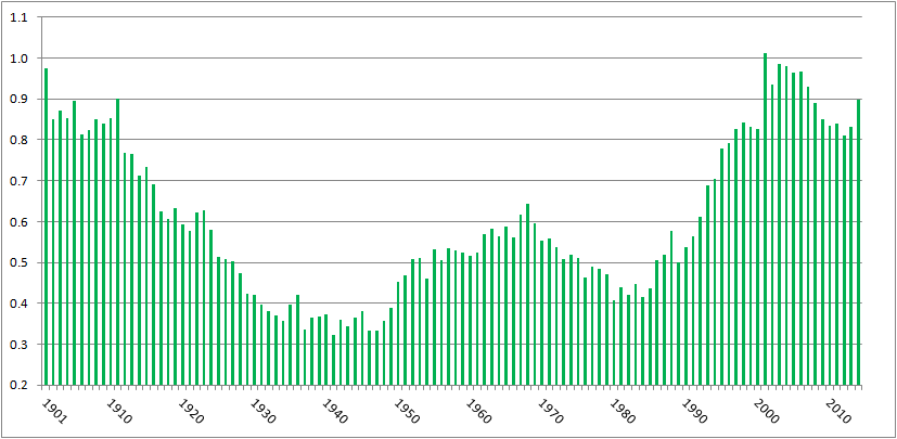
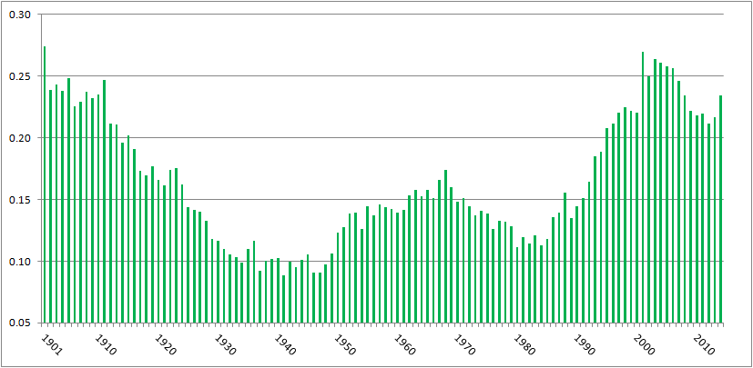
In the past, I’ve written about batters being hit by pitches–specifically, how the rate of hit batters is near all-time highs yet it hasn’t generated much, if any, outcry. Here’s a chart of hit batters per game, from 1901 (the start of the two-league era) to 2014:

HBP per game, 2001-2014

There were 0.68 hit batters per game in 2014, the eleventh-highest total over 115 years of two-league play. The top ten years, in order, have a 21st century slant: 2001, 2004, 2003, 2006, 1901, 2005, 2007, 2002, 2008, 1911.

Or, pretty much the same chart, here’s hit batters per 100 plate appearances:

HBP per 100 PA

There were 0.898 batters hit per 100 plate appearances in 2014, the tenth highest amount in the two-league era. The ten top years are, in order, 2001, 2003, 2004, 1901, 2006, 2005, 2002, 2007, 1911, and 2014.

Commenter jaysfan suggested that the modern emphasis on going deep into counts has changed the number of pitches thrown per game, so perhaps hit batters per pitch haven’t changed much. It turns out the pattern still holds. Here’s a graph of hit by pitch per 100 pitches, using actual pitch counts from FanGraphs for 2002 to present, and Tom Tango’s formula of Pitches = 3.3 x plate appearances + 1.5 x strikeouts + 2.2 x walks for the preceding years:

HBP per 100 pitches

With 0.234 hit batters per 100 pitches, 2014 ranks 16th all time, behind 1901-1905, 1908, 1910, 1911, and every year from 2001 to 2007. Again, a pronounced millennial bias. (Source for all the above graphs: Baseball Reference and FanGraphs)

It’s clear, then, that we’re seeing batters getting hit at the highest rate in a century. I tried to figure out why, and came up dry. Left-handed batters, who face a wider strike zone than righties, aren’t leaning across the plate and thereby getting hit at a proportionately higher rate. HBPs are not inversely correlated to power, with pitchers more willing to pitch inside now to hitters who less frequently pull inside pitches down the line and over the fence. College graduates are slightly more likely to get hit by pitches than other hitters, but not enough to explain the change. Batters setting up deeper in the batter’s box, as measured by catcher’s interference calls, isn’t correlated to HBPs.

However, commenter Peter Jensen noted, “I don’t think there is any question that pitchers throw more to the edges of the strike zone when they are ahead in the count. This could be confirmed with a pretty simple Pitch Fx study. And if they pitch to the edge more they are also going to miss inside more (and outside more) so this could partially or even wholly account for why there are more HBPs in pitcher counts.”

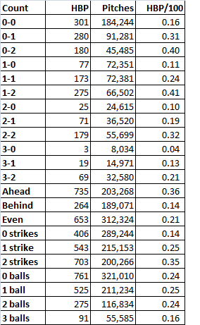
I did the PITCHf/x study Peter suggested. Using Baseball Savant data, I looked at hit by pitch by count, and as Peter found when he studied the data from 1997 and 2013, HBPs occur more when pitchers are ahead on the count. Here are the data from 2014:

2014 HBP

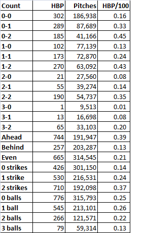
When the pitcher was ahead on the count, the batter was nearly three times as likely to get hit as when the batter was ahead. The most common counts for hit batters: 1-2, 0-2, and 2-2, and 0-1, all counts that encouraged pitchers to try to get batters to chase pitches on the border of the strike zone. Is this trend consistent? Baseball Savant’s data go back only to 2008, but using that season’s data, yes, the trend’s unchanged:

2008 HBP

Same thing. Batters are three times more likely to get hit when the pitcher’s ahead on the count, and the three most common HBP counts are two strikes with zero, one, or two balls, followed by 0-1.

So why the increase in hit batters? It appears that, as Peter implied, it’s because of the increase in strikeouts. Every three strike count requires a two strike count, obviously. In 2008, 22% of at bats went to 0-2 counts, 34% went to 1-2, and 29% went to 2-2. In 2014, those percentages had risen to 25%, 36%, and 30%, respectively, in line with the increase in strikeouts from 17.5% of plate appearances to 20.4%. The route to three strikes, which is being traveled more frequently, includes the four counts most likely to result in a hit batter. That’s why we’re seeing batters hit by pitches at rates not seen since before the first World War.

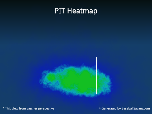
Here’s a graphical representation. In 2014, the Pirates led the majors in hit batters, handily, with 88. Here’s where Pirates pitchers threw on the hitters’ counts of 1-0. 2-0, 3-0, and 3-1:

Those greenish-yellow areas in the middle of the zone indicate that when the pitchers fell behind, they tended to locate their pitches in the strike zone. By contrast, check out the location for pitches thrown on 0-1, 0-2, 1-2, and 2-2 counts, when the pitcher could waste a pitch trying to get the batter to chase it:

That’s a much less concentrated blob, with a higher percentage of pitches outside the strike zone, where the batter can get hit.

As a final check, I ran a correlation between strikeouts per plate appearance and hit batters per plate appearance post-World War II. The correlation coefficient’s 0.82. That’s pretty high, suggesting a link between strikeouts and batters getting hit. Granted, correlation is not causation. But given that there’s an empirical link–to get to three strikes, you have to get to two, and batters with two strikes are at the highest risk of getting hit by a pitch–it’s enough to make me believe that while there are a lot of reasons more batters are getting hit by pitches, a major explanation is that hit batters are a consequence of rising strikeout rates.

CODA: If there were a day last season that I thought might’ve turned to tide on batters getting hit by pitch, it was Thursday, September 11. That day, there were 15 HBPs in 11 games. That doesn’t include the horrific fastball to the face that ended Giancarlo Stanton’s season; that pitch was a strike. A lot of stars got hit: Stanton, Mike Trout (twice), Yoenis CespedesCarlos Gomez, Jayson Werth. Tampa Bay’s Brad Boxberger hit Derek Jeter in the elbow. Had that pitch ended Jeter’s farewell tour, I really think it would’ve created an issue of rising HBP rates. Fortunately for Jeter and purveyors of Jeter memorabilia, it didn’t. But taking the 15 hit batters together, plus Stanton, and excluding two obvious retaliation jobs (Anthony DeSclafani hitting Gomez after Stanton got hit, Joe Smith hitting Tomas Telis after Trout got hit a second time), the fourteen hit batsmen occurred on six 0-1 counts (including Stanton and Jeter), three 1-2 counts, two 1-1 counts, and one count each of 0-0, 2-1, and 2-2. There was only one HBP with the batter ahead on the count, and ten occurred on the four counts identified here as the most dangerous for batters.


Maybe Cano Money Is Not Unreasonable for Heyward

Yesterday, Dave wrote an article about Jason Heyward’s next contract, and concluded with the idea that his next contract would almost definitely start with a two, and might even touch into the threes. When I suggested this to some of my friends they claimed that Heyward was not worth that price and completely disregarded the argument. This got me to thinking about what it would look like if we follow the projections.

After some great help from Neil and Jeff to get help with projections, I decided to try to tackle the question on my own. I started looking at Heyward’s WAR starting in 2016 (the first year of his next contract) and project that moving forward.

To start, I’m going to assume the value of a win next off-season will be roughly $6.3m ($6m this year with a 5 percent increase). Every year after that will go up by 5 percent through the end of the contract. Perhaps this isn’t the best way to go about this, but it is an idea that I have seen suggested several times.

After that, I went into the projections. Steamer projects Heyward to produce 4.4 wins next season, and (following the advice of Jeff and Neil), I assumed he would produce 4.4 wins every season from age-26 to 30 seasons, at which point I started taking a half-win off each following season until the tenth (and final) year of the proposed contract. In the end, Heyward projects to provide about 36.5 wins from 2016 to 2025.

Now that we have set up the parameters, we can get into the actual money of the deal. To find the value of each season I multiplied the WAR for an individual season by the dollars/WAR value for each season. Heyward’s value by season projects to go: $27.7m, $29.1m, $30.6m, $32.1m, $33.7m, $31.4m, $28.7m, $25.7m, $22.3m and $18.6m, for a total of $279.8 million over the ten seasons.

I know a lot of people are not quite as high on Heyward as I (and Steamer, apparently) am, so I also ran the numbers if Heyward produces 4 wins from 26-30, then a half-win less for each season after that. If that were to happen, Heyward would produce about 32.5 wins that would be valued at roughly $248 million.

Without assuming any breakout seasons, and even including the possibility that Heyward regresses a little before plateauing, he still projects to be worth over $225 million, and potentially in the neighborhood of $275 million without a breakout season in 2015. Heyward looks like he might be the guy that makes people realize that $200 million in today’s game isn’t what it used to be.


Will Maddon Matter?

Click here. Ok, now, click here. Uncanny, isn’t it? What are the odds that two Cubs’ figures of historic significance would both be white-haired men who wear black-rimmed glasses? This is further proof, as if any were needed, that forces beyond human ken are shaping the Cubs’ destiny.

Unfortunately, assessing the impact of a manager on a team has also remained largely beyond human ken. There may come a time when we can define a replacement-level manager (like, say, #Yosted), and come up with an accompanying performance metric (Wins Above Yost, or WAY). But that time has not yet arrived, so we must make do with the primitive tools at hand.  These do indeed suggest that Maddon gets it, though, as is often true in using statistics to assess a manager’s performance, it can be hard to separate the manager’s performance from that of the players.

Maddon managed the Tampa Bay (Sometimes Devil) Rays from 2006-2014, so he has a relatively long record to examine.  During that time the Rays accumulated 55,830 plate appearances, 15th out of 30 MLB teams. But Maddon did not allow those PAs to be distributed randomly:


Situation                         Rank

L vs. L                                12

R vs. R                               22

L  vs. R                                8

R  vs. L                                8

Joe knows platoons; the Rays frequently obtained the platoon advantage during his tenure. Carl Crawford partly explains the relatively high L-L rank — Maddon did not platoon Crawford even though his splits would have warranted such treatment after 2007.

Maddon also aggressively used pinch-hitters, a rarity in an era when managers pinch-hit for anyone other than a pitcher with the enthusiasm of a cat taking a bath. During the Maddon Years, the Rays led the AL in pinch-hitting PAs, and it wasn’t even close:

Rays                  1249

Evil Empire       946

A’s                        934

Blue Jays            908

Red Sox               833

The least pinch-hitty team in the NL during this period, the Astros, had 2100 pinch hit PAs, so Maddon wasn’t behaving exactly like an NL manager, but he pushed that envelope farther than any of his DH-league brethren. (It’s also interesting to note that 4 of the top 5 pinch-hitting AL teams hailed from the AL East, though what use one might make of this interesting information is far from clear.) And while activity is often confused with achievement, Joe’s tinkering produced results: the Rays were 8th in wRC+ for pinch-hitters during his tenure.

Baserunning is another area where the manager can exert tangible influence, and this is another area where the Rays score high. From 2006-2014 the Rays were second in the majors, behind only the Mets, in BsR, a metric that expresses stolen bases, caught stealing, and other baserunning plays as runs above or below average.

Team            BsR 2006-2014

Mets                      74.2

Rays                      73.9

Rangers                71.3

Twins                    56.4

Angels                   55.4

As you might guess, Crawford drove a lot of this success. The Rays are just 8th in BsR in the Post Perfect Storm Era (2011-2014), good but no longer elite. And what of that Ebola of hitting, the sacrifice bunt? By and large, Joe let ’em swing — the Rays were 26th in sac hits during his reign.

So as far as the hitters are concerned, Maddon is the model of the modern majors manager. His pitching deployment, however, has a bit more of a retro feel:

Pitchers             MLB innings rank 2006-2014

All Rays                                  15

Starters                                    7

Relievers                                25

“Aha!” you say. “That’s because Rays relievers have needed pine tar to succeed.” Perhaps — from 2006-2014 Rays starters and relievers have amassed nearly the same FIP- (102 for the starters, 101 for the relievers). But on second glance that reliever FIP- does suggest that the Rays should have been purchasing pine tar at Big Lots — it is 5th from the bottom in the majors during this period, while the Rays rank 15th in starter FIP-. In addition, although the FIP- figure doesn’t necessarily demonstrate this, the Rays have obviously had some excellent starters, such as James Shields and David Price, capable of working deep into games.

Maddon’s pitchers have not performed well in high leverage situations, which generally include late, close games:

Leverage           MLB FIP rank

High                          21

Medium                    14

Low                            10

The list looks upside down; most managers would want their best pitching effort when it matters most. It doesn’t appear, based on this admittedly limited data, that Maddon has been able to be as creative with pitchers as he has with hitters, but some of this may simply be a reflection of the Rays’ spotty bullpen quality. On the clearly positive side, Maddon was able to stem the march of Intentional Walk Zombies, with the Rays ranking just 23rd in IBBs during his time in Tampa.

No evaluation of Joe Maddon would be complete without a discussion of defense. He embraced aggressive shifts earlier and oftener than most, with apparently impressive results. Tampa Bay was first in UZR/150 during Maddon’s tenure, and third in Def. The Rays fare less well in Defensive Runs Saved, but still rank 9th during the period. (If you’re curious about how these stats work, I urge you to click on the links — my grasp of defensive metrics is pretty feeble, and the approach I usually take is to use several different ones to answer a defensive question and see if they produce similar results, which in this case they generally do.)

So based on admittedly less than decisive evidence, and bearing in mind that much of any manager’s achievement or lack thereof is down to the players’ talent rather than the manager’s aptitude, it appears that Maddon makes decisions reasonably designed to help his team win games,  His task with the Cubs will differ in many ways from his experience in Tampa Bay. One of the most significant differences is that he’s likely to have a better bullpen, and likely to need it more. Even if the Cubs add two Big Name Horses, the rotation will still have question marks, and this will be true even if Jake Arrieta’s deal with the devil has another year to run. For somewhere around 15-20 home games, Wrigley Field will play like Ebbets Field, a challenge that Maddon didn’t have to deal with in the Logan’s Run-like controlled atmosphere in The Trop, and one that will put his bullpen management skills to their sternest test. He appears to be someone at least as eager to learn as to teach, and the prospect of being known as The Curseslayer will surely be motivation for him to continue evolving.

Maddon’s arrival on the shores of Lake Michigan was not without controversy. There’s little doubt that Rick Renteria got jobbed (or rather, de-jobbed), even though the two players whose regression got Dale Sveum fired (Castro and Rizzo) had excellent bounceback seasons under him. The Cubs’ rank opportunism in dumping Skipperfriend 2.0 for SF 3.0 is matched only by the Rays’ pathetic shakedown dressed up as a tampering charge. A managerial tenure that might end like the EA Sports commercial has begun with several reminders that humans are indeed a predatory species. Not that there’s anything wrong with that.

In any case, flags fly forever, and few will have qualms about any of this moral relativism if indeed the Goat is consigned once and for all to Cthonian darkness. As far as Cubs fans are concerned, the message for now is: Glasses! Half full.


Extreme Makeover: B.J. Upton Edition

Back in 2007, B.J. Upton was thought to be a future megastar, a young tools-filled player, whose future seemed to almost certainly include MVP consideration and numerous other awards. As a 24-year-old he put up back-to-back 4+ WAR seasons. For the past two years however, he has posted a total -0.2 WAR. What has happened to B.J. Upton? He is only 30 years old, which for an athlete of his caliber, is still potentially only the tail end of his prime.

Defensively speaking, he has had ups and downs, but the swings in performance were never too drastic, posting a -7 DRS and -1.9 UZR/150 in 2014 compared to -3 and 8.4 back in 2008. His Defense rating has dropped from 9.8 to 0.1 from 2008 to 2014. Again, obviously not good, but not enough to account for such a big drop in WAR. So his troubles must mostly be tied to his offensive production.

I first tried to identify the problem with his hitting by dividing our options into two groups. The biomechanics processing results versus possible telling statistics on his approach. Let us look at the latter to start. A couple things I want to focus on would be his O-Swing% and how he performs in hitter-friendly counts. From 2008 to 2014, his O-Swing% has jumped up 11% from 16.8% to 27.8%, which is not a great indication that he has a plan when stepping into the box. Hitter’s counts are all about the approach, not only working yourself into this count, but being ready for your pitch because you can be selective at the plate.

Avg. / wRC+ Through 2-0 Through 3-1 Through 3-0
2008 .265 / 176 .262 / 212 .353 / 280
2014 .091 / 134 .097 / 150 .100 / 204

Now obviously the wRC+ numbers will be inflated due to the higher walk rates when in a hitter’s count, so I am focusing more on average. To help put this into perspective, in 2014, through 0-2 counts, Upton hit .085. That is scarily similar to his performance in hitter’s counts. Clearly something is off. When in a hitter’s count, the batter typically sits on a fastball, so naturally my next focus was to look at his wFB. His wFB in 2008 was 1.1 and in 2014 was -11.1. So while he used to be above average, he has now become much worse at handling fastballs, which would correlate to his lack of success hitting in hitter’s counts. In order to survive in this league as a hitter, you must be successful hitting against the fastball. His pitches seen rate has remained relatively consistent except for a slight increase in sliders seen. His lack of production in these areas really makes me question whether he is ready to hit when stepping into the box.

If you have ever seen a B.J. Upton swing you know there are a lot of moving parts. This in and of itself is part of the problem. Double loads, bat wraps, too much rotational and not enough linear movement, dipping, and changing eye levels are all apparent. But first let’s start with the numbers. A couple of things jump out when looking at the numbers. To begin with, his GB/FB rate in 2008 was 1.65 in comparison to a rate of 1.11 in 2014 while his 2014 HR/FB rate is lower than his career rate, it is higher than his 2008 All Star rate at 9% compared to 7.4%. His line drive rate is consistent throughout.

However Upton’s BABIP tells you most of the story. Upon entering the league full time in 2007, B.J.’s BABIP was .393 then .344 in 2007-08 compared to .286 in 2014. This is ridiculous and impossible to sustain! The question is, does this then make his two best years a fluke? Back in 2010 and 2011 he had near-league average BABIP years and posted close to a 4 WAR in both. So as ridiculous as those 2007-08 numbers were, I can’t blame his entire decline on not being as lucky.

Another one of the most worrisome numbers is to see his Z-Contact% drop 10%, almost as much as his overall Contact% which dropped 12%. This to me screams mechanics. So let’s take a look (and I apologize in advance for the youtube link, but it serves our purposes decently enough — I still haven’t figured out the .Gifs). Ironically enough, he hits a home run in this video. It just goes to show all the holes in his best of swings.

The first thing you see is at the peak of his negative move his hips slant upwards (2 second mark). The reason this happens, is because his leg kick doesn’t gain any ground. It immediately makes him more likely to have a bit more uppercut in his swing and it also changes his eye level due to the flexion in his knees changing while the distance between his feet do not change. Both factors make it more difficult to produce solid contact. Once at toe-touch, he then loads again and inverts his front leg, making it a double load (5-6 second mark). This leads to the potential to over-rotate (think Newton’s 3rd law — for every action there is an equal and opposite reaction). By inverting and coiling his body, he will uncoil, or over-rotate off the pitch, causing his shoulders and hips to pull off the pitch and not stay square.

Once he finishes inverting his front side he commits to swinging. His hands/upper half look okay up to this point (7 second mark), and they’re very active. However his upper half and lower half are completely out of sync. Once he initiates his swing, his bat immediately wraps because he still hasn’t come set with his barrel, the bat has been moving the entire time. At this point there is nothing going forward at all, no backside drive. It is all rotational, making it harder to stay on the ball if his timing isn’t near perfect. In other words, due to having a more rotational swing versus a linear swing, his margin of error with timing is much narrower.

Once at the contact position (11 second mark) he looks okay. He hits the ball off his front foot, his elbows are at slightly obtuse angles, and his front side is stiff. During his bat path his hands dip a bit, giving him a high finish, most likely due to the pitch being low.

B.J. Upton’s biggest problems in his swing come before his contact position. This is a very good explanation for why he struggles against fastballs and in hitter’s counts. Simply put, he isn’t ready to hit. He has way too much going on, the main problems being his double load and lack of linear movement. In an age of power bullpens and power fastballs it is no wonder that he is struggling as badly as he is. B.J. Upton needs to simplify and settle everything down in the box. His swing is fixable, but these issues need to be addressed and changes have to be made if he is ever to be successful again.


We Might’ve Met NYY’s Next Great Reliever

2014 wasn’t a good year to be a starting pitcher on the New York Yankees. With injuries to CC Sabathia, Masahiro Tanaka, Michael Pineda, Ivan Nova and David Phelps, jokes about Andy Pettitte coming back from retirement again started to find “but really though” tacked on at the end. Out of the rotation vacuum emerged Shane Greene, an unlikely success story from Daytona Beach Community College. If the Yankees manage to put together a healthy starting rotation for opening day, Greene will likely be shifted to the bullpen, where I believe he will flourish.

In 78.1 IP as a starter, he posted a 3.79 ERA, a 3.64 FIP, a WHIP of 1.37, and K/9 and BB/9 rates of 9.19 and 2.99 respectively. His WHIP would lead many to think he overachieved, but aside from that and his walk rate, he was an above average pitcher.

What stands out specifically about Greene is his 2-seam fastball. To make a long story short, Pitch f/x would suggest that it is very hard to hit:

Pitcher vSI vFT h-movSI v-movSI h-movFT v-movFT
League Average 90.7 91.5 -4.6 4.9 -1.9 6.4
Shane Greene 93.9 92.7 -7.7 5 -8.5 6.3

Note that while his scouting report does not specifically mention him as throwing a sinker, Pitch f/x occasionally registered his 2-seamer as one. While this is pretty common (Kelvin Herrera’s 90 mph changeup routinely registers as a 4-seamer), I believe that it is a telling sign when it comes to the life on Greene’s fastball.

Unsurprisingly, his fastball is harder to hit with increasing velocity. Hitters put up a mere .136 BA and SLG% in an admittedly small sample size against Greene’s 2-seamers above 94 mph. Those slower than 94 mph were hit to the tune of a .340 BA and a .447 SLG%. It is well known that pitchers experience an increase in velocity after a starting rotation to bullpen transition. Greene’s 2-seam fastball, which averaged at 92.8 mph, could easily creep up to the mid 90’s if he were put in the bullpen.

Of course, one reason why he might not ever succeed out of the bullpen is because he could remain a starter. He showed flashes of dominance in 2014, the most noteworthy being his shutout of the potent Tigers lineup. But even if the Yankees do pencil Greene into the 5th spot of their rotation, something will have to give when Ivan Nova comes back from Tommy John surgery.

Like Joba Chamberlain when he became a starter in 2009, those few extra miles per hour on his fastball could make a huge impact on Greene’s numbers. As a fan, I appreciate David Robertson both as an excellent pitcher and a superb role model. But if the Yankees do not want to pay him the closer money he will deservedly get on the free agent market, Greene might be a cost-effective late-inning option.

Note: Stats not taken from FanGraphs are from baseballsavant.com


Pitchers Recovering From Serious Arm Injuries

Pitchers Recovering From Arm Injuries

Introduction

With arm injuries becoming more and more prevalent in Major League Baseball, teams frequently have to figure out what kind of performance to expect from a pitcher coming back from a serious injury. In this study I set out to see how pitchers perform in their first two years after surgery compared to their pre-surgery form.

Overview

I looked at a sample of 39 starting pitchers, encompassing 42 seasons, over the past 10 years that missed a significant amount of time due to an elbow or shoulder injury. I then compared their performance in the last healthy season to their first healthy season back and the season immediately after it. To be considered a “healthy season” for this study a pitcher had to throw at least 80 innings. I did this to get a more accurate indication of the pitchers performance in their last season and first season back, and to not include small samples if a pitcher got hurt in April or came back in September. If a pitcher had no “healthy season” back then I used the season with the most MLB innings out of the two seasons after injury. I excluded all pitchers that never returned to the majors from the study.

To judge pitchers performance I looked at five things: ERA, FIP, strikeout percentage, unintentional walk percentage, and average FB velocity. I chose these measurements because I believe they show the pitchers overall effectiveness (ERA, FIP), stuff (K%), command (UBB%), and arm strength (FB velocity).

I also broke down the data by elbow and shoulder injuries. It is an accepted belief in baseball that shoulder injuries are worse than elbow injuries and harder to come back from. I wanted to see how much harder it was to come back from, and if the statistical decline for pitchers with shoulder injuries was greater than those with elbow injuries.

All Pitchers

ERA

FIP

K%

UBB%

Avg. FB Velocity

Total Last Healthy Season

3.78

4.08

18.75%

7.63%

91.08

Total First Season Back

4.23

4.17

18.58%

7.29%

90.19

Total Second Season Back

3.72

3.78

18.96%

6.80%

90.33

As you can see in the chart above, the ERA and FIP of pitchers in their first year back are higher. Strikeout rates also showed a substantial decline, while walk rates actually improved. The average fastball velocity for these pitchers also decreased as you would expect. The fact that strikeout rates went down by .17% might not seem like a lot, but when you take into account that strikeout rates have been going up steadily over the past ten years, it is actually a larger gap in performance.

MLB Average Strikeout Percentage

2005 2006 2007 2008 2009 2010 2011 2012 2013 2014
16.5% 16.8% 17.1% 17.5% 18.0% 18.5% 18.6% 19.8% 19.90% 20.40%

Naturally, the first full healthy season back is generally 2-3 years after the injury. If they were keeping up with the league average their strikeout percentage should actually go up about about a percentage point, so what looks like a small decrease is in fact quite significant. As for walk rates, there are two competing factors in play. Often times increased wildness is a sign of a larger problem; therefore an elevated walk rate in the season a pitcher blew out could have been an indication of a looming issue. Consequently, walk rates in the last season before surgery may be higher than a pitchers normal level, and by getting their arm fixed, it would gravitate back to their typical performance. The competing philosophy is that control is the last thing to return after elbow or shoulder surgery. Looking pitcher by pitcher it was a 50/50 split with 20 having their walk percentage increase, 20 decrease, and 2 remaining essentially the same in their first year back.

Pitchers in their second year back improved greatly, showing improvements across the board. The sample in year two went down to 26 of the 42 pitcher seasons we started out with. Some dropped out due to age (John Smoltz), re-injury (Johan Santana), or 2014 being their first year back (Michael Pineda). One reason why the numbers in the second post-surgery year improve so much is that to make it to year two you probably had some modicum of success in year one. The pitchers that failed to come back to their pre-surgery form (Mark Mulder, Jason Schmidt, etc.) had their poor stats affect the first year after surgery numbers but are washed out of the second year numbers. Even taking this into account, there are definitely some substantial improvements in year two. Eighteen of the 28 pitchers lowered their ERA in their second season after surgery.

Elbow Injuries

Elbow injuries are generally considered less serious than shoulder injuries. The success rate of coming back from Tommy John surgery is pretty high now, with some people even going as far as to say that pitchers come back stronger after getting it done. The numbers do in some way back that notion as pitchers in their second year post-surgery posted better numbers then they did before getting hurt.

ERA

FIP

K%

UBB%

Avg. FB Velocity

Last Healthy Season Elbow

3.75

3.99 19.42%

7.98%

91.49

First Season Back Elbow

4.06

4.03

19.22%

7.49%

91.04

Second Season Back Elbow

3.60

3.61

19.77%

6.79%

91.38

As you can see in the table above, pitchers do struggle a bit in their first season back, but in year two not only do they improve based on the previous year, they also improved their pre-surgery statistics in all aspects except a small decrease in average FB velocity. Looking specifically at the 18 pitchers that had two seasons after elbow surgery, 11 of the 18 improved their ERA the second season after surgery. Although the data was split regarding average velocity and K%, with about half the pitchers having better numbers the first year after surgery and half the second season, many showed a substantial improvement in their walk rate in season two. This is interesting since it does support the belief that control is the last thing to come back post-surgery.

Shoulder Injuries

Shoulder injuries are believed to be much more damaging to a pitcher’s future than elbow injuries. Part of the reason for this is that Tommy John is so prevalent now, and you see so many people come back from it, it is considered in some ways a routine surgery. Shoulder injuries on the other hand are less frequent and in recent memory we have seen it more or less end the careers of big time pitchers like Mark Prior and Brandon Webb. The numbers in this small study do show that pitchers with shoulder injuries are less likely to get back to a full season of pitching than those with elbow injuries. Eighteen of the 21 (86%) pitchers I looked at with elbow injuries returned to a full season work load (with Brett Anderson still a possibility to get there), while only 11 of 19 (58%) of those with shoulder injuries (Michael Pineda could still do it moving forward) rebounded to even make it over the 80 inning bar one more time in their career.

A couple of pitchers (Johan Santana and Chris Young) who did make it back had another significant shoulder injury during their comeback seasons, although Young made another return to the majors in 2014 after another missed season rehabbing. These numbers also don’t include pitchers like Prior, Webb, Matt Clement, etc. who were established big leaguers at the time of their shoulder injury never to return to Major League Baseball again.

ERA

FIP

K%

UBB%

Avg. FB Velocity

Last Healthy Season Shoulder

3.79

4.13

18.18%

7.30%

90.36

First Season Back Shoulder

4.49

4.35

17.79%

6.95%

89.08

Second Season Back Shoulder

3.94

4.09

17.48%

6.81%

88.93

The numbers do back up the assertion that shoulder injuries are tougher to recover from than elbow injuries. Pitchers who had shoulder injuries had a steeper drop off their first year after surgery, and failed to rebound to the degree that pitchers with elbow injuries did. If you are a team with a young ace who had shoulder surgery, the beacon of hope is Anibal Sanchez. Sanchez went down with a labrum injury during his rookie season in 2006, and although it took him a few years to recover, over the past five seasons he has been pretty durable consistently supporting a mid 3 ERA, including the 2013 season where won the American League ERA title.

Conclusion

Overall this research backed up most of the common thoughts around the game. Pitchers with elbow injuries generally recovered quicker and more effectively than those with shoulder injuries. The biggest improvement from year one to year two after surgery appears to be with walk rates, as a pitcher’s control is often the last thing to come back after being off the mound for so long.

Although Tommy John surgery does have a high success rate, there are pitchers that never really regained their pre-surgery form. Conversely, shoulder surgeries do have a greater negative impact on pitcher performance, but for every Mark Prior and Brandon Webb there is an Anibal Sanchez or Chris Carpenter that returned and went on to have very productive careers. Obviously there are no certainties in medicine, so franchises shouldn’t expect a guaranteed return for pitchers coming off elbow surgery, or automatically disregard pitchers who underwent shoulder surgery.

In fact, there might even be an opportunity for clubs to take a chance on a free agent pitcher a couple of season removed from shoulder surgery with a low-risk high upside deal. The demand for these pitchers is usually low with all of the uncertainly involved with shoulder injuries. If the deal doesn’t work out there isn’t much invested, but if it does, a team might be able to get a guy like Freddy Garcia who won 12 games in 2010 and 2011 while only making $1 million and $1.5 million those two years since he was coming off of labrum surgery. Pitchers coming off shoulder injuries probably aren’t guys you want to pencil in and count on for 200 innings, but for the money involved they could be low cost lottery tickets that could pay off big for a team.


StatCast Playoff Data Breakdown

Now that the baseball season is over I thought I would throw together a little data breakdown of the 2014 playoffs according to the public StatCast records available. I created a rough relational database that will allow me to run a few simple queries to give us an idea of what information the new system will be able to spit out on a daily basis (fingers crossed, next season). I built the database with the anticipation of adding to the records next year as more data is released. I hope, eventually, there will be complete statistics available for each play because in the current format  there are many null values which drives me nuts, but it is what it is.

Seven tables make up the database that is designed to catch each play in it’s entirety. The four main tables are BATTING, FIELDING, PITCHING, and RUNNING. This is where all of the new fancy data is stored. Now as to not get further into the weeds lets take a look at what we got.

BATTING

First, lets look at  the batting statistics for each play in the playoffs monitored by StatCast (and revealed to the public) sorted by batted ball type. Please note each row is an individual play that was tracked and recorded during a given playoff game.

Playoff Batting FB

Playoff Batting FB

Playoff Batting FB

Playoff Batting FB

I purposely left the null values in the tables to demonstrate the inefficiencies that exist due to the lack of data for each play.

FIELDING

This is were the data starts to get a little more thorough. Once again the tables are sorted by batted ball type and each row represents a particular fielders input on a given play.

Playoff Batting FB

Playoff Batting FB

Playoff Batting FB

Playoff Batting FB

Rather than bore you to death with more tables I will just summarize the other two entities, PITCHING and RUNNING. To date, the RUNNING (base running) entity contains more records than any other aspect of the game. MLBAM has been extremely fond of recording players peak running speeds, which I find to be the least informative of the current metrics recorded. What intrigues me about the RUNNING aspect of StatCast are statistics such as a player’s average lead length on a steal and how that might correlate with SB% or which player has the quickest “first step” when stealing a base. I’m sure all of you have thought of countless other ways to utilize StatCast for base running so I wont go into a brainstorming session. Here are just a few quick facts about the base runners of the 2014 playoffs:

The average lead length by all runners was 10.89 feet.

The average secondary lead was 16 feet.

The player who reached the highest max speed rounding the bases was Jarrod Dyson at 22.3 mph.

Jarrod Dyson also had the fastest first to third speed at 21.1 mph.

The quickest first step came on a sac fly tag up by Hunter Pence. It registered at -.17 sec. I wonder if this means he left early?

For all of the talk about KC’s running game, the Giants actually had an average team lead length higher than KC during the playoffs and there was a decent number of records for each to substantiate it. (50 records for KC, 49 records for SFN)

SFN Average lead length in playoffs 11.1 feet

SFN Average secondary lead length in playoffs 16.4 feet.

KC Average lead length in playoffs 10.9 feet.

SFN Average secondary lead length in playoffs 15.8 feet.

The PITCHING entity is by far the most complete, but contains little data. As of today, MLBAM has used StatCast to track four pitching measurements, Extension, Actual Velocity, Perceived Velocity, and Spin Rate. To be honest I have never thought about two of these metrics and how they could affect a pitchers performance; those two being extension and spin rate. Extension might simply need to be recorded for each pitcher so that we could analyze trends. Say a pitcher’s average extension starts to decrease. What steps need to be taken to correct it? Could this be a sign of an injury? and so on. Fun fact, Yusmeiro Petit has had the longest extension recorded by StatCast at 92 inches. There is only one pitcher who has multiple records. Yordano Ventura has an extension of 60 inches and 68 inches. I wonder what the average extension range is for pitchers?  It would be interesting to find what affect the spin rate of the pitch had on batters. With more data, I might first start to analyze the correlation between spin rate and batted ball type. Currently, there is not enough public data available to be able to do this accurately.

I hope this was not too boring and at the least will spark your enumerative imaginations for this off-season.