Archive for December, 2013

Billy Hamilton: 2014 Leadoff Hitter?

The signing of Shin-Soo Choo gives the Rangers a player with strong on-base skills, solid power, and decent corner-outfield defense. The signing also left a gaping hole in the outfield for the Reds. Choo was one of three Reds starters that got on base at an above-average clip. He was easily the first- or second-best offensive player for the Reds in 2013. While he was miscast in center field, Choo brought a great deal of value to a team that needed his particular offensive skill set.

Walt Jocketty has stated that Billy Hamilton is the new center fielder and will likely bat leadoff for the 2014 Reds. Hamilton starting in center field should come as no surprise as the Reds do not have many other options. The wisdom of Hamilton batting leadoff is at least up for debate. You can easily go look at his projections for 2014 and draw your own conclusions, but I would like to at least provide some context.

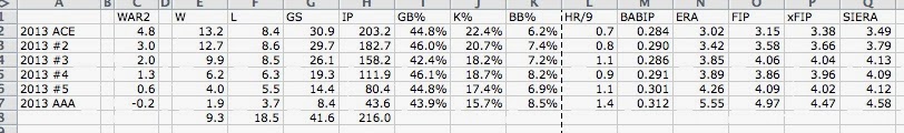
Every baseball fan knows about Hamilton’s speed. He is ferociously fast. He stole 155 bases in the minors in 2012 and successfully stole 13 bases in 14 attempts in limited major league action in 2013. Speed is nice , but it is certainly not close to the most important skill for a player in the leadoff spot. Reds fans may know this best of all from watching Corey Patterson, Willy Taveras, and Drew Stubbs flounder at the plate. Those players were wickedly fast, but as the saying goes, you can’t steal first base. None of them had the on-base skills to bat leadoff, but they found themselves there anyway because of their speed. To avoid this list of failed Reds leadoff hitters, Billy Hamilton will need to get on base enough to justify being at the top of the order. That is the obvious question: can Hamilton get on base to use that blinding speed of his to turn singles into doubles and doubles into triples? There are signs that he can but others that he shouldn’t in 2014.

The 2012 season launched Hamilton into top-20 prospect territory. He obviously broke the stolen-base record, but he also showed some ability with the bat. In a 132 games between high A and AA, Hamilton hit .311/.410/.420. He had 14 triples. His walk rate rose dramatically from the year before. Hamilton looked like a perfect leadoff hitter through two levels.

Then 2013 and AAA came. Hamilton slashed .256/.308/.343. His walk percentage dropped from 16.9% in 50 games in AA (small sample size noted) to 6.9% in 123 games in AAA. it was arguably his worst season as a professional. He looked completely overmatched at times and questions about his ability to get on base resurfaced.

So which is the real Billy Hamilton, and what does it mean for 2014? Hamilton’s ceiling is likely between his 2012 and 2013 minor league performance. In five seasons as a minor leaguer, Hamilton slashed .280/.350/.378. Coupled with his speed and potential excellent defense in center field, that slash line could make him an All-Star-caliber player. The hope is that 2013 was a product of learning a new position and a significant drop in BABIP from over .370 to .310.

Still, Hamilton was very inconsistent at the plate in 2013 and didn’t prove he could hit AAA pitching for an extended period of time. The major leagues are an obvious step up in competition, and it would be surprising to see him match his .280/.350/.378 minor league career slash line in 2014. Steamer projects him to have a .305 OBP, and after last year, it is easy to see why.

While it is very possible Hamilton could surpass gloomy projections, the Reds probably shouldn’t risk it in 2014, at least at first. It makes much more sense to see how Hamilton adjusts to major-league pitching in a less important part of the lineup (7th for instance). He would get fewer at bats and would not be so heavily scrutinized if he struggled adjusting to the level. If he performs well, he can always move up in the lineup, but the Reds likely have better leadoff options than Hamilton to begin the year.

If Hamilton plays excellent defense in center field and has a good year on the bases, he will provide solid value for the Reds. To fill Choo’s shoes, he will have to hit closer to his career minor league mark as opposed to his 2013 numbers. In 2014, that may be difficult.


The Cascading Bias of ERA

There are so many problems with ERA that it’s unbelievable. I’m not going to sit here and tell you what’s wrong with ERA, though, because you’re probably smart. But there’s a problem with ERA, and it’s a problem that transcends ERA. It’s a problem that trickles down through FIP, xFIP, SIERA, TIPS, etc. etc. name your favorite stat, etc., and it’s something I don’t see talked about much.

All of our advanced pitcher metrics are trying to predict or estimate ERA. They’re trying to figure out what a pitcher’s ERA should be, and herein lies the problem: Because they could be exactly right, but they’d still be a little incorrect due to one little assumption.

This assumption–that pitchers have no control over whether or not the fielders behind them make errors–seems easy to make. Like most assumptions, however, this one is subtly incorrect. Thankfully, the reason is pretty simple. Ground balls are pretty hard to field without making an error, and fly balls aren’t. And the difficulty gap is pretty huge.

How big? Well in 2013 there were precisely 58,388 ground balls, 1,344 of which resulted in errors. On the other hand a mere 98 out of 39,328 fly balls resulted in errors. That means that 2.3% of ground balls result in errors while a tiny 0.25% of fly balls do. It’s time to stop pretending that this gap doesn’t exist, because it does.

So now that we know this, what does it mean? Well it means this: ground-ball pitchers will have an ERA that suggests they are better than their actual value, while fly-ball pitchers have the opposite effect. Pitchers who allow contact, additionally, are worse off because every time they allow contact they put pressure on their defense. They’re giving themselves a chance to stockpile unearned runs which nobody will count against them if they’re only looking at ERA derivatives. When it comes to winning baseball games, however, earned runs don’t matter. Runs matter.

I am going to call this the “pressure on the defense” effect, which will cause some pitchers to be more prone to unearned runs than other pitchers. How big is this effect? Well, not huge. The gap between the best pitcher and worst pitcher in the league is roughly three runs over the course of the season. But keep in mind that three runs is about a third of a win, and a third of win is worth about $2 million dollars. We’re not discussing mere minutiae here.

In order to better quantify this effect I have developed the xUR/180 metric, which will estimate how many unearned runs should have taken place behind each pitcher with an average defense. Below is a table of all qualified starting pitchers from 2013 ranked according this metric. I have also included how many unearned runs they actually allowed in 2013, scaled to 180 innings for comparative purposes.

# Name xUR/180 UR/180
1 Joe Saunders 7.24 9.84
2 Jeff Locke 7.11 4.33
3 Wily Peralta 6.97 17.7
4 Edwin Jackson 6.88 13.36
5 Edinson Volquez 6.81 6.35
6 Kyle Kendrick 6.77 8.9
7 Justin Masterson 6.66 0.93
8 Doug Fister 6.58 5.19
9 Wade Miley 6.57 7.12
10 Rick Porcello 6.51 2.03
11 Jerome Williams 6.47 7.45
12 Jorge de la Rosa 6.43 5.38
13 Yovani Gallardo 6.42 7.99
14 A.J. Burnett 6.35 8.48
15 Scott Feldman 6.32 8.94
16 Mike Leake 6.26 5.62
17 Andrew Cashner 6.25 8.23
18 Felix Doubront 6.22 6.66
19 Jhoulys Chacin 6.13 5.48
20 Kevin Correia 6.13 2.92
21 Jeremy Guthrie 6.13 3.41
22 Mark Buehrle 6.11 5.31
23 Andy Pettitte 6.05 7.78
24 Hyun-Jin Ryu 6.01 2.81
25 Jeff Samardzija 6.0 5.07
26 C.J. Wilson 5.93 11.03
27 CC Sabathia 5.9 8.53
28 Jon Lester 5.84 4.22
29 Ryan Dempster 5.8 10.52
30 Tim Lincecum 5.77 5.48
31 Hiroki Kuroda 5.72 4.48
32 Bud Norris 5.72 7.15
33 Jordan Zimmermann 5.69 3.38
34 Patrick Corbin 5.68 1.73
35 Dillon Gee 5.67 3.62
36 Ervin Santana 5.67 7.68
37 Kris Medlen 5.66 8.22
38 Bronson Arroyo 5.63 2.67
39 Stephen Strasburg 5.62 9.84
40 Mat Latos 5.62 6.85
41 Ubaldo Jimenez 5.61 7.9
# Name xUR/180 UR/180
42 Jarrod Parker 5.61 4.57
43 John Lackey 5.6 5.71
44 Gio Gonzalez 5.55 5.53
45 Lance Lynn 5.55 2.68
46 Eric Stults 5.5 7.09
47 Felix Hernandez 5.49 4.41
48 Zack Greinke 5.48 2.03
49 Hisashi Iwakuma 5.47 3.28
50 Jose Quintana 5.46 4.5
51 Ian Kennedy 5.46 8.95
52 Ricky Nolasco 5.45 7.23
53 R.A. Dickey 5.44 6.42
54 Jeremy Hellickson 5.4 3.1
55 Homer Bailey 5.38 3.44
56 Miguel Gonzalez 5.36 9.47
57 Madison Bumgarner 5.34 5.37
58 James Shields 5.32 1.58
59 Adam Wainwright 5.32 2.99
60 Bartolo Colon 5.32 3.79
61 Derek Holland 5.3 7.61
62 Kyle Lohse 5.26 3.63
63 Cole Hamels 5.18 4.91
64 Anibal Sanchez 5.18 3.96
65 David Price 5.18 8.7
66 Chris Sale 5.14 6.73
67 Justin Verlander 5.06 8.25
68 Chris Tillman 5.04 1.75
69 Jose Fernandez 5.03 5.23
70 Shelby Miller 4.98 6.24
71 Matt Cain 4.97 2.93
72 Clayton Kershaw 4.9 5.34
73 Julio Teheran 4.9 2.92
74 Matt Harvey 4.86 1.01
75 Cliff Lee 4.79 4.86
76 Travis Wood 4.78 3.6
77 Dan Haren 4.78 4.26
78 Yu Darvish 4.53 1.72
79 A.J. Griffin 4.46 5.4
80 Mike Minor 4.46 5.29
81 Max Scherzer 4.15 3.36


Some notes:

  • Groundballs are still good, they’re just not as good.
  • A combination of groundballs and contact lead to more unearned runs. The pitchers at the top of the board demonstrate this.
  • A combination of strikeouts and fly balls will tend to limit the impact of unearned runs, as demonstrated by the bottom of the board.
  • Errors that occur on fly balls tend to be more costly than errors on ground balls. This metric accounts for that gap, but the low likelihood of fly-ball errors make this bullet point’s effect relatively negligible.
  • Line drives are similar to fly ball in terms of error rate, but they tend to be less costly than fly ball errors.

I’m sure there is more to be gleaned, but the point is this: we need to stop trying to predict ERA, because ERA is not a pure value stat. We should be trying to figure out how many runs a pitcher should/should have given up, because that’s what matters. Runs matter, and who cares if they’re unearned? They’re kind of the pitcher’s fault, anyways.


What Is an Ace? (2013)

After the 2011 season I asked, and attempted to answer, the question, “what is an ace”?

It’s time to do that again.

Kershaw

Ok. While Kershaw is the aciest of aces right now, that’s not really the answer that we’re looking for.

I certainly don’t claim to be the first person to do something like this, nor am I the most rigorous, but I think it’s good to take a look at things like this every now and then just to reset our baselines.

What I did was to take the average of every starter’s fWAR and RA-9 WAR. Then I used that number to group pitchers into groups of (roughly) 30 — 30 aces, 30 number 2’s, etc. Then, I looked at the average performance of the pitchers in each group.

Here’s what I found:

There’s a couple of interesting things to note.

One is that the best 30 pitchers in baseball are, far and away, the best group. They strike out the most hitters, they walk the fewest hitters, they give up the fewest home runs, they have the lowest BABIP, they’re the best. That’s not surprising when guys like the above-pictured Kershaw, Cliff Lee, Max Scherzer, Justin Verlander, Matt Harvey and Yu Darvish are in the ranks.

The second interesting thing is how similar the #3, #4 and #5 groups are in terms of performance. Look:

#3 18.2% K, 7.2% BB, 3.85 ERA, 4.06 FIP, 4.04 xFIP, 4.13 SIERA
#4 18.7% K, 8.2% BB, 3.89 ERA, 3.86 FIP, 3.96 xFIP, 4.09 SIERA
#5 17.4% K, 6.9% BB, 4.26 ERA, 4.09 FIP, 4.02 xFIP, 4.12 SIERA

In many ways, every way other than walks really, #4 starters outperformed #3 starters. Well, in every way except for number of starts and innings. Number-three starters made about seven more starts and pitched almost 50 more innings than #4 starters. Similarly, #5 starters were a little worse than both #3 and #4 starters but what really limited them from producing value was that they made 12 fewer starts and pitched half as many innings as #3 starters.

The third point is similar to the above. Starters not in the top five accounted for more starts and more innings than the best pitchers in baseball. That makes sense when you stop to think about it, there are more bad pitchers than elite ones, but we don’t think about just how important it is for the other starters to make their starts so these guys don’t have to.

As I mentioned when I first did this little exercise after the 2010 season:

Next time your team signs a pitcher with a 10 – 8 record and 3.99 ERA in 160 innings realize just what you are getting. One of the top 100 pitchers in the league.

The numbers are a little different now — now the average #3 is 10 – 9 with a 3.85 ERA in 158 innings — but the point remains the same: the average baseball fan vastly underrates pitcher performance.


Another Highly Unimportant Stat: Pitcher Craftiness

In this post on measuring a player’s scrappiness, commenter Eric Garcia said “Next up, measuring a pitchers’ craftiness.” I liked this idea and thought I would give it a shot. Of course, the first problem is deciding what makes a pitcher “crafty”. Eric Garcia gave his suggestions and we will look at them eventually. I, however, thought about pitchers that came to my mind when the word “crafty” is used and looked at what they had in common. Generally, they do not have an overpowering fastball and don’t throw it that often. They usually don’t have that many strikeouts, but also don’t walk that many, so they still have a decent WHIP. The perception is that they are good at pitching out of jams, either by inducing ground-ball double plays or popups.

There were 81 pitchers that qualified for the ERA title in 2013. I found the average of this group in four categories: fastball velocity, strikeout percentage, WHIP, and LOB%. For each player I calculated how many standard deviations from the mean they were in each of these categories. I then summed these up (using the negatives for fastball velocity, strikeout percentage, and WHIP). Though “crafty” often seems to be used as a synonym for “left-handed”, I feel that you should be able to be crafty with either hand, so I did not use handedness at all. I considered using fastball percentage instead of velocity, but felt velocity better captured what we are looking for. Pitchers I think of as crafty seem to often outperform their FIP, so I considered using ERA-FIP, but felt that since the outperformance is often the result of a low strikeout rate and generally good WHIP, that it was already taken into account. The numbers are not league adjusted, so National League pitchers get a slight advantage.  So, using these criteria, here are the 2013 leaders in craftiness:

Name Craftiness Score
Bronson Arroyo 4.70
R.A. Dickey 4.44
Hisashi Iwakuma 4.03
Bartolo Colon 3.80
Kyle Lohse 3.65
Mark Buehrle 3.38
Travis Wood 3.20
Mike Leake 2.55
A.J. Griffin 2.50
Dillon Gee 2.38
Zack Greinke 2.25
Eric Stults 2.03
Kris Medlen 1.94
Clayton Kershaw 1.89
Hyun-Jin Ryu 1.86
Jeremy Guthrie 1.68
Julio Teheran 1.60
Kevin Correia 1.43
Hiroki Kuroda 1.39
Chris Tillman 1.30
Cliff Lee 1.26
Ervin Santana 1.26
Mike Minor 1.24
Jhoulys Chacin 1.22
Andy Pettitte 1.11
Doug Fister 1.04
John Lackey 0.94
Jose Quintana 0.83
Jarrod Parker 0.79
James Shields 0.77
Miguel Gonzalez 0.73
Adam Wainwright 0.72
Madison Bumgarner 0.68
Wade Miley 0.69
Scott Feldman 0.64
Jorge de la Rosa 0.55
Jeff Locke 0.47
Patrick Corbin 0.44
Jordan Zimmermann 0.35
Ricky Nolasco 0.01
Dan Haren -0.03
Matt Cain -0.13
Shelby Miller -0.23
Yu Darvish -0.32
Jose Fernandez -0.35
Chris Sale -0.39
Cole Hamels -0.47
Mat Latos -0.50
Andrew Cashner -0.57
Justin Masterson -0.55
Kyle Kendrick -0.64
Felix Hernandez -0.77
Anibal Sanchez -0.86
Matt Harvey -0.94
C.J. Wilson -0.89
Jon Lester -0.93
Jerome Williams -1.00
Max Scherzer -1.05
David Price -1.05
Rick Porcello -1.04
Ryan Dempster -1.09
Yovani Gallardo -1.10
Gio Gonzalez -1.16
Homer Bailey -1.32
Joe Saunders -1.28
Derek Holland -1.38
Ubaldo Jimenez -1.42
Jeremy Hellickson -1.83
Felix Doubront -1.85
Tim Lincecum -1.88
Ian Kennedy -1.94
Justin Verlander -2.12
Stephen Strasburg -2.17
Bud Norris -2.19
CC Sabathia -2.20
Lance Lynn -2.26
A.J. Burnett -2.35
Jeff Samardzija -3.60
Wily Peralta -3.64
Edwin Jackson -4.26
Edinson Volquez -4.84

Considering the model used here, Bronson Arroyo being on top is not really a surprise (though I really thought Dickey would probably wind up on top and he would have easily if I had used fastball percentage instead of fastball velocity).  Now some people might protest that a low strikeout rate should not be required.  They would argue that it is certainly possible that a pitcher might still be considered crafty and have a fair number of strikeouts.  If we remove the strikeout percentage from the stat, we get the following:

Name Craftiness Score
Hisashi Iwakuma 4.34
R.A. Dickey 3.99
Bronson Arroyo 3.40
Clayton Kershaw 3.28
Yu Darvish 2.88
A.J. Griffin 2.63
Bartolo Colon 2.56
Travis Wood 2.51
Cliff Lee 2.53
Kyle Lohse 2.47
Zack Greinke 2.37
Mark Buehrle 2.22
Julio Teheran 2.06
Madison Bumgarner 1.83
Hyun-Jin Ryu 1.73
Mike Minor 1.71
Kris Medlen 1.67
Dillon Gee 1.53
Chris Tillman 1.56
Jose Fernandez 1.52
Adam Wainwright 1.39
Mike Leake 1.29
Chris Sale 1.10
Max Scherzer 1.09
John Lackey 1.06
Matt Harvey 0.98
James Shields 0.91
Hiroki Kuroda 0.88
Ervin Santana 0.89
Anibal Sanchez 0.87
Eric Stults 0.74
Felix Hernandez 0.75
Jose Quintana 0.70
Patrick Corbin 0.57
Shelby Miller 0.59
Doug Fister 0.46
Justin Masterson 0.46
Dan Haren 0.14
Andy Pettitte 0.09
Cole Hamels 0.03
Jhoulys Chacin -0.02
Matt Cain -0.01
Wade Miley -0.03
Jordan Zimmermann -0.04
Scott Feldman -0.11
Miguel Gonzalez -0.11
Ricky Nolasco -0.13
Jarrod Parker -0.18
Jeff Locke -0.21
Ubaldo Jimenez -0.25
Mat Latos -0.26
Jeremy Guthrie -0.30
Gio Gonzalez -0.37
Kevin Correia -0.45
Homer Bailey -0.51
Jorge de la Rosa -0.60
Stephen Strasburg -0.67
C.J. Wilson -0.83
A.J. Burnett -0.90
Ryan Dempster -1.01
David Price -1.01
Jon Lester -1.09
Andrew Cashner -1.08
Derek Holland -1.16
Tim Lincecum -1.24
Rick Porcello -1.30
Justin Verlander -1.31
Yovani Gallardo -1.55
Lance Lynn -1.57
Ian Kennedy -1.93
Felix Doubront -2.04
Kyle Kendrick -2.32
Jeremy Hellickson -2.37
Jerome Williams -2.41
CC Sabathia -2.49
Bud Norris -2.53
Jeff Samardzija -2.82
Joe Saunders -3.14
Wily Peralta -4.70
Edwin Jackson -5.03
Edinson Volquez -5.40


When the poster Eric Garcia suggested this, his idea of a crafty pitcher was someone with a low velocity, high ERA, and a decent number of wins.   If we use those criteria and the same methodology, we come up with the following list:

Name Craftiness Score
R.A. Dickey 6.809175606
Mark Buehrle 4.7547704381
Bronson Arroyo 3.2944617169
Joe Saunders 2.9423646195
Jeremy Hellickson 2.6685500615
CC Sabathia 2.4966613422
Eric Stults 2.7180128884
A.J. Griffin 2.4076452673
Doug Fister 2.2427676408
Dan Haren 2.1691672291
Adam Wainwright 1.7071128009
Kyle Kendrick 1.7118241134
C.J. Wilson 1.5737716721
Jeremy Guthrie 1.4387583548
Chris Tillman 1.4439760517
Rick Porcello 1.459202682
Edinson Volquez 1.2576799698
Bartolo Colon 1.6239711996
Jorge de la Rosa 1.4181128961
Max Scherzer 1.1306105901
Kris Medlen 1.4880878755
Jhoulys Chacin 1.4133629431
Yovani Gallardo 1.1947402807
Lance Lynn 1.0099538962
Felix Doubront 1.1495573185
Scott Feldman 1.1974157822
Ricky Nolasco 1.1042531489
Dillon Gee 1.1994224084
Ryan Dempster 1.1677938881
Tim Lincecum 1.035870434
Andy Pettitte 1.1821092279
Mike Leake 1.05406572
Jordan Zimmermann 0.5825671124
Jon Lester 0.5408497347
Ian Kennedy 0.6776977315
Jarrod Parker 0.4623781624
Justin Masterson 0.3885353357
Hyun-Jin Ryu 0.4892567298
Mike Minor 0.3742320945
Hisashi Iwakuma 0.4643968873
Kevin Correia 0.2593286667
Patrick Corbin 0.0564390189
Kyle Lohse 0.312739265
Julio Teheran 0.0997486611
Cliff Lee 0.0886564906
Miguel Gonzalez -0.0925431019
Jerome Williams -0.256429514
Edwin Jackson -0.4285314635
Ubaldo Jimenez -0.2221254921
Bud Norris -0.5000332264
Jeff Locke -0.2451919386
Mat Latos -0.5647784102
Zack Greinke -0.4470782733
Wade Miley -0.5363196771
Travis Wood -0.3273302268
James Shields -0.705666201
Justin Verlander -0.8883247518
Shelby Miller -0.9631708917
Matt Cain -0.7250659316
Wily Peralta -1.1640247285
Hiroki Kuroda -0.7950288123
Madison Bumgarner -0.7855967316
John Lackey -0.9654585733
Felix Hernandez -1.0396358378
Jose Quintana -1.1617514899
Gio Gonzalez -1.3356468354
Yu Darvish -1.5340675857
Anibal Sanchez -1.598691562
Cole Hamels -1.4973933151
A.J. Burnett -1.7115883636
Clayton Kershaw -1.6983975443
Homer Bailey -1.9877439854
Jeff Samardzija -2.0853342328
Chris Sale -2.0119349525
Derek Holland -2.1558326826
Ervin Santana -2.0875298917
David Price -2.224336605
Andrew Cashner -3.1088119908
Jose Fernandez -3.8720417313
Stephen Strasburg -4.3734432885
Matt Harvey -5.3067683524

I doubt these numbers have any real value and are just presented here for entertainment.  What do you think makes a pitcher crafty?  Let me know in the comments.


xHitting (Part 2): Improved Model, Now with 2013 Leaders/Laggards

Happy holidays, all.  It took me a while, but I finally have the second installment of xHitting ready.  First off, thank you to all those who read/commented on the first piece.  For those who didn’t get a chance to read it, the goal here is to devise luck-neutralized versions of popular hitter stats, like OPS or wOBA.  A main extension over existing xBABIP calculators is that this approach offers an empirical basis to recover slugging and ISO, by estimating each individual hit type.

I’ve returned today with an improved version of the model.  Highlights:

  • One more year of data (now 2010-2013)
  • Now includes batted-ball direction (all player-seasons with at least 100 PA)
  • FB distance now recorded for all player-seasons with at least 100 PA

(There’s no theoretical reason for the 100 PA cutoff, only that I was grabbing some of the new data by hand and couldn’t justify the time to fetch literally every single player.)

I have also relaxed the uniformity of peripherals used for each outcome.  At least one reader asked for this, and after thinking about it a while, I decided I agree more than I disagree.  The main advantage of imposing uniformity was that it ensures the predicted rates (when an outs model is also included) sum to 100%.  But it is true that there are certain interactions or non-linearities that are important for some outcomes, but not others.  Including these where they don’t fully belong has a cost to standard errors/precision, and to intuitive interpretation.  To ensure rates still sum to 100%, there’s no longer an explicit ‘outs’ model; outs are simply assumed to be the remainder.

For those curious, below I display regression results for each outcome and its respective peripherals.  You can otherwise skip below if these are not of direct interest.

(The sample includes all player-years with at least 100 plate appearances between the 2010 and 2013 MLB seasons.  Park factors denote outcome-specific park factors available on FanGraphs.  Robust standard errors, clustered by player, are in parentheses; *** p$<$0.01, ** p$<$0.05, * p$<$0.1)

The new variables seem to help, as each outcome is now modeled more accurately than before (by either R2 or RMSE).  For comparison, here are the R2’s of the original specification:

  • 0.367 for singles rate
  • 0.236 for doubles rate
  • 0.511 for triples rate
  • 0.631 for HR rate

Something else I noticed: for balls that stay “inside the fence,” both pull/opp and actual side of the field matter.  Consider singles: the ball needs to be thrown to 1st base (right side of infield) specifically.  Thus an otherwise-equivalent ball hit to the left side is not the same as one hit to the right side, since the defensive play is harder to make from the left side.  Similarly, hitting the ball to left field is less conducive for triples than hitting the ball to right field.

But hitting the ball to the left side as a lefty is not the same as hitting it there as a righty, since one group is “pulling” while the other group is “slapping.”  The direction x handedness interactions help account for this.

How well do the predicted rates do in forecasting?  For singles, doubles, and triples, the predicted rates do unambiguously better than realized rates in forecasting next season’s rates.  Things are a little less clear for home runs, which I will expand on below.

Although predicted HR rate shows a slight edge in Table 1, the pattern often reverses (for HR only) if you use a different sample restriction — say requiring 300 PA in the preceding season.  (For other outcomes, the qualitative pattern from Table 1 still holds even under alternative sample restrictions.)

So home runs appear to be a potential problem area.  What should we do when we need HR to compute xAVG/xSLG/xOPS/xWOBA, etc.?  Should we:

  1. Use predicted HR anyway?
  2. Use actual HR instead?
  3. Use some combo of actual and predicted HR?

Empirically there is a clear answer for which choice is best.  But before getting to that, let’s take a look at whether predicted home-run rate tells us anything at all in terms of regression.  That is, if you’ve been hitting HR’s above/below your “expected” rate, do you tend to regress toward the prediction?

The answer to this seems to be “yes,” evidenced by the negative coefficient on ‘lagged rate residual’ below.

So, although realized HR rate is sometimes a better standalone forecaster of future home runs, predicted HR rate is still highly useful in predicting regression.  Making use of both, it seems intuitively best to use some combo of actual and predicted HR rate for forecasting.

This does, in fact, seem to be the best option empirically.  And this is true whether your end outcome of interest is AVG, OBP, SLG, ISO, OPS, or wOBA.

Observations:

  • (Option 1 = predicted HR only; Option 2 = actual HR only; Option 3 = combo)
  • Whether you use option 1, 2, or 3, xAVG and xOBP make better forecasters than actual past AVG or OBP
  • Option 1 does not do well for SLG, ISO , OPS, or wOBA
  • ^This was not the case in the previous article, but results to that point had sort of a funky sample, having recorded flyball distance only for a partial list of players
  • Option 2 “saves” things for xOPS and xWOBA, but still isn’t best for SLG or ISO
  • Option 3 makes the predicted version better for any of AVG, OBP, SLG, ISO, OPS, or wOBA

End takeaways:

  • The original premise that you can use “expected hitting,” estimated from peripherals, to remove luck effects and better predict future performance seems to be true; but you might need to make a slight HR adjustment.
  • The main reason I estimate each hit type individually is for the flexibility it offers in subsequent computations.  Whether you want xAVG, xOPS, xWOBA, etc., you have the component pieces that you need.  This would not be true if I estimated just a single xWOBA, and other users prefer xOPS or xISO.
  • A major extension over existing xBABIP methods is that this offers an empirical basis to recover xSLG.  The previous piece actually provides more commentary on this.
  • Natural next steps are to test partial-season performance, and also whether projection systems like ZiPS can make use of the estimated luck residuals to become more accurate.

Finally, I promised to list the leading over- and underachievers for the 2013 season.  By xWOBA, they are as follows:

Overachievers (250+ PA) Underachievers (250+ PA)
Name 2013 wOBA 2013 xWOBA Difference Name 2013 wOBA 2013 xWOBA Difference
Jose Iglesias 0.327 0.259 0.068 Kevin Frandsen 0.286 0.335 -0.049
Yasiel Puig 0.398 0.338 0.060 Alcides Escobar 0.247 0.296 -0.049
Colby Rasmus 0.365 0.315 0.050 Todd Helton 0.322 0.369 -0.047
Ryan Braun 0.370 0.321 0.049 Ryan Hanigan 0.252 0.296 -0.044
Ryan Raburn 0.389 0.344 0.045 Darwin Barney 0.252 0.296 -0.044
Mike Trout 0.423 0.379 0.044 Edwin Encarnacion 0.388 0.429 -0.041
Junior Lake 0.335 0.292 0.043 Josh Rutledge 0.281 0.319 -0.038
Matt Adams 0.365 0.323 0.042 Wilson Ramos 0.337 0.374 -0.037
Justin Maxwell 0.336 0.295 0.041 Yuniesky Betancourt 0.257 0.294 -0.037
Chris Johnson 0.354 0.314 0.040 Brian Roberts 0.309 0.345 -0.036

Comments/suggestions?


A Different Look at the Hall of Fame Standard

I’m writing this as a response to Dave Cameron’s two articles on December 19 and 20 concerning the Hall of Fame.  While I completely understand the point Dave is/was trying to make in both pieces, I felt that his methodology was slightly flawed and perhaps deserved a fresh look.  As mentioned multiple times in the comments section on both articles, the data he used included players that were elected via the Veterans Committee.  Also included were players elected by the Negro Leagues Committee.  The purpose of this post is to look at players elected strictly by the BBWAA.  That list includes 112 inductees, the most recent of which being Barry Larkin.

Using the data Dave listed in his follow-up article that limits the player pool to either 5000 PA or 2000 IP, we get the following results:

Year of Birth

“Eligible Players”

Elected Players

Percentage

<1900

258

20

7.8%

1900-1910

93

16

17.2%

1911-1920

66

10

15.2%

1921-1930

77

8

10.4%

1931-1940

99

22

22.2%

1941-1950

168

15

8.9%

1951-1960

147

19

12.9%

1961-1970

160

2

1.3%

If you combine all the data, you get 112 elected players out of 1068 “eligible” players.  That works out to 10.5% of the eligible population being inducted.  If we remove the 1961-1970 births, it’s 110 elected out of 908 eligible, or 12.1%.  If we try and bring the 1961-1970 total up to the overall average, that would mean ~17 inductees.  To reach pre-1961 levels, we need ~19 inductees.  To reach the lowest percentage of induction, we need a total of ~12 inductees.  To reach the highest percentage, we need a total of ~36 inductees.  I think it is safe to assume that, with the scrutiny given by Hall voters to the Steroid Era, the possibility of 36 inductees is nearly zero.

Dave also listed six players that he felt would surely get inducted in the coming years.  That list included Greg Maddux, Ken Griffey Jr., Randy Johnson, Mariano Rivera, Tom Glavine, and Craig Biggio.  If we include those six with the two already elected from the era (Barry Larkin and Roberto Alomar), the Hall would only need to elect four more members from the era to reach the current lowest standard.  I would think that John Smoltz has a pretty persuasive case for the Hall of Fame as well, being the only pitcher with 200 wins and 150 saves.  Also, Smoltz is one of the 16 members of the 3000 Strikeout Club.  That list includes 10 current Hall of Famers (all elected by BBWAA).  The other members not currently inducted include Smoltz, Roger Clemens, Randy Johnson, Curt Schilling, Pedro Martinez, and Greg Maddux.  Dave already included Johnson and Maddux on his list of “should be in” Hall of Famers.  Martinez was born in 1971, so he isn’t included in this discussion.  That leaves Smoltz, Schilling, and Clemens.  Clemens’ story doesn’t need to be rehashed at this point, and Schilling received 38.8% of the vote on his first ballot last year.  Also, simply looking at traditional stats, you have to think Frank Thomas has a strong case as well (521 HR, .301 BA).

Another point I wanted to bring up involves the ages of the players elected by the BBWAA.  The average age of a player elected is 49.7 years, with the median age being 48.  The data gets skewed a bit by pre-1900s players (as the first election wasn’t until 1936) and by extremely young inductees like Lou Gehrig, Roberto Clemente, and Sandy Koufax .  Gehrig was elected by a special ballot the year he retired after being diagnosed with ALS.  Clemente was elected a year after his death.  Both were elected before the five-year retirement period required for most players elapsed.  Koufax only played 11 years in the MLB, a remarkably short time for a Hall of Famer.

If we use the ~50 year average age of election though, anyone born in 1964 or after still “has a decent chance” at election.  If we figure an even distribution of eligible players born each year between 1961-1970, that means 60% of eligible players, or 96, still can make a case.  That becomes 90 if we take out Maddux, Glavine, Griffey, Rivera, Johnson, and Biggio.  As I stated earlier, they only need to elect four more to reach previously seen levels of induction.  4/90 is only 4.4% needed.  That list of 90 players also doesn’t include still eligible players such as Don Mattingly, Roger Clemens, Edgar Martinez, Fred McGriff, and Mark McGwire.

I’m not trying to take a stand on either side of the PED Hall of Fame discussion.  I’m just trying to point out that maybe the Hall of Fame isn’t being so much more strenuous on eligible players as they’ve been throughout history.  Just something to think about.


Mark Trumbo, Pedro Alvarez, and Perception

We have come a long way in evaluating players and yet, perception still clouds our judgment. Perception awarded Derek Jeter several Gold Gloves during years where he was a poor defensive player. Perception will likely award Nelson Cruz a hefty contract this winter. While there is no way to know for sure, I fear that perception may have played a role in the biggest trade so far this offseason: the well-documented Mark Trumbo trade.

Plenty of writers have covered why this trade looks like a poor move for the Diamondbacks so I won’t dive deeply into that. I desire to understand how Trumbo could be valued so highly (assuming the Diamondbacks feel they gave up quality for quality). Dave Cameron wrote an interesting article about how Trumbo was both overrated and underrated. He stated that Trumbo’s one great skill, breathtaking power, is a frequently overvalued skill. Kevin Towers seems to be one of those who overvalues power and made the trade based on that one skill.  But is Trumbo’s power the only reason that a team might overvalue him? With this in mind, I decided to find a comparable player and at least speculate to the perception differences that may cause a team to overvalue someone like Trumbo.

That player is Pedro Alvarez. The similarities are actually quite amazing. The following table contains combined information from the 2012 and 2013 seasons, the two years that Trumbo and Alvarez were both full-time players.

2012-2013

HR

RBI

BB%

K%

ISO

BABIP

AVG

OBP

SLG

wOBA

wRC+

WAR

Mark Trumbo

66

195

7.1%

26.7%

.221

.293

.250

.305

.471

.333

114

4.7

Pedro Alvarez

66

185

8.8%

30.5%

.232

.292

.238

.307

.470

.332

112

5.4

Holy smokes! Every time I look at these numbers, I am shocked at how similar these two players were over a two-year span. Trumbo is one year older and right-handed, but that’s where the differences end. Neither gets on base much or is a great defender, but Alvarez wasn’t terrible at third in 2013. They both derive their value almost entirely from their power and strike out way too much. They are the right-handed and left-handed versions of each other from an offensive standpoint.

I’ll admit that if someone had forced me to pick between the two players before doing the research, I may have gone with Trumbo. Why does Trumbo seem to get more attention than Alvarez?  Well, the markets are obviously different. Los Angeles draws a lot more attention than the finally revived corpse that is Pittsburgh baseball. What else does Trumbo have that Alvarez doesn’t? Trumbo has one giant first half in 2012 where he flashed skills he probably doesn’t have.

Pedro Alvarez’s best half of baseball was probably the first half of 2013. Alvarez hit .250/.311/.516 with 24 home runs. That is an impressive stat line, but it doesn’t show any growth in other skills outside of Alvarez’s impressive power. He didn’t get on base much more than other stretches of his career, and his average remained similar to his 2012 line of .244. He has never given anyone any reason to believe he is more than a one-trick pony.

During the first half of 2012, Trumbo hit .306/.358/.608 with 22 home runs. He was an All-Star, and some people thought he had taken a big leap forward. It was the kind of first half that can change perceptions, even though it was a small sample size. The second half proved unkind. Trumbo hit .227/.271/.359 with 10 home runs. But what a first half!

I have no idea whether Towers put any stock into Trumbo’s first half in 2012. Probably not. But it isn’t hard to see how teams could talk themselves into thinking that Trumbo has untapped potential based on that half. Regardless, the perception of Mark Trumbo as an above-average player likely comes from his undeniable power and one monster half of baseball that he has never come close to duplicating. It makes me wonder whether Towers would have given up two young players with potential for Alvarez if he had been available. Considering Alvarez is another “100-plus RBI, 30 home run guy”, he may have. But then again, he may secretly be banking on Trumbo as a real impact bat that produces in more ways than one. While there is no definitive answer to that, this comparison is another precautionary tale to overvaluing short sample sizes.


Team Construction, OBP, and the Importance of Variance

A recent article by ncarrington brought up an interesting point, and it’s one that merits further investigation. The basis of the article points out that even though two teams may have similar team average on-base percentages, a lack of consistency within one team will cause them to under-perform their collective numbers when it comes to run production. A balanced team, on the other hand, will score more runs. That’s our hypothesis.

How does the scientific method work again? Er, nevermind, let’s just look at the data.

In order to gain an initial understanding we’re going to start by looking at how teams fared in 2013. We’ll calculate a league average runs/OBP number that will work as a proxy for how many runs a team should be expected to score based on their OBP. And then we’ll calculate the standard deviation of each team’s OBP (weighted to plate appearances), and compare that to the league average standard deviation. If our hypothesis is true, teams with a relatively low OBP deviations will outperform their expected runs scored number.

Of course, there’s a lot more to team production than OBP. We’re going to conquer that later. Bear with me–here’s 2013.

A few things to keep in mind while dissecting this chart: 668.5 is the baseline number for Runs/(OBP/LeagueOBP). Any team number above this means that they are outperforming, while any number below represents underperformance. The league average team OBP standard deviation is .162

Team Runs/(OBP/LeagueOBP) OBP Standard Deviation
Royals 647.71 0.1
Rangers 710.22 0.17
Padres 632.53 0.14
Mariners 642.88 0.15
Angels 700.75 0.17
Twins 618.61 0.16
Tigers 723.95 0.12
Astros 642.5 0.15
Giants 620.1 0.15
Dodgers 627.18 0.21
Reds 673.82 0.19
Mets 638.45 0.18
Diamondbacks 668.02 0.16
Braves 675.02 0.16
Blue Jays 705.27 0.17
White Sox 622.92 0.15
Red Sox 768.53 0.19
Cubs 631.74 0.12
Athletics 738.61 0.15
Nationals 662.76 0.18
Brewers 650.02 0.16
Rays 669.46 0.18
Orioles 749.95 0.19
Rockies 689.93 0.18
Phillies 627.95 0.14
Indians 717.08 0.18
Pirates 637.87 0.17
Cardinals 744.3 0.2
Marlins 552.48 0.14
Yankees 666.17 0.14

That chart’s kind of a bear, so I’m going to break it up into buckets. In 2013 there were 16 teams that exhibited above-average variances. Of those, 11 outperformed expectations while only 5 underperformed expectations. Now for the flipside–of the 14 teams that exhibited below-average variances, only 2 outperformed expectations while a shocking 12(!) teams underperformed.

That absolutely flies in the face of our hypothesis. A startling 23 out of 30 teams suggest that a high variance will actually help a team score more runs while a low variance will cause a team to score less.

Before we get all comfy with our conclusions, however, we’re going to acknowledge how complicated baseball is. It’s so complicated that we have to worry about this thing called sample size, since we have no idea what’s going on until we’ve seen a lot of things go on. So I’m going to open up the floodgates on this particular study, and we’re going to use every team’s season since 1920. League average OBP standard deviation and runs/OBP numbers will be calculated for each year, and we’ll use the aforementioned bucket approach to examine the results.

Team Seasons 1920-2013

Result Occurrences
High variance, outperformed expectations 504
High variance, underperformed expectations 508
Low variance, outperformed expectations 492
Low variance, underperformed expectations 538

Small sample size strikes again. Will there ever be a sabermetric article that doesn’t talk about sample size? Maybe, but it probably won’t be written by me. Anyways, the point is that variance in team OBP has little to no effect on actual results when you up your sample size to 2000+. As a side note of some interest, I wondered if teams with high variances would tend have bigger power numbers than their low variance counterparts. High variance teams have averaged an ISO of .132 since 1920. Low variance teams? .131. So, uh, not really.

If you want to examine the ISO numbers a little more, here’s this: outperforming teams had an ISO of .144 while underperforming teams had an ISO .120. These numbers remain the same for both high and low variance teams. It appears that overachieving/underachieving OBP expectations can be almost entirely explained by ISO.

I’m not satisfied with that answer, though. Was 2013 really just an aberration? What if we limit our samples to only teams that significantly outperformed or underperformed expectations (by 50 runs) while having a significantly large or small team standard deviation OBP.

Team Seasons 1920-2013, significant values only

Result Occurrences
High variance, outperformed expectations 117
High variance, underperformed expectations 93
Low variance, outperformed expectations 101
Low variance, underperformed expectations 119

The numbers here do point a little bit more towards high variance leading to outperformance. High-variance teams are more likely to strongly outperform their expectations to the tune of about 20%, and the same is true for low-variance teams regarding underperforming. Bear in mind, however, that that is not a huge number, and that is not a huge sample size. If you’re trying to predict whether a team should outperform or underperform their collective means then variance is something to consider, but it isn’t the first place you should look.

Being balanced is nice. Being consistent is nice. It’s something we have a natural inclinations towards as humans–it’s why we invented farming, civilization, the light bulb, etc. But when you’re building a baseball team it’s not something that’s going to help you win games. You win games with good players.


What If: The St. Louis Cardinals Were Two Teams

Much has been made of the Cardinals’ amazing depth and seeming ability to pull All-Star-caliber players from their minor leagues at will.

In today’s FanGraphs After Dark chat with Paul Swydan I asked what place in the NL Central the Cardinals would finish in were they to be forced to field two separate (but equal) teams in 2014.

Swydan’s answer:

Probably third and fourth. They’re not THAT good.
Maybe even lower than that. It’s an interesting question.

Well, I too thought it was interesting and decided to try to find out.

I looked at the Oliver projections for the Cardinals and tried to divide them into equal teams. Then I did my best (well, my most efficient, it is 9 at night) to divide up playing time equally between both teams. STEAMER projections assume 600 PA’s for all position players so I prorated each player’s WAR projection for the number of PA’s that I estimated (I tried to stick to 600 PA’s for each position – too much work to do otherwise).

For pitchers I used Oliver’s projected number of starts for starters and innings pitched for relievers to make sure that both teams were equal. I didn’t do any prorating for pitchers. I wanted to, but that started to look like more work than I was willing to put in right now — and I was sort of worried that Paul would do his own post on this, so I wanted to beat him to the punch.

There weren’t quite enough players projected for the Cardinals so for the missing positions I just assumed a replacement-level player.

These were the teams and their projected WAR totals that I came up with.

null

null

So each team was at about 25 .5 WAR.

How about the rest of the NL Central?

For this I just looked at the STEAMER projections since they already adjust playing time and I didn’t want to have to do it for each team. This is what STEAMER had for the other NL Central teams:

Pirates 34.5 WAR
Reds 30.5 WAR
Brewers 27.6 WAR
Cubs 26.9 WAR

So, our Cardinals teams look like they’d finish just behind the rest of the NL Central, but it’s close enough that we can say that the Cardinals might literally be twice as good as the Cubs and Brewers.


Team On-Base Percentage and a Balanced Lineup

Teams that get on base often score more runs than those that don’t. We know this, and it comes as no surprise. In 2013, the Red Sox had the highest team OBP (.349) and also scored the most runs in MLB. The Tigers had the second-highest team OBP (.346), and they scored the second-most runs. Team OBPs can tell us a lot about the effectiveness of an offense (obviously not everything), but they can also be misleading if proper context isn’t applied.

The Cardinals scored 783 runs in 2013, good enough for third in MLB. The rival Reds scored 698 runs, 85 fewer than the Cardinals. There are many reasons for this gap in runs scored, but I would like to examine just one of them.  The Cardinals had a team OBP of .332 while the Reds had a team OBP of .327. On first look, it appears that the Cardinals and Reds got on base at a similar rate. But a major difference exists below the surface. Take a look at the chart below of the top eight hitters by plate appearance for both teams (Chris Heisey gets the nod over Ryan Hanigan as to not have two Reds’ catchers on the list).

Reds OBP Cardinals OBP
Joey Votto .435 Matt Carpenter .392
Shin Soo Choo .423 Matt Holliday .389
Jay Bruce .329 Allen Craig .373
Todd Frazier .314 Yadier Molina .359
Brandon Phillips .310 John Jay .351
Devin Mesoraco .287 David Freese .340
Zack Cozart .284 Carlos Beltran .339
Chris Heisey .279 Pete Kozma .275

The difference is quite evident. The average OBP in 2013 was .318. Seven of the top eight Cardinal hitters got on base at an above-average clip. Besides the pitcher, there is one easy out in that lineup. The Cardinals maintained a ridiculous batting average with RISP, but that matters much more because they always had people on base.

On the other hand, the Reds had two on-base Goliaths. Joey Votto and Shin-Soo Choo camped out on the bases. They became one with the bases. The problem was that the Reds had only one more player with an above-average OBP, Jay Bruce at .329. The other five players struggled to get on base consistently. Three of them had OBPs under .300.

So while the Cardinals achieve a high team OBP through balance, the Reds had two hitters who significantly raised the team OBP. Take Votto and Choo away, and the other six Reds on this list have a combined OBP of .305. That is a staggering low number for six of the top hitters on a playoff team.

What does this teach us? Well, team OBPs do not provide insight into how balanced a lineup a team has. The Reds would be foolish to think they have a lineup that gets on base enough to be an elite offense. With the loss of Choo, the Reds offense may struggle to produce runs at a league-average clip as Votto and Bruce could be stranded on base countless times.

A balanced lineup was a major factor in the Cardinals scoring the most runs in the National League. Their team may have had an excellent .332 OBP, but their top eight hitters by plate appearance had a .355 OBP. As a group they were excellent. The Red Sox were similar in that their top eight hitters by plate appearances all had above-average OBPs with Stephen Drew coming in eighth at .333. Think about that! The Red Sox eighth-best hitter at getting on base was 15 points above league average.

Even though the Reds finished 6th in team OBP in 2013, their on-base skills were lacking. While the Cardinals had only a five-point advantage in team OBP over their rival, they were much more adept at clogging the bases. Team OBPs are great, they just don’t always tell the whole story.