Archive for July, 2013

Who is the Real RBI Leader for 2012?

We all know that Miguel Cabrera had a phenomenal year in 2012, winning the Triple Crown and later being named the American League MVP. His 44 home runs and .330 batting average are all his own but the 139 RBI he amassed are a shared number, as he couldn’t accumulate RBI without the R (runners). What if everybody had Cabrera’s opportunities? Would others have eclipsed his RBI total?

To analyze this I calculated a percentage measure called the Runner Movement Indicator, or RMI for short. It’s a simple calculation once you have the data. Each time a batter comes to the plate with a runner on base, the potential bases that the runners can move are added together. A runner on 1st can move three total bases, 2nd base can move two and 3rd base can move one. Then, at the end of the at-bat, the final positions of the runners are compared with their starting position to determine the total bases moved out of the potential bases. For example if Cabrera gets a single with a runner on 1st, moving the runner to 3rd base, he is awarded two of the possible three bases, for a 0.667 clip. By calculating RMI as a percentage of the opportunities, we’re factoring out the increased benefit Cabrera gets from his stellar teammates.

One of the beautiful things about RMI is not just that it is a simple calculation, but that it reads nearly like a batting average. This makes it is immediately easy to tell the good from the bad. Below is a histogram of the RMI for all qualifying players in 2012.

Now let’s overlay that with the batting averages from the same year in red. You’ll see the distribution is quite similar.

One might think that players with high batting averages also have high RMI, but that’s not quite the case. If we try to correlate RMI with Batting Average, OBP or SLG, we stay below a 0.5 R2 in each case although all with the expected positive slopes.

RMI vs BA

RMI vs OBP

RMI vs SLG

0.411 R2

0.429 R2

0.323 R2

* * *

Now that we know a little about RMI, let’s look at the leaders from 2012.

Player

RMI

Actual Bases Moved

Potential Bases Moved

RBI

Joey Votto

0.342

218

637

56

Joe Mauer

0.332

336

1011

85

Torii Hunter

0.328

300

915

92

Josh Hamilton

0.323

288

891

128

Adrian Gonzalez

0.317

329

1037

108

Yasmani Grandal

0.317

117

369

36

Miguel Cabrera

0.316

319

1008

139

Josh Rutledge

0.316

128

405

37

Garrett Jones

0.315

249

791

86

Elvis Andrus

0.311

271

871

62

We see that Cabrera is 7th on the list for 2012. Still great, but not the best. We also see that Joey Votto moved runners around the bases at the highest rate, 26 points higher than Cabrera. So let’s use the RMI data above to see if anybody would have taken over the RBI lead given the same opportunities as Cabrera.

To do this we first subtract home runs from RBI, as the batter’s own bases aren’t used in RMI. Of Cabrera’s 139 RBI in 2012, 44 came from himself scoring on his own home run. This means he had 95 RMI influenced RBI based on a 0.316 RMI. If we apply this same ratio to Votto’s RMI of 0.342 we get 103 RBI. Votto’s 14 home runs bring him up to 117 RBI, still well shy of Cabrera.

Of course we know that Josh Hamilton was the one chasing Cabrera’s home run total in 2012, so let’s do the same calculation with him. Hamilton’s 0.323 RMI would give him 98 equivalent RBI. Adding in his 43 home runs brings him to 141 RBI, 2 higher than Cabrera. Too close to call? Nah… Hamilton wins.

Takeaways

The ability to get on base is one of the best predictive factors of runs and therefore wins. It gets better if you add RMI but they should be considered a distinct contribution. RMI leaders may not have great batting averages and vice versa. Undervalued players can be found with high RMI that have average OBP and BA stats.

More Data

Complete player and team RMI stats can be found on with the links below


Data Collection & Mining Techniques

All of the data used in this post was loaded from MLB’s gameday servers into a MongoDB database using my atbat-mongodb project. This project is open source code that anybody can use, modify, contribute to, etc. Fork me please!
https://github.com/kruser/atbat-mongodb

All data aggregation code and charts are written in Python using MongoClient, matplotlib, scipy and numpy modules. You can find that code on github as well. https://github.com/kruser/mlb-research

Other Notes on RMI

  • After collecting my data I ran across Gary Hardegree’s Base-Advance Average paper from 2005, which does a nearly similar calculation, with the exception that it gives the batter credit for moving themselves. I prefer to keep this a clutch stat and remove the batter’s bases.

  • The RMI data does not correlate to team run production as high as Batting Average, Slugging Percentage or On-Base Percentage. Adding OBP to RMI correlates much higher, but then again, that’s what a run is–getting on base and moving around to home. So there isn’t anything noteworthy enough there to post numbers.

  • In order to qualify for my list a batter must have a minimum of two potential base movement opportunities per game. Opportunities fluctuate largely among regular players so it is important not to keep this requirement too low.


Appreciating Mike Trout

I apologize up front for beating a dead horse with a stick, but Mike Trout is incredible.

As of July 11, he’s sporting the following line:

  • 320/399/560 164 wRC+, with 21 SB (87.5% success) for good measure

Last year, Mike Trout’s amazingness was well documented, especially on this site. His 2012 (should be MVP) season line:

  • 326/399/564 166wRC+, with 49 SB (89.1% success)

Notice anything about those two lines? They’re basically identical.

At first glance, that’s not particularly interesting. He’s really really good, as we all knew. But what makes it interesting is that he’s actually shown significant signs of improvement in seemingly getting to the same place as last year. He’s walking slightly more (11.1% rate vs. 10.5%), but more importantly, he’s cut down on his K% by over 5%, from a slightly worse than league average 21.8% to a better than average 16.7%. Hence, despite his BABIP dropping by a meaningful 26 points from .383 to .357, he has maintained the exact same AVG and OBP.

Basically, he’s replaced some BABIP luck from last year with actual improvement. His BABIP is still well above league average (currently ranking #15 among qualified), but given his unique combination of speed, power and nearly 23% line drive rate (league average 20.9%), I’m inclined to believe a .350 BABIP is a reasonable true talent level.

I’ve focused on his BABIP and K%, so let’s dig a little deeper into those two rates. In terms of BABIP, his LD/FB/GB rates are essentially the same as last year. Directionally, he’s also hitting about the same percentage of balls in play towards the left, center and right as last year. This could serve as evidence that the decline in BABIP has been nothing more than luck, and that there is no change in the controllable inputs. In terms of his improved K%, what jumps out is that his zone contact rate has improved by 5% so far this year from last year, contributing to a 2% improvement in overall contact rate. He’s seeing 4% fewer fastballs and 1-2% increases in offspeed stuff (sliders, curveballs and changeups). Additionally, he has seen 3% fewer pitches in the zone but been swinging overall at an identical rate. That data can probably be taken multiple ways, but I’d read it that he’s making better contact, despite swinging the same amount at an overall blend of seemingly tougher pitches to hit.

It seems clear that he’s showing improvement, which is to be expected for a 21 year old in his second full major league season. And simple aging curves foretell that there’s much more improvement to come. Using Tango aging curves (1919-1999 data) to get a sense of what Trout’s profile might look like at his peak, the signs are again very encouraging. I’ll use age 27 for a peak year (arbitrarily):

Where a 1.00 is peak for the category

  • Age 21: BB: 0.66, K: 1.32, HR: 0.68 and SB: 0.87
  • Age 27: BB: 0.88, K: 1.01, HR: 0.95 and SB: 0.88

I won’t actually project his numbers forward using these rates, as this is meant to be purely representative and I don’t care to get into debates about calculating correctly, but basically:

  • His walk rate should improve
  • His K rate should decline
  • His HR rate / power should increase
  • And his SB rate / speed should still be more or less the same

Mike Trout is already incredible, so maybe it’s not fair to compare him to the average player’s aging profile. And maybe it’s just not in our best interests to – I’m not sure my mind can handle the concept of a player as amazing as Trout getting that much better.


Albert Pujols Bunted Once

One time, Albert Pujols bunted.

If we include minor-league play, he’s bunted twice in his professional career. But in the major leagues, the major leagues where he’s played for 12.5 years and hit (as of July 10) 489 home runs, 523 doubles, and on average 1.198 hits per game, the major leagues where his career batting average is .321 and he hits twice as many doubles as double plays, Albert Pujols has bunted once.

It was in his rookie season, of course. But what exactly happened? Why did he bunt?

Theory #1: Pujols was an untested rookie.

Strike one. Albert Pujols bunted on June 16, 2001. When the baseballing world awoke that day, he was a rookie batting .354/.417/.654, with 20 home runs. He’d already been intentionally walked three times. (Compare to our latest Rookies of the Year: Mike Trout was intentionally walked four times in all of 2012; Bryce Harper, zero.) Pujols had 11 hits in the previous seven games, including four homers.

Now, this was only two and a half months of gameplay, a small track record. But if you’re savvy enough to realize that ten weeks is not enough time to assess a player’s quality, you’re probably also savvy enough to realize that this is not the type of player who should bunt.

Unless, of course, it’s a critical situation in the game.

Theory #2: Pujols was bunting at a time when the Cardinals really needed a bunt.

Strike two. Albert Pujols bunted in the bottom of the seventh inning, with the Cardinals ahead 6-3. In the top of the same inning, the White Sox had scored two runs, but St. Louis’ win probability was a healthy 96% when Pujols came to the plate. After he bunted, their odds of winning were still 96%.

Now, in some ways it was a textbook bunt situation. The Cardinals had two men on base. They also had zero outs. No outs and two on is a good time to bunt. But they also had a three-run lead in the seventh. And Albert Pujols was batting cleanup. He bunted.

Theory #3: Pujols was facing a pitcher against whom he might have trouble.

Strike three. The White Sox did bring in a new pitcher to face Albert Pujols, a thirty-year-old right-hander named Sean Lowe.

Now, Sean Lowe was pretty good against right-handed hitters. In 2001, righties hit .233 off him. They didn’t strike out much, but they didn’t walk much either, and they made unusually weak contact. We can suppose this because when lefties put balls into play against Lowe, their batting average was .308, but righties’ batting average on balls in play against Lowe was only .243.

On the other hand, the Sox didn’t trust Lowe that much. According to Baseball Reference, he was placed into low-leverage situations more than half the time in 2001. In 17 of his 34 relief appearances, the Sox were already losing–as they were on this day, losing by three runs with only six outs left. (That’s 17 of 34 in a year when the team had a winning record.)

Oh, and there’s another thing. Albert Pujols was killing right-handed pitching; when 2001 was over, his AVG/OBP/SLG against righties was .342/.408/.624.

No, the White Sox brought Sean Lowe into the game not as a magic bullet, but as something simpler: a Band-Aid. Ken Vining had allowed two runners to reach base without getting the inning’s first out. They simply needed somebody new.

Theory #4: Bonus Dan Szymborski theory: the element of surprise.

I asked Dan Szymborski why he might have Pujols bunt in a FanGraphs chat. His reply: “It may be a good surprise play if he’s confident he can get it down and the 3B is super deep or is Mark Reynolds.”

Strike four. Pujols bunted successfully on the second pitch; the first was a foul bunt attempt, terminating the element of surprise and any super-depth on the part of the defense. The third baseman was Joe Crede.

Theory #5: We’re out of theories.

Let’s set the scene, shall we?

The game is in St. Louis. As the fans sit down after their seventh-inning stretch, the Cardinals are winning 6-3. They’re six outs from victory, with odds of 95%, and their 2-3-4 hitters are due up. Chicago reliever Ken Vining starts the inning by walking third baseman Placido Polanco on four pitches. Next J.D. Drew hits a line drive single to right field on a 1-2 pitch, and Polanco advances to second.

This brings up cleanup-hitting right fielder Albert Pujols. The White Sox replace the flailing Ken Vining with Sean Lowe, a middle relief righty who induces weak contact. (Within a month, Vining will pitch his last major-league game.) The Cardinals have their best hitter at the plate: he’s a rookie, but he’s batting fourth, already has 20 homers, and sees two runners on base with no outs.

On the first pitch, Pujols bunts foul. On the second pitch, Pujols bunts fair.

It works, technically. Polanco and Drew advance, and Bobby Bonilla steps up to the plate. This was the 38-year-old Bonilla’s final season, and at the time of this game, his triple slash was a pitiful .217/.321/.391. (It would get worse, but remember, this is who Pujols bunted in front of.) Bonilla has had four home runs all year, one of them the day previous.

Bobby Bonilla is issued the second-to-last intentional walk of his major league career. (Yes, there was another one; he drew three IBBs that year.)

This brings up left fielder Craig Paquette, staring down loaded bases. He delivers a two-run single, putting the Cardinals up 8-3. Sean Lowe gets Edgar Renteria and Mike Matheny out to end the inning. The Cardinals win the ballgame by the same score, and in the ninth inning the last White Sox hitter to go down is a pinch-hitter making his major-league debut, named Aaron Rowand.

So Why Did Pujols Bunt?

Pujols tried to bunt twice, once hitting the ball foul. This suggests that it wasn’t Albert’s idea but his manager’s. If Pujols was the kind of player who liked to bunt spontaneously, he might have done it again by now.

Why did Tony La Russa have Pujols bunting? His team up by three runs, late in the game, two runners, no outs, best hitter at the plate. Perhaps he was overly concerned about Sean Lowe’s ability to get righties out, but there weren’t any outs and a double play would still leave a baserunner. Perhaps he recognized a classic bunting scenario, but Pujols was his best hitter and Bobby Bonilla, with a slugging percentage .263 lower, may have been his worst. Maybe he wanted to spring a surprise, but then came the foul bunt.

The St. Louis Post-Dispatch archives don’t turn up any hits for “Pujols bunt.” One blog post about the bunt groundlessly speculates that Pujols was improvising. Googling “why did Pujols bunt” in quotation marks yields zero hits. And, looking at the evidence we have, there’s no rational explanation. I’ve hand-written Tony La Russa a letter asking about this, but that was over three months ago and there’s not much chance he writes back.

Aaron Rowand played for eleven seasons, was an All-Star, and won two World Series. His entire career has taken place since the last time Albert Pujols bunted. That’s interesting, but not surprising. What’s surprising is that the only time Pujols bunted, there was no reason for him to do so.

Albert Pujols bunted once. We may never know why.


Should pitcher hitting count for Hall of Fame consideration?

The arbitrary cut-off I use for what is to be considered a great season is a minimum of 6 WAR.  Or 6 wins.  This is the cut-off for many.  Some others will count a say, 5.8, as a 6.  But I don’t.  I use a strict baseline.  It benefits some, hurts others.  But in reality does nothing, since I have no vote for any award that Major League Baseball currently has.

Since I wrote about Tom Glavine not quite being great enough to receive my hypothetical Hall of Fame vote,  I received a bunch of feedback.  Readers of the piece said I shouldn’t use FIP, that it is not as relevant over the course of a long career.  A point well-received.  A point that certainly has some validity behind it.

Many chose to use bWAR in Glavine’s defense instead since it takes into account runs allowed, rather than just the three true outcomes a pitcher encounters.

Here are Glavine’s numbers:

Glavine’s pitcher bWAR: 74.  two seasons of 6 or more WAR.

Glavine’s pitcher fWAR: 63.9. no seasons of 6+ WAR.

But according to Baseball Reference, Glavine added 7.5 wins at the plate.  Yes, his career .454 OPS actually added value.  Adjusted, that is an OPS+ of 22.

At Fangraphs, he added 5.7 wins with his bat, while having his career .214 wOBA.

But the question here  is, should we include Glavine’s offensive game?  We are comparing one player to another in cases like these and not every pitcher has the chance to hit in his career.  Or at least a consistent chance to hit and accumulate value by hitting.

It’s not like a general manager would try to sign a free agent pitcher that could hit and use lingo like, “You know, you have a pretty good stick for a pitcher.  If you sign with us in the NL, that will probably increase your total WAR when the statistic is invented in the future, and give you a better Hall of Fame case.”

Of course, the general manager probably would use the fact that he could hit as a “selling point.”  But obviously not the way I described the scenario above.

So if you add in Tom Glavine’s hitting, he all of a sudden has four seasons of 6+ bWAR and two seasons of 6+fWAR.

Neither are particularly dominating, or truly great, but they definitely help his case a little.

But let’s take a pitcher such as  Mike Mussina, who seems to be a good comp in people’s eyes to that of Glavine.

Mussina pitched in the American League his entire career.  He accrued -0.1 wins as a hitter.  He didn’t hit.  He pitched.

He totaled 82 fWAR with three seasons of 6+ wins.

And totaled 82 bWAR with four seasons of 6+ wins.

He has a better case for the Hall of Fame with or without Glavine’s bat.  But that is kind of aside from the point.

So I ask the question: should a pitcher, who hits terribly, but based on opportunity and even more terrible hitting by other pitchers, get credit for it in terms of value?  In particular, in terms of Hall of Fame voting?

It’s a legitimate argument.  But it seems to be unfair to American League pitching.  And when we compare Hall of Fame pitchers to one another, we compare them from both leagues.

Glavine still isn’t a sure-fire Hall of Famer, no matter which way you look at it.  He was never nearly as dominant as a Maddux or Randy Johnson.

But then again, he didn’t have to be.  He just had to be good enough to make a strong enough impression on the voters.


Estimating Pitcher Release Point Distance from PITCHf/x Data

For PITCHf/x data, the starting point for pitches, in terms of the location, velocity, and acceleration, is set at 50 feet from the back of home plate. This is effectively the time-zero location of each pitch. However, 55 feet seems to be the consensus for setting an actual release point distance from home plate, and is used for all pitchers. While this is a reasonable estimate to handle the PITCHf/x data en masse, it would be interesting to see if we can calculate this on the level of individual pitchers, since their release point distances will probably vary based on a number of parameters (height, stride, throwing motion, etc.). The goal here is to try to use PITCHf/x data to estimate the average distance from home plate the each pitcher releases his pitches, conceding that each pitch is going to be released from a slightly different distance. Since we are operating in the blind, we have to first define what it means to find a pitcher’s release point distance based solely on PITCHf/x data. This definition will set the course by which we will go about calculating the release point distance mathematically.

We will define the release point distance as the y-location (the direction from home plate to the pitching mound) at which the pitches from a specific pitcher are “closest together”. This definition makes sense as we would expect the point of origin to be the location where the pitches are closer together than any future point in their trajectory. It also gives us a way to look for this point: treat the pitch locations at a specified distance as a cluster and find the distance at which they are closest. In order to do this, we will make a few assumptions. First, we will assume that the pitches near the release point are from a single bivariate normal (or two-dimensional Gaussian) distribution, from which we can compute a sample mean and covariance. This assumption seems reasonable for most pitchers, but for others we will have to do a little more work.

Next we need to define a metric for measuring this idea of closeness. The previous assumption gives us a possible way to do this: compute the ellipse, based on the data at a fixed distance from home plate, that accounts for two standard deviations in each direction along the principal axes for the cluster. This is a way to provide a two-dimensional figure which encloses most of the data, of which we can calculate an associated area. The one-dimensional analogue to this is finding the distance between two standard deviations of a univariate normal distribution. Such a calculation in two dimensions amounts to finding the sample covariance, which, for this problem, will be a 2×2 matrix, finding its eigenvalues and eigenvectors, and using this to find the area of the ellipse. Here, each eigenvector defines a principal axis and its corresponding eigenvalue the variance along that axis (taking the square root of each eigenvalue gives the standard deviation along that axis). The formula for the area of an ellipse is Area = pi*a*b, where a is half of the length of the major axis and b half of the length of the minor axis. The area of the ellipse we are interested in is four times pi times the square root of each eigenvalue. Note that since we want to find the distance corresponding to the minimum area, the choice of two standard deviations, in lieu of one or three, is irrelevant since this plays the role of a scale factor and will not affect the location of the minimum, only the value of the functional.

With this definition of closeness in order, we can now set up the algorithm. To be safe, we will take a large berth around y=55 to calculate the ellipses. Based on trial and error, y=45 to y=65 seems more than sufficient. Starting at one end, say y=45, we use the PITCHf/x location, velocity, and acceleration data to calculate the x (horizontal) and z (vertical) position of each pitch at 45 feet. We can then compute the sample covariance and then the area of the ellipse. Working in increments, say one inch, we can work toward y=65. This will produce a discrete function with a minimum value. We can then find where the minimum occurs (choosing the smallest value in a finite set) and thus the estimate of the release point distance for the pitcher.

Earlier we assumed that the data at a fixed y-location was from a bivariate normal distribution. While this is a reasonable assumption, one can still run into difficulties with noisy/inaccurate data or multiple clusters. This can be for myriad reasons: in-season change in pitching mechanics, change in location on the pitching rubber, etc. Since data sets with these factors present will still produce results via the outlined algorithm despite violating our assumptions, the results may be spurious. To handle this, we will fit the data to a Gaussian mixture model via an incremental k-means algorithm at 55 feet. This will approximate the distribution of the data with a probability density function (pdf) that is the sum of k bivariate normal distributions, referred to as components, weighted by their contribution to the pdf, where the weights sum to unity. The number of components, k, is determined by the algorithm based on the distribution of the data.

With the mixture model in hand, we then are faced with how to assign each data point to a cluster. This is not so much a problem as a choice and there are a few reasonable ways to do it. In the process of determining the pdf, each data point is assigned a conditional probability that it belongs to each component. Based on these probabilities, we can assign each data point to a component, thus forming clusters (from here on, we will use the term “cluster” generically to refer to the number of components in the pdf as well as the groupings of data to simplify the terminology). The easiest way to assign the data would be to associate each point with the cluster that it has the highest probability of belonging to. We could then take the largest cluster and perform the analysis on it. However, this becomes troublesome for cases like overlapping clusters.

A better assumption would be that there is one dominant cluster and to treat the rest as “noise”. Then we would keep only the points that have at least a fixed probability or better of belonging to the dominant cluster, say five percent. This will throw away less data and fits better with the previous assumption of a single bivariate normal cluster. Both of these methods will also handle the problem of having disjoint clusters by choosing only the one with the most data. In demonstrating the algorithm, we will try these two methods for sorting the data as well as including all data, bivariate normal or not. We will also explore a temporal sorting of the data, as this may do a better job than spatial clustering and is much cheaper to perform.

To demonstrate this algorithm, we will choose three pitchers with unique data sets from the 2012 season and see how it performs on them: Clayton Kershaw, Lance Lynn, and Cole Hamels.

Case 1: Clayton Kershaw
Kershaw Clusters photo Kershaw_Clusters.jpeg

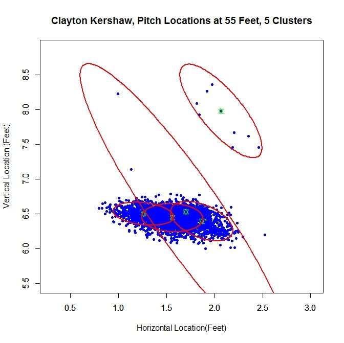
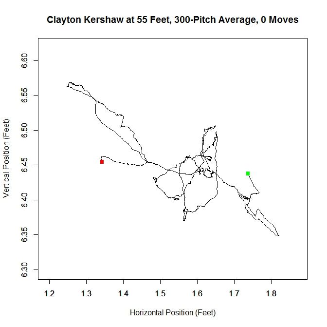
At 55 feet, the Gaussian mixture model identifies five clusters for Kershaw’s data. The green stars represent the center of each cluster and the red ellipses indicate two standard deviations from center along the principal axes. The largest cluster in this group has a weight of .64, meaning it accounts for 64% of the mixture model’s distribution. This is the cluster around the point (1.56,6.44). We will work off of this cluster and remove the data that has a low probability of coming from it. This is will include dispensing with the sparse cluster to the upper-right and some data on the periphery of the main cluster. We can see how Kershaw’s clusters are generated by taking a rolling average of his pitch locations at 55 feet (the standard distance used for release points) over the course of 300 pitches (about three starts).
Kershaw Rolling Average photo Kershaw_Average.jpeg

The green square indicates the average of the first 300 pitches and the red the last 300. From the plot, we can see that Kershaw’s data at 55 feet has very little variation in the vertical direction but, over the course of the season, drifts about 0.4 feet with a large part of the rolling average living between 1.5 and 1.6 feet (measured from the center of home plate). For future reference, we will define a “move” of release point as a 9-inch change in consecutive, disjoint 300-pitch averages (this is the “0 Moves” that shows up in the title of the plot and would have been denoted by a blue square in the plot). The choices of 300 pitches and 9 inches for a move was chosen to provide a large enough sample and enough distance for the clusters to be noticeably disjoint, but one could choose, for example, 100 pitches and 6 inches or any other reasonable values. So, we can conclude that Kershaw never made a significant change in his release point during 2012 and therefore treating the data a single cluster is justifiable.

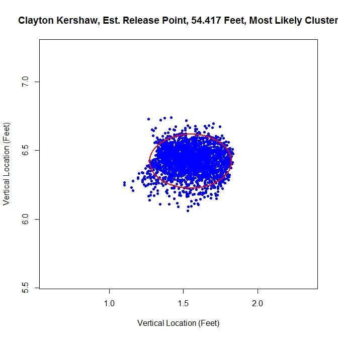
From the spatial clustering results, the first way we will clean up the data set is to take only the data which is most likely from the dominant cluster (based on the conditional probabilities from the clustering algorithm). We can then take this data and approximate the release point distance via the previously discussed algorithm. The release point for this set is estimated at 54 feet, 5 inches. We can also estimate the arm release angle, the angle a pitcher’s arm would make with a horizontal line when viewed from the catcher’s perspective (0 degrees would be a sidearm delivery and would increase as the arm was raised, up to 90 degrees). This can be accomplished by taking the angle of the eigenvector, from horizontal, which corresponds to the smaller variance. This is working under the assumption that a pitcher’s release point will vary more perpendicular to the arm than parallel to the arm. In this case, the arm angle is estimated at 90 degrees. This is likely because we have blunted the edges of the cluster too much, making it closer to circular than the original data. This is because we have the clusters to the left and right of the dominant cluster which are not contributing data. It is obvious that this way of sorting the data has the problem of creating sharp transitions at the edge of cluster.
Kershaw Most Likely photo Kershaw_Likely_Final.jpeg

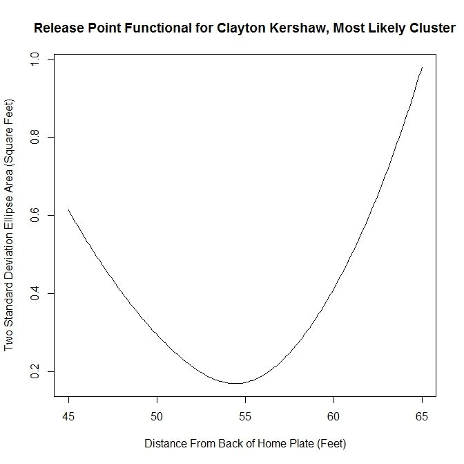
As discussed above, we run the algorithm from 45 to 65 feet, in one-inch increments, and find the location corresponding to the smallest ellipse. We can look at the functional that tracks the area of the ellipses at different distances in the aforementioned case.
Kershaw Most Likely Functional photo Kershaw_Likely_Fcn.jpeg

This area method produces a functional (in our case, it has been discretized to each inch) that can be minimized easily. It is clear from the plot that the minimum occurs at slightly less than 55 feet. Since all of the plots for the functional essentially look parabolic, we will forgo any future plots of this nature.

The next method is to assume that the data is all from one cluster and remove any data points that have a lower than five-percent probability of coming from the dominant cluster. This produces slightly better visual results.
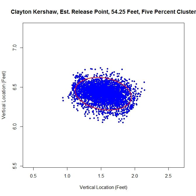
Kershaw Five Percent photo Kershaw_Five_Pct_Final.jpeg

For this choice, we get trimming away at the edges, but it is not as extreme as in the previous case. The release point is at 54 feet, 3 inches, which is very close to our previous estimate. The arm angle is more realistic, since we maintain the elliptical shape of the data, at 82 degrees.
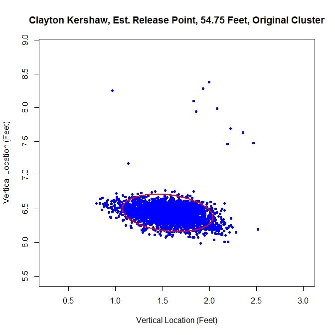
Kershaw Original photo Kershaw_Orig_Final.jpeg

Finally, we will run the algorithm with the data as-is. We get an ellipse that fits the original data well and indicates a release point of 54 feet, 9 inches. The arm angle, for the original data set, is 79 degrees.

Examining the results, the original data set may be the one of choice for running the algorithm. The shape of the data is already elliptic and, for all intents and purposes, one cluster. However, one may still want to remove manually the handful of outliers before preforming the estimation.

Case 2: Lance Lynn

Clayton Kershaw’s data set is much cleaner than most, consisting of a single cluster and a few outliers. Lance Lynn’s data has a different structure.
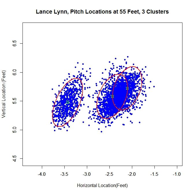
Lynn Clusters photo Lynn_Clusters.jpeg

The algorithm produces three clusters, two of which share some overlap and the third disjoint from the others. Immediately, it is obvious that running the algorithm on the original data will not produce good results because we do not have a single cluster like with Kershaw. One of our other choices will likely do better. Looking at the rolling average of release points, we can get an idea of what is going on with the data set.
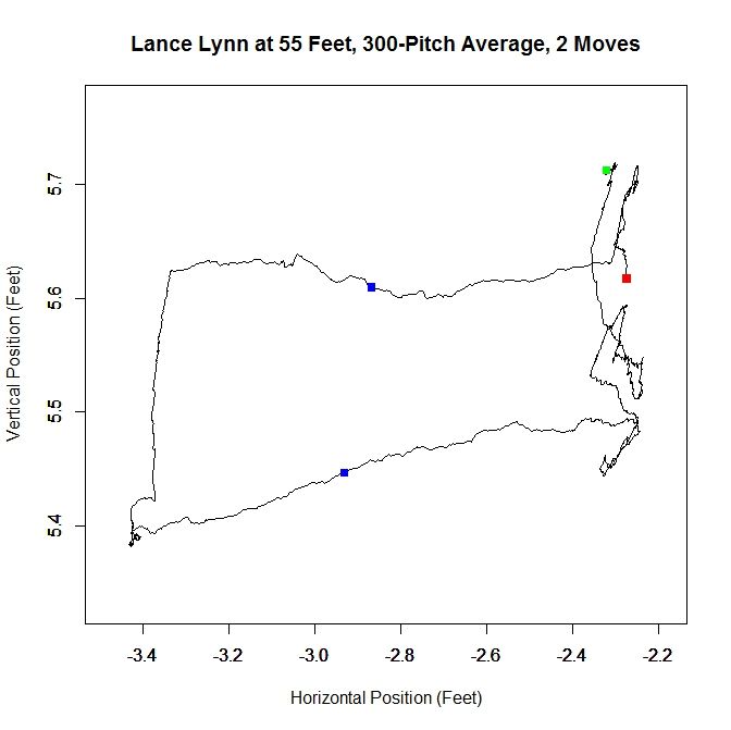
Lynn Rolling Average photo Lynn_Average.jpeg

From the rolling average, we see that Lynn’s release point started around -2.3 feet, jumped to -3.4 feet and moved back to -2.3 feet. The moves discussed in the Kershaw section of 9 inches over consecutive, disjoint 300-pitch sequences are indicated by the two blue squares. So around Pitch #1518, Lynn moved about a foot to the left (from the catcher’s perspective) and later moved back, around Pitch #2239. So it makes sense that Lynn might have three clusters since there were two moves. However his first and third clusters could be considered the same since they are very similar in spatial location.

Lynn’s dominant cluster is the middle one, accounting for about 48% of the distribution. Running any sort of analysis on this will likely draw data from the right cluster as well. First up is the most-likely method:
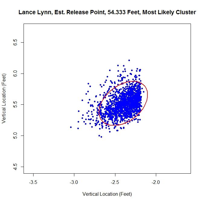
Lynn Most Likely photo Lynn_Likely_Final.jpeg

Since we have two clusters that overlap, this method sharply cuts the data on the right hand side. The release point is at 54 feet, 4 inches and the release angle is 33 degrees. For the five-percent method, the cluster will be better shaped since the transition between clusters will not be so sharp.
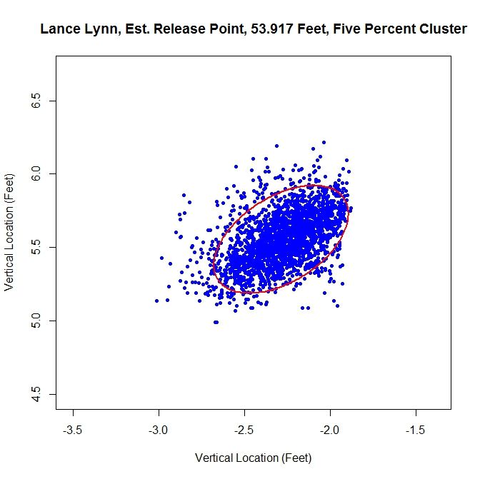
Lynn Five Percent photo Lynn_Five_Pct_Final.jpeg

This produces a well-shaped single cluster which is free of all of the data on the left and some of the data from the far right cluster. The release point is at 53 feet, 11 inches and at an angle of 49 degrees.

As opposed to Kershaw, who had a single cluster, Lynn has at least two clusters. Therefore, running this method on the original data set probably will not fare well.
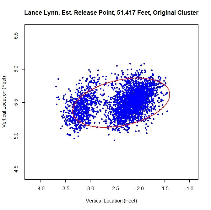
Lynn Original photo Lynn_Orig_Final.jpeg

Having more than one cluster and analyzing it as only one causes both a problem with the release point and release angle. Since the data has disjoint clusters, it violates our bivariate normal assumption. Also, the angle will likely be incorrect since the ellipse will not properly fit the data (in this instance, it is 82 degrees). Note that the release point distance is not in line with the estimates from the other two methods, being 51 feet, 5 inches instead of around 54 feet.

In this case, as opposed to Kershaw, who only had one pitch cluster, we can temporally sort the data based on the rolling average at the blue square (where the largest difference between the consecutive rolling averages is located).
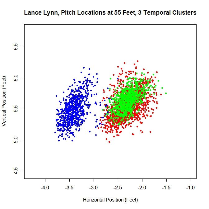
Lynn Time Clusters photo Lynn_Time_Clusters.jpeg

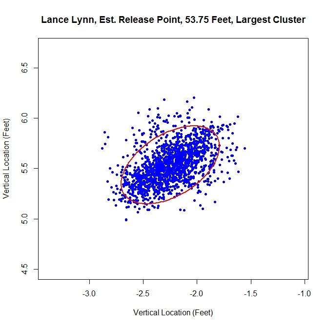
Since there are two moves in release point, this generates three clusters, two of which overlap, as expected from the analysis of the rolling averages. As before, we can work with the dominant cluster, which is the red data. We will refer to this as the largest method, since it is the largest in terms of number of data points.  Note that with spatial clustering, we would pick up the some of the green and red data in the dominant cluster. Running the same algorithm for finding the release point distance and angle, we get:
Lynn Largest photo Lynn_Large_Final.jpeg

The distance from home plate of 53 feet, 9 inches matches our other estimates of about 54 feet. The angle in this case is 55 degrees, which is also in agreement. To finish our case study, we will look at another data set that has more than one cluster.

Case 3: Cole Hamels
Hamels Clusters photo Hamels_Clusters.jpeg

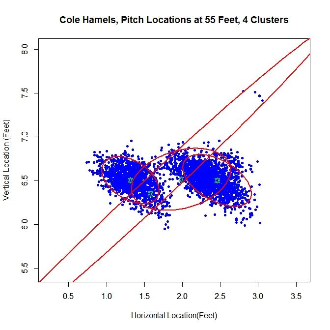
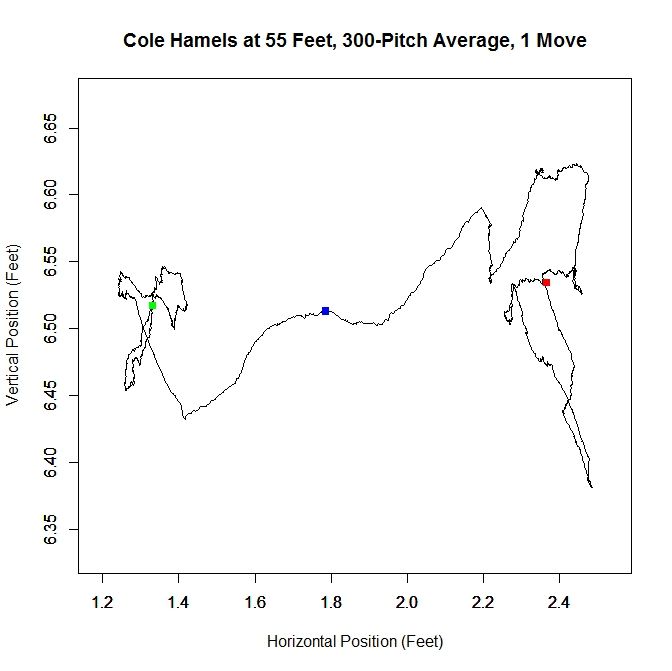
For Cole Hamels, we get two dense clusters and two sparse clusters. The two dense clusters appear to have a similar shape and one is shifted a little over a foot away from the other. The middle of the three consecutive clusters only accounts for 14% of the distribution and the long cluster running diagonally through the graph is mostly picking up the handful of outliers, and consists of less than 1% of the distribution. We will work with the the cluster with the largest weight, about 0.48, which is the cluster on the far right. If we look at the rolling average for Hamels’ release point, we can see that he switched his release point somewhere around Pitch #1359 last season.
Hamels Rolling Average photo Hamels_Average.jpeg

As in the clustered data, Hamel’s release point moves horizontally by just over a foot to the right during the season. As before, we will start by taking only the data which most likely belongs to the cluster on the right.
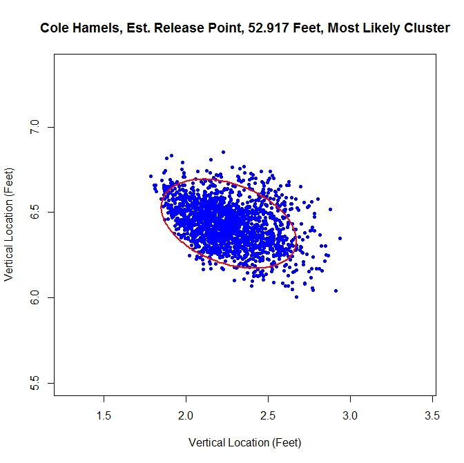
Hamels Most Likely photo Hamels_Likely_Final.jpeg

The release point distance is estimated at 52 feet, 11 inches using this method. In this case, the release angle is approximately 71 degrees. Note that on the top and the left the data has been noticeably trimmed away due to assigning data to the most likely cluster. The five-percent method produces:
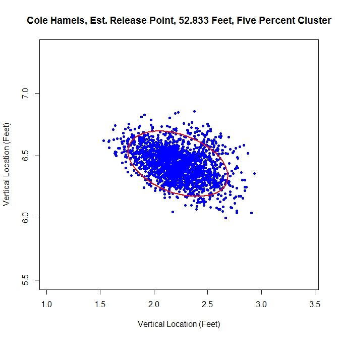
Hamels Five Percent photo Hamels_Five_Pct_Final.jpeg

For this method of sorting through the data, we get 52 feet, 10 inches for the release point distance. The cluster has a better shape than the most-likely method and gives a release angle of 74 degrees. So far, both estimates are very close. Using just the original data set, we expect that the method will not perform well because there are two disjoint clusters.
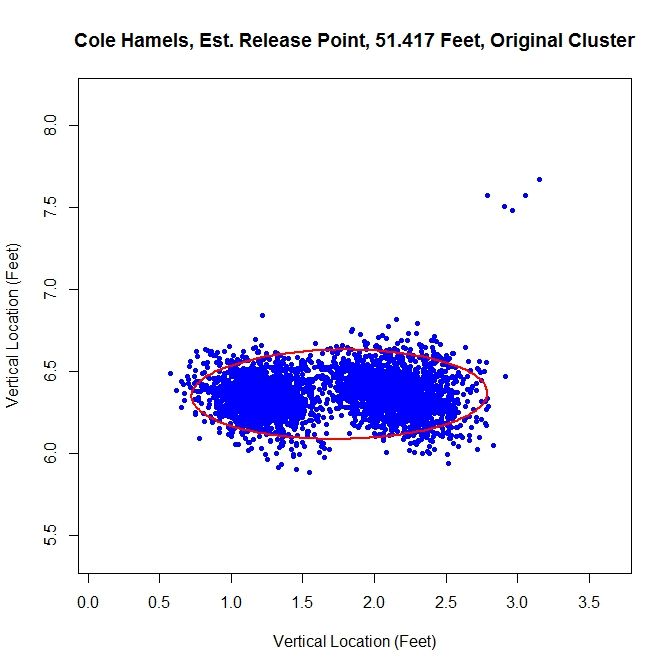
Hamels Original photo Hamels_Orig_Final.jpeg

We run into the problem of treating two clusters as one and the angle of release goes to 89 degrees since both clusters are at about the same vertical level and therefore there is a large variation in the data horizontally.

Just like with Lance Lynn, we can do a temporal splitting of the data. In this case, we get two clusters since he changed his release point once.
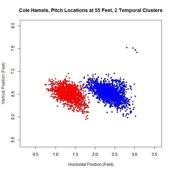
Hamels Time Clusters photo Hamels_Time_Clusters.jpeg

Working with the dominant cluster, the blue data, we obtain a release point at 53 feet, 2 inches and a release angle of 75 degrees.
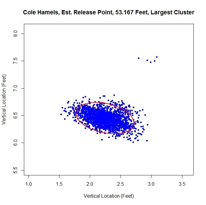
Hamels Largest photo Hamels_Large_Final.jpeg

All three methods that sort the data before performing the algorithm lead to similar results.

Conclusions:

Examining the results of these three cases, we can draw a few conclusions. First, regardless of the accuracy of the method, it does produce results within the realm of possibility. We do not get release point distances that are at the boundary of our search space of 45 to 65 feet, or something that would definitely be incorrect, such as 60 feet.  So while these release point distances have some error in them, this algorithm can likely be refined to be more accurate. Another interesting result is that, provided that the data is predominantly one cluster, the results do not change dramatically due to how we remove outliers or smaller additional clusters. In most cases, the change is typically only a few inches. For the release angles, the five-percent method or largest method probably produces the best results because it does not misshape the clusters like the mostly-likely method does and does not run into the problem of multiple clusters that may plague the original data. Overall, the five-percent method is probably the best bet for running the algorithm and getting decent results for cases of repeated clusters (Lance Lynn) and the largest method will work best for disjoint clusters (Cole Hamels). If just one cluster exists, then working with the original data would seem preferable (Clayton Kershaw).

Moving forward, the goal is settle on a single method for sorting the data before running the algorithm. The largest method seems the best choice for a robust algorithm since it is inexpensive and, based on limited results, performs on par with the best spatial clustering methods. One problem that comes up in running the simulations that does not show up in the data is the cost of the clustering algorithm. Since the method for finding the clusters is incremental, it can be slow, depending on the number of clusters. One must also iterate to find the covariance matrices and weights for each cluster, which can also be expensive. In addition, the spatial clustering only has the advantages of removing outliers and maintaining repeated clusters, as in Lance Lynn’s case. Given the difference in run time, a few seconds for temporal splitting versus a few hours for spatial clustering, it seems a small price to pay. There are also other approaches that can be taken. The data could be broken down by start and sorted that way as well, with some criteria assigned to determine when data from two starts belong to the same cluster.

Another problem exists that we may not be able to account for. Since the data for the path of a pitch starts at 50 feet and is for tracking the pitch toward home plate, we are essentially extrapolating to get the position of the pitch before (for larger values than) 50 feet. While this may hold for a small distance, we do not know exactly how far this trajectory is correct. The location of the pitch prior to its individual release point, which we may not know, is essentially hypothetical data since the pitch never existed at that distance from home plate. This is why is might be important to get a good estimate of a pitcher’s release point distance.

There are certainly many other ways to go about estimating release point distance, such as other ways to judge “closeness” of the pitches or sort the data. By mathematizing the problem, and depending on the implementation choices, we have a means to find a distinct release point distance. This is a first attempt at solving this problem which shows some potential. The goal now is to refine it and make it more robust.

Once the algorithm is finalized, it would be interesting to go through video and see how well the results match reality, in terms of release point distance and angle. As it is, we are essentially operating blind since we are using nothing but the PITCHf/x data and some reasonable assumptions. While this worked to produce decent results, it would be best to create a single, robust algorithm that does not require visual inspection of the data for each case. When that is completed, we could then run the algorithm on a large sample of pitchers and compare the results.


Community “Research”: Team COOL Scores

The following is, more or less, useless. It’s meant to be NotGraphsian more than FanGraphsian. It’s meant to be fun, if your definition of fun involves parodying something that’s already incredibly niche (NERD). It’s like if you time travelled to ancient Phoenicia and saw a minstrel play acting as a Hittite. That might not make sense. You will find that COOL does not make much sense in general. Just enough to make you wonder.

COOL scores are to the uninitiated baseball fan as NERD scores are to the statistically-minded baseball fan. They serve a purpose at opposite tails of a made-up bell curve, one with COOL at the tail representing the least baseballsy people and NERD at the other tail for wannabe sabermetricians. NERD is meant for the aspiring baseball savant and COOL is meant for the unaware baseball ignoramus. Someone who’d rather be playing Call of Duty, doing their nails, or eating at Sbarro than watching baseball.

But why have COOL scores at all? What use are they? Well, as baseball zealots it’s our job to brazenly preach our zeal to the unenlightened. Our joy cannot be contained, our cup overfloweth, our fountain runneth over, we are rivers of joy, etc. But our wives, girlfriends, loser younger brothers, and hip co-workers don’t listen to us. Instead they maim our reputations with insults like “nerd”, “loser”, and “wastrel.” Which is why we must resort to craftiness. We must become the Jamie Moyers of proselytism, precisely throwing junk on the corners of life’s strike zone, hoping our feeble heaters and lazy curves are received and not pummeled. All we want is for people to see beauty in the competitive handling of balls on a field (ahem). So as crafty lefties or crafty righties (some of us may be Moyer, others Livan Hernandez), we can use all the tools we can get. COOL is one such tool. It can work like this:

Nerdlet van Nerdinger: Salutations, Cooldred Coolson!

Cooldred Coolson: Hey, nerd.

NvN: Would you love to join me for a baseball viewing?

CC: No.

NvN: But I have a pseudo-scientific way of determining that it might be fun!

CC: Did you say science? I totes trust that shit.

NvN: Great!

CC: Zowie! I can’t wait for homerz, hottiez, and giant racing weinerz!

NvN: And I can’t wait to foster companionship/copulate with you!

There ya go. Sorkin-esque dialogue. Not that we, the baseball loving community, are friendless poon-hounds. I’m just talking about tools, here. Tools at our disposal, like Custom Leaderboards, a wrench, or a Desert Eagle .50.

La-dee-da. COOL stands for the Coefficient Of On-field Lustre. Or how likely it is for a non-fan to think, more or less, “Ooo! Shiny!” when watching the game. The fact that this number isn’t technically a coefficient is not a thing I want to address or think about.  These are the components of COOL, and how they are determined:

TV Announcer Charisma

The Cooldred Coolsons of the world never listen to the radio. Otherwise Bob Uecker alone could swell the baseball fanbase to billions in seconds (seconds!). Alas, holding the attention of a baseball mongrel requires Visual Stimuli, accompanied by Aural Pleasantries. This is why TV Announcer Charisma is included in COOL. To determine this variable, I took Charisma scores from the Broadcast Rankings, and finagled the z-score of each team’s home announcer. I multiplied this factor by 1.5 because: Science.

Variable: zCHAR*1.5

Lineup Attractiveness and/or Virility and/or Youth and/or Sexiness

There is something unbelievably compelling about watching a fine human being being fine, and human. I’m not even talking about sex, though sometimes that’s compelling, too. Watching beautiful people being beautiful is mesmerizing. Unfortunately there’s no easy way to rate the attractiveness of whole teams. One method I considered was using Amazon’s Mechanical Turk to crowdsource ratings of individual players’ headshots. People (Turks, perhaps) would simply rate the face as “attractive” or “not attractive,” and after a few thousand responses we’d have a good idea if a player was good looking. Alas, this was too much work and required money. Instead I took a massive shortcut and figured that, in general, youth=attractiveness, sorted all teams by age, rewarded young teams, and penalized old teams. I divided it in half because my methodology is shitty.

Variable: zSEX/2

Uniform Appeal

What people are wearing while they play sports appears to be very important to my mother. She frequently comments on the “get up” of athletes, while I frequently comment on the “get out” of a fly ball, while you are probably contemplating a “get the f— out” at this stupid article. The outward aesthetics of baseball are hugely important to the uninitiated. As nice as it is look upon a beautiful human in the buff, even a properly adorned Tom Gorzelanny can hold the eye and make it tremble (with desire, not nystagmus). So to determine the Objective Beauty of a team’s uniform, I took nine 2013 uniform rankings that I found online (science!) created by people of varying bias and credential (Jim Caple, myself, user pittsburghsport16 on sportslogos.net, etc.), averaged the rankings, assumed a normal distribution and pooped out z-scores for each team’s uniform appeal. Simple, easy, and deeply flawed. I multiplied uniform appeal by 2 because my mother holds great sway in the way I form opinions/conduct science.

Variable: zUNI*2

Home Runs

Home runs are the most easily understood event in baseball. Anyone can understand a home run and appreciate it. Home runs are great. They are saffron. They are sex. They are Super Saiyan. I used team HR% for this one. It’s not park adjusted because I am simple, and don’t know how to do that. It’s also accounted for in PARK, which is next. I briefly wondered if I should have used team HR/FB, but I’m betting it would give me a similar result. I also briefly considered halving the zHR% value because while HRs are great, they’re not altogether that common, and hinging your crude buddy’s enjoyment on the doorframe of dingerdom… well that’d be foolish. Better to hinge it on something more reliable, like what people are wearing. Science. But that made the end values less pretty so it remains whole.

Variable: zHR%

Ballpark Appeal

Where a team plays matters. To us it matters because where a park is and how it’s arranged can greatly affect the way baseball happens. To them it matters because they might see people running at full speed dressed as giant pierogies. Baseball is wonderful. I took the average Yelp ratings of each ballpark from Nate Silver’s 2011 article on ballparks, then upgraded the Marlins (based on my own subjective approval of the home run monstrosity in their new park), scaled the scores from 0-2, and then multiplied them by average %attendance to reward well-attended parks, and by each park’s 2013 HR park factor because: I’ve already covered this. Fun!

Variable: PARK

The Invisible, the Intangible, the Unknown, the Ghost in the Fandom Machine

Sometimes something unknowable seems to drive the affection of the masses. Often it’s success, or tragedy, or beauty, or infamy. Sometimes people just love things. Like screaming goats. I wanted to isolate the je ne sais quoi of team appeal, and decided a team’s road attendance best approximated their enigmatic allure. And apparently the Giants are just dripping with Mystery Honey, drawing fans like bees to their away games across the country. Is it because they play in a well-attended division? Because they won the World Series? Because they score runs? Because people still think Barry Bonds is around to boo? Possibly. But I’m not one to dig too hard for the truth. After all, I created COOL scores. This variable is merely, mightily, the z-score of %attendance at road games.

Variable: z???

This is the final formula:

(zSEX/2) + (zCHAR*1.5) + (zUNI*2) + zHR% + PARK + z???+Constant

The constant ensures an average score of 5. I refused to floor/ceiling the scores at 0 and 10 because I’m not entirely a plagiarist of NERD, and feel like this can be one, small, passive-aggressive way I can assert myself. Also laziness.

The COOL Leaderboard

Team COOL z-charisma z-age z-HR% z-unirank PARK z-???
Dodgers 10.59 2.26 -1.63 -1.07 1.55 0.65 1.17
Red Sox 9.51 1.04 -0.52 0.16 0.52 1.51 1.32
Mets 9.47 1.96 0.59 -0.09 0.92 0.68 -0.35
Giants 8.86 2.11 -0.52 -1.79 0.51 1.38 1.18
Orioles 8.53 0.12 0.59 1.96 0.73 1.2 -0.73
Cardinals 8.15 -1.41 1.7 -0.69 1.82 1.55 0.74
Cubs 7.53 0.58 -0.52 0.43 0.07 1.35 0.83
Tigers 7.4 0.43 -1.63 -0.01 0.7 1 1.02
Yankees 6.8 -0.79 -1.63 0.34 1.4 0.89 0.61
Athletics 6.39 0.12 0.59 0.02 1.23 0.06 -0.79
Reds 6.32 -0.34 0.59 0.08 0.25 1.07 0.72
Pirates 5.87 -0.34 0.59 0.12 0.33 0.71 0.43
Twins 5.77 0.28 0.59 -0.55 -0.12 1.14 0.55
Blue Jays 5.72 -0.79 -1.63 1.54 1.37 0 -0.72
Braves 5.58 -0.79 0.59 1.27 0.43 0.49 -0.29
Angels 5.4 0.12 -0.52 0.19 -0.1 0.72 0.62
Phillies 5.39 -1.1 -1.63 -0.09 0.34 2.2 0.89
Astros 5.11 1.5 1.7 0.07 -0.63 0.72 -1.67
Rangers 4.76 -0.49 0.59 1.09 -0.76 1.02 0.45
Brewers 4.73 0.43 0.59 -0.06 -1.21 1.48 0.63
Nationals 3.35 -0.79 1.7 -0.37 -0.6 0.4 0.71
Rockies 3.05 -1.1 0.59 1.2 -1.26 0.95 0.62
Indians 2.36 -0.64 -0.52 0.71 -1.26 0.54 0.69
Mariners 1.29 -0.03 -0.52 0.67 -0.75 0.43 -2.16
Royals 1.27 -0.34 0.59 -2.37 -0.07 0.64 -0.82
Padres 0.99 0.12 0.59 -0.26 -1.72 0.65 -0.59
White Sox 0.61 -1.87 -0.52 -0.09 0.33 0.59 -1.65
Rays 0.54 -0.03 -0.52 0.73 -1.29 0.1 -1.57
Diamondbacks -0.19 -0.03 -0.52 -0.94 -1.52 0.41 -0.49
Marlins -1.17 -0.18 0.59 -2.21 -1.2 0.62 -1.37

It’s the Los Angeles Yasiel Puigs at the top! Page views! Interestingly, the Rays are beloved by NERD (a 10!) but hated by COOL with a .054. That seems true to life. And everyone hates the Marlins (0 NERD, -1.17 COOL). So: this measure passes my smell test. But I have a terrible sense of smell due to allergies. So use your own noses.

Of course COOL is in its infancy. It’s zygotic, even. If my “research” is accepted, there will be time for revisions. I also have a Pitcher COOL score in the works, and there will be an umpire strike call flamboyance factor that can help us calculate games scores.

Despite numerous flaws, I still get the sense that COOL is telling us something. Even if that something is completely useless. Which was the point of this whole exercise from the beginning: To create a watchability measure for the people least likely to ever visit Fangraphs. Useless.

Finally, COOL is entirely inspired by Carson Cistulli’s work on NERD, obviously, without which I am a lost, vagrant, nothing–a malodorous abyss, obviously.

That’s it. Go resume Life.