wOBA – xwOBA vs. Defensive Metrics

Introduction
For quite some time, wOBA has been used as a well-known, all-around statistic for measuring the output of a hitter. wOBA doesn’t treat the many different ways of getting on base equally. Instead, it gives credit to the hitter for the value of each outcome, whether that be a single, home run, or walk. For more information, FanGraphs goes more in-depth here.
With the emergence of Statcast, xwOBA has been introduced. xwOBA uses launch angle, exit velocity, and sometimes sprint speed of the batter to give an expected value of wOBA on batted balls. xwOBA can tell us at what exit velocity and launch angle the most meaningful outcomes are produced. That is important to know because we can now see if specific teams or players are underperforming, overperforming, or are performing as expected based on these two stats. wOBA and xwOBA are not in perfect correlation for hitters with at least 50 plate appearances in 2019, but they still have a very strong relationship (r = 0.918). As plate appearances increase, the two should eventually level out to be the same. At what amount of plate appearances that occurs at, I don’t know.
What I want to know is what goes into a team’s defense if they are allowing a larger xwOBA than wOBA. That would mean they are taking expected hits for the opposing team and turning them into outs. I got to thinking about this idea while watching the ALCS between the Tampa Bay Rays and the Houston Astros, specifically Game 3, and I have now had time to dive deeper into my initial question. The Rays put together a beautifully played defensive game while their offense seemed to struggle outside of Randy Arozarena.
In Game 3, the Rays pitching staff combined to give up an xwOBA of 0.337, but they only allowed a combined wOBA of 0.300. Their defense saved 0.037 points of wOBA from the Astros to take a commanding 3-0 lead.
If we look at the entire series, the Rays pitching/defense performed better than expected (wOBA – xwOBA = -0.018) while Astros pitching/defense performed as expected (wOBA – xwOBA = 0.000). Could the Rays’ ability to turn the Astros’ xwOBA into a lower wOBA be part of what helped them win the American League pennant? Potentially yes, but looking at both LCS and World Series contests from 2015-2020, the team with the lower defensive wOBA – xwOBA won the series only 55% of the time.
Where does wOBA and xwOBA come from?
If we want to have a better understanding of how teams prevent wOBA defensively, it might help to have an understanding of where wOBA and xwOBA hit locations are on the field. This way we can look at certain defensive positions and see if their defensive stats have a relationship with wOBA – xwOBA.
The plot below shows the distribution of batted balls in 2019 colored by wOBA value.
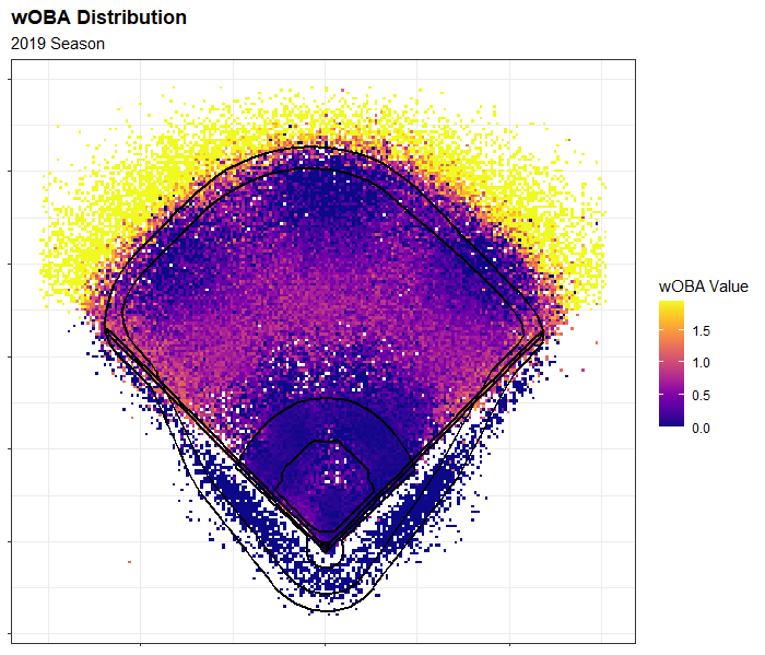
The distribution of higher of wOBA occurs in the outfield and over the fence. There is a large distribution of singles in the middle to shallow portion of the outfield. These batted balls could be groundballs through the infield holes, line drives that fall before the outfielders, or bloopers. Knowing this, it can be important to look at a teams infield range or how well a teams outfielders are coming in towards the plate. There is also high wOBA down the foul lines and in the gaps, where doubles and triples may occur. That focus can be on the range of the corner infielders and the outfielders.
It might also be important to view the distribution of xwOBA values in the field. These are where the results are expected to occur, so it might be helpful so see the difference. Below is the distribution of batted balls in 2019 colored by xwOBA.
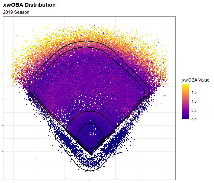
This is a little harder to interpret, as there is not as clear of a tendency for where xwOBA occurs as there was in the wOBA plot. It looks like a large portion of high xwOBA occurs in the shallow/middle portion of the outfield. This could be from lines drives and groundballs, but probably not as much from the latter because xwOBA uses launch angle as a variable and not direction of the batted ball. Groundballs have a lower chance of producing a high value of wOBA, and xwOBA takes this into account.
Having a good defensive infield could be important to look at because xwOBA will be low on balls the infield has a chance at fielding, although those batted balls can still sneak through a hole and reward the hitter with a hit (Example: 0.7 wOBA, 0.1 xwOBA). We will look out for how an infield is on average to the players’ left and right. Looking at an outfield’s overall range is important, but so is the outfield’s range towards the plate since there’s a large distribution of high xwOBA in the shallow outfield.
Defensive Metrics
I will start by looking at how wOBA – xwOBA correlates with overall team fielding stats from FanGraphs and Baseball Savant from 2017-2019 with a series of correlation plots. I will then split the data to infield and outfield to see if specific positions have a higher correlation than others and why. But first, let’s take a look at the distribution of wOBA – xwOBA and which teams have been better at reducing wOBA.
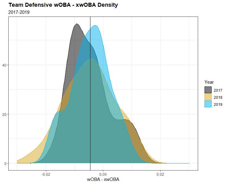
The distribution of defensive wOBA – xwOBA is fairly normal over the course of each year. The mean for all teams from 2017-19 is -0.0045. Close to zero, but that is because the range of wOBA – xwOBA is so small. In a perfect world, the mean would be exactly 0, but with a sample size of only 90, that’s unlikely. It is important to note that a negative wOBA – xwOBA is better than positive because this means teams have a higher xwOBA than wOBA.
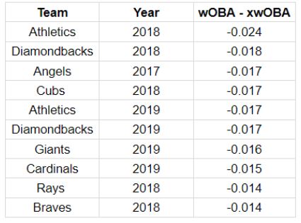
Here is the list of teams with the best wOBA – xwOBA between 2017 and 2019. There doesn’t seem to be a trend of the best teams in the league in their given year but there is a trend of good defensive teams (more on this later).

Here is the list of teams with the worst wOBA – xwOBA. Again, not the worst teams in the league, but when comparing the bottom 10 to the top 10, there is a difference (more on this later).
All Positions
I will now compare wOBA – xwOBA to team level stats starting with FanGraphs, which has a few popular stats to look out for including Defensive Runs Saved (DRS) and Ultimate Zone Rating (UZR). Note that since a smaller wOBA – xwOBA is better, stats that correlate directly will have a negative correlation.
Below is a plot that shows the correlation that wOBA – xwOBA has on the advanced fielding stats on FanGraphs for all positions at the team level.
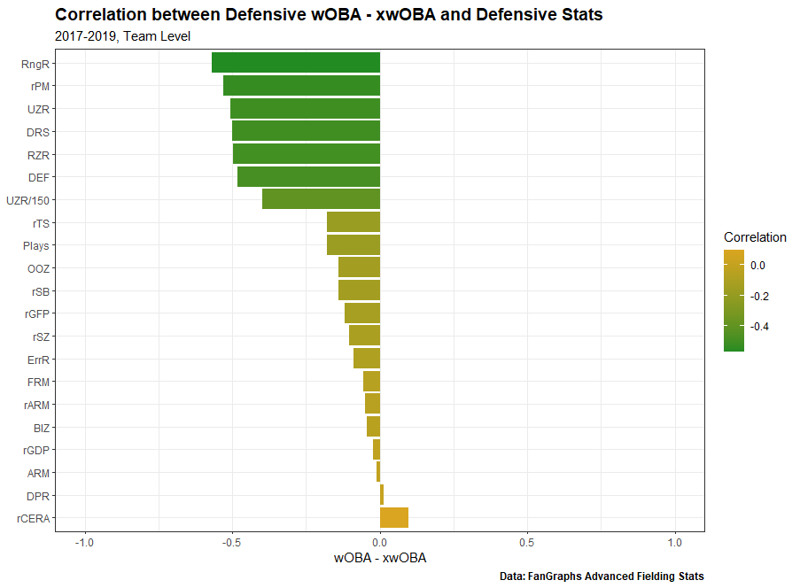
Some widely known defensive stats appear moderately correlated in UZR and DRS. UZR is made up of different components which include Outfield Arm Runs (ARM), Double-Play Runs (DPR), Range Runs (RngR), and Error Runs (ErrR). You can read more about it here. With that in mind, RngR is correlated the strongest at the team level, which puts UZR high on the list. From this plot, we can conclude that the overall range of a defense plays a big role in wOBA – xwOBA. It will be interesting to see if the infield range or outfield range have a bigger influence.
Below is the plot that shows the correlation with the Outs Above Average (OAA) family from Baseball Savant.
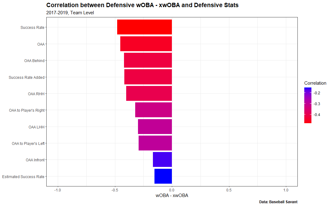
It’s promising to see OAA high on this list with moderate correlation. OAA is a range-based metric calculated from several different variables including Catch Probability for outfielders and distance to the ball, the time the fielder has to get to the point of interception, and a few others for infielders. More information can be found here. As far as direction, it looks like the success players have going back has the highest influence while coming in has the smallest influence. This surprised me as I expected players coming in, towards the plate, would have a significant relationship. However, it will be interesting to see that relationship after separating infield from outfield.
Outfield
Some things to keep in mind from the beginning of this article is to look at the relationship with outfield range, as range has a moderately strong relationship for all positions. We also want to see the relationship when outfielders are coming in towards the plate. This is made possible with OAA, but not FanGraphs advanced stats.
To start off, below is the correlation plot for each team’s outfield defensive stats from FanGraphs.
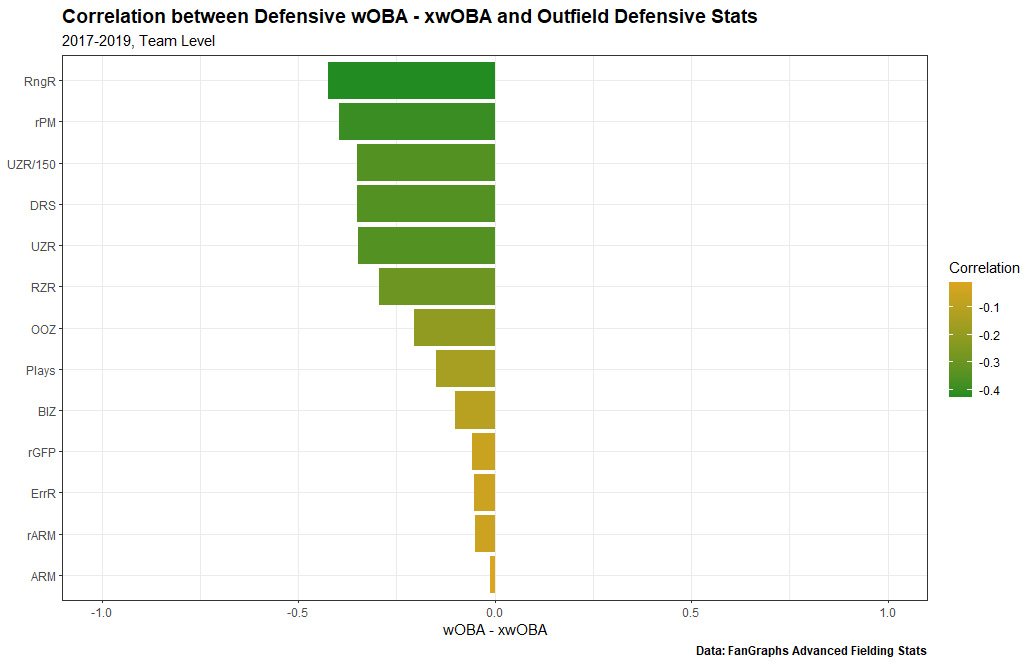
Range Runs remains at the top of the list but the correlation is not as strong as the relationship with all positions. Plus Minus Runs Saved (rPM) remains in the No. 2 spot, and the rest of the list looks similar to the plot with all positions combined. Less stats were included in the second plot because some advanced stats on FanGraphs are exclusively for specific positions.
Now let’s looks at stats from Baseball Savant.
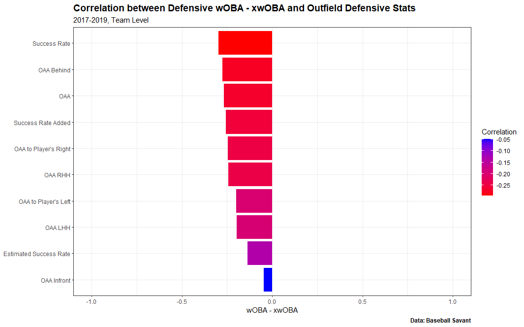
This is a surprise to me, as none of these stats have a very strong correlation with wOBA – xwOBA. It is even more surprising that OAA in front has an even smaller correlation. Just by taking a look at the correlation plot, it seems that outfield defense alone does not have as big of an impact as I originally thought. It is much more valuable for outfielders to have success going back instead of coming in. This does make sense because higher-valued xwOBA plays are located in the deeper portions of the outfield. However, from the plots above, it looked like wOBA and xwOBA were heavily located in the shallow portion of the outfield. That could result from groundballs and line drives much too shallow for an outfielder to reach.
We can conclude that the outfield defense does not have as big as an impact as originally thought, with key stats including the range of the outfield and how well outfielders are going back, away from the plate.
Infield
I will use the same process but for just infield stats starting with FanGraphs and ending with Baseball Savant. Some things to remember with FanGraphs stats is the range of the infield and overall success (DRS). In Baseball Savant stats, we should look to see the importance of a teams ability to the left and right.
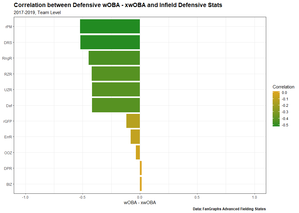
To my surprise, infield DRS has a much stronger relationship with wOBA – xwOBA than outfield DRS. The correlation with infield DRS is -0.52 and the correlation with outfield DRS is -0.35. The Range Runs of the infield also has a stronger relationship than outfield Range Runs, but only slightly. The estimated difference in average wOBA – xwOBA for a difference of 1 infield Range Run is -0.000253 for observations with the same outfield Range Runs. Compare that to the estimated difference in average wOBA – xwOBA for a difference of 1 outfield Range Run being -0.000233 for observations with the same infield Range Runs. Both of these are statistically significant at the 0.05 level. We can conclude that the range of an infield is more important than the range of an outfield, when it comes to wOBA – xwOBA, but only slightly.
Now let’s look at Baseball Savant.
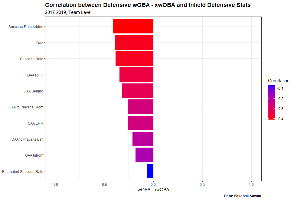
If we compare this to the correlation plot with the outfield correlation plot, we see a significant difference throughout. Infield OAA correlated with wOBA – xwOBA is -0.39 while outfield OAA correlated at only -0.27, a much larger difference than I originally anticipated. The importance of OAA to a player’s left and right is very similar to OAA when outfielders go to their left and right. What is really interesting is that there is more correlation when infielders go towards the plate than when outfielders go towards the plate. This could be because weakly hit ground balls have the opportunity to produce a single, while the xwOBA would be close to zero.
Conclusion
If we go back and look at the top and bottom teams in wOBA – xwOBA from 2017-19, the bottom 10 have an average -35.1 DRS as a team per year. Compare that to the top 10 who had an average 71 DRS per year. There is a clear difference between the top and bottom in terms of overall defense, and we can conclude that there is relationship between wOBA – xwOBA and good defense.
This was just an introduction to what goes into a teams’ defensive wOBA – xwOBA. There is much more that can be explored. For example, what if we looked at even more defensive metrics from other baseball websites like Baseball Prospectus? What about the shift? I’ll leave that up to future analysis. There are so many ways to improve a teams wOBA – xwOBA, and we now have a more clear understanding of how teams can make that possible.
I hoped you enjoyed this article and thank you for reading!
Exvellent job! The wOBA vs xwOBA scatter plots are very cool to visualize.
Yes, excellent work.
Great work and nice scatterplots!
This article is really amazing. Thanks for the information, keep sharing this type of info.
https://www.myfordbenefits.us/