Archive for texas

Evaluating Lance Lynn’s Unexpected 2019

If you scroll down the pitching leaders page at FanGraphs today, most of the top names are not so surprising, but one unexpected player near the top is Lance Lynn. Currently, Lynn is second overall with 3.2 WAR, leading the American League as Craig Edwards noted yesterday. Historically, Lynn has been a consistent pitcher, a 2-3 WAR guy who can eat innings, but he’s hardly the type of character you would expect to break out. He’s currently in his age-32 season, putting him on the wrong side of the starting pitcher aging curve, and he is post Tommy John surgery, which he underwent at the end of 2015.

If you look longer at Lynn’s row on the pitching leaderboard, something else might catch your eye – he’s managed this while having a 4.16 ERA. This is symptomatic of fWAR being calculated using his FIP, which is considerably better at 3.00, meaning the Rangers defense is costing him more than a run per nine innings. This is further highlighted in his BABIP, suffering from a career-worst at .345, where league average this year is .293. In fact, his FIP is a full point lower than his own career average, indicating that there has been some significant, true improvement this year. To evaluate this season against his prior production, I took a look at Lynn’s IP per WAR:
Already this plot is a bit surprising, as the expectation for such a distribution would be to follow a typical aging curve, but excluding the outlier, Lynn seems to be continuing to improve. If you do drop off the outlier and remove his missed year for Tommy John surgery, a linear regression does quite well in describing his improvement year-to-year:

Read the rest of this entry »


Does Warm Weather Create Better Players?

My high-school-aged son sits at home yet again. Why? Because another of his baseball games has been canceled due to the wet and cold Ohio spring, and my thoughts turn again to our days playing baseball in Florida. Before we moved to this less-agreeable northern climate, it was a rarity to have a game canceled due to weather. Not only that, but games were scheduled year-round, which of course meant more baseball on the calendar. This situation reminded me of the familiar equation known to baseball fans:

Good weather leads to more playing.
More playing means better players.

But is this true? After all, it’s well-known that the best player in baseball, Mike Trout, is from cold-weather New Jersey. Many quickly point to the fact that California, Texas, and Florida are at the top of the list for states with the most MLB draftees, but they’re the three most populous states. Perhaps proportionally they don’t stack up to colder states after all.

I decided to look at the data from the last two drafts — 2017 and 2018 — to see if there is a relationship between a state’s average temperature and how well its players do in the draft. Do warmer-weather states really produce more MLB draftees than average?

To do this, I first gathered population data from each state to determine what percentage of the overall US population it contains. Then I did the same for each states’ MLB draft population. Finally, I compared those two figures and determined the percentage difference between their population proportion and their draft proportion. I call this figure the “Draft Difference”.

For example, let’s say State X makes up 10% of the US Population, but the State X’s draft class makes up only 8% of the overall class. Its Draft Difference is calculated as:

(Draft-Population)/Population = Draft Difference

In this case,

(8-10)/10 = -.20 = -20%

A state with 10% of the US population should, all things being equal, contribute 10% of all players in an MLB draft. But, in this case, State X did 20% worse than should be expected just from its population size. Read the rest of this entry »


A Different Way to Look at Strikeout Ability

Mike Podhorzer has looked into the relationship of a batters’ average fly ball distance as it relates to their HR/FB ratio, and has found results that will allow others to more accurately project a hitter’s home run totals from year to year.

This got me thinking. Which can be a good or bad, but in this case, the authors’ labor produced a fruitful return. While a hitters’ HR/FB ratio can fluctuate indiscriminately from year to year, Podhorzer has proven a batters’ average fly ball distance is a better indication of a player’s true talent power production. In the same light, my study looks at how a player’s swinging strike rate (SwStr%) is a better indication of a pitcher’s strikeout potential than K/9.

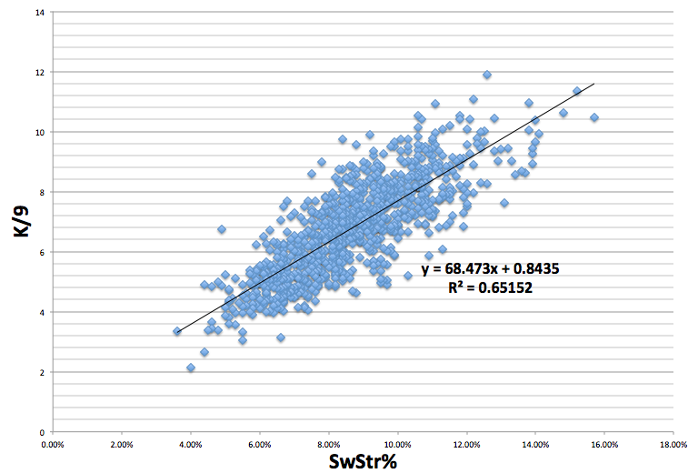
My assumption was that K/9 and SwStr% have a strong relationship. But, how strong of a relationship is it? To find this out, I took all qualified starter seasons from 2003 to 2013, which gave me a sample size of 933 pitchers, and ran a correlation between their SwSTR% and their K/9. The results showed that there is an exceedingly positive correlation between SwSTR% and K/9, to the tune of a .807 correlation coefficient and a .65 R2.
Screen shot 2013-10-03 at 1.06.11 PM

What is important to note is that there are very few pitchers present in the sample with a SwStr% above 13%, which may be symptomatic of something larger. Getting batters to swing and miss is difficult. The more often you can get a batter to swing and miss, the more valuable you are as a pitcher. As a result, the higher the SwStr%, the smaller the sample size becomes. For example, Johan Santana (2004) and Kerry Wood (2003) are the two lone dots to the farthest right on the graph with SwStr% of over 15: wow.

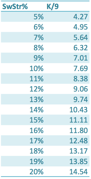
After the relationship between SwStr% and K/9 ratio became unmistakable, I calculated what a particular SwSTR%s translates into, as far as K/9, with the formula Y=68.473*x+0.8435, and got this chart:
Screen shot 2013-10-03 at 1.55.30 PM

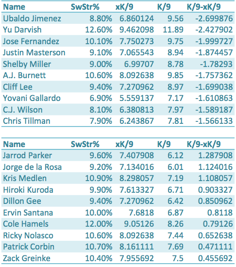
The next step is to take what we have discovered and apply it to a sample. The chart below shows each qualified pitcher for 2013, their SwStr%, xK/9, K/9, and K/9-xK/9.  xK/9 is what we would expect a pitcher’s K/9 to be based off of their SwStr%, and K/9-xK/9 shows us how much a pitcher over-performed or under-performed their SwStr% and xK/9.The first set of ten names are the pitchers who outperformed their xK/9 the most, and the second list of ten names are the players who underperformed their xK/9 the most.
Screen shot 2013-10-03 at 2.44.59 PM

The results show that Ubaldo Jimenez, Yu Darvish, and Jose Fernandez are the pitchers who have outperformed their xK/9 the most in 2013. These three pitchers also have great a great amount of deception and/or command (deception in Jimenez’s case: because, no one has ever called Ubaldo a control artist). And, while they may have outperformed their true talent in 2013 to an extent—they all had remarkable years—maybe that deception and control, which SwStr% does not take into account, leads to less swings by batters and more pitches taken for strikes, as opposed to swung at for strikes.

Perhaps xK/9 is more helpful when we look at pitchers who underperformed their SwStr%, like Jarrod Parker and Kris Medlen. Both of these pitchers had down years compared to what their projections suggested, but their xK/9s seem to be optimistic about their futures. Parker showed a .18 improvement in his K/9 from the first half to the second half of the season, while Medlen showed almost a full point improvement going from a 6.81 K/9 in the first half to a 7.67 K/9 in the second half.

While xK/9 may miss something—deception and command—when it comes to pitchers that outperform their SwStr%, xK/9 seems to find a reason to be optimistic when it comes to pitchers like Kris Medlen and Jarrod Parker who have underperformed their SwStr% and strikeout potential.

Devon Jordan is obsessed with statistical analysis, non-fiction literature, and electronic music. If you enjoyed reading him, follow him on Twitter @devonjjordan.