Archive for pitchers

Searching For Undervalued Pitchers

When looking to the future, there are countless ways to try and find undervalued pitchers.

One such way is to look at which pitchers’ FIPs outperformed their ERAs last year. This is a good approach, but it isn’t enough. For one, there will be players who consistently underachieve on their metrics, like the ever-teasing Michael Pineda. He sits second on the 2016 leaderboard in ERA-FIP, but his ERA is more than half a point greater than his FIP for his career and over a point greater each of the past two seasons.

The other problem with this approach is that FIP has become mainstream enough that everyone will be doing this same thing. Players who outperformed their FIP will be be common targets on draft day, driving up their prices and eliminating any sleeper potential that they had. This, too, is the downside of projections and other easily accessible data.

A different approach is then needed. In that spirit, I decided to create a linear regression model to predict a subsequent year’s ERA based on the difference in first- and second-half splits from the previous year, as well as that year’s ERA. This would help find the players who improved the most from the beginning of the year to the end, and perhaps players who are likely to carry over those improvements into the next season.

The model was generated using data from 2002 to 2015 obtained from FanGraphs’ splits leaderboard, with only pitchers with at least 50 IP in each half-season being considered so as to remove potential outliers. Non-significant variables were removed, and a final model was created. The resulting model was then used with 2016 data to predict ERA in 2017. The following graph shows those predictions, after being rescaled, plotted against 2016 ERA:

For the most part, the predictions line up with their 2016 counterparts. The labeled data points, though, are the ones I want to focus on. Based on this model, each of them are expected to see their ERA drop significantly from last season to this one and could help provide value in the latter rounds of drafts.

Jeff Samardzija
2016 ERA: 3.81
2017 Projected ERA: 3.40

The Shark has had a rough career. Since becoming a starter in 2012, he’s only had one season in which he’s beaten last year’s mark of a 3.81 ERA. He’s played for four different teams in those five years, he’s on the wrong side of 30 and his name is at the same spot on the pronunciation scale as Jedd Gyorko’s. But he does have a few things going for him. He’s struck out over 20 percent of the batters he’s faced in all but one year since 2011, and he’s pitching in a park where home runs go to die. His average fastball velocity is holding steady above 94mph and it was only two years ago where he had a sub-3 ERA with the estimators to back it up. He’s proven he can put up solid numbers, so the predicted improvement isn’t unreasonable. He had a 3.66 FIP in the second half of 2016 that exactly matched his ERA, a substantial drop from his first half numbers. The biggest contributors were his strikeout rate, which rose from 18.9 to 21.9 percent, and his HR/9, which dropped from 1.15 to 0.94. There’s no reason to think the rates are unsustainable either — his HR/FB dropped to a near-league average (in a normal year) 10.8 percent, and his strikeout rate improved almost directly with an increase in his O-Swing%:

Samardzija was able to get batters to swing at pitches out of the zone more frequently as the season went on, and consequently was able to produce more strikeouts. Steamer projects him for a 3.66 ERA, which isn’t all that far off this model’s prediction. If he can bring his strikeout rate back to what it used to be, and AT&T Park does its job, Samardzija could provide some sneaky value in 2017.

Ivan Nova
2016 ERA: 4.17
2017 Projected ERA: 3.72

Moving to the NL seemingly agreed with the former Yankees second-round pick. After posting an unsightly 4.90 ERA in 21 games (only 15 starts) in pinstripes, he turned his season around in Pittsburgh with a 3.06 ERA and 2.62 FIP in his final 11. Switching leagues undoubtedly helped, but there are more reasons behind his improvement. For one thing, he increased his strikeout rate while decreasing his walk rate — just doing those two would be reason to expect a lower ERA. Perhaps more significant, though, is that he halved his HR/9. Much of this is due to a change in scenery — his HR/FB dropped from 21.3 percent before his trade to just 7.8 percent afterward. Of course, he can’t be expected to repeat his performance. He walked just three batters in 64 2/3 innings, good for a 1.1 percent walk rate and a 17.33 K/BB. While Nova is probably better than Phil Hughes, it’s unlikely that even he can replicate that kind of walk rate. Look for Nova to improve on his ERA from last year, but don’t expect him to be as good as his second half. He’ll fall somewhere in the middle, but even that will be more than useful.

Wily Peralta
2016 ERA: 4.86
2017 Projected ERA: 4.35

Don’t look now (unless you promise to come back), but Peralta had a 2.92 ERA in the second half of 2016. Part of this was admittedly due to an inflated 81.7 percent strand rate, but even accounting for that, he managed a 3.75 FIP and 3.59 xFIP during that stretch. His success can be due largely in part to his increase in strikeout percentage, which jumped from 13.6 percent to 20.8 percent. It’s difficult to determine the exact reason behind this, but one explanation might be his increase in velocity. At the start of the year, his fastball was only averaging under 95 mph, a continuation of his 2015 trend and a disgrace to fireballers everywhere. By August, he was closing in on 97 mph, and presumably striking out batters as a consequence. Here’s his velocity by month since 2014, via BrooksBaseball:

Not only did Peralta see an increase in his strikeout rate, but his walk rate improved as well from 8.7 percent to 6.5 percent, which is the lowest to reasonably expect given his career numbers. His WHIP dropped from 1.88 to 1.15, his HR/9 from 1.64 to 1.02 and his wOBA against from .421 to .295 — seemingly everything improved except his age, but I’ll give him a pass on that account. The secret behind his success? His ability to limit hard-hit balls and induce soft contact. Take a look at the trends for each type of contact rate:

In case that doesn’t do it for you, here’s his Statcast exit velocity broken down by game date, via Baseball Savant (with a linear regression line added for those last few skeptics who aren’t convinced):


Peralta’s not an ace, but he has the potential to help out teams this season. Monitor his velocity during spring training, and buy him for a discount on draft day.

Clay Buchholz
2016 ERA: 4.78
2017 Projected ERA: 4.02

Of all pitchers who threw at least 50 innings in each half of the season, Buchholz improved his FIP the most — his first-half FIP was 6.02, so he gave himself quite an advantage, but he still brought it down to 3.74 following the Midsummer Classic. He’s already proven himself to be a capable pitcher, with four sub-3.50 ERA seasons in his past seven seasons, and now he goes to Philadelphia, where pitchers go to be reborn (see: Hellickson, Jeremy). Also, he moves from the AL East to its NL counterpart. Besides going up against a pitcher instead of a designated hitter, he will be facing the likes of the Braves and Marlins instead of the Blue Jays and Yankees.

Despite the difficulty of his former division, Buchholz still managed to improve as the 2016 season wore on. He marginally increased his strikeout and walk rates, doubling his K-BB% to a still-mediocre 9.3 percent in the second half of the season. While that’s not exactly comforting, it’s worth noting that his walk rate in the first half the season was higher than anything he’s put up since 2008, so it’s not likely to approach that number anytime soon. Furthermore, he was able to bring down his bloated HR/FB rate, despite the league’s general struggle to do so. In the first half of the season, 15.9 percent of Buchholz’s fly balls resulted in home runs, which would have been higher than any single season in his career. In the second half that number improved to 5.1 percent, which was much more reasonable given his average rate of 6.5 percent over the previous three seasons. Steamer projects him for a 4.07 ERA, but it’s not difficult to envision a scenario where he does better than even that.

With all that being said, not all of the pitchers on this list are going to live up to their projections. No model is perfect, and none of these guys have exactly had exemplary careers. But they all showed significant improvement over the course of last year, and that’s a strong indication for what to expect from them in 2017.

Combining Arsenal Scores and Stuff to Evaluate Pitcher Performance

Introduction

The Arsenal score is a metric which can examine how effective a pitch currently is, or how effective it could be. This metric is compiled from z-scores (a statistical measure of how far above, or below the mean a specific value is) of ground ball and swinging-strike rates (Sarris, 2016). Eno Sarris put this metric together to see which players might be on the verge of a breakout, should they figure out control issues, improve their fitness and last longer in games. Eno has used the Arsenal score to rank pitchers from the 2015 season, proposing that pitchers like Chad Bettis, Rich Hill, and Raisel Iglesias are on the verge of a breakout.

My colleague Dan and I built the Stuff metric for a couple of different reasons. The first, and yet to be completed, was to look at how a pitcher’s stuff could influence their risk of injury. The second was for a similar reason as to the development of the Arsenal score – how can we possibly find players who have electric “stuff”, yet are a mere tweak away from major-league success. The Stuff metric is developed in a similar fashion to the Arsenal score – we look at the z-scores of a pitcher’s velocity, change of velocity, velocity of breaking pitches, and amount of break (Sonne & Mulla, 2015). However, unlike the Arsenal score, we have no indication as to how these pitchers are influencing the hitter – if they are causing swings and misses, or if they are inducing ground balls. In a sense, this is a weakness of the Stuff metric compared to the Arsenal scores, but it could possibly be used sooner than the Arsenal score – as minor-league parks install PITCHf/x systems and other tools for measuring pitch movement and velocity. Using the Stuff metric, we’ve proposed possible 2016 breakout pitchers like Chris Bassitt and Mike Foltynewicz.

These two metrics try to get at similar answers, but go about it in a different manner. For this analysis, I wanted to see how these two metrics could be combined to predict pitcher success.

Methods

I used the Stuff metric calculated for 2015 pitchers (found here) and the Arsenal scores for pitchers in 2015 (found here). In both evaluations, a pitch had to be thrown 100 times to be eligible for further analysis. In total, 138 different pitchers were included in this analysis. To see how both new pitching metrics performed (Arsenal scores and Stuff), I calculated the R2 between the metric and ERA, xFIP, K/9, and WAR. These result values were obtained from FanGraphs. To see how the combined metrics worked to predict pitcher performance, I used a multiple regression analysis, and developed separate equations for each of the FanGraphs result values, using the sum of Arsenal scores and Stuff value as inputs.

For further analysis of the combined metric model, the difference between predicted values and actual values was calculated for ERA, xFIP, and K/9. This analysis did not include WAR, as to allow for equal comparison between players who played different numbers of games.

Results

Model Performance

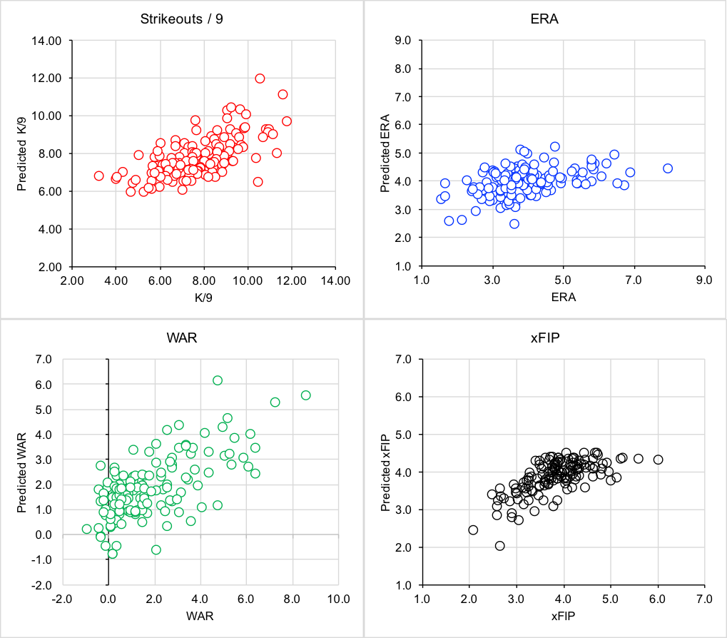
In general, the Arsenal score was a better predictor of pitcher performance than Stuff. Arsenal scores had higher R2 values when predicting xFIP, WAR and K/9, with Stuff having a slightly higher R2 value for ERA (Table 1). The new combined model was a better predictor than either metric alone, with the greatest improvement seen for WAR (an 11% increase in explained variance compared to a single input variable).

The combined Arsenal-Stuff model performed the best when predicting xFIP (accounting for 46% of the variance in xFIP). Predicted vs. actual values can be found in figure 1 for all result variables.

Table 1. R2 values between the input variables of Stuff / Arsenal Score, and result values of ERA, K/9, WAR, and xFIP. R2 values are also presented for the combined model, which uses both Arsenal Score and Stuff as an input.

  ERA K9 WAR xFIP
Stuff 0.14 0.17 0.27 0.13
Sum Arsenal 0.12 0.37 0.33 0.44
Combined Model 0.19 0.41 0.44 0.46

stuff and arsenal

Figure 1. Relationships between predicted K/9, ERA, WAR, and xFIP and actual values. All predicted values are determined from a model that uses both Arsenal scores and the Stuff metric.

Player Identification

As a post-hoc analysis, I calculated the difference between predicted values and actual values. For ERA and xFIP, a lower value indicated the player’s predicted ERA or xFIP was lower than their actual results, which, could indicate that the player may perform better in 2016. A higher value may indicate that the pitcher may not have as favourable of results in 2016. The analysis is the opposite for K/9 – with higher values indicating that the pitcher should be expected to strike out more batters in 2016.

Table 2. The top 10 and bottom 10 predicted ERA errors. The top 10 represents pitchers who can be expected to have better results in 2016, with the bottom 10 predicted to perform with less success in 2016.

  Rank Pitcher ERA Difference Predicted ERA ERA Arsenal Score Stuff
Room for Improvement 1 Chris Capuano -0.80 4.44 7.97 0.19 -0.62
2 Bud Norris -0.74 3.85 6.72 1.15 0.81
3 Keyvius Sampson -0.67 3.92 6.54 0.11 0.89
4 Hector Noesi -0.61 4.28 6.89 -2.06 0.41
5 Carlos Carrasco -0.48 2.45 3.63 14.33 1.43
6 David Hale -0.47 4.15 6.09 2.36 -0.35
7 Archie Bradley -0.46 3.97 5.80 1.51 0.38
8 Matt Garza -0.45 3.88 5.63 -0.92 1.25
9 Matt Moore -0.38 3.92 5.43 0.90 0.66
10 Michael Lorenzen -0.38 3.90 5.40 -0.59 1.10
Due for Regression 121 Jerad Eickhoff 0.29 3.76 2.65 2.05 0.85
122 Josh Tomlin 0.31 4.36 3.02 0.90 -0.58
123 Jake Arrieta 0.31 2.56 1.77 7.22 2.95
124 Jaime Garcia 0.33 3.63 2.43 4.14 0.67
125 David Price 0.34 3.70 2.45 1.61 1.11
126 Dallas Keuchel 0.34 3.76 2.48 6.04 -0.19
127 Brandon Morrow 0.36 4.28 2.73 -1.89 0.37
128 John Lackey 0.38 4.46 2.77 -2.30 -0.04
129 Steven Matz 0.44 4.02 2.27 1.02 0.36
130 Zack Greinke 0.52 3.45 1.66 3.04 1.48

Table 3. The top 10 and bottom 10 predicted xFIP errors. The top 10 represents pitchers who can be expected to have better results in 2016, with the bottom 10 predicted to perform with less success in 2016.

  Rank Pitcher xFIP Difference Predicted xFIP xFIP Arsenal Score Stuff
Room for Improvement 1 Allen Webster -0.40 4.30 6.02 -0.95 -0.95
2 Archie Bradley -0.34 3.85 5.15 1.51 0.38
3 Henry Owens -0.33 3.77 5.01 1.93 0.62
4 Carlos Carrasco -0.32 2.02 2.66 14.33 1.43
5 Hector Noesi -0.30 4.33 5.61 -2.06 0.41
6 Jarred Cosart -0.25 3.57 4.46 3.15 0.99
7 Keyvius Sampson -0.24 3.99 4.97 0.11 0.89
8 Garrett Richards -0.24 3.06 3.80 6.44 1.69
9 Matt Moore -0.23 3.91 4.81 0.90 0.66
10 Chi Chi Gonzalez -0.21 4.36 5.26 -1.98 0.00
Due for Regression 121 Chris Sale 0.15 3.08 2.60 6.49 1.49
122 Joe Blanton 0.16 3.56 3.01 3.99 -0.15
123 Jose Quintana 0.16 4.18 3.51 -0.91 0.33
124 Dallas Keuchel 0.16 3.29 2.75 6.04 -0.19
125 Tyler Duffey 0.16 4.35 3.64 -2.35 0.56
126 Clay Buchholz 0.17 3.98 3.30 0.40 0.57
127 Brett Anderson 0.18 4.29 3.51 -2.10 0.92
128 Jose Fernandez 0.19 3.24 2.62 5.38 1.33
129 Michael Pineda 0.19 3.65 2.95 3.07 0.26
130 Stephen Strasburg 0.20 3.35 2.69 4.40 1.61


Table 4. The top 10 and bottom 10 predicted K/9 errors. The top 10 represents pitchers who can be expected to have better results in 2016, with the bottom 10 predicted to perform with less success in 2016.

  Rank Pitcher K9 Difference Predicted K9 K9 Arsenal Score Stuff
Room for Improvement 1 Tyler Wilson 0.52 6.76 3.25 -0.76 -0.55
2 Chi Chi Gonzalez 0.39 6.61 4.03 -1.98 0.00
3 Jose Urena 0.39 6.70 4.09 -1.99 0.24
4 Cody Anderson 0.38 7.01 4.34 -0.47 -0.12
5 Scott Feldman 0.36 7.91 5.07 1.52 0.71
6 Jarred Cosart 0.29 8.49 6.07 3.15 0.99
7 Aaron Sanchez 0.26 8.09 5.95 1.25 1.37
8 Archie Bradley 0.25 7.78 5.80 1.51 0.38
9 Kyle Ryan 0.25 6.39 4.79 -0.85 -1.42
10 Allen Webster 0.25 6.54 4.94 -0.95 -0.95
Due for Regression 121 Stephen Strasburg -0.20 9.10 10.96 4.40 1.61
122 Chris Archer -0.21 8.83 10.70 3.77 1.39
123 Tyler Duffey -0.22 6.72 8.22 -2.35 0.56
124 Chris Sale -0.22 9.66 11.82 6.49 1.49
125 Ian Kennedy -0.23 7.55 9.30 0.18 0.79
126 Vincent Velasquez -0.24 7.55 9.38 -0.11 1.00
127 Nate Karns -0.27 7.01 8.88 -1.35 0.54
128 Lance Lynn -0.28 6.70 8.57 -2.27 0.45
129 Drew Smyly -0.34 7.75 10.40 2.16 -0.17
130 John Lamb -0.62 6.49 10.51 -2.09 -0.24

Discussion

This new model which incorporates both the Stuff metric and the Arsenal score improves predictions of ERA, xFIP, K/9 and WAR. By combining both of these metrics, the new model incorporates both the action of a pitch, plus the ability of a pitcher to induce swings and misses and ground balls.

Examining the player rankings to determine which pitchers are both under-performing and over-performing based on the new model’s predictions, there are some interesting names that show up. Carlos Carrasco appears to be due for improvement based on ERA and xFIP. Matt Moore is slowly returning from injury, but could see improvements in 2016 based off of his Stuff and Arsenal scores.

While pitchers like Zack Greinke, David Price, and Dallas Keuchel appear on the list of pitchers who could see regression in 2016, this is more due to the fact that they had otherworldly, perhaps outlier seasons, than it is a commentary on them pitching above their ability. Zack Greinke has gone on the record saying that his 2015 season was an outlier, and “that he may not actually be that good (Rodgers, 2016)”.  For Blue Jays fans, it is exciting to see how Aaron Sanchez’s stuff predicts he will have a better K/9 next season – though it’s to be seen whether he will pitch as a starter or reliever.

This model, much like the previous evaluations of Stuff and Arsenal scores, does not factor in control, deception or pitch sequencing. While model performance is strong, there is room for improvement of greater than 50% of explained variance. Pitching is complicated, and to achieve better predictions, models will need to grow increasingly complicated.

Conclusion

The combined Stuff/Arsenal score model improves predictions of ERA, xFIP, K/9 and WAR over the individual metrics on their own. This model was used to identify possible candidates for improvement and regression in the 2016 season. Future work should include a variety of more complicated measures to account for control, deception and additional game factors.

References

Rogers, J., 2016.  Zack Greinke on furthering his 2015 domination: ‘I’m probably not that good’. Retrieved from:

http://www.sportingnews.com/mlb-news/4695603-zack-greinke-stats-diamondbacks-projection-cy-young-chances, on February 21, 2016.

Sarris, E., 2016. The Change: Arsenal Scores. Retrieved from: http://www.fangraphs.com/fantasy/the-change-arsenal-scores/, on February 2, 2016.

Sonne, M.W., and Mulla, D., 2015. Revisiting the “Stuff” Metric. Retrieved from http://www.mikesonne.ca/baseball/22/, on December 21, 2016.

Additional Information

Difference between predicted and actual values – all pitchers included in the analysis.


Top 5 Fantasy Starting Pitching Prospects for 2016

For this list there will be two requirements:

  1. The players under consideration must not have thrown even a single pitch in the major leagues. This throws out notable names such as Steven Matz, Jon Gray, and others who have already done so.
  2. The players under consideration must be projected to graduate from the prospect label in 2016 and have a significant influence on a major-league team. This throws out notable names like Julio Urias, Lucas Giolito, and others who are projected to be unlikely call-ups for the 2016 season.


So here we go, my projections for the top five pitching prospects you should keep an eye on for your fantasy team in 2016.

1. Tyler Glasnow

Team: Pittsburgh Pirates

Throws: Right

Height/Weight: 6’8”/225

Age: 22

Projected Path: Opening day rotation

Rundown: Nobody in this year’s projected rookie class boasts a bigger frame or, more importantly, a bigger fastball than Glasnow. Standing at an intimidating 6’8”, Glasnow is known to be able to pound the catcher’s mitt repeatedly with an upper 90s fastball that routinely overpowers hitters. MLB.com gives his fastball a 75 on the 20 to 80 scale, a truly remarkable grade. Add that to an above-average power curveball and an improving changeup, and it is easy to see why scouts rave about this guy’s immense upside.

But really, who cares about what scouts think? Not me, and neither should you. Let’s check out some upper-minor-league numbers Glasnow produced in 2015. Glasnow’s largest body of work in 2015 came in AA where he threw an even 63 innings over a span of 12 starts. Here he struck out a remarkable 33.1% of batters while only walking a respectable rate of 7.7% of batters he faced. His strikeout rate was tied with fellow highly-touted right-hander Jose De Leon for tops in all AA leagues among pitchers who threw at least 60 innings. Throw in his respectable walk rate, and he led all AA pitchers with the same inning restrictions in K-BB%. In AA he had an ERA of 2.43 while only stranding 66.4% of baserunners, a statistic generally attributed to luck. Again the average LOB% from 2015 was 72.3%, so one can assume he was a little unfortunate giving up some of those runs. With that said, his ERA could have easily looked more like his FIP which was an outstanding 1.98.

Either way, Glasnow proved to be dominant in AA and was later called up to the next level. In 43 innings of AAA ball he struck out a similarly great 27.6% of hitters. He walked some extra guys, leading to a high 12.6% BB%. Unsurprisingly, he was able to strand more runners in AAA, 73.3% of them to be exact, and yielded a 2.20 ERA. His FIP was 2.82.

Final take: Go get this guy. If he’s available late for a cheap price, Glasnow could be the ultimate diamond found in the rough. His best strength is in his strikeout numbers which plays really well for fantasy. The only weakness to his game is the walks. If he can find a way to limit walk totals, Glasnow could join the conversation for top young arms in 2016 and beyond.

2. Jose Berrios

Team: Minnesota Twins

Throws: Right

Height/Weight: 6’0”/190

Age: 21

Projected Path: Opening day rotation

Rundown: Perhaps more polished than Glasnow, Jose Berrios is a very strong name to have on your radar. As an undersized righty, Berrios hits mid-90s with his fastball, but will mainly live in the lower 90 range. He also throws a slurve-like breaking ball with various velocities as well as an above-average changeup. The best thing about Berrios is his plus command. As a 21 year old, he walked only 6.5% and 4.7% of batters in 90⅔ innings in AA and 75⅔ innings in AAA respectively. His strikeout numbers were also strong with a 25.1% mark in AA and a 27.7% effort in AAA. An interesting note on Berrios was his major improvement from AA to AAA. His K-BB% improved by 4.5%, as well as his FIP and ERA numbers.

Final Take: I was going back and forth for quite sometime trying to decide who was more valuable between Berrios and Glasnow. In the end I chose Glasnow mainly due to the unprecedented strikeout potential as well as the national league benefit. However, that by no means says that Berrios can’t be better. Led by his impressive ability to limit walks, go into your draft with Berrios’ name in mind.

3. Blake Snell

Team: Tampa Bay Rays

Throws: Left

Height/Weight: 6’4”/180

Age: 23

Projected Path: Opening day rotation

Rundown: Blake Snell is one of the most intriguing names in the prospect heap for 2016, partly because he came into the year as a relatively unknown 22-year-old in the Tampa Bays Rays A+ affiliate. The other part is that in 2015 he didn’t let up a run until his 50th inning of work. He escaped A+ ball in 21 innings without letting up a run and then rattled off another 28 scoreless innings in AA. Eventually though, he did prove to be human as he let up a first-inning home run to the Cubs’ Wilson Contreras ending his scoreless inning streak at 49. Nevertheless, he put up astounding numbers across three levels of the minor leagues in 2015.

Like Glasnow, Snell’s best tool is his ability to strike hitters out. He does this with a low to mid-90s fastball as well as an above-average slider and changeup. His biggest flaw is the walks, as he walked over 10% of the batters he faced in both AA and AAA. Like Berrios, he posted his best K-BB% numbers in AAA. In 44⅓ there he struck out 33.3% of batters and only walked 7.6%, good for an incredible 25.7% K-B%. Although it is very difficult to project his basic run-prevention skill without the aid of batted-ball type or velocity, he certainly excelled in that area in 2015. In 21, 68⅔, and 44⅓ innings in A+, AA, and AAA his ERA was 0.00, 1.57 and 1.83 respectively.   

Final Take: Like I said at the beginning, Blake Snell is intriguing. Walks will hold him down, strikeouts will bring him up. If you like what see take a shot and thank me later. He has the potential of an elite starter.

4. Jose De Leon

Team: Los Angeles Dodgers

Throws: Right

Height/Weight: 6’2”/185

Age: 23

Projected Path: Mid/late season call up

Rundown: The only thing holding De Leon back from being closer to the top of this list is the Dodgers’ management. Most likely, he will not make the team out of camp and will head to AAA to start the year.  However, due to the Dodgers’ thin staff and postseason desperation, De Leon is bound to make a splash sometime in 2016. As mentioned earlier, he was tied with Tyler Glasnow in K% in AA during the 2015 season among pitchers with more than 60 innings pitched. De Leon pitched a total of 76⅔ innings at the AA level through 16 starts. Before that, also in 2015, he threw 37⅔ innings at the A+ level. He put up ridiculous numbers there, striking out batters at a rate of a nearly unheard of 40% while only walking 5.4% of hitters. His walk rate increased a little bit in AA, but he still boasts better command than the likes of Glasnow and Snell. De Leon pairs his low to mid-90s fastball with a slider and changeup.

Final Take: Although De Leon is unlikely to make the team out of spring camp it is worth keeping this guy on your fantasy radar. Pay attention for any news on a potential call-up, and if you find any, don’t waste time to add him to your roster. In deeper formats, De Leon certainly deserves a late-round draft choice.

5. Josh Hader

Team: Milwaukee Brewers

Throws: Left

Height/Weight: 6’3”/160

Age: 21

Projected Path: Mid/late season call up

Rundown: After coming to the Brewers in the Carlos Gomez deal, Hader quickly improved his prospect stock by increasing his K-BB% by almost 10% with the move from the Astros AA affiliate to the AA affiliate of the Brew Crew. Although he started his only 7 games with Milwaukee, Hader spent time both starting and coming out of the pen before the deal in Houston. Over there he was not nearly as impressive with a higher BB% as well as significantly lower K% in 65⅓ innings. Like I promised, things got better in his 38⅔ innings for the Brewers in AA. Hader struck out a robust  32.9% of hitters while only walking 7.2%. Overall, Hader finished sixth in K-BB% among starters under 25 in AA who logged more than 60 innings. Hader pairs his mid-90s fastball with an average changeup and curveball. Due to his shot forward with the Brewers, and the lack of organizational pitching skill combined with likely trades of veterans either during the offseason or before the July trade deadline, Hader could be looking at a potential midseason call-up where his ability to get strikeouts would be an asset, especially in the NL. On top of this, Hader has better command than most 21-year-olds.

Final Take: Hader’s upside is real. A strong fastball, paired with above-average command bodes well for National League pitchers. Now all he has to do is continue his success in the minor leagues for the Brewers, and he will almost certainly see a call-up to the big-league rotation. If this happens make sure you remembered his name.

If you enjoyed this article be sure to check out our website www.analyticfb.com and our instagram @fantasybaseballanalytics!

Stats and research courtesy of FanGraphs and MLB.com


Get Nasty: Quantifying a Pitcher’s “Stuff”

This article was co-authord by Daanish Mulla (@DanMMulla)

A New York Times article by John Branch in October 2015 discussed the elusive definition of the pitching term “stuff”. Talk of “plus stuff” and feelings of “all the stuff being there” was scattered throughout the article. Despite interesting commentary discussing the ability for pitchers to over-power hitters, there was no true definition of the nastiness of a pitcher’s stuff.

Earlier this November, Eno Sarris wrote an article examining who had the best changeup in the 2015 season. This was evaluated by looking at the difference in speed and movement with respect to the pitcher’s fastball. This made us think, to truly quantify “stuff”, you would first need to understand what goes into a pitcher having a truly dominant repertoire.

Our definition of a pitcher’s “stuff”, or their overall nastiness, was based on three different factors: 1) fastball velocity; 2) change of velocity of a secondary pitch with respect to the fastball; and 3) movement with respect to the fastball. We downloaded all of FanGraphs’ PITCHf/x data from 2008 to 2015 to attempt solving this problem.

For a pitch to qualify for this analysis, it had to be thrown by an individual pitcher at a frequency equal to, or greater than, the average frequency for that pitch to be thrown throughout the entire data set. For example, in our data set, the curveball was thrown at an average of 12% of the time by all pitchers. Thus, a pitcher’s curveball was only considered if it was thrown at a frequency of greater than or equal to 12%. We then determined the maximum and minimum velocity for all eligible pitches for each pitcher. Working off of the fastball, we then determined the maximum change in movement in both the X direction, and the Z direction, for any qualifying pitches. We then calculated the maximum resultant movement for these values. Z-scores were then calculated and summed from the following factors to get a final pitcher “stuff” score: 1) maximum velocity; 2) change in velocity between maximum and minimum velocity; and 3) maximum resultant movement.

Here is an example as to how a pitcher with elite stuff performed in this analysis. David Price had a great year with the Blue Jays and Tigers. From FanGraphs data, his maximum pitch velocity was 94.1 mph, and the minimum pitch velocity was 85.2 mph – a difference of 8.9 mph. Working off the fastball, the greatest x direction break on a pitch was 15.1”, and the greatest z direction break was 10.9”.  This produced a resultant change in movement of 18.6”.

These values translated to a z scores for velocity, change in velocity, and resultant movement of 0.969, -0.08, 0.91, resulting in a stuff value of 1.80. Comparatively, another Blue Jays starter who struggled in 2015 was Drew Hutchinson. Hutchison had a fastball velocity of 92.4 mph, an offspeed pitch of 84.3 mph, an x direction break of 7.1, and a z direction break of 9.8. Corresponding z scores for velocity, change in velocity, and resultant break were 0.392, -0.24, -0.08, resulting in a stuff value of 0.1.

To break down how well our stuff rating was performing, we correlated stuff with K/9. Pitchers included in this analysis were all starting pitchers who pitched 90 innings in a season, between the 2008 and 2015 season. Average stuff and average K/9 was calculated during this time. Overall, the correlation was r = 0.42 (Figure 1). For the sake of these graphs, knuckleballers Tim Wakefield and R.A. Dickey were not included, as the stuff metric had them rated lower than -4 per season.

View post on imgur.com

Figure 1. Stuff vs K/9, between the 2008 and 2015 MLB season.

Here’s the top 25 starting pitchers from the 2015 season ranked by their stuff. While overall, we think this is a good starting point for evaluating a pitcher’s repertoire, there are a few notable pitchers that the stuff calculation doesn’t seem to do justice. Chris Archer, who has had his slider called one of the best pitches in all of baseball, has only a 1.12 stuff value, and is ranked as having the 67th best stuff. Max Scherzer, who threw two no-hitters, is ranked as only having the 60th best stuff.

View post on imgur.com

Table 1. Top 25 stuff for pitchers, with raw data on velocity and break

What’s worth stressing however, is that this metric serves to evaluate the individual pitches within their repertoire. There are pitchers which would be scouted to have the ability to throw hard, with lots of break. Pitching is clearly an art form that involves more than those two things, thus players like Mark Buerhle (-2.7), are clearly someone who has mastered the art of pitching, without having great stuff.  When comparing stuff against xFIP, correlation coefficients are smaller (r = -0.33) (Figure 2). Much like K/9 does not directly predict pitcher success, neither does stuff.

View post on imgur.com

Figure 2. Stuff vs. xFIP, between the 2008 and 2015 season.

We believe there’s great use for this metric. We think this metric can provide insight into how stuff changes with age, how stuff changes after a pitcher is injured, and how it can let a coach know when a player has returned to pre-injury form, and how a pitcher’s consistency with their stuff relates to success. As with any ranking that appears on the FanGraphs website, we’re sure that there will be debate – however, we are looking forward to the input from the community into how we can improve this technique.

References

Branch, J. (2015). The Mysteries of Pitching, and All That ‘Stuff’. Posted online, October 3, 2015. http://www.nytimes.com/2015/10/04/sports/baseball/the-mysteries-of-pitching-and-all-that-stuff.html

Sarris, E. (2015). The Best Changeups of the Year by Shape and Speed. Posted online, November 9, 2015. http://www.fangraphs.com/blogs/the-best-changeups-of-the-year-by-shape-and-speed/


Pitchers Recovering From Serious Arm Injuries

Pitchers Recovering From Arm Injuries

Introduction

With arm injuries becoming more and more prevalent in Major League Baseball, teams frequently have to figure out what kind of performance to expect from a pitcher coming back from a serious injury. In this study I set out to see how pitchers perform in their first two years after surgery compared to their pre-surgery form.

Overview

I looked at a sample of 39 starting pitchers, encompassing 42 seasons, over the past 10 years that missed a significant amount of time due to an elbow or shoulder injury. I then compared their performance in the last healthy season to their first healthy season back and the season immediately after it. To be considered a “healthy season” for this study a pitcher had to throw at least 80 innings. I did this to get a more accurate indication of the pitchers performance in their last season and first season back, and to not include small samples if a pitcher got hurt in April or came back in September. If a pitcher had no “healthy season” back then I used the season with the most MLB innings out of the two seasons after injury. I excluded all pitchers that never returned to the majors from the study.

To judge pitchers performance I looked at five things: ERA, FIP, strikeout percentage, unintentional walk percentage, and average FB velocity. I chose these measurements because I believe they show the pitchers overall effectiveness (ERA, FIP), stuff (K%), command (UBB%), and arm strength (FB velocity).

I also broke down the data by elbow and shoulder injuries. It is an accepted belief in baseball that shoulder injuries are worse than elbow injuries and harder to come back from. I wanted to see how much harder it was to come back from, and if the statistical decline for pitchers with shoulder injuries was greater than those with elbow injuries.

All Pitchers

ERA

FIP

K%

UBB%

Avg. FB Velocity

Total Last Healthy Season

3.78

4.08

18.75%

7.63%

91.08

Total First Season Back

4.23

4.17

18.58%

7.29%

90.19

Total Second Season Back

3.72

3.78

18.96%

6.80%

90.33

As you can see in the chart above, the ERA and FIP of pitchers in their first year back are higher. Strikeout rates also showed a substantial decline, while walk rates actually improved. The average fastball velocity for these pitchers also decreased as you would expect. The fact that strikeout rates went down by .17% might not seem like a lot, but when you take into account that strikeout rates have been going up steadily over the past ten years, it is actually a larger gap in performance.

MLB Average Strikeout Percentage

2005 2006 2007 2008 2009 2010 2011 2012 2013 2014
16.5% 16.8% 17.1% 17.5% 18.0% 18.5% 18.6% 19.8% 19.90% 20.40%

Naturally, the first full healthy season back is generally 2-3 years after the injury. If they were keeping up with the league average their strikeout percentage should actually go up about about a percentage point, so what looks like a small decrease is in fact quite significant. As for walk rates, there are two competing factors in play. Often times increased wildness is a sign of a larger problem; therefore an elevated walk rate in the season a pitcher blew out could have been an indication of a looming issue. Consequently, walk rates in the last season before surgery may be higher than a pitchers normal level, and by getting their arm fixed, it would gravitate back to their typical performance. The competing philosophy is that control is the last thing to return after elbow or shoulder surgery. Looking pitcher by pitcher it was a 50/50 split with 20 having their walk percentage increase, 20 decrease, and 2 remaining essentially the same in their first year back.

Pitchers in their second year back improved greatly, showing improvements across the board. The sample in year two went down to 26 of the 42 pitcher seasons we started out with. Some dropped out due to age (John Smoltz), re-injury (Johan Santana), or 2014 being their first year back (Michael Pineda). One reason why the numbers in the second post-surgery year improve so much is that to make it to year two you probably had some modicum of success in year one. The pitchers that failed to come back to their pre-surgery form (Mark Mulder, Jason Schmidt, etc.) had their poor stats affect the first year after surgery numbers but are washed out of the second year numbers. Even taking this into account, there are definitely some substantial improvements in year two. Eighteen of the 28 pitchers lowered their ERA in their second season after surgery.

Elbow Injuries

Elbow injuries are generally considered less serious than shoulder injuries. The success rate of coming back from Tommy John surgery is pretty high now, with some people even going as far as to say that pitchers come back stronger after getting it done. The numbers do in some way back that notion as pitchers in their second year post-surgery posted better numbers then they did before getting hurt.

ERA

FIP

K%

UBB%

Avg. FB Velocity

Last Healthy Season Elbow

3.75

3.99 19.42%

7.98%

91.49

First Season Back Elbow

4.06

4.03

19.22%

7.49%

91.04

Second Season Back Elbow

3.60

3.61

19.77%

6.79%

91.38

As you can see in the table above, pitchers do struggle a bit in their first season back, but in year two not only do they improve based on the previous year, they also improved their pre-surgery statistics in all aspects except a small decrease in average FB velocity. Looking specifically at the 18 pitchers that had two seasons after elbow surgery, 11 of the 18 improved their ERA the second season after surgery. Although the data was split regarding average velocity and K%, with about half the pitchers having better numbers the first year after surgery and half the second season, many showed a substantial improvement in their walk rate in season two. This is interesting since it does support the belief that control is the last thing to come back post-surgery.

Shoulder Injuries

Shoulder injuries are believed to be much more damaging to a pitcher’s future than elbow injuries. Part of the reason for this is that Tommy John is so prevalent now, and you see so many people come back from it, it is considered in some ways a routine surgery. Shoulder injuries on the other hand are less frequent and in recent memory we have seen it more or less end the careers of big time pitchers like Mark Prior and Brandon Webb. The numbers in this small study do show that pitchers with shoulder injuries are less likely to get back to a full season of pitching than those with elbow injuries. Eighteen of the 21 (86%) pitchers I looked at with elbow injuries returned to a full season work load (with Brett Anderson still a possibility to get there), while only 11 of 19 (58%) of those with shoulder injuries (Michael Pineda could still do it moving forward) rebounded to even make it over the 80 inning bar one more time in their career.

A couple of pitchers (Johan Santana and Chris Young) who did make it back had another significant shoulder injury during their comeback seasons, although Young made another return to the majors in 2014 after another missed season rehabbing. These numbers also don’t include pitchers like Prior, Webb, Matt Clement, etc. who were established big leaguers at the time of their shoulder injury never to return to Major League Baseball again.

ERA

FIP

K%

UBB%

Avg. FB Velocity

Last Healthy Season Shoulder

3.79

4.13

18.18%

7.30%

90.36

First Season Back Shoulder

4.49

4.35

17.79%

6.95%

89.08

Second Season Back Shoulder

3.94

4.09

17.48%

6.81%

88.93

The numbers do back up the assertion that shoulder injuries are tougher to recover from than elbow injuries. Pitchers who had shoulder injuries had a steeper drop off their first year after surgery, and failed to rebound to the degree that pitchers with elbow injuries did. If you are a team with a young ace who had shoulder surgery, the beacon of hope is Anibal Sanchez. Sanchez went down with a labrum injury during his rookie season in 2006, and although it took him a few years to recover, over the past five seasons he has been pretty durable consistently supporting a mid 3 ERA, including the 2013 season where won the American League ERA title.

Conclusion

Overall this research backed up most of the common thoughts around the game. Pitchers with elbow injuries generally recovered quicker and more effectively than those with shoulder injuries. The biggest improvement from year one to year two after surgery appears to be with walk rates, as a pitcher’s control is often the last thing to come back after being off the mound for so long.

Although Tommy John surgery does have a high success rate, there are pitchers that never really regained their pre-surgery form. Conversely, shoulder surgeries do have a greater negative impact on pitcher performance, but for every Mark Prior and Brandon Webb there is an Anibal Sanchez or Chris Carpenter that returned and went on to have very productive careers. Obviously there are no certainties in medicine, so franchises shouldn’t expect a guaranteed return for pitchers coming off elbow surgery, or automatically disregard pitchers who underwent shoulder surgery.

In fact, there might even be an opportunity for clubs to take a chance on a free agent pitcher a couple of season removed from shoulder surgery with a low-risk high upside deal. The demand for these pitchers is usually low with all of the uncertainly involved with shoulder injuries. If the deal doesn’t work out there isn’t much invested, but if it does, a team might be able to get a guy like Freddy Garcia who won 12 games in 2010 and 2011 while only making $1 million and $1.5 million those two years since he was coming off of labrum surgery. Pitchers coming off shoulder injuries probably aren’t guys you want to pencil in and count on for 200 innings, but for the money involved they could be low cost lottery tickets that could pay off big for a team.


Democratic and Fascist Pitchers

As we all know from the movie Bull Durham, strikeouts are fascist and groundballs are democratic.  So, I want to set out to find the most democratic pitchers and the most fascist pitchers out there.  Luckily, FanGraphs offers a custom leaderboard page that includes batted-ball data.

I set the filters to allow a K/9 rate of 5 or less in a game, a groundball percentage of 50% or greater, and a minimum innings-pitched threshold of 500 innings from 2002-2013.  I realize that five strikeouts a game is kind of arbitrary but I wanted to focus on pitchers who were striking out a batter about every two innings.  You can see the leaderboard for the most democratic pitchers from 2002-2013.

Based on that leaderboard, Aaron Cook should be considered the most democratic pitcher of the twelve-year span, based on his 3.7 K/9 and 57.5% groundball rate.  So, there’s that on his mantle.  Although, I still get confused trying to figure out how Cook was successful. Some other options for most democratic pitcher could be Jake Westbrook and Chien-Ming Wang.  Westbrook had a higher K/9 than Cook but also a higher GB%.  Wang was only slightly higher than Cook on his K/9 but induced groundballs at a slightly higher rate, too.  If you want to say Wang should be more democratic than Cook, far be it from me to stop you.

But, I also wanted to look at pitchers who have had democratic seasons during the span.  So, I created another leaderboard.  Not surprisingly, Cook appears near the top of the leaderboard in terms of value for his democratic season.  Tim Hudson had the most valuable democratic season in 2004, having an fWAR of 4.9.  The difference between 4.9 and 4.5 fWAR, that Cook put up in 2008 is probably not statistically significant.  I feel confident in saying that Aaron Cook is the most democratic pitcher for which we have comprehensive data.

On the flip side of this, I wanted to see who would be considered the most fascist pitchers for which we have data.  To set the parameters, I chose a K/9 of greater than or equal to 10.8 (represents 40% of 27, or how many outs a pitcher can get in a ball game) and a GB% of less than 40% with the same innings requirement as before.  The leaderboard can be found here.

Based on the leaderboard, there are only two fascist pitchers out there: Octavio Dotel and Carlos Marmol.  For some baseball fans, they are essentially the same pitcher and based on the rate stats it is hard to tell them apart.  Dotel was more valuable somehow being able to register a lower FIP than Marmol and pitching about 70 innings more.  So, Dotel is probably a little more fascist based on this stat.

Looking at individual seasons, I chose the same rates but with a minimum of 60 innings pitched.  The leaderboard for individual seasons has a handful of seasons registered by starting pitchers.  By and large, though, these types of seasons are usually only put up by relief pitchers.  Max Scherzer, Rich Harden, and Oliver Perez had more or less the same season in terms of value.  But Rich Harden’s season in 2008 is absolutely stunning.  Look at that low GB%, look how fascist it is.  There are a couple of pitchers on the individual-season list who don’t meet the 500-innings mark in Aroldis Chapman and Kenley Jansen who could also be in the running for most fascist pitchers.  Harden’s individual season was the most fascist, for the purpose of this exercise.  It seems unlikely that a starting pitcher can survive with such a low GB% or keep up such a high K/9 over the course of his career, or a number of seasons.