Archive for jose fernandez

Poking Holes In Some of the Best Players of 2016

We are reaching the end of the 2016 fantasy-baseball season, which means two things: 1) It’s time to look ahead to next season a bit, and 2) the sample sizes on many metrics are either stabilized or right around the corner from stabilizing.

With that in mind, let’s take a look at a few of players who are sure to be trendy draft picks in 2017, and see what their potential downfalls might be. This is not to say to avoid these players, but rather to spot a potential weakness so that if you do draft this player, and they start to struggle you can maybe know why, and see if it is a recurring issue, instead of just a bit of bad luck. Let’s meet our contestants:


Rougned Odor

In many ways Rougned Odor has had his coming-out party this season. He has hit 31 home runs through 135 games, adding in 12 steals, to go along with a .282 batting average, and strong production (85 runs and RBI each). He’s been the fifth-best second baseman by the ESPN player rater, and that’s with two players (Daniel Murphy and Jean Segura) with multiple positions above him in the ranks. He even got famous on the national scene with his punch heard round the hot-take tables in May.

However, when looking at his plate discipline, it has somehow got even worse than it was last year. His walk rate has dropped to 3.0 percent (17 walks all season!), while his strikeout rate has climbed above 20 percent (20.9, to be exact). His swing rate on pitches outside the zone is seventh in all of baseball, while his contact on those pitches outside the zone isn’t even in the top 80. That’s a dangerous duo. Talented players who hit the ball as hard as Odor can sustain success while flailing that much for a little while, but in the long haul, it almost always burns you. Odor could certainly make strides to improve his discipline, but coming off the season he is having, why is he going to try to change anything? He may well need a rough season, or at least rough couple of months, to admit he needs to fix the holes in his swing, and you don’t want to deal with that when he does.


Jon Lester

With a record of 16-4 and a 2.51 ERA, Lester is having arguably the best season of his career. He’s a candidate for the Cy Young, and currently trails only Noah Syndergaard and teammate, Kyle Hendricks, in the race for the lowest ERA in all of baseball. There are plenty of signs for regression, though.

For starters, Lester is 32, and while left-handed pitchers seem to age like a fine wine sometimes, that’s only because we forget about the guys who crash and burn and are out of the league by 34. Now Lester is showing no real signs of aging, but he also has signs of regression elsewhere.

His left-on-base rate is currently leading all qualified pitchers, at 85.5 percent. That’s more than 10 percent higher than his career rate, and by far the highest percent of his career. That’s especially amazing considering Lester can’t even throw to first base, meaning runners should be moving around the bases faster on him if anything. He is also one of the FIP-ERA leaders, thanks to a well below-average opponent BABIP (.257).

There’s also the fact that, while not by a huge margin, Lester’s strikeout rate has also dropped this season, while the rest of the league is striking out more batters than ever. If you’re already going to get some regression in terms of ERA and wins, you best not be losing strikeouts, as well.

I don’t think Lester is going to fall off a cliff, but I also don’t think he’ll be repeating his 2016 performance next year.


Michael Fulmer

We’ll start with the most obvious candidate for overdrafting. Fulmer will be a 23-year-old, (likely) coming off an American League Rookie of the Year Award, and pitching for a strong Tigers team. He may well win the AL ERA crown, and will easily have a winning record. Heck, he’s got an outside shot at a Cy Young in what has been a weak year for AL pitchers.

That being said, there are some definite weak spots in his profile, the most obvious being his FIP-ERA. If one were to simply go to the FIP-ERA leaderboard — a good spot to at least start to find potential regression candidates — Fulmer’s name is sitting there in fourth, trailing only Kyle Hendricks (borderline historic ERA), Brandon Finnegan (a guy who would have certainly made this list if he were famous enough), and Ian Kennedy (a professor at Hogwarts in the baseball offseason).

It’s more than just the FIP with Fulmer, though. His left-on-base rate is over 80 percent (81.3, to be exact), and his opponent BABIP is just .251. He allows over 30 percent hard-hit rate and his line-drive rate allowed is nearly 20 percent, which while not terrible, do not portend a Cy Young winner.

With Fulmer, it’s more an accumulation of slights rather than one big one, combined with the fact that he will be an extremely trendy pick. There’s no reason to believe he won’t finish the year 13-8 with a 3.35 ERA and 140 strikeouts, but you’ll have to pay for much better stats than that to land him.


Ryan Braun

Like all of the players on this list, Braun is having one of his best seasons in 2016, which is saying something for the six-time All-Star. Braun is hitting .310 with 27 home runs, both of which are his highest since 2012. He has also stolen 14 bases, and only been caught three times, impressive for a 32-year-old.

But it’s not Braun’s age that is troubling (although it is obviously worth remembering come draft day); it’s his ground-ball rate. Braun is seventh in all of baseball in ground-ball rate, surrounded by names like Jonathan Villar and Cesar Hernandez. He has hit ground balls on 55.6 percent of the balls he has put in play in 2016, and has only hit fly balls on 25.4 percent. Because of that, it’s hard to imagine his home-run totals staying as high as they are right now in 2017.

Braun is currently sporting a HR/FB rate of 28.4 percent, highest in the major leagues. Ask Jose Abreu owners what it is like to own the reigning HR/FB rate champion. Here’s how the last four HR/FB rate champions fared the next season:

2012 Adam Dunn – 41 HRs; 2013 Adam Dunn – 34 HRs

2013 Chris Davis – 53 HRs; 2014 Chris Davis – 26 HRs

2014 Jose Abreu – 36 HRs; 2015 Jose Abreu – 30 HRs

2015 Nelson Cruz 44 HRs; 2016 Nelson Cruz 35 HRs (with 18 games to go)

Only Chris Davis fell off the earth, but none of the four went up. If you’re buying on Braun’s power, you’re basically buying at its highest point, which is never a good idea. Especially with a 32-year-old.


Jose Fernandez

Yes, we are getting a little bit into “snake eating his own tail,” by turning advanced metrics against Jose Fernandez, after spending all of the first couple months using the advanced numbers to show a turnaround was imminent, but it was foolish to ignore Fernandez’s biggest weakness: his line-drive rate allowed.

Opponents are hitting line drives off Fernandez 29.3 percent of the time in 2016, by far the highest percent among qualified pitchers, and a rate that tops even Freddie Freeman, the 2016 league-leader in line-drive rate.

Part of that can be explained by the fact that Fernandez throws so hard, that of course the ball is going to come out faster — that’s just physics. It also isn’t as big a deal to allow such a high line-drive rate, when you also have, by far, the highest strikeout rate in the big leagues this season (34.9 percent). It doesn’t matter how hard you hit it, if you simply can’t hit it.

However, that line-drive rate certainly helps to explain the fact that opponents have a BABIP of .341 off Fernandez this year, a figure that would seem due for some regression in favor of Fernandez if we missed looking at the full picture. Some 2017 drafters may see Fernandez’s .341 BABIP and his 2.27 FIP and assume that his 2017 ERA will drop into the low 2.00s. If Fernandez keeps allowing line drives at the rate he has this season, there’s no reason to think his ERA will drop at all. Now drafting a player with an ERA of 3.00 and the best strikeout rate in baseball is still never a bad idea, but if batters start to elevate their swings against Fernandez, while maintaining that same hard contact, Jose could see his home-run rate jump up quite a bit, even when pitching in pitcher-friendly Marlins Park.

Fernandez allowed just as high a line-drive rate in his 11 starts in 2015, and while some of it may still be noise, it is something to keep an eye on. Especially if you have Fernandez in a long-term keeper league, and he eventually makes a move to somewhere like Fenway where the stadium might be a lot less forgiving than in Miami.


Performance After Tommy John Surgery

In the past few years a number of high profile pitchers have gone under the knife for Tommy John surgery (TJS). This surgery involves reconstructing the ulnar collateral ligament (UCL) in the throwing arm to re-stabilize a players elbow. I’ve heard a few stories about TJS — firstly, pitchers who get the surgery are able to throw harder after the procedure and another where college pitchers were voluntarily undergoing the procedure and sacrificing a year of pitching due to the belief that they would be able to throw harder or have more stamina. Whether either of these are actually true I have no idea, and I didn’t do any digging to find the answer. Instead I wanted to take a closer look at some pitchers who’ve undergone the procedure in the last couple of years and compare their performances before and after the surgery. In the table below I’ve included 4 players who missed the entire 2014 season or a significant portion of it. Matt Harvey underwent the procedure in October of 2013 while the other pitchers had the surgery sometime in 2014.

Name Season GS IP K/9 ERA FIP xFIP
Matt Harvey 2013 26 178.1 9.64 2.27 2.00 2.63
2015 24 160.0 8.38 2.48 3.34 3.38
Matt Moore 2013 27 150.1 8.56 3.29 3.95 4.32
2014 2 10.0 5.40 2.70 4.73 4.54
2015 6 26.2 5.74 8.78 5.61 5.77
Jose Fernandez 2013 28 172.2 9.75 2.19 2.73 3.08
2014 8 51.2 12.19 2.44 2.18 2.18
2015 7 43.0 11.09 2.30 1.74 2.48
Patrick Corbin 2013  32 208.1 7.69 3.41 3.43 3.48
2015  11 56.1 6.06 3.67 4.02 3.18

In 2013 all of the pitchers had pretty good years. They all made at least 26 starts and threw at least 150 innings. Fernandez and Harvey were both striking out more than one batter per inning, while Moore and Corbin still posted very respectable numbers. Now Harvey and Corbin didn’t pitch at all in 2014 and the other two suffered their injuries early in the 2014 season. Matt Moore only pitched 10 innings so it is tough to draw any conclusions due to small sample size, while Jose Fernandez threw 51.2 innings before he was shut down. His 2014 season was looking very promising posting very high K/9 numbers with a low ERA and his FIP and xFIP were even more favourable.

Now lets jump ahead to 2015. If you want to check over their 2015 stats they are in the table above. I’m not going to regurgitate them for you, but I will give a quick synopsis of each player. Harvey is having an excellent first year in his recovery, and in limited sample Corbin and Fernandez are also throwing really well. Matt Moore has had a season to forget so far, but he is just about return from a stint in AAA where he posted pretty strong numbers so the jury is still out.

Any time a player is coming off a major injury it is entirely within reason that psychological issues, fitness/conditioning or lack of practice has an effect on their performance. Without any first-hand knowledge of their unique situations fans always want a pitcher to just step right back in and perform at previous levels without any decline in performance. It’s tough to only compare stats from a before and after season and say with confidence whether a pitcher has lost any ability. So I wanted to go a step further and look at some PITCHf/x data and take a look at how their fastball, breaking ball and change-up velocities have changed, as well as any changes in the movement of their breaking balls.

Pitch Speeds By Year (MPH)
Matt Moore Patrick Corbin Jose Fernandez Matt Harvey
FF SL CH FF SL CH FF CU CH FF SL CH CU
2011 95.2 82.7 85.8
2012  94.2  82.1 85.8 90.7 78.8 80.2
2013  92.4 81.1  84.5  91.8  80.0  81.0  94.7 80.9 86.3  95.0 89.0 86.7 82.3
2014 91.3  79.7  84.2 94.9 82.3  87.7
2015  91.0  79.0 83.3  92.4  81.2  82.2 95.8 83.2 88.5 95.9 89.3 87.9  83.2
FF = 4-Seam Fastball, SL = Slider, CH = Change-up, CU = Curveball

Let’s start off with fastball velocities. As you can see from the table above Matt Moore has data going all the way back to 2011. His fastball velocities have decreased each year which should be a cause for some concern. The remaining 3 pitchers have all shown increased fastball velocities since their rookie years. Whether this is proof that TJS has an effect on increasing pitch speed I’m not sure and I’m not going to speculate, but I would welcome any comments from people who may have some theories. I’ll let you read through the rest of the table, but in general, Moore is showing decreased speed for all of his pitches this year and everybody else is throwing their stuff just a little bit harder.

OK now that’s enough looking at tables, let’s move on to some pretty graphs. Who doesn’t like a nice graph? So the first one from the set of pitch trajectories that I’m going to show you are the mean fastball trajectories from each pitcher with different colours showing a trajectory from different years. Now I’ll admit that I don’t know much about trajectories and how to analyze them, but the interesting part that I found from these was the release point. Matt Harvey has been remarkably consistent with his fastball release point; Fernandez and Corbin haven’t changed all that much either. But look at how Moore’s arm slot has dropped in the last three years. Now again I’m certainly no expert in pitching mechanics but something seems to be going on there that might be related to the drop in velocity that we saw above.

On to the curveballs! There doesn’t seem to be too much going on with arm slot changes here. Fernandez looks like he changed up his arm slot from the 2013 season and his release point has been almost identical in 2014 and 2015. Harvey on the other hand has slightly dropped his arm, but from my standpoint it doesn’t seem too significant.

Lastly we come to the sliders. Look at Harvey and Corbin! If the pitches weren’t different colours it would be very difficult to tell them apart based on the release point. Moore seems to have dropped his arm slot from the 2013 season, but his release point has remained the same the last 2 years. Corbin is definitely targeting the bottom corner of the strike zone with his slider; it looks like he may be trying to get hitters to chase. Moore and Harvey look like they are also doing a good job of keeping those pitches down in the zone.

For those of you who are not too familiar with stats, I’m going to give you a quick lesson about confidence intervals. In the plots below I’ve included the 95% confidence intervals. Basically if the ends don’t overlap from the coloured bars you can consider the differences from year to year to be significantly different statistically (boring!). On to the fun stuff — the year after Fernandez and Harvey had TJS, the spin rates on their curveballs are considerably lower. I know it’s a little tough to tell if the bars are overlapping on Harvey’s curveball, but trust me, the lines aren’t overlapping. Maybe both pitchers are a little worried about their elbows or maybe it’s just advice from the doctor, trainers, coaches, their parents, who knows. Harvey is also showing a decreased spin rate on his slider from 2 years ago. If we ignore 2013 for Moore, then Moore and Corbin have maintained consistent spin rate from their last season.

And finally we get to our last plot; hopefully I’ve kept you all interested up to this point. This is looking at the pitch movement (in inches). The decreased spin rate illustrated above for Fernandez and Harvey’s curveball has also led to less movement. Fernandez has lost just a little over a 1/2 inch from his curveball since last year, but about 1.5 inches from his 2013 curve. That seems like an awful lot, but I don’t know if there has been any change in the effectiveness of his curveball in that time. Oddly enough after TJS the sliders are showing more movement. Maybe that elbow is a little more stabilized, or maybe it has something to do with increases in velocity, but unexpected on my end to see that.

From what I can tell Harvey, Corbin and Fernandez haven’t lost a step. Moore is somewhat of a mystery though. It’s tough to tell if anything has changed, but he only threw 10 innings last year so any direct comparison to last year would be useless. I’m a little alarmed at Moore’s decreasing fastball velocity since 2011. He’s going to need to start relying on his secondary pitches if he’s going to be successful going forward. But the basic conclusion that I’m going to draw from this analysis is that players are able to come back from Tommy John and still be effective. I’m sure there are articles that argue in favour and against my conclusion, but by showing you some information about pitch speed, release point and spin rate you can go ahead and make you own conclusions.


A Different Way to Look at Strikeout Ability

Mike Podhorzer has looked into the relationship of a batters’ average fly ball distance as it relates to their HR/FB ratio, and has found results that will allow others to more accurately project a hitter’s home run totals from year to year.

This got me thinking. Which can be a good or bad, but in this case, the authors’ labor produced a fruitful return. While a hitters’ HR/FB ratio can fluctuate indiscriminately from year to year, Podhorzer has proven a batters’ average fly ball distance is a better indication of a player’s true talent power production. In the same light, my study looks at how a player’s swinging strike rate (SwStr%) is a better indication of a pitcher’s strikeout potential than K/9.

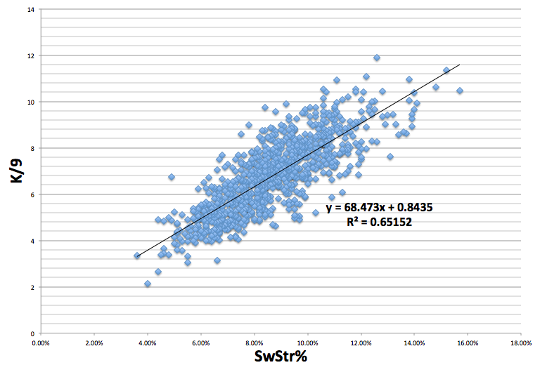
My assumption was that K/9 and SwStr% have a strong relationship. But, how strong of a relationship is it? To find this out, I took all qualified starter seasons from 2003 to 2013, which gave me a sample size of 933 pitchers, and ran a correlation between their SwSTR% and their K/9. The results showed that there is an exceedingly positive correlation between SwSTR% and K/9, to the tune of a .807 correlation coefficient and a .65 R2.

Screen shot 2013-10-03 at 1.06.11 PM

What is important to note is that there are very few pitchers present in the sample with a SwStr% above 13%, which may be symptomatic of something larger. Getting batters to swing and miss is difficult. The more often you can get a batter to swing and miss, the more valuable you are as a pitcher. As a result, the higher the SwStr%, the smaller the sample size becomes. For example, Johan Santana (2004) and Kerry Wood (2003) are the two lone dots to the farthest right on the graph with SwStr% of over 15: wow.

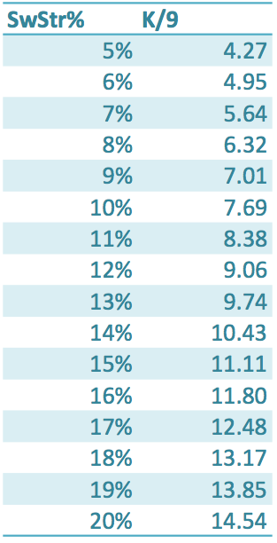
After the relationship between SwStr% and K/9 ratio became unmistakable, I calculated what a particular SwSTR%s translates into, as far as K/9, with the formula Y=68.473*x+0.8435, and got this chart:

Screen shot 2013-10-03 at 1.55.30 PM

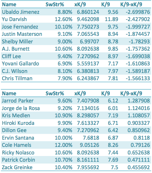
The next step is to take what we have discovered and apply it to a sample. The chart below shows each qualified pitcher for 2013, their SwStr%, xK/9, K/9, and K/9-xK/9.  xK/9 is what we would expect a pitcher’s K/9 to be based off of their SwStr%, and K/9-xK/9 shows us how much a pitcher over-performed or under-performed their SwStr% and xK/9.The first set of ten names are the pitchers who outperformed their xK/9 the most, and the second list of ten names are the players who underperformed their xK/9 the most.

Screen shot 2013-10-03 at 2.44.59 PM

The results show that Ubaldo Jimenez, Yu Darvish, and Jose Fernandez are the pitchers who have outperformed their xK/9 the most in 2013. These three pitchers also have great a great amount of deception and/or command (deception in Jimenez’s case: because, no one has ever called Ubaldo a control artist). And, while they may have outperformed their true talent in 2013 to an extent—they all had remarkable years—maybe that deception and control, which SwStr% does not take into account, leads to less swings by batters and more pitches taken for strikes, as opposed to swung at for strikes.

Perhaps xK/9 is more helpful when we look at pitchers who underperformed their SwStr%, like Jarrod Parker and Kris Medlen. Both of these pitchers had down years compared to what their projections suggested, but their xK/9s seem to be optimistic about their futures. Parker showed a .18 improvement in his K/9 from the first half to the second half of the season, while Medlen showed almost a full point improvement going from a 6.81 K/9 in the first half to a 7.67 K/9 in the second half.

While xK/9 may miss something—deception and command—when it comes to pitchers that outperform their SwStr%, xK/9 seems to find a reason to be optimistic when it comes to pitchers like Kris Medlen and Jarrod Parker who have underperformed their SwStr% and strikeout potential.

Devon Jordan is obsessed with statistical analysis, non-fiction literature, and electronic music. If you enjoyed reading him, follow him on Twitter @devonjjordan.