Projecting BABIP Using Batted Ball Data
Hi everybody, this is my first post here. Today, I’ll be sharing some of my BABIP research with you. There will probably be several more in the near future.
Now, I don’t know about you, but Voros McCracken’s famous thesis stating that pitchers have practically no control over their batting average on balls in play (BABIP) always seemed counterintuitive to me, ever since I heard it about 10 years ago. Basically, my thought this whole time was that if an Average Joe were pitching to an MLB lineup, the hitters would rarely be fooled by the pitches, and would be crushing most of them, making it very tough on the fielders. Think Home Run Derby (only with a lot more walks). Now, the worst MLB pitcher is a lot closer in ability to the best pitcher than he is to an Average Joe, but there still must be a spectrum amongst MLB pitchers relating to their BABIP, I figured. After crunching some numbers, I have to say that intuition hasn’t completely failed me.
This is going to be a long article, so if you want the main point right here, right now, it’s this: in the long run, about 40% or more of the difference in pitchers’ BABIPs can be explained by two factors that are independent of their team’s defense: how often batters hit infield fly balls and line drives off of them. It is more difficult to predict on a yearly basis, where I can only say that those factors can predict over 22% of the difference. Line drive rates are fairly inconsistent, but pop fly rates are among the more predictable pitching stats (about as much as K/BB). I’ll explain the formula at the very end of the article.
Now, for those of you who enjoy delving a lot deeper into topics than is necessary, or who love the word “correlation” (or generous use of parentheses), here you go:
For what I’m about to get into, my data set was composed only of pitchers with a qualifying number of innings pitched per season, from 1970-2012. I could have gone further back than that, but the further you go, the more you start dealing with issues like different stadiums, and even different gloves. I know that using only qualified pitchers arguably introduces bias (the really bad pitchers don’t get that many IP), but I feel it’s necessary to avoid fluky results.
A quick refresher on correlations: they range from -1 to +1, with +1 meaning when one factor increases, the other one does too in a perfectly predictable way; -1 indicates they move in perfectly opposite directions; and 0 meaning there is no apparent linear relationship between the two. It depends on who you ask (and what the subject matter is), but if the correlation is over 0.5 (or under -0.5), it is generally considered “strong,” while if it’s less than 0.1 away from 0, it’s considered very weak or negligible. A strong correlation indicates the two factors are connected, but not necessarily that one causes the other (they could both be caused by a third factor, for example).
The table below shows how well, on average, a pitcher’s BABIP in a given year correlates to past performances, in terms of the past year, the past two consecutive years, the past 3 consecutive, and the past 3 or more qualifying seasons out of the past 5 (using innings-weighted averages):
| Correlation | R-Squared | |
| 1-year | 0.239 | 0.057 |
| 2-year | 0.262 | 0.069 |
| 3-year | 0.327 | 0.107 |
| 3+ of last 5 | 0.324 | 0.105 |
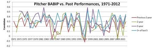
So, we see that overall, perhaps about 10% of the variation in pitchers’ BABIPs in any given year can be predicted by the past BABIPs of those pitchers. How much of that is due to the pitcher, as opposed to their defense, or even where they play, is up for debate. The chart shows how important the sample can be when you’re looking at BABIP, as the pattern is very inconsistent, but definitely real. For a little context, a pitcher’s ERA’s correlated to his past ERAs only slightly better, in the long run:
| 1 year | 0.322 |
| 2-year | 0.347 |
| 3-year | 0.376 |
| 3+ of last 5 | 0.362 |
Alright, I have 2 data sets I’ll be referring to over the rest of the article: 2007-2012 for anything PitchF/X related, but 2002-2012 as my main data set (assume I’m talking about this one unless otherwise noted). They both go back as far back as was possible to get the needed data. I know there are valid concerns about changes in the use of infield shifts altering BABIP rates in recent years, but with something with as much “noise” as BABIP, I think a lot of years’ worth of data is needed to see the underlying patterns.
In the upcoming correlation tables, green highlights indicate that higher values of the stat may lead to a lower BABIP (good news for the pitcher, obviously), whereas red indicates they may lead to a higher BABIP. Of course, correlation does not necessarily imply causation. Black stats are there for comparison, and to satisfy curiosities. These are based on the whole span of the data, not single seasons.
BABIP
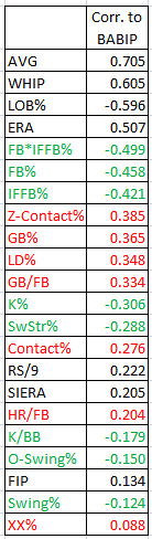
The combined stat FB%*IFFB% (sometimes denoted as FB*IFFB%, to save space) indicates the total percentage of balls in play that are infield popups. I think the idea that this is perhaps one of the most significant inputs to BABIP should come as no surprise, as they’re pretty much automatic outs.
Z-Contact%, the percentage of swung-on balls thrown in the zone that are made contact with, turns out to be very important, but as I’ll show you, is largely made superfluous by its strong correlation to infield popups.
I think it makes perfect sense that groundballs and especially line drives both lead to higher BABIPs; they both make for harder putouts than the average fly ball. You’ll see later that LD% is actually the more important of the two, not surprisingly.
More strikeouts being connected goes along with my Average Joe theory. A pitcher fooling hitters will be reflected in terms of less frequent and weaker contact.
Run support (RS/9) is an interesting one; is the connection a reflection of better hitters also being worse fielders, or does it have to do with the park?
“XX” Pitches are unknown pitch types… perhaps they’re breaking pitches that don’t break like they’re supposed to, etc. A weak connection overall, but it makes sense to consider them, I think.
Line Drive Percentage
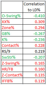
Getting hitters to swing at pitches outside the zone is a very good sign when it comes to allowing fewer line drives. I’ll show you later how repeatable this, and other abilities, are.
The mystery (botched?) XX pitches loom large here. A curveball that slips and doesn’t curve much is going to be close to as hittable as an Average Joe’s pitch.
Throwing in the zone more often puts you at risk for giving up more liners. I think the trends suggest that you want to be a nibbler and to throw breaking pitches outside (probably mainly below or away) the zone, if you want to avoid giving up liners. Not shocking, is it?
Thought I’d throw in run support again: defense has nothing to do with line drives, and the only park factors involved are maybe the batter’s eye and the air (e.g. pitches breaking less in Colorado). Perhaps this is really more about pitchers not being cautious when they have a big lead.
Infield Fly Balls
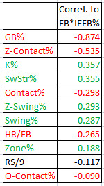
When it comes to infield popups, it’s no surprise that ground ball specialists don’t get many of them.
A popup pitcher gets hitters to swing and miss a lot at pitches in the zone (reflected by Z-Contact%). He has dominant stuff.
Z-swing% shows that for a popup pitcher, the hitters are swinging more often at pitches in the zone. Maybe that’s because they expect the pitcher to throw strikes, maybe the pitches look better to hit, or maybe the hitters are more prone to protect the plate due to an unfavorable count.
As with LD%, a higher HR/FB rate is an indication that hitters are making more solid contact with the pitches.
Contrary to LD%, pitching in the zone is beneficial for pitchers when it comes to popups.
Getting popups is less about nibbling, and more about attacking the zone and blowing it by hitters. You’ll see later in the PitchF/X data how they tend to accomplish this.
How consistent are the rates of line drives and infield fly balls hit off of pitchers? Take a look:
| Pitchers’ Line Drive Percentage (LD%) Correlation to Previous Years | Overall Average | 2007-2012 Average | ||||||||||
| 2003 | 2004 | 2005 | 2006 | 2007 | 2008 | 2009 | 2010 | 2011 | 2012 | |||
| Previous year | 0.340 | 0.429 | 0.223 | 0.223 | 0.421 | 0.238 | 0.088 | 0.220 | 0.087 | -0.009 | 0.226 | 0.174 |
| Previous 2 years | 0.476 | 0.203 | 0.243 | 0.554 | 0.284 | 0.180 | 0.185 | -0.086 | -0.030 | 0.223 | 0.181 | |
| Previous 3 years | 0.502 | 0.289 | 0.471 | 0.491 | 0.295 | 0.230 | 0.012 | -0.255 | 0.254 | 0.207 | ||
| 3+ of past 5 | 0.415 | 0.532 | 0.551 | 0.251 | -0.079 | 0.041 | 0.285 | 0.285 | ||||
So, line drive percentage, an important contributor to BABIP, is less predictable than BABIP itself. For a bit of context, though, the correlation in pitcher ERA to the previous year was 0.338, on average. It’s a very “noisy” statistic, and, I think it’s safe to say, is influenced somewhat by the pitcher, but not nearly as much as…
| Pitchers’ Infield Fly Ball Percentage (FB%*IFFB%) Correlation to Previous Years | Overall Average | 2007-2012 Average | ||||||||||
| 2003 | 2004 | 2005 | 2006 | 2007 | 2008 | 2009 | 2010 | 2011 | 2012 | |||
| Previous year | 0.616 | 0.720 | 0.675 | 0.609 | 0.705 | 0.633 | 0.581 | 0.518 | 0.686 | 0.524 | 0.627 | 0.608 |
| Previous 2 years | 0.748 | 0.749 | 0.639 | 0.735 | 0.705 | 0.516 | 0.595 | 0.634 | 0.664 | 0.665 | 0.642 | |
| Previous 3 years | 0.768 | 0.714 | 0.732 | 0.691 | 0.599 | 0.728 | 0.655 | 0.568 | 0.682 | 0.662 | ||
| 3+ of past 5 | 0.701 | 0.685 | 0.618 | 0.768 | 0.656 | 0.598 | 0.671 | 0.671 | ||||
Based on this, it would seem that close to half of the differences in popup rate between pitchers can be attributed directly to the pitchers’ attibutes. You may wonder why I would put so much emphasis on an occurrence such as infield popups, which happens on a little less than 4% of balls in play. Well, besides being automatic outs by themselves, I think it’s reasonable to assume that they are also a sign of less sharply-hit fly balls in general.
For the PitchF/X data I’m about to get into, I ignore velocity and movement for any type of pitch that was thrown less than 5% of the time by the pitcher. This was important to avoid skewing the correlations with fluky data, caused by PitchF/X measurement or pitch identification errors. A level as high as 5% was chosen because the pitch has to be a meaningful contributor to the pitcher’s arsenal to take its effects on his overall numbers seriously. A better analysis would also look at BIBIP results specific to each pitch type, but I’ll have to leave that to somebody else who has that data.
Here are the sample sizes for each pitch type (i.e., the number of pitchers who threw that pitch at least 5% of the time):
| Pitch Type | Qualifying Pitchers |
| FA (4-seam fastball) | 285 |
| SL (Slider) | 240 |
| CH (Changeup) | 234 |
| CU (Curve) | 188 |
| FT (2-seam fastball) | 123 |
| SI (Sinker) | 84 |
| FC (Cutter) | 78 |
| FS (Splitter) | 21 |
With these numbers in mind, take the results of the FS (splitter) movement and velocity correlations with a grain of salt. In the following lists, “X” indicates horizontal movement (e.g. FA-X for 4-seamers), “Z” indicates vertical, and “abs” indicates that I’m looking at the absolute value of the movement (i.e. movement to the left is as good as right, up as good as down). I omit the absolute value figure when its correlation is the same or worse than the non-absolute. By the way, I removed knuckleballs, eephuses, and knuckle-curves from these PitchF/X analyses due to their rarity.
Here’s the best explanation I’ve come across when it comes to PitchF/X movement . The summary is that a positive Z-value means the pitch has backspin that keeps it from dropping, whereas a negative Z indicates topspin (like a curveball) and therefore a drop; 0 means the ball has neither topspin nor backspin. For X values, negative means that from the catcher’s perpective, the ball breaks left, while positive means it breaks right. Absolute values are probably more significant for X (horizontal) movement for these reasons, as righties ought to have opposite movement from lefties in the horizontal axis, if I understand it correctly. Sidearm throwers do have odd vertical values, though (their fastballs have topspin, if anything).
BABIP (Pitch F/X)
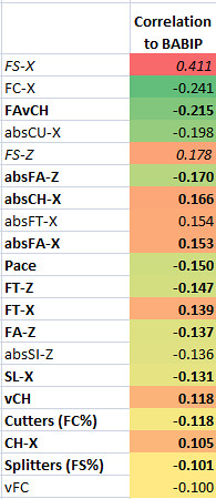
So, the PitchF/X data for BABIP overall doesn’t have spectacular results. As we saw above, the methods for preventing line drives vs. the methods for getting popups are a bit at odds, however, so that’s not surprising.
If we can take it seriously (and I don’t think we can, due to sample size), FS-X (horizontal movement on the splitter) is apparently undesirable for the pitcher, when in the positive direction (to the right of the catcher). Meanwhile, a cutter that moves more to the right is apparently helpful to the pitcher, if they can throw it.
FAvCH, a construction of mine (I’m probably not the first), is the difference in velocities between the pitcher’s 4-seam fastball and his changeup. Not surprisingly, a bigger gap correlates to a lower BABIP. Pitchers who purposely change speeds on their fastballs probably see some of this effect too, though I don’t have the data to prove that.
The absolute vertical movement on the pitcher’s fastball is connected to a lower BABIP. It seems movement is a lot more important than speed when it comes to fastballs and BABIP (vFA had basically no correlation).
Greater horizontal changeup movement in either direction was correlated to higher BABIPs. However, vertical movement had no correlation to BABIP.
Pace is an interesting one; it shows pitchers who wait longer in-between pitches tend towards lower BABIPs. Who knows why?
Line Drive Percentage (Pitch F/X)
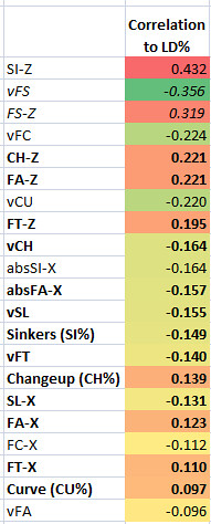
The profile of a line-drive preventer reads: 1) has good sinking pitches, and; 2) is a hard-thrower. It’s a hard thing to predict, though.
More drop on sinkers correlates fairly well with a lower line drive rate (SI-Z is also the strongest predictor of ground ball rates, with a -0.74 correlation).
Again, I wouldn’t take the splitter data (FS) too seriously due to how few pitchers rely on the pitch, but the data suggests a fast, sinking splitter is pretty useful here.
On the other hand, almost every pitcher throws a changeup, and they all throw 4-seamers, so it seems clear that more drop on the changeup (CH-Z) and 4-seam (FA-Z) are correlated with a higher LD%, though not as much as they are with ground ball percentage (GB%), (-0.421 and -0.685 respectively).
Faster pitches in general seem to lead to all be connected to a lower LD%. That seems logical – the hitters have less time to judge the location and movement of the pitch, and therefore won’t square it up as well. The connection is much weaker than it is to strikeout rates, as I’ll show you later, for comparison purposes.
As you see, there aren’t any particularly strong correlations in this data. Line drives are only semi-predictable (as I’ll demonstrate later), so that’s to be expected. Don’t worry, though – the pop fly data is more encouraging.
Infield Fly Balls (Pitch F/X)
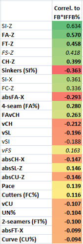
A fastball with more “rise” (technically, less drop) leads to more popups. I think that’s pretty much a slam dunk, based on this information (well, and logic).
A popup pitcher throws a lot of 4-seam fastballs, and not many sinkers and other sinking pitches. He also changes speeds well (i.e. as far as FAvCH, which has no correlation to LD%, by the way).
Fastball speed has no correlation to infield fly ball rate, but apparently you’re better off complementing your average-speed (but high-spin) fastball with some slow changeups, sliders, and sinkers, if you’re after popups – as long as they have plenty of backspin.
Pace shows up here. Take your time, I guess.
UN% are unknown pitches, like XX% earlier, only it’s probably harder to confuse PitchF/X. Once again, they are not a good sign for a pitcher, though.
Next, I’ll show you how these correlate with strikeout rates, because, hey, why not. Well, pitchers with high strikeout rates tend to have low BABIPs (-0.3 correlation), so it is relevant in that regard. Plus, I think it’s useful for context, to see how these numbers correlate to something that it’s pretty well accepted that pitchers have a good amount of control over (there’s a 0.787 year-to-year correlation for K%, by the way)
Strikeouts (Pitch F/X)
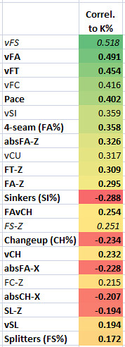
Velocity is king when it comes to strikeouts, it seems. A higher percentage of 4-seamers is also fairly helpful.
Pace – wow, apparently making the batter wait is pretty useful in getting strikeouts. But, you never know, with correlation – maybe hard-throwers need more rest between pitches, so the pace is just a side-effect. I’d have to do a regression to try to weed things out, but that’s tricky when there are as many factors as these involved.
A “rising” fastball isn’t as important here as it is for getting popups, but is still one of the main factors. This, along with other shared factors, such as using more 4-seamers, fewer sinkers and greater changes of speed, is probably why strikeout pitchers tend to get more popups.
So, hopefully by now I’ve brainwashed you through sheer repetition convinced you that pitchers do have some control over their BABIP, and that there are even particular traits that can explain how they influence it. Even though, altogether, only about 10% of the differences between BABIPs can be attributed to the pitchers themselves, this doesn’t mean that there aren’t certain pitchers who you can’t expect to have a low BABIP on a fairly consistent basis. Especially in the case of pitchers who get a lot of infield fly balls, I think you can.
So, without further ado, this is the formula of mine with the best mix of simplicity and accuracy when it comes to explaining a pitcher’s BABIP:
xBABIP = 0.4*LD% – 0.6*FB%*IFFB% + 0.235
In the long run, this formula correlates with a pitcher’s BABIP at 0.628, and is accurate to within 0.0096, on average. As a comparison, David Appelman’s 3-factor model from 2008, which was the best formula I am aware of that predates this one, has a 0.572 correlation to actual BABIP, and is accurate to within only 0.0148 (though if you subtract 0.01276 from the result of the formula, it’s accurate to within 0.0101, as his formula tends to overestimate BABIP). When comparing one individual season to the next, this formula has a 0.428 correlation to BABIP (vs. Appelman’s 0.351) and is only accurate to within 0.0157, however. Please let me know if you’re aware of any other formulas I should be testing it against.
The other factors I’ve tried to add in so far only make tiny improvements to the formula — HR/FB, for example, makes a very small improvement, but not enough to convince me that it’s really needed. Maybe next time, I’ll show up with a minor improvment, but I think it’s pretty clear that, at least in the long run, line drives and popups are the most important factors.
In the next installment, I plan to see if I can spot exceptional BABIP pitchers, and to explore how predictable BABIP is.
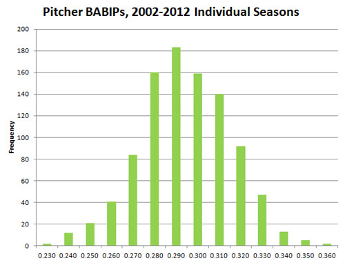
I leave you now with this gratuitous graph:
And a little extra context on how predictable stats are from year to year (average correlation between years for 2002-2012):
| Mean YTY Correlation | |
| GB/FB | 0.864 |
| GB% | 0.838 |
| FB% | 0.823 |
| SwStr% | 0.804 |
| Contact% | 0.798 |
| K% | 0.787 |
| OFFB% | 0.787 |
| Swing% | 0.754 |
| Z-Contact% | 0.738 |
| O-Contact% | 0.702 |
| BB% | 0.689 |
| K/BB | 0.655 |
| Z-Swing% | 0.647 |
| F-Strike% | 0.636 |
| FB*IFFB% | 0.627 |
| Zone% | 0.598 |
| O-Swing% | 0.551 |
| xBABIP | 0.408 |
| WHIP | 0.408 |
| IFFB% | 0.361 |
| ERA | 0.338 |
| HR/FB | 0.262 |
| XX% | 0.260 |
| Appelman’s | 0.257 |
| LD% | 0.226 |
| BABIP | 0.184 |
| LOB% | 0.179 |
| RS/9 | 0.153 |
Steve is a robot created for the purpose of writing about baseball statistics. One day, he may become self-aware, and...attempt to make money or something?
This is super cool, but Voros McCracken never claimed that pitchers have no control over what happens to batted balls, just that it was not something that was consistent enough to be predictive, and therefore isn’t useful for predicting which pitchers will do well in the future. Very different claim.
Thank you!
In my defense, I did say that he said they have “practically” no control, and by that I meant what you said. I think, hopefully, I’ve taken a step towards demonstrating there actually is a practical way to make distinctions between pitchers (especially in the long run) that may have eluded McCracken.
Great stuff, Steve. One thought: now, I know w/ values per-pitch type are generally considered insignificant due to the BAPIP on them, but I have found in my own research to show significant results on what is lucky in one particular combination: high FA and high CH together appear as “lucky” when you look at where those pitchers rank in terms of HR/FB, BABIP, LD% and LOB%. So while one can claim that those values are luck based, the fact that far, far more percentage of “plus” FA plus “plus” CH” are seen as lucky, it happens at a far more significant rate than any other combination of “plus” pitches, year after year. Thoughts?
Thanks Will. Sorry, I’m a little confused about what you’re saying; are you referring to velocity, movement, location, frequency, or some combination thereof regarding fastballs and changeups?
I guess since 4-seam fastballs and changeups are the first and third most common pitches, that could help explain why they’re so significant, though (about 45% and 11%, respectively, with sliders in 2nd at about 15%). But I definitely see the value in being able to throw off a hitter’s timing the way a good fastball/changeup combination can, which could lead to less contact on the “sweet spot,” swinging underneath fastballs (when they drop less than the hitter expects), and maybe more defensive swings.
Some very interesting stuff here. I like it. With that said, both factors (LD and IFFB) seem analogous skills of preventing batters from squaring up on the ball when they make contact. IFFB would be getting too far underneath the ball, while a low LD percentage would be the ability to keep it off the meat of the bat on either side.
It makes me think that an important piece of information is the distribution of angles where the ball hits the bat for that pitcher. Balls struck above a certain angle are likely to be outs (regardless of if they are IF or not, they’re likely to be caught before dropping). Balls below a certain angle will be ground balls. Not sure if anything captures this kind of information, but an ability to throw pitches that influence this distribution should result in these kind of effects.
Thanks B N. Yeah, it would be really nice to have access to Hit F/X data for those reasons, but it’s not publically available, as far as I know.
I did find it odd that there’s very little connection between popups and line drives allowed — the correlation was 0.066, which means pitchers who generate more popups actually tend to allow more line drives (but the two have almost nothing to do with each other). I would have expected pitchers who got more popups to allow fewer liners, by virtue of being harder to hit in general. Apparently it takes two different types of approaches that are not very aligned.
I thought this was a very cool chart that demonstrates some of what you’re talking about, though.
Using data from BIS, league average LD% changes a lot from year to year. Furthermore, the changes have not been well correlated at all with BABIP, giving me the impression that it’s a measurement difference, not a real change. I think that’s going to make it difficult to achieve a very high level of predictability to take batted ball data from year 0 to predict BABIP in year 1.
Yeah, I think you’re probably right, Michael. What appears a line drive to one stat recorder might not to another. Hit F/X data should be more precise. I think we’ll find from that data that the some pitchers really do get hit harder than others, in the long run, and that a good deal of it is their own fault.
As for using year 0’s batted ball data to predict year 1 BABIP… you’re right. With this formula, the correlation was only 0.166. I have another one that gets 0.278, though, thanks to its greater emphasis on popups (far more consistent year-to-year). I’m going to work on something that does a better job of predicting future years than that for the next article.
Also, using years 0, 1, and 2 to predict year 3 makes a huge improvement over just using 1 year of data, getting correlations over 0.4 for 2012, despite it being an unusual year for LD%. I’m working on looking at other years for the article.
Steve,
This is a great article, and I find it fascinating to see the correlations that all of these metrics have to BABIP. I think that your xBABIP approximation should be very useful and is better than any other approximation I have seen. I really liked the idea to use FB%*IFFB%. This value seems more intuitive to include in the regression than what people have previously used. The only concern that I have is that I am not sure that LD % and FB%*IFFB% are independent. I think this because if LD % increases, there is inherently less probability mass available for the FB%*IFFB% to occupy.
This would be easy for you to check by taking the correlation between the two inputs. If a strong correlation does exist, you could improve your approximation by using principal component analysis to orthagonalize your inputs. Then, you can rerun the regression with independent inputs.
Thanks Kevin,
Well, the correlation between line drive percentage and FB%*IFFB% is 0.066 over the 2002-2012 data set (I called FB%*IFFB% “popups” in my reply to B N earlier). I definitely get why you would think they’d be correlated, though (I thought so too, early in the analyses). I should have stated in the article that there was basically no correlation there. But, just assume that if you don’t see any of the batted ball or plate discipline numbers in those first three tables, it’s because the correlation was weaker than the others on the list (and therefore pretty insignificant).
My explanation for the lack of a connection between the two factors is that popup-inducing pitchers tend to be aggressive, with “rising” pitches, which are both apparently detrimental to preventing liners; this is counterbalanced, for one thing, by a possible unifying link of weaker contact in general (with HR/FB as a mediocre stan-in for the speed off the bat).
I like your article, and it was referenced and used in this article at The Crawfish Boxes:
http://www.crawfishboxes.com/2012/11/6/3603134/talking-sabermetrics-what-does-astros-pitcher-babip-tell-us
Awesome, thanks CJ. Great article over there.
If people are curious how I came up with that formula, yeah, it definitely wasn’t arbitrary — I had my computer come up with the most accurate (in terms of both correlation and RMSE) numbers it could. I started out with a lot more factors, including GB%, FB%, and HR/FB, but discovered they didn’t make a difference, really, as I started whittling them down. The numbers for the two remaining factors were 15 digits long, but they were pretty close to 0.4 and -0.6, so I just rounded them with a pretty minimal cost to correlation coefficient (I figure there’s no point in trying to be very precise when it comes to BABIP).
This is an interesting article, I love how you broke down the cause’s of Line drives, and IFFB’s. I’ve done a lot of research in this area as well, and developed a similar conclusion: (http://fantasybaseballadvantage.blogspot.com/2011/01/2011-pitcher-babip-calculator.html). However, since batted ball data (particularly LD%, and IFFB%) vary so much themselves (as you pointed out), I’ve found the equation to not be very useful. While it (my equation, as well as yours) do a good job of dissecting what makes a pitchers current year BABIP. It doesn’t appear to do a good job of predicting future BABIP. And it’s easy to see why, as LD% and IFFB% can swing so much from year to year (as you pointed out, even moreso then BABIP itself).
On that front, for my projection system this past year, I used an equation that incorporates K% (as you pointed out, strikeout pitchers tend to have higher BABIPS), GB% (flyball pitchers have lower babips), an adjustment for park factors, and an adjustment for team defense (specifically I used last years UZR, then did a kind of manual guess of next years team UZR, by moving around numbers for some of the best defensive players who moved teams). The result, it correlated, and RMSE’d better then previous year pitcher BABIP, and Bill James projection system (the only one I benchmarked against). With Bill james at a .034 and me at a .029 RSME it’s about a .005 improvement. Unfortunately, with park factors, and team defense components, my equation needs to be manually built every year, and I’m not sure if the results were good enough to warrant doing it again for another year.
Hey slash, thanks for reading. I definitely remember reading about some of your hitter BABIP work on Fangraphs before, when I was working on some of my own.
Did you misspeak on the K% vs. BABIP relationship? I actually found that high strikeout pitchers tend to have lower BABIPs.
Can you tell me more about your latest projection system? What was the sample you used to get that .029 RMSE — what was the minimum innings pitched, and was the projection made from only one year of data, or several? I’ve been working on my own, and I want to know if I have anything worthwhile here.
Also, my projection system doesn’t include park effects or defense factors, due to the noise I think they probably add to it all (and the complexity), but I was curious about how much of a difference they made for you.
yes, I misspoke.
The sample is 113 pitchers in 2012, I projected them at the beginning of 2012, recorded bill james projection as well, and then compared the BABIP results at the end of the year, to find that Bill James had a .163 Correlation, and .034 RMSE, I had a .396 Correlation, and .029 RMSE.
I scrapped the batted ball data for the most part, my BABIP projections were build like this:
1) I build a park factor for BABIP, using historic BABIP data by park (3 years), then I halved it (since they only play half their games at home)
2) I build a defense factor for BABIP, I did a multi-year regression of team UZR as it related to team BABIP. Then I did team UZR projections for 2012, using a very rough system of using 2011’s team UZR, then adjusting them manually for players who were removed from, or added to teams, who had a defensive impact of one extreme or another (the best, or worst defenders). Again, I halved the impact, this time because I just didn’t trust my rough estimations of projecting team UZR
3) I build a regression of 3 years of previous data (2009-2011) to see how GB% affects BABIP (it increases it)
4) I build a regression of 3 years of previous data to see how K% affects BABIP (it decreases it)
5) I combined all these factors together to come up with my projection.
In the end, I did ERA Projections as well, based on this projected BABIP (and my projections for other stats), and it performed better then Previous year’s SIERRA, Bill James, and ZIPS. But it didn’t perform so much better that I’m going to do it again this year.
Pre-season last year I did some comparisons to find that my batted ball data based equations (like yours, based around LD%, and IFFB% mostly) just were not doing a good job predicting subsequent season BABIP (previous year’s BABIP/Multi-year BABIP was doing a better job predicting). This park factor, K%, GB%, Defense factor method does a better job (and would do an even better one, with real UZR projections).
One thing I didn’t mention…Part of the reason any of my projections outperformed Bill James, or Zips, can be chalked up to the fact that I knew about, and accounted for team/league moves, that they were not accounting for (because their projections were built before some players even switched teams). In fact, that may be the entire reason my projections were better, I’m just not sure. I haven’t done the work of eliminating these players and seeing how things stack up, partially because doing so would make a sample that’s already probably too small, even smaller.
Great article. Just wondering, how did you calculate the correlation of Pitch F/X movement to BABIP? I’ve been looking for a place with raw F/X data for a while.
OK, thanks slash. Well, I think I must have taken a different approach from yours, because I’ve seen more success with the batted ball data than you seem to have. I think I’d better write an article about it after all.
Thanks, Sabermetric Solutions.
I got all the data right here at FanGraphs. Here’s a link to the vertical movement data.
Question for Steve and/or Slash. I read the article by Slash in the link above, and he wrote this:
“Fantasy baseball is one example of a case where FIP doesn’t necessarily do us a lot of good. In this case we’d rather get an idea of what their real ERA is going to look like.”
Is this because FIP doesn’t take into account the park and team factor? Does FIP only show what the ERA would be if pitching for a neutral team at a neutral park?
I think I read that Fangraphs FIP- does account for park factors, is that correct?
Hi Larry, I just crunched some numbers, to get an idea of the effectiveness of predicting ERA based on certain stats. But first, to answer your question:
The formula for FIP is:
FIP = ((13*HR)+(3*(BB+HBP))-(2*K))/IP + constant
The constants vary by year (listed here, as cFIP: http://www.fangraphs.com/guts.aspx?type=cn )
So, parks have some effect on FIP, via HRs (and, arguably Ks, in the case of breaking balls that break less in Denver). Probably thanks mainly to the DH, the leagues should definitely have an effect, though.
I wasn’t able to locate the formula for FIP-, but what it does is attempt to park- and league-adjust the pitcher’s FIP. So it’s FIP- that [purportedly] shows what the pitcher’s ERA would be in a neutral park and a neutral league.
Anyway, here’s how well some of those types of stats in one year correlate a pitcher’s ERA in the next year:
FIP: 0.432
tERA: 0.430
SIERA: 0.407
FIP-: 0.393
xFIP: 0.392
xFIP-: 0.385
ERA: 0.338
AVG: 0.308
ERA-: 0.305
WHIP: 0.294
These were the averages for my 2002-2012 sample. Here are the mean absolute errors from the next year’s ERA for the relevant stats:
FIP: 0.631
xFIP: 0.634
SIERA: 0.639
tERA: 0.712
ERA: 0.720
So, FIP, despite being one of the simplest of those methods, is the best, it seems to me, for predicting the next year’s performance. I’m sure I’m leaving out plenty of other methods, but those were the ones I got off of Fangraphs.
Steve,
Thanks. Let me ask another way…not sure if you can answer this, but if not, maybe someone else can:
Suppose I have the following data for 2012 pitchers:
Pitcher Team Actual ERA FIP
Joe Smith SD 3.00 3.50
John Doe Col 4.00 3.50
I can tell by this that both pitchers were really equally effective, when you strip away their luck, defense, strand rate, and park factors. Is this correct?
So if I’m a MLB GM considering a trade or free agent signing, this gives me a good measure of the true talent level of these pitchers.
But if I’m a fantasy baseball player, and I want to know who’s going to have a better ERA for 2013; and I know that both pitchers will still be pitching for SD and COL, respectively, then I would want to know what their FIP would be for someone pitching at SD or COL.
So where do I find that information? The FIP- apparently is park and league adjusted, but it gives a number that doesn’t equate to an ERA. For example, Kershaws FIP- says “78”. The only instruction I’ve seen is that 100 is average, and the lower the better.
So, in the above example, if Joe Smith’s FIP- said “78” or “52” or “123”, how do I use that number to adjust his ERA of 3.00 or his FIP of 3.50?
Well, BABIP is a significant component of ERA (0.528 correlation in my main sample). FIP, however, doesn’t include BABIP or its inputs as part of its equation at all, as it goes along with Voros McCracken’s idea of BABIP being unpredictable. I think there’s room for a little bit of an improvement to that, as popup-inducing pitchers (e.g. Jered Weaver, Chris Young, Barry Zito, and Matt Cain) can be expected to have good BABIPs more often than not. So, what I’m saying is that in your example, if pitcher A is like Weaver, perhaps he actually is better than his FIP indicates, thanks to his legitimately lower BABIPs (all of those guys I mentioned have FIPs at least 0.4 higher than their ERAs, and their xFIPs are much higher than even their FIPs). But I’ll have to mess with that and see if I can come up with some effective method of integrating this BABIP stuff into ERA projections (as SIERA tries to do, though it’s no better than FIP, it seems to me).
Regarding FIP-, as you saw, it’s worse at predicting future years for a pitcher than plain FIP. That’s because pitchers usually play for the same team they did in the previous year. I’d say that FIP- is more useful in the context of arguing which pitcher is better than which than it is for making projections.
So, if they’re playing for the same team as the previous year, just use their straight FIP (better yet, a weighted average of more relevant FIPs from earlier years). But if the player pitched in Colorado one year and San Diego the next, I imagine you could use these: http://www.fangraphs.com/guts.aspx?type=pf&teamid=0&season=2011
… which have the basic park factors for the Rockies at 113 and for the Padres at 92. So, I guess you could just multiply his previous FIP by (92/113), if you’re looking for the quick and dirty method. If you want the [probably] better method, you’d use multi-year averages for park factors, and apply the specific park factor ratios for HR, BB, and SOs directly to the pitcher’s numbers within the aforementioned FIP formula. I haven’t really tested any of this out, so I can’t vouch for the accuracy of those methods, though.
I’m a bit skeptical, by the way, as to the reliability of park factors (see how much they vary from year-to-year, inexplicably). I think they’re really measuring the teams’ tendencies in addition to the parks themselves. I haven’t looked into it much, but I’d probably want to give a bit less weight to them.
Thanks again, but I’m still confused.
1) You said “FIP doesn’t include BABIP…” but I thought a big part of FIP, xERA, SIERA and all the other measures were to normalize BABIP to try and eliminate the luck factor?
2) I thought that FIP shows what a pitcher should have done with a neutral team in a neutral park, and that FIP- shows what they should have done with their specific team in that specific park. But according to what you just wrote, it looks like I’ve got that backwards?
1) Take a look at the FIP formula from my first reply to you — it ignores hits (other than home runs, which BABIP ignores). It’s based on the assumption that pitchers should have the same BABIPs each year. SIERA and tERA don’t make that assumption — they look at the batted ball profiles, to try to figure out a pitcher’s “true” BABIP, as a component of their “true” ERA (though they apparently don’t do a great job of that). xERA, which you brought up, (but I don’t have the numbers for) apparently looks directly at the pitcher’s hits allowed as a factor, so it’s pretty much the polar opposite of FIP (unless we’re talking about different versions of xERA).
2) Yeah, you had it backwards; the formula for FIP doesn’t include league averages or park effects, but FIP- does. FIP- is the pitching equivalent of OPS+ or wRC+, as it says here: http://www.fangraphs.com/library/index.php/pitching/era-fip-xfip/
I’m a little late in reading and responding to this article, but both this (and the second installment) are excellent! Thanks for including the “gratuitous” graph at the end, along with the correlations of various pitching stats.
It’s great to see how many of the individual seasons fall within +/- 10 points of .290, which has the highest frequency. In the correlations, it’s instructive to see just how much stronger YTY correlations on things like GB/FB and contact rates are than BABIP. Again, this is great work!
Thank you very much, Michael! Stay tuned, next I’ll be talking about future BABIPs and applying all this to ERAs.