The Unique Path to Success in Oakland

 Two roads diverged in a wood, and I–

I took the one less traveled by,

And that has made all the difference.

— Robert Frost

There are many things that stand out about this year’s Oakland A’s. Their incredible run differential has reached a near historic level, their breakout star from last year has proven that last season was no fluke, and the top three starters are pitching at incredible levels. They’ve been marauding through the American League like Heisenberg’s nemesis through Janjira. However, there’s one aspect of this team that flies under the radar: of their current 25-man roster, only two players were acquired through the amateur draft – Sonny Gray and Sean Doolittle. The rest were acquired through a mix of trades, free agency, waiver claims, purchases, and even one conditional deal.

Billy Beane made his name a while ago by not being afraid to stray from the pack, and in fact looking for those market inefficiencies that could save him a buck or two with the low payroll A’s. By trading for players who may have disappointed at other spots across Major League Baseball, or claiming players put on waivers, Beane is once again finding talent in the most frugal way possible. So is this a new phenomenon in Oakland? Let’s see what the numbers say. Here’s the acquisitional (who says you can’t invent words?!) breakdown of the Oakland A’s roster the last thirteen years.* This includes any hitters who made at least 100 plate appearances and any pitchers who pitched in at least ten games in addition to this year’s current 25-man roster.

* Why thirteen years? Because, Moneyball, of course!

A’s Roster Construction Since 2002
Year AD* FA** T*** AFA^ WC^^ P^^^ CD’ R5” MD”’
2014 2 4 13 1 2 2 1 0 0
2013 4 4 16 1 4 2 1 0 0
2012 7 9 16 2 2 1 0 0 0
2011 6 7 17 0 1 1 0 0 0
2010 9 7 12 1 2 1 0 0 0
2009 11 6 14 1 3 2 0 0 0
2008 8 5 16 1 2 3 0 0 0
2007 10 5 10 1 4 2 0 0 0
2006 8 5 15 0 1 0 0 0 0
2005 10 4 15 0 1 0 0 0 0
2004 8 7 11 0 1 0 0 0 0
2003 8 6 9 2 0 0 1 1 0
2002 6 8 16 2 0 0 0 0 1

AD*= Players acquired through amateur draft;  FA**= Players acquired through free agency;  T***= Players acquired through trades;  AFA^= Players acquired through amatuer free agency;  WC^^= Players acquired through waiver claims;  P^^^= Players acquired through purchases;  CD’= Players acquired through conditional deals;  R5’’= Players acquired through the rule 5 draft;  MnD’’’= Players acquired through minor league draft


While the A’s have always built their roster through trades more than through the draft (the only years those numbers were even tied was in 2007 and 2003; every other year there were more players acquired via trade than draft), the trend is becoming more and more evident as of late. On the A’s current 25-man roster, there are a measly two players who the A’s acquired through the amateur draft versus sixteen acquired through trades. Granted, the number acquired through the draft was bound to be a bit smaller so far this season than in previous years since a 25-man roster was used this season, instead of qualified players (again, players who had either 100 plate appearances or ten games in which a player pitched in that given season), which totaled between 27 and 37 in the previous twelve seasons. However, given that the season with the second lowest number of players acquired via the draft was last season, there definitely appears to be a trend here.

Now the question becomes, “how does this compare to the league as a whole?”

Usually Beane is at the forefront of certain trends, so if the A’s roster composition varies greatly from the rest of the league, could it be the start of a league wide trend, especially given the A’s incredible success so far? To answer that question, data on all 30 teams’ roster composition was collected for the 2013 season. Given the same requirements as the previous A’s seasons (100 plate appearances or ten games pitched), how did other rosters across Major League Baseball look last year?

League Wide Roster Construction in 2013
Team AD* FA** T*** AFA^ WC^^ P^^^ CD’ R5”
BOS 26.47 35.29 26.47 5.88 0.00 5.88 0.00 0.00
STL 65.63 12.50 18.75 0.00 0.00 3.13 0.00 0.00
OAK 12.50 12.50 50.00 3.13 12.50 6.25 3.13 0.00
ATL 33.33 10.00 33.33 6.67 16.67 0.00 0.00 0.00
PIT 28.57 21.43 42.86 3.57 0.00 3.57 0.00 0.00
DET 18.75 40.63 31.25 6.25 3.13 0.00 0.00 0.00
LAD 21.88 34.38 34.38 6.25 0.00 3.13 0.00 0.00
CLE 13.79 24.14 58.62 3.45 0.00 0.00 0.00 0.00
TBR 22.58 29.03 41.94 0.00 3.23 3.23 0.00 0.00
TEX 29.03 32.26 19.35 12.90 0.00 3.23 0.00 3.23
CIN 40.00 23.33 23.33 10.00 3.33 0.00 0.00 0.00
WSN 37.50 25.00 31.25 3.13 3.13 0.00 0.00 0.00
KCR 33.33 13.33 36.67 6.67 3.33 6.67 0.00 0.00
BAL 25.81 12.90 35.48 3.23 9.68 6.45 0.00 6.45
NYY 25.81 35.48 22.58 9.68 3.23 0.00 0.00 3.23
ARI 16.13 25.81 45.16 9.68 3.23 0.00 0.00 0.00
LAA 37.84 29.73 21.62 5.41 5.41 0.00 0.00 0.00
SFG 33.33 36.67 10.00 6.67 10.00 3.33 0.00 0.00
SDP 31.43 20.00 40.00 0.00 2.86 0.00 2.86 2.86
NYM 31.58 31.58 13.16 13.16 10.53 0.00 0.00 0.00
MIL 39.39 36.36 12.12 3.03 6.06 3.03 0.00 0.00
COL 36.36 27.27 21.21 12.12 3.03 0.00 0.00 0.00
TOR 24.32 21.62 45.95 2.70 2.70 2.70 0.00 0.00
PHI 35.00 37.50 20.00 7.50 0.00 0.00 0.00 0.00
SEA 27.27 30.30 30.30 9.09 0.00 0.00 0.00 3.03
MIN 33.33 33.33 12.12 6.06 9.09 0.00 0.00 6.06
CHC 11.43 42.86 22.86 11.43 8.57 0.00 0.00 2.86
CHW 30.00 33.33 20.00 10.00 6.67 0.00 0.00 0.00
MIA 30.30 24.24 39.39 6.06 0.00 0.00 0.00 0.00
HOU 15.00 22.50 40.00 5.00 10.00 0.00 0.00 7.50

That’s a lot of numbers, so let’s take a step back and look at some of the numbers that stick out. First of all, instead of using raw totals, percentages have been used to even out the variance among how many players each team had qualify for this roster construction study. It’s also important to note that the highest and lowest percentage in each column has been bolded (this was used only for the three primary ways of acquiring players – the amateur draft, free agency, and trades). One may think of the old adage, “there’s more than one way to skin a cat” when looking at the top of the league. Apparently this adage holds true for baseball roster construction, as well as cat mutilation, as the St. Louis Cardinals – you know, that franchise that has won four of the last ten NL pennants with a pair of titles, and has the self-proclaimed best fanbase in baseball – has gone the complete opposite direction as the A’s to build their squad, relying more on the amateur draft than any other team in baseball, and doing so with great success. Then there are last year’s World Series champions, the Boston Red Sox, who were among the league leaders in players brought in through free agency.

One consistent, league-wide trend was that teams at the bottom of the league standings had far more players qualify for the 100 plate appearance/ten games pitched minimums. This is a bit of a “chicken or the egg” type observation, where the cause can sometimes be confused with the effect. There are several teams among the league’s cellar dwellers that went through numerous players throughout the season in an attempt to find effective players (the “throw the spaghetti at the wall and see what sticks” approach Jonah Keri has referenced on multiple occasions). This would be your Marlins, Astros, and Cubs. However, there are also teams among the lower tier of the standings that were forced into more personnel choices due to injuries; your Phillies, Blue Jays, and Angels. Whatever the reason, it is noticeable that nearly all the teams at the top of the standings at the end of the year have fewer players qualified for the 100 plate appearance/ten games pitched minimums thanks to good health and a clear vision – two staples of successful franchises (interestingly enough the one team that was an exception to this rule in 2013 was the Boston Red Sox; however, given their disaster of a 2012 season, it’s not as surprising to see that they tinkered a bit with their roster throughout the season).

The data supports what many baseball fans would already think, which is that the teams with higher payrolls usually are among the most reliant on free agents, and, in order to compete, the smaller market teams need to find other ways to build their rosters. For example, the top eight teams who built through free agency were: the Cubs, the Tigers, the Phillies, the Giants, the Brewers, the Yankees, the Red Sox, and the Dodgers. Of those eight, the Tigers, Philles, Giants, Yankees, Red Sox, and Dodgers make up the top six teams by payroll in 2014. The Cubs are in the middle of a complete roster overhaul, and Theo Epstein seems to be constructing a team built for flipping at the deadline for future prospects, so cheap free agents are a prime commodity. The Brewers are the odd team out, and would make for an interesting case study.

On the flip side, the top nine teams created by trading players were: the Indians, the A’s, the Blue Jays, the Diamondbacks, the Pirates, the Rays, the Astros, the Padres, and the Marlins. Of those nine, the A’s Pirates, Rays, Astros, Padres, and Marlins made up the six lowest teams by payroll in 2013; the Indians were not far off, with only the 21st biggest payroll of 2013; and the Blue Jays and Diamondbacks both have super aggressive front offices that prefer to bring in players via (usually poor) trades.

There is, of course, the caveat that while this study looks at general roster construction it does not have the nuance to differentiate between a team that is loaded with free agents that are big money free agents (like the Yankees and Red Sox) versus a team loaded with replacement level free agents (like the Cubs). If each player’s salary was totaled by how he was acquired, and then turned into percentages of roster construction again, this would show us how much each team is truly investing into each method of roster construction from a financial point of view. This could be used to compliment Jonah Keri and Neil Payne’s recent study that looked at roster construction. In their piece, Keri and Payne look at roster construction through the lens of a stars and scrubs roster versus a balanced roster. Although there might be some discrepancy based on the arbitrary 100 plate appearance and ten games pitched cut-offs, the data likely wouldn’t be vastly skewed from the current results.

Todd Boss, of Nationals Arm Race did an interesting study somewhat similar to this one, looking at the core players (the 5-man starting rotation, the setup and closer, the 8 out-field players, and the DH for AL teams) for the playoffs teams in 2013, and put the teams into four different categories of roster construction: draft/development, trade major leaguers, trade prospects, and free agency. The results were similar to what was found here, and help to support the idea that the arbitrary cut-offs of 100 plate appearances and 10 games pitched didn’t have a negative impact on the study. The only slightly different result was that Boss found the Rays to be relying more on the draft than on trades.

Having looked at the league-wide breakdown for roster construction last season, let’s take a look at roster construction from an historical perspective. To make a long story short, when Curt Flood took on Major League Baseball, and eventually the Supreme Court, in his fight to turn down a trade to Philadelphia (who can blame him?), he opened up the Floodgates (couldn’t help myself) for the eventual implementation of free agency in baseball. So, has successful (being judged by the extremely arbitrary “ringz” perspective) roster construction changed since then? Let’s take a look with yet another chart (Marshall Eriksen would be proud), this time looking at the past 40 World Series winners, and how each team was constructed.

Roster Construction of World Series Winners Since 1974
Year Team AD* FA** T*** AFA^ WC^^ P^^^ CD’ R5” MD”’ DC+ XD++
2013 BOS 26.47 35.29 26.47 5.88 0.00 5.88 0.00 0.00 0.00 0.00 0.00
2012 SFG 37.50 37.50 15.63 6.25 3.13 0.00 0.00 0.00 0.00 0.00 0.00
2011 STL 39.39 33.33 21.21 3.03 0.00 3.03 0.00 0.00 0.00 0.00 0.00
2010 SFG 31.25 50.00 15.63 3.13 0.00 0.00 0.00 0.00 0.00 0.00 0.00
2009 NYY 21.88 43.75 12.50 15.63 0.00 6.25 0.00 0.00 0.00 0.00 0.00
2008 PHI 29.63 44.44 14.81 3.70 3.70 0.00 0.00 3.70 0.00 0.00 0.00
2007 BOS 20.00 46.67 23.33 0.00 3.33 6.67 0.00 0.00 0.00 0.00 0.00
2006 STL 16.13 41.94 32.26 0.00 0.00 3.23 0.00 6.45 0.00 0.00 0.00
2005 CHW 14.81 40.74 40.74 0.00 3.70 0.00 0.00 0.00 0.00 0.00 0.00
2004 BOS 9.09 39.39 30.30 0.00 12.12 6.06 3.03 0.00 0.00 0.00 0.00
2003 FLA 10.00 30.00 50.00 10.00 0.00 0.00 0.00 0.00 0.00 0.00 0.00
2002 LAA 35.71 28.57 14.29 7.14 14.29 0.00 0.00 0.00 0.00 0.00 0.00
2001 ARI 10.00 50.00 20.00 6.67 0.00 3.33 0.00 0.00 0.00 0.00 10.00
2000 NYY 25.00 31.25 31.25 9.38 3.13 0.00 0.00 0.00 0.00 0.00 0.00
1999 NYY 20.00 36.00 32.00 12.00 0.00 0.00 0.00 0.00 0.00 0.00 0.00
1998 NYY 16.00 44.00 28.00 12.00 0.00 0.00 0.00 0.00 0.00 0.00 0.00
1997 FLA 6.45 29.03 38.71 16.13 0.00 0.00 0.00 0.00 3.23 0.00 6.45
1996 NYY 12.12 27.27 39.39 18.18 0.00 3.03 0.00 0.00 0.00 0.00 0.00
1995 ATL 40.00 40.00 16.00 4.00 0.00 0.00 0.00 0.00 0.00 0.00 0.00
1994 BOO XX XX XX XX XX XX XX XX XX XX XX
1993 TOR 29.63 37.04 33.33 0.00 0.00 0.00 0.00 0.00 0.00 0.00 0.00
1992 TOR 44.00 20.00 24.00 0.00 0.00 0.00 0.00 8.00 0.00 4.00 0.00
1991 MIN 33.33 29.63 33.33 0.00 0.00 0.00 0.00 3.70 0.00 0.00 0.00
1990 CIN 32.00 12.00 52.00 0.00 0.00 0.00 0.00 4.00 0.00 0.00 0.00
1989 OAK 32.14 32.14 32.14 3.57 0.00 0.00 0.00 0.00 0.00 0.00 0.00
1988 LAD 32.14 35.71 28.57 0.00 0.00 3.57 0.00 0.00 0.00 0.00 0.00
1987 MIN 33.33 11.11 51.85 3.70 0.00 0.00 0.00 0.00 0.00 0.00 0.00
1986 NYM 30.77 11.54 50.00 7.69 0.00 0.00 0.00 0.00 0.00 0.00 0.00
1985 KCR 38.46 19.23 26.92 11.54 0.00 3.85 0.00 0.00 0.00 0.00 0.00
1984 DET 42.86 17.86 28.57 3.57 0.00 7.14 0.00 0.00 0.00 0.00 0.00
1983 BAL 32.14 21.43 32.14 10.71 0.00 3.57 0.00 0.00 0.00 0.00 0.00
1982 STL 19.23 3.85 65.38 7.69 0.00 3.85 0.00 0.00 0.00 0.00 0.00
1981 LAD 43.48 17.39 21.74 8.70 0.00 8.70 0.00 0.00 0.00 0.00 0.00
1980 PHHI 39.29 14.29 39.29 3.57 0.00 3.57 0.00 0.00 0.00 0.00 0.00
1979 PIT 32.00 12.00 40.00 16.00 0.00 0.00 0.00 0.00 0.00 0.00 0.00
1978 NYY 18.18 13.64 63.64 4.55 0.00 0.00 0.00 0.00 0.00 0.00 0.00
1977 NYY 18.18 13.64 63.64 4.55 0.00 0.00 0.00 0.00 0.00 0.00 0.00
1976 CIN 28.00 N/A 44.00 28.00 0.00 0.00 0.00 0.00 0.00 0.00 0.00
1975 CIN 33.33 N/A 45.83 20.83 0.00 0.00 0.00 0.00 0.00 0.00 0.00
1974 OAK 25.00 N/A 37.50 29.17 0.00 8.33 0.00 0.00 0.00 0.00 0.00

#DC+= Players acquired through free agent draft compensation;  #XD++= Players acquired through the expansion draft

The first note that needs to be made is regarding the 1997 Marlins and 2001 Diamondbacks. Both rosters had skewed roster construction due to how soon after the team’s inception they were able to win a championship. The Marlins have by far the lowest reliance on the amateur draft, and the Diamondbacks have tied for the highest reliance on free agents, but both of these numbers were driven up (or down) by the limited time for drafting and moving along prospects before their championships.

After accounting for the 2001 Diamondbacks season, the steady rise of reliance on free agents since the mid-seventies is notable – up until three years ago that is. It’s hard to tell whether baseball is undergoing an actual “grass roots” movement, with teams relying less and less on big market free agents to succeed, or if this is simply a three-year blip in the radar, but it is certainly notable that the last three World Series winners have had notably lower reliance on free agents than the previous seven years’ winners. The 2011 Cardinals, 2012 Giants, and 2013 Red Sox have not, however, relied on trades, but instead their farm systems more so than other winners of this millennium (not including the 2002 Angels).

In fact, excluding the fluky 2003 Marlins, there has not been a World Series winner as reliant on trades as the 2013 A’s (50 percent) since the mid-eighties Twins and Mets. What’s even more troubling for the A’s is that there hasn’t been a team to use the draft and free agency combined as little as the 2013 A’s since the 1982 Cardinals, a team built during the dawn of free agency.

When judging by championships, in fact, the picture of baseball as a sport in which you need to be in a big market, with the ability to sign big name free agents becomes unfortunately evident. The roster composition of nearly all of the World Series winners this century is quite similar to that first group of teams mentioned above as big market teams built through free agency. This is no surprise to any real baseball fans, however. Look at the cities that have hosted World Series parades since the Yankees’ dynasty of the nineties began. Sure, there are the success stories in Florida and Arizona, but other than that it’s a who’s who of big market teams. While the Cardinals play themselves off as plucky little underdogs, their payroll was the eleventh largest in baseball last year, almost exactly twice that of the A’s.

That’s why this year’s A’s team could be so special. If they are able to continue their regular season success, and finally make the breakthrough they have been struggling so much to make in recent years, they could continue the recent trend of teams moving away from a strictly free agent diet to fulfill their championship dreams. Of course, this has been the case for a couple of years in Oakland now, and it hasn’t happened yet. However, with the top three in the A’s rotation looking as good as any in baseball right now, baseball’s secret superstar at third, and the fact that it is the 25th anniversary of the last A’s World Series title, suddenly it doesn’t seem that unlikely that the A’s could make ole Bobby Frost proud this October.
What’s Changed for J.D. Martinez?

Before the 2012 season, some folks drafted J.D. Martinez as a deep sleeper, coming off a decent debut with the Astros in 2011 and a solid minor league profile. He went on to slug only 11 HR in 439 PA and hit a disappointing .241/.311/.375.  What went wrong? Well, he pounded the ball into the ground at a 51.8 % clip. His line drive % dropped to 16.6 % and he hit only 31.6 % flyballs. It’s hard to hit HR’s and hit for average with that kind of batted ball profile.

He got demoted to AA after failing to impress in 2013 and got injured. This year, for the Tigers, he mashed in AAA, was called up in late April, and has already hit 7 HR’s in only 117 PA with a .312/.342/.596 batting line. So what has changed? Read the rest of this entry »


The Resurgence of Starlin Castro and Anthony Rizzo

The struggles of Starlin Castro and Anthony Rizzo during the 2013 season were well documented. Chicago Cubs fans’ hopes and dreams rested on these two young players to be the cornerstones of the long and painful “rebuild” on the North Side and it appeared that maybe they were not cut out for such lofty expectations. The lineup around them offered little in the way of quality. Pitchers shifted most of their focus on these two and they struggled terribly. Starlin Castro owned a triple slash of .245/.284./.347. which led to the questioning of his focus and ability. Anthony Rizzo did not exactly turn any heads either, batting .233/.323/.419. At least Rizzo’s peripherals offered some hope that some positive regression was in store for the 2014 season. To say the least, 2013 was a down year for both young players.

When the 2014 season arrived, the script was quite different. Castro and Rizzo set out to silence the critics. With the disappointing 2013 season in the rearview mirror, both are producing at all-star levels so far this season. Castro’s mainstream statistics look spectacular, with a triple slash of .287/.331/.484 including 11 home runs and 43 RBIs (already matching his 2012 counting stats). That production at the premium position of shortstop makes it all the better. Here’s a look at Castro’s underlying statistics from 2013 and 2014:

O-Swing% BB% K% ISO wOBA wRC+ WAR
2013 32.6 4.3 18.3 .102 .280 70 -0.1
2014 29.8 5.5 17.2 .197 .356 122  1.7

Castro has improved greatly across the board. He is swinging at less pitches out of the zone which is paying dividends towards his BB% and K%. He ranks 3rd in both wOBA and wRC+ among all shortstops, behind Troy Tulowitzki and Hanley Ramirez. It is amazing to think that he is still pre-peak in the power category since he has been in the MLB for almost five full seasons. He is on pace for a career high in home runs this year collecting 11 so far. I think that it is safe to say that last year’s Castro was an illusion. He appears to be on his way to stardom just as the Cubs rebuild comes to a close.

Over at first base, Anthony Rizzo looks like the player Theo Epstein and Jed Hoyer thought he was going to be when they traded for him. This year, his production is nothing short of spectacular with a .278/.400/.506 triple slash including 15 home runs and 48 RBIs. That production is drawing comparisons to Joey Votto. The growth in his game can also be seen in his sabermetric stat line from 2013 and so far in 2014:

O-Swing% BB% K% ISO wOBA wRC+ WAR
2013 31.1 11.0 18.4 .186 .325 102 1.6
2014 26.9 15.5 19.4 .227 .393 148  2.6

Just like Castro, Anthony Rizzo drastically improved across the board (minus K%). Rizzo ranks 4th in wOBA and 5th in wRC+ among all first basemen. He has improved his defense and looks very comfortable at the plate. He too is on pace for a career high in home runs, racking up 15 already. Rizzo is showing that he can be a huge threat at the plate for years to come.

This was a crucial season for both Castro and Rizzo. The Cubs organization, having given out long term contracts to both, depended on them becoming mainstays in the lineup when they finally become threats in the NL Central. With Rizzo on pace for 4+ WAR this season and Starlin on pace for 3+ WAR, it looks like they really are the budding stars that Epstein and Hoyer believed they would be. With these two all-stars, Javier Baez, Kris Bryant, and the other top prospect talent the Cubs possess, the future looks very bright on the North Side of Chicago.


Taking a Closer Look at Hitting with Runners in Scoring Position

In baseball, part of what is commonly debated is how important it is to hit with runners in scoring position. Viewers of their teams will often have their sad sigh when their team leaves runners stranded in scoring position and will look up how their team does in those situations and say, “this is why we don’t score runs” or “this is why we don’t win games.” They will also look at other teams and see how good of an offense the other team might have and immediately make the assumption that they are going to be better at hitting with runners in scoring position than most other teams if their offense is better. But just how much of a team’s success is based on hitting with runners in scoring position and how much of hitting with runners in scoring position is based on team success?

I. Impact of Hitting with Runners in Scoring Position

One of the old clichés in baseball is, “you can’t win without hitting with runners in scoring position.” Many people link that to why the Cardinals had done so well in the past and why they haven’t really been able to get going this year. In years past, they have consistently been not only one of the best teams in baseball, but also the best at hitting with runners in scoring position.

Many people in the game consider it also to be one of the most important stats when it comes to judging a player’s hitting ability. In a press conference at the beginning of the season, Matt Williams had sabermetricians finally thinking that someone with their ideology was becoming the manager of the Washington Nationals when he said, “If you don’t get with the times, bro, you better step aside.” When I heard that, I immediately thought that he would be talking about more advanced hitting metrics than batting average and home runs and RBI’s. He followed that comment up with, “My favorite stat right now and always has been the stat of hitting with runners in scoring position. Because batting average and on-base percentage and all of those things are great, but who is doing damage and how can they hit with guys in scoring position.” When I heard that, I immediately slunked back in my chair and placed him in the category of old-school.

And listening to one of the Reds games (as I always do), listening to Marty Brennaman (who I think is a good broadcaster for his catchy phrases and also because he’s from where I’m from), I heard him talk about Votto and he said, “Votto will take a 3-0 pitch an inch off the outside corner, when he could do with it what he did Wednesday. I believe in expanding your strike zone when you’ve got guys on base.” For those who don’t know, what he did on Wednesday (a while ago), was drive a 3-0 pitch from Matt Harvey (that shows how long ago it was) for a home run to left field in New York. Unfortunately, for a while now Marty Brennaman has been seemingly leading a war of the old-school against his own team’s star first baseman Joey Votto over hitting. Namely hitting with runners in scoring position or men on base. Again, while listening, I slide back in my chair, disappointed in Marty for being so illusioned and confused and broadcasting his wrong opinion to many of the people who listen to him on the radio.

Williams and Brennaman aren’t the only people that have this mindset though. The thing that they and many other people think is that if you can’t hit with runners in scoring position, you can’t win games and you can’t score runs. For these people, it is for the most part a blind hypothesis, just assuming it is true because it seems that it should be true.

For examining this data, I am going to look at the coefficient of determination, or R2 (I have below this the formula for R, correlation coefficient, that when squared equals the coefficient of determination). For those who don’t know, when looking at the data and calculating a formula of best fit, R2 shows a percentage value of how many of the samples of the x-value fit the line of best fit (the line that in perfect situations can calculate the y-values). I am going to call the dependent variable, or y-value, wins and runs and the independent variable, or x-value, the various offensive statistics that I will use to test my hypothesis (hitting with runners in scoring position does not have much to do with determining how many wins a team gets in a season or how many runs a team scores). Basically it is how dependent team wins and runs are on hitting with runners in scoring position. Before I look at hitting with runners in scoring position, it is important to establish which three offensive statistics are the best at determining wins and runs.

In terms of influencing the scoring of runs from 2002 to 2013, the three best offensive statistics are:

1. OPS with an R2 of .9132 (91% of the OPS x-values fit the formula: y = 2059.2x – 791.27)
2. ISO with an R2 of .5801 (58% of the ISO x-values fit the formula: y = 3279.75x + 238.02)
3. wOBA with an R2 of .3999 (40% of the wOBA x-values fit the formula: y = 3482.9x – 389.93).

When it comes to which statistics determine wins the most, the three best statistics are:

1. WAR with an R2 of .5329 (53% of the WAR x-values fit the formula: y = 1.1243x + 59.614)
2. wRC+ with an R2 of .4302 (43% of the wRC+ x-values fit the formula: y = 0.8977x – 5.4636)
3. wRAA with an R2 of .3632 (36% of the wRAA x-values fit the formula: y = 0.1033x + 81.239)

There are a couple things to notice when looking at this data. One of those things is that most offensive statistics have a much weaker coefficient of determination when looking at wins, largely in part to the fact that pitching is kept completely out of the equation. Another thing to know is that if there was a bigger sample size, the R2 values would be different but using this sample size (which I will use for RISP), these are the R2 values that show up.

The purpose behind collecting those statistics in terms of offense in general as opposed to just RISP is because this way there will be statistics to use when looking at how much RISP influences offense. Looking at determining runs scored in an overall season with RISP numbers:

1. OPS has an R2 of .3099 (31% of the OPS x-values fit the formula: y = 948.7x + 19.173)
2. ISO has an R2 of .2395 (24% of the ISO x-values fit the formula: y = 1812.2x + 470.92)
3. wOBA has an R2 of .2898 (29% of the wOBA x-values fit the formula: y = 2391.5x – 35.754)

It is quite a dramatic change, especially when looking at OPS that clearly had a big hand in determining runs scored in a season. While some of them still have some modest effect in determining runs scored, it is still not quite at the same level as those that covered a full season and not just a given scenario. Now looking at how those other statistics determine wins with runners in scoring position:

1. WAR has an R2 of .29 (29% of the WAR x-values fit the formula: y = 2.5609x + 68.94)
2. wRC+ has an R2 of .2739 (27% of the wRC+ x-values fit the formula: y = 0.5518x + 27.727)
3. wRAA has an R2 of .2366 (24% of the wRAA x-values fit the formula: y = 0.2366x + 80.996)

As I had mentioned before, it should be expected that these numbers ought to be low because there is much more that goes into a win than just offensive ability. There has to be great pitching too that is not put into account. With that said, these numbers are quite far from being great in determining wins as is evidenced by their still being far away from even the 50% mark that they should be close to.

For Matt Williams’ sake, I also looked at how much batting average with runners in scoring position determines wins and runs:

1. For scoring runs, AVG has R2 value of .181 (18% of AVG x-values fit the formula: y = 2005.8x + 213.05)
2. For wins, AVG has R2 of .1427 (14% of AVG x-values fit the formula: y = 257.76x + 13.255)

So Matt, not to rain on your parade, but batting average with runners in scoring position has very little to do with determining runs or wins. And Marty, it’s just limiting Votto’s overall production to a small sample size that doesn’t have a whole lot to do with winning games. No one will argue that hitting with runners in scoring position can help to win games because it does often result in scoring a run but it should not be looked at as one of the key stats in a player’s production.
II. Is it dependent on overall strength of offense?

Now back to those St. Louis Cardinals. Last year, with runners in scoring position, they put up not only unreal numbers, they put up numbers that are really just plain stupid. I mean, they batted .330 with runners in scoring position, had a .370 wOBA, and a 138 wRC+, and won 97 games, 32 games over .500. Like I have previously established, those numbers are intrinsically worthless considering that it is such a small sample size but those are still just gaudy numbers. This year, for lack of a better word, they’re awful with runners in scoring position. A .244 batting average, .293 wOBA, and 86 wRC+ all those with runners on second or third and have won 39 games, only 4 over .500.

Many people look at that and think that clearly, their inability to hit with runners in scoring position this year has caused the drop off in production. Of course, the low .303 wOBA, 92 wRC+, OPS of .681, and AVG of .250 are a bit of a drop off from the .322 wOBA, 106 wRC+, .733 OPS, and .269 AVG of last year might have something to do with that drop off in offense too. The Cardinals offense is also scoring about a run less this year than they did last year (4.83 Runs/9 innings in 2013 and 3.67 Runs/9 innings in 2014) meanwhile their pitching has practically been identical to last year with a FIP of 3.31, xFIP of 3.66, and SIERA of 3.60 this season compared to last year’s 3.39 FIP, 3.63 xFIP, and SIERA of 3.57. But is hitting with runners in scoring position dependent on how the offense overall is? I’m sure you can already see what coefficient we’re going back to.

The process was similar to last time, with the dependent variable, or y-value, being hitting with runners in scoring position, and the independent variable, or x-value, being the same statistic only looking at the value over the course of a full season. I found that wRC in a year has by far the strongest effect in determining how a team hits with RISP with an R2 of .7527 with 75% of the x-values fitting into the equation of y = 0.3364x – 51.232. OPS is after that with an R2 of .6487 and 65% of the x-values fitting the equation of y = 1.0184x + 0.0025. And then there is wOBA that has an R2 of .6258 and 63% of the x-values fitting the equation of y = 0.9807x + 0.0062. Some other values are:

• wRAA that has an R2 of .5811 (58% of the x-values fit into the equation: y = 0.2586 + 0.5721)
• wRC+ that has an R2 of .5558 (56% of the x-values fit into the equation: y = 0.9678x + 3.3038)
• WAR that has an R2 of .3831 (38% of the x-values fit into the equation: y = 0.2005x + 0.8901)

So a case could be made that the strength of a team’s offense overall does dictate how that same team hits with runners in scoring position. While by no means is it an overwhelmingly strong coefficient of determination in any of the cases, in most cases the strength of an offense determines at least 50% of hitting with runners in scoring position which is good enough to at the very least say that better offensive teams are more likely to hit better with runners in scoring position than weak offensive teams.


How Jose Abreu’s Career in Cuba Reflects His Future MLB Success

Before coming to the MLB and smashing 20 home runs in just his first 58 games, Jose Abreu had a prolific career in the Cuban Baseball National Series (Cuba’s top championship), starting at the very early age of 16, when he would play at first, second, third or in the outfield. While doing so, he averaged .271 with five homers and 21 RBIs in 71 games. He seemed like a very hot prospect, taking into account how old he was (or how young, for that matter), and for that very short stretch (say for the 2003-04 and the 2004-05 seasons) he seemed overpowered by pitchers, some of whom were old enough to be his father. From then on, he owned them.

For his career in Cuba, Abreu fell shy 16 homers of 200 in ten seasons. Yet, it was his youth that kept him from getting them early season-wise. Up to his 21-year-old season, his career-high in dingers was 13 (that very year) and had collected more than ten only once (11 in 2005-06), when he had what could be called his breakthrough year, hitting .337, with 105 hits and 64 RBIs in 84 games. Read the rest of this entry »


Breaking Down The Aging Curve

Ever since I read Jeff Zimmerman’s aging curve article in December I have been thinking more about aging curves in general.  That has lead me to take a step back and start digging through players in a different way.  Jeff gave a couple of plausible reasons for the difference in aging curve, teams are developing players better prior to appearing in the majors and that they are doing a better job of identifying when they are ready.  I’ll throw another out there before I start this.  MLB has gotten younger recently and to do that you need to be pulling in more young players.  In general you would expect players first pulled up at each age point are in the farthest region of the right tail of the talent distribution and then you move left as you add more players from that group.  Maybe a larger percentage of the younger players being brought up just are not as good and won’t ever thrive at the big league level.  Anyway, let’s get to what I have started working on to see if breaking things apart can shed any light on the subject.

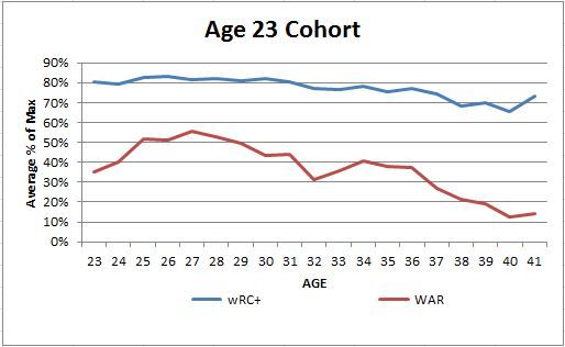
To start I pulled every position player year for rookies in the expansion era (after 1960) and ended up with 2,054 players and 11,585 player seasons including active players not just completed careers.  Then I broke players into age cohorts with when they played their first season with at least 300 plate appearances which I will refer to as full seasons the rest of the way.  I will be working through to see if players age differently based on what age they reach the majors and get regular playing time.  To do this I will mostly be looking at percent of peak wRC+ and WAR.  For this post I am only doing the first couple of cohorts and then I will work through more in the coming weeks.

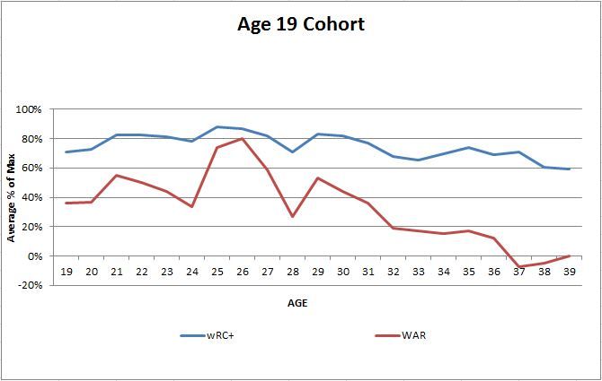
The first cohort I broke down was the age 19 group.  Only one player amassed the 300 plate appearances necessary at age 18, Robin Yount, so there is not much to learn there except that if you can hack it at the big leagues when you are 18 you are probably really, really good.  That will be true for the 19 and 20 year-olds as well, but there are more of them.  The age 19 cohort is also small with only 8 players; Ken Griffey Jr., Edgar Renteria, Bryce Harper, Cesar Cedeno, Tony Conigliaro, Ed Kranepool, Jose Oquendo, and Rusty Staub.  This will be the only cohort small enough that I will list everybody.  Interestingly the age 20 cohort has a lot more star power as Griffey is the only Hall of Famer (I know he isn’t in yet, but he will be on the first ballot).

Of the seven 19 year-olds that have retired, the average number of full seasons played is almost 13, so they did have long careers as you would expect.    None of the players peaked in wRC+ or WAR in their first full season, which is not surprising.  The more seasons you are in the majors, the lower the probability that the first season will be the best one just because you have more opportunities to best it.  Harper actually put up a better wRC+ in year 2, though his rookie WAR was better and this year isn’t looking like a new high for him so far.  If you take their average percent of peak at each age and chart it this is what you get:
 photo 19percentofmaxchart_zps8c04fc32.jpg
The sample size here is so small I wouldn’t want to believe it too much, but we might see some improvement for this cohort early in their careers.  The peak, if there is one, looks like 25 to about 27 especially in WAR.  Then it is all decline.  Again, these are players from the ERA that showed this before, not from players in the last 10 years that are not showing improvement in Jeff’s article.

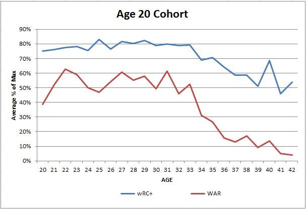
Let’s move on to a bigger group and see what happens.  The age 20 cohort includes 37 players with 10 current players.  There are Hall of Fame or near HoF players all over.  Rickey Henderson, Roberto Alomar, Ivan Rodriguez, and Johnny Bench are in along with Alex Rodriguez, Joe Torre, Andruw Jones, Gary Sheffield, Alan Trammel, Adrian Beltre, and Miguel Cabrera.  Mike Trout  is the only young guy I would assume has to eventually make it, but there are a couple others there that might eventually be that good too.  In my opinion, about a third of this group are HoF caliber or will be after their career is done.  That is 1 out of every 3 players that stick in the bigs at age 20 will be good enough to make it to Cooperstown.  Way better than the 19 year olds.  The average career length for those that are not active was over 11 years, so again most should not max out in their first year.

Only three players had their best hitting season as a rookie, but it was because all three of them had their only 300+ plate appearance season at age 20 so it was the only season in the sample.  Danny Ainge was one of the three though, so we could go see when his basketball career peaked instead maybe.  All three therefore also had their best WAR season at 20, but there was a fourth player who had his max WAR in that first full season, Claudell Washington.  Washington had 14 full seasons as a major leaguer and his best by WAR was year 1, and he had only one wRC+ better than that first year.  If we look at the chart for the age 20 cohort chart it looks way different than the 19 cohort.
 photo 20percentofmaxchart_zpse95fa760.jpg
Again, this is not a large sample, and it is overwhelmed by extremely good players.  There seems to be an increase in the first couple of seasons followed by a long, flat peak that for wRC+ goes all the way into their early 30s.  WAR is more volatile and might start declining a couple of years sooner.

I expect that this will get more informative as we get into more normal players and larger samples, but it is fun to look at elite players.  I’ll break down a couple of more age groups in the near future, and eventually try and build a regressed model for the bigger cohorts to control for the era and some of the other effects that aren’t rolled into wRC+ or WAR.


Is David Price Actually Improving?

Casual fans who look at David Price’s stat-line this year definitely come away unimpressed. On the surface, his 4-6 record with a 3.97 ERA are sub-par for a pitcher of his caliber, especially one who has been pegged as an ace for his entire major league career. Along with the underwhelming initial stat-line, his average fastball velocity is still down from its apex at about 95-97 MPH to around 92-94 MPH. All of this looks like it spells disaster for both the Rays, who want to ship him out at the deadline for future cornerstone players, and for Price, who is a free agent after the 2015 season.

This table can show you the slight but meaningful decline in Price’s velocity since his Cy Young Award winning season in 2012:

Velocity (MPH)
Fastball    Sinker    Change    Curve    Cutter
2012    96.49       96.17        84.93      79.55     89.88
2013    94.51        94.47       84.72      80.32     89.15
2014    94.38       93.96       85.63      79.88     87.26

But if you delve deep into the world of statistics, it appears that David Price is arguably improving as a pitcher.

His K/9 is sitting at a career best 10.02 along with a career best BB/9 at 0.90. If you look a little deeper at the sabermetric stat-line Price is also performing at a career best FIP and xFIP, which are 2.97 and 2.66, respectively. These two stats portray how Price’s ERA is not indicative of his actual performance. Continuing this trend, his LOB% sits at below average 67.5%. High strikeout pitchers like Price usually have more control over their LOB%, so its very likely that Price will positively regress toward his career average of about 75%. It could even be better due to his increase of strikeouts and decrease in walks. He also is sporting a career high 12.3% HR/FB that is contributing to his inflated ERA.

And if you look even deeper into the statistical world, Price is changing how he pitches—-and its actually improving his performance from its already lofty level. The only problem is the surface stats are not catching up with his actual performance…… just yet. Here is a table that shows Price’s pitch usage over the past three years:

      Pitch Usage
Fastball    Sinker     Change    Curve    Cutter
2012    12.56%    48.39%    12.15%    10.85%    16.06%
2013    15.07%    39.43%    16.61%    11.02%    17.87%
2014    15.97%    40.45%    17.02%    10.93%    15.64%

 With the velocity decrease in mind, the data is portraying that Price has had to adapt as a pitcher in order to continue having success. His fastball and changeup usage has increased because he can no longer blow it by hitters with ease. Along with this:

 Whiff Percentage
Fastball   Sinker  Change  Curve   Cutter
2012     9.24        6.15       12.37      20.25    9.74
2013     9.83        4.49      17.38      6.73       6.29
2014     9.28        9.20      19.09     12.88    12.02

In 2014, Price is rocking better whiff rates than in his amazing Cy Young Award winning 2012 season. His whiff rates have increased across the board other than his curveball. This means that David Price has adjusted his game around his diminishing velocity and has adapted from a power pitcher to a smarter, more crafty pitcher that changes speeds and does not solely rely on velocity to put away hitters. These increased whiff rates are the reason that Price is sporting a career best K/9 ratio. He is throwing a career best 72.1% of pitches for strikes on the first pitch of an at-bat, which contributes to his career best BB/9.

Overall, a simple glance at Price’s stat-line would give the impression that he is declining. But after looking deeper at his actual performance this season, the underlying facts show that he is changing the way he pitches and could quite possibly be getting better. There are rumblings that scouts no longer view Price as an ace that can lead a team deep into the playoffs. From a scouting perspective that may appear to be true, but with the knowledge of these underlying statistics, I believe that Price is still the pitcher he always has been, if not better.


The Essay FOR the Sacrifice Bunt

There are many arguments against the sacrifice bunt, by many sabermetricians and sports writers, all with the purpose of retiring its practice in baseball. The three main reasons not to bunt are that it gives away an out (out of only 27), the rate of scoring goes down (based on ERT by Tango), and that most bunters are unsuccessful.

For my argument, I will establish a more romantic approach and one I haven’t seen across the world of sabermetrics. With this approach, I will land on a conclusion that supports the sacrifice bunt and even speaks to the expansion of its practice.

Bunters can be successful

First, I’ll attack the last argument. If bunting is coached, bunters will be better. In my own research, as well as research done by others, I’ve found that there have been years when even the pitchers are able to bunt successfully over 90% of the time. Many people say that practice makes perfect, and while perfection might not be reached in the batters box, I wouldn’t be surprised if bunters were allowed to get close, or at least to their abilities in the 80’s.

Innings are more prosperous after bunt

The second argument is the main staple of this essay. In the world of analytics, general numbers are not good enough to explain why a phenomena is bad. Tom Tango’s famous Run Expectancy Matrix is used to make arguments against bunting across the Internet. Unfortunately, it’s assumed that the situations just exist rather than being set up the way that they are. It would be appropriate to use the table if a team were allowed to place a man, or men, on a base, or bases, and set the number of outs. However, as a strong believer in the principle of sufficient reason, I believe that there’s variability between a man on second with one out from a bunt and a man on second with one out from other situations.

For this reason, I set up my own analysis through the resource of Retrosheet play by play for the years of 2010-2013. To make things simple and not delve too deeply in varying circumstances, I will simply use larger data sets and noticeable differences to tell a story. First, I will look at only innings that start with men on base before the first out. Sacrifice bunts cannot happen when men are not on base, so it would be unfair to statistically compare innings with bunts to just innings without bunts. In line with Retrosheet’s system, I’m looking at all instances of SH, when they occur before (and usually result in) the first out.

To summarize, I’ll be looking at the percent chance that a team scores in an inning where they are able to get a man, or men, on base before the first out (as well as the average runs per inning when that situation is set up). I will compare this base situation to the percent chance that a team scores in an inning when they decide to sacrifice for that first out (as well as the average runs per inning when that situation is set up).

This data can be seen below with a total of about 53,000 innings across seasons where men were on base before the first out. In general, through the four years, teams score in about 26.8% of innings with about 0.478 runs per inning (RPI); when men get on base before the first out, they score 45.8% of innings with a .691 RPI. (In innings where a leadoff HR is hit, this does not count as men on base (nor will these runs count in calculation of either group, assuming men get on after the home run is hit, and before an out)).

Percent of Innings where a run is scored

Many managers, if not statisticians, understand this increase in the chance to score a run; after all, that’s why they do it. In 2010 and 2013, deciding to, and successfully laying down a sacrifice bunt resulted in a 13% increase in the ability to score that inning for the AL. And while it would make sense that the argument stops there, RPI also supports the sacrifice bunt (with data of the last four years). (Here, again, RPI = Runs scored after MOB B1O situation divided by number of innings of situation.)

Runs per Inning based on situation

This increase in RPI (seen as high as 0.137 Runs Per Inning larger than without bunting, 2012 AL) can contribute a decent number of runs over the course of a season. For example, in 2013, if the Oakland Athletics bunted a little less than once per series, they would have been on par with National League teams with number of bunts (in the 60’s). If they were able to bunt 47 more times (68, rather than 21), then their run total would have given them enough wins to have the best record in baseball (using Bill James adjusted pythagorean expected win percentage).

To summarize, an adjusted estimated runs table with respect to sacrifice bunt set up positioning and outs would produce more runs than the average table that does not take into concern how outs or players arrived at their position. This argument was suggested at the end of an essay by Dan Levitt, with earlier data in a more complex and subtle manner. RPI and the probability of scoring a run increase with a sacrifice bunt.

Bunting is symbolic of the greater good

The first and final argument to discuss is the idea that a sacrifice bunt throws away an out. In baseball, if a player bats out of order, or does not run out an error (among other mental mistakes), then that is giving away an out. And I believe that if a coach tells a player that he can’t hit, and to bunt because he can’t hit, then I wouldn’t argue that in those cases, you are giving away an out (knowingly removing the opportunity from the player to get a hit). So unless you believe that’s how coaches interact with their players prior to calling for the bunt, I will disagree with that notion.

The dictionary definition of sacrifice is “an act of giving up something valued for the sake of something else regarded as more important or worthy.” It’s the biggest theme in religious studies, the coolest way to die in movies, and the plot for heroic stories in the nightly news. Eliminating the psychological effects of a sacrifice, where they’re common place in our culture, seems slightly irresponsible after seeing the data.

This idea lends nicely to the discrepancy between American and National Leagues. Articles can be found, research has been done, and the common thought among those surrounding the game is that pitchers should bunt because they won’t do much else (in appropriate situations). In fact, an article by James Click gives the opinion that the lower the average, the more advantageous it is to bunt. However, my argument is the opposite. The amount they sacrifice, if they’re unable to hit is not valuable to those involved. If the pitcher is respected as a hitter, then their sacrifice is meaningful. Mentally as a leadoff man, if your pitcher is hitting sub .100, and there’s a man on base, he’s bunting because he cannot hit. That’s not a teamwork inspired motive, that’s a picking poison motive. The chart below shows data from the last four years when men get on base before the first out, it distinguishes that the National League is better than either league that doesn’t bunt, but far from as effective as AL bunters.

The argument can be made that the AL contains better hitters, and while I believe this, there would be a larger separation of the % scoring without bunting as well as the RPI of the innings where players get on before the first out.

Summary Chart

Because of this separation, I feel that bunting is not giving away an out, but sacrificing for something greater. Simply put, if my teammate sets me up to knock in a run with a hit, that’s easier that having to find a gap, or doing something greater. In many cases, I might need to just find a hole in the infield. Also, I know that my team, and coach, believes in me to be successful. Professional athletes can’t possibly feel pressure and confidence that emanates from teammates with the hopes of greater success, that idea would be ridiculous, right? Those ideas are practiced and taught in business places and self-help books around the world.

Opposition

The data that I used was from Retrosheet, and while this data lists a lot of SH’s (sacrifice bunts) from where errors occur, to double plays, the main output is the standard sacrifice bunt. That being said, it does not include instances where the batter was bunting for a base hit (regardless of number of men on base), or other strange incidents of sacrifice failures (places where the scoring did not distinguish that an SH was in play). After recreating the analysis to include all bunts, the values of RPI and % scoring assuming men on base before the first out, values were still larger than without the bunt, but not as large as the sacrifice representation. This argument falls with the established idea that bunting could be more successful than most people think (especially when the bunt is a sacrifice). For instance, if the numbers above are reduced by as much as 85% in some cases, it still produces more successful results.

The next piece of opposition is that different circumstances have different weights in these situations, and that my case is too general to provide an advantage to a staff trying to decide whether to bunt. My argument is that upon analyzing circumstances, the most important element is the sacrifice bunt. In most situations, I feel that it will boost the team’s ability (and desire) to have success. With four years of data, my goal was to be able to refute the reliance on the simple Tango Run Expectancy Matrix, and how it is used, not to recreate one. In my opinion, in order for people to understand how historically successful situations have been, there should be hundreds of Run Expectancy Matrices highlighting how runners came to be where they are, as well as what batters follow.

The final piece of opposition has been created by myself during the generation of this essay or idea. The Heisenberg Uncertainty Principle relates to the ability to study the speed and position of a microscopic particle. Simply put, by studying one, you’re unable to observe the other. The act of observation limits the ability to fully observe. Because my argument is set up in a romantic sense, it could be argued that this principle relates. If coaches and teams start bunting every other inning, the act of giving oneself away for the greater good of the team will diminish and its advantage psychologically will wither away. In other words, the knowledge of how something effects one emotionally can limit one from being emotionally affected. I present this as an opposition because I feel that this might already be the case where if a pitcher is repeatedly bunting, teams will not think much of it as a quest for the greater good. However, when players are seen as an asset in the box, this advantage still exists; so teammates can still be sold on the relevance of the opportunity.

If these ideas spread, will this essay result in more bunts, especially when there are no outs? Probably not, because statisticians are stubborn. But it definitely provides an outlet for coaches who support the old school, traditional game of baseball.


Felix, Better than Ever, and the Best Ever

Anytime a sports piece starts making claims that so and so is the best player ever, it’s best to check assumptions being made.  And the sooner those assumptions are made, the better.  So let’s get the big assumption out of the way early.

Felix now has a legitimate claim to being the best Mariner pitcher ever.  Considering that he has 8 full seasons under his belt and 2 half seasons, all the while sitting atop the Mariner rotation, this claim hardly seems surprising, but for one thing…

Randy Johnson pitched 8 full seasons and 2 half seasons for the Mariners, too.

And for anyone following baseball during the 1990’s, it’s hard to believe any pitcher could usurp the title of best ever from the Big Unit, whose left arm terrified hitters, as a Mariner, from 1989 to 1998.  Nevertheless, here we are:

Seasons IP FIP K/9 BB/9 HR/9 WAR
Randy Johnson 1989-1998 1838 3.34 10.6 4.3 0.8 45
Felix Hernandez 2005-2014 1931 3.16 8.5 2.5 0.7 45

Johnson has very few peers, through history, in his ability to strike out hitters.  But it’s clear that Felix is proportionally better than the Unit in his ability to limit base on balls.  Felix’s superior FIP is mostly a function of playing his home games at Safeco while Johnson had to pitch in the hitter friendly Kingdome.  As WAR is park-adjusted, we can see that Felix has come to match Johnson’s 45 WAR accumulation, as of this date.  From this point on in Felix’s career, his WAR total will likely increase beyond Randy’s static Mariner total of 45, and probably rapidly so.

One could take the position that Randy’s playoff totals in 1995 and 1997 still keep him ahead of Felix.  But that would be crediting Randy’s better supporting cast for having gotten him to that position in the first place.  Hardly an individual achievement.

The amazing thing about Felix is he’s putting up performances that are the best of his career.  Felix came into his own by winning the Cy Young Award in 2010.  He followed up that season in 2011 by essentially matching those award winning stats.  His encore has been to better the stats in each successive year, to where he’s matching his best K-rate and beating his best BB-rate, ever, in 2014.

Years IP FIP K/9 BB/9 HR/9
Felix Hernandez 2010 249.2 3.04 8.36 2.52 0.61
2011 233.2 3.13 8.55 2.58 0.73
2012 232 2.84 8.65 2.17 0.54
2013 204.1 2.61 9.51 2.03 0.66
2014 106.1 1.96 9.48 1.61 0.25

And in case you were wondering, here’s where Felix ranks for pitchers between the ages of 16 and 28, over the last 50 years:

Player FIP WAR
Bert Blyleven 2.80 63.3
Roger Clemens 2.68 56.0
Pedro Martinez 2.81 50.6
Dwight Gooden 2.73 50.6
Tom Seaver 2.58 48.6
Felix Hernandez 3.16 45.1
Fergie Jenkins 2.77 44.1
Greg Maddux 3.13 42.8
CC Sabathia 3.59 42.7
Sam McDowell 2.89 42.3

And by the way, if you’re curious who Felix will need to measure up to for the rest of his career, from his age 29 season onward; well, there’s really only one name: Randy Johnson, who accumulated 101.2 WAR, from the age of 29 to 45.

As a long-time Mariners fan, I never thought I’d see the likes of Randy Johnson, ever again.

Then came the King.


What is Wrong with Trevor Rosenthal?

This title is slightly misleading, and may be best put as “What is Not Quite Right with Trevor Rosenthal?”  His ERA is below 4.00 and his FIP is much better than his ERA, thanks in large part to his high strikeout rate and low home run rate. Yet, Rosenthal is not dominating in the same way that he did last year when he struck out 108 batters in 75 1/3 innings and compiled a miniscule 1.91 FIP. So, what is different about Rosenthal that has led to a 1.36 increase in ERA and .83 spike in FIP? As I said, Rosenthal is in the midst of a very respectable season, by many metrics, but he is not supposed to be “just” respectable. Rosenthal should be able to dominate the league, just as he did last year when he ranked 5th among relievers in FIP and WAR. Naturally, I turned to the numbers to determine what is holding Rosenthal back from being one of the best closers in the league.

With such a significant jump in his ERA, I expected to see that Rosenthal was being hit much harder, but that is not what I found. Not only is his opponents’ SLG% down, but so is his opponents’ AVG. So, Rosenthal is allowing fewer hits compared to last year and also fewer extra base hits, which certainly seems like a great formula for success. However, based on the type of contact Rosenthal is letting up this year, I would expect to see the opposite trend. For the second straight season, Rosenthal’s GB% has decreased, and this year, his Line Drive % (LD%) ballooned 10% up to 30%. Despite allowing more hard contact, Rosenthal has decreased his BABIP, which suggests he has actually been lucky to this point in the season. Rosenthal has also done a nice job limiting home runs, even while allowing more balls to be put in the air. His GB/FB ratio has dropped all the way to .85 from 1.23 just a year ago. Fortunately, he has still managed to drop his HR/9 to 0.3 thanks to a miniscule HR/FB ratio of .037.

In an attempt to understand why he was letting up more solid contact, I looked at his fastball velocity, but it was right where it was last year. Rosenthal has not lost any velocity from where he was last year, which means it his stuff is not to blame for his increased FB and LD rates this year. Yet, even with his upper-90s heat, Rosenthal has struggled to get ahead in the count. He has thrown the first pitch of the at-bat for a strike just 57.1% of the time this year, which is a 6% drop from last season. Anytime you fall behind a hitter, you give them a much better chance to make solid contact, even when you can touch triple digits. As a pitcher with as much stuff as he has, Rosenthal must be aggressive and work ahead in the count in order to maximize his lights out repertoire.

More concerning than the fact that he is falling behind more hitters than last year, is where Rosenthal is missing. Of all the pitches Rosenthal has thrown outside the strike zone, 44% have missed up above the zone, compared to just 28% below the zone. This is compared to last year when he missed above the zone just 34% of the time and below the zone with 35% of his pitches outside the zone. While this may not seem significant since these balls are outside the zone, so they are unlikely to be hit, it is always concerning to see a pitcher consistently throwing up in the zone. Rosenthal’s propensity to miss with pitches up has certainly contributed to his increased LD% and FB%, as it is easier to elevate a pitch that is already up. This could be a strategy for Rosenthal, as it is harder to catch up to fastballs up in the zone, but it has yet to materialize into positive results, as his performance is worse than in 2013.

Also, based off the times I have seen him throw, this does not seem to be a strategy, as he has also missed up in the zone with his changeup, which is never intended by any pitcher. Despite some issues keeping it down in the zone, Rosenthal’s changeup has been his best pitch by far this season. This is particularly surprising for a pitcher that throws as hard as he does, but his changeup has compiled an astounding 5.71 runs above average per every 100 pitches, which has likely contributed to his increased use of the pitch (up to 15% from 6% in 2013). On a more concerning note though, his fastball is registering a career low .21 runs above average per every 100 pitches, down .77 runs from last year. It isn’t surprising the fastball is not worth as much as the changeup on average because the changeup is often used in higher leverage situations and also with less frequency. However, with Rosenthal’s struggles to get ahead in the count, it is not shocking that his fastball is less effective this year.

While Rosenthal has allowed harder contact this year, it has yet to materialize into better statistics for his opponents, in terms of batting average and slugging percentage. Where Rosenthal has been hurt this season is with his walks, which is among the few things he can fully control. He has already walked 17 batters this season, after walking just 20 all of last season in 45 more innings. Rosenthal’s BB/9 has actually more than doubled from it 2.39 mark in 2013, as it sits at 4.99 thus far in 2014. As a result of his lost control, Rosenthal’s opponent’s OBP has shot up from .289 last year to .321 this season, despite a lower opponent’s batting average. Rosenthal also tends to lose his control at the wrong times, as he has walked 10 of his 17 batters in high leverage situations, while pitching just 2/3 of an inning more in those situations than low and medium leverage situations.

Even more concerning, he has walked 11 batters with men on base, leading to an opponent’s OBP of .409 with men already on base. Rosenthal’s struggles from the stretch seem to be related to his rushing to the plate. Based purely on the times I have seen him throw, he has a propensity to rush to the plate when pitching from the stretch, which does not give his throwing arm time to get up into position. This tendency for his arm to lag leaves him susceptible to throw the ball up, which is where most of his pitches are missing. With his struggles from the stretch, it is no wonder Rosenthal’s Left on Base% has dropped 5.3% from last season.

This is not an article to criticize Rosenthal and call for his removal from the closer role, but rather to point out where Rosenthal needs to improve. His ERA is certainly high for a closer, but because he is not allowing many hits, he can easily improve his season by being more aggressive in the strike zone. A pitcher with as much stuff as Rosenthal should not be afraid to pitch within the zone. Working ahead in the count will also work to prevent the solid contact that has increased this year. Rosenthal shows the importance of throwing strikes, as he has gone from one of the premier late-inning arms in the game to a pitcher with the 114th best ERA of qualified relievers. Even in terms of FIP, Rosenthal ranks 51st among qualified relievers. While these are certainly discouraging trends, if he can return to throwing strikes the way he did in his previous two opportunities in the Majors, he will be able to reverse these trends.