Archive for Research

Foundations of Batting Analysis: Part 4 — Storytelling with Context

Examining the foundations of batting analysis began in Part 1 with an historical examination of the earliest statistics designed to examine the performance of batters. In Part 2, I presented a new method for calculating basic averages reflecting the “real and indisputable” rate at which batters reached base. In Part 3, I examined the development of run estimation techniques over the last century, culminating with the linear weights system. I will employ that system now as I reconstruct run estimation from the bottom up.

We use statistics in baseball to tell stories. Statistics describe the action of the game or the performance of players over a period of time. Statistics inform us of how much value a player provided or how much skill a player showed in comparison to other players. To tell such stories successfully, we must understand how the statistics we use are constructed and what they actually represent.

A single, for instance, seems simple enough at first glance. However, there are details in its definition that we sometimes gloss over. In general, a single is any event in which the batter puts the ball into play without causing an out, while showing an accepted form of batting effectiveness (reaching on a hit), and ultimately advancing to first base due to the primary action of the event (before any secondary fielding errors or advancement on throws to other bases). Though this is specific in many regards, it is still quite a broad definition for a batting event. The event could occur in any inning, following any number of outs, and with any number of runners on the bases. The ball could be hit in any direction, with any speed and trajectory, and result in any number of baserunners advancing any number of bases.

These kinds of details form the contextual backdrop that characterizes all batting events. When we construct a statistic to evaluate these events, we choose what level of contextual detail we want to consider. These choices define our analysis and are critical in developing the story we want to tell. For instance, most statistics built to measure batting effectiveness—from the simple counting statistics like hits and walks, to advanced run estimators like Batter Runs or weighted On Base Average (wOBA)—are constructed to be independent of the “situational context” in which the events occur. That is, it doesn’t matter when during the game a hit is made or if there are any outs or any runners on the bases at the time it happens. As George Lindsey noted in 1963, “the measure of the batting effectiveness of an individual should not depend on the situations that faced him when he came to the plate.”

Situational context is the most commonly cited form of contextual detail. When a statistic is described as “context neutral,” the context being removed is very often the one describing the out/base state before and after the event and the inning in which it occurred. However, there are other contextual details that characterize the circumstances and conditions in which batting events occur that also tend to be removed from consideration when analyzing their value. Historically, where the ball was hit, as well as the speed and trajectory which it took to reach that location, have also not been considered when judging the effectiveness of batters. This has partly been due to the complexity of tracking such things, especially in the century of baseball recordkeeping before the advent of computers. Also, most historical batting analyses focus exclusively on the outcome for the batter, independent of the effect on other baserunners. If the batter hits the ball four feet or 400 feet but still only reaches first base, there is no difference in the personal outcome that he achieved.

If the value of a hit was limited to only how far the batter advances, then there would be no need to consider the “batted-ball context,” but as F.C. Lane observed in 1916, part of the value of making a hit is in the effect on the “runner who may already be upon the bases.” By removing the batted-ball context when considering types of events in which the ball is put into play, we’re assuming that a four-foot single and 400-foot single have the same general effect on other baserunners. For some analyses, this level of contextual detail describing an event may be irrelevant or insignificant, but for others—particularly when estimating run production—such a level of detail is paramount.

Let’s employ the linear weights method for estimating run production, but allow the estimation to vary from one completely independent of any contextual detail to one as detailed as we can make it. In this way, we’ll be able to observe how various details impact our valuation of events. Also, in situations where we are only given a limited amount of information about batting events, it will allow us to make cursory estimations of how much they caused their team’s run expectancy to change.

To begin, let’s define the run-scoring environment for 2013.[i] While we have focused on context concerning how events transpired on the field, the run scoring environment is another kind of contextual detail that characterizes how we evaluate those events. The exact same event in 2013 may not have caused the same change in run expectancy as it would have in 2000 when runs were scored at a different rate. We will define the run scoring environment for 2013 as the average number of runs that scored in an inning following a plate appearance in each of the 24 out/base states – a 2013-specific form of George Lindsey’s run expectancy matrix:

Base State 0 OUT 1 OUT 2 OUT
0   0.47   0.24   0.09
1   0.82   0.50   0.21
2   1.09   0.62   0.30
3   1.30   0.92   0.34
1-2   1.39   0.84   0.41
1-3   1.80   1.11   0.46
2-3   2.00   1.39   0.56
1-2-3   2.21   1.57   0.71

While we will focus on examining various levels of contextual detail concerning the events themselves, the run-scoring environment can also be varied based on contextual details concerning the scoring of runs. The matrix we will employ, as defined by Lindsey, reflects the average number of runs scored across the entire league. If we wanted, we could differentiate environments by league or park, among other things, to try and reflect a more specific estimate of the number of runs produced. As the work I’m going to present is meant to provide a general framework for run estimation, and these adjustments are not trivial, I’m going to stick with the basic model provided by Lindsey.

With Lindsey’s tool, we can define a pair of statistics for general analysis of run production. Expected Runs (xR) reflect the estimated change in a team’s run expectancy caused by a batter’s plate appearances independent of the situational context in which they occur. A batter’s expected Run Average (xRA) is the rate per plate appearance at which he produces xR.

xRA = Expected Runs / Plate Appearances = xR / PA

xR and xRA create a framework for estimating situation-neutral run production. Based on the contextual specificity that is used to describe the action of a plate appearance, xR and xRA will yield various estimations. The base case for calculating expected runs, xR0, is calculated independently of any contextual detail, considering only that a plate appearance occurred. By definition, an average plate appearance will cause no change in a team’s run expectancy. Consequently, no matter a player’s total number of plate appearances, his xR0 and, by extension, his xRA0, will be 0.0.

This is completely uninformative of course, as base cases often are. So let’s add our first layer of contextual specificity by noting whether an out occurred due to the action of the plate appearance. This is the most significant contextual detail that we consider when evaluating batting events – it is the only factor that determines whether a plate appearance increases or decreases a team’s run expectancy. In 2013, 67.5 percent of all plate appearances resulted in at least one out occurring. On average, those events caused a team’s run expectancy to decrease by .252 runs. The 32.5 percent of plate appearances in which an out did not occur caused a team’s run expectancy to increase by .524 runs on average. We’ll define xR1 as the estimated change in run expectancy based exclusively on whether the batter reached base without causing an out; xRA1 is the rate at which a batter produced xR1 per plate appearance.

You’ll notice that the components that construct xRA1 can only take on two values—.524 and -.252—in the same way that the components that construct effective On Base Average (eOBA) (as defined in Part 2) can only take on two values—1 and 0. These statistics—xRA1 and eOBA—have a direct linear correlation:

1

In effect, xRA1 is a weighted version of eOBA, incorporating the same contextual details but on a different scale. This estimation provides us with an association between reaching base safely and producing runs. However, the lack of detail would suggest that all players that reach base at the same rate produce the same value, which is over simplified. It’s why you wouldn’t just use eOBA, or eBA, or any other basic statistic that reflects the rate which a batter reaches base, when judging the performance of a batter. Let’s add another layer of contextual detail to account for the different kinds of value a batter provides when he reaches base.

xR2 will represent the estimated change in run expectancy based on whether the batter safely reached base and the number of bases to which he advanced due to the action of the plate appearance; xRA2 will be the rate at which a batter produces xR2 per plate appearance. While xR1 and xRA1 were built with just two components to estimate run production, xR2 and xRA2 require five components: one to define the value of an out, and four to define the value of safely reaching each base.

In 2013, a batter safely reaching first base during a plate appearance caused an average increase of .389 runs to his team’s run expectancy. Reaching second base was worth .748 runs, third base was worth 1.026 runs, and reaching home was worth 1.377 runs on average. Where xRA1 provided a run estimation analog to eOBA, xRA2 is built with very similar components to effective Total Bases Average (eTBA), though it’s not quite a direct linear correlation:

The reason xRA2 and eTBA do not correlate with each other perfectly, like xRA1 and eOBA, is because the way in which a batter advances bases is significant in determining how valuable his plate appearances were. Consider two players that each had two plate appearances: Player A hit a home run and made an out, Player B reached second base twice. Their eTBA would be identical—2.000—as they each reached four bases in two plate appearances. However, from the run values associated with reaching those bases, Player A would record 1.125 xR2 from his home run and out, while Player B would record 1.496 xR2 from the two plate appearances leaving him on second base. Consequently, Player A would have produced a lower xRA2 (.5625) than Player B (.7480), despite their having the same eTBA. These effects tend to average out over a large enough sample of plate appearances, but they will still cause variations in xRA2 among players with the same eTBA.

As stated in Part 2, the two main objectives of batters are to not cause an out and to advance as many bases as possible. If the only value that batters produced came from accomplishing these objectives, then we would be done – xR2 and xRA2 would reflect the perfect estimations of situation-neutral run production. As I hope is clear, though, the value of a batting event is dependent not only on the outcome for the batter but on the impact the event had on all other runners on base at the time it occurred. Different types of events that result in the batter reaching the same base can have different average effects on other baserunners. For instance, a single and a walk both leave the batter on first base, but the former creates the opportunity for baserunners to advance further on average than the latter. To address this, the next layer of contextual detail will bring the official scorer into the fray. xR3 will represent the estimated change in run expectancy produced during a batter’s plate appearance based on:

(1)    whether the batter safely reached base,

(2)    the number of bases, if any, to which the batter advanced due to the action of the plate appearance, and

(3)    the type of event, as defined by the official scorer, that caused him to reach base or cause an out.

xRA3 will, as always, be the rate at which a batter produces xR3 per plate appearance.

Each of the run estimators that were examined in Part 3, from F.C. Lane’s methods through wOBA, are subsets of this level of xR. Expected runs incorporate estimations of the value produced during every event in which the batter was involved, including those which may be considered “unskilled.” The run estimators examined in Part 3 consider only those events that reflected a batter’s “effectiveness,” and either disregard the “ineffective” events or treat them as failures. xR3 provides the total value produced by a batter, independent of the effectiveness he showed while producing it, based solely on how the official scorer defines the events. Consequently, some events, like strikeouts, sacrifice bunts, reaches on catcher’s interference, and failed fielder’s choices, among other more obscure occurrences, are examined independently in xR3. From the two components of xR2 and the five of xR3, we build xR4 with 18 components: five types of outs and 13 types of reaches.

To help illustrate how xR has progressed from level to level, here is a chart reflecting the run values for 2013 as estimated by xR based on the contextual detail provided thus far.

xR Progression

Beyond any consideration of skilled or unskilled production, xR3 is the level at which most run estimators are constructed. It incorporates events that are well defined in the Official Rules of the game, and have been for at least the last few decades, and in some cases for over a century. While we still define most of a batter’s production by his accomplishing these events, we live in an era where we can differentiate between events on the field in more specific ways. Not all singles are identical events. We weaken our estimation of run production if we don’t account for the different kinds of singles, among other events, that can occur. xR3 brought the official scorer into action; xR4 will do the same with the stat stringer.

While the scorer is concerned with the result of an event, a stringer pays attention to the action in between the results. They chart the type, speed, and location of every pitch, and note the batted ball type (bunt, groundball, line drive, flyball, pop up) [ii] and the location to which the ball travels when put into play.While we don’t have this data as far back in time as we have result data, we do have decades worth of information concerning these details. By differentiating events based on these details, we will begin to unravel the “batted-ball context.” Ideally, we would know every detail of the flight of the ball, and use this to group together the most similar possible type of events for comparison.[iii] At present, we’re limited to what the scorers and stringers provide, but that’s still quite a lot of information.

xR4 will represent the estimated change in run expectancy produced during a batter’s plate appearance based on:

(1)    whether the batter safely reached base,

(2)    the number of bases, if any, to which the batter advanced due to the action of the plate appearance,

(3)    the type of event, as defined by the official scorer, that caused him to reach base or make an out,

(4)    the type of batted ball, if there was one, as defined by the stat stringer, that resulted from the plate appearance,

(5)    the direction in which the ball travelled, and

(6)    whether the ball was fielded in the infield or outfield.

xRA4 will be the rate at which a batter produces xR4 per plate appearance.

There are 18 components in xR3 which describe the assorted types of general events a batter can create.  When you add in these details concerning the batted-ball context, the number of components increases to 145 for xR4. With such specific details being considered, we can no longer rely on a single season of data to accurately inform us on the average situation in which each type of event occurs; the sample sizes for some events are just too small. To address this, there are two steps required in evaluating events for xR4. The first is to build a large sample of each event to build an accurate picture of their relative frequency in each out/base state. I’ve done this by using a sample covering the previous ten seasons to the one in which the estimations are being made. Once this step is completed, the run-scoring environment in the season being analyzed is applied to these frequencies, in the same way it is when looking at single season frequencies for basic events.

For instance, the single, which is traditionally treated as just one type of event, is broken into 24 parts based on the contextual details listed above. By observing the rate at which each of these 24 variations of singles occurred in each out/base state from 2004 through 2013, and applying the 2013 run-scoring environment, we get the following breakdown for the estimated value of singles in 2013:

Single Left Center Right   All
Bunt, Infield .418   .451  .436 .427
Groundball, Infield .358   .361  .384 .363
Pop Up, Infield .391   .359  .398 .369
Line Drive, Infield .343   .369  .441 .369
Groundball, Outfield .463   .464  .499 .474
Pop Up, Outfield .483   .480  .498 .488
Line Drive, Outfield .444   .463  .471 .460
Flyball, Outfield .481   .479  .490 .482

This process is repeated for every type of batting event in which the ball is put into play. One of the ways we can use this information is to consider the run value based not on the result of the event, but on the batted-ball context that describes the event. Here are those values in the 2013 run-scoring environment:

Popups Groundballs Fly Balls Line Drives All Swinging BIP
All Outs -.261 -.257 -.226 -.257 -.249
Infield Out -.260 -.257 ——- -.297 -.260
Outfield Out -.269 ——- -.226 -.233 -.229
Left Out -.262 -.260 -.230 -.251 -.253
Center Out -.262 -.281 -.223 -.257 -.257
Right Out -.260 -.229 -.227 -.262 -.237
All Reaches   .514   .468 1.108   .571   .629
Infield Reach   .436   .381 ——-   .390   .382
Outfield Reach   .517   .503 1.108   .572   .659
Left Reach   .516   .463 1.172   .577   .632
Center Reach   .535   .443 1.006   .546   .593
Right Reach   .483   .510 1.166   .593   .672
All Infield -.257 -.199 ——- -.267 -.211
All Outfield -.003   .503   .093   .402   .262
All Left -.219 -.058   .161   .332   .054
All Center -.205 -.078   .030   .312   .030
All Right -.191 -.069   .123   .326   .045
All -.207 -.068   .093   .323   .042

Similarly, we can break down each player’s xR4 by the value produced on each type of batted ball. Here are graphs for xR4 produced on each of the four types of batted balls resulting from a swing, with respect to the number of batted balls of that type hit by the player. For simplicity, from this point on, when I drop the subscript when describing a batter’s expected run total, I’m referring to xR4.

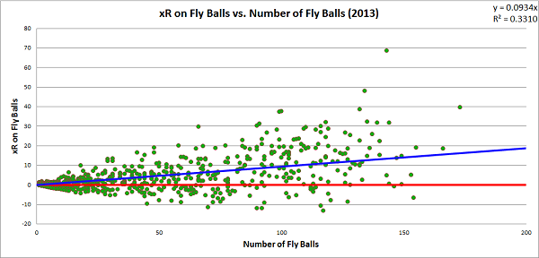
Line drives are the most optimal result for a batter. The first objective of batters is to reach base safely, and they did that on 67.0 percent of line drives last season. No batter who hit at least eight line drives in 2013 caused a net decrease in his team’s run expectancy during those events. For most batters, hitting the ball into the outfield in the air is the ideal way to produce value, as fly ball production tends to create a positive change in a team’s run expectancy. However, fly balls have the most variance of any of the batted ball types, and there are certainly batters who hurt their teams more when hitting the ball at a high launch angle than a low one. Here are the players to produce the lowest xRA on fly balls last season (minimum 50 fly balls):

Lowest xRA on Fly Balls, MLB – 2013
 (minimum 50 fly balls)
Pete Kozma, StL -.1626
Ruben Tejada, NYM -.1546
Cliff Pennington, Ari -.1513
Andres Torres, SF -.1465
Placido Polanco, Mia -.1224

For each of these batters, hitting the ball on the ground or on a line drive were far better results on average.

xRA by Batted Ball Type – 2013
FB GB LD
Pete Kozma, StL -.1626 -.0738 .2496
Ruben Tejada, NYM -.1546 -.0961 .1227
Cliff Pennington, Ari -.1513 -.0421 .3907
Andres Torres, SF -.1465 -.0155 .4269
Placido Polanco, Mia -.1224 -.0981 .1889

While groundballs may be a preferable result for some batters when compared to fly balls, they are still effectively batting failures for the team. There were 840 batters in 2013 to hit at least one groundball and only 44 produced a net positive change in their team’s run expectancy. Of those 44 players, only 11 hit more than 10 groundballs, and only two (Mike Trout and Juan Francisco) hit at least 100 groundballs. Here are the players with the highest xRA on groundballs in 2013 who hit at least 100 groundballs:

Highest xRA on Groundballs, MLB – 2013
 (minimum 100 groundballs)
Mike Trout, LAA   .0187
Juan Francisco, Atl-Mil   .0123
Brandon Barnes, Hou -.0076
Andrew McCutchen, Pit -.0081
Marlon Byrd, NYM-Pit -.0093

xR4 allows us to tell the most detailed story concerning the type of value a batter produced, independent of the situational context at the time the plate appearance occurred. Because we gradually added layers of detail to our estimation, we can compare how each level of expected runs correlates to this most detailed level. In this way, we can judge how much information each level provides with respect to our most detailed estimation. Here is a graph that charts a batter’s xR4 with respect to his xR1, xR2, and xR3 estimations:

The line that cuts through the data reflects the xR4 values charted against themselves. For each xRn, we can calculate how well it correlates with xR4 and, consequently, how much of xR4 it can explain. Remember that we have already shown that xR1 has a direct linear correlation with eOBA and xR2 has a very high, though not quite direct, correlation with eTBA. For the xR1 values, we observe a correlation, r, with xR4 of .912, and an r2 of .832, meaning that knowing the rate at which a batter reaches base explains over four-fifths of our estimation of xR4. For the xR2 values, r2 increases to .986; for the xR3 values, r2 increases slightly higher to .990.[iv]

The takeaway from this is that when considering the whole population of players, there is little difference in a run estimator that considers the batted-ball context and one that does not; you can still explain 99 percent of the value estimated by xR4 by stopping at xR3. In fact, if all you know is the rate at which a batter accomplishes his two main objectives—reaching base and advancing as far as possible—you can explain well over 90 percent of the value estimated by xR4. However, on an individual level, there is enough variation that observing the batted-ball context can be beneficial. Here are the five players with the largest positive and negative differences between their xR3 and xR4 estimations:

Largest Increase from xR3 to xR4, MLB – 2013
Player xR3 xR4 Diff
David Ortiz, Bos 44.1 48.2 +4.1
Kyle Seager, Sea 11.8 15.9 +4.1
Chris Davis, Bal 57.2 61.0 +3.8
Matt Carpenter, StL 36.6 40.3 +3.7
Freddie Freeman, Atl 38.6 41.9 +3.3


Largest Decrease from xR3 to xR4, MLB – 2013
Player    xR3    xR4 Diff
Adeiny Hechavarria, Mia -27.2 -32.9 -5.7
Jean Segura, Mil     9.7     4.2 -5.5
Jose Iglesias, Bos-Det     4.5    -0.1 -4.7
Elvis Andrus, Tex   -8.6  -12.9 -4.3
Alexei Ramirez, CWS   -1.9    -5.8 -3.9

These changes are not massive, and these are the extreme cases for 2013, but they are certainly large enough that ignoring them will weaken specific analyses of batting production. Incorporating batted ball details into our analysis adds a significant layer of complexity to our calculation, but it must be considered if we want to tell the most accurate story of the value a batter produced.

If this work seems at all familiar, you may have read this article that I wrote last year on a statistic that I called Offensive Value Added (OVA). For all intents and purposes, OVA and xR are identical. I decided that the name change to xR would help me differentiate estimations more simply, as I could avoid naming four separate statistics for each level of contextual detail, but there was also a secondary reason for changing the presentation of the data. OVAr was the rate statistic associated with OVA, and it was scaled to look like a batting average, much in the same way that wOBA is scaled to look like an on base average. At the time, I choose to do this to make it easier to appreciate how a batter performed, since many baseball enthusiasts are comfortable interpreting the relative significant of a batting average.

After thinking on the subject, though, I came to decide that I prefer statistics that actually “mean” something to those that give a general, unit-less rating. For instance, try to explain what wOBA actually reflects. It starts as a run estimator, but then it’s transformed into a number that looks like a statistic with specific units (OBA), while not actually using those units. Once that transformation occurs, it no longer reflects anything specific and only serves as a way to rate batters. The same principle applies to other statistics as well, most notably OPS, which is arguably the most meaningless of all baseball statistics, perhaps all statistics ever (don’t get me started).

xR and xRA estimate the change in a team’s run expectancy caused by a batter’s plate appearances. They are measured in runs and runs per plate appearance, respectively. xRA may not look like a number you’ve seen before, and generally needs to be written out to four decimal places instead of three, unlike basic averages, but it’s linguistically very simple to use and understand. I’d rather sacrifice the comfort of having a statistic merely look familiar and instead have it actually reflect something tangible. This doesn’t take away from the value of a statistic like wOBA, which is a great run estimator no matter what scale it is on; a lack of meaning certainly does not imply a lack of value. Introducing an unscaled run average, xRA, will hopefully create a different perspective on how to talk about batting production.

There is one final expected run estimation that I want to consider that could easily cover an entire new part on its own, but I’ll limit myself to just a few paragraphs. The xR estimations we have built have been constructed independent of the situational context at the time of the batter’s plate appearance. Since we want to cover the entire spectrum of context-neutral run estimation to context-specific run estimation, we will conclude by considering xRs, which is an estimate of the change in a team’s run expectancy based on the out/base state before and after the action of the plate appearance. This is very nearly the same thing as RE24 but it only considers runs produced due to the primary action of plate appearances and not baserunning events.

In many respects, xRs is the simplest run estimator to construct of all that we have built thus far. There are only three pieces of information you need to know in a given plate appearance to construct xRs: the run-scoring environment, the out/base state at the start of the action of the plate appearance, and the out/base state at the end of the action of the plate appearance. Next time you go to a baseball game, bring along a copy of a run expectancy matrix, like the one provided earlier. On a scorecard, at the start of every plate appearance, take note of the value assigned to the out/base state, making adjustments if any runners move while the batter is still in the batter’s box. Once the plate appearance is over, note the value of the new out/base state, separating out any advancement on secondary fielding errors or throws to other bases. Subtract the first value from the second value, and add in any RBIs on the play, and write the number in the box associated with the batter’s plate appearance; you just calculated xRs. Do this for a whole game, and you will have a picture of the total value produced by every batter based on the out/base state context in which they performed.

The effective averages and expected run estimations provide a foundation on which batting analysis can be performed. They combine both “real and indisputable facts” with detailed estimations of the run produced in every event in which a batter participates. Any story that aims to describe the value that a batter provides to his team must consider these statistics, as they are the only ones which account for all value produced. 147 years ago, Henry Chadwick suggested that batters should be judged on whether they passed a “test of skill.” I think they should be judged on whether they passed a “test of value.”

Thanks to Benjamin H Byron for editorial assistance, as well as the staff at the Library of Congress for assistance in locating original copies of the 19th century newspaper articles included in Part 1.

Here is data on eOBA, eTBA, and each level of xR and xRA estimation, for each batter in 2013.

Bibliography


[i] I’ll be focusing on 2013 because the full season is complete. All the work described here could easily be applied to 2014, or any other season, I just don’t want to use incomplete information.

[ii] While these terms are used a lot, there aren’t any specific definitions commonly accepted that differentiate each type of batted ball. For terms used so commonly, it doesn’t make much sense to me that they are not well defined. It won’t apply to the data used in this research, but here is my attempt at defining them.

A bunt is a batted ball not swung at but intentionally met with the bat. A groundball is a batted ball swung at that lands anywhere between home plate and the outer edge of the infield dirt and would be classified as a line drive if it made contact with a fielder in the air. A line drive is a batted ball swung at that leaves the bat at an angle of at most 20° above parallel to the ground (the launch angle), and either lands in the outfield or makes contact with any fielder before landing (generally through a catch, but sometimes a deflection). A fly ball is a batted ball swung at, with a launch angle between 20° and 60° above parallel (not inclusive), that either lands in the outfield or is caught in the air by a player in the outfield. A popup is a batted ball swung at that either (a) leaves the bat at an angle of 60° or greater above parallel and lands or is caught in the air in the outfield, or (b) leaves the bat at an angle greater than 30° and lands or is caught in the air in the  infield.

This would result in some balls being classified differently than they currently are, and not just because differentiating between a line drive and a fly ball is somewhat difficult with just a pair of eyes. If the defense were to play an infield shift, and the batter were to hit a line drive into the outfield grass into that shift, subsequently being thrown out at first base, it would likely be called a groundout by current standards. Batted balls should not be defined based on defensive success or failure, but by the general path which they take when leaving the bat. It may be unusual to credit a batter with making a line out despite the ball hitting the ground, but it more accurately reflects the type of ball put into play by the batter.

I don’t know that these are the “correct” ways to group together these events, but as we now are using technology that tracks the flight of the baseball from the moment it is released by the pitcher through the end of the play, we should probably have better definitions for types of batted balls than those currently provided by MLB. I don’t expect a human stringer to be able to differentiate between a ball hit with a 15° launch angle or a 25° launch angle, but that doesn’t mean we shouldn’t have some standard definition for which they should aim.

[iii] In theory, xR5 would attempt to consider details that are even more specific, perhaps the initial velocity of the ball off the bat, the launch angle, and whatever other information can be gleaned from technology like HIT F/X. The xR framework leaves room to consider any further amount of detail that a researcher wants to consider.

[iv] Though not charted here, the r2 value based on the correlation between wRAA, the “counting” version of wOBA, and xR4 is .984. As wRAA is nearly identical to xR3 but excludes a few of the more rare events from its calculation, it’s not surprising that the r2 value between wRAA and xR4 is just slightly smaller than the r2 between xR3 and xR4.


Leadoff Rating 2.0

It feels icky to create a statistical formula based on what “feels right”.

Last month, I introduced a stat called Leadoff Rating, or LOR. The idea was that most systems to identify great leadoff hitters tab players like Ted Williams and Mickey Mantle, who would always hit closer to the middle of the order. I wanted to distinguish players specially suited to batting leadoff. The formula was simple: OBP minus ISO. By subtracting isolated power, we identified players who get on base a lot but aren’t true sluggers. It’s an easy calculation, and it produced fairly reasonable results. Two particular things bothered me:

1. Bad hitters occasionally had good leadoff ratings because of their very low ISO.

2. Rickey Henderson ranked 45th.

We know that leadoff is one of the two or three most important positions in the batting order. As little impact as lineup construction has on winning percentage, leadoff hitters are important. But LOR saw high OBP and low ISO as equally meaningful, so players with no power sometimes rated as desirable leadoff hitters. That seemed like something to correct.

Rickey Henderson is generally recognized as the greatest leadoff man of all time. LOR did not show this, for two main reasons. One was that the formula did not include baserunning. The other was that the all-time list slanted heavily towards Deadball players. Before Babe Ruth, everyone had low isolated power. Ty Cobb was a terrific power hitter, who led the AL in slugging eight times. Cobb’s career ISO (.146) is basically the same as Rickey’s (.140). Henderson only ranked among the top 10 in slugging twice. The game has changed.

Based on the feedback of FanGraphs readers and on my own muddlings, I’ve reworked the leadoff rating formula. The new system is more complicated — it’s annoying to do without a spreadsheet — and it’s kind of haphazard. OBP – ISO was a nice system because of its simplicity. With the updated formula, I’m guessing, choosing numbers that seem right. If someone better than I am at math would care to suggest revisions, please do so. I am fully prepared to give this stat away to smart people.

The formula I’m using now is — wait. There’s another calculation I abandoned, but it’s important for explaining how we arrived at the current iteration, and that middle step looked like this: OBP – ( .75 * ISO ) + ( ( .005 * BsR ) / ( PA / 600 ) )

On-base percentage is the heart of leadoff rating. A good hitter, and especially a good leadoff hitter, must get on base. But I only subtracted 3/4 of ISO, because (1) low ISO is not as important as high OBP, and (2) the original formula was probably a little too hard on doubles hitters. Guys like Rickey and Tim Raines ranked too low because they had more power than players like Jason Kendall and Ozzie Smith.

Commenter foxinsox suggested adding (Constant * BsR) to the calculation, which was a fine idea I should have seen earlier. The hitch was turning BsR into a rate stat.  By using BsR/PA or BsR/G, we can incorporate that element smoothly.

When I ran the numbers, the historical lists looked great (Rickey Henderson in the top 10!), but for active players, there were hits and misses. Elvis Andrus came back as the ideal leadoff hitter in 2013, and Craig Gentry (.264/.326/.299) ran away with 2014 to date. Even with the adjustments, LOR rewarded low ISO. While a .250 ISO isn’t really the right fit for the top of the batting order, neither is a sub-.050 ISO. We don’t want a guy who only hits singles, we just don’t want a cleanup hitter. Looking at the historical lists, I found that most of the top players had an ISO right around .100, so I created a Goldilocks formula, preferring a minimal absolute difference from .100 ISO. Rather than simply treating low ISO as desirable, we’re looking for the sweet spot between singles and slugging. The new formula is:

OBP –  .75 * | .100 – ISO |  + ( .005 * BsR ) / ( PA / 600 )

That’s on-base percentage, minus 3/4 of the absolute difference between ISO and .100, plus .005 times BsR per 600 plate appearances. Now very low isolated power is punished just as much as very high ISO.

Hopefully you want to see some lists. I’ll show you five: the all-time list, the post-Jackie Robinson list, the leaders for the 2013 season, 2014 to date (through July 31), and 2014 rest-of-season projections (ZiPS). We’ll also look at the 2014 leaders (both to date and projected) for every team in the major leagues. Read the rest of this entry »


Using Short-Season A Stats to Predict Future Performance

Over the last couple of weeks, I’ve been looking into how a player’s stats, age, and prospect status can be used to predict whether he’ll ever play in the majors. So far, I’ve analyzed hitters in Rookie leagues, Low-A, High-A, Double-A and Triple-A using a methodology that I named KATOH (after Yankees prospect Gosuke Katoh), which consists of running a probit regression analysis. In a nutshell, a probit regression tells us how a variety of inputs can predict the probability of an event that has two possible outcomes — such as whether or not a player will make it to the majors. While KATOH technically predicts the likelihood that a player will reach the majors, I’d argue it can also serve as a decent proxy for major league success. If something makes a player more likely to make the majors, there’s a good chance it also makes him more likely to succeed there.

For hitters in Low-A and High-A, age, strikeout rate, ISO, BABIP, and whether or not he was deemed a top 100 prospect by Baseball America all played a role in forecasting future success. And walk rate, while not predictive for players in Rookie ball, Low-A, or High-A, added a little bit to the model for Double-A and Triple-A hitters. Today, I’ll look into what KATOH has to say about players in Short-Season A-ball. Due to varying offensive environments in different years and leagues, all players’ stats were adjusted to reflect his league’s average for that year. For those interested, here’s the R output based on all players with at least 200 plate appearances in a season in SS A-ball from 1995-2007.

Short Season Output

Just like we saw with hitters in Rookie ball, a player’s Baseball America prospect status couldn’t tell us anything about his future as a big leaguer. This was entirely due the scarcity players top 100 prospects in the sample, as only a handful of players spent the year in SS A-ball after making BA’s top 100 list. Somewhat surprisingly, walk rate is predictive for players in SS-A, despite being statistically insignificant for hitters in Rookie ball and the more advanced A-ball levels. Another interesting wrinkle is the “Strikeout_Rate:Age” variable. Basically, this says that strikeout rate matters more for younger players than for older players at this level. Although frequent strikeouts are obviously a bad thing no matter how old you are:

Rplot

The season is less than 50 games old for most teams in the New York-Penn and Northwest Leagues, which makes it a little premature to start analyzing players’ stats. But just for kicks, here’s a look at what KATOH says about this year’s crop of players with at least 100 plate appearances through July 28th. The full list of players can be found here, and you’ll find an excerpt of those who broke the 40% barrier below:

Player Organization Age MLB Probability
Rowan Wick STL 21 82%
Eduard Pinto TEX 19 68%
Marcus Greene TEX 19 60%
Mauricio Dubon BOS 19 59%
Franklin Barreto TOR 18 57%
Christian Arroyo SFG 19 57%
Skyler Ewing SFG 21 56%
Taylor Gushue PIT 20 55%
Domingo Leyba DET 18 55%
Raudy Read WSN 20 53%
Nick Longhi BOS 18 52%
Andrew Reed HOU 21 52%
Danny Mars BOS 20 51%
Amed Rosario NYM 18 49%
Yairo Munoz OAK 19 48%
Seth Spivey TEX 21 47%
Mike Gerber DET 21 47%
Mark Zagunis CHC 21 47%
Kevin Krause PIT 21 46%
Leo Castillo CLE 20 45%
Jordan Luplow PIT 20 45%
Mason Davis MIA 21 40%
Kevin Ross PIT 20 40%
Franklin Navarro DET 19 40%

As we saw with Rookie league hitters, KATOH doesn’t think any of these players are shoo-ins to make it to the majors. Even Rowan Wick, who hit a Bondsian .378/.475/.815 before getting promoted, gets just 82%. This goes to show that SS A-ball stats just aren’t all that meaningful.

Once the season’s over, I’ll re-run everything using the final 2014 stats, which will give us a better sense of which prospects had the most promising years statistically. I also plan to engineer an alternative methodology — to supplement this one — that will take into account how a player performs in the majors, rather than his just getting there. Additionally, I hope to create something similar for projecting pitchers based on their statistical performance. In the meantime, I’ll apply the KATOH model to historical prospects and highlight some of its biggest “hits” and “misses” from years past. Keep an eye out for the next post in the coming days.

Statistics courtesy of FanGraphs, Baseball-Reference, and The Baseball Cube; Pre-season prospect lists courtesy of Baseball America.


Pitch Win Values for Starting Pitchers – July 2014

Introduction

A couple months back, I introduced a new method of calculating pitch values using a FIP-based WAR methodology.  That post details the basic framework of these calculations and  can be found here .  The May and June updates can be found here and here respectively.  This post is simply the July 2014 update of the same data.  What follows is predominantly data-heavy but should still provide useful talking points for discussion.  Let’s dive in and see what we can find.  Please note that the same caveats apply as previous months.  We’re at the mercy of pitch classification.  I’m sure your favorite pitcher doesn’t throw that pitch that has been rated as incredibly below average, but we have to go off of the data that is available.  Also, Baseball Prospectus’s PitchF/x leaderboards list only nine pitches (Four-Seam Fastball, Sinker, Cutter, Splitter, Curveball, Slider, Changeup, Screwball, and Knuckleball).  Anything that may be classified outside of these categories is not included.  Also, anything classified as a “slow curve” is not included in Baseball Prospectus’s curveball data.

Constants

Before we begin, we must first update the constants used in calculation for Jule.  As a refresher, we need three different constants for calculation: strikes per strikeout, balls per walk, and a FIP constant to bring the values onto the right scale.  We will tackle them each individually.

First, let’s discuss the strikeout constant.  In July, there were 47,449 strikes thrown by starting pitchers.  Of these 47,449 strikes, 4,585 were turned into hits and 13,750 outs were recorded.  Of these 13,750 outs, 3,725 were converted via the strikeout, leaving us with 10,025 ball-in-play outs.  10,025 ball-in-play strikes and 4,585 hits sum to 14,610 balls-in-play.  Subtracting 14,610 balls-in-play from our original 47,449 strikes leaves us with 32,839 strikes to distribute over our 3,725 strikeouts.  That’s a ratio of 8.82 strikes per strikeout.  This is exactly the same as our from 8.82 strikes per strikeout in June.

The next two constants are much easier to ascertain.  In July, there were 26,244 balls thrown by starters and 1,328 walked batters.  That’s a ratio of 19.76 balls per walk, up from 19.36 balls per walk in June.  This data would suggest that hitters were slightly less likely to walk in July than previously.  The FIP subtotal for all pitches in July was 0.52.  The MLB Run Average for July was 4.17, meaning our FIP constant for May is 3.65.

Constant Value
Strikes/K 8.82
Balls/BB 19.76
cFIP 3.65

The following table details how the constants have changed month-to-month.

Month K BB cFIP
March/April 8.47 18.50 3.68
May 8.88 18.77 3.58
June 8.82 19.36 3.59
July 8.82 19.76 3.65

Pitch Values – July 2014

For reference, the following table details the FIP for each pitch type in the month of July.

Pitch FIP
Four-Seam 4.06
Sinker 4.20
Cutter 4.42
Splitter 3.50
Curveball 4.08
Slider 3.87
Changeup 4.79
Screwball 3.58
Knuckleball 3.97
MLB RA 4.16

As we can see, only three pitches would be classified as below average for the month of July: sinkers, cutters, and changeups.  Four-Seam Fastballs and curveballs also came in right around league average.  Pitchers that were able to stand out in these categories tended to have better overall months than pitchers who excelled at the other pitches.  Now, let’s proceed to the data for the month of July.

Four-Seam Fastball

Rank Pitcher Pitch Value Rank Pitcher Pitch Value
1 Ian Kennedy 0.6 180 Brad Peacock -0.3
2 Clayton Kershaw 0.6 181 Jake Odorizzi -0.3
3 Jose Quintana 0.6 182 Jason Hammel -0.3
4 Drew Hutchison 0.5 183 Edwin Jackson -0.3
5 Jacob deGrom 0.5 184 Chris Young -0.3

Sinker

Rank Pitcher Pitch Value Rank Pitcher Pitch Value
1 Brandon McCarthy 0.4 167 Chase Whitley -0.2
2 Roberto Hernandez 0.4 168 Andrew Heaney -0.2
3 Doug Fister 0.4 169 Jon Niese -0.2
4 Hisashi Iwakuma 0.4 170 David Buchanan -0.2
5 Wade Miley 0.3 171 Nick Tepesch -0.3

Cutter

Rank Pitcher Pitch Value Rank Pitcher Pitch Value
1 Josh Collmenter 0.3 77 Brandon McCarthy -0.2
2 Jon Lester 0.3 78 Drew Smyly -0.2
3 Kevin Correia 0.2 79 Brandon Workman -0.2
4 Jarred Cosart 0.2 80 Dan Haren -0.3
5 Adam Wainwright 0.2 81 Hector Noesi -0.4

Splitter

Rank Pitcher Pitch Value Rank Pitcher Pitch Value
1 Hisashi Iwakuma 0.3 27 Daisuke Matsuzaka 0.0
2 Hiroki Kuroda 0.3 28 Ubaldo Jimenez 0.0
3 Jake Odorizzi 0.2 29 Tim Lincecum -0.1
4 Alex Cobb 0.2 30 Doug Fister -0.1
5 Tim Hudson 0.2 31 Clay Buchholz -0.1

Curveball

Rank Pitcher Pitch Value Rank Pitcher Pitch Value
1 Sonny Gray 0.3 155 Hiroki Kuroda -0.1
2 Clay Buchholz 0.2 156 Josh Tomlin -0.2
3 Jesse Hahn 0.2 157 Kevin Correia -0.2
4 Adam Wainwright 0.2 158 Eric Stults -0.3
5 Jose Quintana 0.2 159 Josh Beckett -0.3

Slider

Rank Pitcher Pitch Value Rank Pitcher Pitch Value
1 Garrett Richards 0.5 125 Jair Jurrjens -0.1
2 Tyson Ross 0.4 126 Jason Lane -0.1
3 Jake Arrieta 0.3 127 Jake Buchanan -0.1
4 Brett Anderson 0.3 128 Matt Cain -0.1
5 Kyle Lohse 0.3 129 C.J. Wilson -0.1

Changeup

Rank Pitcher Pitch Value Rank Pitcher Pitch Value
1 Cole Hamels 0.3 156 Rubby de la Rosa -0.2
2 David Price 0.3 157 David Holmberg -0.2
3 Chris Sale 0.2 158 Mike Minor -0.2
4 Zack Greinke 0.2 159 Jeff Locke -0.3
5 James Shields 0.2 160 Drew Hutchison -0.4

Screwball

Rank Pitcher Pitch Value
1 Trevor Bauer 0.0
2 Julio Teheran 0.0
3 Hector Santiago 0.0

Knuckleball

Rank Pitcher Pitch Value
1 R.A. Dickey 0.4

Overall

Rank Pitcher Pitch Value Rank Pitcher Pitch Value
1 Cole Hamels 1.0 187 Jair Jurrjens -0.4
2 Jacob deGrom 0.9 188 Erik Bedard -0.4
3 Tyson Ross 0.9 189 Jason Hammel -0.4
4 Jose Quintana 0.9 190 Brad Peacock -0.4
5 Chris Sale 0.9 191 Nick Tepesch -0.4

Pitch Ratings – July 2014

Four-Seam Fastball

Rank Pitcher Pitch Rating Rank Pitcher Pitch Rating
1 Drew Hutchison 59 83 Jake Odorizzi 38
2 Jose Quintana 59 84 Jake Peavy 38
3 Cole Hamels 58 85 Josh Tomlin 36
4 Mark Buehrle 58 86 Brad Peacock 35
5 Tim Lincecum 58 87 Jason Hammel 34

Sinker

Rank Pitcher Pitch Rating Rank Pitcher Pitch Rating
1 Travis Wood 58 73 Kevin Correia 36
2 Scott Kazmir 57 74 John Danks 36
3 Matt Garza 57 75 Jeff Samardzija 35
4 Brandon McCarthy 57 76 Dan Haren 32
5 Doug Fister 57 77 Nick Tepesch 25

Cutter

Rank Pitcher Pitch Rating Rank Pitcher Pitch Rating
1 Marcus Stroman 58 32 Mike Minor 33
2 Jon Lester 58 33 Tim Hudson 33
3 Daisuke Matsuzaka 57 34 Brandon McCarthy 32
4 Phil Hughes 57 35 Dan Haren 28
5 Franklin Morales 57 36 Hector Noesi 20

Splitter

Rank Pitcher Pitch Rating Rank Pitcher Pitch Rating
1 Tim Hudson 57 8 Jorge de la Rosa 53
2 Kyle Kendrick 56 9 Alfredo Simon 53
3 Hisashi Iwakuma 56 10 Jeff Samardzija 53
4 Kevin Gausman 56 11 Alex Cobb 52
5 Hiroki Kuroda 56 12 Tim Lincecum 42

Curveball

Rank Pitcher Pitch Rating Rank Pitcher Pitch Rating
1 Jacob deGrom 59 65 Franklin Morales 38
2 Felix Hernandez 59 66 Chase Anderson 38
3 Clay Buchholz 58 67 Jered Weaver 37
4 Brandon McCarthy 58 68 Kevin Correia 26
5 David Phelps 58 69 Josh Beckett 20

Slider

Rank Pitcher Pitch Rating Rank Pitcher Pitch Rating
1 Jordan Zimmermann 59 55 Zack Wheeler 44
2 Brett Anderson 59 56 Miles Mikolas 43
3 Wei-Yin Chen 58 57 Miguel Gonzalez 42
4 Kyle Lohse 58 58 Carlos Martinez 40
5 Corey Kluber 58 59 Yu Darvish 39

Changeup

Rank Pitcher Pitch Rating Rank Pitcher Pitch Rating
1 Chase Whitley 60 65 Jeff Locke 30
2 Cole Hamels 59 66 Joe Kelly 27
3 Chase Anderson 59 67 Rubby de la Rosa 26
4 Hector Santiago 58 68(t) Drew Hutchison 20
5 Jered Weaver 57 68(t) Mike Minor 20

Screwball

Rank Pitcher Pitch Rating
1 Trevor Bauer 52

Knuckleball

Rank Pitcher Pitch Rating
1 R.A. Dickey 52

Monthly Discussion

As we can see, Cole Hamels takes the top for this month due to the  strength of his overall repertoire.  Hamels was classified as throwing five different pitches in July (Four-Seam, Sinker, Cutter, Curveball, and Changeup) and managed to earn at least 0.1 WAR from all five.  The most valuable pitch overall in July was Ian Kennedy’s Four-Seam Fastball.  The least valuable was Drew Hutchison’s Changeup.  As far as offspeed pitches, Garrett Richards’s 0.5 WAR from his slider lead the way.  The least valuable fastball was Hector Noesi’s cutter.

On our 20-80 scale pitch ratings, the highest rated qualifying pitch was Chase Whitley’s changeup.  The lowest rated pitches were the changeups thrown by Drew Hutchison and Mike Minor, Hector Noesi’s cutter, and Josh Beckett’s curveball.  The highest rated fastball was Drew Hutchison’s four-seam fastball.

Pitch Values – 2014 Season

Four-Seam Fastball

Rank Pitcher Pitch Value Rank Pitcher Pitch Value
1 Ian Kennedy 1.9 247 Masahiro Tanaka -0.4
2 Jose Quintana 1.7 248 Dan Straily -0.4
3 Phil Hughes 1.6 249 Nick Martinez -0.4
4 Jordan Zimmermann 1.6 250 Juan Nicasio -0.4
5 Clayton Kershaw 1.5 251 Marco Estrada -0.7

Sinker

Rank Pitcher Pitch Value Rank Pitcher Pitch Value
1 Charlie Morton 1.5 236 John Danks -0.3
2 Felix Hernandez 1.3 237 Wandy Rodriguez -0.3
3 David Price 1.1 238 Vidal Nuno -0.3
4 Chris Archer 1.1 239 Nick Tepesch -0.4
5 Cliff Lee 1.1 240 Andrew Heaney -0.4

Cutter

Rank Pitcher Pitch Value Rank Pitcher Pitch Value
1 Madison Bumgarner 1.2 110 Dan Haren -0.2
2 Adam Wainwright 1.2 111 Felipe Paulino -0.2
3 Corey Kluber 1.2 112 Hector Noesi -0.3
4 Jarred Cosart 1.2 113 C.J. Wilson -0.3
5 Josh Collmenter 1.0 114 Brandon McCarthy -0.5

Splitter

Rank Pitcher Pitch Value Rank Pitcher Pitch Value
1 Masahiro Tanaka 0.8 32 Jake Peavy -0.1
2 Alex Cobb 0.6 33 Franklin Morales -0.2
3 Hisashi Iwakuma 0.6 34 Miguel Gonzalez -0.2
4 Hiroki Kuroda 0.6 35 Danny Salazar -0.2
5 Tim Hudson 0.4 36 Clay Buchholz -0.4

Curveball

Rank Pitcher Pitch Value Rank Pitcher Pitch Value
1 Sonny Gray 1.1 210 Homer Bailey -0.2
2 A.J. Burnett 0.9 211 Alfredo Simon -0.2
3 Brandon McCarthy 0.8 212 Felipe Paulino -0.3
4 Adam Wainwright 0.7 213 Franklin Morales -0.3
5 Jose Fernandez 0.6 214 Eric Stults -0.4

Slider

Rank Pitcher Pitch Value Rank Pitcher Pitch Value
1 Garrett Richards 1.3 179 Roberto Hernandez -0.2
2 Tyson Ross 1.1 180 Liam Hendriks -0.2
3 Kyle Lohse 0.8 181 Erasmo Ramirez -0.3
4 Corey Kluber 0.8 182 Danny Salazar -0.3
5 Ervin Santana 0.8 183 Travis Wood -0.4

Changeup

Rank Pitcher Pitch Value Rank Pitcher Pitch Value
1 Felix Hernandez 0.9 232 Wandy Rodriguez -0.4
2 Stephen Strasburg 0.6 233 Matt Cain -0.4
3 Cole Hamels 0.6 234 Jordan Zimmermann -0.5
4 Chris Sale 0.5 235 Drew Hutchison -0.6
5 Roberto Hernandez 0.5 236 Marco Estrada -0.6

Screwball

Rank Pitcher Pitch Value
1 Trevor Bauer 0.1
2 Alfredo Simon 0.0
3 Hector Santiago 0.0
4 Julio Teheran 0.0

Knuckleball

Rank Pitcher Pitch Value
1 R.A. Dickey 1.2
2 C.J. Wilson 0.0

Overall

Rank Pitcher Pitch Value Rank Pitcher Pitch Value
1 Felix Hernandez 3.5 254 Felipe Paulino -0.5
2 Adam Wainwright 3.2 255 Juan Nicasio -0.5
3 Garrett Richards 2.9 256 Nick Martinez -0.6
4 Corey Kluber 2.9 257 Wandy Rodriguez -0.8
5 Jose Quintana 2.7 258 Marco Estrada -1.2

Year-to-Date Discussion

If we look at the year-to-date numbers, AL FIP and MLB WAR leader Felix Hernandez still sits in the top spot.  Current MLB FIP leader Clayton Kershaw ranks ninth.  The least valuable starter has been Marco Estrada.  On a per-pitch basis, the most valuable pitch has been Ian Kennedy’s four-seam fastball.  The most valuable offspeed pitch has been Garrett Richards’s slider.  The least valuable pitch has been Marco Estrada’s four-seam fastball.  The least value offspeed pitch has been Marco Estrada’s changeup.  Needless to say, it’s been a rough year for Marco.  Qualitatively, I feel fairly encouraged by the year-to-date results so far.  The leaderboard is topped by two no-doubt aces, both of whom currently in the top two in their respect leagues in FIP, and Marco Estrada comes in at the bottom after posting the highest FIP among qualified starters so far.  For reference, the top five in the year-to-date overall rankings are currently 1st, 12th, 10th, 2nd, and 9th on the FanGraphs WAR leaderboards respectively.


Using Rookie League Stats to Predict Future Performance

Over the last couple of weeks, I’ve been looking into how a player’s stats, age, and prospect status can be used to predict whether he’ll ever play in the majors. I used a methodology that I named KATOH (after Yankees prospect Gosuke Katoh), which consists of running a probit regression analysis. In a nutshell, a probit regression tells us how a variety of inputs can predict the probability of an event that has two possible outcomes — such as whether or not a player will make it to the majors. While KATOH technically predicts the likelihood that a player will reach the majors, I’d argue it can also serve as a decent proxy for major league success. If something makes a player more likely to make the majors, there’s a good chance it also makes him more likely to succeed there. In the future, I plan to engineer an alternative methodology to go along with this one, that takes into account how a player performs in the majors, rather than his just getting there.

For hitters in Low-A and High-A, age, strikeout rate, ISO, BABIP, and whether or not he was deemed a top 100 prospect by Baseball America all played a role in forecasting future success. And walk rate, while not predictive for players in A-ball, added a little bit to the model for Double-A and Triple-A hitters. Today, I’ll look into what KATOH has to say about players in Rookie leagues. Due to varying offensive environments in different years and leagues, all players’ stats were adjusted to reflect his league’s average for that year. For those interested, here’s the R output based on all players with at least 200 plate appearances in a season in Rookie ball from 1995-2007.

Rookie Output

Just like we saw with hitters in the A-ball leagues, a player’s walk rate is not at all predictive of whether or not he’ll crack the majors. Unlike all of the other levels I’ve looked at so far, a player’s Baseball America prospect status couldn’t tell us anything about his future as a big-leaguer. This was entirely due the scarcity of top-100 prospects in the sample, as only a handful of players spent the year in rookie ball after making BA’s top-100 list.

The season is less than 40 games old for most rookie league teams, which makes it a little premature to start analyzing players’ stats. But just for kicks, here’s a look at what KATOH says about this year’s crop of rookie-ballers with at least 80 plate appearances through July 28th. This only considers players in the American rookie leagues — the Appalachian, Arizona, Gulf Coast, and Pioneer Leagues, meaning it excludes the Dominican and Venezuelan Summer Leagues. The full list of players can be found here, and you’ll find an excerpt of those who broke the 40% barrier below:

Player Organization Age MLB Probability
Kevin Padlo COL 17 73%
Bobby Bradley CLE 18 67%
Alex Verdugo LAD 18 65%
Luke Dykstra ATL 18 64%
Yu-Cheng Chang CLE 18 59%
Magneuris Sierra STL 18 56%
Juan Santana HOU 19 54%
Joshua Morgan TEX 18 50%
Jason Martin HOU 18 49%
Edmundo Sosa STL 18 48%
Oliver Caraballo TEX 19 46%
Sthervin Matos MIL 20 46%
Alexander Palma NYY 18 45%
Eloy Jimenez CHC 17 45%
Javier Guerra BOS 18 44%
Zach Shepherd DET 18 44%
Tito Polo PIT 19 44%
Jose Godoy STL 19 43%
Henry Castillo ARI 19 42%
David Gonzalez DET 20 42%
Dan Jansen TOR 19 42%
Max George COL 18 42%
Gleyber Torres CHC 17 42%
Luis Guzman WSN 18 41%
Jose Martinez KCR 17 41%
Alex Jackson SEA 18 40%
Emmanuel Tapia CLE 18 40%

What stands out most is that KATOH doesn’t think any of these players are shoo-ins to make it to the majors. Even those who are hitting the snot out of the ball get probabilities that fall short of what we saw for unremarkable performances in Double-A. Kevin Padlo, for example, gets just a 73%, despite hitting a ridiculous .317/.463/.619 as a 17-year-old. Its hard to do much better than that. I think this really speaks to how little rookie ball stats matter in the grand scheme of things. A good offensive showing is obviously better than a poor one, but numbers from this level need to be taken with a huge grain of salt. A hitter’s performance against pitchers who are fresh out of high school just can’t tell us much about how he’ll fare when matched up against more advanced pitching at the higher levels.

Next up, I’ll complete the series by looking at stats from short-season A-ball. Teams at that level are also only a few weeks into their season, but at the very least, it will be interesting to see how KATOH feels about SS A-ballers in general. Next week, I’ll apply the KATOH model to historical prospects and highlight some of its biggest “hits” and “misses” from the past.

Statistics courtesy of FanGraphs, Baseball-Reference, and The Baseball Cube; Pre-season prospect lists courtesy of Baseball America.


Sonny Gray, Perfecting What Works

Tip: Click on any acronyms for an explanation in the FanGraphs glossary of terms.

With his final turn in the rotation for July completed, we’ve now had almost exactly one full year of Sonny Gray – one year of the 24-year-old starting pitcher, the up-and-coming staff ace, the dueler of Playoff Verlanders. In that year, we’ve seen him do some great things, like going eight innings with nine Ks and no runs against the Tigers in Game 2 of the 2013 ALDS. We’ve also seen MLB Fan Cave forcing him to prank New Yorkers as a result of some unknown fine print embedded in his rookie contract. Above all else, the one thing we’ve always known is that Sonny Gray has a really good curveball. Let’s take a look at it for all of its 12 to 6, 80-MPH Uncle Charlie glory, from a game against the Astros in August of last year:

Gray_Curve_Early_2

How good is his curveball? He has never given up a home run off of the pitch, with the only extra-base hits against the curve in his career being four doubles. In the past calendar year, Sonny Gray has saved more runs with his curveball than any other pitcher in baseball, and is behind only Corey Kluber and Yu Darvish in Runs Saved/100 curveballs. Having watched Kluber a lot, I suspect his slider/slurve is actually being classified as a curveball; I think it looks like a slider, but PITCHf/x doesn’t, so I will defer to the all-knowing pitch computer. Regardless, with the metrics we’re about to examine, Sonny Gray has one of the best curveballs in the game. What we’re going to focus on specifically are the advances in his curve’s effectiveness, spurred on by an adjustment in the way he throws the pitch.

To start, let’s take a look at the top-15 starters by wCB and wCB/C for the past calendar year:

wCB_Leaders

As stated before, Gray is at the top in both of these categories. We should put a little more stock into wCB/C, as it normalizes all pitchers to runs saved per 100 pitches, taking away the advantage that one player might have due to throwing a certain pitch more frequently than another player. This is important for what we’re looking at, because Sonny Gray throws a lot of curveballs. How frequently does he throw curveballs? Here are the leaders for percentage of curveballs thrown over the last calendar year:

Screen Shot 2014-07-29 at 9.03.14 PM

The words “second only to Scott Feldman” don’t come up very often, but here they are. Gray throws his curveball a ton. Not only has he always leaned on the curve as a major weapon in his arsenal, but he has actually increased his number of curves thrown since he came into the league every month except for May (when he maintained his % thrown) and June of this year, when he seemed to temporarily lose a feel for the pitch and threw more changeups. However, his first start of July had Gray saying this after holding Toronto to one run over seven innings:

“That was the idea, to really get (it) going again,” Gray said of the curveball. “I think the last five or six starts it’s been OK, but it hasn’t been a big factor. We did some things a little different this week and I was able to find that again.”

Over the last 30 days, Gray has thrown the curveball more than ever, up to over 32% for the month. Not only that, he has found more effectiveness in the pitch, with his whiff % on the curve up to a career-best 19.2% during July. There’s also reason to believe that this isn’t simply a good month for Sonny Gray’s curveball – what we are now seeing is the fruition of a change of approach with the way he throws the pitch that has been coming for some time now. Let’s take a look.

Here we have the release speed of Sonny Gray’s curveball for every start since he was called up:

Release_Speed

He’s throwing the curve harder than he ever has, adding over three miles per hour since he started pitching in the majors. That’s not a small change. On top of the speed increase, he’s cut about 2.5 inches of vertical movement off his curve between his first start in the majors and now:

Vertical_Movement

Finally, he’s added more three-dimensional depth to his curve in the form of a top-3 best horizontal movement over the past calendar year. Only Corey Kluber and Charlie Morton have had better horizontal movement on their curves in that time period.

Add all of that up, and we have this 84-MPH curve from his last start against the Orioles:

Gray_Curve_Late_2

It now looks more like a slurve, with its high release speed and nasty late break away from right-handed hitters. As Eno Sarris included in his great article from October of last year, Gray said he “adds and subtracts” with the same grip on his curve to move between the 12-to-6 and slurve (which is sometimes classified as a slider) varieties. However, it seems as if he has leaned more toward the slurve option as time has gone on.

One question that arises out of this is “why throw the slurve more?”

Given his whiff % on the curve has increased as he has added velocity, I’d say that fact alone has supported the move to the slurve over the 12-to-6. However, there’s another potential reason that isn’t strictly rooted in statistics, and could be more about what goes into an elite pitching approach: by increasing his arm speed and flattening out the vertical movement of his curve, Gray can further deceive batters into thinking he’s throwing hard pitches before the bottom drops out. His struggles to find consistency with the changeup are well documented, so why shouldn’t he adjust his best breaking pitch to better fool hitters for whiffs and weak contact? As we’ve seen with Yu Darvish, the pinnacle of an ace approach may be one that includes a “great convergence” of arm slots and release points, in which every pitch looks hard until it’s not, or until it is.

Gray’s horizontal release points for all of his pitches are closer to one another than they ever have been during his major league career. Not surprisingly, his curveball and fastball were released on average at the almost identical horizontal point during his May and July starts, when he posted career-best whiff rates on his curveball (18.6% & 19.2%, respectively). June was an aberration, as Gray seemed to lose his release point in general and was tinkering with his delivery, leaning more on the changeup:

Release_Points

Sonny Gray has work to do on parts of his game before he takes the next step into the true elite of starting pitchers. His walk rate has actually increased this year to 8.5%, owing mostly to a lack of fastball command in deep counts, and his changeup is still very much a work in progress as a third pitch. However, his adoption of the hard curve and syncing of arm angles is a positive step toward dominance, and is a sign that he knows what works; he’s now perfecting it.

And now, my first go at a DShep Darvish-like GIF of Sonny Gray’s 12-to-6 curve from last August along with his harder slurve from his last start to compare:

Sonny_Curves_Final


xHitting (Part 4): 2014 Fantasy Edition!

Welcome to the fourth installment of xHitting!  As always, reader comments and feedback are super encouraged and appreciated.  (Links to parts one, two, and three)

Briefly recapping the method, the gist is to estimate the expected rate of each individual hit type based on a player’s underlying peripherals, and in turn recover all the needed components to compute expected versions of wOBA, OPS, etc.  The only real change to the model since last time is that I now utilize a “hybrid” predicted home run rate, that averages between actual and (raw) predicted home run rate, with the weight given to actual HR rate increasing in the number of plate appearances.  (This is explained in part three, for those curious.)

Perhaps the more exciting change, though, is that this time I actually have results for an ongoing season, which potentially can help for fantasy purposes.  (Not that most readers need my help necessarily.)  Related to fantasy usage, there were a few requests to see a full spreadsheet of past results (2010-2013 seasons), which I have posted here.  Again feel free to take it or leave it at your leisure.

Note: I collected most of these data at the All-Star Break, so numbers may be a few weeks behind, but they’re still mostly true.  Also, for time considerations I only fetched 2014 stats for qualified leaders.  This even leaves out a few big names, but I couldn’t justify time to fetch every player.

So far, I’ve typically posted the biggest “over-” and “under”-achievers for a given season.  And I suppose I’ll continue that tradition today.  But while these lists are useful for highlighting which players seem most likely to regress, it overlooks another main use of the model, which is to assess the realness of a player’s apparent “breakout” or “decline;” at least in-sample.  (In some cases, the model may think that a player’s breakout is entirely justified, given peripherals, while others it may view more skeptically.)  Thus, today I’ll also post a second list, of players who seem to have taken a pronounced step forward/step back this season, and what the model thinks of their season-to-date performance.

Okay, time for results!  I’ll start with the list of “over-” and “underachievers.”

2014 Underachievers (1st half) 2014 Overachievers (1st half)
Name wOBA xWOBA Diff Name wOBA xWOBA Diff
Jean Segura 0.256 0.305 -0.049 Casey McGehee 0.345 0.277 0.068
Chris Davis 0.306 0.353 -0.047 Yasiel Puig 0.398 0.340 0.058
Mark Teixeira 0.352 0.397 -0.045 Matt Adams 0.376 0.324 0.052
Gerardo Parra 0.289 0.327 -0.038 Mike Trout 0.428 0.381 0.047
Brian McCann 0.298 0.330 -0.032 Marcell Ozuna 0.343 0.300 0.043
Torii Hunter 0.323 0.355 -0.032 Lonnie Chisenhall 0.396 0.359 0.037
Joe Mauer 0.308 0.340 -0.032 Scooter Gennett 0.355 0.320 0.035
Jimmy Rollins 0.320 0.352 -0.032 Marlon Byrd 0.344 0.309 0.035
Brian Roberts 0.304 0.334 -0.030 Giancarlo Stanton 0.397 0.363 0.034
Buster Posey 0.326 0.352 -0.026 Hunter Pence 0.359 0.325 0.034

A general pattern I notice is that, having worked with this model for a while now, there do seem to be players that give the model some trouble and have a disproportionate tendency to appear on this list from year to year.  A few of these players appear on this list… more on that later.

Partly for that reason, I wouldn’t necessarily say to “buy low” the guys on the left, nor “sell high” the guys on the right; although you can if you want.  I won’t address every player, but I have some scattered comments:

  • For readers who prefer OPS, .020 wOBA translates to about .050 OPS, on the margin.
  • .397 predicted for Teixeira?  Not sure where that came from…
  • Poor Segura.  All things considered, I think nobody deserves a big second half more than he does.
  • Whatever happened to Casey McGehee’s power?  The guy once hit 23 home runs in a season, but now has ISO of .073, with surprisingly low fly ball distance.
  • Although Chisenhall’s breakout is not as impressive if you take out what the model thinks is luck, it’s still a pretty impressive improvement.
  • Chris Davis is sort of the reverse of Chisenhall.  Adding back in what the model thinks has been bad luck, he’s still way down from what he did last year, but not nearly as disappointing as he probably has been to many owners thus far.

As mentioned, certain players do seem to be able to over/underperform the model somewhat consistently; the same way we think some pitchers are usually better or worse than their FIP.  With now 4.5 years of data to work with, however, I think I can make educated guesses about which players systematically deviate from the model predictions.  I’ll term this deviation the “player fixed effect.”

(Requiring at least 1000 PA from 2010 through 2014 first half)

Model loves too much Model loves too little
Name Player FE
estimate (wOBA)
Name Player FE
estimate (wOBA)
Brian Roberts -0.033 Wilson Betemit 0.032
Todd Helton -0.026 Brandon Moss 0.032
Jean Segura -0.026 Ryan Sweeney 0.028
Jose Lopez -0.025 Mike Trout 0.027
Mark Teixeira -0.025 Peter Bourjos 0.026
Russell Martin -0.024 Matt Carpenter 0.025
Darwin Barney -0.023 Brandon Belt 0.025
Chris Getz -0.023 Melky Cabrera 0.025
Jimmy Rollins -0.021 Carlos Ruiz 0.024
Jason Bay -0.020 Chris Johnson 0.024

Comments:

  • Again, .020 wOBA is equivalent to about .050 OPS, on the margin.
  • Taking out their apparent fixed effect, Teixeira is only underperforming his xWOBA by about .020, and Brian Roberts is actually doing about par.
  • On the reverse side, Mike Trout’s “adjusted” xWOBA jumps up to .408, where really it probably doesn’t surprise us that he’s outperforming even that, since he’s Mike Trout.  And although Giancarlo Stanton misses the Top 10 cutoff above, his apparent fixed effect of +.022 would be 11th; so his “adjusted” xWOBA is more like .385.
  • Yasiel Puig (.058) would also be on the list of “positive fixed effects” if we relaxed the PA requirement (he has 826 during this time).  And Matt Adams (~.040) might also be well on his way to that list; although he has fewer plate appearances still than Puig.
  • I don’t really have good explanations/know any common themes for players with negative fixed effects.  Maybe readers can help?
  • For Trout, home runs are pretty clearly the area where the model underestimates him.  In any given season (2010-2014), he hits about twice as many HR as the model thinks he should in the “raw” prediction.
  • And Trout’s not the only “HR rate defier,” either; just the most salient.  In general, the model has never done as well with home runs as it does with singles, doubles, and triples.  It seems there are other important determinants of home run hitting that really should be in the model, but currently are not.  Intuitively, I sort of would like velocity and angle of the ball off the bat, but so far have not found a good data source to actually include these.  (Maybe that will change in the coming years as MLBAM releases “Hit F/X” style data?)  Until then, reader suggestions are also super welcome here.

And now, finally, for the other usage: here’s a partial list of players who have taken either a pronounced step forward or back this season, relative to established norms.

2014 “Decliners” 2014 “Improvers”
Name Career wOBA 2014 wOBA 2014 xWOBA Name Career wOBA 2014 wOBA 2014 xWOBA
Nick Swisher 0.352 0.285 0.305 Michael Brantley 0.324 0.394 0.404
Joe Mauer 0.373 0.308 0.340 Lonnie Chisenhall 0.328 0.396 0.359
Allen Craig 0.350 0.289 0.309 Seth Smith* 0.334 0.389 0.356
Billy Butler 0.352 0.300 0.309 Victor Martinez 0.362 0.416 0.422
Evan Longoria 0.365 0.315 0.323 Jonathan Lucroy 0.342 0.383 0.354
Domonic Brown 0.315 0.267 0.267 Anthony Rizzo 0.342 0.382 0.382
Chris Davis 0.351 0.306 0.353 Nelson Cruz 0.356 0.393 0.380
Matt Holliday* 0.385 0.342 0.318 Jose Altuve 0.319 0.356 0.325
Jean Segura 0.299 0.256 0.305 Brian Dozier 0.311 0.344 0.362
David Wright 0.377 0.335 0.305 Kyle Seager 0.334 0.367 0.344
Buster Posey 0.366 0.326 0.352 Dee Gordon 0.297 0.329 0.318
Shin-Soo Choo 0.369 0.333 0.346 Alcides Escobar 0.284 0.312 0.300
Dustin Pedroia 0.356 0.325 0.337 Casey McGehee 0.321 0.345 0.277
Jed Lowrie 0.327 0.297 0.305
Jay Bruce 0.343 0.315 0.326

* – To avoid inflation from Coors Field, for these players I’ve taken the total from 2011-13 seasons only

Comments:

  • At least in-sample, Brantley’s breakout seems to be pretty much entirely justified.  Of course this doesn’t mean that he won’t regress somewhat, but if I were to guess, I’m a little more optimistic than ZiPS and Steamer (which currently project .341 and .333 RoS, respectively).  Similar deal for some others.
  • “Yikes” for Billy Butler and Domonic Brown, whose declines this season seem (at least in-sample) to be entirely justified.
  • I’m not sure why the model dislikes Casey McGehee so much.  Obviously his fly ball distance (mentioned earlier) isn’t doing him any favors, and his .369 first-half BABIP is probably unsustainable.  Still, .277 xWOBA?  Seems harsh.

As with any fantasy advice, don’t take any of this too literally…  Take it or leave it as you see fit.

Lastly, although I hyped this piece from a fantasy perspective, the overall goal remains that I would love to see more work done to de-luck hitter stats, the way people do so often for pitchers.  (FIP for pitchers, and xWOBA or xWRC+ for hitters! Is the dream.)

Reader thoughts on how to improve the model, or requests for players not already mentioned?


Looking at Attendance after Aces are Dealt

As baseball season and the summer months heat up, so too do the trade rumors. Almost every year, baseball media and fans postulate and prognosticate who might be traded before the annual trading deadline.

This year, the big fish on the market is Rays left-hander David Price. With only one year left on his contract, it is unlikely the Rays can afford to keep the former Cy Young Award Winner. But with the team winning eight in a row and 19 of their last 24, trading their ace doesn’t seem like a sure deal anymore. Most recent reports say the Rays management will wait until the absolute last minute to make a decision on if, where, and for whom the popular lefty will be traded.

With the Rays’ status with regards to popularity and market, some of the talk in regards to trading David Price has wound into the realm of attendance. The Rays are currently last in the Major Leagues in attendance, and some are concerned attendance could drop even lower if they traded their best pitcher. There are those who think Rays fans would consider the trade a message from ownership to wait until next year. And if that’s the message, why not wait until next year to buy a ticket?

To estimate how Rays attendance might react to a possible trade of David Price, I looked at 12 prior trades of ace pitchers over the last 37 years. Via Baseball-Reference.com, I looked at attendance before and after each trade. I also looked at winning percentage before and after.

My goal is to see if two maxims hold true:

  1. Attendance goes up when teams win and goes down when teams lose.
  2. A team that trades its best pitcher will have a worse record after the trade.

Hence, if attendance is attached to winning and ace pitchers are attached to winning, attendance should drop after ace pitchers are traded.

Is this really the case? Or is attendance in some cities more sensitive to major trades than others?

Let’s begin by looking at the granddaddy of superstar pitcher trades: the Tom Seaver trade. On June 15, 1977, after a slight tiff with ownership, the Mets shipped the franchise’s first ace to the Reds for Steve Henderson, Pete Flynn, Pat Zachary, and Dan Norman. The Mets were bad before but worse after and attendance followed suit.

Twelve years later, in 1989, two aces were traded during the season. On May 25th, the Mariners moved ace Mark Langston to the Expos for a bevy of prospects headlined by future ace Randy Johnson. Mariners fans reduced their attendance by nearly the same amount Mets fans did in 1977. Although playing .500 baseball prior to the trade, the Mariners winning percentage dropped significantly after the trade.

Two months after the Langston trade, the Minnesota Twins traded 1988 Cy Young Award winner Frank Viola to the Mets for Rick Aguilera, Kevin Tapani, and three other pitchers. The Twins were two games under .500 at the time of the trade, and then played .500 after the trade. Despite their slight improvement, attendance dropped 12.95% after the Viola trade.

We fast-forward to 1998 and another Mariners trade. During the 1998 season, the Mariners dealt the aforementioned Johnson to the Astros for Freddy Garcia, Carlos Guillen, and John Halama. While Johnson immediately did well in Houston, the Mariners played better after his departure, going 28-25 after the trade. Like the 1988 Twins, however, the positive play did not lead to an increase in attendance, as the average per game attendance went down after the trade.

Our next trade is the Bartolo Colon trade in 2002. On June 27, 2002, the Indians shipped Colon and Tim Drew to the Expos for Cliff Lee, Grady Sizemore, Brandon Phillips, and Lee Stevens. The Indians played .467 baseball before the trade and a lesser .447 clip following the deal. Attendance, however, jumped after the trade, up 10.04% over the team’s final 45 games.

We look at Cleveland again in 2008, when the Indians moved CC Sabathia to the Milwaukee Brewers for Michael Brantley, Matt LaPorta, and three other players. After trading Sabathia, the Brewers vastly improved their record, finishing the season 44-30. Attendance also went up after the Sabathia trade, from 25,964 to 27,766 per game, an increase of 6.94%.

The 2009 season saw the trade of three high profile pitchers. Two were legitimate aces, and the other a former ace that might give us insight to a Rays attendance prediction.

The first major pitcher trade in 2009 again involved the Indians. On July 29th, the Tribe shipped Cliff Lee and Ben Francisco to Philadelphia for Jason Knapp, Carlos Carrasco, Jason Donald and Lou Marson. Unlike the Colon or Sabathia trades, following the Lee trade, the Indians winning percentage and attendance per game both decreased.

Two days after the Indians traded Lee, the San Diego Padres moved right-hander Jake Peavy to the Chicago White Sox for Clayton Richard and three other players. Like the Twins in 1989 and the Mariners in 1998, the Padres played better after moving their ace, finishing the remaining 59 games with a 34-25 record. Unfortunately, also like the ’89 Twins and ’98 Mariners, less fans came out to see their now-winning team.

Our final pitcher trade of 2009 occurred on August 29th, when the Rays moved former ace Scott Kazmir to the Angels for Sean Rodriguez, Alex Torres, and Matthew Sweeney. Kazmir was no longer the Rays ace in 2009, handling over the title to James Shields and the up-and-coming David Price. But Kazmir still had name value in the Tampa Bay area, despite his decreased effectiveness.

After trading Kazmir, the Rays stumbled to a 15-20 finish. They went from being 4.5 games out of the wildcard to finishing 11 games out of the playoffs. Per game attendance following the Kazmir trade also dropped considerably, from 24,169 per game to 19,574 per game. This attendance decrease of 19.01% is the biggest drop of any of our surveyed trades.

The next year, two of our most frequent subjects collided when the Mariners traded Cliff Lee. After signing with Seattle in the offseason, Lee was sent to the Rangers for the stretch run. After the trade, the Mariners, who had played .400 baseball prior to trading Lee, finished the season with a .350 winning percentage and saw attendance drop 4.99% over the last 39 home games.

In 2012, the Brewers were on the dealing side when they sent Zack Grienke to the Angels for Jean Segura and two other players. While the Brewers were 10 games under .500 before the trade, they reversed fortune after the deal, going 39-25, a .609 clip. Attendance also increased after moving Grienke, albeit by 124 fans per game, or only 0.3%.

In our final trade, we look at the Chicago Cubs. Prior to trading Matt Garza on July 22, 2013, the Cubs were 10 games under .500 and averaging exactly 33,000 fans per game. After trading Garza, the Cubs dropped to 30 games under .500 and lost 919 fans per game in the seats, a 2.78% decrease.

There are many other trades and fanbases I could have looked at (the Ubaldo Jimmenez trade in 2011 comes to mind), but this small sample set gives a wide spectrum of possible outcomes resulting from trading an ace pitcher. From what we looked at, we found:

  • 50% of the data set decreased in both record and attendance
  • 25% increased in record and decreased in attendance
  • 16% increased in both record and attendance after trading their ace
  • 8% decreased in record but increased in attendance

The Indians are particularly interesting, seeing a different outcomes each time they traded an ace. The Mariners saw an attendance drop after both the Langston and Johnson trades but played better after trading Johnson and worse after moving Langston. Perhaps Langston had a bigger effect on the team in 1989 than Johnson did in 1998.

So what would happen if the Rays traded David Price? Given their current winning streak and the attendance sensitivity seen after the Kazmir trade, my initial estimate would have them in the same category as the 1989 Twins, 2009 Padres, and 1998 Mariners – an improved winning percentages but lower attendance. An better record post-trade might not be difficult considering the beginning of the Rays season was a disaster marred by injured players who are slowly returning (Alex Cobb, Jeremy Hellickson, David DeJesus, and possibly Wil Myers).

But with the Rays struggling to fill seats, moving fan favorite David Price might be a bad public relations move. From the studies I have done, games David Price has pitched in have drawn 6% more than average. That could be because Joe Maddon sometimes aligns the rotation so Price faces prime opponents such as the Yankees and Red Sox, teams that traditionally draw well at Tropicana Field. But some of Price’s “bump” could be the allure of seeing one of the best pitchers in the American League.

My estimate is the Rays would suffer an initial attendance drop if they traded David Price. Games against the Red Sox and Yankees (especially Jeter’s last series in Tampa Bay) will continue to do well. Bobbleheads and other promotions will also do well (expect a good turnout for the Don Zimmer sno-globe). And if the team plays well enough to contend, attendance may recover, but even then, the Rays won’t average over 20,000 per game.

Then again, doubtful they would draw 20K on average even with David Price in the rotation.


Using Double-A Stats to Predict Future Performance

Over the last couple of weeks, I’ve been looking into how a players’ stats, age, and prospect status can be used to predict whether he’ll ever play in the majors. I used a methodology that I named KATOH (after Yankees prospect Gosuke Katoh), which consists of running a probit regression analysis. In a nutshell, a probit regression tells us how a variety of inputs can predict the probability of an event that has two possible outcomes — such as whether or not a player will make it to the majors. While KATOH technically predicts the likelihood that a player will reach the majors, I’d argue it can also serve as a decent proxy for major league success. If something makes a player more likely to make the majors, there’s a good chance it also makes him more likely to succeed there.

Things that were predictive for players in low-A and high-A included age, strikeout rate, ISO, BABIP, and whether or not he was deemed a top 100 prospect by Baseball America in the pre-season. However, a player’s walk rate was not significant in predicting a player’s ascension to the majors. Today, I’ll look into what KATOH has to say about players in double-A leagues. For those interested, here’s the R output based on all players with at least 400 plate appearances in a season in double-A from 1995-2010. Due to varying offensive environments in different years and leagues, all players’ stats were adjusted to reflect his league’s average for that year.

AA Output

Unlike in the A-ball iterations of KATOH, a player’s double-A walk rate is predictive — albeit only slightly — of whether or not he’ll make it to the show. While walk rate is statistically significant, it still matters much less than the other stats: it takes 3 or 4 percentage points on a player’s walk rate to match what 1 percentage point of strikeout rate does to a player’s MLB probability.

This version is also different in that there are a couple of significant interaction terms, signified by the last two coefficients in the above output. The “I(Age^2)” term adds a little bit of nuance into how a players’ age can predict his future success. While the “ISO:BA.Top.100.Prospect” term basically says that if you’re a top 100 prospect, hitting for power is slightly less important than it would be otherwise. Hitting for power and making Baseball America’s top 100 list both make a player much more likely to make it to the majors, but if he does both, he’s a tad less likely to make it than his power output and prospect status would suggest independently. Put another way, a few top 100 prospects hit for power in double-A, but never cracked the majors — such as Jason Stokes (.241 ISO), Nick Weglarz (.204 ISO) and Eric Duncan (.173 ISO). But virtually all of the low-power guys made it, including Elvis Andrus (.073 ISO), Luis Castillo (.076 ISO), and Carl Crawford (.078). For non-top 100 guys, many more punchless hitters topped out in double-A and triple-A.

By clicking here, you can see what KATOH spits out for all current prospects who logged at least 250 PA’s in double-A as of July 7th, as well as a few that fell short of the cutoff — most notably Joey Gallo, Kevin Plawecki, and Robert Refsnyder. Topping the list is Mookie Betts with a probability of 99.95%, and of course the prophesy was fulfilled when the Red Sox called up the 21-year-old last month. Here’s an excerpt of the top players from double-A this year:

Player Organization Age MLB Probability
Mookie Betts BOS 21 100%
Francisco Lindor CLE 20 100%
Gary Sanchez NYY 21 99%
Austin Hedges SDP 21 99%
Alen Hanson PIT 21 99%
Jorge Bonifacio KCR 21 98%
Blake Swihart BOS 22 98%
Kris Bryant CHC 22 93%
Ketel Marte SEA 20 91%
Rangel Ravelo CHW 22 90%
Robert Refsnyder NYY 23 86%
Jake Lamb ARI 23 85%
Jake Hager TBR 21 84%
Darnell Sweeney LAD 23 83%
Joey Gallo TEX 20 82%
Preston Tucker HOU 23 81%
Scott Schebler LAD 23 79%
Kevin Plawecki NYM 23 79%
Cheslor Cuthbert KCR 21 78%
Kyle Kubitza ATL 23 77%
Michael Taylor WSN 23 76%
Christian Walker BAL 23 76%
Ryan Brett TBR 22 75%

Keep an eye out for the next installment, which will dive into what KATOH says about hitters at the triple-A level.

Statistics courtesy of FanGraphs, Baseball-Reference, and The Baseball Cube; Pre-season prospect lists courtesy of Baseball America.


Do Rookie Hitters Decline in the Second Half?

Do rookies perform worse after the All-Star break?

My claim over this statement is nonexistent, while the original thought of its occurrence was brought to my attention by Adam Aizer on the CBS Fantasy Baseball Podcast.

My judgment dissuaded, I thought that it would be worth the effort to look into the validity of the statement.

From the perspective of an offensive player, rookies infrequently make enough of an impact in the size of leagues (i.e. 10-team and 12-team leagues) that pedestrian Fantasy Baseball players occupy. For those sizes of leagues that the aforementioned owners participate in, a rookie hitter that is worth owning is either an elite prospect or a player that has preformed beyond their true talent level. As a result, the former is rare, while it would make sense for the latter to regress to their true talent level and is more common than the former. The idea that rookie hitters decline throughout the year is just a misevaluation of the player’s true talent level.

To put another way, it is the same logic that comes into play with a recent event: the Home Run Derby. Players that participate in the Home Run Derby are players that have exceptional first halves, which are often beyond their true talent level. These players often perform worse in the second half than they did in the first half, not because they participated in the monotonous and dated event that has become the Home Run Derby, but because, just like the rookies who perform worse in the second half of the season than the first, they have regressed toward their true talent level; when the rookies regress, they have just regressed to the point where they are not ownable.

The research looks at all player seasons between 1988 and 2013 where a batter was in their first season, had 250 plate appearances in the first half of the season, and had 250 plate appearances in the second half of the season.

Screen Shot 2014-07-20 at 8.48.48 PM

The rookie second half decline and the post Home Run Derby slump intuitively make sense, but intuition does not always bear truth. Through cognitive ease we rationalize that “Swinging that hard for that long throws off your timing”; “A rookie is too young to be able to make it through the long hot summer.”

Because most fantasy leagues are small, the only reason that the common rookie was on our teams to begin with is because they had to play beyond their ability in the first half of the season. The rookie who is on our team right now, unless he is a reputable prospect, is probably a safe bet to decline. But as a whole, we can see that there is no decline in rookie performance based on first half/second half splits.

Our desire to perceive a decline is just our desire to hold onto our ability as talent evaluators. We know that Yangervis Solarte is a great player, and the only reason he hasn’t been able to sustain his performance is because he is rookie that can’t play out the season: common baseball logic. In actuality, Solarte was not as good as some originally thought, and his true talent was never good enough to be on a 10 or 12 team league.

Summary:

Rookie hitters, as a generalization, are not good enough to play in 10 or 12 team leagues, and, as a generalization, those that do play in ten team leagues regress to their true talent level, which is not valuable enough to be ownable.

Devin Jordan is obsessed with statistical analysis, non-fiction literature, and electronic music. If you enjoyed reading him, follow him on Twitter @devinjjordan.