Archive for Research

Basic Machine Learning With R (Part 2)

(For part 1 of this series, click here)

Last time, we learned how to run a machine-learning algorithm in just a few lines of R code. But how can we apply that to actual baseball data? Well, first we have to get some baseball data. There are lots of great places to get some — Bill Petti’s post I linked to last time has some great resources — but heck, we’re on FanGraphs, so let’s get the data from here.

You probably know this, but it took forever for me to learn it — you can make custom leaderboards here at FanGraphs and export them to CSV. This is an amazing resource for machine learning, because the data is nice and clean, and in a very user-friendly format. So we’ll do that to run our model, which today will be to try to predict pitcher WAR from the other counting stats. I’m going to use this custom leaderboard (if you’ve never made a custom leaderboard before, play around there a bit to see how you can customize things). If you click on “Export Data” on that page you can download the CSV that we’ll be using for the rest of this post.

View post on imgur.com


Let’s load this data into R. Just like last time, all the code presented here is on my GitHub. Reading CSVs is super easy — assuming you named your file “leaderboard.csv”, it’s just this:

pitcherData <- read.csv('leaderboard.csv',fileEncoding = "UTF-8-BOM")

Normally you wouldn’t need the “fileEncoding” bit, but for whatever reason FanGraphs CSVs use a particularly annoying character encoding. You may also need to use the full path to the file if your working directory is not where the file is.

Let’s take a look at our data. Remember the “head” function we used last time? Let’s change it up and use the “str” function this time.

> str(pitcherData)
'data.frame':	594 obs. of  16 variables:
 $ Season  : int  2015 2015 2014 2013 2015 2016 2014 2014 2013 2014 ...
 $ Name    : Factor w/ 231 levels "A.J. Burnett",..: 230 94 47 ...
 $ Team    : Factor w/ 31 levels "- - -","Angels",..: 11 9 11  ...
 $ W       : int  19 22 21 16 16 16 15 12 12 20 ...
 $ L       : int  3 6 3 9 7 8 6 4 6 9 ...
 $ G       : int  32 33 27 33 33 31 34 26 28 34 ...
 $ GS      : int  32 33 27 33 33 30 34 26 28 34 ...
 $ IP      : num  222 229 198 236 232 ...
 $ H       : int  148 150 139 164 163 142 170 129 111 169 ...
 $ R       : int  43 52 42 55 62 53 68 48 47 69 ...
 $ ER      : int  41 45 39 48 55 45 56 42 42 61 ...
 $ HR      : int  14 10 9 11 15 15 16 13 10 22 ...
 $ BB      : int  40 48 31 52 42 44 46 39 58 65 ...
 $ SO      : int  200 236 239 232 301 170 248 208 187 242 ...
 $ WAR     : num  5.8 7.3 7.6 7.1 8.6 4.5 6.1 5.2 4.1 4.6 ...
 $ playerid: int  1943 4153 2036 2036 2036 12049 4772 10603 ...

Sometimes the CSV needs cleaning up, but this one is not so bad. Other than “Name” and “Team”, everything shows as a numeric data type, which isn’t always the case. For completeness, I want to mention that if a column that was actually numeric showed up as a factor variable (this happens A LOT), you would convert it in the following way:

pitcherData$WAR <- as.numeric(as.character(pitcherData$WAR))

Now, which of these potential features should we use to build our model? One quick way to explore good possibilities is by running a correlation analysis:

cor(subset(pitcherData, select=-c(Season,Name,Team,playerid)))

Note that in this line, we’ve removed the columns that are either non-numeric or are totally uninteresting to us. The “WAR” column in the result is the one we’re after — it looks like this:

            WAR
W    0.50990268
L   -0.36354081
G    0.09764845
GS   0.20699173
IP   0.59004342
H   -0.06260448
R   -0.48937468
ER  -0.50046647
HR  -0.47068461
BB  -0.24500566
SO   0.74995296
WAR  1.00000000

Let’s take a first crack at this prediction with the columns that show the most correlation (both positive and negative): Wins, Losses, Innings Pitched, Earned Runs, Home Runs, Walks, and Strikeouts.

goodColumns <- c('W','L','IP','ER','HR','BB','SO','WAR')
library(caret)
inTrain <- createDataPartition(pitcherData$WAR,p=0.7,list=FALSE)
training <- data[inTrain,goodColumns]
testing <- data[-inTrain,goodColumns]

You should recognize this setup from what we did last time. The only difference here is that we’re choosing which columns to keep; with the iris data set we didn’t need to do that. Now we are ready to run our model, but which algorithm do we choose? Lots of ink has been spilled about which is the best model to use in any given scenario, but most of that discussion is wasted. As far as I’m concerned, there are only two things you need to weigh:

  1. how *interpretable* you want the model to be
  2. how *accurate* you want the model to be

If you want interpretability, you probably want linear regression (for regression problems) and decision trees or logistic regression (for classification problems). If you don’t care about other people being able to make heads or tails out of your results, but you want something that is likely to work well, my two favorite algorithms are boosting and random forests (these two can do both regression and classification). Rule of thumb: start with the interpretable ones. If they work okay, then there may be no need to go to something fancy. In our case, there already is a black-box algorithm for computing pitcher WAR, so we don’t really need another one. Let’s try for interpretability.

We’re also going to add one other wrinkle: cross-validation. I won’t say too much about it here except that in general you’ll get better results if you add the “trainControl” stuff. If you’re interested, please do read about it on Wikipedia.

method = 'lm' # linear regression
ctrl <- trainControl(method = 'repeatedcv',number = 10, repeats = 10)
modelFit <- train(WAR ~ ., method=method, data=training, trControl=ctrl)

Did it work? Was it any good? One nice quick way to tell is to look at the summary.

> summary(modelFit)

Call:
lm(formula = .outcome ~ ., data = dat)

Residuals:
     Min       1Q   Median       3Q      Max 
-1.38711 -0.30398  0.01603  0.31073  1.34957 

Coefficients:
              Estimate Std. Error t value Pr(>|t|)    
(Intercept) -0.6927921  0.2735966  -2.532  0.01171 *  
W            0.0166766  0.0101921   1.636  0.10256    
L           -0.0336223  0.0113979  -2.950  0.00336 ** 
IP           0.0211533  0.0017859  11.845  < 2e-16 ***
ER           0.0047654  0.0026371   1.807  0.07149 .  
HR          -0.1260508  0.0048609 -25.931  < 2e-16 ***
BB          -0.0363923  0.0017416 -20.896  < 2e-16 ***
SO           0.0239269  0.0008243  29.027  < 2e-16 ***
---
Signif. codes:  0 ‘***’ 0.001 ‘**’ 0.01 ‘*’ 0.05 ‘.’ 0.1 ‘ ’ 1

Residual standard error: 0.4728 on 410 degrees of freedom
Multiple R-squared:  0.9113,	Adjusted R-squared:  0.9097 
F-statistic: 601.5 on 7 and 410 DF,  p-value: < 2.2e-16

Whoa, that’s actually really good. The adjusted R-squared is over 0.9, which is fantastic. We also get something else nice out of this, which is the significance of each variable, helpfully indicated by a 0-3 star system. We have four variables that were three-stars; what would happen if we built our model with just those features? It would certainly be simpler; let’s see if it’s anywhere near as good.

> model2 <- train(WAR ~ IP + HR + BB + SO, method=method, data=training, trControl=ctrl)
> summary(model2)

Call:
lm(formula = .outcome ~ ., data = dat)

Residuals:
     Min       1Q   Median       3Q      Max 
-1.32227 -0.27779 -0.00839  0.30686  1.35129 

Coefficients:
              Estimate Std. Error t value Pr(>|t|)    
(Intercept) -0.8074825  0.2696911  -2.994  0.00292 ** 
IP           0.0228243  0.0015400  14.821  < 2e-16 ***
HR          -0.1253022  0.0039635 -31.614  < 2e-16 ***
BB          -0.0366801  0.0015888 -23.086  < 2e-16 ***
SO           0.0241239  0.0007626  31.633  < 2e-16 ***
---
Signif. codes:  0 ‘***’ 0.001 ‘**’ 0.01 ‘*’ 0.05 ‘.’ 0.1 ‘ ’ 1

Residual standard error: 0.4829 on 413 degrees of freedom
Multiple R-squared:  0.9067,	Adjusted R-squared:  0.9058 
F-statistic:  1004 on 4 and 413 DF,  p-value: < 2.2e-16

Awesome! The results still look really good. But of course, we need to be concerned about overfitting, so we can’t be 100% sure this is a decent model until we evaluate it on our test set. Let’s do that now:

# Apply to test set
predicted2 <- predict(model2,newdata=testing)
# R-squared
cor(testing$WAR,predicted2)^2 # 0.9108492
# Plot the predicted values vs. actuals
plot(testing$WAR,predicted2)

View post on imgur.com


Fantastic! This is as good as we could have expected from this, and now we have an interpretable version of pitcher WAR, specifically,

WAR = -0.8 + 0.02 * IP + -0.13 * HR + -0.04 * BB + 0.02 * K

Most of the time, machine learning does not come out as nice as it has in this post and the last one, so don’t expect miracles every time out. But you can occasionally get some really cool results if you know what you’re doing, and at this point, you kind of do! I have a few ideas about what to write about for part 3 (likely the final part), but if there’s something you really would like to know how to do, hit me up in the comments.


dSCORE: Pitcher Evaluation by Stuff

Confession: fantasy baseball is life.

Second confession: the chance that I actually turn out to be a sabermetrician is <1%.

That being said, driven purely by competition and a need to have a leg up on the established vets in a 20-team, hyper-deep fantasy league, I had an idea to see if I could build a set of formulas that attempted to quantify a pitcher’s “true-talent level” by the performance of each pitch in his arsenal. Along with one of my buddies in the league who happens to be (much) better at numbers than yours truly, dSCORE was born.

dSCORE (“Dominance Score”) is designed as a luck-independent analysis (similar to FIP) — showing a pitcher might be overperforming/underperforming based on the quality of the pitches he throws. It analyzes each pitch at a pitcher’s disposal using outcome metrics (K-BB%, Hard/Soft%, contact metrics, swinging strikes, weighted pitch values), with each metric weighted by importance to success. For relievers, missing bats, limiting hard contact, and one to two premium pitches are better indicators of success; starting pitchers with a better overall arsenal plus contact and baserunner management tend to have more success. We designed dSCORE as a way to make early identification of possible high-leverage relievers or closers, as well as stripping out as much luck as possible to view a pitcher from as pure a talent point of view as possible.

We’ve finalized our evaluations of MLB relievers, so I’ll be going over those below. I’ll post our findings on starting pitchers as soon as we finish up that part — but you’ll be able to see the work in process in this Google Sheets link that also shows the finalized rankings for relievers.

Top Performing RP by Arsenal, 2016
Rank Name Team dSCORE
1 Aroldis Chapman Yankees 87
2 Andrew Miller Indians 86
3 Edwin Diaz Mariners 82
4 Carl Edwards Jr. Cubs 78
5 Dellin Betances Yankees 63
6 Ken Giles Astros 63
7 Zach Britton Orioles 61
8 Danny Duffy Royals 61
9 Kenley Jansen Dodgers 61
10 Seung Hwan Oh Cardinals 58
11 Luis Avilan Dodgers 57
12 Kelvin Herrera Royals 57
13 Pedro Strop Cubs 57
14 Grant Dayton Dodgers 52
15 Kyle Barraclough Marlins 50
16 Hector Neris Phillies 49
17 Christopher Devenski Astros 48
18 Boone Logan White Sox 46
19 Matt Bush Rangers 46
20 Luke Gregerson Astros 45
21 Roberto Osuna Blue Jays 44
22 Shawn Kelley Mariners 44
22 Alex Colome Rays 44
24 Bruce Rondon Tigers 43
25 Nate Jones White Sox 43

Any reliever list that’s headed up by Chapman and Miller should be on the right track. Danny Duffy shows up, even though he spent most of the summer in the starting rotation. I guess that shows just how good he was even in a starting role!

We had built the alpha version of this algorithm right as guys like Edwin Diaz and Carl Edwards Jr. were starting to get national helium as breakout talents. Even in our alpha version, they made the top 10, which was about as much of a proof-of-concept as could be asked for. Other possible impact guys identified include Grant Dayton (#14), Matt Bush (#19), Josh Smoker (#26), Dario Alvarez (#28), Michael Feliz (#29) and Pedro Baez (#30).

Since I led with the results, here’s how we got them. For relievers, we took these stats:

Set 1: K-BB%

Set 2: Hard%, Soft%

Set 3: Contact%, O-Contact%, Z-Contact%, SwStk%

Set 4: vPitch,

Set 5: wPitch Set 6: Pitch-X and Pitch-Z (where “Pitch” includes FA, FT, SL, CU, CH, FS for all of the above)

…and threw them in a weighting blender. I’ve already touched on the fact that relievers operate on a different set of ideal success indicators than starters, so for relievers we resolved on weights of 25% for Set 1, 10% for Set 2, 25% for Set 3, 10% for Set 4, 20% for set 5 and 10% for Set 6. Sum up the final weighted values, and you get each pitcher’s dSCORE. Before we weighted each arsenal, though, we compared each metric to the league mean, and gave it a numerical value based on how it stacked up to that mean. The higher the value, the better that pitch performed.

What the algorithm rolls out is an interesting, somewhat top-heavy curve that would be nice to paste in here if I could get media to upload, but I seem to be rather poor at life, so that didn’t happen — BUT it’s on the Sum tab in the link above. Adjusting the weightings obviously skews the results and therefore introduces a touch of bias, but it also has some interesting side effects when searching for players that are heavily affected by certain outcomes (e.g. someone that misses bats but the rest of the package is iffy). One last oddity/weakness we noticed was that pitchers with multiple plus-to-elite pitches got a boost in our rating system. The reason that could be an issue is guys like Kenley Jansen, who rely on a single dominant pitch, can get buried more than they deserve.


Basic Machine Learning With R (Part 1)

You’ve heard of machine learning. How could you not have? It’s absolutely everywhere, and baseball is no exception. It’s how Gameday knows how to tell a fastball from a cutter and how the advanced pitch-framing metrics are computed. The math behind these algorithms can go from the fairly mundane (linear regression) to seriously complicated (neural networks), but good news! Someone else has wrapped up all the complex stuff for you. All you need is a basic understanding of how to approach these problems and some rudimentary programming knowledge. That’s where this article comes in. So if you like the idea of predicting whether a batted ball will become a home run or predicting time spent on the DL, this post is for you.

We’re going to use R and RStudio to do the heavy lifting for us, so you’ll have to download them (they’re free!). The download process is fairly painless and well-documented all over the internet. If I were you, I’d start with this article. I highly recommend reading at least the beginning of that article; it not only has an intro to getting started with R, but information on getting baseball-related data, as well as some other indispensable links. Once you’ve finished downloading RStudio and reading that article head back here and we’ll get started! (If you don’t want to download anything for now you can run the code from this first part on R-Fiddle — though you’ll want to download R in the long run if you get serious.)

Let’s start with some basic machine-learning concepts. We’ll stick to supervised learning, of which there are two main varieties: regression and classification. To know what type of learning you want, you need to know what problem you’re trying to solve. If you’re trying to predict a number — say, how many home runs a batter will hit or how many games a team will win — you’ll want to run a regression. If you’re trying to predict an outcome — maybe if a player will make the Hall of Fame or if a team will make the playoffs — you’d run a classification. These classification algorithms can also give you probabilities for each outcome, instead of just a binary yes/no answer (so you can give a probability that a player will make the Hall of Fame, say).

Okay, so the first thing to do is figure out what problem you want to solve. The second part is figuring out what goes into the prediction. The variables that go into the prediction are called “features,” and feature selection is one of the most important parts of creating a machine-learning algorithm. To predict how many home runs a batter will hit, do you want to look at how many triples he’s hit? Maybe you look at plate appearances, or K%, or handedness … you can go on and on, so choose wisely.

Enough theory for now — let’s look at a specific example using some real-life R code and the famous “iris” data set. This code and all subsequent code will be available on my GitHub.

data(iris)
library('caret')
inTrain <- createDataPartition(iris$Species,p=0.7,list=FALSE)
training <- iris[inTrain,]
model <- train(Species~.,data=training,method='rf')

Believe it or not, in those five lines of code we have run a very sophisticated machine-learning model on a subset of the iris data set! Let’s take a more in-depth look at what happened here.

data(iris)

This first line loads the iris data set into a data frame — a variable type in R that looks a lot like an Excel spreadsheet or CSV file. The data is organized into columns and each column has a name. That first command loaded our data into a variable called “iris.” Let’s actually take a look at it; the “head” function in R shows the first five rows of the dataset — type

head(iris)

into the console.

> head(iris)
  Sepal.Length Sepal.Width Petal.Length Petal.Width Species
1          5.1         3.5          1.4         0.2  setosa
2          4.9         3.0          1.4         0.2  setosa
3          4.7         3.2          1.3         0.2  setosa
4          4.6         3.1          1.5         0.2  setosa
5          5.0         3.6          1.4         0.2  setosa
6          5.4         3.9          1.7         0.4  setosa

As you hopefully read in the Wikipedia page, this data set consists of various measurements of three related species of flowers. The problem we’re trying to solve here is to figure out, given the measurements of a flower, which species it belongs to. Loading the data is a good first step.

library(caret)

If you’ve been running this code while reading this post, you may have gotten the following error when you got here:

Error in library(caret) : there is no package called 'caret'

This is because, unlike the iris data set, the “caret” library doesn’t ship with R. That’s too bad, because the caret library is the reason we’re using R in the first place, but fear not! Installing missing packages is dead easy, with just the following command

install.packages('caret')

or, if you have a little time and want to ensure that you don’t run into any issues down the road:

install.packages("caret", dependencies = c("Depends", "Suggests"))

The latter command installs a bunch more stuff than just the bare minimum, and it takes a while, but it might be worth it if you’re planning on doing a lot with this package. Note: you should be planning to do a lot with it — this library is a catch-all for a bunch of machine-learning tools and makes complicated processes look really easy (again, see above: five lines of code!).

inTrain <- createDataPartition(iris$Species,p=0.7,list=FALSE)

We never want to train our model on the whole data set, a concept I’ll get into more a little later. For now, just know that this line of code randomly selects 70% of our data set to use to train the model. Note also R’s “<-” notation for assigning a value to a variable.

training <- iris[inTrain,]

Whereas the previous line chose which rows we’d use to train our model, this line actually creates the training data set. The “training” variable now has 105 randomly selected rows from the original iris data set (you can again use the “head” function to look at the top 5).

model <- train(Species~.,data=training,method='rf')

This line of code runs the actual model! The “train” function is the model-building one. “Species~.” means we want to predict the “Species” column from all the others. “data=training” means the data set we want to use is the one we assigned to the “training” variable earlier. And “method=’rf'” means we will use the very powerful and very popular random-forest method to do our classification. If, while running this command, R tells you it needs to install something, go ahead and do it. R will run its magic and create a model for you!

Now, of course, a model is no good unless we can apply it to data that the model hasn’t seen before, so let’s do that now. Remember earlier when we only took 70% of the data set to train our model? We’ll now run our model on the other 30% to see how good it was.

# Create the test set to evaluate the model
# Note that "-inTrain" with the minus sign pulls everything NOT in the training set
testing <- iris[-inTrain,]
# Run the model on the test set
predicted <- predict(model,newdata=testing)
# Determine the model accuracy
accuracy <- sum(predicted == testing$Species)/length(predicted)
# Print the model accuracy
print(accuracy)

Pretty good, right? You should get a very high accuracy doing this, likely over 95%*. And it was pretty easy to do! If you want some homework, type the following command and familiarize yourself with all its output by Googling any words you don’t know:

confusionMatrix(predicted, testing$Species)

*I can’t be sure because of the randomness that goes into both choosing the training set and building the model.

Congratulations! You now know how to do some machine learning, but there’s so much more to do. Next time we’ll actually play around with some baseball data and explore some deeper concepts. In the meantime, play around with the code above to get familiar with R and RStudio. Also, if there’s anything you’d specifically like to see, leave me a comment and I’ll try to get to it.


Exploring Relief Pitcher Usage Via the Inning-Score Matrix

Relief pitching has gotten a lot of attention across baseball in the past few seasons, both in traditional and analytical circles. This has come into particular focus in the past two World Series, which saw the Royals’ three-headed monster effectively reducing games to six innings in 2015, and a near over-reliance on relief aces by each manager this past October. It came to a head this offseason, when Aroldis Chapman signed the largest contract in history for a relief pitcher. Teams are more willing than ever to invest in their bullpens.

At the same time, analytical fans have long argued for a change in the way top-tier relievers are used – why not use your best pitcher in the most critical moments of the game, regardless of inning? For the most part, however, managers have appeared largely reluctant to stray from traditional bullpen roles: The closer gets the 9th inning with the lead, the setup man gets the 8th, and so forth. This might be in part due to managerial philosophy, or in part due to the fact that relievers are, in fact, human beings who value continuity and routine in their roles.

That’s the general narrative, but we can also quantify relief-pitching roles by looking at the circumstances when a pitcher comes into the game. One basic tool for this is the inning/score matrix found at the bottom of a player’s “Game Log” page at Baseball-Reference. The vertical axis denotes the inning in which the pitcher entered the game, while the horizontal axis measures the score differential (+1 indicating a 1-run lead, -1 indicating a 1-run deficit).

millean01_bbref_matrix

From this, we can tell that Andrew Miller was largely used in the 7th through 9th innings to protect a lead. This leaves a lot to be desired, however, both visually and in terms of the data itself. Namely:

  • Starts are included in this data. This doesn’t matter for Miller, but skews things quite a bit if we only care about bullpen usage for a player who switched from bullpen to rotation, such as Dylan Bundy.
  • Data is aggregated for innings 1-4 and 10+, and for score differentials of 4+. In Miller’s case, those two games in the far left column of the above chart actually represent games where his team was down seven runs. This is important if we want to calculate summary statistics (more on this in a bit).
  • Appearances are aggregated for an entire year, regardless of team. This is a big issue for Miller, who split his time between the Yankees and Indians last year, as there is no easy way to discern how his usage changed upon being traded from one to the other.

To address these issues, I’ve collected appearance data for all pitchers making at least 20 relief appearances for a single team in 2016. We can then construct an inning/score matrix which is specific by team and includes only relief appearances. Additionally, we can calculate summary statistics (mean and variance) for the statistics associated with their relief appearances, including: score and inning when they entered the game, days rest prior to the appearance, batters faced, and average Leverage Index during the appearance. This gives insight into the way the manager decided to use that pitcher: Was there a typical inning or score situation where he was called upon? Was he usually asked to face one batter, or go multiple innings? Was his role highly specific or more fluid?

So let’s start there – and in particular, let’s see if we can identify some relievers who had very rigid roles, or roles that simply stood out from the crowd. To start, here are the relievers who had the lowest variance by inning in 2016.

varinn_2016_min

No surprise here: Most teams reserve their closers for the 9th inning, and rarely deviate from that formula. What you have is a list of guys who were closers for the vast majority of their time with the listed team in 2016, with one very notable exception. Prior to being traded over to Toronto, Joaquin Benoit made 26 appearances for Seattle – 25 of which were in the 8th inning! The next-most rigid role by inning, excluding the 9th inning “closer” role, was Addison Reed, who racked up 63 appearances in the 8th inning for the Mets, but was also given 17 appearances in either the 7th or 9th. In short, Benoit’s role with the Mariners was shockingly inning-specific. I’ve also included the variance of the score differential, which shows that score seemed to have no bearing on whether Benoit was coming into the game. The 8th inning was his, whether the team really needed him there or not.

benoijo01_2016_matrix

Speaking of variance in score differential, there’s a name at the top of that list which is quite interesting, too.

varscore_2016_min

Here we mostly see a collection of accomplished setup men and closers who are coming in to protect 1-2 run leads in highly-defined roles (low variance by inning). We also see Matt Strahm, a young lefty who quietly made a fantastic two-month debut for a Royals team that was mostly out of the playoff picture, and a guy who Paul Sporer mentioned as someone who might be in line for a closer’s role soon. Strahm’s great numbers – 13 hits and 0 home runs surrendered in 22.0 innings, to go with 30 strikeouts – went under the radar, but Ned Yost certainly trusted Strahm with a fairly high-leverage role in the 6th and 7th innings rather quickly. With Wade Davis and Greg Holland both out of the picture, it’s not unreasonable to think Strahm will move into a later-game role, if the Royals opt not to try him in the rotation instead.

strahma01_2016_matrix

This next leaderboard, sorted by average batters faced per appearance, either exemplifies Bruce Bochy’s quick hook, or the fact that the Giants bullpen was a dumpster fire, or perhaps both.

varscore_2016_min

This is a list mostly reserved for lefty specialists: The top 13 names on the list are left-handed. Occupying the 14th spot is Sergio Romo, which is notable because he’s right-handed, and also because he’s the fourth Giants pitcher on the list. The Giants take up four of the top 14 spots!

While they never did quite figure out the right configuration (or simply never had enough high-quality arms at their disposal), certainly one could question why Will Smith appears here; the Giants traded for Smith who was, by all accounts, an effective and important part of the Brewers’ pen. The Giants not only used him (on average) in lower-leverage situations, but they also used him in shorter outings, and with less regard for the score of the game.

smithwi012016_teamsplits

Dave Cameron used different data to come to the same conclusion several months ago. Very strange, considering that they had not just one, but two guys who already fit the lefty-specialist role in Javier Lopez and Josh Osich. Smith is back in San Francisco for the 2017 season, and it will be interesting to track whether his usage returns to the high-leverage setup role that he occupied in Milwaukee.

This is a taste of how this data can be used to pick out unique bullpens and bullpen roles. My hope is that a deeper, more mathematical review of the data can produce insights on how bullpens are structured: Perhaps certain teams are ahead of the curve (or just different) in this regard, or perhaps the data will show that there is a trend toward greater flexibility over the past few seasons. Certainly, if teams are spending more than ever on their bullpens, it stands to reason that they should be thinking more than ever about how to manage them, too.


Maximizing the Minor Leagues

Throughout each level of the minor leagues, a lot of time and effort is devoted to travel. A more productive model would be for an entire level playing in one location. Spring training’s Grapefruit and Cactus Leagues are a great example. Like spring training, the goal of the minor leagues is to develop, not to win. In this system, players would have more time to work on strength, durability, and skill development. This system could be in effect until the prospect reaches Double-A. At that level, players could start assimilating themselves to playing ball all over the map. However, this is merely a pipe dream. The more realistic option to improving the minor leagues would be to raise each player’s salary.

In 2014, three ex-minor-league baseball players filed a lawsuit against Major League Baseball, commissioner Bud Selig and their former teams in U.S. District Court in California. Sports Illustrated attorney and sports law expert, Michael McCann, explained their case.

“The lawsuit portrays minor league players as members of the working poor, and that’s backed up by data. Most earn between $3,000 and $7,500 for a five-month season. As a point of comparison, fast food workers typically earn between $15,000 and $18,000 a year, or about two or three times what minor league players make. Some minor leaguers, particularly those with families, hold other jobs during the offseason and occasionally during the season. While the minimum salary in Major League Baseball is $500,000, many minor league players earn less than the federal poverty level, which is $11,490 for a single person and $23,550 for a family of four….

The three players suing baseball also stress that minor league salaries have effectively declined in recent decades. According to the complaint, while big league salaries have risen by more than 2,000 percent since 1976, minor league salaries have increased by just 75 percent during that time. When taking into account inflation, minor leaguers actually earn less than they did in 1976.”

Like many big corporations, MLB teams would never increase minor-league salary just because it is the right thing to do. What’s in it for them? Think about it like this.

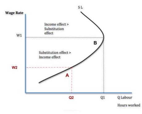
economics-milb

At point A, when the average MiLB player has a wage set at W2, the player will take Q2 hours out of the day to work toward baseball. As you can see, there is room to improve, as point B is optimal. Accomplishing point B would mean increasing a player’s salary to W1. In turn, players could afford to take Q1 hours out of the day toward baseball. With most minor-league players needing to find work in the offseason or even during the baseball season, a raise in salary would give them the opportunity to be full-time baseball players. These prospects would spend more time mastering their craft, speeding up the developmental process.

With a season as long as 162 games, there is no telling how much depth could be needed in a given year. Just ask the Mets. That’s why it is important to maximize the development in a team’s farm system. At the end of the day, this is merely a marginal benefit. It will not take an organization’s farm system from worst to first. However, it only takes one player that unexpectedly steps up in September to alter a playoff race, proving worth to the investment.


Hardball Retrospective – What Might Have Been – The “Original” 2008 Mariners

In “Hardball Retrospective: Evaluating Scouting and Development Outcomes for the Modern-Era Franchises”, I placed every ballplayer in the modern era (from 1901-present) on their original team. I calculated revised standings for every season based entirely on the performance of each team’s “original” players. I discuss every team’s “original” players and seasons at length along with organizational performance with respect to the Amateur Draft (or First-Year Player Draft), amateur free agent signings and other methods of player acquisition.  Season standings, WAR and Win Shares totals for the “original” teams are compared against the “actual” team results to assess each franchise’s scouting, development and general management skills.

Expanding on my research for the book, the following series of articles will reveal the teams with the biggest single-season difference in the WAR and Win Shares for the “Original” vs. “Actual” rosters for every Major League organization. “Hardball Retrospective” is available in digital format on Amazon, Barnes and Noble, GooglePlay, iTunes and KoboBooks. The paperback edition is available on Amazon, Barnes and Noble and CreateSpace. Supplemental Statistics, Charts and Graphs along with a discussion forum are offered at TuataraSoftware.com.

Don Daglow (Intellivision World Series Major League Baseball, Earl Weaver Baseball, Tony LaRussa Baseball) contributed the foreword for Hardball Retrospective. The foreword and preview of my book are accessible here.

Terminology

OWAR – Wins Above Replacement for players on “original” teams

OWS – Win Shares for players on “original” teams

OPW% – Pythagorean Won-Loss record for the “original” teams

AWAR – Wins Above Replacement for players on “actual” teams

AWS – Win Shares for players on “actual” teams

APW% – Pythagorean Won-Loss record for the “actual” teams

Assessment


The 2008 Seattle Mariners 

OWAR: 41.0     OWS: 251     OPW%: .519     (84-78)

AWAR: 21.3      AWS: 183     APW%: .377     (61-101)

WARdiff: 19.7                        WSdiff: 68  

The “Original” 2008 Mariners finished a few percentage points behind the Athletics for the AL West crown but out-gunned the “Actual” M’s by a 23-game margin. Alex Rodriguez (.302/35/103) paced the Junior Circuit with a .573 SLG. Raul Ibanez (.293/23/110) established career-highs with 186 base hits and 43 two-base knocks.  Ichiro Suzuki nabbed 43 bags in 47 attempts and batted .310, topping the League with 213 safeties. Jose Lopez socked 41 doubles and 17 long balls while posting personal-bests with 191 hits and a .297 BA. Adrian Beltre clubbed 25 four-baggers and earned his second Gold Glove Award for the “Actuals”.

Ken Griffey Jr. ranked seventh in the center field charts according to “The New Bill James Historical Baseball Abstract” top 100 player rankings. “Original” Mariners chronicled in the “NBJHBA” top 100 ratings include Alex Rodriguez (17th-SS) and Omar Vizquel (61st-SS).


  Original 2008 Mariners                           Actual 2008 Mariners


STARTING LINEUP POS OWAR OWS STARTING LINEUP POS AWAR AWS
Raul Ibanez LF 1.77 19.64 Raul Ibanez LF 1.77 19.64
Ichiro Suzuki CF/RF 3.36 19.48 Jeremy Reed CF -0.18 4.19
Shin-Soo Choo RF 2.86 14.97 Ichiro Suzuki RF 3.36 19.48
Ken Griffey, Jr. DH/RF 0 13.1 Jose Vidro DH -1.34 1.53
Bryan LaHair 1B -0.42 1.66 Richie Sexson 1B 0.06 4.43
Jose Lopez 2B 2.73 18.55 Jose Lopez 2B 2.73 18.55
Asdrubal Cabrera SS/2B 1.85 11.92 Yuniesky Betancourt SS 0.2 8.69
Alex Rodriguez 3B 4.99 27.21 Adrian Beltre 3B 2.45 16.09
Jason Varitek C 0.7 8.74 Kenji Johjima C -0.01 6.1
BENCH POS AWAR AWS BENCH POS AWAR AWS
David Ortiz DH 1.37 12.01 Willie Bloomquist CF 0.15 3.92
Ramon Vazquez 3B 1.05 9.63 Miguel Cairo 1B -0.64 3.17
Adam Jones CF 1 9.12 Jeff Clement C -0.36 2.88
Yuniesky Betancourt SS 0.2 8.69 Jamie Burke C -0.16 1.89
Greg Dobbs 3B 0.7 7.22 Bryan LaHair 1B -0.42 1.66
Kenji Johjima C -0.01 6.1 Luis Valbuena 2B 0.15 1.19
Omar Vizquel SS -0.22 3.94 Wladimir Balentien RF -1.18 1.09
Willie Bloomquist CF 0.15 3.92 Greg Norton DH 0.21 0.99
Jeff Clement C -0.36 2.88 Brad Wilkerson RF -0.13 0.6
Luis Valbuena 2B 0.15 1.19 Rob Johnson C -0.3 0.35
Wladimir Balentien RF -1.18 1.09 Matt Tuiasosopo 3B -0.28 0.32
Chris Snelling 0.16 0.58 Mike Morse RF 0.03 0.28
Rob Johnson C -0.3 0.35 Tug Hulett DH -0.2 0.16
T. J. Bohn LF 0.05 0.34 Charlton Jimerson LF -0.03 0
Matt Tuiasosopo 3B -0.28 0.32
Jose L. Cruz LF -0.34 0.17

Derek Lowe and Gil Meche compiled identical records (14-11) while starting 34 games apiece. “King” Felix Hernandez contributed nine victories with an ERA of 3.45 in his third full season in the Major Leagues. Brian Fuentes accrued 30 saves while fashioning an ERA of 2.73 along with a 1.101 WHIP. “T-Rex” whiffed 82 batsmen in 62.2 innings pitched.

  Original 2008 Mariners                        Actual 2008 Mariners 

ROTATION POS OWAR OWS ROTATION POS AWAR AWS
Derek Lowe SP 4.16 15.69 Felix Hernandez SP 3.99 13.45
Gil Meche SP 3.7 13.81 Ryan Rowland-Smith SP 2.1 8.39
Felix Hernandez SP 3.99 13.45 Erik Bedard SP 1.24 5.4
Ryan Rowland-Smith SP 2.1 8.39 Jarrod Washburn SP 0.7 5.11
Joel Pineiro SP -0.39 3.75 R. A. Dickey SP 0.2 3.28
BULLPEN POS OWAR OWS BULLPEN POS OWAR OWS
Brian Fuentes RP 1.88 11.8 Brandon Morrow SW 1.09 7.19
Matt Thornton RP 1.95 9.41 Roy Corcoran RP 0.71 6.7
Ryan Franklin RP 0.52 7.47 J. J. Putz RP 0.4 5.24
Brandon Morrow SW 1.09 7.19 Sean Green RP -0.56 3.59
George Sherrill RP 0.03 6.43 Arthur Rhodes RP 0.48 3.03
Aquilino Lopez RP 0.93 6.13 Cesar Jimenez RP 0.66 2.28
Damaso Marte RP 0.52 6.02 Randy Messenger RP 0.19 0.84
J. J. Putz RP 0.4 5.24 Mark Lowe RP -1.11 0.68
Cha-Seung Baek SP 0.56 3.67 Cha-Seung Baek SW -0.11 0.56
Mike Hampton SP 0.34 2.32 Jake Woods RP -0.3 0.05
Cesar Jimenez RP 0.66 2.28 Miguel Batista SP -1.89 0
Ron Villone RP -0.13 1.94 Ryan Feierabend SP -0.88 0
Rafael Soriano RP 0.28 1.78 Eric O’Flaherty RP -1.07 0
Shawn Estes SP 0.03 0.88 Carlos Silva SP -1.91 0
Mark Lowe RP -1.11 0.68 Justin Thomas RP -0.07 0
Scott Patterson RP 0.22 0.43 Jared Wells RP -0.31 0
Kameron Mickolio RP -0.09 0.08
Ryan Feierabend SP -0.88 0
Eric O’Flaherty RP -1.07 0
Justin Thomas RP -0.07 0


Notable Transactions

Alex Rodriguez 

October 30, 2000: Granted Free Agency.

January 26, 2001: Signed as a Free Agent with the Texas Rangers.

February 16, 2004: Traded by the Texas Rangers with cash to the New York Yankees for a player to be named later and Alfonso Soriano. The New York Yankees sent Joaquin Arias (April 23, 2004) to the Texas Rangers to complete the trade.

October 29, 2007: Granted Free Agency.

December 13, 2007: Signed as a Free Agent with the New York Yankees. 

Derek Lowe

July 31, 1997: Traded by the Seattle Mariners with Jason Varitek to the Boston Red Sox for Heathcliff Slocumb.

November 1, 2004: Granted Free Agency.

January 11, 2005: Signed as a Free Agent with the Los Angeles Dodgers.

Shin-Soo Choo

July 26, 2006: Traded by the Seattle Mariners with a player to be named later to the Cleveland Indians for Ben Broussard and cash. The Seattle Mariners sent Shawn Nottingham (minors) (August 24, 2006) to the Cleveland Indians to complete the trade. 

Gil Meche

October 31, 2006: Granted Free Agency.

December 13, 2006: Signed as a Free Agent with the Kansas City Royals.

Ken Griffey Jr. 

February 10, 2000: Traded by the Seattle Mariners to the Cincinnati Reds for Jake Meyer (minors), Mike Cameron, Antonio Perez and Brett Tomko. 

David Ortiz 

September 13, 1996: the Seattle Mariners sent David Ortiz to the Minnesota Twins to complete an earlier deal made on August 29, 1996. August 29, 1996: The Seattle Mariners sent a player to be named later to the Minnesota Twins for Dave Hollins.

December 16, 2002: Released by the Minnesota Twins.

January 22, 2003: Signed as a Free Agent with the Boston Red Sox.

Honorable Mention

The 1999 Seattle Mariners 

OWAR: 46.4     OWS: 296     OPW%: .549     (89-73)

AWAR: 33.8      AWS: 237     APW%: .488     (79-83)

WARdiff: 12.6                        WSdiff: 59  

The “Original” 1999 Mariners secured the American League Western Division title by six games over the Rangers. The “Actuals” placed third, sixteen games behind Texas. Ken Griffey Jr. (.285/48/134) paced the circuit in home runs, tallied 123 runs and collected his tenth Gold Glove Award. Edgar Martinez (.337/24/86) topped the League with a .447 OBP. Alex Rodriguez (.285/42/111) swiped 21 bags and scored 110 runs. Slick-fielding shortstop Omar Vizquel posted career-highs in batting average (.333), runs scored (112) and base hits (191) while stealing successfully on 42 of 51 attempts. Tino Martinez clubbed 28 four-baggers and plated 105 baserunners. Bret Boone tagged 38 doubles and surpassed the century mark in runs. Jason Varitek drilled 39 two-base knocks and swatted 20 big-flies during his first full campaign.

Mike Hampton (22-4, 2.90) placed runner-up in the Cy Young Award balloting. Derek Lowe notched 15 saves in 74 relief appearances. Dave Burba contributed a 15-9 record and set personal-bests with 34 starts and 220 innings pitched.

On Deck

What Might Have Been – The “Original” 1993 Angels

References and Resources

Baseball America – Executive Database

Baseball-Reference

James, Bill. The New Bill James Historical Baseball Abstract. New York, NY.: The Free Press, 2001. Print.

James, Bill, with Jim Henzler. Win Shares. Morton Grove, Ill.: STATS, 2002. Print.

Retrosheet – Transactions Database

The information used here was obtained free of charge from and is copyrighted by Retrosheet. Interested parties may contact Retrosheet at “www.retrosheet.org”.

Seamheads – Baseball Gauge

Sean Lahman Baseball Archive


How Often Is the “Best Team” Really the Best?

We know the playoffs are a crapshoot. A 5- or 7-game series tells us very little about which team is actually the better team. But it is easy to forget that the regular season is a crapshoot, too, just with a larger sample size. Teams go into a given game with a certain probability of winning, based on their true-talent levels (i.e., their probability of winning a game against a .500 team). And then, as luck decides, one team wins and the other loses. A season is just the sum total of 162 luck-based games for each team, and there is no guarantee that the luck must even out in the end.

After the regular season, the team with the best record is usually proclaimed “the best team in baseball.” It was the Cubs this year, and the Cardinals the year before, and the Angels the year before that. But were those teams really the best? We can’t tell just by looking at their records. It would be great if we knew the true-talent level of every team. But baseball doesn’t give us probabilities of teams winning; it only gives us outcomes. The same flaw exists for Pythagorean Record, BaseRuns, or any other metric you might use to evaluate a team at season’s end. BaseRuns gets the closest to a team’s true-talent level, because it uses a sample size of thousands of plate appearances, but it’s still an estimate based on outcomes, and not the underlying probabilities of those outcomes.

I wanted to know what the probability is that the team with the most true talent finishes the regular season with the best record in baseball. Since there’s no way to test that empirically, I ran a simulation in R. For each trial of the simulation, every team was assigned a random true-talent level from a normal distribution (see Phil Birnbaum’s blog post for my methodology, although I based my calculations for true-talent variance off of win totals from the two-wild-card era). The teams then played through the 2017 schedule, with each game being simulated using Bill James’ log5 formula. If the team with the most wins matched the team with the most true talent, that trial counted as a success. Trials in which two or more teams tied for the most wins were thrown out altogether.

I ran through one million simulated seasons using this method. In 91.2% of them, a single team finished with the best record in the league. But out of those seasons, the team with the best record matched the team with the most true talent only 43.1% of the time.

So, given that a team finishes with the best record in baseball, there is a 43.1% chance that they are actually the best team. More likely than not, some other team was more talented. Even after 162 games, we can’t really be sure who deserved to come out on top.


An Attempt to Quantify Quality At-Bats

Several of my childhood baseball coaches believed in the idea of “quality at-bats.” It’s a somewhat subjective statistic that rewards a hitter for doing something beneficial regardless of how obvious it is. This would include actions such as getting on base, as well as less noticeably beneficial things like making an out but forcing the pitcher to throw a lot of pitches. There is some evidence that major league coaches use quality at-bats and, through my experience working for the Florida Gators, I noticed that some college coaches like using it too. However, how it is used varies from coach to coach and it is a stat that is rarely talked about in the online community. Since there doesn’t seem to be a consensus of what a quality at-bat is, I decided to define a quality at-bat as an at-bat that results in at least one of any of the following:

  1. Hit
  2. Walk
  3. Hit by pitch
  4. Reach on error
  5. Sac bunt
  6. Sac fly
  7. Pitcher throws at least six pitches
  8. Batter “barrels” the ball.

There is some room for debate on a few of these parameters (e.g. if six pitches is enough, whether or not sacrifices should be included, etc.). However, in my experience this is roughly in line with what most coaches use, and I think it does a good job of determining whether or not a hitter has a “quality” at-bat. In my analysis I was excited to be able to include the new Statcast statistic, barrels. I have seen coaches subjectively reward a hitter with a quality at-bat for hitting the ball hard, but barrels gives us an exact definition of a well-hit ball based on a combination of exit velocity and launch angle.

The first player I used to test this definition was Billy Hamilton. Hamilton is a player that has always interested me, partially because stealing bases is entertaining, but also because there has always been speculation about whether or not he will ever be able to develop into an average hitter. I also find him interesting because his career has consisted of one awful offensive season sandwiched between two less horrible but still sub-par offensive seasons. His wRC+ in 2014 was 79, in 2015 it was an unsightly 53, and in 2016 it was back up to 78. I thought that his quality at-bat percentages might be able to give us a clue as to whether or not he could become a better hitter. By pulling Baseball Savant data from Bill Petti’s amazing baseballr package, I counted all of Billy Hamilton’s quality at-bats in each of his three MLB seasons. I then divided those quality at-bat totals by his total plate appearances to get his quality at-bat percentages:

2014:  41.75%

2015:  42.28%

2016:  47.52%

It is never ideal to make sweeping conclusions about statistics — especially new ones that are not widely used or understood — without putting them in context. However, at the very least, I think it is a good sign that Billy Hamilton has experienced an upward trend in his quality at-bat percentages. Based on my definition, these results show that he is making more effective use of his at-bats and that he is continuing to develop as a hitter.

To put Hamilton’s scores in some context, I calculated the quality at-bat percentages for several other players and provided them below. I have not had a chance to run every player as of yet, but I think this chart can give you a feel of where Billy Hamilton stands compared to other players. It is also interesting to point out Jason Heyward’s large drop-off in quality at-bat percentage. This is yet another indicator of how poor his 2016 season was. Additionally, and not surprisingly, Joey Votto and Mike Trout have, relatively, very high quality at-bat percentages, while Adeiny Hechavarria (a player who had a wRC+ just north of 50 last season) had a quality at-bat percentage well below that of even Billy Hamilton.


                                                      Quality at-bat percentages
Year Billy Hamilton Mike Trout Jason Heyward Joey Votto Adeiny Hechavarria
2014 41.75% 56% 47% 56% 41%
2015 42.28% 55% 48% 56% 42%
2016 47.52% 58% 40% 59% 39%


There is more research that needs to be done here in order to make more intelligent conclusions. I would like to run more players through my statistic, including minor leaguers, to see just how well quality at-bats can be used in evaluating talent, development, and predicting future success. I believe that quality at-bats are something that could be relevant in many of the same ways as quality starts. Neither of these statistics inform you of the nuances that make a player great (or not so great), but they do give you an idea of a player’s reliability in having a passable performance. I believe that with further analysis into quality at-bat percentages using the definition I created, we may be able to learn more about how hitters make use of each and every at-bat.


Examining the Tendencies of the Rockies’ Rotation

Don’t you just love how talking about one topic in baseball can bring you to a completely separate topic than the one you were discussing? For instance, my friend and I were discussing possible landing spots for Mark Trumbo (before he decided to head back to Baltimore). One team that came up was the Colorado Rockies and how they shouldn’t have signed Ian Desmond and should’ve gone with Trumbo instead. This led to talking about the Rockies’ rotation and the fact that it wouldn’t matter what sluggers they had if the rotation was — for lack of better words — “trash.” This led me to think what I’m sure many of you are wondering: How is the Rockies’ starting rotation?

Now, we can look at ERA, FIP, and whatever advanced metric you prefer until we’re blue in the face. But what I wanted to focus on is what type of pitchers they bring into Coors Field, mainly in regard to batted-ball statistics. I want to see if the front office prefers to bring in ground-ball pitchers to combat the altitude and ballpark factors of the stadium. I also want to take a look at the pitch mix of their starting five to see if that has a hand in how their rotation is selected.

One would imagine that a pitcher with a good mix of ground balls and fly balls would be preferred in a starting rotation. Too many ground balls and you have a better chance of giving up more hits. Too many fly balls and you risk the opportunity for more home runs. Like the library on FanGraphs says, “If you allow 10 ground balls, you can’t control if zero, three, or nine go for hits, but you did control the fact that none are leaving the park.” Considering a park with the altitude and home-run factor of Coors Field, you would expect a rotation of primarily ground-ball pitchers to lessen the chance of a home run.

Let’s look at Tyler Chatwood and Chad Bettis first. Chatwood and Bettis have very similar stats across the board in addition to being the only two that are above-average ground-ball pitchers. While their HR/FB% are close and below league-average, where they both differ are the home and away splits. While Chatwood seems to get lit up at home, Bettis goes the opposite direction and actually has more fly balls go for home runs when he isn’t starting in Colorado.

Now let’s look at Jorge de la Rosa. Jorge has the worst HR/FB% of any starter on the team, by far. In fact, he was ranked 20th overall in 2016 for HR/FB%. Another stat that Jorge is last in for the starting rotation? Fastball usage, and by a considerable margin. For all MLB starting pitchers with a minimum of 60 IP, he ranks fifth-last in fastball usage in 2016. Maybe this is why the Rockies prefer to stick with fastball-type pitchers. Since 2011, the Rockies have used 21 different starting pitchers. Of those 21, 13 (62%) have been above the league average in fastball usage. In the four years that Jorge has been used as a starter, he’s sat at the bottom of the list three times (he was ranked eighth-last in 2013).

Something else I found noteworthy in the chart is that all five starters have higher fly-ball rates when pitching away as opposed to at home. While the difference for Tyler Anderson is very minuscule (0.2%), the fact that all five fall under this criteria makes it seem more than coincidental. Could they be pitching differently at home than they are when they’re away? Let’s take a historical look.

According to Baseball-Reference, this is the list of the most common Colorado Rockies starting pitchers from 2011 – 2016. The list gives us 30 total pitcher-seasons and 21 unique pitchers. Out of the 30 pitchers listed, 21 (70%) have a lower fly-ball rate at home than they do when pitching away. Additionally, 23 (76%) have a higher ground-ball rate at Coors as opposed to any other stadium. This leads me to believe that Rockies pitchers are conditioned to pitch differently when they are at home versus when they are away. This would make sense, since Coors has the highest park factor in all of baseball and anyone from a fair-weather fan to a front-office executive understands that keeping the ball on the ground in that park is best.

The last question we have to ask is, “Is this change effective?” The short answer is, not really. As seen, 14 out of the 30 (46%) pitchers have a higher HR/FB% when pitching away, while 15 out of the 30 (50%) pitchers have a higher HR/FB% when pitching at home (Eddie Butler in 2015 is the odd man out at an even 0.00%). The good news is that four out of the five latest seasons have the Rockies’ starting rotation having a lower HR/FB% than the league average for starting pitchers. The bad news is that all five seasons were losing seasons.


Hierarchical Clustering For Fun and Profit

Player comps! We all love them, and why not. It’s fun to hear how Kevin Maitan swings like a young Miguel Cabrera or how Hunter Pence runs like a rotary telephone thrown into a running clothes dryer. They’re fun and helpful, because if there’s a player we’ve never seen before, it gives us some idea of what they’re like.

When it comes to creating comps, there’s more than just the eye test. Chris Mitchell provides Mahalanobis comps for prospects, and Dave recently did something interesting to make a hydra-comp for Tim Raines. We’re going to proceed with my favorite method of unsupervised learning: hierarchical clustering.

Why hierarchical clustering? Well, for one thing, it just looks really cool:

That right there is a dendrogram showing a clustering of all player-seasons since the year 2000. “Leaf” nodes on the left side of the diagram represent the seasons, and the closer together, the more similar they are. To create such a thing you first need to define “features” — essentially the points of comparison we use when comparing players. For this, I’ve just used basic statistics any casual baseball fan knows: AVG, HR, K, BB, and SB. We could use something more advanced, but I don’t see the point — at least this way the results will be somewhat interpretable to anyone. Plus, these stats — while imperfect — give us the gist of a player’s game: how well they get on base, how well they hit for power, how well they control the strike zone, etc.

Now hierarchical clustering sounds complicated — and it is — but once we’ve made a custom leaderboard here at FanGraphs, we can cluster the data and display it in about 10 lines of Python code.

import pandas as pd
from scipy.cluster.hierarchy import linkage, dendrogram
# Read csv
df = pd.read_csv(r'leaders.csv')
# Keep only relevant columns
data_numeric = df[['AVG','HR','SO','BB','SB']]
# Create the linkage array and dendrogram
w2 = linkage(data_numeric,method='ward')
labels = tuple(df.apply(lambda x: '{0} {1}'.format(x[0], x[1]),axis=1))
d = dendrogram(w2,orientation='right',color_threshold = 300)

Let’s use this to create some player comps, shall we? First let’s dive in and see which player-seasons are most similar to Mike Trout’s 2016:

2016 Mike Trout Comps
Season Name AVG HR SO BB SB
2001 Bobby Abreu .289 31 137 106 36
2003 Bobby Abreu .300 20 126 109 22
2004 Bobby Abreu .301 30 116 127 40
2005 Bobby Abreu .286 24 134 117 31
2006 Bobby Abreu .297 15 138 124 30
2013 Shin-Soo Choo .285 21 133 112 20
2013 Mike Trout .323 27 136 110 33
2016 Mike Trout .315 29 137 116 30

Remember Bobby Abreu? He’s on the Hall of Fame ballot next year, and I’m not even sure he’ll get 5% of the vote. But man, take defense out of the equation, and he was Mike Trout before Mike Trout. The numbers are stunningly similar and a sharp reminder of just how unappreciated a career he had. Also Shin-Soo Choo is here.

So Abreu is on the short list of most underrated players this century, but for my money there is someone even more underrated, and it certainly pops out from this clustering. Take a look at the dendrogram above — do you see that thin gold-colored cluster? In there are some of the greatest offensive performances of the past 20 years. Barry Bonds’s peak is in there, along with Albert Pujols’s best seasons, and some Todd Helton seasons. But let’s see if any of these names jump out at you:

First of all, holy hell, Barry Bonds. Look at how far separated his 2001, 2002 and 2004 seasons are from anyone else’s, including these other great performances. But I digress — if you’re like me, this is the name that caught your eye:

Brian Giles’s Gold Seasons
Season Name AVG HR SO BB SB
2000 Brian Giles .315 35 69 114 6
2001 Brian Giles .309 37 67 90 13
2002 Brian Giles .298 38 74 135 15
2003 Brian Giles .299 20 58 105 4
2005 Brian Giles .301 15 64 119 13
2006 Brian Giles .263 14 60 104 9
2008 Brian Giles .306 12 52 87 2

Brian Giles had seven seasons that, according to this method at least, are among the very best this century. He had an elite combination of power, batting eye, and a little bit of speed that is very rarely seen. Yet he didn’t receive a single Hall of Fame vote, for various reasons (short career, small markets, crowded ballot, PED whispers, etc.) He’s my vote for most underrated player of the 2000s.

This is just one application of hierarchical clustering. I’m sure you can think of many more, and you can easily do it with the code above. Give it a shot if you’re bored one offseason day and looking for something to write about.