Archive for Outside the Box

Ranking the Importance of the Five Tools

A good friend of mine with whom I argue about baseball often once posed a very interesting question to me.  He asked me, if I were to build a team completely devoid of one tool, which tool would I want to be missing?  In the ensuing argument, I was asked to rank the tools from least to most important for team success.  I put the order as arm, speed, fielding, contact, and power.  It was not until later that day that it struck me just how great a question he had asked.  Now, several months later, I will attempt to quantify the tools.

The rules for this study will be simple.  Two teams will be assembled for each of the five tools.  Each team will be considered league-average in every tool but the one for which they are being evaluated.  One of the teams for each tool will be the best possible in that one area, and the other will be the worst possible.  The runs lost from league-average by the worst possible team will be subtracted from the runs gained by the best possible teams.  The larger the difference, the more important the tool.  The teams will have one player for each position (minimum 250 PA, 450 Inn).

Note:  Pitchers are not included.  Losing arm does not mean losing value from pitchers.

Power

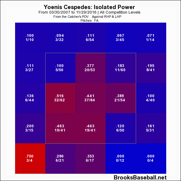
The players on the teams for power will be determined using isolated power.

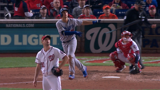
Best Possible Team:  C) Evan Gattis (.257); 1B) Chris Carter (.277); 2B) Ryan Schimpf (.315); 3B) Nolan Arenad0 (.275); SS) Trevor Story (.296); LF) Khris Davis (.277); CF) Yoenis Cespedes (.251); RF) Mark Trumbo (.277)

This group has a combined ISO of .276, which would put their team OPS+ at about 115.4.  An average team has 6152.6 PA in a season.  Using these figures, they would score 836 runs as a team, compared to the 725 of an average team.

Worst Possible Team:  C) Francisco Cervelli (.058); 1B) Chris Johnson (.107); 2B) Jed Lowrie (.059); 3B) Yunel Escobar (.087); SS) Ketel Marte (.064); LF) Ben Revere (.083); CF) Ramon Flores (.056); RF) Flores

The combined ISO for this team was only .072, making the OPS+ about 87.8.  Runs scored for this team would then be 636.

Difference between BPT and WPT:  200 runs

Contact

The players on the teams for contact will be determined using K%.

BPT:  C) Yadier Molina (10.8); 1B) James Loney (10.1); 2B) Joe Panik (8.9); 3B) Jose Ramirez (10.0); SS) Andrelton Simmons (7.9); LF) Revere (9.1); CF) Revere; RF) Mookie Betts (11.0)

Collectively, this team would strike out in 9.7% of their plate appearances.  League average in 2016 was 21.1%, meaning the BPT is 11.4% better than league average.  The team would score 807 runs.

WPT:  C) Jarrod Saltalamacchia (35.6); 1B) Chris Davis (32.9); 2B) Schmipf (31.8); 3B) Miguel Sano (36.0); SS) Story (31.3); LF) Ryan Raburn (31.3); CF) Byron Buxton (35.6); RF) Sano

This high swing-and-miss team would strike out in 33.9% of plate appearances.  This is 12.8% higher than average.  The team would score 632 runs.

Difference between BPT and WPT:  175 runs

Fielding/Arm

As it turns out, there are really not stats for exclusively measuring a fielder’s arm.  Baseball-Reference has Arm Runs Saved, but that is not for infielders.  Additionally, the stat I originally wanted to use for Fielding, UZR/150, is not available for catchers.  To remedy both of these problems, I elected to use DRS.  DRS is available for all positions, and it takes a fielder’s arm into account.  Because I will not be taking values for fielding and arm on their own, fielding will receive about 60% of the total difference in the category.  The remaining 40% will be attributed to arm.

BPT:  C) Buster Posey (23); 1B) Anthony Rizzo (11); 2B) Ian Kinsler/Dustin Pedroia (12); 3B) Arenado (20); SS) Brandon Crawford (20); LF) Starling Marte (19); CF) Kevin Kiermaier (25); RF) Betts (32)

Kinsler and Pedroia tied for the lead at second base, so I just listed both of them.  The brilliant defensive team would be 162 runs better than the average in the field.  Of these, 97 will be attributed to fielding and 65 to arm.

WPT:  C) Nick Hundley (-16); 1B) Joey Votto (-14); 2B) Schimpf/Daniel Murphy/Rougned Odor (-9); 3B) Danny Valencia (-18); SS) Alexei Ramirez (-20); LF) Robbie Grossman (-21); CF) Andrew McCutchen (-28); RF) J.D. Martinez (-22)

The team of these players, who look like pretty good players, would have a -148 defensive value.  The value to fielding is -89 runs, and -59 for arm.

Difference between BTP and WPT (Fielding):  186 runs

Difference between BTP and WPT (Arm):  124 runs

Speed

Speed presents a problem.  It is valuable on the basepaths, obviously, but it is also valuable in the field.  More speed means more range.  Speed Score is a stat that represents the importance of both, but it does not translate well into value.  I decided to go with FanGraphs BsR, even though it does not measure speed in the field.  That value can be circumvented by routes and reactions anyway.

BPT:  C) Derek Norris (1.8); 1B) Wil Myers (7.8); 2B) Dee Gordon (6.2); 3B) Ramirez (8.8); SS) Xander Bogaerts (6.1); LF) Rajai Davis (10.0); CF) Billy Hamilton (12.8); RF) Betts (9.8)

This speed roster is a team that anyone would like to run out every day.  It is a young and athletic team.  Even so, based on speed alone, the team is just 63 runs above average.  That is the lowest value above average for any BPT.

WPT:  C) Molina (-8.7); 1B) Miguel Cabrera (-10.0); 2B) Pedroia (-4.5); 3B) Escobar (-5.6); SS) Erick Aybar (-3.9); LF) Yasmany Tomas (-5.5); CF) Jake Smolinski (-3.4); RF) Tomas

The lead-foot team is 47 runs below average.  That is the closest to average of any WPT.  Speed clearly has the least impact of the five tools.  I regret not putting it last.

Difference between BPT and WPT:  110 runs

Conclusion

I will admit that I was wrong.  Arm actually has some real value.  My excuse, I guess, is to say that it slipped my mind that arm is important for infielders as well as outfielders.  That should not have happened, and I am a little upset I made that mistake.  Fielding also beat out contact, which I did not expect.  I do not even have a defense for this one, as I do not know what I was thinking.

In all honesty, this post was written to win an argument.  However, it does have a deeper purpose.  This answers the question posed so many years ago in Moneyball.  If a general manager can afford to buy players with only one tool, which tool should it be?  This information is probably not new to any front office in baseball, but it is something to remember when considering small-market strategy.

Anyway, here is the official list of the five tools by importance, at least for 2017.

1.  Power

2.  Fielding

3.  Contact

4.  Arm

5.  Speed


Derek Norris, 2016 — A Season to Forget

While it may not be the most exciting Nationals story of the offseason, Wilson Ramos signing with the Rays and the subsequent trade for Derek Norris to replace him is a very big change for the Nats. Prior to tearing his ACL in September, Ramos was having an incredible 2016, and he really carried the Nationals offense through the first part of the year (with the help of Daniel Murphy, of course) when Harper was scuffling and Anthony Rendon was still working back from last season’s injury. Given Ramos’ injury history it makes sense to let him walk, but Nationals fans have reasons to be concerned about Norris.

After a few seasons of modest success, including an All-Star appearance in 2014, Norris batted well under the Mendoza line (.186) in 2016 with a significant increase in strikeout rate. What was the cause for this precipitous decline? Others have dug into this lost season as well, and this article will focus on using PitchFx pitch-by-pitch data through the pitchRx package in R as well as Statcast batted-ball data manually downloaded into CSV files from baseballsavant.com, and then loaded into R. Note that the Statcast data has some missing values so it is not comprehensive, but it still tells enough to paint a meaningful story.

To start, Norris’ strikeout rate increased from 24% in 2015 to 30% in 2016, but that’s not the entire story. Norris’ BABIP dropped from .310 in 2015 to .238 in 2016 as well, but his ISO stayed relatively flat (.153 in 2015 vs. .142 in 2016). Given the randomness that can be associated with BABIP, this could be good new for Nats fans, but upon further investigation there’s reason to believe this drop was not an aberration.

Using the batted-ball Statcast data, it doesn’t appear that Norris is making weaker contact, at least from a velocity standpoint (chart shows values in MPH):

Screen Shot 2016-12-11 at 9.50.27 PM.png

Distance, on the other hand, does show a noticeable difference (chart shows values in feet):

Screen Shot 2016-12-11 at 9.53.45 PM.png

So Norris is hitting the ball further in 2016, but to less success, which translates to lazy fly balls. This is borne out by the angle of balls he put in play in 2015 vs. 2016 (values represent the vertical angle of the ball at contact).

Screen Shot 2016-12-11 at 9.56.55 PM.png

The shifts in distance & angle year over year are both statistically significant (velocity is not), indicating these are meaningful changes, and they appear to be caused at least in part by the way pitchers are attacking Norris.

Switching to the PitchFx data, it appears pitchers have begun attacking Norris up and out of the zone more in 2016. The below chart shows the percentage frequency of all pitches thrown to Derek Norris in 2015 & 2016 based on pitch location. Norris has seen a noticeable increase in pitches in Zones 11 & 12, which are up and out of the strike zone.

Screen Shot 2016-12-11 at 10.11.19 PM.png

Norris has also seen a corresponding jump in fastballs, which makes sense given this changing location. This shift isn’t as noticeable as location, but Norris has seen fewer change-ups (CH) and sinkers (SI) and an increase in two-seam (FT) & four-seam fastballs (FF).

Screen Shot 2016-12-11 at 10.15.10 PM.png

The net results from this are striking. The below chart shows Norris’ “success” rate for pitches in Zones 11 & 12 (Represented by “Yes” values, bars on the right below) compared to all other zones for only outcome pitches, or the last pitch of a given at-bat. In this case success is defined by getting a hit of any kind, and a failure is any non-productive out (so, excluding sacrifices). All other plate appearances were excluded.

Screen Shot 2016-12-11 at 10.21.20 PM.png

While Norris was less effective overall in 2016, the drop in effectiveness on zone 11 and 12 pitches is extremely noticeable. Looking at the raw numbers makes this even more dramatic:

2015                                                     2016

Screen Shot 2016-12-11 at 10.23.19 PM.png                       Screen Shot 2016-12-11 at 10.23.38 PM.png

So not only did more at-bats end with pitches in zones 11 and 12; Norris ended up a shocking 2-for-81 in these situations in 2016.

In short, Norris should expect a steady stream of fastballs up in the zone in 2016, and if he can’t figure out how to handle them, the Nationals may seriously regret handing him the keys to the catcher position in 2016.

All code can be found at the following location : https://github.com/WesleyPasfield/Baseball/blob/master/DerekNorris.R


Examining Net Present Value and Its Effects

Going back to January 2016, Dave Cameron wrote an article detailing the breakdown of money owed to Chris Davis over the life of the deal he signed last year. For myself, this provided insight into how teams value long-term contracts, but more importantly it led me to more questions about how money depreciates over time. Fast-forward to the present and we start to see some articles and comments with people speculating about how much money teams are going to throw at Bryce Harper when he reaches free agency in a few years. The numbers have been pretty incredible; $400 million? $500 million? Even $600 million? Then someone threw out an even larger number: $750 million.

The best thing to do is ignore these numbers because we are still a couple of years away from free agency and he just had a down year where he was “only” worth 3.5 WAR, which gave the team a value of $27.8 million. At some point the numbers don’t even make sense because the contract values are getting so inflated. But at the same time, good for him, maybe he’ll buy a baseball team once he retires, or a mega-yacht. But unfortunately we will need to wait until after the 2018 season before we find out the value of this contract. In the meantime, speculation will run rampant and the media will throw out inflated numbers for the amusement of the masses.

Now, the purpose of this article is not to predict the value of Bryce Harper’s future contract, but to examine a few scenarios as to the actual value in present-day dollars. To do this I will use the concept of Net Present Value (NPV) from Dave Cameron’s Chris Davis article and then use some of the numbers from his article predicting a contract for Bryce Harper. Let’s set a couple rules; (1) Match the length of contract given to Stanton — 13 years, (2) use nice round numbers and get as close to the total values as possible, (3) use a discount rate of 4%, (4) this is an exercise in futility and not to be taken too seriously and finally (5) to estimate NPV for a massive contract.

Here are the scenarios for a 13-year contract totaling in excess of $400M, $500M and $600M.

13 Year Contract Structure
Year Age
2019 26 $31,000,000 $38,500,000 $46,500,000
2020 27 $31,000,000 $38,500,000 $46,500,000
2021 28 $31,000,000 $38,500,000 $46,500,000
2022 29 $31,000,000 $38,500,000 $46,500,000
2023 30 $31,000,000 $38,500,000 $46,500,000
2024 31 $31,000,000 $38,500,000 $46,500,000
2025 32 $31,000,000 $38,500,000 $46,500,000
2026 33 $31,000,000 $38,500,000 $46,500,000
2027 34 $31,000,000 $38,500,000 $46,500,000
2028 35 $31,000,000 $38,500,000 $46,500,000
2029 36 $31,000,000 $38,500,000 $46,500,000
2030 37 $31,000,000 $38,500,000 $46,500,000
2031 38 $31,000,000 $38,500,000 $46,500,000
Total $403,000,000.00 $500,500,000.00 $604,500,000.00
NPV $309,555,083.25 $384,447,442.10 $464,332,624.87

Over the life of this contract, the value of each in NPV is significantly less than the actual amount signed. That’s because $5 today won’t buy you as much five years down the road. To get a little more numerical, 13 years from now currency will lose ~40% of its value. Quoting the Chris Davis article again, the league and the MLBPA have agreed to use a 4% discount rate to calculate present-day values of long-term contracts. Since important people within the industry take this into account, that’s likely why we don’t see too many contracts with a significant amount of deferred money.

Since players are taking — and I use this term very lightly — a “hit” when they sign a long-term deal, I wondered what kind of contract structure would benefit a player the most. Again, I wanted to use nice round numbers, so I settled on a 10-year, $100M contract, looking at an equal payment structure, a front-loaded contract, and a back-loaded contract. Here’s what I came up with:

Hypothetical 10 Year $100M Contract
Year Equal Front-loaded Back-loaded
1 $10,000,000 $14,500,000 $5,500,000
2 $10,000,000 $13,500,000 $6,500,000
3 $10,000,000 $12,500,000 $7,500,000
4 $10,000,000 $11,500,000 $8,500,000
5 $10,000,000 $10,500,000 $9,500,000
6 $10,000,000 $9,500,000 $10,500,000
7 $10,000,000 $8,500,000 $11,500,000
8 $10,000,000 $7,500,000 $12,500,000
9 $10,000,000 $6,500,000 $13,500,000
10 $10,000,000 $5,500,000 $14,500,000
Total $100,000,000 $100,000,000 $100,000,000
NPV $81,108,957.79 $83,726,636.52 $78,491,279.06

There’s not a huge difference, but a player would gain just over $5M by signing a front-loaded contract as compared to a back-loaded contract. It seems as though the agents and the MLBPA are more concerned about total dollars rather than NPV since they probably want to drive up total contracts.

And in case you’re wondering what those annual salaries would look like in NPV from the table above, I’ve created another table to show what those salaries actually look like in NPV over the life of our hypothetical 10-year contract.

NPV Of Hypothetical 10 Year $100M Contract
Year Expected Equal Front-loaded Back-loaded
1 $10 $9.62 $13.94 $5.29
2 $10 $9.25 $12.48 $6.01
3 $10 $8.89 $11.11 $6.67
4 $10 $8.55 $9.83 $7.27
5 $10 $8.22 $8.63 $7.81
6 $10 $7.90 $7.51 $8.30
7 $10 $7.60 $6.46 $8.74
8 $10 $7.31 $5.48 $9.13
9 $10 $7.03 $4.57 $9.48
10 $10 $6.76 $3.72 $9.80

What I was hoping to show you next was a cool interactive plot similar to the table above, but instead of showing you the annual salaries it will show cumulative earnings as the life of our 10-year/$100M contract as time progresses. Well unfortunately I am unable to get this plot to show up on this webpage; it has something to do with WordPress being unable to use Javascript. If you’ll bear with me, you can click the link below (it just opens a new window and shows the plot).

https://docs.google.com/spreadsheets/d/19qGcrwGmdZemmYG_LaP_Ay6_5g6hL3VKT8z-Q3-PWXI/pubchart?oid=422413074&format=interactive
Front-loaded contracts seem to have the most benefit to the players themselves since they actually get more value out of any long-term contracts they might sign. For a player to maximize their career earnings it looks like it would be way more beneficial to sign shorter-length contracts with higher AAV than those long-term contracts. Maybe that is why we are beginning to see more deals with opt-out clauses in them.


wERA: Rethinking Inherited Runners in the ERA Calculation

There are many things to harp on about traditional ERA, but one thing that has always bothered me is the inherited-runner portion of the base ERA calculation. Why do we treat it in such a binary fashion? Shouldn’t the pitcher who allowed the run shoulder some of the accountability?

As a Nationals fan, the seminal example of the fallacy of this calculation was Game 2 of the 2014 Division Series against the Giants. Jordan Zimmermann had completely dominated all day, and after a borderline ball-four call, Matt Williams replaced him with Drew Storen, who entered the game with a runner on first and two outs in the top of the 9th and the Nats clinging to a one-run lead. Storen proceeded to give up a single to Buster Posey and a double to Pablo Sandoval to tie the game, but he escaped the inning when Posey was thrown out at the plate. So taking a look at the box score, Zimmermann, who allowed an innocent two-out walk, takes the ERA hit and is accountable for the run, while Storen, who was responsible for a lion’s share of the damage, gets completely off the hook. That doesn’t seem fair to me!

I’ve seen other statistics target other flawed elements of ERA (park factors, defense), but RE24 is the closest thing I’ve found to a more context-based approach to relief pitcher evaluation. RE24 calculates the change in run expectancy over the course of a single at-bat, so it’s applicable beyond relief pitchers and pitchers in general, and is an excellent way to determine how impactful a player is on the overall outcome of the game. But at the same time, it does not tackle the notion of assignment, but simply the change in probability based on a given situation.

wERA is an attempt to retain the positive components of ERA (assignment, interpretability), but do so in a fashion that better represents a pitcher’s true role in allowing the run.

The calculation works in the exact same way as traditional ERA, but assigns inherited runs based on the probability that run will score based on the position of the runner and the number of outs at the start of the at-bat when a relief pitcher enters the game. These probabilities were calculated using every outcome from the 2016 season where inherited runners were involved.

Concretely, here is a chart showing the probability, and thus the run responsibility, in each possible situation. So in the top example – if there’s a runner on 3rd and no one out when the RP enters the game, the replaced pitcher is assigned 0.72 of the run, and the pitcher who inherits the situation is assigned 0.28 of the run. On the flip side, if the relief pitcher enters the game with two outs and a runner on first, they will be assigned 0.89 of the run, since it is primarily the relief pitcher’s fault the runner scored.

Screen Shot 2016-12-04 at 9.35.13 AM.png
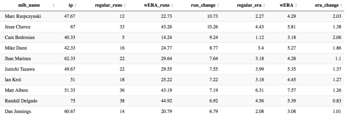
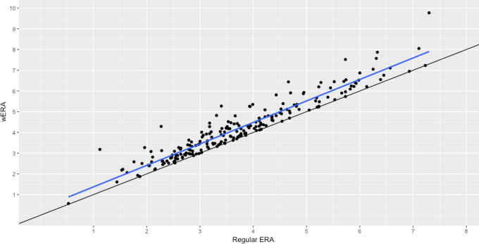
Let’s take a look at the 2016 season, and see which starting and relief pitchers would be least and most affected by this version of the ERA calculation (note: only showing starters with at least 100 IP, and relievers with over 30 IP).
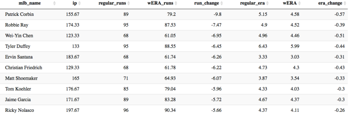
Screen Shot 2016-12-07 at 9.39.40 PM.png

The Diamondbacks starting pitchers had a rough year this year, but they were not helped out by their bullpen. Patrick Corbin would shave off almost 10 runs and over half a run in season-long ERA using the wERA calculation over the traditional ERA calculation.

On the relief-pitcher side the ERA figures shift much more severely.

Screen Shot 2016-12-07 at 9.40.37 PM.png

Cam Bedrosian had by normal standards an amazing year with an ERA of just 1.12. Factoring inherited runs scored, his ERA jumps up over two runs to a still solid 3.18, but clearly he was the “beneficiary” of the traditional ERA calculation. So to be concrete about the wERA calculation – it is saying that Bedrosian was responsible for an additional 9.22 runs this season stemming directly from his “contribution” of the runners who he inherited that ultimately scored.

The below graph shows relief pitcher wERA vs. traditional ERA in scatter-plot form. The blue line shows the slope of the relationship of the Regular ERA vs wERA, and the black line shows a perfectly linear relationship. It’s clear that the result of this new ERA is an overall increase to RP ERA, albeit to varying degrees based on individual pitcher performance.

Screen Shot 2016-12-07 at 10.04.15 PM.png

While I believe this represents an improvement over traditional ERA, there are two flaws in this approach:

  • In complete opposite fashion compared to traditional ERA, wERA disproportionately “harms” relief pitcher ERA, because they enter games in situations that starters do not which are more likely to cause a run to be allocated against them.
  • This does not factor in pitchers who allow runners to advance, but don’t allow that runner to reach base or score. Essentially a pitcher could leave a situation worse off than he started, but not be negatively impacted.

The possible solution to both of these would be to employ a similar calculation to RE24 and calculate both RP and SP expected vs. actual runs based on these calculations. This would lose the nature of run assignment to a degree, but would be a more unbiased way to evaluate how much better or worse a pitcher is compared to expectation. I will attempt to refactor this code to perform those calculations over the holidays this year.

All analysis was performed using the incredible pitchRx package within R, and the code can be found at the Github page below.

Baseball/wERA.R


Maple Leaf Mystery

Canadians! They walk among us, only revealing themselves when they say something like “out” or “sorry” or “I killed and field-dressed my first moose when I was six.” But we don’t get to hear baseball players talk that often, so how can we tell if a baseball player is Canadian? Generally there are three warning signs:

  1. They have a vaguely French-sounding last name
  2. They have been pursued by the Toronto Blue Jays1
  3. They bat left-handed and throw right-handed

1 I honestly thought Travis d’Arnaud was Canadian until just now

Wait, hold on. What’s up with that third one? This merits a bit of investigation.
Read the rest of this entry »


BatCast the Bat Flip Tracker: Oh, How the Wood Was Chucked

“Make baseball fun again” is Bryce Harpers outcry against baseball fundamentalists who continue to police emotions and enforce baseball’s expressionless professionalism.  “Shut up and play the game right” might be something you’d hear uttered from the fundamentalist’s side — ideally through tobacco-glazed teeth — and maybe by Brian McCannThe discourse is of course more involved than that, covering everything from retaliatory plunk balls to bat flips, and anytime something marginally inflammatory happens, it’s beaten so hard that we’re reminded how boring our lives are that we have to discuss the same things over and over and over.  I know you can picture the media package that accompanies the discourse: a young, brash, exquisitely coiffed, generational talent, who was hit in the ribs in his first ever plate appearance (then proceeded to steal home), is unabashedly passionate about a “fun” revolution in baseball.  His eye black is adorned like war paint; he has emojis on the bottom of his bats; his helmet never stays on his head when he runs the bases; and yes, he “pimps” his home runs.  Cut to Joey Bats‘ ALDS bat flip and the ensuing brawl and then connect it with Rougned Odor’s haymaker; cut to Brian McCann standing at home plate waiting for Jose Fernandez after his first career home run; then enter the commentator: “Is this wrong?”

While baseball’s moral code on gaining an edge is unpredictable, there’s always been the idea that individuals conform to the game, not the other way around.  Harper’s sermon won’t shatter the code of conduct, but it might move the needle, if it hasn’t already.  For example, I can’t think of a standout incident this season because of a bat flip.  That’s good! Because bat flips are really fun!  There’s really no need to overthink it.  There were plenty of memorable bat flips this year, and in an effort to make some fun out of baseball when there is no baseball being played, I’m breaking out my bat flip tracking equipment (a ruler, a stop watch, and a parabolic trajectory calculator) that I introduced last year, and booting up BatCast for a look back at the year’s most memorable wood-chucking moments.

A brief recap: arriving at these numbers is a sloppy and wildly imprecise affair.  I pull videos, gifs, and stills of a bat flip and start by measuring the height of the player as he appears on my screen.  I convert that measurement into the player’s real-life size and reference this ratio, as well as measurements on the baseball field, and rough estimates, to arrive at some of the data I present to you in meters and feet: initial height, apex, and distance.  Using a stopwatch or the time stamp on YouTube, I can declare a fairly accurate hang time of the bat.  Angles are roughly noted using the batter and the ground to form a 90-degree angle and are adjusted in the parabolic trajectory calculator.

Let’s kick this off:

Exhibit A – The one that’s probably at the forefront of your mind:

Asdrubal Cabrera

Date Inning Leverage Index ΔWE% Implication
09/22/16 11 4.42 82.5% 0.5 gm ld in WC

Statcast

Exit Velocity Launch Angle Distance
102 mph 28.50 393 ft

Le Flip

asdrubalbatflip092216

How about in slow motion?

092216_asdrubal_walkoff_slomo_med_m9up6w4p 

Ejaculatory!

How many of his teammates do you think saw that flip?  They may have seen the tail end of it, but I’m willing to bet zero saw the flip in its entirety because everyone in the dugout was gazing at the ball in flight.  But this was a no-doubter.  Edubray Ramos resigned to the outcome likely before the ball had reached its apex.  The Phillies weren’t playing for anything at this point, but the Mets?  Before this pitch, the Mets were tied with the Giants and Cardinals for the top wild-card spot.  Before this pitch, in the 9th inning, Jose Reyes erased a two-run deficit with a home run of his own, only to see that lead given up again when Jeurys Familia and Jim Henderson allowed two runs to score in the top of the 11th.  After this pitch, this game ended and they had a half-game lead on any team in the National League for the first wild-card spot.  That bat flip is a team effort.  There’s some “I did it” in there, but the way he looks towards the dugout and offers his bat up towards his teammates makes this feel like “We did it!”

The numbers:

Cabrera is listed as 6′ tall.  On the freeze frame I measured, he’s 1.9″ tall.  So our key tells us that 1″ on the screen is 37.9″ in real life.  When he releases the bat, he does so from about shoulder height and we’ll call 5′ (1.52 m) in real life.  The acme is, it appears, not a great deal lower than the top of Asdrubal’s head, so we’ll tally that down at 5′-7″ (1.71 m).  To me, the launch angle looks to be right around 30 degrees, and we’ll refine this number once we get them in the parabolic trajectory calculator.  The duration of flight I’m using is the average number I’ve come up with through timing the video 10 times — 0.79 seconds.

Parabolic Trajectory Calculator:

ptraj

BatCast

Exit Velocity Launch Angle Acme Distance
8.7 mph 30 Deg 5’-7” 8’-9”

Exhibit B – A Man Possessed:

Matt Adams

Date Inning Leverage Index ΔWE% Implication
07/22/16 16th 1.71 42.7% 2nd straight walk-off for Cardinals

Statcast

Exit Velocity Launch Angle Distance
105.8 mph 28.34 444 ft

636048353090779282-gty-579171664-83514488_1469294083291_4281277_ver1-0

If this picture was part of an emotional intelligence quiz, I’m sure the answers given as to what facial expression is being displayed would vary greatly.  To accurately assess the information in this picture it may behoove one to understand that, in baseball, home teams wear white and that the man in the background is most likely a fan of the home team and that his hands are held high in jubilation.  If you’re only looking at the horrifying ogre in the foreground who appears to be screaming at 67 Hz+, the pitch only a dog can hear, you’d be hard-pressed to say that is a happy man.  In fact, he may not be happy yet — he’s likely evoking a form of relief, having just exorcised the demons one faces when up to bat in the 16th inning of a tie baseball game; he looks like pure adrenaline.  Most of us don’t get to experience a moment like this in our lifetime so we don’t have a really strong reference point for what he’s feeling, but luckily you know what this article is about and there’s a gif:

giphy

PUMP! PUMP! PUMP IT UP!

That’s all lizard brain right there.  It’s a little undignified, but that’s the beauty of it.  Matt Adams is a dense, hulking man, and that makes it a little scarier and a little sillier.  Look:

matt-adams-b809f422f7cc9370

Sassy.

The numbers:

This one is especially hard to measure because of Adams’ primitive (yet graceful) movements.  I extracted these numbers using the still image and the video:

screen-shot-2016-11-28-at-10-04-38-pm

BatCast

Exit Velocity Launch Angle Acme Distance
20.6 mph 10 Deg 4’-11” 22’-1”

Exhibit C – Into the Batosphere

Yoenis Cespedes

Date Inning Leverage Index ΔWE% Implication
08/29/16 10th 1.23 47.0% The first baseball bat in outer space (for America – Korea has several).

Statcast

Exit Velocity Launch Angle Distance
101.9 mph 28.33 416 ft

Yoenis Cespedes made it into my BatCast segment last year with his nifty flip in the NLDS.  This flip follows a similar trajectory but he varies his look this time with a cross-bodied toss.  It’s rude:

082916_cespedes_bat_toss_med_k3thrcyn (1).gif

“Hold my drink, bitch.”

While the lesson here is obvious, the mistake is not as easily avoided: get the fastball ball UP and in on Cespedes.

plot_h_profile

Because of the evidence we have, the numbers for this bat flip will be even more rough than the others — by the way, I hope you’re not a mathematician, and I apologize if you are.  The data we can gather is the launch angle and at what time stamp the bat reaches it’s highest point.  Here’s a better view of the angle:

USP MLB: MIAMI MARLINS AT NEW YORK METS S BBN USA NY

Can we agree on shoulder height for the initial launch height to make things easier?   Let’s call it 5′ since Cespedes is 5′-10″.  We’ll say the bat was launched at a 70-degree angle and in the gif the bat appears to reach it’s apex at just before 0.4 seconds.

BatCast

Exit Velocity Launch Angle Acme Distance
9.2 mph 70 deg 12’-6” 4’-11”

Exhibit D – The “I probably didn’t even need this bat to hit this home run” flip

Bryce Harper

Date Inning Leverage Index ΔWE% Implication
09/10/16 8th 3.63 30.5% Bryce’s helmet probably won’t fall off when he’s running the bases.
Statcast
Exit Velocity Launch Angle Distance
99.7 mph 26.39 377 ft

After my long-winded intro it’s fitting to get to feature Bryce Harper in this piece.  He probably didn’t have as much fun this year as he did in 2015, but he appears to have gotten some enjoyment out of this shot.
wp-1480462655679.gif

Correct me if I’m wrong, but I believe that is what the kids call “Swagadoscious.”  I’ll just get right to the point this time.

bharpflipp


BatCast

Exit Velocity Launch Angle Acme Distance
6.3 mph 50 deg 6’-8” 5’-1”

Those are the ones that stuck out to me as the best flips of the year and I hope you were able to move past the rough estimates and get some enjoyment out of that as well.  I should note that Joc Pederson’s bat flip in the NLDS is omitted because I cannot find substantial evidence of an acme or distance.  And while a lefty going across his body like he did is pretty exotic, the uncertainty he exudes, combined with his panicked sashay, makes this effort pretty uncool.

pedersonbattoss_echl1ngh_il9khrdi

(Scherzer looks super imposed here)

So what can we pretend to glean from this?  Based on WPA, it’s probably not surprising that Harper had the most disproportionate bat flip.  Looking at the Statcast data, Harper’s home run was also the “weakest” out of the group.  So I guess even if Bryce Harper says what he says just so he can get away with being a little douchey, he’s holding up his part of the deal.  Of course, bat flips aren’t what make baseball fun.  Baseball is fun because we can see so much of our own lives in the game — it’s the humanity.  It provokes endless curiosity and it will reward you if you know where to look.  It’s the only game that can end, not because of time, but with one swing, and flip, of the bat.

Don’t be afraid to clue me in to bat flips in the future — my Twitter handle is in my bio (below).


Wait, Who Got an MVP Vote?

In the spirit of awards season, I decided to take a look at the BBWAA decisions of the past couple decades and, my goodness, I could not believe my eyes when seeing some of the down-ballot vote-getters. Middle relievers, players who didn’t even play long enough to make it out of arbitration, below-average corner outfielders, you name it. I could not help but put some of these names in writing to maybe strike a little nostalgia into some curious baseball fans.

Brad Hawpe, Colorado Rockies, 2007, 2009

Mr. Hawpe shows up on a ballot in TWO different years. I haven’t heard this name since 2012. Hawpe last played for the Angels in 2013 and posted a .185 slugging percentage in 32 plate appearances. He never received another contract. His two ‘MVP caliber’ years were eerily similar. Hawpe is the prototypical product of Coors Field. Although he didn’t have too different of numbers outside of Coors Field as a Rockie, he completely tanked once he got out of their organization. If you are from some other planet and don’t believe that Coors Field has any benefit for the hitter, then Hawpe’s offensive numbers were outstanding. He posted an on-base percentage above .380 in both years and hit over 20 home runs in both as well. He did all of that while still maintaining a solid batting average. The problem with Hawpe, and most likely a huge reason why he didn’t get more chances in the majors, was how god-awful his defense was. Sandwiched between his 2007 and 2009 seasons, he posted the worst defensive season in the league according to fWAR. If he would have been merely a below-average corner outfielder, or even first baseman, there is a chance Hawpe could’ve resurrected his career and maybe would still be playing today.

Scott Eyre, San Francisco Giants, 2005

Growing up a Giants fan, this name is familiar to me. Yet 99% of other baseball fans might need to do some thinking before they can figure out who he was, let alone realize that he actually received an MVP vote once. In 2005, Scott Eyre became the first-ever relief pitcher to receive an MVP vote without recording a save. He was outstanding. He posted a 2.63 ERA in 63.1 innings, appearing in 86 games. Now, 2.63 may not be too sexy for a middle relief pitcher nowadays, but 2005 was still feeling the effects of the steroid era. It is hard to believe a middle relief pitcher playing on the 2005 Giants got enough attention to receive a vote. The only thing bringing any attention to those 2005-2007 Giants teams were the controversies surrounding Barry Bonds. Trust me, I lived through it. Sadly, this was by far Eyre’s best year in the majors. He posted a couple semi-solid years before and after his 2005 season, but was all but out of the league by his 37th birthday.

Nate McLouth, Pittsburgh Pirates, 2008

Probably the most recognizable name on this list, Nate McLouth. McLouth had a weird career. He posted a couple stand-out season with the Pirates, toiled with an almost career-ending stint with the Braves, had a a solid comeback season with the Orioles in 2013, then was out of the league after the 2014 season. That 2008 season, though. If it weren’t for his almost-terrible defense he would’ve received several top-five votes. He went 26-23, had over 200 combined runs and RBIs, had a .356 OBP, and was one of the best baserunners in the league. It would’ve helped if he played for a better team too. Mr. McLouth is one of the few on this list I’d argue deserved a few more votes than he actually got.

Antonio Alfonseca, Florida Marlins, 2000

I’ll admit I had to look this one up. Alfonseca received one tenth-place vote way back when in 2000. If he had the same stat line in 2016, he might have a hard time keeping a job, but 2000 was a different time. He posted a 4.24 ERA in 70 innings, which was right in line with his 4.16 FIP. He only struck out six per nine but he tallied a whopping 45 saves, which I assume was the kicker for him nabbing that tenth-place vote. Alfonseca, surprisingly, was a perfectly viable middle reliever throughout the steroid era. Oddly enough, his 2000 season was probably his third or fourth-best season. Although he never came close to topping his 45-save number. Long gone are the days of average closing pitchers with high save totals receiving MVP votes.

Travis Fryman, Cleveland Indians, 2000

How I have never heard about this guy before this exercise is beyond me. He had a great career! Over 30 career WAR. Sadly for Travis he played through the steroid era and his skillset was completely overlooked, or else he may have seen a few more MVP votes. A slick-fielding third baseman with a solid walk rate was underappreciated in the years before Moneyball and modern defensive metrics. I’d describe Fryman as the very poor man’s Adrian Beltre. His 200o season was very Beltre-esque. He hit 22 bombs while sporting a .321 BA and a .392 OBP with solid defensive numbers, a type of season that gets overlooked when you think about the absurd numbers being put up around the league around the turn of the millennium. Unfortunately for Mr. Fryman, he was born 20 years too early, or else he would be heralded as one of the top three-baggers in the league and would’ve been in for one or two hefty paydays.

Bob Wickman, Cleveland Indians, 2005

Don’t get me wrong, while big Bobby Wickman is an easy player to overlook, he had an outstanding career. He recorded 13.7 WAR over his 15-year career, outstanding for a relief pitcher. He notched a career-high 45 saves in his 2005 season. What is so unbelievable about that particular season was that it was by far his worst season of his career. He was worth -0.3 WAR. And yet he received an MVP vote. You can make an argument he has had two or three different seasons where he warranted an MVP vote! But he never had the gaudy save total that he did in 2005. That along with the Indians’ solid 93-win season and Wickman takes some of the credit despite being worse than their best AAA pitcher. Maybe this was some kind of career achievement award for an underappreciated closing pitcher.

Who’s going to be 2016’s Antonio Alfonseca? My guess is Wilson Ramos, but that might be cheating with his season-ending injury already in the books. All in all, it is pretty amazing the types of names you can come up with just by looking at the historical results of baseball’s most prestigious award.


The Real Best Reliever in Baseball

The best relief pitcher in baseball is not who you think he is. Most of you probably would not even include him in the top 10. If I were to take a poll on who is the best relief pitcher in baseball, the top voted would likely be Zach Britton, Dellin Betances, Aroldis Chapman, Kenley Jansen, and Andrew Miller. I will say that it is none of them. To illustrate my point, I will compare this mystery pitcher’s numbers to all of their numbers. Nothing too scary, just xFIP, K/9, and ERA. I also will not just tell you which pitcher produced which numbers. Where would be the fun in that? I will compare the numbers of all six pitchers and walk you, the reader, through determining which one is the best.

Pitcher A: 1.18 xFIP; 14.89 K/9; 1.45 ERA
Pitcher B: 1.92; 13.97; 1.55
Pitcher C: 1.17; 16.84; 1.16
Pitcher D: 1.75; 15.53; 3.08
Pitcher E: 2.41; 13.63; 1.83
Pitcher F: 2.09; 9.94; 0.54

At first glance, Pitcher F’s ERA of 0.54 is likely what stands out most. Alas, even calling him only by a letter cannot mask Britton. He has the lowest K/9 by far and the second-highest xFIP, so Britton is effectively taken out of consideration.

Pitcher D has an ERA over a run higher than any of the others. His K/9 and xFIP fit in the range but do not stand out. Thus, Dellin Betances is out as well.

Of the remaining four, Pitcher E rates the worst in each of the three categories. Goodbye, Kenley Jansen.

That leaves us with Pitcher A, Pitcher B, and Pitcher C. In this group, B is the worst across the board. Aroldis Chapman leaves the conversation.

Pitcher C is better than Pitcher A in all three statistics. Andrew Miller bows and exits.

Carter Capps stands victorious.

Yes, I know Capps did not pitch in 2016. I used his 2015 numbers. They stack up just as well against the elite relievers from that year as well. It is true that Capps pitched only 31 innings in 2015, but the stats I used are rates. Maybe a larger sample would have dragged him into mediocrity, but I doubt it. Capps was ahead of the field by such a large margin that even with regression in his 2017 return he would be #1.

I am crazy for saying Carter Capps is the best relief pitcher in baseball. Or am I, really? If Capps pitches as well in 2017 as he did in 2015, just over a larger sample, I believe many of you will agree with me. Some of you may even agree with me after reading this.

So, let me be the first to say it: Carter Capps is the real best relief pitcher in baseball.


Bucking the Trends

As Cubs fans and non-Cubs fans alike celebrate the end of the 108-year drought, we have overlooked the fact that in winning, the Cubs also bucked two trends in major league baseball:

  1. 100+ win teams struggle in the postseason and rarely win the World Series, especially since the wild-card era began in 1995
  2. Losers of the ALCS and NLCS (Cubs lost 2015 NLCS) historically decline the following season, both in win total and playoff appearance/outcome

Below is a table to quantify a team’s performance in the playoffs:

Playoff

Result

Playoff Result Score
Win WS 4
Lose WS 4-3 3.75
Lose WS 4-2 3.5
Lose WS 4-1 3.25
Lose WS 4-0 3
Lose LCS 4-3 2.75
Lose LCS 3-2* 2.666666667
Lose LCS 4-2 2.5
Lose LCS 3-1* 2.333333333
Lose LCS 4-1 2.25
Lose LCS 4-0 or 3-0* 2
Lose LDS 3-2 1.666666667
Lose LDS 3-1 1.333333333
Lose LDS 3-0 1
Lose Wild Card Game 0.5
Miss Playoffs 0

*The LCS was a best-of-five-game series from 1969 through 1984

It is important to acknowledge how close a team comes to winning a particular round. Based on a 0 to 4 scale, with 0 indicating the team missed the playoffs and 4 indicating the team won the World Series, the table credits fractions of a whole point for each playoff win. For example, in a best-of-seven-game series, each win (four wins needed to clinch) is worth 0.25. In a best-of-five-game series, each win (three wins needed to clinch) is worth 0.333 (1/3). Any mention of playoff result or average playoff result in this article is derived from this table.

THE STRUGGLE OF 100+ WIN TEAMS IN THE POST-SEASON

Playoff baseball, due to its small sample size and annual flair for the dramatic, historically has not treated exceptional regular season teams well. Jayson Stark recently wrote an article for ESPN titled, “Why superteams don’t win the World Series.” He noted that only twice in the first 21 seasons of the wild-card era had a team with the best record in baseball won the World Series (1998 and 2009 Yankees). Those two Yankee teams are also the only two 100-win ball clubs in the wild-card era to win the World Series. Research in this article will span the years 1969 to 2015, with 1969 being the first year of the league championship series (LCS).

Entering the 2016 season there had been 47 100+ win teams since the start of the 1969 season. Of those, 10 (21.3%) won the World Series. Other than those 10 World Series winners, how did 100+ win teams fare in the post-season?

Below are the average playoff results for 100+ win teams in each period of the major league baseball playoff structure from 1969 to 2015. The playoff structures were as follows:

1969-1984: LCS (best of 5 games) + World Series (best of 7 games)

1985-1993: LCS (best of 7 games) + World Series (best of 7 games)

1995-present: LDS (best of 5 games) + LCS (best of 7 games) + World Series (best of 7 games)

The wild-card game (2012-present) is omitted because a 100+ win team has yet to play in that game, although it certainly would be rare if we ever see a 100+ win team playing in the wild-card game.

Teams Average Playoff Result WS Titles % WS Titles
1969-1984 18 3.07 7 38.9%
1985-1993 7 2.75 1 14.3%
1995-2015 22 2.27 2 9.1%
1969-2015 47 2.65 10 21.3%

As the data shows, 100+ win teams during the 1969-1984 period on average made a World Series appearance. This could be partly due to the fact there was only one round of playoffs (the LCS) ahead of the World Series, with the LCS being a best of five games. It was certainly a much easier path to the World Series once a team made the playoffs, yet on average 100+ win teams were finishing with a World Series sweep.

Changing the LCS from a best-of-five-game series to a best-of-seven-game series had a negative impact on team post-season performance, as 100+ win teams during the 1985-1993 span on average lost a deciding Game Seven in the LCS.

When the league added the wild card and LDS in 1995, it expanded the opportunity to make the playoffs but made the path to a World Series title more difficult, for a team now had to win 11 games to hoist the trophy. In the wild-card era, 100+ win teams are on average losing 4-1 in the LCS. This period also has the lowest percentage of 100+ win teams winning the World Series.

Average Playoff Result Likelihood to Win WS
1969-1984 3.07 25.3%
1985-1993 2.75 19.4%
1995-2015 2.27 6.8%
1969-2015 2.65 17.1%

Using average playoff result standard deviation and a normal distribution, we can also see that the likelihood of a 100+ win team to win the World Series has had a significant decrease over the past several decades, left at under 7% during the wild-card era. The longevity of 100+ win teams in the playoffs has been trending downward over the past several decades. Despite being on the verge of a World Series defeat, the Cubs were able to successfully break through and buck a trend that had haunted outstanding regular-season teams for decades, especially since the wild-card era began in 1995.

THE CURSE OF THE LCS DEFEAT

The 2015 Cubs lost to the Mets in the NLCS yet bounced back in 2016 to have an even better regular season and win the World Series. This, however, was a rare feat. Teams that lose in the LCS historically win fewer regular-season games and perform worse on average in the post-season (if they make it) the following year. Below are two charts (1969-2015 and 1995-2015) that display average win differential, average playoff result, likelihood win differential is greater than +5 (2016 Cubs were +6), and the likelihood of winning the World Series.

1969-2015 American League National League MLB
Average Win Differential -7.27 -5.73 -6.5
Average Playoff Result 1.02 1.07 1.05
Likelihood Win Differential is >(+5) 13.7% 13.7% 13.8%
Likelihood to Win WS 2.9% 2.7% 2.8%
1995-2015 American League National League MLB
Average Win Differential -5.42 -2.32 -3.87
Average Playoff Result 1.00 1.46 1.23
Likelihood Win Differential is >(+5) 18.1% 21.6% 20.0%
Likelihood To Win WS 1.4% 5.2% 3.2%

Due to the 1981 and 1994 strikes, a few data points for win differential and playoff result are not included in the calculation. The data set includes 82 LCS losers for win differential and 88 LCS losers for average playoff result. The 1980-81, 1981-82, 1993-94, 1994-95, 1995-96 win differentials are not included for LCS losers in both leagues. The 1994 and 1995 playoff results are not included for LCS losers in both leagues because there was no post-season in 1994, hence no LCS loser. Regardless, there is a notable trend among LCS losers to perform worse the following season.

The 2016 Cubs not only won six more regular-season games than in 2015, but they became only the seventh team in history to lose the LCS one season and win the World Series the following season (1971 Pirates, 1972 Athletics, 1985 Royals, 1992 Blue Jays, 2004 Red Sox, 2006 Cardinals). Two of the previous six teams repeated as champions: 1973 Athletics and 1993 Blue Jays. Most recently, the 2005 Red Sox lost 3-0 in the ALDS and the 2007 Cardinals failed to make the playoffs.

LOOKING FORWARD

The Cubs have already been pegged favorites to win the 2017 World Series, which isn’t surprising given the fact nearly every key player is under team control. Is history on their side? Winning back-to-back titles is difficult in today’s competitive league, as new baseball thinking has somewhat evened the playing field and the small sample size of post-season baseball has the ability to lend unexpected results.

The 10 100+ win teams who have won the World Series since 1969 historically have not been successful in their attempts for back-to-back titles. Below are the average win differentials and average playoff result for these teams in the season following their championship:

Win Differential From 100+ Win WS Team Playoff Result
1970 Mets -17 0
1971 Orioles -7 3.75
1976 Reds -6 4
1977 Reds -14 0
1978 Yankees 0 4
1979 Yankees -11 0
1985 Tigers -20 0
1987 Mets -16 0
1999 Yankees -16 4
2010 Yankees -8 2.5
Average -11.5 1.83

Only three of these 10 teams (1975-76 Reds, 1977-78 Yankees, 1998-99 Yankees) have repeated as champions. Can the 2017 Cubs be the fourth? No matter the numbers, the 2017 Cubs still have to perform on the field. They were on the brink of losing the World Series in 2016, so we must not take anything for granted. But despite this, there’s no doubt the 2017 Cubs will be in a good position for a repeat. The Cubs are expected to be MLB’s best regular season team in 2017, according to FanGraphs and Jeff Sullivan’s analysis in his November 11, 2016 article. Only time will tell.


Joe Morgan’s Secret Socialist Baseball Regime

A popular theme this preseason was parity.  Truth be told, it’s been quite popular since the 2014 preseason projections forecast the smallest disparity between the best and worst teams at least going back to 2005Since then, the term has been so worn out that BuzzFeed included it on their end-of-the-year list of “words that need to be stricken from the Saber community” (source needed).

While the AL was the main driver of parity-related conversation, it might be worth mentioning that the results show that the AL was more lopsided than it was in 2015 while the NL’s gap was more compressed compared to the previous season despite the existence of the Chicago Cubs World Champion Chicago Cubs.  It’s not that that’s incredible — projection systems are conservative and variables such as sequencing and luck are still unpredictable.  Reflections of these points can be seen in Texas’ record in one-run games, or the Phillies and Braves performing better than they expected, or the Twins performing more like the Phillies and Braves were expected to.

It’s possibly reasonable to think that, as front offices skew more towards advanced analytics, the trend of increased parity will continue.  Of course that’s too simple of a statement as revenue sharing and luxury-tax measures have played their part in balancing out the competitive environment as well.  But as front offices progress it’s more likely that the true-talent level at the major-league level will span a smaller range, fewer and fewer at-bats will go to poor players, and the top players should be more evenly distributed throughout the league, speaking in terms of true talent.

This article, however, is not really about anything based in analytics or reality and I don’t know how to segue from my intro into delivering to you what I set out to do any better than asking you to assume some truly ridiculous prerequisites:

  1. MLB and the owners of all the teams only care about the viewer’s experience
  2. Unpredictable variables have become somewhat predictable. This includes some luck, breakouts, injuries, and rapid declines or dips based on smaller injuries.  This does not mean, however, that Runs and RBIs are predictable; it just works out perfectly by FanGraphs WAR
  3. The public is unaware of the predictability of baseball and there is an Illuminati-type presence in baseball headed by a board of trustees that includes, ironically, but obviously, Joe Morgan
  4. Payrolls are dictated by the outcomes that MLB knows will happen and are strictly performance-based – by FanGraphs WAR
  5. Rosters are reconstructed every single year
  6. Reconstructing rosters has no effect on luck or sequencing or ballpark effects (maybe all ballparks have the same dimensions)
  7. The DH is in both leagues but is only reserved for a portion of games throughout the year; teams are required to allocate at least 140 PA to pitchers
  8. Dave Stewart somehow managed to mess up his last season as the Diamondbacks GM (They just happened to be the last team I constructed and there wasn’t enough WAR left to make them as good as the other teams — the Cubs got dinged by this, too.)

What I did was export all the data I felt was relevant from the leaderboards and build 30 rosters based on the average number of Plate Appearances, Games Started, Innings Pitched, and WAR.  The numbers for the league break down like this:

Offense

PA (Non Pitchers): 179,218 (5,974.93/team)

WAR (Non Pitchers): 572 (19.07/team)

PA (Pitchers): 5,366 (178.87/team)

WAR (Pitchers): -2.6 (-0.09/team)

Pitching

GS: 4856 (161.87/team)

IP: 43306.3 (1443.54/team)

WAR: 429.5 (14.32/team)

The only other things I wanted to be consistent with reality were the distribution of plate appearances by position and accounting for the IP by position players.  The first caveat doesn’t work out perfectly, but you’re not going to find a team that received 1,500 PA from their catchers and only 900 from all three outfield positions combined.  The second one, however, I believe I perfected.

After I had built the 30 rosters I realized they were only distinguished by a roster number, so in order to assign each roster a team, I simply took an alphabetical list of the team names and went down one by one with a random number generator and matched that team and random number to the roster with the corresponding number.

Here’s a link!

Who was on your favorite team?  Considering the public doesn’t know about the basically flawless projection systems, how did your team do compared to how you thought they would do? How much would this affect the way you watch the game?  How much would this affect your team loyalty?  Would you enjoy this?  Is this the dumbest exercise you’ve ever seen?  Is Joe Morgan a genius for complaining about the lack of dynasties while he secretly pulled strings to get all teams to be perfectly balanced, competitively, thereby creating a socialist baseball regime?


illuminati

I’ll do this again when the 2017 rosters and projections are set so we can follow up on “equal” roster construction.