Nobody’s perfect, especially umpires. This is the case at any level of the game. Be it softball, tee ball, or baseball, from Little League to the Big Leagues, you will have undeniably disagreed with a call that an ump has made.
Given the movement, velocity, and the newly anointed skill of pitch framing, it’s becoming more difficult for umpires to get the calls right. The robo ump has been discussed quite a bit but I’m not sure how I feel about a machine making decisions in lieu of accepting the concept of human error. We did it for decades before instant replay was instituted.
Umpires get balls and strikes wrong a lot. It’s the way it goes. Given that understanding, I wanted to know which pitcher has in recent years been the beneficiary of favorable calls.
And, like the umpires, not all (strike zone) charts are 100% accurate; leave a little room for error here.
I’ve parsed data on which pitchers have had the most declared strikes that were actually out of the zone. I decided to stop at 2014 because I felt that four years of information was sufficient for the study.
First, the accumulated data.
From 2014 to 2017, the amount of pitchers with phantom strikes has been increasing at fairly high rate; the biggest leap was from 2014 to 2015 (36 pitchers).
Interestingly, the pitchers with at least 100 ‘phantom strike’ calls has actually decreased.
And, despite the jump in total pitchers involved from ’14 to ’15, the pitchers with <=100 strikes called decreased at the highest rate.
Should we go tin foil hat and infer that umps are no longer favoring certain pitchers as much as they used to? Doubtful, but I’m not investigating integrity here.
So who is getting the most benefit from the perceptively visually impaired? First, I took the last four years of pitching data for our parameters. Then, I cut final the list down to a minimum of 10,000 pitches thrown. Lastly, I included only the top 20 pitchers in the group.
As we can see, Jon Lester of the Chicago Cubs has been the most aided overall; 562 non-strikes in four years.
For the optically minded, here is the pitch chart of Lester’s data.
That’s A LOT of Trix!
Now, lets see if the percent of pitches has any impact on our leader(s).
Not a whole lot of variance, at least near the top. Lester clearly wins The MLB Umpires’ “Benefit of the Doubt Award”.
OK, so now we’ve got our man. Case closed, right?
Oh…that little caveat of ‘pitch framing’. Perhaps its that Lester has had great framing from his catchers. Let’s look into that.
For the moment, we are going to focus on Lester and his primary catcher from 2014-2016, David Ross.
Clearly 2014 was Lester’s most favorable year with Ross. That year, Lester ranked third in total pitches called favorably out of the zone (156) and 11th in ratio of calls (4.47).
Here’s where things get a bit intriguing. Recapping 2017, things appear to fall apart completely for the Cubs in the context of pitch framing.
The only catcher who was able to garner a positive framing rating was Kyle Schwarber, who caught just seven innings that year. But even his stats are far from impressive.
And how did Lester fair in terms of ‘phantom strikes’ that year? He ranked first in overall strikes called out of the zone (150) and fourth in total call ratio to pitches thrown (4.46).
He wasn’t all that far from the top under Ross, but was basically the frontman of the metrics in 2017.
Some things are hopelessly lost in the sphere of the unexplained. But, the research didn’t set out to find reasoning. In this case its more fun to be left with subjective theories. However, it’s a bit silly to think that there is actually an umpire conspiracy allowing Lester to succeed when he apparently shouldn’t.
Regardless, Lester is our guy, here; receiving a sizable edge in terms of missed calls. It will be interesting to see if this trend continues this season.
Using Statcast data, we are able to quantify and analyze baseball in ways that were recently immeasurable and uncertain. In particular, with data points such as Exit Velocity (EV) and Launch Angle (LA) we can determine an offensive player’s true level of production and use this information to predict future performance. By “true level of production,” I am referring to understanding the outcomes a batter should have experienced, based on how he hit the ball throughout the season, rather than the actual outcomes he experienced. As we are now better equipped to understand the roles EV and LA play in the outcome of batted balls, we can use tools like Statcast to better comprehend performance and now have the ability to better predict future results.
Batted Ball Outcomes
Having read several related posts and projection models, particularly Andrew Perpetua’s xStats and Baseball Info Solutions Defense-Independent Batting Statistic (DIBS), I sought to visualize the effect that EV and LA had on batted balls. For those unfamiliar with the Statcast measurements, EV is represented in MPH off the bat, while LA represents the trajectory of the batted ball in Vertical Degrees (°) with 0° being parallel to the ground.
The following graph visualizes how EV and LA together can visually explain batted ball outcomes and allows us to identify pockets and trends among different ball in play (BIP) types.
The following two density graphs were created to show the density of batted ball outcomes by EV and LA, without the influence of one another.
As expected, our peaks in density are located where we notice pockets in Graph 1. Whereas home runs tend to peak at 105 MPH and roughly 25°, we see that outs and singles are more evenly distributed throughout and doubles and triples fall somewhere in between, with peaks around 100 MPH and 19°. These graphs served as a substantiation to the understanding that hitting the ball hard and in the air correlates to a higher likelihood of extra-base hits. I found it particularly interesting to see triples resembled doubles more than any other batted-ball outcome in regards to EV and LA densities. Triples are often the byproduct of a variable such as larger outfields, defensive misplays, and batter sprint speed, which are three factors not taken into account during this project.
Expected Results
My original objective in this project was to create a table of expected production for the 2017 season using data from 2017 BIP. Through trial and error, I shifted my focus towards the idea that I could use this methodology to better understand the influence expected stats using EV/LA can have in predicting future results. With the implementation of Statcast in all 30 Major League ballparks beginning in 2015, I gathered data on all BIP from 2015 and 2016 from Baseball Savant’s Statcast search database. In addition, I created customized batting tables on FanGraphs for individual seasons in 2015, 2016, and 2017 for all players with a plate appearance (PA).
After cleaning the abundance of Statcast data that I had downloaded, I assigned values of 0 and 1 to all BIP, representing No Hit or Hit respectively, and values of 1, 2, 3, and 4 for Single/ Double/Triple/Home Run respectively. Comparing hits and total bases to their FanGraphs statistics for all individuals, I made sure all BIP were accounted for and their real-life counting statistics matched. Following this, I created a table of EV and LA buckets of 3 MPH and 3°, along with bat side (L/R), and landing location of the batted ball (Pull, Middle, Opposite), using Bill Petti’s horizontal spray angle equation. While projection tools often take into account age, park factors, and other variables, my intention was to find the impact of my four data points and to tell how much information this newly quantifiable batted-ball data can give us.
By calculating Batting Average (BA) and Slugging Percentage (SLG) for every bucket, we can more accurately represent a player’s true production by substituting in these averages for the actual outcomes of similar batted balls. For instance, a ball hit the opposite way by a RHB in 2015 and 2016 between 102 and 105 MPH and 21° and 24° was worth .878 BA and a 2.624 SLG, representing the values I will substitute for any batted ball hit in this bucket.
While a player’s skills may be unchanged, opportunity in one season can be tremendously different from the following, affecting individual counting statistics. With a wide range of factors that can lead to changes in playing time, from injuries to trades to position battles, rate statistics are steadier when looking at year-to-year correlation than counting statistics. Typically rate statistics, such as BA and SLG, will correlate better because they remove themselves from the variability and uncertainty of playing time, which counting statistics are predicated heavily on. Totaling the BA and SLG for each individual batter’s BIP from the 2015 and 2016 season, I was able to then divide by their respective at-bats for that year to determine their expected BA (xBA) and SLG (xSLG).
Year-to-Year Correlation Rates For BA/SLG/xBA/xSLG to Next Season BA/SLG, 2015 to 2016 / 2016 to 2017
Season (Min. 200 AB Per Season)
Statistic
2015 to 2016
2016 to 2017
BA
0.140
0.173
xBA
0.163
0.179
SLG
0.244
0.167
xSLG
0.301
0.204
While our correlation rates for xBA and xSLG are not terribly strong from season to season over their BA and SLG counterparts, we are seeing some positive steps towards predicting future performance. The thing that stands out here is the decline in SLG and xSLG from 2015/2016 to 2016/2017 and my suspicions are that batters are beginning to use Statcast data. It is widely known that a “fly-ball revolution” has been taking place and many players are embracing this by changing their swings and trying to elevate and drive the ball more than ever. With a new record in MLB home runs in 2017, I would not be surprised to see our correlation rates jump back up next season as the trend has now been identified and our batted-ball data should reflect that.
By turning singles, doubles, triples, and home runs into rate statistics per BIP, we are able to put aside the playing time variables and apply these rates to actual opportunities. Similar to calculating xBA and xSLG, I created a matrix of expected BIP rates (xBIP%) for each possible BIP outcome (x1B%, x2B%, x3B%, xHR%, xOut%). In other words, for each bucket of EV/LA/Stand/Location, I calculated the percentage of all batted-ball outcomes that occurred in that bucket (i.e. 99-102 MPH/18-21°/RHB/Middle: x1B% = 0.012, x2B% = 0.373, x3B% = 0.069, xHR% = .007, xOut% = .536), and summed the outcomes for each batter, giving their expected batting line for that season.
Using this information, I wanted to find the actual and expected rates per BIP for each possible outcome (actual = 1B/BIP, expected = x1B/BIP, etc.) and apply these to the next seasons BIP totals. For example, by taking the 2B/BIP and x2B/BIP for 2015 and multiplying by 2016BIP, I can find the correlation rates for actual and expected results, with disregard to opportunity and playing time in either season. Below are the correlations from 2015 to 2016 and 2016 to 2017, with both their actual and expected rates applied to the BIP from the following season.
Correlation Rates For Actual and Expected Batted Ball Outcomes, 2015 to 2016 /
2016 to 2017
Season (200 BIP Per Season)
Statistic
2015 to 2016
2016 to 2017
1B
0.851
0.843
x1B
0.871
0.865
2B
0.559
0.594
x2B
0.624
0.644
3B
0.173
0.262
x3B
0.107
0.098
HR
0.628
0.608
xHR
0.662
0.617
Looking at the above table, the expected statistics have a higher correlation to the following seasons production than a player’s actual stats. The lone area where actual stats prevail in our year-to-year correlations is projecting triples, which should come as no surprise. Two noticeable areas that this study neglects to take into account are park factors and batter sprint speed. Triples, more than any other batted-ball outcome, rely on these two factors, as expansive power alleys and elite speed can influence doubles becoming triples very easily.
One interesting area where this projection tool flourishes is x2B/BIP to home runs in the following season. By taking the x2B/BIP and multiplying by the following seasons’ BIP and then running a correlation to the home runs in that second season, we see a tremendous jump from the actual rate in season one to the expected rate in season one.
Correlation Rates of 2B/x2B To HR In Following Season, 2015 to 2016 / 2016 to 2017
Season (200 BIP Per Season)
Statistic
2015 to 2016
2016 to 2017
2B -> HR
0.381
0.322
x2B -> HR
0.535
0.420
Conclusion
With this information, we can continue to understand the underlying skills and more accurately determine expected future offensive production. By continuing to add variables to tools like this, including age, speed, park factors, as many projection models have done, we can incrementally gain a better understanding to the question at hand. This research attempted to show the effect EV/LA/Stand/Location have on batted balls and how that data can help us find tendencies, underlying skills, and namely, competitive advantages.
Having strong correlation rates on xBIP% to the next season’s actual results, it is exciting to find another area of baseball that gives the information and ability to better understand players and their abilities. With the use of Statcast, we are looking to create a better comprehension of what has happened and how can we use that to know what will happen, and it appears that we have.
The shift has taken the MLB by storm in recent years. Broadcasters love to criticize the shift, despite its numerous advantages. One potential problem that the shift may cause is an increase in fielding errors. This may be a direct result of fielders playing out of their normal position. Using the shift data provided to FanGraphs courtesy of Baseball Info Solutions, as well as batted ball data courtesy of Baseball Savant, I ran a logistic regression to find the likelihood of a batted ball resulting in a fielding error.
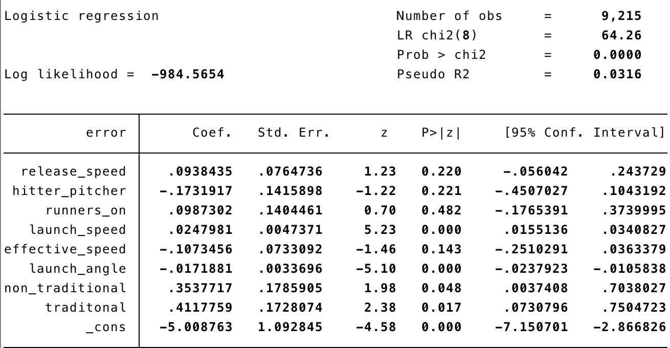
The approach I used to find the probability of a batted ball being a fielding error was to run a logistic regression. The variables included in the regression were release speed, hitter-pitcher matchup (dummy variable with a value of 1 if the pitcher and hitter were both righties or lefties), runners on base dummy, launch speed (exit velocity), effective speed, launch angle, and dummy variables for both traditional and non-traditional shifts. The model only included batted balls that were hit in the infield, as the majority of shifts occur in the infield.
Above are the results of the logistic regression used to determine the probability of a batted ball being an error. The dependent variable is whether or not the error occurred. Two results that logically make sense are Exit Velocity (Launch Speed) having a positive coefficient and Launch Angle having a negative coefficient. Both of these variables are significant on the 1% level. Exit Velocity having a positive coefficient shows that the harder the ball is hit, the harder the ball is to field. Launch Angle has a negative coefficient, meaning that the lower the angle (meaning a ground ball over a fly ball) the more likely the fielder is to commit an error. Both of these results are logical, and are consistent with research that has been conducted in the past. The most interesting results from the model are both traditional and non-traditional shifts leading to an increased likelihood of an error occurring. Both variables were statistically significant on the 5% level, and prove that players struggle more in the field when playing out of their normal position.
While teams are unlikely to change their shifting patterns (more good comes out of the shift than bad), they must take into account which fielders are worse when playing out of position.
Despite the increased probability of an error occurring, I still believe that the positives out weigh the negatives when it comes to shifting. In future research, it would be interesting to look at this data on a minor league level, as well as seeing if fielders who shifted more in the minors are more prepared to field out of position in the majors.
If you play in a traditional 12-team 5×5 roto auction league with 25-man rosters and a $200 FA budget per season, you might constantly feel like there is solid waiver-wire talent out there, but your roster is too stacked to cut anyone. So, you offer your league-mates a trade of two or three mediocre players for one of their better players, but they are facing a similar roster crunch and immediately see right through your pernicious plan. It can be tempting to cut the lowest-production, lowest-upside player on your roster, which in many cases is the $1 catcher you drafted. But is that catcher really providing value to your roster? Let’s break it down.
Let’s say you draft Realmuto this year for $10 and expect a line of 13 HR, 53 R, 58 RBI, 7 SB, .275 AVG (Steamer projected line, ~500 PA). The other cost of drafting Realmuto is the opportunity cost of his roster spot. In a typical fantasy week, there are three or four days where your typical starting lineup is not intact. Whether it’s because a team is having an off-day or one of your regular starters is DTD with a bruised toe, holes in your lineup are bound to happen. A smart streamer can look for good matchups and plug those holes. If you have unlimited pickups allowed in your league, then there is no cost to picking up a player if you have an open roster spot. In my league, I can pick up players for $1 on free-agent days (M/W/F).
This begs the question: if you are streaming to fill in holes four times per week over 26 weeks of the regular season, and each game you plug in a streaming player you get 4 PA, then that is going to equal just over 200 PA and cost you around $78 FAAB (assuming three pickups per week * 26 weeks, and one of your streamed pickups fills holes twice in one week for a total of four fill-ins). What does a slash line of 200 PA for a waiver-wire bat look like?
Kevin Pillar screams waiver-wire bat. His Steamer projection reduced to 200 PA looks like: 5 HR, 25 R, 20 RBI, 5 SB, .270 AVG. That’s quite worse than Realmuto’s line in every way excepting AVG. It amounts to a little less than 50% of Realmuto’s line at the cost of $78 FAAB. Now you could argue that maybe amidst all your streaming you end up picking up a Jonathan Villar 2016 breakout type of bat and end up sticking with him and getting immense value, but that’s easier said than done. Maybe you are also going to research pitcher vs. batter matchups on a daily basis and you get an edge there, but that is also easier said than done.
How does the 200 PA of Kevin Pillar compare to a $1 draft day, bottom of the barrel catcher’s line? Even poor Jonathan Lucroy is projected by Steamer to beat this line: 10 HR, 44 R, 46 RBI, 2 SB, .268 AVG. Other such luminaries projected to outshine it include Tucker Barnhart, Christian Vazquez, and Tyler Flowers. Pretty much any catcher who is a starter and can bat .250+ for a season will put up much better counting stats than the Pillar line.
Long story short — even though your catcher’s line may look meek, and they don’t play every day, making your roster look thin, it will still likely be better than waiver-wire lineup hole streaming. Better to save your FAAB cash for other needs. If you play in an unlimited transaction league, you would still need about 500 PAs of Pillar to exceed the Realmuto line. That’s a lot of transactions, and you might not have time to get all the necessary PAs in. Punting C is like heeding the siren calls — it can be very tempting, but also a dangerous and costly exercise. Staying the course with the catcher you drafted is usually the best call in terms of value per FAAB dollar spent.
There is a segment of the population of the United States which meets the following criteria: between the age of 18-21, devout FanGraphs reader, and was mesmerized by the movie “Moneyball.” I have read the book and watched the movie a number of times, as well as dedicating time to understanding the guiding principles in the book and how they relate to professional baseball. The relationship between on-base percentage and scoring runs in Major League Baseball is well established, but has anyone ever taken the time to examine the relationship at the collegiate level?
Collegiate baseball is volatile — roster makeups change dramatically each year, no player is around more than five years, not to mention there are hundreds of teams competing against one another. In terms of groundbreaking sabermetric principles, this study is not intended to turn over any new stones, but rather present information which may have been overlooked up to this point, which is the relationship between on-base percentage and runs scored in collegiate baseball.
To conduct this study, I compiled a list of Southeastern Conference team statistics from the 2014-2017 seasons (Runs Scored, On Base Percentage, Runs Against, and Opponents’ On Base Percentage). I then performed linear regression on the distribution by implementing a line of best fit. Some teams’ seasons were excluded due to inability to access that season’s data, and I felt like removing the 2014 Auburn season on the grounds that it was an outlier affecting the output (235 runs, 0.360 OBP). Below is the resulting math: the R2, and the resulting predictive equation:
I am by no means a seasoned statistician, but in my interpretation of the R2 value, the relationship between Runs Scored and OBP in this is moderately strong, with a team’s OBP accounting for roughly 72.3% of the variation in Runs Scored in a season. Simply, OBP is statistically significant in determining the offensive potency of a team.
At the professional level, the R2 is found to be around 0.90. The competitive edge the Oakland A’s used in “Moneyball” was using this correlation to purchase the services of “undervalued” players. But what about in college? Colleges certainly cannot purchase their players, but the above information can be useful to college programs.
For example, the average Runs Scored per season of the sample I used was roughly 347.8. If an SEC team wanted to set the goal of being “above average” offensively, they would be able to determine, roughly, what their target OBP should be by using the resulting predictive equation from the Linear Fit:
Does this mean if an SEC program produces an OBP of .362 they would score 348 runs precisely? Obviously not. Could they end up scoring exactly 348 runs? Yes, but variation exists, and statistics is the study of variation. Here are a few seasons in which teams posted an OBP at or around 0.362, and the resulting run totals:
The average of those six seasons’ run totals was 347.5, which is pretty darn close to 348, and even closer to the average of 347.8 runs derived from the sample.
Another use for this information is lineup construction and tactical strategy in-game. The people in charge of baseball programs do not need instruction on how to construct their roster and manage their team, but who would disagree with a strategy of maximizing your team’s ability to get on base?
The purpose of this study was to examine the relationship between On Base Percentage and Runs Scored in college baseball, and how the relationship compares to its professional counterpart. To conclude, the relationship between OBP and runs exists at the collegiate level, and carries considerable weight and value if teams are willing to get creative in utilizing its ability.
Disclaimer: I am a beginner-level statistician, and if you have any suggestions or critiques of this article, please feel free to share them with me.
Theodore Hooper is a Student Assistant, Player Video/Scouting, for the University of Tennessee baseball program. He can be reached at thooper3@vols.utk.edu or on LinkedIn at https://www.linkedin.com/in/theodore-hooper/
Because I believed Jeff Sullivan that there was a 2% chance Ohtani would sign Friday, I wrote this article, that now reads a bit weird, but I’m not going to change it because I have to get back to the job that I do for money instead of for fun. Any complaints about said weirdness should be addressed to Jeff Sullivan.
The phrase “sure thing” is thrown around a lot in sports to describe things that are not actually sure things. Atlanta was going to win the Super Bowl. Up 25 points, it was a sure thing until it wasn’t. Shohei Ohtani is not a sure thing to be a superstar in MLB, or even an All-Star. He’s not even a sure thing to be an average big-league player. History is littered with players that were star players one day and also-rans the next. But what Ohtani is a sure thing to do is pay off his price tag. Barring a tragic accident or something else outside of the realm of baseball, the team that signs Ohtani will surely earn more than $20.5 million extra during the 2018 baseball season that they would not have earned without him.
To understand why this is a certainty, you can look at Stephen Strasburg in 2010. The Nationals were the worst team in baseball in 2009, finishing with 59 wins for the second consecutive season. They were not much better in 2010, adding 10 more wins to that total, but still finishing 5th in the NL East. Their overall attendance for 2010 was bad, which is to be expected. 1,828,066 were said to have paid money to see the Nationals play that year, or about 22,500 per game. That was only about 10,000 higher, on the season, than they managed in 2009. Strasburg’s first game was electric (I was there). It was the kind of atmosphere that made no sense at all for a team that was mired in long-term terribleness. The game, played on a Tuesday, sold out with attendance only rivaled that season by opening day, up to that point.
But that only tells a small part of the story. The two Tuesday games the Nationals had played at home prior to this game averaged about 16,000 fans. It’s pretty safe to say that this game, against the Pirates, would have been in a similar range without Strasburg. But the Strasburg effect was much wider reaching. First, once it became known that Strasburg was pitching, the Nationals created a ticket package to sell many of the unsold tickets. The package included the Strasburg game, plus three additional games. For those that came to the stadium without a ticket, their choices were between that and the suddenly busy scalpers.
The weekend before Strasburg’s debut, the Nationals drew almost 91,000 fans against the Reds. That was about 6,000 more than they drew during their previous weekend series against the Orioles. But the Orioles are not really a fair comparison because they are Beltway rivals of the Nationals. If you go back the weekend series before that, when the Nationals were playing the Marlins, just over 63,000 came to the ballpark. Now, some of this might have been random or based on other factors, but fans were anticipating Strasburg’s debut and buying tickets in anticipation of it — fans including the humble author of this post. Some even speculated that the Nationals intentionally misled fans in order to juice the gate.
Strasburg’s second start was in Cleveland, who also seemed to have benefited from a large Strasburg-related spike in attendance for that game. His third game was a Friday and was sold out. Again, even weekend games prior to Strasburg were sparsely attended. The Saturday game after his start was nearly sold out, likely due to fans incorrectly believing it was going to be the day Strasburg pitched. His 3rd home game was the first that did not sell out. But there is more to the story (again, I was there). This game was played during the week, during the day, and it was literally at or above 100 degrees that day. There were still almost 32,000 fans there. After pitching on the road, Strasburg again sold out the stadium for his 6th start and had a large, but not sold-out game for his 7th. His next home start, another Tuesday game, again sold out. I’ve probably gone on long enough, if not too long. If you didn’t know how much Strasburg boosted attendance, you do now.
And here is the question: As much hype as there was in D.C. during the summer of 2010, do we really think that Ohtani’s hype won’t meet or perhaps even far exceed it? I certainly do. Additionally, the team that signs Ohtani will have a much easier time plotting and planning exactly how they can wring the most dollars possible out of their fans. In 2010, the Nationals created a multigame package on the fly, but now teams are exploring more and more ways of earning extra dollars through dynamic pricing. If a team like Seattle were to get Ohtani and announces that he’ll be pitching the second game of the season, the added revenue they would be able to earn would be astounding. Last season, the Mariners’ attendance dropped from 44,856 on opening day to 18,527 the next day. With Ohtani, it’s safe to say they’d sell out their second game.
If you’ve stayed with me this long, you might be wondering “yeah, I knew all of this already, so what?” And yes, most FanGraphs readers probably already believed that Ohtani is going to really juice attendance wherever he ends up. But then, why did three teams not even bother to try to acquire him? There simply is no justification. If you are the Marlins, you can do both things. You can say you are cutting payroll by $50 million, but at the same time if Ohtani for some reason picks the Marlins (he wouldn’t), you find the $20 million to pay him. You will get it back and more. Take out a loan. Heck, take out a payday loan with onerous and unfair terms and you will still end up ahead. It simply makes no sense. He is, from a financial standpoint, literally a sure thing.
Earlier this season I set out to build a tool similar in nature to my dSCORE tool, except this one was meant to identify swing-change hitters. Along the course of its construction and early-alpha testing, it morphed into something different, and maybe something more useful. What I ended up with was a tool called cHit (“change Hit”, named for swing changers but really I was just too lazy to bother coming up with a more apt acronym for what the tool actually does). cHit, in its current beta form, aims to identify hitters that tend to profile for “impact production” — simply defined as hit balls hard, and hit them in the air. Other research has identified those as ideal for XBH, so I really didn’t need to reinvent the wheel. Although I’d really like to pull in Statcast data offerings in a more refined form of this tool, simple batted ball data offered here on FanGraphs does the trick nicely.
The inner workings of this tool takes six different data points (BB%, GB%, FB%, Hard%, Soft%, Spd), compares each individual player’s stat against a league midpoint for that stat, then buffs it using a multiplier that serves to normalize each stat based on its importance to ISO. I chose ISO as it’s a pretty clean catch-all for power output.
Now here’s the trick of this tool: it’s not going to identify “good” hitters from “bad” hitters. Quality sticks like Jean Segura, Dee Gordon, Cesar Hernandez, and others show up at the bottom of the results because their game doesn’t base itself on the long ball. They do just fine for themselves hitting softer liners or ground balls and using their legs for production. Frankly, chances are if a player at the bottom of the list has a high Speed component, they’ve got a decent chance of success despite a low cHit. Nuance needs to be accounted for by the user.
Here’s how I use it to identify swing-changers (and/or regression candidates): I pulled in data for previous years, back to 2014. I compared 2017 data to 2016 data (I’ll add in comparisons for previous years in later iterations) and simply checked to see who were cHit risers or fallers. The results were telling — players we have on record as swing changers show up with significant positive gains, and players that endured some significant regression fell.
There’s an unintended, possible third use for this tool: identifying injured hitters. Gregory Polanco, Freddie Freeman, and Matt Holliday all suffered/played through injury this year, and they all fell precipitously in the rankings. I’ll need a larger sample size to see whether injuries and a fall in cHit are related or if that’s just noise.
Data!
cHit 2017
Name
Team
Age
AB
cHit Score
BB%
GB%
FB%
Hard%
Soft%
Spd
ISO
Joey Gallo
Rangers
23
449
27.56
14.10%
27.90%
54.20%
46.40%
14.70%
5.5
0.327
J.D. Martinez
– – –
29
432
23.52
10.80%
38.30%
43.20%
49.00%
14.00%
4.7
0.387
Matt Carpenter
Cardinals
31
497
22.46
17.50%
26.90%
50.80%
42.20%
12.10%
3.1
0.209
Aaron Judge
Yankees
25
542
21.56
18.70%
34.90%
43.20%
45.30%
11.20%
4.8
0.343
Lucas Duda
– – –
31
423
19.69
12.20%
30.30%
48.60%
42.10%
14.50%
0.5
0.279
Cody Bellinger
Dodgers
21
480
19.26
11.70%
35.30%
47.10%
43.00%
14.00%
5.5
0.315
Miguel Sano
Twins
24
424
17.73
11.20%
38.90%
40.50%
44.80%
13.50%
2.9
0.243
Jay Bruce
– – –
30
555
16.50
9.20%
32.50%
46.70%
40.30%
11.70%
2.6
0.254
Trevor Story
Rockies
24
503
16.39
8.80%
33.70%
47.90%
40.30%
14.40%
4.7
0.219
Justin Turner
Dodgers
32
457
16.16
10.90%
31.40%
47.80%
38.90%
9.80%
3.3
0.208
Khris Davis
Athletics
29
566
15.64
11.20%
38.40%
42.30%
42.10%
13.50%
3.4
0.281
Brandon Belt
Giants
29
382
15.38
14.60%
29.70%
46.90%
38.40%
14.00%
4.2
0.228
Nick Castellanos
Tigers
25
614
14.94
6.20%
37.30%
38.20%
43.40%
11.50%
4.6
0.218
Eric Thames
Brewers
30
469
14.52
13.60%
38.40%
41.30%
41.50%
16.00%
4.6
0.271
Justin Upton
– – –
29
557
14.43
11.70%
36.80%
43.70%
41.00%
19.80%
4
0.268
Justin Smoak
Blue Jays
30
560
14.38
11.50%
34.30%
44.50%
39.40%
13.10%
1.7
0.259
Wil Myers
Padres
26
567
14.32
10.80%
37.50%
42.90%
41.40%
19.50%
5.3
0.220
Paul Goldschmidt
Diamondbacks
29
558
14.31
14.10%
46.30%
34.90%
44.30%
11.30%
5.6
0.265
Chris Davis
Orioles
31
456
14.28
11.60%
36.70%
39.80%
41.50%
12.80%
2.7
0.208
Kyle Seager
Mariners
29
578
13.57
8.90%
31.30%
51.60%
35.70%
13.10%
2.2
0.201
Nelson Cruz
Mariners
36
556
13.35
10.90%
40.40%
41.80%
40.70%
14.70%
1.7
0.261
Mike Zunino
Mariners
26
387
13.31
9.00%
32.00%
45.60%
38.60%
17.50%
1.9
0.258
Mike Trout
Angels
25
402
13.16
18.50%
36.70%
44.90%
38.30%
19.00%
6.2
0.323
Corey Seager
Dodgers
23
539
13.08
10.90%
42.10%
33.10%
44.00%
12.90%
2.7
0.184
Logan Morrison
Rays
29
512
12.74
13.50%
33.30%
46.20%
37.40%
17.50%
2.4
0.270
Randal Grichuk
Cardinals
25
412
12.61
5.90%
35.90%
42.70%
40.20%
18.20%
5.2
0.235
Salvador Perez
Royals
27
471
12.50
3.40%
33.30%
47.00%
38.10%
16.50%
2.4
0.227
Michael Conforto
Mets
24
373
12.42
13.00%
37.80%
37.80%
41.60%
20.20%
3.6
0.276
Matt Davidson
White Sox
26
414
12.19
4.30%
36.20%
46.50%
38.20%
15.80%
1.8
0.232
Mike Napoli
Rangers
35
425
12.15
10.10%
33.20%
52.10%
35.50%
21.90%
2.7
0.235
Miguel Cabrera
Tigers
34
469
12.03
10.20%
39.80%
32.90%
42.50%
9.90%
1.1
0.149
Brandon Moss
Royals
33
362
11.83
9.20%
33.10%
44.50%
37.30%
13.60%
2.3
0.221
Curtis Granderson
– – –
36
449
11.69
13.50%
32.60%
48.80%
35.30%
17.60%
4.8
0.241
Ian Kinsler
Tigers
35
551
11.64
9.00%
32.90%
46.50%
37.00%
18.70%
5.6
0.176
Edwin Encarnacion
Indians
34
554
11.01
15.50%
37.10%
41.80%
37.60%
15.50%
2.7
0.245
Manny Machado
Orioles
24
630
10.79
7.20%
42.10%
42.10%
39.50%
18.50%
3.3
0.213
Freddie Freeman
Braves
27
440
10.72
12.60%
34.90%
40.60%
37.50%
12.40%
4.3
0.280
Nolan Arenado
Rockies
26
606
10.60
9.10%
34.00%
44.90%
36.70%
17.60%
4.1
0.277
Anthony Rendon
Nationals
27
508
10.41
13.90%
34.00%
47.20%
34.30%
13.00%
3.5
0.232
Yonder Alonso
– – –
30
451
10.34
13.10%
33.90%
43.20%
36.00%
13.20%
2.4
0.235
Kyle Schwarber
Cubs
24
422
10.24
12.10%
38.30%
46.50%
36.40%
21.30%
2.8
0.256
Carlos Gomez
Rangers
31
368
10.19
7.30%
39.10%
40.30%
39.00%
16.50%
5
0.207
Luis Valbuena
Angels
31
347
9.81
12.00%
38.40%
47.30%
35.80%
22.00%
1.3
0.233
Dexter Fowler
Cardinals
31
420
9.61
12.80%
39.40%
38.20%
38.10%
12.70%
5.9
0.224
Jed Lowrie
Athletics
33
567
9.40
11.30%
29.40%
43.50%
34.50%
12.10%
2.7
0.171
Giancarlo Stanton
Marlins
27
597
8.96
12.30%
44.60%
39.40%
38.90%
20.80%
2.3
0.350
Jose Abreu
White Sox
30
621
8.95
5.20%
45.30%
36.40%
40.50%
15.80%
4.4
0.248
Josh Donaldson
Blue Jays
31
415
8.92
15.30%
41.00%
42.30%
36.30%
17.30%
1.6
0.289
Joey Votto
Reds
33
559
8.87
19.00%
39.00%
38.00%
36.30%
10.40%
2.8
0.258
Victor Martinez
Tigers
38
392
8.75
8.30%
42.10%
34.20%
39.90%
12.40%
0.9
0.117
Charlie Blackmon
Rockies
31
644
8.63
9.00%
40.70%
37.00%
39.00%
17.10%
6.4
0.270
Mitch Moreland
Red Sox
31
508
8.43
9.90%
43.40%
36.20%
38.90%
13.50%
1.7
0.197
Scott Schebler
Reds
26
473
8.29
7.30%
45.60%
38.20%
39.40%
19.30%
3.9
0.252
Paul DeJong
Cardinals
23
417
8.19
4.70%
33.70%
42.90%
36.40%
21.40%
2.5
0.247
Ryan Zimmerman
Nationals
32
524
8.18
7.60%
46.40%
33.70%
40.50%
14.10%
2.2
0.269
Mookie Betts
Red Sox
24
628
7.76
10.80%
40.40%
42.80%
35.70%
18.20%
5.5
0.194
Rougned Odor
Rangers
23
607
7.61
4.90%
41.50%
42.20%
36.80%
18.50%
5.6
0.193
Francisco Lindor
Indians
23
651
7.42
8.30%
39.20%
42.40%
35.20%
14.30%
5.1
0.232
Brad Miller
Rays
27
338
7.39
15.50%
47.40%
36.10%
38.40%
18.10%
4.6
0.136
Daniel Murphy
Nationals
32
534
6.97
8.80%
33.50%
38.90%
35.70%
16.70%
3.8
0.221
Travis Shaw
Brewers
27
538
6.87
9.90%
42.50%
37.60%
37.10%
15.80%
4.5
0.240
Jake Lamb
Diamondbacks
26
536
6.86
13.70%
41.10%
38.30%
35.70%
12.90%
4.4
0.239
Todd Frazier
– – –
31
474
6.75
14.40%
34.20%
47.50%
32.20%
23.20%
3.1
0.215
Yasmani Grandal
Dodgers
28
438
6.63
8.30%
43.50%
40.00%
36.50%
17.60%
1.1
0.212
Brian Dozier
Twins
30
617
6.60
11.10%
38.40%
42.60%
34.10%
15.90%
5.2
0.227
Adam Duvall
Reds
28
587
6.55
6.00%
33.20%
48.60%
31.80%
17.50%
3.9
0.232
Hunter Renfroe
Padres
25
445
6.52
5.60%
37.90%
45.40%
34.60%
23.50%
3.2
0.236
Justin Bour
Marlins
29
377
6.40
11.00%
43.40%
33.60%
38.80%
19.60%
1.6
0.247
Carlos Correa
Astros
22
422
6.33
11.00%
47.90%
31.70%
39.50%
15.00%
3.2
0.235
Marcell Ozuna
Marlins
26
613
6.09
9.40%
47.10%
33.50%
39.10%
18.30%
2.3
0.237
Domingo Santana
Brewers
24
525
5.85
12.00%
44.90%
27.70%
39.70%
11.70%
4
0.227
Kris Bryant
Cubs
25
549
5.83
14.30%
37.70%
42.40%
32.80%
14.80%
4.4
0.242
Gary Sanchez
Yankees
24
471
5.47
7.60%
42.30%
36.60%
36.90%
18.60%
2.6
0.253
Asdrubal Cabrera
Mets
31
479
5.46
9.30%
43.50%
36.20%
36.80%
17.20%
2.5
0.154
Austin Hedges
Padres
24
387
5.37
5.50%
36.60%
45.70%
33.10%
22.30%
2.7
0.183
Logan Forsythe
Dodgers
30
361
5.33
15.70%
44.00%
33.10%
36.60%
13.20%
2.8
0.102
Yadier Molina
Cardinals
34
501
5.25
5.20%
42.20%
37.40%
36.40%
16.50%
3.9
0.166
Bryce Harper
Nationals
24
420
5.07
13.80%
40.40%
37.60%
34.30%
13.30%
3.7
0.276
Neil Walker
– – –
31
385
5.01
12.30%
36.20%
41.70%
32.80%
17.70%
2.8
0.174
Aaron Altherr
Phillies
26
372
5.01
7.80%
43.10%
37.50%
36.40%
20.10%
5.5
0.245
Andrew McCutchen
Pirates
30
570
4.90
11.20%
40.70%
37.40%
35.20%
17.50%
4.3
0.207
Eduardo Escobar
Twins
28
457
4.86
6.60%
33.70%
45.30%
31.40%
16.00%
5.1
0.195
Anthony Rizzo
Cubs
27
572
4.79
13.20%
40.70%
39.20%
34.40%
19.80%
4.4
0.234
Ryan Braun
Brewers
33
380
4.73
8.90%
49.20%
31.90%
39.00%
19.20%
5.3
0.218
Kendrys Morales
Blue Jays
34
557
4.56
7.10%
48.40%
33.20%
37.90%
15.20%
1.1
0.196
Jose Ramirez
Indians
24
585
4.54
8.10%
38.90%
39.70%
34.00%
16.70%
6
0.265
Mike Moustakas
Royals
28
555
4.51
5.70%
34.80%
45.70%
31.90%
21.20%
1.1
0.249
Andrew Benintendi
Red Sox
22
573
4.50
10.60%
40.10%
38.40%
34.30%
16.60%
4.5
0.154
Jose Bautista
Blue Jays
36
587
4.47
12.20%
37.70%
45.80%
31.40%
21.70%
3.4
0.164
Jason Castro
Twins
30
356
4.36
11.10%
41.90%
33.50%
36.00%
14.00%
1.5
0.146
Albert Pujols
Angels
37
593
4.12
5.80%
43.50%
38.10%
35.10%
15.90%
2.1
0.145
Hanley Ramirez
Red Sox
33
496
4.04
9.20%
41.80%
37.10%
35.30%
20.00%
1.5
0.188
Tommy Joseph
Phillies
25
495
3.99
6.20%
41.70%
39.00%
35.00%
20.90%
2.2
0.192
Tim Beckham
– – –
27
533
3.99
6.30%
48.80%
29.50%
39.10%
15.50%
4.4
0.176
Jonathan Schoop
Orioles
25
622
3.90
5.20%
41.90%
37.20%
36.10%
23.00%
2.2
0.211
George Springer
Astros
27
548
3.58
10.20%
48.30%
33.80%
36.70%
17.90%
3.1
0.239
Carlos Beltran
Astros
40
467
3.54
6.50%
43.10%
40.40%
33.70%
17.50%
1.8
0.152
Alex Bregman
Astros
23
556
3.52
8.80%
38.40%
39.90%
33.00%
18.00%
5.9
0.191
Carlos Santana
Indians
31
571
3.49
13.20%
40.80%
39.30%
33.00%
18.40%
4
0.196
Eugenio Suarez
Reds
25
534
3.33
13.30%
38.90%
37.10%
33.80%
20.70%
3.1
0.200
Scooter Gennett
Reds
27
461
3.29
6.00%
41.30%
37.60%
34.40%
17.20%
4.3
0.236
Mark Reynolds
Rockies
33
520
3.26
11.60%
42.10%
36.30%
34.50%
19.00%
2.7
0.219
Josh Reddick
Astros
30
477
3.23
8.00%
33.60%
42.30%
31.10%
17.20%
4.8
0.170
Mitch Haniger
Mariners
26
369
2.97
7.60%
44.00%
36.70%
34.70%
17.70%
4.3
0.209
Ian Happ
Cubs
22
364
2.92
9.40%
40.20%
39.70%
32.80%
18.70%
5.7
0.261
Josh Harrison
Pirates
29
486
2.90
5.20%
36.50%
40.80%
32.40%
18.70%
4.9
0.160
Keon Broxton
Brewers
27
414
2.78
8.60%
45.10%
34.60%
35.30%
17.00%
7.4
0.200
Matt Joyce
Athletics
32
469
2.69
12.10%
37.80%
42.80%
30.30%
16.30%
3.2
0.230
Derek Dietrich
Marlins
27
406
2.65
7.80%
36.50%
40.70%
32.10%
20.50%
3.9
0.175
Ryon Healy
Athletics
25
576
2.56
3.80%
42.80%
38.20%
33.90%
16.50%
1.4
0.181
Evan Longoria
Rays
31
613
2.50
6.80%
43.40%
36.80%
34.30%
18.00%
3.8
0.163
Zack Cozart
Reds
31
438
2.49
12.20%
38.20%
42.30%
30.80%
19.50%
5.3
0.251
Robinson Cano
Mariners
34
592
2.48
7.60%
50.00%
30.60%
36.90%
12.80%
2
0.172
Max Kepler
Twins
24
511
2.39
8.30%
42.80%
39.50%
32.90%
18.70%
4.2
0.182
Steven Souza Jr.
Rays
28
523
2.22
13.60%
44.60%
34.30%
34.10%
16.50%
4.8
0.220
Michael Taylor
Nationals
26
399
2.17
6.70%
42.90%
36.70%
34.00%
18.10%
5.9
0.216
Yulieski Gurriel
Astros
33
529
2.12
3.90%
46.20%
35.20%
35.10%
15.90%
2.8
0.187
Corey Dickerson
Rays
28
588
1.24
5.60%
41.80%
35.80%
33.60%
18.70%
4
0.207
Whit Merrifield
Royals
28
587
1.01
4.60%
37.70%
40.50%
30.60%
15.40%
6.7
0.172
Chris Taylor
Dodgers
26
514
0.88
8.80%
41.50%
35.80%
32.40%
15.80%
6.4
0.208
A.J. Pollock
Diamondbacks
29
425
0.81
7.50%
44.60%
32.10%
35.00%
19.80%
7.5
0.205
Marwin Gonzalez
Astros
28
455
0.71
9.50%
43.90%
36.20%
32.70%
18.60%
3.2
0.226
Yangervis Solarte
Padres
29
466
0.62
7.20%
41.60%
42.10%
31.10%
25.20%
2.4
0.161
Shin-Soo Choo
Rangers
34
544
0.57
12.10%
48.80%
26.20%
36.10%
12.20%
4.7
0.162
Buster Posey
Giants
30
494
0.50
10.70%
43.60%
33.00%
33.00%
14.10%
2.8
0.142
Jedd Gyorko
Cardinals
28
426
0.48
9.80%
40.50%
39.30%
30.80%
19.20%
3.8
0.200
Yasiel Puig
Dodgers
26
499
0.30
11.20%
48.30%
35.60%
32.90%
18.30%
4.4
0.224
Eddie Rosario
Twins
25
542
0.12
5.90%
42.40%
37.40%
31.70%
16.70%
3.9
0.218
J.T. Realmuto
Marlins
26
532
-0.01
6.20%
47.80%
34.30%
33.30%
14.90%
5
0.173
Jorge Bonifacio
Royals
24
384
-0.20
8.30%
39.30%
34.80%
32.20%
20.20%
2.9
0.177
Gerardo Parra
Rockies
30
392
-0.27
4.70%
46.80%
30.30%
34.70%
14.40%
3
0.143
Willson Contreras
Cubs
25
377
-0.34
10.50%
53.30%
29.30%
35.50%
17.00%
2.4
0.223
Kole Calhoun
Angels
29
569
-0.37
10.90%
43.90%
35.00%
31.80%
17.00%
3.7
0.148
Robbie Grossman
Twins
27
382
-0.43
14.70%
40.70%
34.40%
30.90%
16.00%
3.5
0.134
Matt Holliday
Yankees
37
373
-0.46
10.80%
47.70%
37.50%
31.80%
21.20%
2.1
0.201
Mark Trumbo
Orioles
31
559
-0.47
7.00%
43.30%
40.60%
30.40%
20.90%
2.5
0.163
Stephen Piscotty
Cardinals
26
341
-0.80
13.00%
49.20%
33.20%
32.70%
17.90%
2.7
0.132
Tommy Pham
Cardinals
29
444
-0.86
13.40%
51.70%
26.10%
35.50%
15.40%
6
0.214
Joe Mauer
Twins
34
525
-0.92
11.10%
51.50%
23.60%
36.40%
12.80%
2.4
0.112
Jackie Bradley Jr.
Red Sox
27
482
-0.94
8.90%
49.00%
32.60%
33.30%
17.50%
4.5
0.158
Brandon Crawford
Giants
30
518
-0.98
7.40%
46.20%
34.40%
32.60%
19.30%
2.5
0.151
Nomar Mazara
Rangers
22
554
-1.13
8.90%
46.50%
34.20%
32.60%
20.90%
2.6
0.170
Ben Zobrist
Cubs
36
435
-1.35
10.90%
51.10%
33.30%
32.30%
14.90%
3.6
0.143
Javier Baez
Cubs
24
469
-1.36
5.90%
48.60%
36.00%
32.40%
21.30%
5.3
0.207
Jorge Polanco
Twins
23
488
-1.42
7.50%
37.90%
42.80%
27.70%
19.90%
4.9
0.154
Avisail Garcia
White Sox
26
518
-1.70
5.90%
52.20%
27.50%
35.30%
15.70%
4.3
0.176
Matt Kemp
Braves
32
438
-1.76
5.80%
48.50%
28.20%
34.70%
17.40%
1.7
0.187
Maikel Franco
Phillies
24
575
-2.04
6.60%
45.40%
36.70%
30.90%
20.80%
1.5
0.179
Nick Markakis
Braves
33
593
-2.17
10.10%
48.60%
29.20%
33.10%
15.60%
1.9
0.110
Tucker Barnhart
Reds
26
370
-2.46
9.90%
46.00%
27.80%
33.20%
16.50%
3.4
0.132
Trey Mancini
Orioles
25
543
-2.48
5.60%
51.00%
29.70%
34.10%
19.60%
3.2
0.195
Christian Yelich
Marlins
25
602
-2.51
11.50%
55.40%
25.20%
35.20%
15.90%
5.2
0.156
Lorenzo Cain
Royals
31
584
-2.79
8.40%
44.40%
32.90%
31.10%
18.70%
6.5
0.140
Josh Bell
Pirates
24
549
-2.87
10.60%
51.10%
31.20%
32.60%
20.60%
3.5
0.211
Jose Reyes
Mets
34
501
-3.00
8.90%
37.20%
43.10%
26.70%
26.10%
7.2
0.168
Carlos Gonzalez
Rockies
31
470
-3.04
10.50%
48.60%
31.70%
31.90%
20.50%
3.2
0.162
Adam Jones
Orioles
31
597
-3.27
4.30%
44.80%
34.30%
30.90%
20.10%
2.7
0.181
Byron Buxton
Twins
23
462
-3.57
7.40%
38.70%
38.00%
27.60%
18.20%
8.2
0.160
Kevin Kiermaier
Rays
27
380
-3.81
7.40%
49.60%
32.10%
31.80%
22.00%
5.9
0.174
Chase Headley
Yankees
33
512
-3.90
10.20%
43.50%
31.70%
30.00%
17.10%
4.3
0.133
Xander Bogaerts
Red Sox
24
571
-4.31
8.80%
48.90%
30.50%
31.40%
19.70%
6.7
0.130
Jordy Mercer
Pirates
30
502
-4.33
9.10%
48.30%
30.90%
31.00%
19.00%
2.9
0.151
Brandon Drury
Diamondbacks
24
445
-4.44
5.80%
48.80%
29.40%
31.70%
16.60%
2.4
0.180
Alex Gordon
Royals
33
476
-4.69
8.30%
42.60%
33.00%
29.20%
19.40%
4.3
0.107
Ben Gamel
Mariners
25
509
-4.84
6.50%
44.90%
33.30%
29.40%
18.70%
4.9
0.138
Hernan Perez
Brewers
26
432
-4.85
4.40%
48.30%
33.50%
30.40%
21.20%
5.3
0.155
Matt Wieters
Nationals
31
422
-4.94
8.20%
42.50%
36.40%
27.40%
18.10%
2
0.118
Brett Gardner
Yankees
33
594
-5.07
10.60%
44.50%
33.20%
28.80%
20.00%
6
0.163
Odubel Herrera
Phillies
25
526
-5.10
5.50%
44.10%
34.70%
29.40%
24.40%
4.3
0.171
Freddy Galvis
Phillies
27
608
-5.11
6.80%
36.70%
39.20%
25.50%
18.10%
5.3
0.127
Elvis Andrus
Rangers
28
643
-5.13
5.50%
48.50%
31.50%
30.50%
18.70%
5.7
0.174
Danny Valencia
Mariners
32
450
-5.93
8.00%
47.90%
31.00%
29.80%
20.50%
3.3
0.156
Kevin Pillar
Blue Jays
28
587
-6.25
5.20%
43.10%
36.40%
27.30%
22.50%
4.4
0.148
Dansby Swanson
Braves
23
488
-6.35
10.70%
47.40%
29.40%
29.30%
18.00%
3.2
0.092
Jose Altuve
Astros
27
590
-6.45
8.80%
47.00%
32.70%
28.20%
19.00%
6.4
0.202
Alcides Escobar
Royals
30
599
-6.47
2.40%
40.80%
37.40%
26.80%
22.80%
4.3
0.107
Andrelton Simmons
Angels
27
589
-6.62
7.30%
49.50%
31.50%
29.30%
20.60%
5
0.143
Didi Gregorius
Yankees
27
534
-6.91
4.40%
36.20%
43.80%
23.10%
24.40%
2.7
0.191
Ryan Goins
Blue Jays
29
418
-6.94
6.80%
50.30%
34.80%
27.70%
19.60%
2.7
0.120
Gregory Polanco
Pirates
25
379
-7.00
6.60%
42.20%
37.50%
25.90%
22.80%
3.7
0.140
David Peralta
Diamondbacks
29
525
-7.02
7.50%
55.10%
26.50%
31.80%
21.20%
4.6
0.150
Kolten Wong
Cardinals
26
354
-7.11
10.00%
48.10%
31.80%
28.20%
20.80%
5.4
0.127
Orlando Arcia
Brewers
22
506
-7.74
6.60%
51.60%
28.50%
30.20%
22.90%
4.1
0.130
Martin Maldonado
Angels
30
429
-7.80
3.20%
48.50%
36.60%
26.70%
21.60%
2.3
0.147
Cory Spangenberg
Padres
26
444
-7.85
7.00%
49.30%
27.80%
29.20%
16.90%
5
0.137
Joe Panik
Giants
26
511
-7.96
8.00%
44.00%
34.10%
26.10%
20.10%
4.2
0.133
David Freese
Pirates
34
426
-8.08
11.50%
57.00%
22.60%
31.90%
19.40%
1
0.108
Melky Cabrera
– – –
32
620
-8.14
5.40%
48.90%
29.00%
28.90%
19.00%
2.3
0.137
Hunter Pence
Giants
34
493
-8.28
7.40%
57.20%
29.40%
29.40%
18.50%
3.6
0.126
Manuel Margot
Padres
22
487
-8.30
6.60%
40.50%
36.30%
25.40%
25.90%
6.1
0.146
Trea Turner
Nationals
24
412
-8.61
6.70%
51.70%
33.50%
26.70%
18.00%
8.9
0.167
Jonathan Villar
Brewers
26
403
-8.85
6.90%
57.40%
21.90%
33.20%
27.00%
5.4
0.132
Starlin Castro
Yankees
27
443
-9.19
4.90%
51.80%
28.00%
29.20%
21.80%
3.5
0.153
Denard Span
Giants
33
497
-9.30
7.40%
45.00%
33.60%
25.10%
18.60%
5.5
0.155
Jacoby Ellsbury
Yankees
33
356
-9.73
10.00%
45.90%
31.00%
26.10%
22.70%
7.7
0.138
Delino DeShields
Rangers
24
376
-9.93
10.00%
45.10%
34.80%
23.90%
20.10%
7.1
0.098
Adam Frazier
Pirates
25
406
-9.98
7.90%
47.90%
26.80%
27.50%
17.90%
5.7
0.123
DJ LeMahieu
Rockies
28
609
-10.42
8.70%
55.60%
19.70%
30.60%
15.40%
3.9
0.099
Yolmer Sanchez
White Sox
25
484
-10.53
6.60%
44.50%
33.90%
24.00%
19.30%
5.3
0.147
Jason Heyward
Cubs
27
432
-10.54
8.50%
47.40%
32.70%
25.50%
25.80%
4.3
0.130
Tim Anderson
White Sox
24
587
-10.66
2.10%
52.70%
28.00%
28.30%
21.30%
6.2
0.145
Jean Segura
Mariners
27
524
-10.79
6.00%
54.30%
26.40%
28.30%
19.70%
5.5
0.128
Cameron Maybin
– – –
30
395
-10.88
11.30%
57.70%
27.90%
27.40%
20.10%
6.9
0.137
Dustin Pedroia
Red Sox
33
406
-10.90
10.60%
48.80%
28.80%
25.90%
20.10%
2.2
0.099
Jose Iglesias
Tigers
27
463
-10.91
4.30%
50.40%
26.40%
28.40%
23.40%
4.2
0.114
Eric Hosmer
Royals
27
603
-11.30
9.80%
55.60%
22.20%
29.50%
21.80%
3.4
0.179
Eduardo Nunez
– – –
30
467
-12.27
3.70%
53.40%
29.10%
26.70%
24.50%
4.8
0.148
Jon Jay
Cubs
32
379
-12.53
8.50%
47.10%
23.90%
25.30%
11.50%
5.3
0.079
Brandon Phillips
– – –
36
572
-12.97
3.50%
49.50%
28.30%
25.50%
21.70%
4.1
0.131
Guillermo Heredia
Mariners
26
386
-15.19
6.30%
47.40%
34.90%
20.40%
23.80%
2.2
0.088
Ender Inciarte
Braves
26
662
-15.36
6.80%
47.00%
29.10%
22.10%
20.90%
5.4
0.106
Jonathan Lucroy
– – –
31
423
-16.18
9.60%
53.50%
27.90%
22.30%
20.50%
3.1
0.106
Jose Peraza
Reds
23
487
-16.45
3.90%
47.10%
31.30%
21.40%
26.60%
5.8
0.066
Cesar Hernandez
Phillies
27
511
-18.08
10.60%
52.80%
24.60%
22.10%
23.50%
6
0.127
Billy Hamilton
Reds
26
582
-21.80
7.00%
45.80%
30.60%
16.00%
25.00%
9
0.088
Dee Gordon
Marlins
29
653
-28.88
3.60%
57.60%
19.60%
16.10%
24.70%
8.5
0.067
Okay, so here’s the breakdown. I pulled all 2017 hitters with 400 at-bats or more so I could capture some significant hitters that didn’t have qualifying numbers of ABs due to injury. Ball-bludgeon extraordinaire Joey Gallo is a pretty solid name to have heading up this list, as he’s pretty much the human definition of what this tool is trying to identify. JD Martinez, Aaron Judge, Cody Bellinger, Miguel Sano, Trevor Story, and Justin Turner all in the top 10 is pretty much all the proof-of-concept I needed.
Interesting notes:
Brandon Belt at 12 — Someone needs to tell the Giants to trade him to literally any other team, stat.
Giancarlo Stanton at 46 — Surprisingly, the MVP fell off from his stats in 2016. His grounders and soft contact rose by 3 or more percentage points, and shaved off the equivalent from hard and fly balls. His output was fueled by adding almost 200 ABs to his season — he could actually get better if he can stay healthy and add those hard flies back in!
Francisco Lindor at 58 — The interesting part of this is even though Lindor is still a decent way down the list, he actually was the biggest gainer from last season to this, adding 9.52 points to his cHit. We knew he was gunning for flies from the outset of the season, and it looks like his mission was accomplished.
Mike Moustakas at 87 — Frankly, being bookended by Jose Ramirez and Andrew Benintendi should, in a vacuum, should be great company. But this is a prime example of how cHit requires users to not take the numbers at face value. Ramirez and Benintendi aren’t slug-first hitters like Moose. They’ve got significantly better Speed scores, plus aren’t as prone to soft contact. I’d be very wary of Moose regressing, as he seems to rely on sneaking some less-than ideal homers over fences. If he goes to San Francisco I could see his value crater (see Belt, Brandon).
Eric Hosmer at 206 — Nope, negative, pass, I’m trying to sign quality hitters here <— Suggested responses for GMs when approached this offseason by Scott Boras on behalf of Hosmer.
Final Notes:
Batted-ball distribution data is noticeably absent. In one of my iterations I added in those stats, and found that they actually regressed the accuracy of the formula. It doesn’t matter where you hit the ball, as long as you hit it hard.
Medium% and LD% are noisy stats. They also regressed the formula.
I may look to replace BB% in future iterations. For now though, it does a decent job of capturing plate discipline and selectivity.
K% doesn’t seem to have much of an impact on cHit (see Gallo, Joey).
R-squared numbers over the last four years of data hold pretty steady between .65 and .75, which is really encouraging. Also, the bigger the pool of data per year (number of batters analyzed), the higher R-squared goes; which is ultimately the most encouraging result of this whole endeavor.
Input is greatly appreciated! I’m not a mathematician in any stretch of the imagination, so if there’s a better way of going about this I’d love to hear it. I’ll do a writeup about my swing-change findings at a later date.
We all know that Aaron Judge hit for more power this year than Jose Altuve. But, whose power was more impressive? Aaron Judge, who is 6’7 and 282 pounds, has a considerable size advantage over Jose Altuve, at 5’6 and 164 pounds. Perhaps Altuve is actually a better power hitter for his size than is Judge. Let’s expand this idea to the entire league: who is the pound-for-poundtop power hitter?
Role of Height and Weight in Batter Power
Using simultaneous linear regression, I estimated the effects of two physical characteristics — height and weight — on batter power. Measures of batter height and weight were taken from MLB.com. For batter power, I used Isolated Power.
As shown in the figures below, weight and height have positive relationships with power.
Weight has a stronger relationship with power than height, though it is difficult to see in the figures alone. (It’s also not intuitively clear exactly how height affects power.) In subsequent analyses, I consider both weight and height.
Who are the top pound-for-pound power hitters?
Using the model, one can predict a batter’s expected power (based on height and weight) and compare it to their actual power.
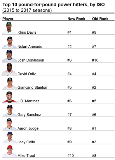
Who are the top pound-for-pound power hitters? See below for the results.
Khris Davis, formerly the #9 top power hitter, emerges as the #1 pound-for-pound power hitter in baseball. In 2017, Davis, who is three inches and over 30 pounds below average for a Major League hitter, hit a remarkable 43 home runs in 2017, with an ISO of .281. Nolan Arenado and Josh Donaldson made similar jumps in the rankings, from #7 to #2, and #10 to #3, respectively.
Notable power hitters have fallen slightly on this list, though remain in the top 10. For example, Aaron Judge fell from the top spot to #8, while Giancarlo Stanton dropped three spots (#2 to #5). It is important to note here that these power hitters are still impressive – continuing to hold spots in the top 10, regardless of their size.
Biggest improvements in rankings
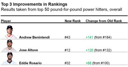
Which players showed the most improvement in the list? Below are results from the top 50 players on the list.
Andrew Benintendi showed the largest increase in rankings (from 184 to 43). Jose Altuve nearly broke into the top 10, jumping from 132 to 12. Lastly, Eddie Rosario improved 68 spots (100 to 32). Altuve, in particular, has recently shown increases in power (from .146 to .194 to .202 in 2015-2017); as a result, his pound-for-pound status may continually increase in upcoming years.
Who was more impressive?
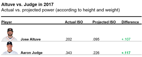
To reference the initial question in this article: was Jose Altuve’s or Aaron Judge’s power more impressive? Results from the above analyses were compiled from 2015 to 2017 seasons. To compare Altuve and Judge’s recent season, take a look below.
Aaron Judge tops Jose Altuve in the pound-for-pound hitter rankings – by a very thin margin – in 2017. Judge’s power performance exceeded expectations (as predicted by his height and weight) to a slightly higher degree than Altuve.
Full Rankings
If you want to see the full list of hitters for this dataset, including the worst pound-for-pound power hitters (poor Jason Heyward!), click here.
Baseball season is coming to a close and the Baseball Writers’ Association of America (BBWAA) will soon unveil its votes for AL and NL MVP. The much-anticipated vote is consistently under the public microscope, and in recent years has drawn criticism for neglecting a clear winner *cough* Mike Trout *cough*. This being one of the closest all-around races in years, voters certainly have some tough decisions to make. This might be the first year since 2012 where it’s not wrong to pick someone other than Mike Trout for AL MVP.
Of course, wrong is subjective. The whole MVP vote is subjective. Voter guidelines are vague and leave much room for interpretation. The rules on the BBWAA website read:
There is no clear-cut definition of what Most Valuable means. It is up to the individual voter to decide who was the Most Valuable Player in each league to his team. The MVP need not come from a division winner or other playoff qualifier. The rules of the voting remain the same as they were written on the first ballot in 1931:
1. Actual value of a player to his team, that is, strength of offense and defense.
2. Number of games played.
3. General character, disposition, loyalty and effort.
4. Former winners are eligible.
5. Members of the committee may vote for more than one member of a team.
It won’t do any good for me to saturate the web with another opinion piece on who deserves to win. It won’t change the vote, and I don’t think I could choose. My goal is rather to illustrate how BBWAA voters have interpreted these rules over time. Have modern sabermetrics driven any shifts in voter consideration? Do voters actually consider team success? Do voters unconsciously vote for players with a better second half?
I thought the best (and most entertaining) way to answer these questions would be to create a model that would act as an MVP voter bot. Lets call the voter bot Jarvis. Jarvis is a follower.
Jarvis votes with all the other voters.
It detects when the other voters start changing their voting behavior.
It evaluates how fast the voters are changing behavior and at what speed it should start considering specific factors more heavily.
It learns by predicting the vote in subsequent years.
I created two different sides to Jarvis. One that is skilled at predicting the winners, and one that is skilled at ordering the players in the top 3 and top 5 of total votes. The name Jarvis just gives some personality to the model in the background: a combination of the fused lasso and linear programming. And it also saves me some key strokes. If you are interested in the specifics, skip to the end, but for those of you who’ve already had enough math, I will spare you the lecture.
Jarvis needs historical data from which to learn. I concentrated on the past couple decades of MVP votes spanning 1974 to 2016 (1974 was the first year FanGraphs provided specific data splits I needed). I considered both performance stats and figures that served as a proxy for anecdotal reasons voters may value specific players (e.g., played on a playoff-bound team). For all performance-based stats, I adjusted each relative to league average — if it wasn’t already — to enable comparison across years (skip to adjustments here). Below are some stats that appeared in the final model.
Position player specific stats: AVG, OBP, HR, R, RBI
Starting pitcher (SP) specific stats: ERA, K, WHIP, Wins (W)
Relief pitcher (RP) specific stats: ERA, K, WHIP, Saves (SV)
Other statistics for both position players and pitchers:
Wins Above Replacement (WAR) – Average of FanGraphs and Baseball Reference WAR
Clutch – FanGraphs’ measure of how well a player performs in high-leverage situations
2nd Half Production – Percent of positive FanGraphs WAR in 2nd half of season
Team Win % – Player’s team winning percentage
Playoff Berth– Player’s team reaches the postseason
Visualizing the way Jarvis considers different factors (i.e. how the model’s weights change) over time for position players reveals trends in voter behavior.
Immediately obvious is the recent dominance of WAR. As WAR becomes socialized and accepted, it seems voters are increasingly factoring WAR into their voting decisions. What I’ll call the WAR era started in 2013 with Andrew McCutchen leading the Pirates to their first winning season since the early 90s. He dominated Paul Goldschmidt in the NL race despite having 15 fewer bombs, 41 fewer RBI, and a lower SLG and OPS. While Trout got snubbed once or twice since 2013, depending on how you see it, his monstrous WAR totals in ’14 and ’16 were not overlooked.
As voters have recognized the value of WAR, they have slowly discounted R and RBI, acknowledging the somewhat circumstantial nature of the two stats. The “No Context” era from ’74 to ’88 can be characterized perfectly by the 1985 AL MVP vote. George Brett (8.3 WAR), Rickey Henderson (9.8), and Wade Boggs (9.0) were all beaten out by Don Mattingly (6.3), likely because of his gaudy 145 RBI total.
Per the voting rules, winners don’t need to come from playoff-bound teams, yet this topic always surfaces during the MVP discussion. Postseason certainly factored in when Miggy beat out Mike Trout two years in a row, starting in 2012. See that playoff-berth bump in 2012 on the graph below? Yeah, that’s Mike Trout. What the model doesn’t consider, however, are the storylines, the character, pre-season expectations: all the details that are difficult for a bot to quantify. For example, I’ve seen a couple of arguments for Paul Goldschmidt as the front-runner to win NL MVP after leading a Diamondbacks team with low expectations to the playoffs. I’ll admit, sometimes the storylines matter, and in a year with such a close NL MVP race, it could push any one player to the top.
What can I say about AVG and HR? AVG is a useless stat by itself when it comes to assessing player value, but it’s ingrained in everyone’s mind. It’s the one stat everyone knows. Hasn’t everyone used the analogy about batting .300 at least once? Home runs…they are sexy. Let’s leave it at that. Seems like these are always on the minds of MVP voters and that is not likely to change any time soon.
I’m sure some of you are already thinking, “What about pitchers!?” Don’t worry, I haven’t forgotten — although it seems MVP voters have. Only three SP and three RP have won the MVP award since 1974, and pitchers account for only about 7.5% of all top-5 finishers. As you can see in the factor-weight graph below, their sparsity in the historical data results in little influence on the model; voter opinions don’t change often, and their raw weights tend to be lower than position players. Overall, it seems as though wins continue to dominate the SP discussion, along with ERA and team success. While I would expect saves to have some influence, voters tend to be swayed by recency bias and clutch performance along with WHIP and WAR.
What would an MVP article be without a prediction? Using the model geared to predict the winners, here are your 2017 MLB MVPs:
AL MVP: Jose Altuve Runner Up: Aaron Judge
NL MVP: Joey Votto Runner Up: Charlie Blackmon
Here are the results from the model tuned to return the best top-3 and top-5 finisher order:
It’s apparent that I adjusted rate and counting stats for league and not park effects given both Rockies place in the top 2. Certainly, if voters are sensitive to park effects, Stanton and Turner get big bumps, and Rockies players likely don’t have a chance. Larry Walker was the only Colorado player to win the MVP since their inception in 1993, but in a close 2017 race it might make the difference.
Continue reading below for the complete methodology and checkout the code on github.
A previous version of this article was published at sharpestats.com.
Statistical Adjustments
Note: lgStat = league (AL/NL) average for that stat, qStat = league average for qualified players, none of the adjusted stats are park adjusted
There were two different adjustments needed for position player rate stats and count stats.
Rate stat adjustment: AVG+ = AVG/lgAVG
Count stats: HR, R, RBI
Count stat adjustment: HR Above Average = PA*(HR/PA – lgHR/PA)
There were three different adjustments needed for starting pitcher (SP) and relief pitcher (RP) rate stats and count stats.
Rate stats: ERA, WHIP
Rate stat adjustment: ERA+ = ERA/lgERA
Count stats I: K
Count stat I adjustment: K Above Average = IP*(K/IP – lgK/IP)
Count stats II: Wins (W), Saves (SV)
Count stat II adjustment: Wins Above Average = GS*(W/GS – qW/GS)
Fused Lasso Linear Program
I combined two different approaches to create a model I thought would work best for the purpose of predicting winners and illustrating change in voter opinions over time. Stephen Ockerman and Matthew Nabity’s approach to predicting Cy Young winners was the inspiration for my framework for scoring and ordering players. A players score is the dot product of the weights (consideration by the voters) and the player’s stats.
The constraints in the optimization require the scores of the first place player to be higher than the second place, and so on and so on. This approach, however, doesn’t allow for violation of constraints. I add an error term for violation of these constraints, and minimize the amount by which they are violated.
Instead of constraining the weights to sum to 1, I applied concepts from Robert Tibshirani’s fused lasso which simultaneously apply shrinkage penalties to the absolute value of weights themselves as well as the difference between weights for the same stat in consecutive years. This accomplishes two things: 1) it helps perform variable selection on statistics within years helping combat collinearity between some performance statistics, and 2) it ensures that weights don’t change too quickly overreacting to a single vote in one year.
However, this approach and formulation cannot be solved by traditional linear optimization methods since absolute value functions are non-linear. The optimization can be reformulated as follows:
To select the lambda parameters, I trained the model using the first 10 seasons of scaled data increasing the training set by 1 season each time and tested with the subsequent year’s vote.After in season statistical adjustments, I scaled the stats by mean and standard deviation of training data to enable comparison across coefficients. All position player stats were replaced with 0 for pitchers and vice versa.
References:
1. Ockerman, Stephen and Nabity, Matthew (2014) “Predicting the Cy Young Award Winner,” PURE Insights: Vol. 3, Article 9.
2. R. Tibshirani, M. Saunders, S. Rosset, J. Zhu, and K. Knight. Sparsity and smoothness via the fused lasso. Journal of the Royal Statistical Society Series B, 67(1):91–108, 2005.
We saw the Yankees basically bullpen the AL wild-card game. Sure, it was on accident, but their bullpen pitched 8.2 innings. And they did it well. This made me think about whether a team could put together a pitching staff that is almost completely used for bullpenning for the entire season.
To see if this would be possible, we will look at the Yankees since they are the team most closely equipped for it already. In the wild-card game, they essentially used four relief pitchers (let’s not count the one out Luis Severino had). Chad Green, David Robertson, Tommy Kahnle, and Aroldis Chapman combined for 8.2 innings and one earned run. Clearly, if a team could do this all the time, they would. In that game they did not use other relievers Dellin Betances and Adam Warren, as well as regular starting pitchers Jordan Montgomery and Jaime Garcia, who would have been available that night.
Since we now know what happened in that bullpen game, can we find out if it is possible to do it over a full season? First off, and MLB roster is comprised of 25 men for any given game and an additional 15 that can be called up if needed. An AL team can get by with 12 position players: one for every starting position (including DH) plus a fourth outfielder, utility infielder, and backup catcher. Let’s say a team’s backups can field multiple positions, like many can. We can get rid of the everyday DH and use one of the backups or starters in that role for a needed day off. That leaves us with 11 position players and room for 14 pitchers.
Many of the Yankees’ own relievers can go multiple innings. Among those pitchers are Chad Green, David Robertson, Tommy Kahnle, Adam Warren, and occasionally Aroldis Chapman and Dellin Betances. Each are effective in their own right. The problem we have to face is the amount of rest needed for these pitchers. The four from the wild-card game each pitched with two days of rest, so we’ll set that as a bench mark. I also don’t want to assume a team needs five pitchers each game like they did in the wild card.
I don’t want to completely get rid of the starting pitcher. It would be dumb to just throw away what Luis Severino and other starters bring to that team. Instead, I want to put a hard limit on how much they pitch each game and how often they pitch. Theoretically, a team could go with a three-game cycle of pitchers. Games are played almost every day during the season, so the two days of rest benchmark will be used here. If we are using four pitchers per game every three games, we need 12 pitchers.
Game 1
Game 2
Game 3
L. Severino
M. Tanaka
S. Gray
C. Green
A. Warren
D. Robertson
T. Kahnle
D. Betances
C. Shreve
A. Chapman
J. Holder
G. Gallegos
I didn’t make this with any set reason, just the best options the Yankees would have in my view. There are many other options available for them and some may be even better. But, if this is the set of pitchers being used, that leaves two extra spots for our 14 available pitchers. Those two extra spots can be utilized for guys needed for extra innings that can pitch multiple innings, or a guy needed for an inning or two in case one of the above gets into trouble.
If a team were to go by this set of pitchers, the regular starting pitchers would be throwing 162 innings over a season. That would be seen as pretty normal for a starting pitcher over the course of a season and in some cases much less. Severino pitched 193 innings himself. The relievers, however, would see a pretty big bump in action. They would pitch 108 innings in a season, more than any of the pitchers above did last year. However, some of those pitchers were starters to begin their careers. Green, Warren, Betances, and Holder have each pitched more than 108 innings in a season. Now, that could be a reason for their increased effectiveness as relievers, but they would still only be pitching two innings in a game, not five or six.
It is possible to ask these relievers to stretch their arms out to be able to throw that many innings in a season. Relievers do transition to starting and this wouldn’t be quite the workload necessary. If a pitcher needs a break during a cycle through this set of pitchers, that could be what the additional two pitchers on the roster are for, or some of the 40-man pitchers could be called up to give a guy a break. They could also call up an actual starter from the minors to take over for four or five innings after the three-inning “starter” in this example. My point here is that if the relievers get tired over the course of a season, there are ways to give them breaks. Plus, the Yankees have so many resources and available pitchers that they have that capability to give breaks.
If the Yankees wanted to, they could keep Severino, Tanaka, Gray, Green, Warren, Robertson, Kahnle, Betances, and Chapman all on the roster for the whole season. That makes up 3/4 of the necessary pitchers. Shreve, Holder, and Gallegos could each be cycled up and down from AAA with other pitchers like Ben Heller, Domingo German, etc. in order to give breaks to the core nine pitchers. Another solution is to go out and get more relievers who can pitch multiple innings on a regular basis. They certainly have the prospects to do that. Pitchers like Brad Hand, Yusmeiro Petit, and Mike Minor each pitched over 77 innings and were very effective doing so.
Clearly there is much more that would be needed to make this a reality, and I don’t have the resources to know if it is even possible. Maybe these guys simply couldn’t pitch that many innings over a full season or they would lose too much velocity of break on their pitches from fatigue. But I saw David Robertson pitch 3.1 masterful innings in the wild-card game and pitch another 1.2 innings three days later. Obviously that is only two outings, but he was nevertheless effective in doing it, and I believe if any team could make this happen, it would be the Yankees.