A Better Understanding of Pitch Overlays
I make pitching gifs on a regular basis. In fact, there are dozens of other accounts on Twitter that do it as well. We participate in trying to help other fans understand what happens during plate appearances that go beyond what meets the eye. They can be great for seeing pitch shapes and how they contrast each other, but it’s important to know that there are some factors that can make them a bit deceptive (I myself have been guilty of making more out of an overlay that there actually is).
Overlays can be good for viewing how pitches move in relation to each other or noticing how different spin and axis affect the shape of a pitch. The Athletic’s Joe Schwarz is great at writing about and breaking that stuff down with the help of another gif-creating giant, ‘cardinalsgifs‘.
These two use gifs to demonstrate how a pitcher has made adjustments, for better or worse, and compare how it impacted the shape of their respective pitch. Having a good camera angle for that practice matters as we are less concerned about how the hitter sees the pitch and more about how certain tweaks can alter its personality.
Most MLB cameras do not lend themselves to a good visual representation of an event. You’re not getting the actual pitch shape nor are you getting the real trajectories from the hitter’s perspective. Even direct-level views (via the Braves, Marlins, or Orioles, to name a few) aren’t always beneficial, especially if you’re trying to make a point of how “filthy” or “nasty” pitches are to hitters.
Here is an overlay of three pitches from pitcher Kenji Price (via Randy Price), pitcher for Newport HS in Bellvue, WA. While he’s pitching to a RHH, this camera angle gives you an outstanding look at what a LHH would see from Price.
You would get a pretty different impression should this have been shot behind the pitcher as opposed to what was captured here.
Here is a video rarity that captures the best hitter eyeshot I’ve seen (although we should be mindful of the camerawork). While this is very visually appealing, it does skew the actual viewpoint a bit.
Don’t get caught up in how Trevor Bauer appears to throw each pitch from the same arm slot either because when I created the gif, it was more about viewing spin and tilt. Getting a look at those pitch aspects is very important as well.
Being able to see how the pitch takes on its form in relation to axis and tilt are things that the team over at Driveline Baseball are helping pitchers at all levels perfect.
Speaking of Driveline, here’s another great visual, this time of Jake Yogel (source video came from Driveline’s Rob Hill).
Most overlays are created to capture a concept known as pitch tunneling. Here and here are two good articles that can elaborate on tunneling for the unfamiliar and the preceding information as well. The following are some terms (created over at Baseball Prospectus) you’ll be seeing — PreMax, PlateDist, FTimeDiff, and PlatePreRatio.
PreMax is basically how far apart (in inches) two pitches are at the tunnel point (roughly 24 feet before home plate). The smaller the spread, the tighter the pitches are. PlateDist is how far apart the pitches are from each other at home plate. FTimeDiff is another way of quantifying velocity differences, in milliseconds. PlatePreRatio is the ratio of how far apart the pitches are at the tunnel point (PreMax) and when they reach home plate (PlateDist).
Being able to replicate release points are the best place for a pitcher to start. If you have different arm slots or your slider comes out of one location and your fastball another, it can be easier for a hitter to decipher what they are actually getting. That’s not to say that it’s easy, but hitters will take even the slightest visual cue to help them make an adjustment that requires a decision to be made in a fraction of a second.
We are going to use Jacob deGrom and Stephen Strasburg as examples in this article. deGrom’s tunneling metrics are some of the best in all of baseball. He has a tight release point (barely over an inch difference on average), well-below-average PreMax distance, and a sizeable PlatePreRatio.
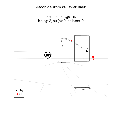
Here’s deGrom pitching to Javier Baez on June 23rd in Chicago. As you can see, the camera is a bit off but it’s still not a bad perspective. Baez gets deGrom’s variation of a slider and a fastball that isn’t badly paired but not as tight as you’d like to see in a tunnel. In fact, they don’t separate very much and the velo difference is only around 5 mph.

I would venture to guess that Baez’s mind’s eye is timing the fastball (mid-90s) and, if that’s the case, he has a good shot at guessing right because they follow identical paths, although the slider produces a bit more break and cut.
In the gif you can see that Baez is pretty close, although he’s expecting the pitch, a slider, to stay elevated (he’s likely thinking fastball because of the trajectory) and it runs away from his barrel for a whiff. We could dive into the pitch physics that makes this combo work during this at-bat, but that’s not what we want to focus on here.
Have a look at this next example with the BP matchup data embedded in the video. You can see that the image tells a much different story than what the video is showing.
Obviously, not all gifs are deceptive when trying to assess how well a pitcher is troubling a hitter. Let’s look at an example featuring Strasburg, who has one of the tightest release points in all of baseball. When he uses his four-seam fastball and curveball in tandem, Strasburg’s release points differ barely one inch, which is less than half of the league average mark of 2.14 inches.
Strasburg’s mechanics are nearly flawless in repetition and his release points on both pitches are nearly identical. The two separate a little early once they hit the tunnel point, but his PreMax average of 1.37-inch differential is better than the majority of major-league pitchers.

What works best for Strasburg when using this combo is the FTimeDiff between the point when pitch one crosses home and when pitch two does the same. His curveball reaches the plate .067 seconds later than his fastball; the gif shows a velocity spread of 15 mph. Somewhere Perry Husband is smiling.
You also need to have an understanding of how the handedness of the hitter affects the assessment of what they are really seeing versus what video shows us. Pitch trajectories will look different from each side of the plate. The pitch trail image examples (via Baseball Savant) from the Strasburg gif show the four-seam and curveball create different pitch shapes from each side of the plate. Observe how much earlier the tunnel breaks to a righty as opposed to a lefty.


Well-developed pitch design, in relation to how each can play off each other, is a good practice for all pitchers at any level. Understanding the shape and personality of each pitch is key when attempting to create as much deception as possible. Hitters have to react in terms of milliseconds and anything a pitcher can do to make their decisions more convoluted makes things much harder. By developing a plan of attack to keep pitches on the same trajectory as long as possible before reaching the commit point (about 167 ms before home plate), and getting a sizable location ratio once the ball reaches the hitter, gives a huge advantage to the pitcher.
Pitching gifs are a lot of fun to watch (and create), but it’s important to remember to keep what you’re seeing in context if you’re breaking down a pitcher’s attack and how effective he is against hitters using the various offerings in his repertoire.
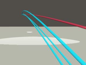
From this last perspective, we can witness the topspin of a curveball, the twirl of a changeup/screwball, and the backspin on a fastball. More effective for pitch design than pitch effectiveness.
Pitching strategist. Driveline Baseball pitch design-certified. Systems Administrator for a high school by day, I also provide ESPN with pitching visuals and am the site manager for SB Nation's Bucs Dugout.

Excellent.
Wow… This is amazing.