Runtime Error

Server Error in '/' Application.

Runtime Error

Description: An exception occurred while processing your request. Additionally, another exception occurred while executing the custom error page for the first exception. The request has been terminated.

Archive for August, 2014

Why is Bryce Harper Not Hitting for Power in 2014?

Bryce Harper has been disappointing so far in 2014, both before and after he launched three home runs in one AA rehab game.  The highly touted left-hand hitting outfielder has been pretty bad for a guy with a .346 BABIP.

As of August 7, 2014, he’s still been walking a lot (11.2%), but he’s striking out far too often (27.4%).  His ISO is just .121, which is lower than Dustin Ackley, Alexei Ramirez, and Billy Hamilton.  He’s also slugging just .374.

Yes, it’s only 215 PA so far.  That’s about a third of a season however, so I’m going to dig into to something that may contribute to why he’s struggling and hitting for next to no power.

First I will look into the types of pitches he’s getting.  Harper is seeing significantly more fastballs in 2014, and a lot less curve balls.  He is seeing 56.2% fastballs in 2014, compared to 45.9% in 2012 and 49.9% in 2013.  He is seeing 9.1% curve balls in 2014, compared to 13.1% in 2012 and 12.4% in 2013.

Now that we know that, let’s look at what Harper has actually produced with these pitches.  His HR/FB is less than half of what his career mark is.  This year, his HR/FB rate is 7.1%, down from his career mark of 15.6%.  This is interesting because he is hitting more fly balls than he ever has, at 34.4%, which is about 1% above his career average.  The final difference in his fly ball rates are infield flies.  He’s hitting infield popups 9.5% of the time, up from his career percentage of 7.6%.

So what does all this mean?

Harper has gone through a lot in 2014.  He’s changed his stance a couple times and he’s missed time with a thumb injury.  These two factors, especially the thumb issue, could be causing Harper to be late on fastballs.  There’s evidence that shows he is late on some pitches as well.  His ISO is just .071 when he hits the ball to center field and .118 when he goes to the opposite field.  For his entire career, his ISO is .209 to center and .188 to the opposite field.  That’s a pretty significant difference.  Most of his fly balls are going to center and left as well, as you can see here, which suggests he’s not driving the ball the other way with as much authority as he usually does.  His contact has clearly been weaker when taking the ball up the middle and the other way.

Let’s all remember he’s still a 21 year old kid.  He’s learning. He will be fine.  This is just a blip on the road and an area in which he’s struggled with this season.

The fact that Harper is getting pitched differently means he will need to make an adjustment, just as pitchers have clearly made an adjustment to him.  With his talent, he will certainly make that adjustment.  Once his thumb is fully healed, he will be able to drive the ball better as well.  These are also still short samples too, so if you’re a Nationals fan, there’s no reason to think Harper’s non-existent power will continue.


Using xBABIP to Examine the Offensive End of the Mets’ Shortstop Dilemma

It’s no secret that a vast majority of Mets fans want Wilmer Flores to be playing shortstop every day. It’s also no secret that manager Terry Collins has some strange infatuation with Ruben Tejada, opting again and again to give him starts at shortstop.

Although Collins hasn’t given the media any clear reasoning as to why this is, there are a few reasons we can speculate. The biggest one is defense — Ruben Tejada has made major strides at shortstop this season, posting the highest DRS of his career. Flores, on the other hand, is a second baseman, and even his defense at second is questionable — he really profiles more as a corner infielder. However, with the other three infield positions being blocked by Daniel Murphy, David Wright, and the new-and-improved Lucas Duda, Ruben Tejada is the odd man out.

The other side of the coin is the one I’m going to be focusing on: offense. When Tejada started getting regular playing time as a 21-year-old in 2011, he showed some legitimate offensive potential, hitting line drives at an extremely impressive 28.1% rate (would have ranked 2nd among qualified batters,) good for .287/.345/.345 in 877 PAs between 2011 and 2012. Then, in 2013, he came to spring training out of shape, hit .202, got sent down, got hurt a couple times, and basically threw yet another monkey wrench into the Mets’ rebuild. The job became his to lose in 2014, and he’s hit a measly .228/.348/.280, the OBP even being inflated by the amount of intentional walks he received in the 8 hole. His 0.4 fWAR this season cancels out his -0.4 last season, making him a perfect replacement-level player.

Meanwhile, Wilmer Flores has been a top offensive prospect in the Mets system since he was signed out of Venezuela as a 16-year-old in 2007.  His numbers finally started to reflect his talent in 2012, when he hit .300/.349/.479 between high A and AA. In 2013, he exploded in AAA, and the past two seasons has hit .321/.360/.543 with 28 home runs and 47 doubles in exactly 162 games. Sure, he plays in Vegas, one of the most hitter friendly parks in AAA, but these are still numbers that demand attention — attention that he hasn’t yet seemed to receive from Terry Collins. Despite Tejada’s offensive struggles, he has still started 86 games at short this season, as opposed to Flores’ 20. One of the reasons a few Mets fans have been pointing to is the fact that Flores has yet to actually produce at the major league level, hitting only .220/.254/.304 in his 201 big league plate appearances. But is that slash-line an accurate reflection of his talent? And, for that matter, is Tejada’s?

For this mini-evaluation, we’ll use slash12’s xBABIP formula. It’s never a perfect system, but it will give us a good estimation of what these players slash-lines should look like (or at least their average and OBP.)

After inserting Ruben Tejada’s batted ball profile, we get that his xBABIP for 2014 is .329 — much higher than his actual BABIP of .288. We can then plug that backwards into the BABIP formula to determine how many hits he theoretically should have. Since the formula is (H-HR)/(AB-HR-K+SF), we can plug in everything except for hits to get (H-2)/(289-2-65+0)=.329, simplify that to (H-2)/(222)=.329, multiply both sides by 222 to get H-2=73, and we can come to the conclusion that Ruben Tejada should have 73 hits on the year, instead of the 66 he has. This would make his batting average .253 and his OBP .364 (although, keep in mind that that’s being inflated by the 10 intentional walks he’s had while hitting 8th in the order. If we decided to remove those, his OBP would drop to .345).

Now, doing the same to Wilmer Flores is slightly tricky, as we don’t have nearly as large a sample size worth of batted ball data to use. In the interest of accuracy, we’ll use his career profile, so we can at least get a sample of 201 PAs instead of his 100 this year. Plugging his batted ball profile into the xBABIP calculator, we get a result of .333, compared to his actual career BABIP of .268. Doing the same backwards math we did with Tejada, this brings his expected career batting average up to .272, and his career OBP up to .304.

Now, these are only two stats, and they only tell us so much — Flores seems to be a better hitter, but his career 4.5% BB rate is clearly overmatched by Tejada. There isn’t a formula out there for expected slugging percentage — at least, as far as I know — so we can’t really determine what that would be (and subsequently, what their OPS would be). We could assume the same ISO, which would not be entirely accurate, but it would give us a .305/.669 for Tejada and a .355/.659 for Flores. Still, I think it’s clear, both from my biased perspective as a Mets fan and my objective perspective as a baseball fan, that Flores has the brighter future offensively — but it’s up to the Mets to decide how to capitalize on it.


Foundations of Batting Analysis: Part 4 — Storytelling with Context

Examining the foundations of batting analysis began in Part 1 with an historical examination of the earliest statistics designed to examine the performance of batters. In Part 2, I presented a new method for calculating basic averages reflecting the “real and indisputable” rate at which batters reached base. In Part 3, I examined the development of run estimation techniques over the last century, culminating with the linear weights system. I will employ that system now as I reconstruct run estimation from the bottom up.

We use statistics in baseball to tell stories. Statistics describe the action of the game or the performance of players over a period of time. Statistics inform us of how much value a player provided or how much skill a player showed in comparison to other players. To tell such stories successfully, we must understand how the statistics we use are constructed and what they actually represent.

A single, for instance, seems simple enough at first glance. However, there are details in its definition that we sometimes gloss over. In general, a single is any event in which the batter puts the ball into play without causing an out, while showing an accepted form of batting effectiveness (reaching on a hit), and ultimately advancing to first base due to the primary action of the event (before any secondary fielding errors or advancement on throws to other bases). Though this is specific in many regards, it is still quite a broad definition for a batting event. The event could occur in any inning, following any number of outs, and with any number of runners on the bases. The ball could be hit in any direction, with any speed and trajectory, and result in any number of baserunners advancing any number of bases.

These kinds of details form the contextual backdrop that characterizes all batting events. When we construct a statistic to evaluate these events, we choose what level of contextual detail we want to consider. These choices define our analysis and are critical in developing the story we want to tell. For instance, most statistics built to measure batting effectiveness—from the simple counting statistics like hits and walks, to advanced run estimators like Batter Runs or weighted On Base Average (wOBA)—are constructed to be independent of the “situational context” in which the events occur. That is, it doesn’t matter when during the game a hit is made or if there are any outs or any runners on the bases at the time it happens. As George Lindsey noted in 1963, “the measure of the batting effectiveness of an individual should not depend on the situations that faced him when he came to the plate.”

Situational context is the most commonly cited form of contextual detail. When a statistic is described as “context neutral,” the context being removed is very often the one describing the out/base state before and after the event and the inning in which it occurred. However, there are other contextual details that characterize the circumstances and conditions in which batting events occur that also tend to be removed from consideration when analyzing their value. Historically, where the ball was hit, as well as the speed and trajectory which it took to reach that location, have also not been considered when judging the effectiveness of batters. This has partly been due to the complexity of tracking such things, especially in the century of baseball recordkeeping before the advent of computers. Also, most historical batting analyses focus exclusively on the outcome for the batter, independent of the effect on other baserunners. If the batter hits the ball four feet or 400 feet but still only reaches first base, there is no difference in the personal outcome that he achieved.

If the value of a hit was limited to only how far the batter advances, then there would be no need to consider the “batted-ball context,” but as F.C. Lane observed in 1916, part of the value of making a hit is in the effect on the “runner who may already be upon the bases.” By removing the batted-ball context when considering types of events in which the ball is put into play, we’re assuming that a four-foot single and 400-foot single have the same general effect on other baserunners. For some analyses, this level of contextual detail describing an event may be irrelevant or insignificant, but for others—particularly when estimating run production—such a level of detail is paramount.

Let’s employ the linear weights method for estimating run production, but allow the estimation to vary from one completely independent of any contextual detail to one as detailed as we can make it. In this way, we’ll be able to observe how various details impact our valuation of events. Also, in situations where we are only given a limited amount of information about batting events, it will allow us to make cursory estimations of how much they caused their team’s run expectancy to change.

To begin, let’s define the run-scoring environment for 2013.[i] While we have focused on context concerning how events transpired on the field, the run scoring environment is another kind of contextual detail that characterizes how we evaluate those events. The exact same event in 2013 may not have caused the same change in run expectancy as it would have in 2000 when runs were scored at a different rate. We will define the run scoring environment for 2013 as the average number of runs that scored in an inning following a plate appearance in each of the 24 out/base states – a 2013-specific form of George Lindsey’s run expectancy matrix:

Base State 0 OUT 1 OUT 2 OUT
0   0.47   0.24   0.09
1   0.82   0.50   0.21
2   1.09   0.62   0.30
3   1.30   0.92   0.34
1-2   1.39   0.84   0.41
1-3   1.80   1.11   0.46
2-3   2.00   1.39   0.56
1-2-3   2.21   1.57   0.71

While we will focus on examining various levels of contextual detail concerning the events themselves, the run-scoring environment can also be varied based on contextual details concerning the scoring of runs. The matrix we will employ, as defined by Lindsey, reflects the average number of runs scored across the entire league. If we wanted, we could differentiate environments by league or park, among other things, to try and reflect a more specific estimate of the number of runs produced. As the work I’m going to present is meant to provide a general framework for run estimation, and these adjustments are not trivial, I’m going to stick with the basic model provided by Lindsey.

With Lindsey’s tool, we can define a pair of statistics for general analysis of run production. Expected Runs (xR) reflect the estimated change in a team’s run expectancy caused by a batter’s plate appearances independent of the situational context in which they occur. A batter’s expected Run Average (xRA) is the rate per plate appearance at which he produces xR.

xRA = Expected Runs / Plate Appearances = xR / PA

xR and xRA create a framework for estimating situation-neutral run production. Based on the contextual specificity that is used to describe the action of a plate appearance, xR and xRA will yield various estimations. The base case for calculating expected runs, xR0, is calculated independently of any contextual detail, considering only that a plate appearance occurred. By definition, an average plate appearance will cause no change in a team’s run expectancy. Consequently, no matter a player’s total number of plate appearances, his xR0 and, by extension, his xRA0, will be 0.0.

This is completely uninformative of course, as base cases often are. So let’s add our first layer of contextual specificity by noting whether an out occurred due to the action of the plate appearance. This is the most significant contextual detail that we consider when evaluating batting events – it is the only factor that determines whether a plate appearance increases or decreases a team’s run expectancy. In 2013, 67.5 percent of all plate appearances resulted in at least one out occurring. On average, those events caused a team’s run expectancy to decrease by .252 runs. The 32.5 percent of plate appearances in which an out did not occur caused a team’s run expectancy to increase by .524 runs on average. We’ll define xR1 as the estimated change in run expectancy based exclusively on whether the batter reached base without causing an out; xRA1 is the rate at which a batter produced xR1 per plate appearance.

You’ll notice that the components that construct xRA1 can only take on two values—.524 and -.252—in the same way that the components that construct effective On Base Average (eOBA) (as defined in Part 2) can only take on two values—1 and 0. These statistics—xRA1 and eOBA—have a direct linear correlation:

1

In effect, xRA1 is a weighted version of eOBA, incorporating the same contextual details but on a different scale. This estimation provides us with an association between reaching base safely and producing runs. However, the lack of detail would suggest that all players that reach base at the same rate produce the same value, which is over simplified. It’s why you wouldn’t just use eOBA, or eBA, or any other basic statistic that reflects the rate which a batter reaches base, when judging the performance of a batter. Let’s add another layer of contextual detail to account for the different kinds of value a batter provides when he reaches base.

xR2 will represent the estimated change in run expectancy based on whether the batter safely reached base and the number of bases to which he advanced due to the action of the plate appearance; xRA2 will be the rate at which a batter produces xR2 per plate appearance. While xR1 and xRA1 were built with just two components to estimate run production, xR2 and xRA2 require five components: one to define the value of an out, and four to define the value of safely reaching each base.

In 2013, a batter safely reaching first base during a plate appearance caused an average increase of .389 runs to his team’s run expectancy. Reaching second base was worth .748 runs, third base was worth 1.026 runs, and reaching home was worth 1.377 runs on average. Where xRA1 provided a run estimation analog to eOBA, xRA2 is built with very similar components to effective Total Bases Average (eTBA), though it’s not quite a direct linear correlation:

The reason xRA2 and eTBA do not correlate with each other perfectly, like xRA1 and eOBA, is because the way in which a batter advances bases is significant in determining how valuable his plate appearances were. Consider two players that each had two plate appearances: Player A hit a home run and made an out, Player B reached second base twice. Their eTBA would be identical—2.000—as they each reached four bases in two plate appearances. However, from the run values associated with reaching those bases, Player A would record 1.125 xR2 from his home run and out, while Player B would record 1.496 xR2 from the two plate appearances leaving him on second base. Consequently, Player A would have produced a lower xRA2 (.5625) than Player B (.7480), despite their having the same eTBA. These effects tend to average out over a large enough sample of plate appearances, but they will still cause variations in xRA2 among players with the same eTBA.

As stated in Part 2, the two main objectives of batters are to not cause an out and to advance as many bases as possible. If the only value that batters produced came from accomplishing these objectives, then we would be done – xR2 and xRA2 would reflect the perfect estimations of situation-neutral run production. As I hope is clear, though, the value of a batting event is dependent not only on the outcome for the batter but on the impact the event had on all other runners on base at the time it occurred. Different types of events that result in the batter reaching the same base can have different average effects on other baserunners. For instance, a single and a walk both leave the batter on first base, but the former creates the opportunity for baserunners to advance further on average than the latter. To address this, the next layer of contextual detail will bring the official scorer into the fray. xR3 will represent the estimated change in run expectancy produced during a batter’s plate appearance based on:

(1)    whether the batter safely reached base,

(2)    the number of bases, if any, to which the batter advanced due to the action of the plate appearance, and

(3)    the type of event, as defined by the official scorer, that caused him to reach base or cause an out.

xRA3 will, as always, be the rate at which a batter produces xR3 per plate appearance.

Each of the run estimators that were examined in Part 3, from F.C. Lane’s methods through wOBA, are subsets of this level of xR. Expected runs incorporate estimations of the value produced during every event in which the batter was involved, including those which may be considered “unskilled.” The run estimators examined in Part 3 consider only those events that reflected a batter’s “effectiveness,” and either disregard the “ineffective” events or treat them as failures. xR3 provides the total value produced by a batter, independent of the effectiveness he showed while producing it, based solely on how the official scorer defines the events. Consequently, some events, like strikeouts, sacrifice bunts, reaches on catcher’s interference, and failed fielder’s choices, among other more obscure occurrences, are examined independently in xR3. From the two components of xR2 and the five of xR3, we build xR4 with 18 components: five types of outs and 13 types of reaches.

To help illustrate how xR has progressed from level to level, here is a chart reflecting the run values for 2013 as estimated by xR based on the contextual detail provided thus far.

xR Progression

Beyond any consideration of skilled or unskilled production, xR3 is the level at which most run estimators are constructed. It incorporates events that are well defined in the Official Rules of the game, and have been for at least the last few decades, and in some cases for over a century. While we still define most of a batter’s production by his accomplishing these events, we live in an era where we can differentiate between events on the field in more specific ways. Not all singles are identical events. We weaken our estimation of run production if we don’t account for the different kinds of singles, among other events, that can occur. xR3 brought the official scorer into action; xR4 will do the same with the stat stringer.

While the scorer is concerned with the result of an event, a stringer pays attention to the action in between the results. They chart the type, speed, and location of every pitch, and note the batted ball type (bunt, groundball, line drive, flyball, pop up) [ii] and the location to which the ball travels when put into play.While we don’t have this data as far back in time as we have result data, we do have decades worth of information concerning these details. By differentiating events based on these details, we will begin to unravel the “batted-ball context.” Ideally, we would know every detail of the flight of the ball, and use this to group together the most similar possible type of events for comparison.[iii] At present, we’re limited to what the scorers and stringers provide, but that’s still quite a lot of information.

xR4 will represent the estimated change in run expectancy produced during a batter’s plate appearance based on:

(1)    whether the batter safely reached base,

(2)    the number of bases, if any, to which the batter advanced due to the action of the plate appearance,

(3)    the type of event, as defined by the official scorer, that caused him to reach base or make an out,

(4)    the type of batted ball, if there was one, as defined by the stat stringer, that resulted from the plate appearance,

(5)    the direction in which the ball travelled, and

(6)    whether the ball was fielded in the infield or outfield.

xRA4 will be the rate at which a batter produces xR4 per plate appearance.

There are 18 components in xR3 which describe the assorted types of general events a batter can create.  When you add in these details concerning the batted-ball context, the number of components increases to 145 for xR4. With such specific details being considered, we can no longer rely on a single season of data to accurately inform us on the average situation in which each type of event occurs; the sample sizes for some events are just too small. To address this, there are two steps required in evaluating events for xR4. The first is to build a large sample of each event to build an accurate picture of their relative frequency in each out/base state. I’ve done this by using a sample covering the previous ten seasons to the one in which the estimations are being made. Once this step is completed, the run-scoring environment in the season being analyzed is applied to these frequencies, in the same way it is when looking at single season frequencies for basic events.

For instance, the single, which is traditionally treated as just one type of event, is broken into 24 parts based on the contextual details listed above. By observing the rate at which each of these 24 variations of singles occurred in each out/base state from 2004 through 2013, and applying the 2013 run-scoring environment, we get the following breakdown for the estimated value of singles in 2013:

Single Left Center Right   All
Bunt, Infield .418   .451  .436 .427
Groundball, Infield .358   .361  .384 .363
Pop Up, Infield .391   .359  .398 .369
Line Drive, Infield .343   .369  .441 .369
Groundball, Outfield .463   .464  .499 .474
Pop Up, Outfield .483   .480  .498 .488
Line Drive, Outfield .444   .463  .471 .460
Flyball, Outfield .481   .479  .490 .482

This process is repeated for every type of batting event in which the ball is put into play. One of the ways we can use this information is to consider the run value based not on the result of the event, but on the batted-ball context that describes the event. Here are those values in the 2013 run-scoring environment:

Popups Groundballs Fly Balls Line Drives All Swinging BIP
All Outs -.261 -.257 -.226 -.257 -.249
Infield Out -.260 -.257 ——- -.297 -.260
Outfield Out -.269 ——- -.226 -.233 -.229
Left Out -.262 -.260 -.230 -.251 -.253
Center Out -.262 -.281 -.223 -.257 -.257
Right Out -.260 -.229 -.227 -.262 -.237
All Reaches   .514   .468 1.108   .571   .629
Infield Reach   .436   .381 ——-   .390   .382
Outfield Reach   .517   .503 1.108   .572   .659
Left Reach   .516   .463 1.172   .577   .632
Center Reach   .535   .443 1.006   .546   .593
Right Reach   .483   .510 1.166   .593   .672
All Infield -.257 -.199 ——- -.267 -.211
All Outfield -.003   .503   .093   .402   .262
All Left -.219 -.058   .161   .332   .054
All Center -.205 -.078   .030   .312   .030
All Right -.191 -.069   .123   .326   .045
All -.207 -.068   .093   .323   .042

Similarly, we can break down each player’s xR4 by the value produced on each type of batted ball. Here are graphs for xR4 produced on each of the four types of batted balls resulting from a swing, with respect to the number of batted balls of that type hit by the player. For simplicity, from this point on, when I drop the subscript when describing a batter’s expected run total, I’m referring to xR4.

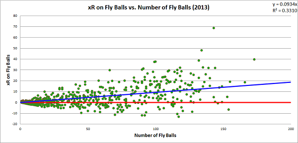
Line drives are the most optimal result for a batter. The first objective of batters is to reach base safely, and they did that on 67.0 percent of line drives last season. No batter who hit at least eight line drives in 2013 caused a net decrease in his team’s run expectancy during those events. For most batters, hitting the ball into the outfield in the air is the ideal way to produce value, as fly ball production tends to create a positive change in a team’s run expectancy. However, fly balls have the most variance of any of the batted ball types, and there are certainly batters who hurt their teams more when hitting the ball at a high launch angle than a low one. Here are the players to produce the lowest xRA on fly balls last season (minimum 50 fly balls):

Lowest xRA on Fly Balls, MLB – 2013
 (minimum 50 fly balls)
Pete Kozma, StL -.1626
Ruben Tejada, NYM -.1546
Cliff Pennington, Ari -.1513
Andres Torres, SF -.1465
Placido Polanco, Mia -.1224

For each of these batters, hitting the ball on the ground or on a line drive were far better results on average.

xRA by Batted Ball Type – 2013
FB GB LD
Pete Kozma, StL -.1626 -.0738 .2496
Ruben Tejada, NYM -.1546 -.0961 .1227
Cliff Pennington, Ari -.1513 -.0421 .3907
Andres Torres, SF -.1465 -.0155 .4269
Placido Polanco, Mia -.1224 -.0981 .1889

While groundballs may be a preferable result for some batters when compared to fly balls, they are still effectively batting failures for the team. There were 840 batters in 2013 to hit at least one groundball and only 44 produced a net positive change in their team’s run expectancy. Of those 44 players, only 11 hit more than 10 groundballs, and only two (Mike Trout and Juan Francisco) hit at least 100 groundballs. Here are the players with the highest xRA on groundballs in 2013 who hit at least 100 groundballs:

Highest xRA on Groundballs, MLB – 2013
 (minimum 100 groundballs)
Mike Trout, LAA   .0187
Juan Francisco, Atl-Mil   .0123
Brandon Barnes, Hou -.0076
Andrew McCutchen, Pit -.0081
Marlon Byrd, NYM-Pit -.0093

xR4 allows us to tell the most detailed story concerning the type of value a batter produced, independent of the situational context at the time the plate appearance occurred. Because we gradually added layers of detail to our estimation, we can compare how each level of expected runs correlates to this most detailed level. In this way, we can judge how much information each level provides with respect to our most detailed estimation. Here is a graph that charts a batter’s xR4 with respect to his xR1, xR2, and xR3 estimations:

The line that cuts through the data reflects the xR4 values charted against themselves. For each xRn, we can calculate how well it correlates with xR4 and, consequently, how much of xR4 it can explain. Remember that we have already shown that xR1 has a direct linear correlation with eOBA and xR2 has a very high, though not quite direct, correlation with eTBA. For the xR1 values, we observe a correlation, r, with xR4 of .912, and an r2 of .832, meaning that knowing the rate at which a batter reaches base explains over four-fifths of our estimation of xR4. For the xR2 values, r2 increases to .986; for the xR3 values, r2 increases slightly higher to .990.[iv]

The takeaway from this is that when considering the whole population of players, there is little difference in a run estimator that considers the batted-ball context and one that does not; you can still explain 99 percent of the value estimated by xR4 by stopping at xR3. In fact, if all you know is the rate at which a batter accomplishes his two main objectives—reaching base and advancing as far as possible—you can explain well over 90 percent of the value estimated by xR4. However, on an individual level, there is enough variation that observing the batted-ball context can be beneficial. Here are the five players with the largest positive and negative differences between their xR3 and xR4 estimations:

Largest Increase from xR3 to xR4, MLB – 2013
Player xR3 xR4 Diff
David Ortiz, Bos 44.1 48.2 +4.1
Kyle Seager, Sea 11.8 15.9 +4.1
Chris Davis, Bal 57.2 61.0 +3.8
Matt Carpenter, StL 36.6 40.3 +3.7
Freddie Freeman, Atl 38.6 41.9 +3.3


Largest Decrease from xR3 to xR4, MLB – 2013
Player    xR3    xR4 Diff
Adeiny Hechavarria, Mia -27.2 -32.9 -5.7
Jean Segura, Mil     9.7     4.2 -5.5
Jose Iglesias, Bos-Det     4.5    -0.1 -4.7
Elvis Andrus, Tex   -8.6  -12.9 -4.3
Alexei Ramirez, CWS   -1.9    -5.8 -3.9

These changes are not massive, and these are the extreme cases for 2013, but they are certainly large enough that ignoring them will weaken specific analyses of batting production. Incorporating batted ball details into our analysis adds a significant layer of complexity to our calculation, but it must be considered if we want to tell the most accurate story of the value a batter produced.

If this work seems at all familiar, you may have read this article that I wrote last year on a statistic that I called Offensive Value Added (OVA). For all intents and purposes, OVA and xR are identical. I decided that the name change to xR would help me differentiate estimations more simply, as I could avoid naming four separate statistics for each level of contextual detail, but there was also a secondary reason for changing the presentation of the data. OVAr was the rate statistic associated with OVA, and it was scaled to look like a batting average, much in the same way that wOBA is scaled to look like an on base average. At the time, I choose to do this to make it easier to appreciate how a batter performed, since many baseball enthusiasts are comfortable interpreting the relative significant of a batting average.

After thinking on the subject, though, I came to decide that I prefer statistics that actually “mean” something to those that give a general, unit-less rating. For instance, try to explain what wOBA actually reflects. It starts as a run estimator, but then it’s transformed into a number that looks like a statistic with specific units (OBA), while not actually using those units. Once that transformation occurs, it no longer reflects anything specific and only serves as a way to rate batters. The same principle applies to other statistics as well, most notably OPS, which is arguably the most meaningless of all baseball statistics, perhaps all statistics ever (don’t get me started).

xR and xRA estimate the change in a team’s run expectancy caused by a batter’s plate appearances. They are measured in runs and runs per plate appearance, respectively. xRA may not look like a number you’ve seen before, and generally needs to be written out to four decimal places instead of three, unlike basic averages, but it’s linguistically very simple to use and understand. I’d rather sacrifice the comfort of having a statistic merely look familiar and instead have it actually reflect something tangible. This doesn’t take away from the value of a statistic like wOBA, which is a great run estimator no matter what scale it is on; a lack of meaning certainly does not imply a lack of value. Introducing an unscaled run average, xRA, will hopefully create a different perspective on how to talk about batting production.

There is one final expected run estimation that I want to consider that could easily cover an entire new part on its own, but I’ll limit myself to just a few paragraphs. The xR estimations we have built have been constructed independent of the situational context at the time of the batter’s plate appearance. Since we want to cover the entire spectrum of context-neutral run estimation to context-specific run estimation, we will conclude by considering xRs, which is an estimate of the change in a team’s run expectancy based on the out/base state before and after the action of the plate appearance. This is very nearly the same thing as RE24 but it only considers runs produced due to the primary action of plate appearances and not baserunning events.

In many respects, xRs is the simplest run estimator to construct of all that we have built thus far. There are only three pieces of information you need to know in a given plate appearance to construct xRs: the run-scoring environment, the out/base state at the start of the action of the plate appearance, and the out/base state at the end of the action of the plate appearance. Next time you go to a baseball game, bring along a copy of a run expectancy matrix, like the one provided earlier. On a scorecard, at the start of every plate appearance, take note of the value assigned to the out/base state, making adjustments if any runners move while the batter is still in the batter’s box. Once the plate appearance is over, note the value of the new out/base state, separating out any advancement on secondary fielding errors or throws to other bases. Subtract the first value from the second value, and add in any RBIs on the play, and write the number in the box associated with the batter’s plate appearance; you just calculated xRs. Do this for a whole game, and you will have a picture of the total value produced by every batter based on the out/base state context in which they performed.

The effective averages and expected run estimations provide a foundation on which batting analysis can be performed. They combine both “real and indisputable facts” with detailed estimations of the run produced in every event in which a batter participates. Any story that aims to describe the value that a batter provides to his team must consider these statistics, as they are the only ones which account for all value produced. 147 years ago, Henry Chadwick suggested that batters should be judged on whether they passed a “test of skill.” I think they should be judged on whether they passed a “test of value.”

Thanks to Benjamin H Byron for editorial assistance, as well as the staff at the Library of Congress for assistance in locating original copies of the 19th century newspaper articles included in Part 1.

Here is data on eOBA, eTBA, and each level of xR and xRA estimation, for each batter in 2013.

Bibliography


[i] I’ll be focusing on 2013 because the full season is complete. All the work described here could easily be applied to 2014, or any other season, I just don’t want to use incomplete information.

[ii] While these terms are used a lot, there aren’t any specific definitions commonly accepted that differentiate each type of batted ball. For terms used so commonly, it doesn’t make much sense to me that they are not well defined. It won’t apply to the data used in this research, but here is my attempt at defining them.

A bunt is a batted ball not swung at but intentionally met with the bat. A groundball is a batted ball swung at that lands anywhere between home plate and the outer edge of the infield dirt and would be classified as a line drive if it made contact with a fielder in the air. A line drive is a batted ball swung at that leaves the bat at an angle of at most 20° above parallel to the ground (the launch angle), and either lands in the outfield or makes contact with any fielder before landing (generally through a catch, but sometimes a deflection). A fly ball is a batted ball swung at, with a launch angle between 20° and 60° above parallel (not inclusive), that either lands in the outfield or is caught in the air by a player in the outfield. A popup is a batted ball swung at that either (a) leaves the bat at an angle of 60° or greater above parallel and lands or is caught in the air in the outfield, or (b) leaves the bat at an angle greater than 30° and lands or is caught in the air in the  infield.

This would result in some balls being classified differently than they currently are, and not just because differentiating between a line drive and a fly ball is somewhat difficult with just a pair of eyes. If the defense were to play an infield shift, and the batter were to hit a line drive into the outfield grass into that shift, subsequently being thrown out at first base, it would likely be called a groundout by current standards. Batted balls should not be defined based on defensive success or failure, but by the general path which they take when leaving the bat. It may be unusual to credit a batter with making a line out despite the ball hitting the ground, but it more accurately reflects the type of ball put into play by the batter.

I don’t know that these are the “correct” ways to group together these events, but as we now are using technology that tracks the flight of the baseball from the moment it is released by the pitcher through the end of the play, we should probably have better definitions for types of batted balls than those currently provided by MLB. I don’t expect a human stringer to be able to differentiate between a ball hit with a 15° launch angle or a 25° launch angle, but that doesn’t mean we shouldn’t have some standard definition for which they should aim.

[iii] In theory, xR5 would attempt to consider details that are even more specific, perhaps the initial velocity of the ball off the bat, the launch angle, and whatever other information can be gleaned from technology like HIT F/X. The xR framework leaves room to consider any further amount of detail that a researcher wants to consider.

[iv] Though not charted here, the r2 value based on the correlation between wRAA, the “counting” version of wOBA, and xR4 is .984. As wRAA is nearly identical to xR3 but excludes a few of the more rare events from its calculation, it’s not surprising that the r2 value between wRAA and xR4 is just slightly smaller than the r2 between xR3 and xR4.


Home Run Skewness, Babe Ruth, and Maybe PEDs

The breaking of baseball known as the dead-ball era is generally considered a phenomena of the 1919 Babe Ruth season where he hit a record 29 homers for the Red Sox.  That was a good year, but not something jaw dropping as three players had managed 25+ homers at that point and Ned Williamson’s record from 1884 was only two behind Babe.  The next season was the unprecedented explosion when Ruth redefined power posting 54 home runs doubling up anyone else who had ever played in the big leagues.

It only took a few years for the trajectory of offense, and especially home run production, to change drastically.  In 1922 Rogers Hornsby hit 42, Ken Williams 39, and Tilly Walker 37 all besting The Bambino’s paltry 35 that season.  Over the next several decades home run production shifted drastically as power re-shaped the game.

 photo HRSkew_zpsb90e19d4.jpg


Skewness is based on the Excel formula where anything between -1 and 1 is not skewed, and since we have no negatives here we will focus on above 1 to start, or positive skewness (long right tail).  As you can see, the peak of skewness in HR production was that 1920 season where Ruth was an extreme outlier, see below:

 photo 1920HRs_zps20fcd686.jpg


You can see the skewness, a long right tail, and most of it is being driven by one observation.  Positive skewness was always present in early baseball due to the large cluster of players at or slightly above 0, but this took it to a new level.  If you go back to the previous chart though, you will see that as the league started hitting more long balls the skewness quickly dissipated, and by the late 40s went away.  Only twice since 1949 did we see a skewness above 1, in 1981 and 1981 where the skewness shows up as 1.05 and 1.04 respectively, so right on the dividing line between truly skewed or not.  Interestingly, the skewness leaves and stays away shortly after the talent pool widened with an influx from the Negro Leagues which may have cut out some of the lower end that was causing it.

One of the things to keep in mind for all of this is that a lot of people look at the steroid era as another period where baseball was broken with scientifically enhanced freaks blasting way more home runs than should be seen.  Yet, in the data we don’t see a large spike in skewness through that period, which of course leads to a lot of ambiguity and no answers as you could read it in multiple ways including the two extreme views:

1) See, EVERYONE was cheating in the steroid era, so the entire distribution shifted enough to prevent even 1998’s home run chase ending with two players breaking the all-time record from becoming a skewed distribution.

2) Despite the cheating nothing was all that greatly affected.  There happen to be  a couple of cheaters who succeeded, but mostly the cheaters stayed with the pack and thus we see no skewness.

So what did the distribution look like in 1998?

 photo 1998HRs_zpsc52198d3.jpg

Rather than the highest frequencies being 0 to 4 home runs and then tapering off quickly like 1920, we now see that every qualified batter came up with at least 1 HR and that the largest mass is from 9 to 23 home runs.  This means that Mark McGwire’s 70 HRs was about 3.5 times the average and median which were 20.7 and 20 for the year.  In comparison, Babe Ruth hit 10 times the average of 5.3 HRs in 1920 and 18 times the median of 3, so you can see how much farther from the pack he was.

Whether or not PEDs broke baseball again is not something I am prepared to answer here, but we can at least say it didn’t break it to the degree that Babe Ruth did when he signaled the end of the dead-ball era.  What we can tell from home run production is that it seems to be distributed fairly evenly and has been for more than half a century of baseball in which time we have seen many changes to the game.  All that leaves me with is more questions in reality, and that is just fine by me.


Leadoff Rating 2.0

It feels icky to create a statistical formula based on what “feels right”.

Last month, I introduced a stat called Leadoff Rating, or LOR. The idea was that most systems to identify great leadoff hitters tab players like Ted Williams and Mickey Mantle, who would always hit closer to the middle of the order. I wanted to distinguish players specially suited to batting leadoff. The formula was simple: OBP minus ISO. By subtracting isolated power, we identified players who get on base a lot but aren’t true sluggers. It’s an easy calculation, and it produced fairly reasonable results. Two particular things bothered me:

1. Bad hitters occasionally had good leadoff ratings because of their very low ISO.

2. Rickey Henderson ranked 45th.

We know that leadoff is one of the two or three most important positions in the batting order. As little impact as lineup construction has on winning percentage, leadoff hitters are important. But LOR saw high OBP and low ISO as equally meaningful, so players with no power sometimes rated as desirable leadoff hitters. That seemed like something to correct.

Rickey Henderson is generally recognized as the greatest leadoff man of all time. LOR did not show this, for two main reasons. One was that the formula did not include baserunning. The other was that the all-time list slanted heavily towards Deadball players. Before Babe Ruth, everyone had low isolated power. Ty Cobb was a terrific power hitter, who led the AL in slugging eight times. Cobb’s career ISO (.146) is basically the same as Rickey’s (.140). Henderson only ranked among the top 10 in slugging twice. The game has changed.

Based on the feedback of FanGraphs readers and on my own muddlings, I’ve reworked the leadoff rating formula. The new system is more complicated — it’s annoying to do without a spreadsheet — and it’s kind of haphazard. OBP – ISO was a nice system because of its simplicity. With the updated formula, I’m guessing, choosing numbers that seem right. If someone better than I am at math would care to suggest revisions, please do so. I am fully prepared to give this stat away to smart people.

The formula I’m using now is — wait. There’s another calculation I abandoned, but it’s important for explaining how we arrived at the current iteration, and that middle step looked like this: OBP – ( .75 * ISO ) + ( ( .005 * BsR ) / ( PA / 600 ) )

On-base percentage is the heart of leadoff rating. A good hitter, and especially a good leadoff hitter, must get on base. But I only subtracted 3/4 of ISO, because (1) low ISO is not as important as high OBP, and (2) the original formula was probably a little too hard on doubles hitters. Guys like Rickey and Tim Raines ranked too low because they had more power than players like Jason Kendall and Ozzie Smith.

Commenter foxinsox suggested adding (Constant * BsR) to the calculation, which was a fine idea I should have seen earlier. The hitch was turning BsR into a rate stat.  By using BsR/PA or BsR/G, we can incorporate that element smoothly.

When I ran the numbers, the historical lists looked great (Rickey Henderson in the top 10!), but for active players, there were hits and misses. Elvis Andrus came back as the ideal leadoff hitter in 2013, and Craig Gentry (.264/.326/.299) ran away with 2014 to date. Even with the adjustments, LOR rewarded low ISO. While a .250 ISO isn’t really the right fit for the top of the batting order, neither is a sub-.050 ISO. We don’t want a guy who only hits singles, we just don’t want a cleanup hitter. Looking at the historical lists, I found that most of the top players had an ISO right around .100, so I created a Goldilocks formula, preferring a minimal absolute difference from .100 ISO. Rather than simply treating low ISO as desirable, we’re looking for the sweet spot between singles and slugging. The new formula is:

OBP –  .75 * | .100 – ISO |  + ( .005 * BsR ) / ( PA / 600 )

That’s on-base percentage, minus 3/4 of the absolute difference between ISO and .100, plus .005 times BsR per 600 plate appearances. Now very low isolated power is punished just as much as very high ISO.

Hopefully you want to see some lists. I’ll show you five: the all-time list, the post-Jackie Robinson list, the leaders for the 2013 season, 2014 to date (through July 31), and 2014 rest-of-season projections (ZiPS). We’ll also look at the 2014 leaders (both to date and projected) for every team in the major leagues. Read the rest of this entry »


Best/Worst Starting Pitchers According to ISO

ISO is used to determine a hitter’s ability to get extra-base hits as it is a measure of slugging percentage minus batting average.  So using the same idea and with the help of slugging percentage and batting average against we can evaluate the best pitchers at limiting extra-base hits.  First we will look a the 10 best starting pitchers in 2014 according to ISO.

PLAYER ISO
Garrett Richards 0.069
Chris Sale 0.077
Felix Hernandez 0.083
Chris Archer 0.083
Sonny Gray 0.084
Adam Wainwright 0.089
Jose Quintana 0.089
Clayton Kershaw 0.092
Tyson Ross 0.093
Jarred Cosart 0.094

As would’ve been expected the top ten includes some of the best pitchers in the league.  Guys like Wainwright, Kershaw and many of the others are also found near the top of the ERA leader-boards.  However, one name more than the others does not quite fit with the others on this list, Jarred Cosart.  The hard throwing right-hander who was traded at the deadline from Houston to Miami has been one of the best pitchers in the league at limiting extra-base hits.  However, his ERA — 4.51 — does not match.

Cosart’s lack of success despite his ability to limit hitters to singles is due to two areas where he struggles.  The first is stranding runners.  Cosart’s LOB% of 67.4 is 9th worst in the league.  Although Cosart has excelled in mainly allowing singles he has not done a good job of keeping those hits from coming around to score.  However, the main area that Cosart has struggled this season is his control.  His BB% is tied with A.J. Burnett for third worst in the league at 10%.  Thus Cosart’s high frequency of baserunners due to his walk rate and his struggles in stranding runners have caused the hits he has allowed to do more damage.

Player ISO
R.A. Dickey 0.174
Josh Beckett 0.175
Wei-Yin Chen 0.177
Edwin Jackson 0.177
John Danks 0.184
Chris Young 0.186
Eric Stults 0.188
Jake Peavy 0.191
Dan Haren 0.202
Marco Estrada 0.234

Again not surprisingly, several of these pitchers are among the worst qualifying starters in terms of ERA in 2014.  With the bottom 4 pitchers all with high-4 ERAs and Jackson pitching to a 5.66 ERA.  However, there are also a few outliers in terms of success with Beckett and Chris Young both pitching to much better ERAs than their ISO allowed would suggest.  Beckett’s 2.88 ERA is good for 19th best in the league with Young’s ERA placing him in the top 40 among starters.

Where both pitchers have succeeded this season is in stranding runners.  Beckett ranks number 1 in the league in LOB% while Young finds himself at 4th.  Both pitchers have been very successful at pitching themselves out of jams this season.  For that reason both pitchers have been able to allow a large amount of extra-base hits and still be among the best in the league at preventing runs.


Theo Sells High, Amazes Onlookers

There’s an old joke about a guy who’s just lost everything — marriage, job, home — and decides to end it all, so he goes to the top of the Empire State Building and jumps. As he’s plummeting to his doom, at the last possible second he performs a triple somersault and lands on his feet, completely unharmed. Two cats are watching across the street and one says to the other, “See? That’s how you do that.”

Since taking over the Cubs front office in October, 2011, Theo Epstein has been carrying out a three-pronged rebuilding plan: (1) acquire a stable of fast-developing power hitters; (2) find a #1 starter; and (3) rebuild the roster with a yard sale. The first prong is coming along well, with Arismendy Alcantara joining Anthony Rizzo in the majors and another wave (including but not necessarily limited to Kris Bryant, Javy Baez, and Jorge Soler) on the way soon. The second prong has borne no fruit yet; there is still no one in the Cubs system that realistically projects as an ace.

The jury is still out on the third prong, which has involved international signings of, and trades for, young players who in some cases are several years away from the majors. But at least on the surface, Theo has made the most out of the tattered wares in his basement. This is especially true of the parade of pitchers (some he inherited and some he acquired as reclamation projects) that he has, for the most part, successfully sold high.  For the most part the folks stopping by Crazy Theo’s Pitching Palace have walked away happy, only to soon suffer buyer’s remorse.

Here’s a list of pitchers Theo has traded away, together with the principal player received in return. In this post, all slash numbers are ERA/FIP – the first pair is the player’s numbers with the Cubs, and the second are his numbers with the team that acquired him.


Sean Marshall  (3.96/4.02 , 3.27/2.67 (CIN))

Swag: Travis Wood

Skinny: Marshall’s thrown just 24 innings since 2012.


Andrew Cashner    (4.29/4.84, 3.08/3.25 (SDP))

Swag: Anthony Rizzo

Skinny: Trade could end up helping both clubs, though Cashner’s durability is still questionable.


Paul Maholm  (3.74/4.14, 4.14/4.09 (ATL))

Swag: Arodys Vizcaino

Skinny: Vizcaino could be a future closer, but the T.J. survivor has logged just 34 IP in the minors this year.


Ryan Dempster (3.74/3.78, 5.09/4.08 (TEX))

Swag: Kyle Hendricks

Skinny: Hendricks is already benefiting from the long Wrigley grass.


Scott Feldman  (3.46/3.93, 4.27/4.13 (BAL))

Swag: Jake Arrieta

Skinny: Arrieta won’t defy gravity forever, but some of his improvement may be for real.


Matt Garza  (3.45/3.45, 4.38/3.96 (TEX))

Swag:  C.J. Edwards

Skinny: Rangers got little from this deal, in which they also gave away Neil Ramirez, Mike Olt, and Justin Grimm.


Jeff Samardzija  (3.97/3.80, 3.19/4.00 (OAK))

Swag: Addison Russell

Skinny: Sharknado 2 is about as good as the original, but his 2014 FIP jumped a run after the trade.


Jason Hammel  (2.98/3.19, 9.53/7.31 (OAK))

Swag:  Addison Russell

Skinny: Might be time to try pine tar, Jason.


Epstein hasn’t been able to spin all the lead into gold: he may have held onto Travis Wood past the sell-by date, and Edwin Jackson, inked to a union-appeasing contract, has been barrel-bomb bad and is now unmovable. Taken together, however, these trades brought 60% of the Cubs’ current rotation, two guys (Rizzo and Reed) who may have numerous all-star seasons in them, and a potential closer of the future. In virtually no case except Cashner did the player traded improve after the trade. (Marshall had one good year in the Reds’ bullpen, but he’s spent the bulk of the last  2 seasons in the trainer’s room.)

See? That’s how you do that.


Sorting Out Boston’s Outfield Logjam

The Red Sox made some noise this trade deadline.  On a day that was similar to August 25, 2012 when the Red Sox and Dodgers completed the Nick Punto trade, Boston unloaded key pieces to the 2013 world championship team.

The players they acquired show a clear stance to contend in 2015, just as Dave and Paul stated before.  Yoenis Cespedes and Allen Craig add something the Red Sox have lacked for quite some time now: right-handed, power hitting outfielders. However, these additions add question marks to the surplus of outfielders the Red Sox now have.  With Mike Carp designated for assignment, they now have Cespedes, Craig, Victorino, Bradley, Holt, Nava, and recently called up Mookie Betts who have all seen time in the outfield this season.

Cespedes will occupy one of those spots, most likely in right field with Victorino moving back to the DL.  Craig will probably take over in left.  Holt will be a super utility man who can fill in for literally any of the seven positions not called catcher and pitcher.  Nava will most likely be a fourth outfielder, or he could possibly platoon with Craig in left.

Craig has had a down year, but has had injury woes and still has a 110 wRC+ against LHP this year.  He owns a career wRC+ of 136 against lefties.  That figures to be an ideal platoon situation with Nava who owns a career 126 wRC+ against RHP.  It was Nava and Gomes platooning in 2013, and with Gomes out and Craig in, it looks as if Craig could be an option to replace Gomes and provide an upgrade in that role.

That leaves center field: Betts or Bradley.

Bradley has shown he’s one of the premier defensive center fielders in all of baseball.  He has been worth +17.7 runs defensively and has a UZR/150 of 28.2, which makes him the third best outfielder in the game behind Heyward and Gordon.  The problem is his bat.  He has a decent walk rate of 8.3%, but he strikes out far too often (27.6%) for a hitter with no power (1 HR, .083 ISO).  If he wants to stay the center fielder of the Red Sox he needs to cut down on his strike outs and show that he can at least be an 85-90 wRC+ guy (he’s at 67 in 2014).

Betts figures to be more of an offensive force.  Although he struggled during his brief major league stint, Betts has absolutely torn up the minor leagues.  In 54 AA games he hit .355/.443/.551 and in 34 AAA games he has hit .321/.408/.496.  He will not be what Bradley is in center field defensively, but that’s a lot to ask.  If he can be an average to above average defender, he looks to be the better choice heading forward.  With his recent call up, he will get two months to show what he can do at the big league level.

As far as 2015 goes, it seems like Shane Victorino doesn’t fit into what the Red Sox are planning to do.  After a breakout 2013, he has just not been able to consistently stay healthy.  He has one year remaining on his contract, but he may be dealt in August or sometime in the offseason. In my opinion, Betts will eventually win the center field job and Bradley could potentially be a part of a trade package in the offseason for a starting pitcher, which is another need for Boston moving forward. These new pieces will go along with their core of Pedroia, Ortiz, and Napoli to help boost an offense that has been abysmal in 2014.  Boston also has money to spend and a boatload of prospects.  According to ESPN Boston, Ben Cherington recently stated that “My expectation is that we would be active in the starting pitching market this winter with trades, free agency, whatever.”

Once they add some pieces to the top of their rotation, the Red Sox will be in prime position to contend again in 2015.


The Rays’ Not So Simple Arithmetic

The other day, the Rays traded David Price — 2012 Cy Young Award winner, homegrown star, and overall great guy — to the Tigers in a three-team deal that netted them soft-tossing fifth starter Drew Smyly, former top prospect turned utilityman Nick Franklin, and 18 year old Dominican shortstop Willy Adames.

On the surface, it looks absolutely atrocious, and there’s no way to avoid that. Most people look at the Rays’ previous trades, and compare their return from Matt Garza and James Shields. Since both are good-but-not-quite-Price caliber pitchers, one would think the Rays should have gotten a much better return than they did. And they didn’t. There’s no sugarcoating that. It is widely accepted that the Royals overpaid for Shields, and you could argue the Cubs did for Garza. But history is history. Heck, we even got more out of Victor Zambrano!

I wish we could see if the Garza or Shields trades worked out, but the minor leaguers that determine this are still hanging in the balance. Hak-ju Lee, from the Cubs, is in AAA Durham after recovering from a nasty ACL injury. He was the centerpiece of the Garza deal. Chris Archer, also from the Cubs, has yet to finish a full season. Similarly, from the Shields deal, neither Wil Myers nor Jake Odorizzi has played a full season; Patrick Leonard and Mike Montgomery have shown promise but are still a ways away from making a big league impact. So we have to resort to analyzing this year’s trade as it looks right now.

Drew Smyly has an obvious role: he will fill in the spot Price vacated. No, he’s not Price, but he’s a legitimate young big league starter right now and that is important. The consensus has him as a high-floor-low-ceiling type, not likely to develop too much further but not likely to be relegated to long relief. Over the past three years, his WAR is at 1.8, 1.9, and on pace for 2.0 this year. So if you have him under team control for four years, you could reasonably expect him to bring a total of 8.0 WAR to Tampa Bay. I will use the conservative (and inaccurate) yet convenient figure of $5 million per WAR and put the 4-year value of Drew Smyly at $40 million.

Nick Franklin was a 1st round draft pick and blossomed into a top 100 prospect….who currently holds a career .214 big league average and an even more atrocious 0.34 BB/K ratio. Upon his acquisition, Tampa Bay talking heads proclaimed him to be the next Ben Zobrist. The comparison is not unfair — utilityman, can play multiple positions, solid all-around, a nice touch of power and speed. FanGraphs has him in the mid 3’s for WAR over the next four years. As it was with Zobrist, this is entirely possible if he can draw walks at the big league level, post consistent power numbers, and maintain his defense and speed. If. He could be a quad-A player if he doesn’t put it together. But still, let’s assume he will hold a starting job and mark him down to a total of 12.0 WAR over four years. Using the same constant as above, we get $60 million for four years of Franklin.

Rumor has it that Andrew Friedman wanted Willy Adames as the key piece of the deal. Sure enough, Adames instantly found himself slotted as the Rays’ #2 prospect. As an 18 year old in a league with guys well older than him, Adames has held his own and then some — posting a 112 wRC+. Being better than average as one of the youngest players in the league is promising. Here, the Rays are testing their player evaluators. They evidently believe in Adames, but a lot can go wrong between now and his projected MLB debut. Adames is the crapshoot, the pie-in-the-sky. While I could, I’m not going to assign him a WAR value, mostly because of the abnormally high risk and my inability to calculate it. But it is something, and he could even turn out to BE the key piece of this deal.

Now here’s where it gets interesting.

David Price is having a career year — while the traditional numbers are lagging, he has a career-low FIP at 2.93, and is on pace for 6 WAR in 2014. In previous full seasons he has averaged 4.3 WAR (that’s it?), and he is projected to be right around there for the next four years. Let’s put him at 17 WAR over the next four years. That means his services would be worth $85 million were he to become a free agent today.

Price, while being a bargain over the past few years, could earn $20 million per year next year. That is barely less than he is worth on the hypothetical free agent market, and that is approximately the market value of his next four years. That’s great for a team that can pay that, and on the open market someone WILL pay that, but the Rays simply can’t. He is also likely to be a depreciating asset who will be a worse and worse bargain for whatever team he signs with. Price leaves at the height of his career and at the point of the Rays’ most leverage. Meanwhile, Smyly and Franklin are much more flexible and can be under team control for the next four years. Rays fans are getting used to this pattern of salary dumping, and they will have to — unless their available payroll magically doubles sometime soon.

This trade is a reminder that the Rays are one of the most efficient teams in baseball because they have to be. They cannot just look for the best players; they must look for the BEST VALUE players. A player is only valuable IF AND ONLY IF the player is under team control. Smyly and Franklin, on paper, add up to be just as valuable as David Price right now, for a fraction of the cost. So while it was no secret that the mediocre Rays had to dump salary this year, what shocked me was how actually valuable these three players could end up being.

This is still not a perfect trade, even if the trio performs as expected. What took everyone by surprise was the lack of name recognition. Where were the “untouchable” prospects? Where’s the upside? While Bryant, Buxton, and Correa are all legitimately untouchable, it was presumed that the Rays would get a combination like Taveras/Miller, or Gausman/Harvey, or Pederson/Seager. All six of those were floated among the talking heads of baseball, with many more possibilities abound, all six stayed put. Did the Rays wait too long to pull the trigger? I personally would have taken Russell and McKinney for Price, but instead the Rays lost one buyer when the A’s landed Samardzija.

Did they ask for too much in return? It is possible that they tried to, and they lost another potential buyer in the Cardinals upon their acquisition of Masterson. It is very plausible that the Rays, in trying to rip off Major League Baseball like they have previously, forced themselves into a buyers’ market instead of a sellers’ market. While the arithmetic above shows that they didn’t get totally ripped off, it is absolutely plausible that at one point they were offered much more than what they ended up getting. This is a disappointment, because the Rays HAVE to maximize every asset that they have to compete.

Finally, the David Price trade also puts this good ol’ fashioned arithmetic to the test one more time. By trading for two big-league ready players that add up to Price’s value, Friedman is not-so-subtly hinting that he plans on contending right now, but on a budget. Even if Smyly and Franklin add up to Price’s mid-4 WAR per year in 2015, will the Rays end up contending? If they are good enough to make the playoffs, will their plethora of #3ish starters be good enough to match up against Hernandez/Iwakuma, Kershaw/Greinke, or…uh….Scherzer/Price? I doubt it. And this is where Friedman’s arithmetic meets it match. The Rays have been right at the top of the pack in regular season wins after 2008, but have not won a playoff series in that stretch. Friedman’s math could very well be just fine for the regular season, when there are large enough sample sizes for a team to tend to be better than the other guy over 162 games, but not for the postseason, where if you’re not better than the other guy in this exact five-game series, you’re kicked to the curb.

We are still waiting on word whether a trade from before the 2011 season has worked out, so it will be a long time before we know for sure who “won.” Therefore, the only way to truly measure success is by on-field performance, and Drew Smyly and Nick Franklin surprisingly do add up to David Price’s value as far as we can tell. Before we know who won for sure, the Rays will probably have to make more tough decisions with more players to make the most of their precious money. They will probably contend, too, but if the last few years are a precedent, there won’t be any ring deliveries to St. Petersburg anytime soon. Maybe this is the tragedy of being a small-market team. Maybe, as we’ve seen with the Moneyball A’s, small-market teams just aren’t normally destined to go deep into the postseason. We should feel somewhat sorry that teams like the Rays have their hands tied, and feel sorry that Friedman only has so much room to maneuver. Meanwhile, the rings go to St. Louis and San Francisco and Boston.

With every stars-for-prospects trade as a contending team, Andrew Friedman bets on the Rays being more valuable than the sum of their parts.

With every year the scrap heap Rays rumble and tumble into contention, Andrew Friedman proves his mettle as a wise, pragmatic GM that can overcome the odds.

But with every good-but-not-great season, Andrew Friedman also cements his legacy as the genius whose arithmetic didn’t quite add up.


Using Short-Season A Stats to Predict Future Performance

Over the last couple of weeks, I’ve been looking into how a player’s stats, age, and prospect status can be used to predict whether he’ll ever play in the majors. So far, I’ve analyzed hitters in Rookie leaguesLow-A, High-A, Double-A and Triple-A using a methodology that I named KATOH (after Yankees prospect Gosuke Katoh), which consists of running a probit regression analysis. In a nutshell, a probit regression tells us how a variety of inputs can predict the probability of an event that has two possible outcomes — such as whether or not a player will make it to the majors. While KATOH technically predicts the likelihood that a player will reach the majors, I’d argue it can also serve as a decent proxy for major league success. If something makes a player more likely to make the majors, there’s a good chance it also makes him more likely to succeed there.

For hitters in Low-A and High-A, age, strikeout rate, ISO, BABIP, and whether or not he was deemed a top 100 prospect by Baseball America all played a role in forecasting future success. And walk rate, while not predictive for players in Rookie ball, Low-A, or High-A, added a little bit to the model for Double-A and Triple-A hitters. Today, I’ll look into what KATOH has to say about players in Short-Season A-ball. Due to varying offensive environments in different years and leagues, all players’ stats were adjusted to reflect his league’s average for that year. For those interested, here’s the R output based on all players with at least 200 plate appearances in a season in SS A-ball from 1995-2007.

Short Season Output

Just like we saw with hitters in Rookie ball, a player’s Baseball America prospect status couldn’t tell us anything about his future as a big leaguer. This was entirely due the scarcity players top 100 prospects in the sample, as only a handful of players spent the year in SS A-ball after making BA’s top 100 list. Somewhat surprisingly, walk rate is predictive for players in SS-A, despite being statistically insignificant for hitters in Rookie ball and the more advanced A-ball levels. Another interesting wrinkle is the “Strikeout_Rate:Age” variable. Basically, this says that strikeout rate matters more for younger players than for older players at this level. Although frequent strikeouts are obviously a bad thing no matter how old you are:

Rplot

The season is less than 50 games old for most teams in the New York-Penn and Northwest Leagues, which makes it a little premature to start analyzing players’ stats. But just for kicks, here’s a look at what KATOH says about this year’s crop of players with at least 100 plate appearances through July 28th. The full list of players can be found here, and you’ll find an excerpt of those who broke the 40% barrier below:

Player Organization Age MLB Probability
Rowan Wick STL 21 82%
Eduard Pinto TEX 19 68%
Marcus Greene TEX 19 60%
Mauricio Dubon BOS 19 59%
Franklin Barreto TOR 18 57%
Christian Arroyo SFG 19 57%
Skyler Ewing SFG 21 56%
Taylor Gushue PIT 20 55%
Domingo Leyba DET 18 55%
Raudy Read WSN 20 53%
Nick Longhi BOS 18 52%
Andrew Reed HOU 21 52%
Danny Mars BOS 20 51%
Amed Rosario NYM 18 49%
Yairo Munoz OAK 19 48%
Seth Spivey TEX 21 47%
Mike Gerber DET 21 47%
Mark Zagunis CHC 21 47%
Kevin Krause PIT 21 46%
Leo Castillo CLE 20 45%
Jordan Luplow PIT 20 45%
Mason Davis MIA 21 40%
Kevin Ross PIT 20 40%
Franklin Navarro DET 19 40%

As we saw with Rookie league hitters, KATOH doesn’t think any of these players are shoo-ins to make it to the majors. Even Rowan Wick, who hit a Bondsian .378/.475/.815 before getting promoted, gets just 82%. This goes to show that SS A-ball stats just aren’t all that meaningful.

Once the season’s over, I’ll re-run everything using the final 2014 stats, which will give us a better sense of which prospects had the most promising years statistically. I also plan to engineer an alternative methodology — to supplement this one — that will take into account how a player performs in the majors, rather than his just getting there. Additionally, I hope to create something similar for projecting pitchers based on their statistical performance. In the meantime, I’ll apply the KATOH model to historical prospects and highlight some of its biggest “hits” and “misses” from years past. Keep an eye out for the next post in the coming days.

Statistics courtesy of FanGraphs, Baseball-Reference, and The Baseball Cube; Pre-season prospect lists courtesy of Baseball America.