There’s no question that Statcast has revolutionized the way we think about hitting. Now in year three of the Statcast era, everyone from players to stat-heads to the average fan is talking about exit velocities and launch angles. But what can a player do to improve both their exit velocity and launch angle? It all comes down to the mechanics of the swing.
The next great revolution in baseball is leveraging data about swing mechanics to optimize exit velocities and launch angles. It’s a revolution that has already begun. Using technologies developed by companies like Zepp, Blast Motion, and Diamond Kinetics, players and coaches can now get detailed analyses of every swing during practice. Teams are already starting to integrate these swing analyses into their player-development programs. However, none of these sensors are currently being used during MLB games.
It’s only a matter of time before MLB starts tracking swing data during games, but until then we can use Statcast data and a little physics to reverse engineer the mechanics of the swing. A couple of weeks ago, Eno Sarris and Andrew Perpetua wrote some great articles about the importance of making contact out in front of the plate and how we can infer the contact point from Statcast data. Other than contact point, what are the other important characteristics of a swing? Well, let’s look at Eno’s favorite graphic, from the time Zepp analyzed his swing:

It all comes down to swing speed, attack angle, and timing! The time to impact is probably impossible to get from the Statcast data, so let’s focus on the two remaining metrics: swing speed and attack angle.
Swing speed
Statcast doesn’t measure swing speed directly, but nonetheless reports an estimated swing speed, computed using an algorithm with all the transparency of a black box. In fact, it’s so secretive that estimated swing speeds have all but disappeared from Baseball Savant in recent weeks. Just to find the data, I had to dig up a couple of the saved searches from Alex Chamberlain’s article from a few weeks ago on that topic. Here is the leaderboard of the fastest average estimated swing speeds as reported in that article:
Hitter Average Estimated Swing Speed, 2015-17
SOURCE: Baseball Savant/Statcast
Eno swings like Giancarlo Stanton!
Now, I don’t want to shatter anyone’s dreams of blasting a home run off of a Major League pitcher, but something is clearly off about the data. It turns out that not all reported bat speeds are equal. Physics tells us that as the bat rotates, the barrel (the end) of the bat moves the fastest and that the bat speed decreases in an approximately linear fashion as we move toward the hands. According to Patrick Cherveny, the lead biomechanist for Blast Motion, which is the official swing sensor of the MLB, measuring the barrel speed is essentially meaningless:
“We see some swing speeds where people claim that you get into the 90s. That would make sense if it’s at the end of the bat, but if you hit it at the end of the bat, it’s not going to travel as far because some of the energy is lost in the bat’s vibration. So that kind of a swing speed is essentially ‘false.’ Swing speed is dependent on where you’re measuring on the bat. In order to maximize quality of contact, the best hitters want to hit the ball in the “sweet spot” of the bat.”
Measuring the speed of the bat at the sweet spot, a two-inch-long area whose center is located six inches from the barrel of the bat, Blast Motion reports that MLB players swing the bat between 65 and 85 MPH. Zepp, on the other hand, reports the barrel speed, which accounts for its elevated values. Still, none of the swing-tracking devices on the market report swing speeds as low as those estimated by Statcast.
Let’s see if we can uncover more information about the black-box algorithm used by Statcast to estimate swing speeds. A quick linear regression between average estimated swing speed and average exit velocity for all batters with at least 100 batted ball events (BBE) in a season from 2015-2017 yields an R2 of 0.99. Wow! Statcast estimates swing speeds almost entirely from exit-velocity data. No wonder the names at the top of the list are so obvious.
Exit velocity, however, isn’t the only velocity measured by Statcast. We also know the speed of the pitch as it is released from the pitcher’s hand. Thinking about the physics, the bat transfers energy and momentum to the oncoming ball at the point where the bat collides with the ball. Thus, any estimation of swing speed based on Statcast’s EV and pitch speed data represents the speed of the bat at the point where it makes contact with the ball. Since hitters want to hit the ball at the sweet spot, swing speeds estimated from Statcast data should fall in approximately the same range as those measured by Blast Motion.
Much of the research on the physics of bat-ball collisions has been conducted by Dr. Alan Nathan, so let’s start with one of his equations:
EV = eAvball + (1 + eA)vbat
where EV is the exit velocity, vball is the velocity of the ball before it hits the bat, and vbat is the velocity of the bat. Here eA is a fudge factor called the collision efficiency, and depends on the COR of the ball, which was at the center of the juiced-ball controversy, the physical properties of the bat, and the point on the bat in which that bat strikes the ball. Thus, assuming all MLB players use a standard ball and bat, eA can be viewed as a measure of quality of contact. Nathan found that at the sweet spot of a wood bat, eA = 0.2. Using that value of eA and the release speed and exit velocities from Statcast, we can estimate the bat speed for every ball in play. According to Nathan’s pitch-trajectory calculator, the average pitch slows down by 8.4% from the release point to when it crosses the plate, so we’ll also make that adjustment to the release speed reported by Statcast. Here’s the relationship between our physics-based model for swing speed and the estimated swing speed from Statcast/Baseball Savant:

Look at that! When you get a slope of 1 and an intercept of about 0, you know you’ve hit the nail on the head. This must be the equation that Statcast is using to estimate swing speed. After doing a little digging, it appears that Nathan gave them that exact formula, but assumed that the pitch slows down by 10% by the time it crosses the plate.
The problem with this algorithm is it assumes that the hitter always hits the ball at the sweet spot. Nathan’s paper actually shows that eA varies linearly as a function of EV, from about -0.1 for the weakest hit balls to 0.21 for the best hit, depending on how far from the barrel the bat collides with the ball. To get a good estimate of swing speed, we’ll need to get a better estimate of eA. Unfortunately, eA must be computed independently for every hitter due to inherent differences in a hitter’s strength. For instance, when Giancarlo Stanton hits a ball with an EV of 100 MPH, he is making weaker contact than when Billy Hamilton hits a ball 100 MPH.
I calibrated eA for each hitter with at least 100 BBE in a season by estimating that the average of the top 15 BBE by exit velocity corresponds to eA =0.21 and the average of the bottom 15 BBE by exit velocity corresponds to eA = -0.1 for each player. Since eA and EV are related linearly, we can compute eA from EV for each player. Finally, I will assume that every player uses a standard 34 in., 32 oz. bat. Since Nathan’s study used a 34 in., 31 oz. bat, I subtracted 0.42 MPH from the estimated swing speeds, because every extra ounce reduces that bat speed by about 0.42 MPH. Here’s a look at our new average estimated swing speeds:

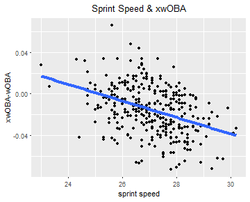
We see that swing speed still correlates strongly with exit velocity, but with a much more reasonable R2 value of 0.81. Much of the remaining variance is due to the quality of contact, as estimated by eA. The colors here show the soft-hit rates from FanGraphs. We can see not only that slower swing speeds result in more soft contact, but also that the regression line strongly divides hitters based on their soft-contact rates. Hitters above the line tend to make better contact and hit the ball more efficiently than those below the line, given their swing speeds.
Knowing the value of eA also gives us an estimate of where the ball hit the bat in relation to the barrel. Nathan found that eA ~ d2, where d is the distance from the barrel. Since a quadratic function has no inverse, we’re forced to infer d from our computed values of eA by assuming a linear relationship between the two variables. Once we know where the ball struck the bat, we can also estimate the barrel speed and hand speed, assuming that those speeds are proportional to distance from the axis of rotation.
League Average Estimated Swing Speeds (MPH), 2015-17
|
Point of Contact |
Barrel |
Hands |
| Year |
Min |
Avg |
Max |
Min |
Avg |
Max |
Min |
Avg |
Max |
| 2015 |
63.9 |
71.9 |
83.3 |
76.3 |
85.8 |
98.9 |
22.8 |
26.7 |
32.2 |
| 2016 |
63.7 |
72.2 |
80.8 |
76.2 |
86.2 |
95.5 |
22.9 |
26.8 |
31.0 |
| 2017 |
63.0 |
71.1 |
78.6 |
75.3 |
84.9 |
93.8 |
22.5 |
26.4 |
30.7 |
| Overall |
63.0 |
71.7 |
83.3 |
75.3 |
85.7 |
98.9 |
22.5 |
26.6 |
32.2 |
SOURCE: Baseball Savant/Statcast. Players with min 100 BBE in a season
I have no idea how accurate these estimates are, but they look pretty good! The swing speeds at the point of contact line up nicely with those from Blast Motion (65-85 MPH range and league average of 70 MPH), as do the barrel speeds (Zepp claims 75-95 MPH) and hand speeds (Blast Motion says 23-29 MPH). There’s a lot more uncertainty in the barrel and hand speeds than at the point of contact, because they require additional assumptions about bat size, axis of rotation, and distance from barrel of the point of contact. Even with all of those assumptions, the accuracy probably isn’t much worse than those of the swing-tracking devices on the market today, which claim an uncertainty of about 3-7 MPH for individual swings.
Here are the fastest and slowest average swing speeds in a season during the Statcast era:
Hitter Average Estimated Swing Speeds (MPH), 2015-17
| Player |
Year |
BBE |
Point of Impact (MPH) |
Barrel (MPH) |
Hands (MPH) |
| Giancarlo Stanton |
2015 |
187 |
83.3 |
98.9 |
32.2 |
| Rickie Weeks Jr. |
2016 |
127 |
80.8 |
95.5 |
29.5 |
| Giancarlo Stanton |
2016 |
275 |
80.3 |
95.5 |
31.0 |
| Greg Bird |
2015 |
107 |
80.2 |
95.2 |
30.4 |
| Gary Sanchez |
2016 |
145 |
80.1 |
95.0 |
29.9 |
| Kelby Tomlinson |
2017 |
131 |
63.8 |
76.3 |
24.1 |
| Dee Gordon |
2017 |
497 |
63.8 |
76.2 |
23.2 |
| Shawn O’Malley |
2016 |
152 |
63.7 |
76.2 |
23.2 |
| Mallex Smith |
2017 |
178 |
63.5 |
75.6 |
22.6 |
| Billy Hamilton |
2017 |
436 |
63.0 |
75.3 |
22.5 |
SOURCE: Baseball Savant/Statcast. Players with min 100 BBE in a season
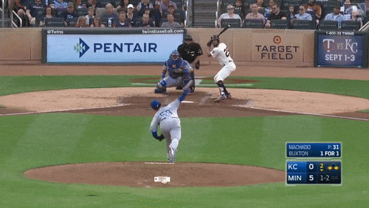
At the top of the list we see some well-known sluggers and … Rickie Weeks? Who knew he had such elite bat speed? Unfortunately for him, his average eA in 2016 was the lowest of any player in the Statcast era, indicating that he was making a ton of weak contact. Weeks is the quintessential over-swinger, whose impressive bat speed is often nullified by a lack of bat control. That’s completely unsurprising for a player’s whose 2016 highlight reel features at least one hack that would make even Charlie Brown blush:

I was also going to include a table of all of the fastest individual swings, until it turned into an exercise in how many times I can write Giancarlo Stanton’s name. He has 18 of the top 19 swings by barrel speed, which tops out at 108 MPH.
Attack Angle
Unlike swing speed, Statcast doesn’t give us an estimate of attack angle. Instead, we’ll again turn to some research done by Dr. Alan Nathan, this time from his 2017 Saberseminar presentation. To better understand the geometry of the bat-ball collision, let’s look at a diagram from his presentation:
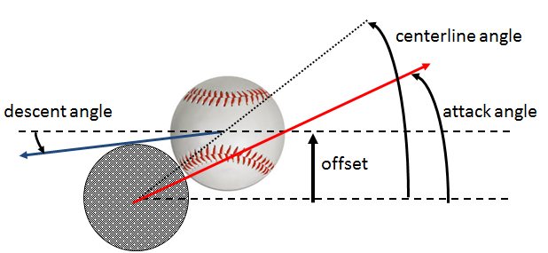
The attack angle, or swing plane, is the angle that the bat is moving at when it hits the ball. Drawing a line between the centers of the bat and ball at the time of impact defines a second angle, called the centerline angle. When a hitter swings the bat such that the attack angle lines up with the centerline angle, he generates his maximum exit velocity and launches the ball at an angle equal to that of the attack angle.
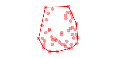
Armed with this information, we can compute the attack angle by looking at the launch angles when a hitter produces his highest exit velocities. Nathan does this by plotting EV against LA for each hitter (below is his figure for Khris Davis’s BBE, whose attack angle is about 20°). He then divides the data, presumably binning the data by launch angle and then pulling out the top few BBE by exit velocity in each bin (red points). Once the data has been divided, a parabola can be fit to the red points, such that the attack angle corresponds to the peak of the parabola.
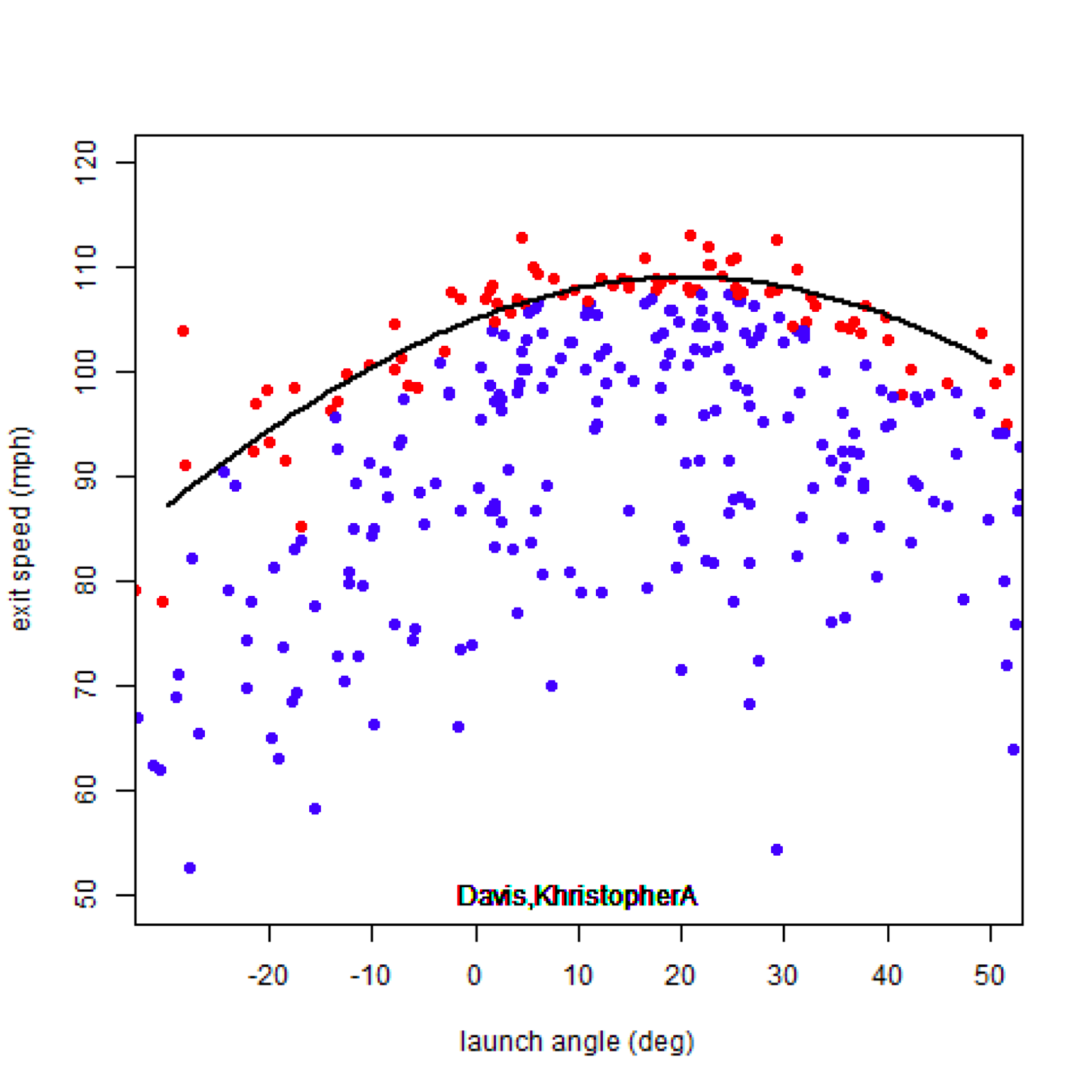
I found that the computed attack angle is fairly sensitive to the number of bins and number of data points in each bin, so this method is far from perfect. Ultimately, I chose the number of bins based on each player’s standard deviation in launch angle (~3° bins), and selected the top 20% of data points by exit velocity. I then computed a second version of attack angle by averaging the launch angles of the top 15 BBE by exit velocity (just as I did when computing swing speeds). Finally, I averaged the values from the two different methods to get a final value for the attack angle.
This method of computing the attack angle gives us what I’ll call the “preferred” attack angle. Batters change their attack angles slightly based on pitch location, but the preferred attack angle represents the plane of a hitter’s natural swing when he gets a good pitch to hit (à la batting practice).

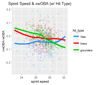
A lot of digital ink has been spilled over the last few years trying to make sense of how to evaluate hitters using launch angles. While a ton of progress has been made, we still have a long way to go. Who knew launch angles could be so complicated? Here, we see a relatively weak correlation between attack angle and launch angle, because launch angle is also strongly dependent a hitter’s aim, timing, and bat speed. While we don’t have any direct measurements of aim or timing, we can see from the color scale that players with flatter swings (lower attack angles) have more margin for error when it comes to timing, and therefore tend to have higher contact rates than players with uppercut swings (larger attack angles).
League Average Attack and Launch Angles (°), 2015-17
| Year |
Launch Angle |
Attack Angle |
| 2015 |
10.5 |
11.4 |
| 2016 |
11.1 |
12.0 |
| 2017 |
11.4 |
13.8 |
| Overall |
11.0 |
12.4 |
SOURCE: Baseball Savant/Statcast. Players with min 100 BBE in a season
The fly-ball revolution is even more evident when looking at league-wide attack angles instead of launch angles. There was a lot of buzz before this season about players reworking their swings to increase their launch angle. Not all of them were successful though, as the average launch angle only increased by 0.3°, despite a nearly 2° jump in attack angle.
Here are the highest and lowest preferred attack angles in a season during the Statcast era:
Hitter Preferred Attack Angle, 2015-17
| Player |
Year |
BBE |
Attack Angle(°) |
| Brian Dozier |
2017 |
433 |
29.2 |
| Mike Napoli |
2017 |
268 |
29.0 |
| Ryan Schimpf |
2016 |
351 |
27.6 |
| Ryan Howard |
2016 |
220 |
25.7 |
| Chris Davis |
2015 |
265 |
25.1 |
| Jarrod Dyson |
2016 |
269 |
-0.1 |
| Jason Bourgeois |
2015 |
164 |
-0.2 |
| Justin Morneau |
2015 |
143 |
-1.4 |
| Billy Burns |
2016 |
279 |
-1.7 |
| Jonathan Herrera |
2015 |
107 |
-4.5 |
SOURCE: Baseball Savant/Statcast. Players with min 100 BBE in a season
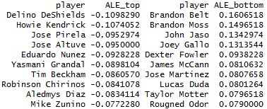
It’s good confirmation to see Ryan Schimpf’s name on this list, though it’s interesting that his attack angle isn’t the extreme outlier that his GB/FB ratio and LA are. An analysis of attack angle may also finally give us an answer to why Brian Doziers’s home runs have gone missing this season. His 2017 batting line is almost identical to that of 2016, except his ISO (and HRs) have plummeted. The biggest difference is his attack angle has skyrocketed from 20° to 29°. We know that the optimal LA for hitting home runs is about 24°, so he’s probably getting too much loft on his fly balls this year. All of these guys at the top of the list would probably benefit by flattening out their swings a bit. Interestingly, Joey Gallo, everyone’s other favorite extreme fly-ball hitter, has an attack angle right at 24° this year. He has built the perfect swing for his batted-ball profile, which explains why he is among the league leaders in HR/FB ratio.
This turned out to be an extremely lengthy primer on swing mechanics, but there plenty of questions that can be tackled with estimates of swing metrics. For instance, can we use swing speed and attack angle to predict future exit velocities and launch angles? How much do hitters reduce their swing speeds on two-strike counts? How do attack angles change with pitch location? But, alas, those questions will have to be answered at a later time.
A complete list of swing speeds and attack angles for players with at least 100 BBE is available here.