Author Archive

Derek Norris, 2016 — A Season to Forget

While it may not be the most exciting Nationals story of the offseason, Wilson Ramos signing with the Rays and the subsequent trade for Derek Norris to replace him is a very big change for the Nats. Prior to tearing his ACL in September, Ramos was having an incredible 2016, and he really carried the Nationals offense through the first part of the year (with the help of Daniel Murphy, of course) when Harper was scuffling and Anthony Rendon was still working back from last season’s injury. Given Ramos’ injury history it makes sense to let him walk, but Nationals fans have reasons to be concerned about Norris.

After a few seasons of modest success, including an All-Star appearance in 2014, Norris batted well under the Mendoza line (.186) in 2016 with a significant increase in strikeout rate. What was the cause for this precipitous decline? Others have dug into this lost season as well, and this article will focus on using PitchFx pitch-by-pitch data through the pitchRx package in R as well as Statcast batted-ball data manually downloaded into CSV files from baseballsavant.com, and then loaded into R. Note that the Statcast data has some missing values so it is not comprehensive, but it still tells enough to paint a meaningful story.

To start, Norris’ strikeout rate increased from 24% in 2015 to 30% in 2016, but that’s not the entire story. Norris’ BABIP dropped from .310 in 2015 to .238 in 2016 as well, but his ISO stayed relatively flat (.153 in 2015 vs. .142 in 2016). Given the randomness that can be associated with BABIP, this could be good new for Nats fans, but upon further investigation there’s reason to believe this drop was not an aberration.

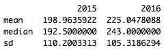
Using the batted-ball Statcast data, it doesn’t appear that Norris is making weaker contact, at least from a velocity standpoint (chart shows values in MPH):

Screen Shot 2016-12-11 at 9.50.27 PM.png

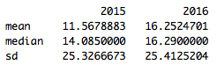
Distance, on the other hand, does show a noticeable difference (chart shows values in feet):

Screen Shot 2016-12-11 at 9.53.45 PM.png

So Norris is hitting the ball further in 2016, but to less success, which translates to lazy fly balls. This is borne out by the angle of balls he put in play in 2015 vs. 2016 (values represent the vertical angle of the ball at contact).

Screen Shot 2016-12-11 at 9.56.55 PM.png

The shifts in distance & angle year over year are both statistically significant (velocity is not), indicating these are meaningful changes, and they appear to be caused at least in part by the way pitchers are attacking Norris.

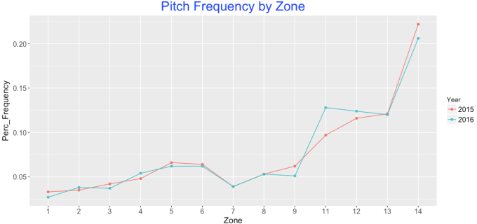
Switching to the PitchFx data, it appears pitchers have begun attacking Norris up and out of the zone more in 2016. The below chart shows the percentage frequency of all pitches thrown to Derek Norris in 2015 & 2016 based on pitch location. Norris has seen a noticeable increase in pitches in Zones 11 & 12, which are up and out of the strike zone.

Screen Shot 2016-12-11 at 10.11.19 PM.png

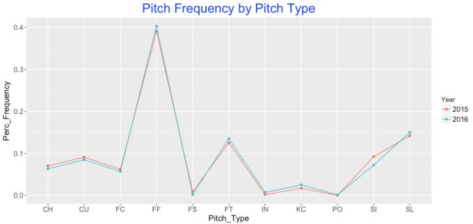
Norris has also seen a corresponding jump in fastballs, which makes sense given this changing location. This shift isn’t as noticeable as location, but Norris has seen fewer change-ups (CH) and sinkers (SI) and an increase in two-seam (FT) & four-seam fastballs (FF).

Screen Shot 2016-12-11 at 10.15.10 PM.png

The net results from this are striking. The below chart shows Norris’ “success” rate for pitches in Zones 11 & 12 (Represented by “Yes” values, bars on the right below) compared to all other zones for only outcome pitches, or the last pitch of a given at-bat. In this case success is defined by getting a hit of any kind, and a failure is any non-productive out (so, excluding sacrifices). All other plate appearances were excluded.

Screen Shot 2016-12-11 at 10.21.20 PM.png

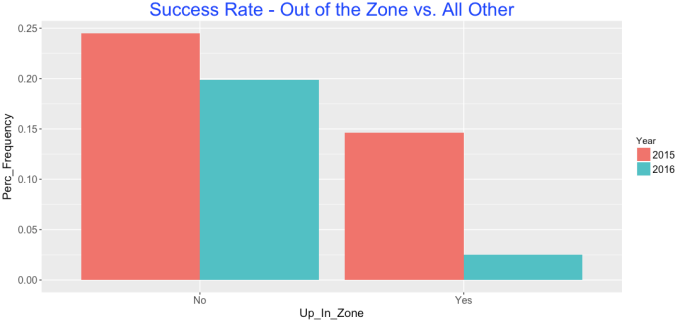
While Norris was less effective overall in 2016, the drop in effectiveness on zone 11 and 12 pitches is extremely noticeable. Looking at the raw numbers makes this even more dramatic:

2015                                                     2016

Screen Shot 2016-12-11 at 10.23.19 PM.png                       Screen Shot 2016-12-11 at 10.23.38 PM.png

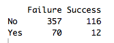
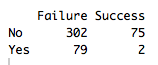
So not only did more at-bats end with pitches in zones 11 and 12; Norris ended up a shocking 2-for-81 in these situations in 2016.

In short, Norris should expect a steady stream of fastballs up in the zone in 2016, and if he can’t figure out how to handle them, the Nationals may seriously regret handing him the keys to the catcher position in 2016.

All code can be found at the following location : https://github.com/WesleyPasfield/Baseball/blob/master/DerekNorris.R


wERA: Rethinking Inherited Runners in the ERA Calculation

There are many things to harp on about traditional ERA, but one thing that has always bothered me is the inherited-runner portion of the base ERA calculation. Why do we treat it in such a binary fashion? Shouldn’t the pitcher who allowed the run shoulder some of the accountability?

As a Nationals fan, the seminal example of the fallacy of this calculation was Game 2 of the 2014 Division Series against the Giants. Jordan Zimmermann had completely dominated all day, and after a borderline ball-four call, Matt Williams replaced him with Drew Storen, who entered the game with a runner on first and two outs in the top of the 9th and the Nats clinging to a one-run lead. Storen proceeded to give up a single to Buster Posey and a double to Pablo Sandoval to tie the game, but he escaped the inning when Posey was thrown out at the plate. So taking a look at the box score, Zimmermann, who allowed an innocent two-out walk, takes the ERA hit and is accountable for the run, while Storen, who was responsible for a lion’s share of the damage, gets completely off the hook. That doesn’t seem fair to me!

I’ve seen other statistics target other flawed elements of ERA (park factors, defense), but RE24 is the closest thing I’ve found to a more context-based approach to relief pitcher evaluation. RE24 calculates the change in run expectancy over the course of a single at-bat, so it’s applicable beyond relief pitchers and pitchers in general, and is an excellent way to determine how impactful a player is on the overall outcome of the game. But at the same time, it does not tackle the notion of assignment, but simply the change in probability based on a given situation.

wERA is an attempt to retain the positive components of ERA (assignment, interpretability), but do so in a fashion that better represents a pitcher’s true role in allowing the run.

The calculation works in the exact same way as traditional ERA, but assigns inherited runs based on the probability that run will score based on the position of the runner and the number of outs at the start of the at-bat when a relief pitcher enters the game. These probabilities were calculated using every outcome from the 2016 season where inherited runners were involved.

Concretely, here is a chart showing the probability, and thus the run responsibility, in each possible situation. So in the top example – if there’s a runner on 3rd and no one out when the RP enters the game, the replaced pitcher is assigned 0.72 of the run, and the pitcher who inherits the situation is assigned 0.28 of the run. On the flip side, if the relief pitcher enters the game with two outs and a runner on first, they will be assigned 0.89 of the run, since it is primarily the relief pitcher’s fault the runner scored.

Screen Shot 2016-12-04 at 9.35.13 AM.png
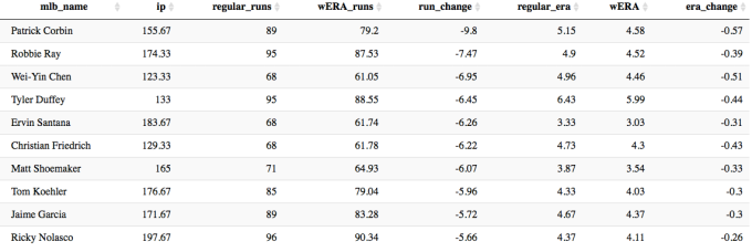
Let’s take a look at the 2016 season, and see which starting and relief pitchers would be least and most affected by this version of the ERA calculation (note: only showing starters with at least 100 IP, and relievers with over 30 IP).
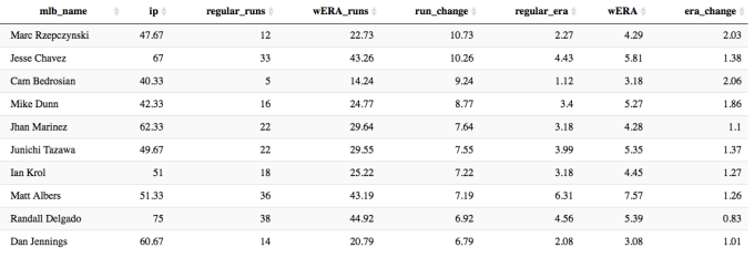
Screen Shot 2016-12-07 at 9.39.40 PM.png

The Diamondbacks starting pitchers had a rough year this year, but they were not helped out by their bullpen. Patrick Corbin would shave off almost 10 runs and over half a run in season-long ERA using the wERA calculation over the traditional ERA calculation.

On the relief-pitcher side the ERA figures shift much more severely.

Screen Shot 2016-12-07 at 9.40.37 PM.png

Cam Bedrosian had by normal standards an amazing year with an ERA of just 1.12. Factoring inherited runs scored, his ERA jumps up over two runs to a still solid 3.18, but clearly he was the “beneficiary” of the traditional ERA calculation. So to be concrete about the wERA calculation – it is saying that Bedrosian was responsible for an additional 9.22 runs this season stemming directly from his “contribution” of the runners who he inherited that ultimately scored.

The below graph shows relief pitcher wERA vs. traditional ERA in scatter-plot form. The blue line shows the slope of the relationship of the Regular ERA vs wERA, and the black line shows a perfectly linear relationship. It’s clear that the result of this new ERA is an overall increase to RP ERA, albeit to varying degrees based on individual pitcher performance.

Screen Shot 2016-12-07 at 10.04.15 PM.png

While I believe this represents an improvement over traditional ERA, there are two flaws in this approach:

  • In complete opposite fashion compared to traditional ERA, wERA disproportionately “harms” relief pitcher ERA, because they enter games in situations that starters do not which are more likely to cause a run to be allocated against them.
  • This does not factor in pitchers who allow runners to advance, but don’t allow that runner to reach base or score. Essentially a pitcher could leave a situation worse off than he started, but not be negatively impacted.

The possible solution to both of these would be to employ a similar calculation to RE24 and calculate both RP and SP expected vs. actual runs based on these calculations. This would lose the nature of run assignment to a degree, but would be a more unbiased way to evaluate how much better or worse a pitcher is compared to expectation. I will attempt to refactor this code to perform those calculations over the holidays this year.

All analysis was performed using the incredible pitchRx package within R, and the code can be found at the Github page below.

Baseball/wERA.R